A logo is the smallest part of a brand and the part people see most often: on a shop sign, a delivery box, a phone screen and the corner of an invoice. Abcon Branding designs logos for businesses in Dubai, Abu Dhabi, Sharjah and across the UAE, in English, in Arabic or in both. We start with what the mark needs to say about the business, draw it on a construction grid, test it small and in one colour, and hand over a complete set of files that your printer, signmaker and web developer can use without guessing.
Some clients come to us for a logo on its own, others as the first step of a full identity. Either way the mark gets the same attention. A logo project usually covers:
A short diagnosis
who the business serves, who it is compared with and where the logo will appear most, from a fascia to a social profile. This sets the brief before any sketching starts.
The right kind of logo
a decision between a wordmark, a symbol with a name, or a combination that can be split into parts, based on how long the name is, how it sounds and where it has to fit.
Concept routes
a small number of distinct directions, each with the idea behind it explained, rather than a wall of options that differ only in font.
Arabic and English lockups
both scripts drawn together, with matched weight, height and spacing, in horizontal, stacked and single-language arrangements when the business needs them.
Construction and grid
the geometry that fixes curves, angles and gaps, so the mark can be redrawn accurately at any size and by any supplier.
Colour versions
a primary colour version, a reversed version for dark backgrounds and a one-colour version for stamps, embroidery, engraving and single-ink print.
Small-size and reproduction tests
the mark checked as an app icon, a browser tab, a profile picture, a cup lid and a line of embroidery, then simplified wherever detail starts to fill in.
Clear space and minimum size
how much room the logo needs around it and how small it can go before a compact version takes over.
Master files and a usage sheet
vector masters for print and signage, screen files for the web and social media, colour values for print and screen, and a short sheet that shows how to use them.
A logo sits inside a wider identity of colour, typography, pattern, photography and tone. When the business needs that whole system, start with brand identity design.
If people already know your current mark, it may be better to redraw it than to replace it. We make that call as part of rebranding.
Once the logo is approved, the rules for using it across every format belong in brand guidelines.
If the name itself is still open, or the business needs a clearer way of speaking, begin with naming and tone of voice.
What a logo has to do
Be recognised before it is read.
Most people see a logo for a moment: on a passing van, a shelf or a feed. Shape and colour have to do the work before anyone reads the letters.
Work at the size it is used most.
A mark that looks fine on a presentation board can become a smudge on a cup lid or a browser tab. The sizes that matter most to the business are the ones we test first.
Read properly in both languages.
Many customers in the UAE read the Arabic first. If the Arabic is set in a default font beneath a custom English name, the logo looks like a translation. Both scripts need the same care.
Survive one colour.
Rubber stamps, embroidery, laser engraving, newspaper ads and till receipts all strip a logo back to one ink. If the idea depends on a gradient or a fine outline, it disappears.
Carry an idea that is true to the business.
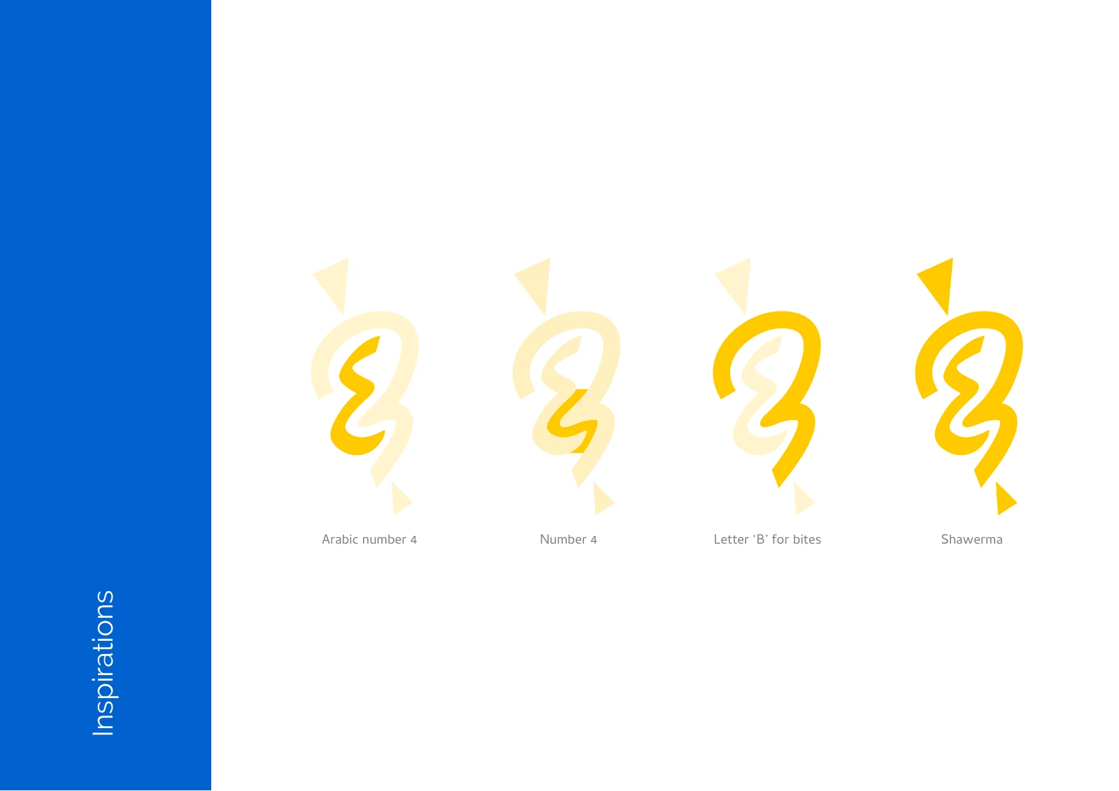
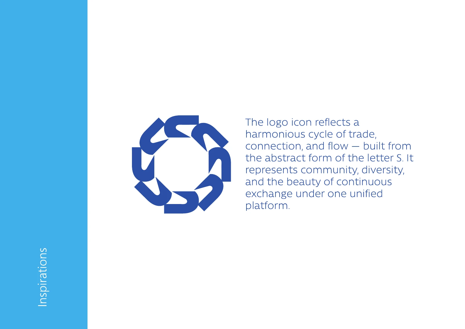
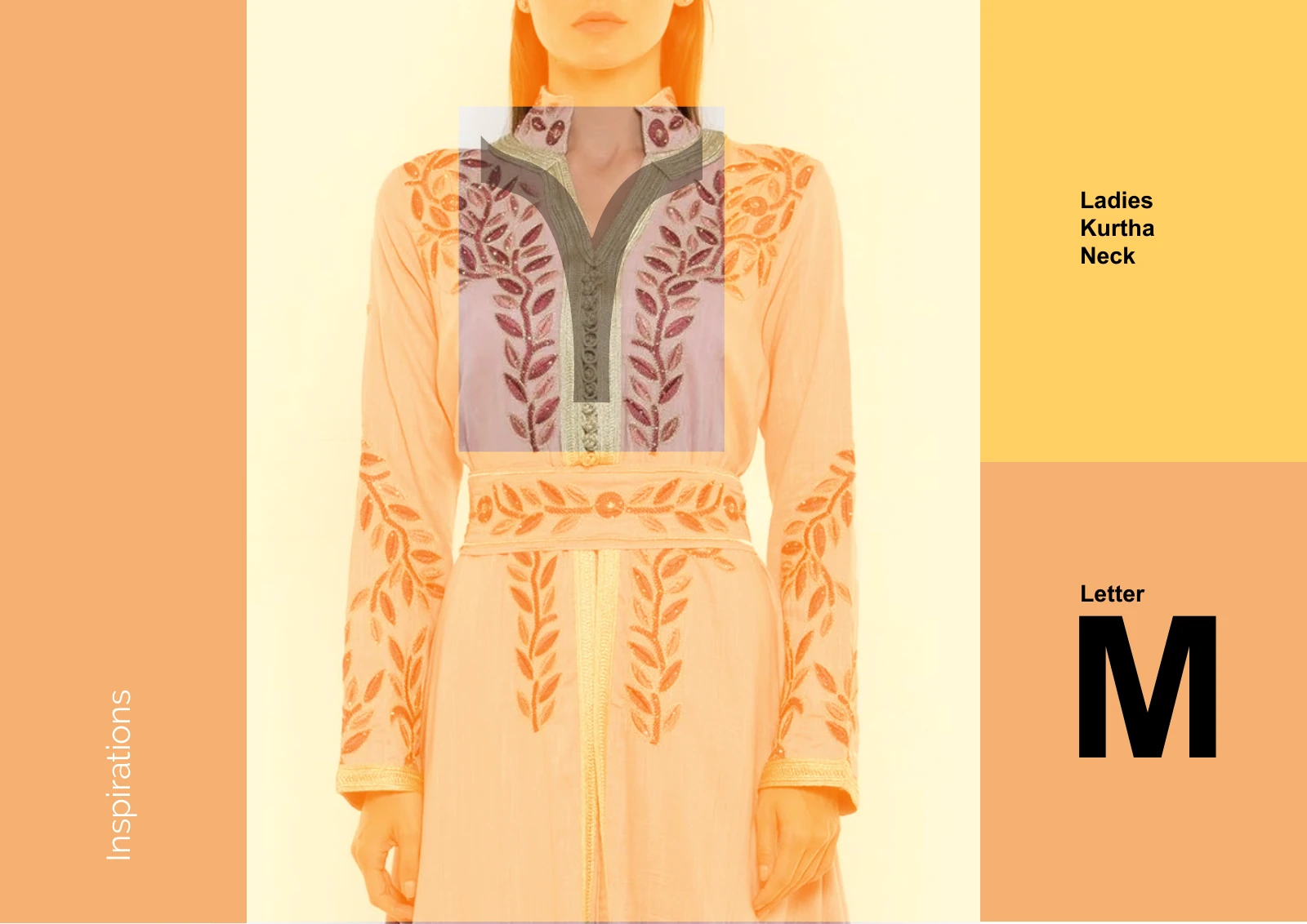
An idea behind the mark helps people remember it and helps your team explain it. The Sara’s Cash & Carry emblem turns the letter S into a cycle of trade, and the Mashaghal Hareer M comes from the neckline of a kurta.
Leave room for what comes next.
A logo drawn for one shop often ends up on a second branch, a product range or a sister company. The structure should allow for that without starting again.
How we work on logo design
Every project follows the same four stages. This is what they mean here:
01
Diagnose
We talk to the people who run the business, review the current logo if there is one and the places it appears, and look at the marks competitors use in the same streets, malls and feeds. We agree which languages the logo needs, where it will be used most and any names, colours or symbols that must stay. The result is a short written brief that we both approve before design begins.
02
Architect
We develop a small number of concept routes, explain the thinking behind each, and show them on real applications: a sign, a pack, a profile picture. Once a route is chosen, we refine it on a construction grid, draw the Arabic and English together where both are needed, and test the mark small, reversed and in one colour before it is signed off.
03
Deploy
We prepare the master artwork in every agreed version and format, with colour values for print and screen, clear space and minimum size rules, and a short usage sheet. If the logo is going straight onto a shopfront, packaging or printed material, Abcon Group’s Abjar Signboard Works and German Printing Press can produce it, or we brief your own suppliers.
04
Compound
When the business needs a new lockup for a branch, a product line or a sister company, we draw it on the same grid so it belongs with the original. If you later need a full identity or guidelines, the logo becomes the starting point rather than something to redo.
These boards come from original project presentations: construction grids, inspiration boards, Arabic and English lockups and colour versions. Most of the logos were designed as part of a wider identity, and each image links to the full case study. They show how the marks were built and tested, not sales or recognition figures.
See how an idea carries into the design. These examples draw on the original project presentations.
How do two scripts share one mark?
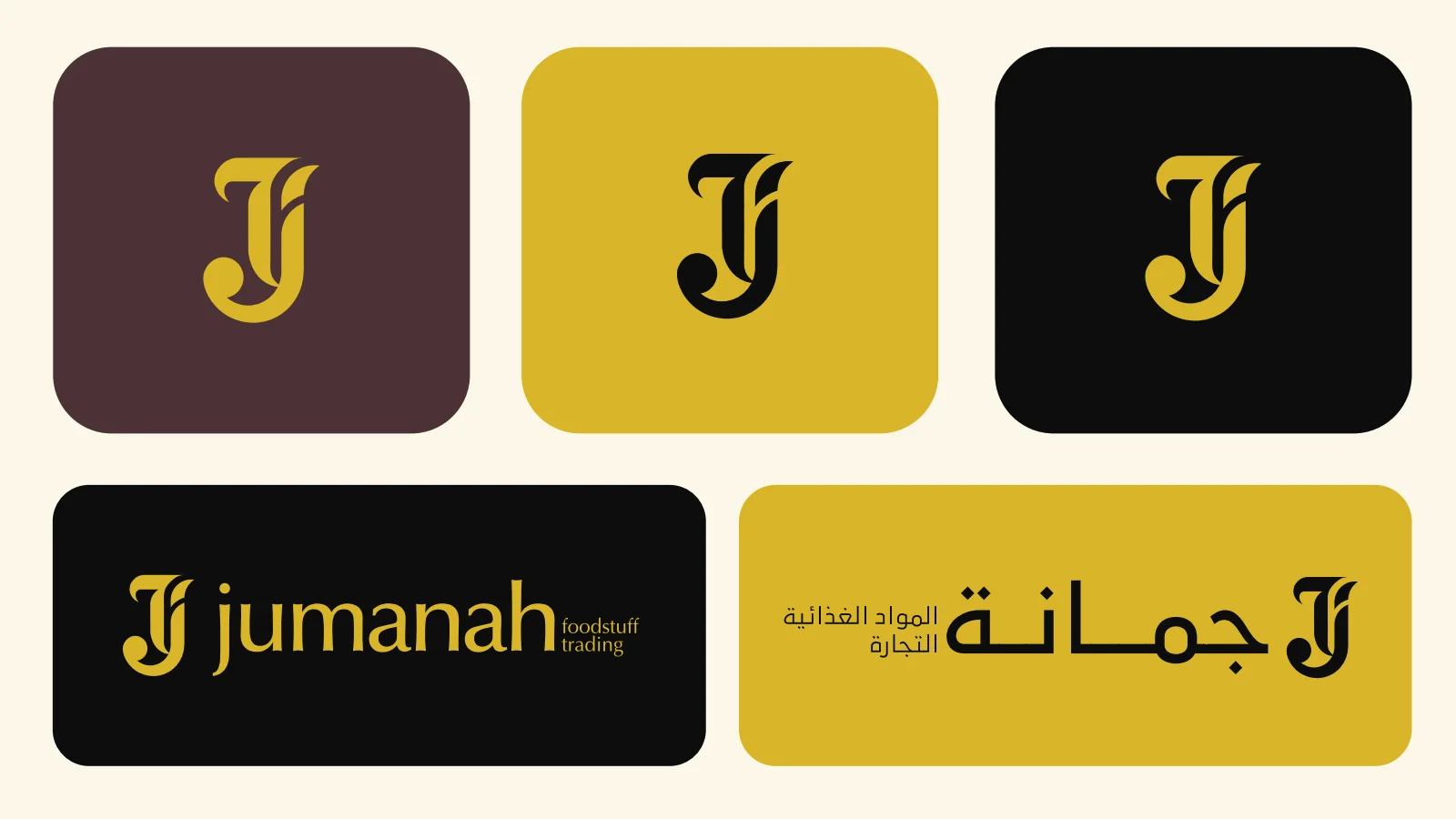
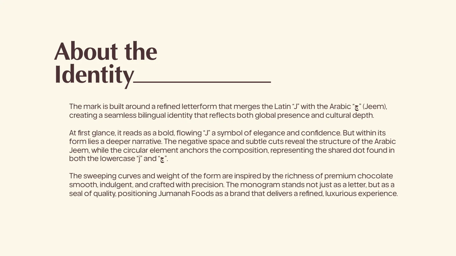
The Jumanah Foods rationale board describes a letterform that merges the Latin J with the Arabic Jeem, with a circular element standing for the dot both letters share.
Because the monogram reads in both alphabets, the English, Arabic and combined lockups can all lead with it, and neither language looks like an addition to the other.
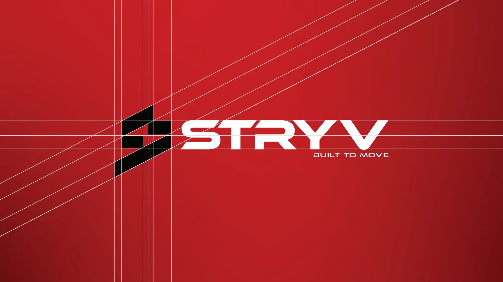
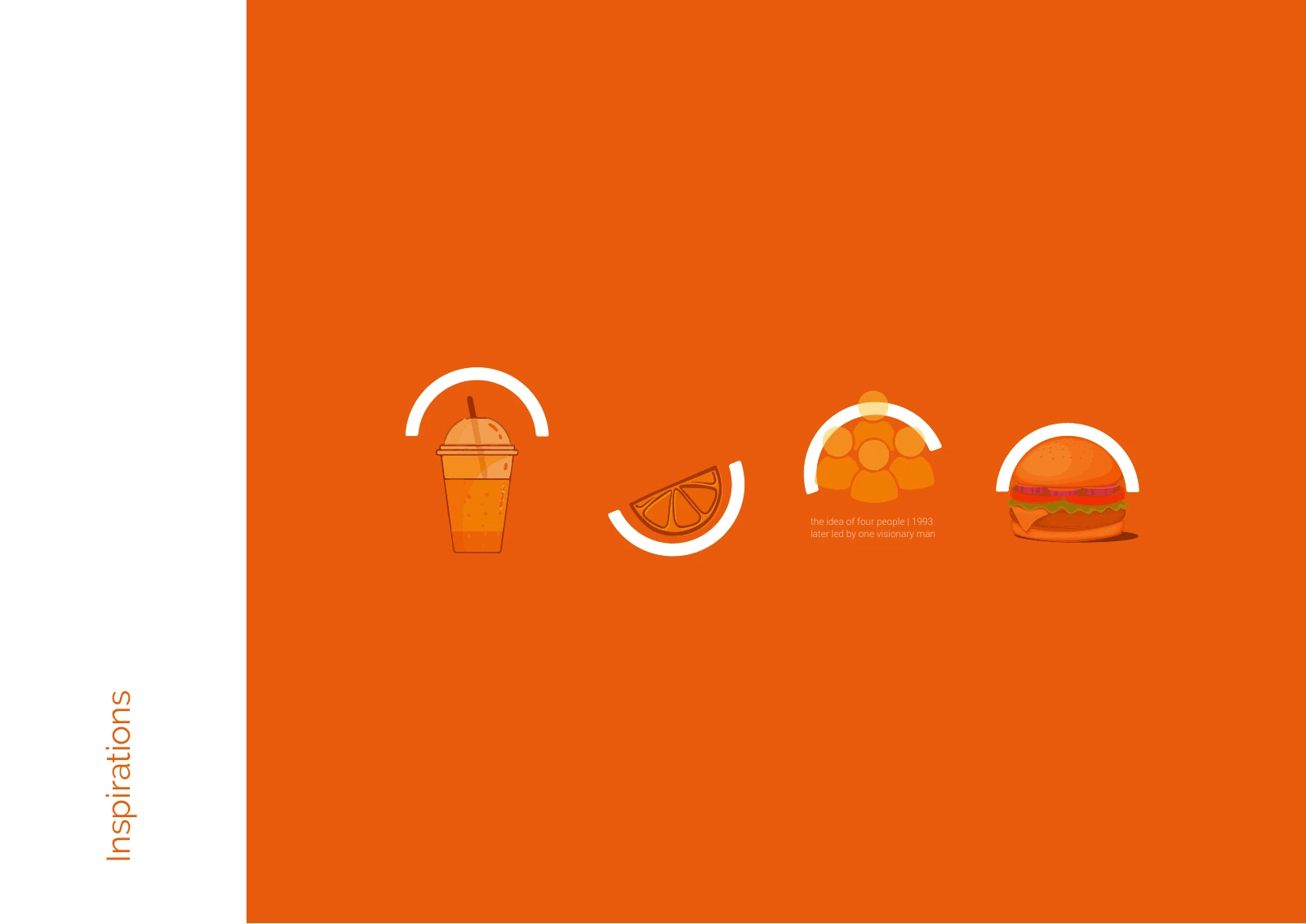
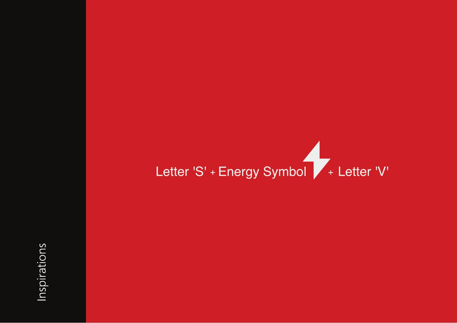
The Stryv inspiration board sets out three parts on red: the letter S, an energy symbol and the letter V.
The construction board then fixes one slant for the symbol and the wordmark, so the compact S can stand alone as an app icon and still match the name beside it.
We quote every project after a first conversation, so the proposal matches what the business needs. These are the things that move the cost and the timeline most:
Starting point: a new logo for a new name is a different job from refining a mark that customers already recognise.
Languages: a bilingual logo needs the Arabic and English drawn and balanced together, which takes more design and testing than one script.
Type of mark: a custom symbol or hand-drawn lettering takes longer to develop and construct than a wordmark set in a refined typeface.
Routes and rounds: how many concept directions are explored, and how many rounds of refinement are agreed in the proposal.
Versions and lockups: each extra arrangement, such as stacked, horizontal, symbol only, or a lockup for a branch or product line, adds artwork.
What comes with the logo: a logo with a usage sheet is a smaller scope than a logo with a colour system, typography, patterns and full brand guidelines.
Naming: if the name is not settled, naming comes first and is scoped separately.
I worked with them for my new startup. They supported me from my logo branding, product photography, website creation to marketing campaigns. Amazing team. Highly recommended.
Very professional work, they choose quality over quantity all the time, creative and innovative , love the fact that they include their own opinions and give me honest feedback, helps with improving business and business development.
What is the difference between a wordmark, a symbol and a combination logo?
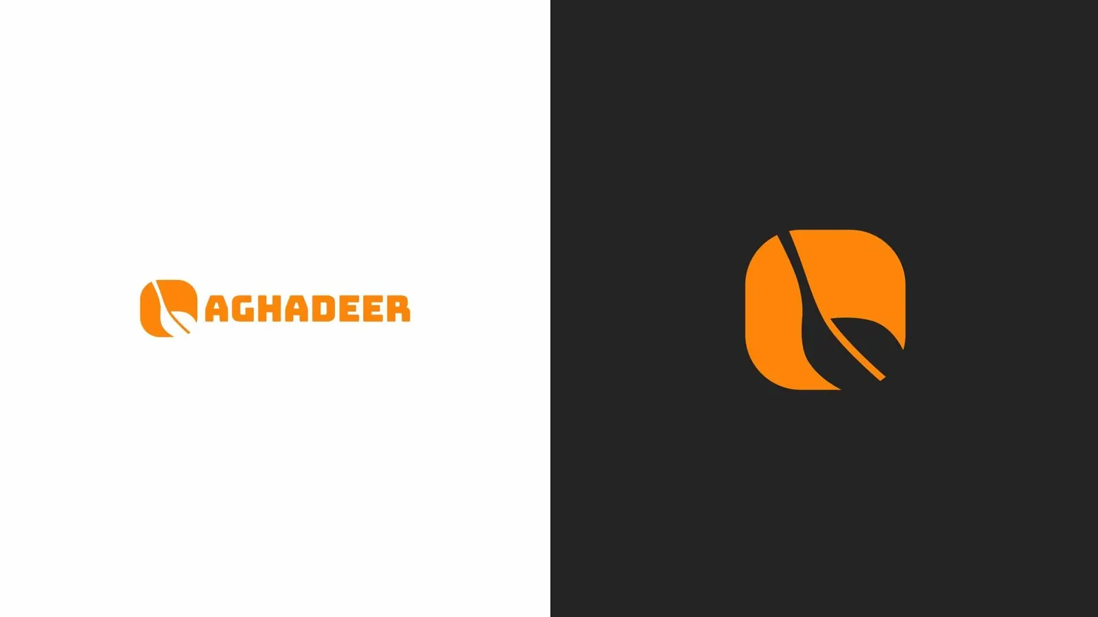
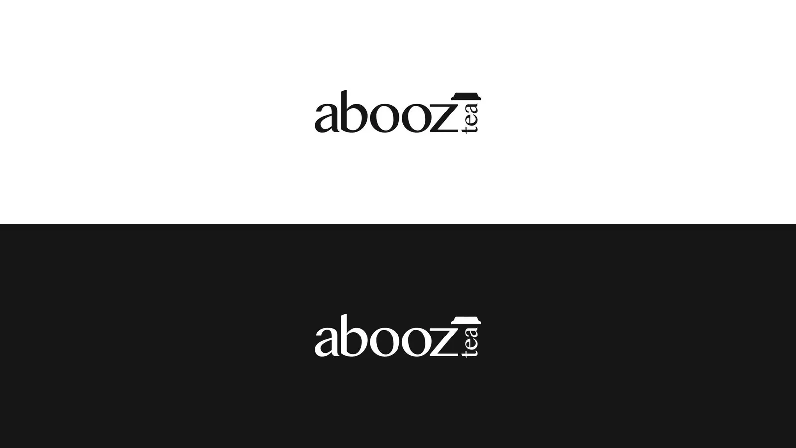
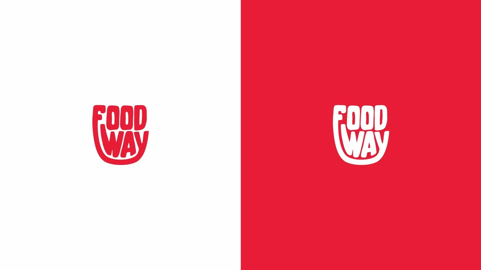
A wordmark is the name itself drawn as the logo, like Food Way’s red cup-shaped lettering or the Abooz Tea wordmark. A symbol is a mark that can stand without the name, like the Aghadeer leaf-and-spoon square. A combination logo puts the two together and lets you separate them when space is tight. Short, distinctive names often suit a wordmark. Long names, and businesses that need an app icon or a pattern, usually need a symbol as well.
Can you design our logo in Arabic and English?
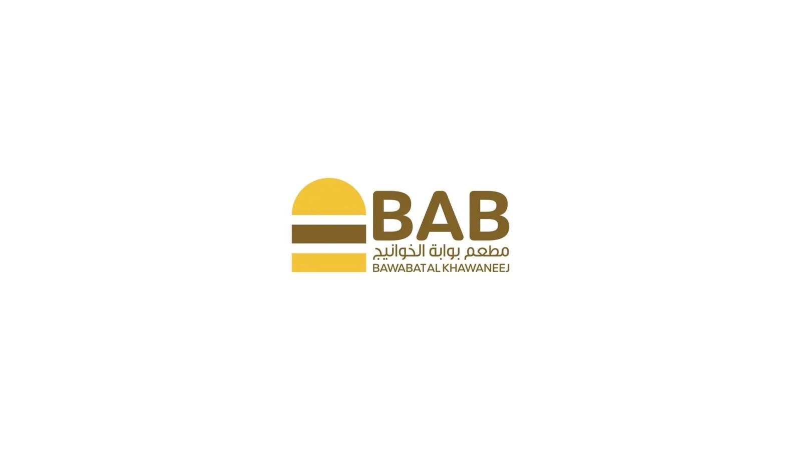
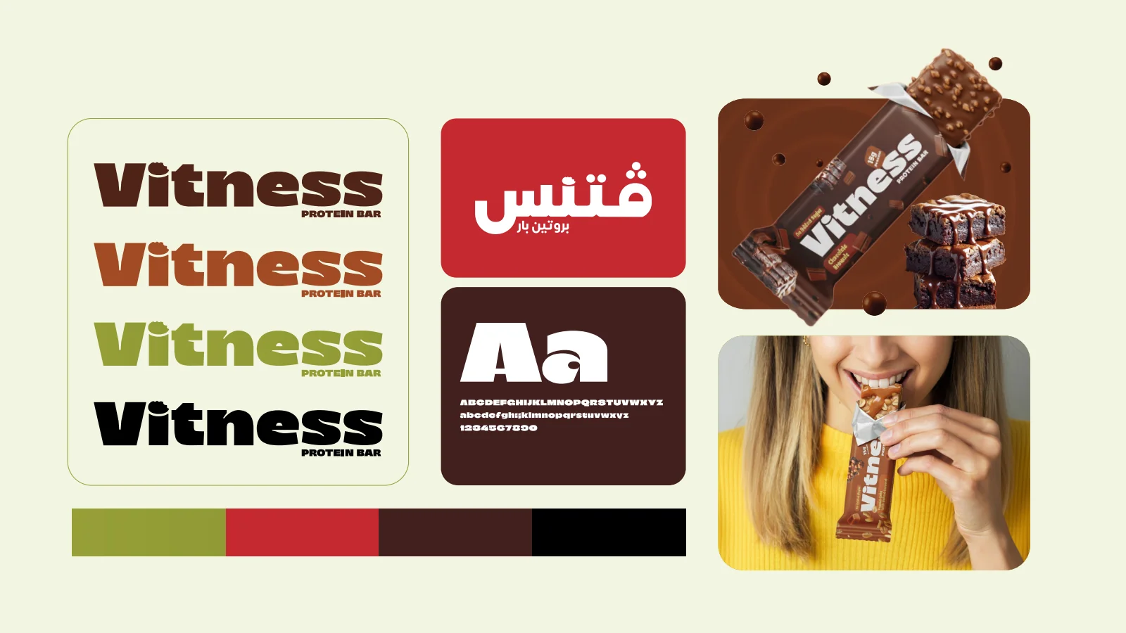
Yes, and we draw both from the start. Jumanah Foods joins the Latin J and the Arabic Jeem in one monogram, Bab sets its Arabic name beneath the symbol and the English name, and Vitness has an Arabic version of its wordmark. We match the weight, height and spacing of the two scripts, and we confirm the Arabic spelling and letterforms with you before the artwork is final.
Do you design logos on their own, without a full identity?
Yes. Some businesses need a logo now and the wider identity later. We still begin with a short diagnosis, because a mark designed without knowing who it is for is guesswork. If that conversation shows the business needs more than a logo, we will say so and explain why. Our brand identity page covers the full system.
What is a construction grid, and why does it matter?
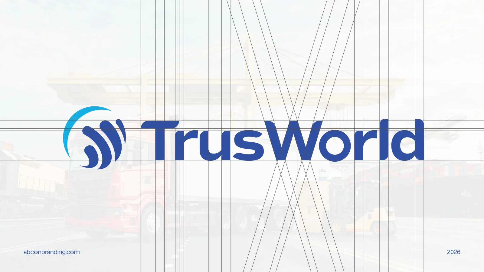
It is the geometry behind the mark: the circles, angles and guide lines that fix every curve and gap. The Trusworld and Stryv boards show theirs. A constructed logo can be redrawn for a building sign or a favicon without drifting out of shape, and a signmaker or embroiderer can reproduce it accurately from the master file.
How do you make sure the logo works at small sizes?
We test it where it is smallest: as a social profile picture, a browser tab, an app icon, a cup lid and a line of embroidery on a shirt. If fine details fill in, we simplify the mark or design a compact version, such as the symbol alone, for those uses. We also check it in one colour and reversed out of a dark background.
What files do we receive at the end?
Vector master files for print, signage and production, screen files with transparent backgrounds for websites and social media, and versions in full colour, reversed and one colour. You also receive the colour values for print and screen, the clear space and minimum size rules, and a short usage sheet. We list the exact files in the proposal so nothing is missing at handover.
Who owns the logo when the project is finished?
Ownership and the transfer of rights are set out in the agreement before work starts. If a wordmark uses a commercial typeface, we tell you which one and whether a licence is needed. Trademark searches and registration should be handled by a specialist adviser, and we can share the artwork they need for that check.
Can you refresh our existing logo instead of replacing it?
Often, yes. If customers already recognise the mark, we can redraw it on a proper grid, fix weak spacing and details, add an Arabic version or a compact symbol, and keep what people know. When the problem is bigger than the logo, our rebranding page explains how we decide how far a brand should move.
Do you work with businesses in Abu Dhabi and the other emirates?
Yes. We work with businesses across the UAE, from Abu Dhabi and Ajman to Ras Al Khaimah, Fujairah and Umm Al Quwain, from our head office in Al Qusais, Dubai and our office in Muweilah, Sharjah, and you are welcome to meet the team at either. We have no office in Abu Dhabi, so logo reviews for clients there happen online or at one of our offices. Abcon Branding is part of Abcon Group, which began in 1997 and works across the UAE and Oman.
Can Abcon Group make the sign, the packaging and the print?
Yes. Abcon Group includes Abjar Signboard Works, German Printing Press, Alfapack Plastic & Paper Packaging and GPack Paper Packaging, so the new logo can go onto a shopfront, a pack or printed stationery within the group. If you already have suppliers, we prepare the artwork to their specifications instead.
How long does a logo design project take?
It depends on the languages, the number of routes and versions, and whether the name is settled. Once the first diagnostic conversation has shown the scope, we agree a timeline with you and write it into the proposal before any design starts.
What should we share before a logo design project?
Send the business name in every language it uses, with the exact spelling, a short description of what you sell and to whom, and the competitors you are compared with. Include your current logo if there is one, and list where the new one must work first: a shopfront, packaging, uniforms, vehicles, a website or an app icon. Tell us about any colours, symbols or words that must stay, and who will approve the design.
Preparing the first conversation? Build a brand project brief around your business challenge, audience and priorities.