Burger restaurant
Bab
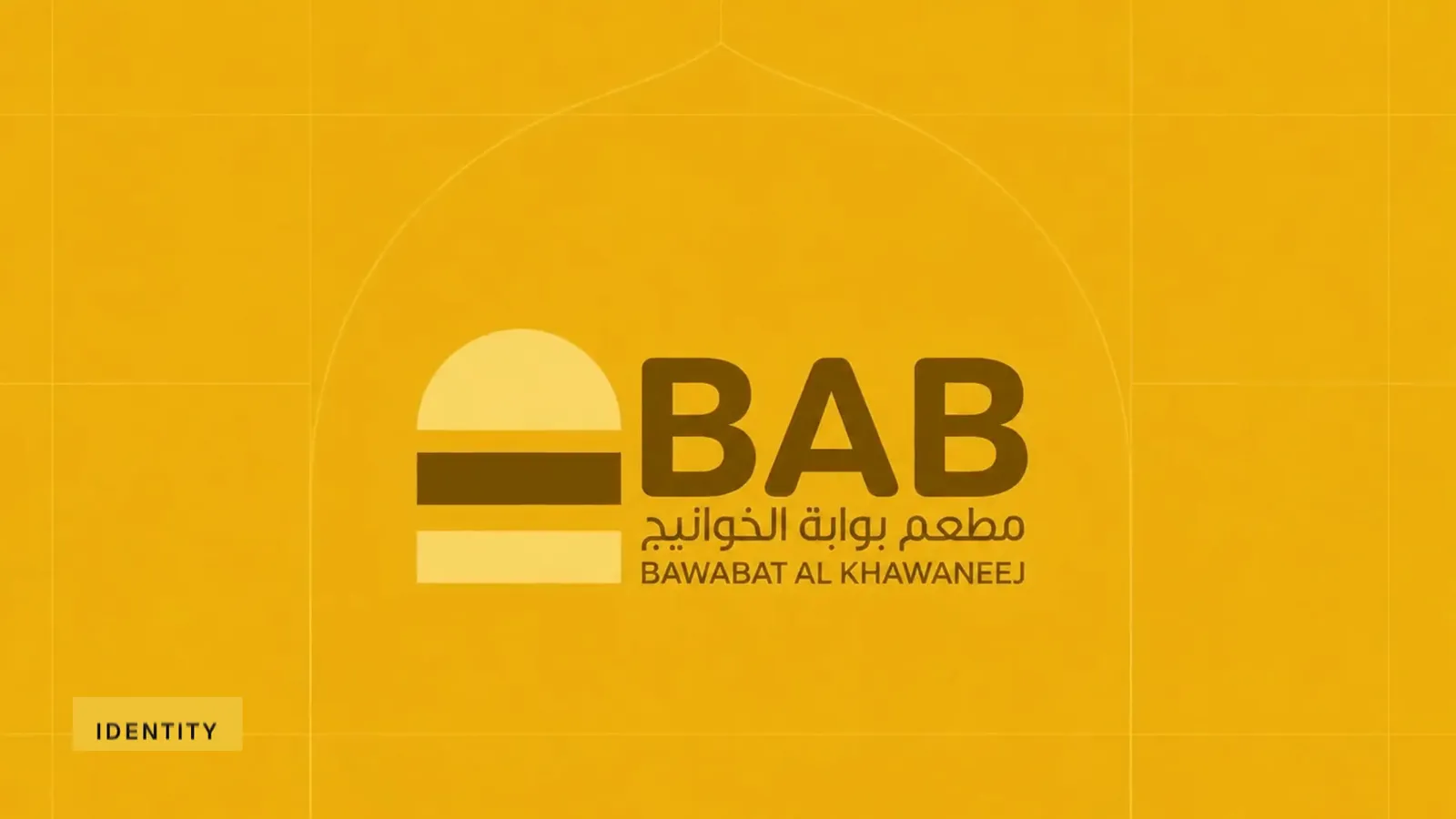
Bab brand film. Motion film made from the original Bab identity boards and brand applications.
Overview
An identity for Bab, short for Bawabat Al Khawaneej, a burger restaurant.
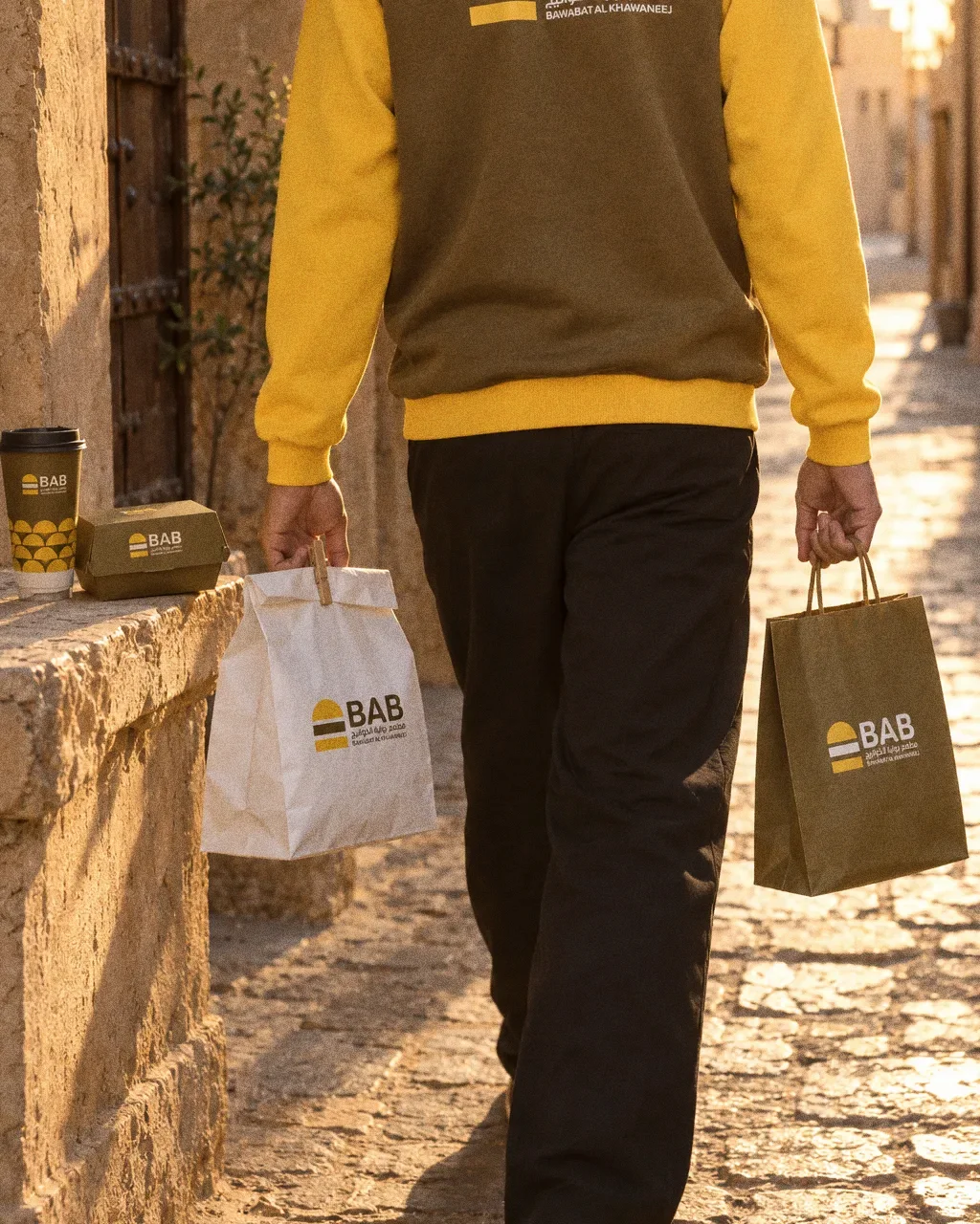
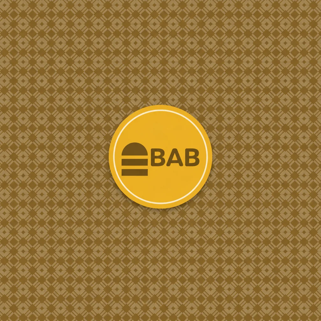
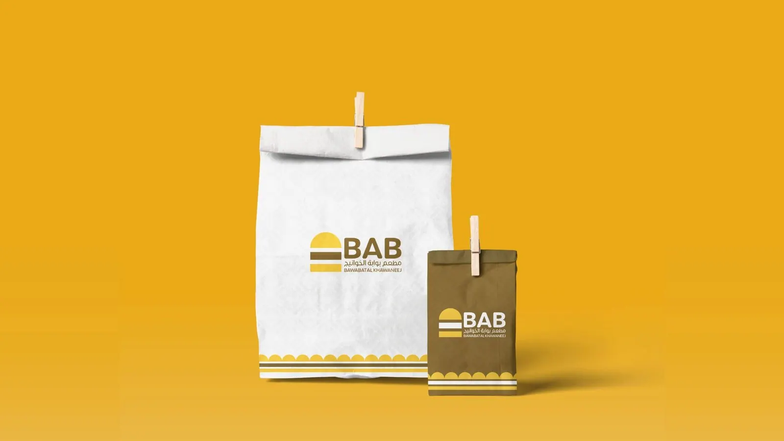
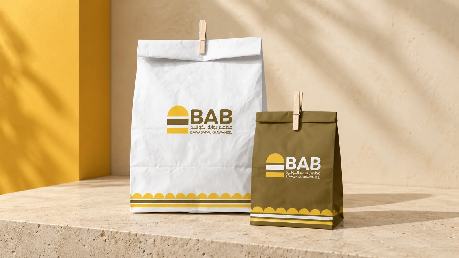
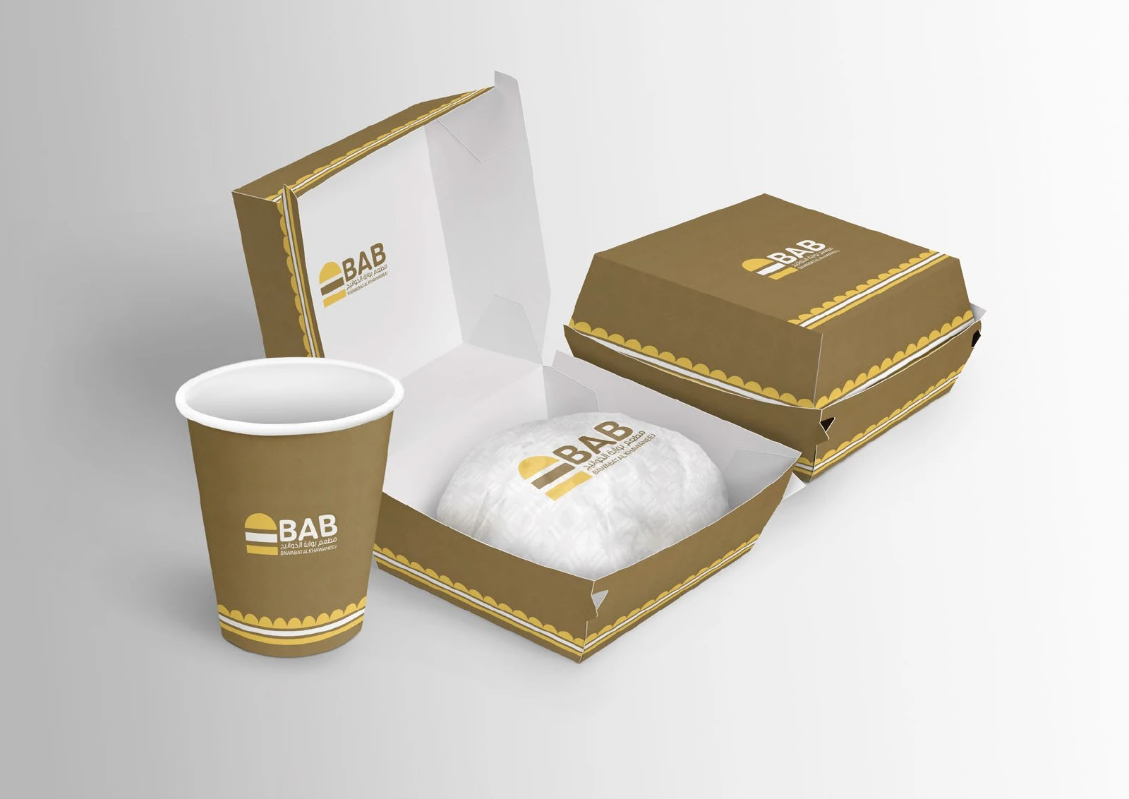
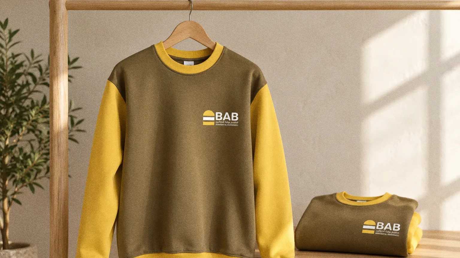
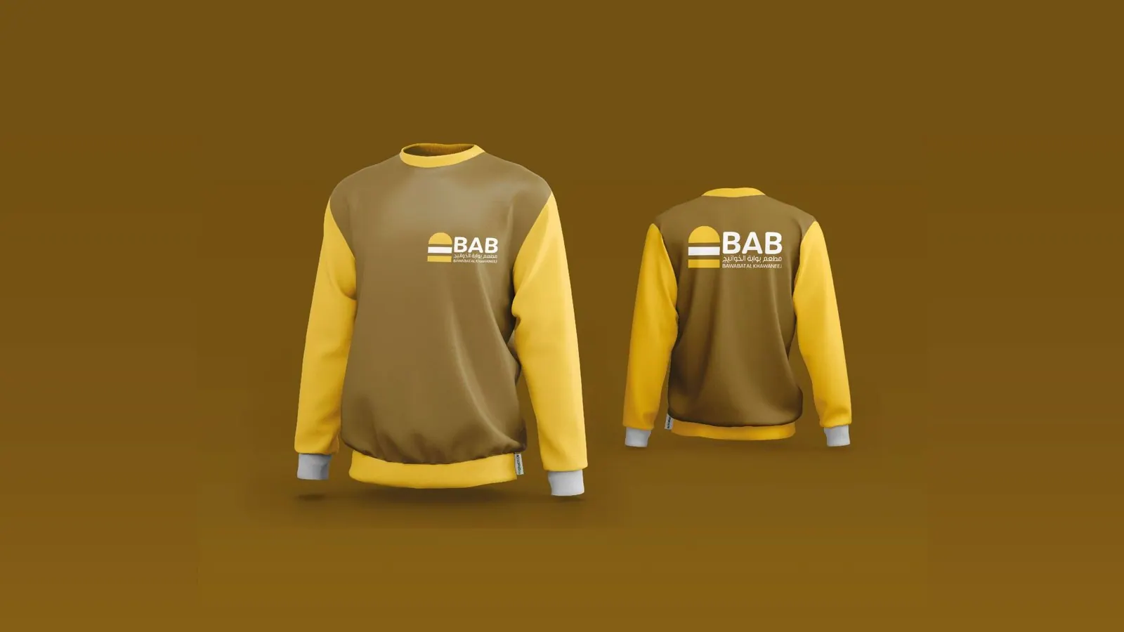
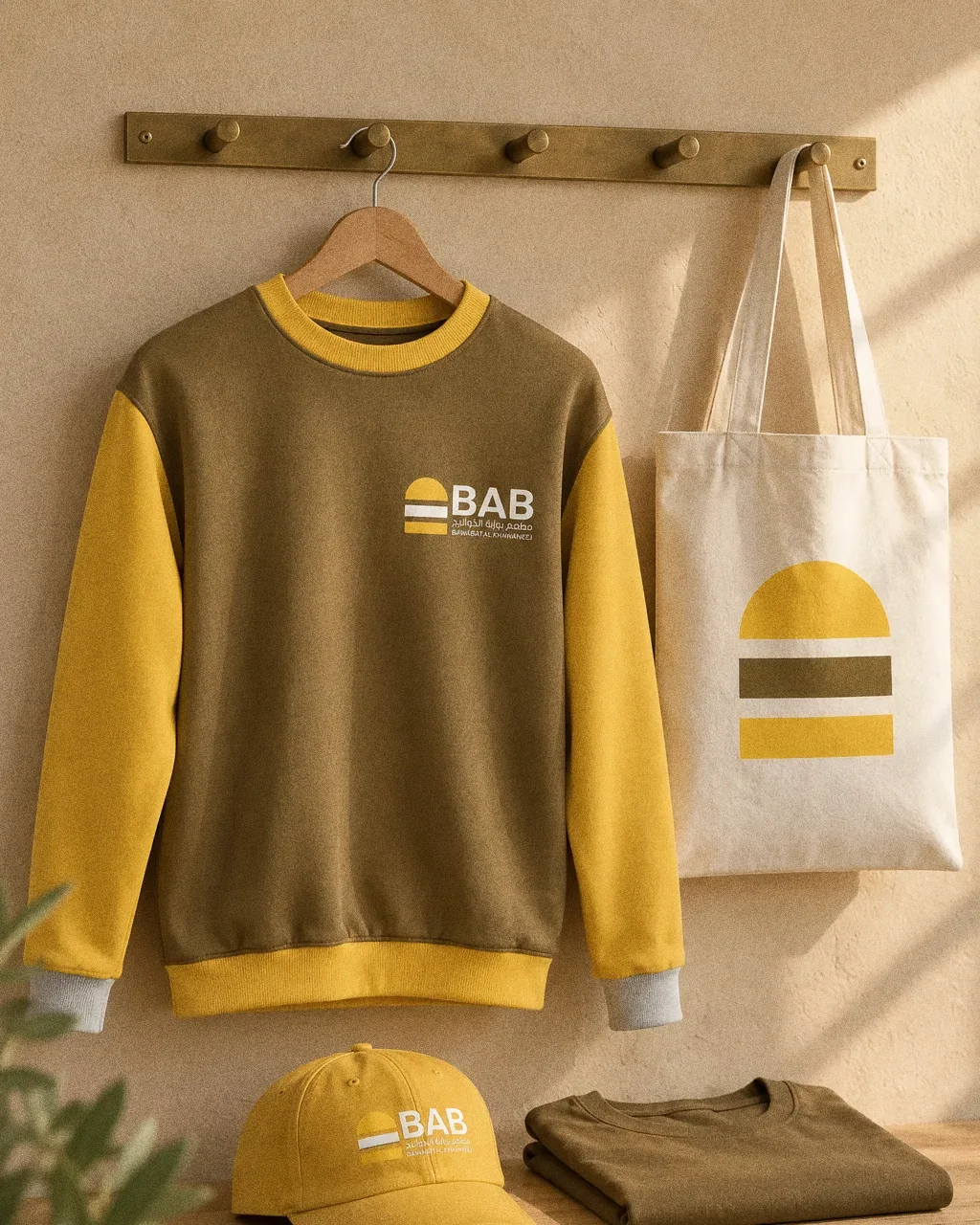
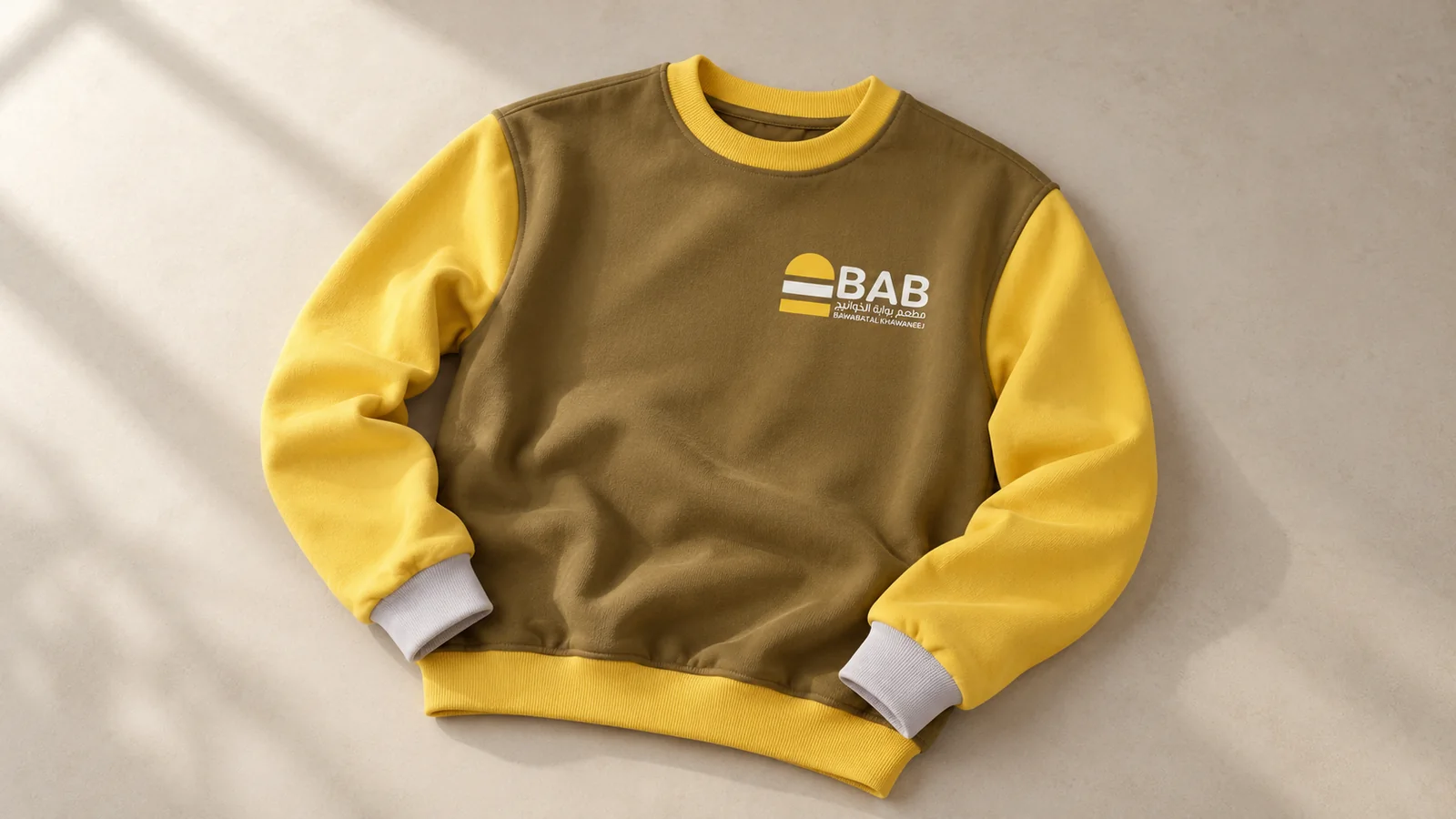
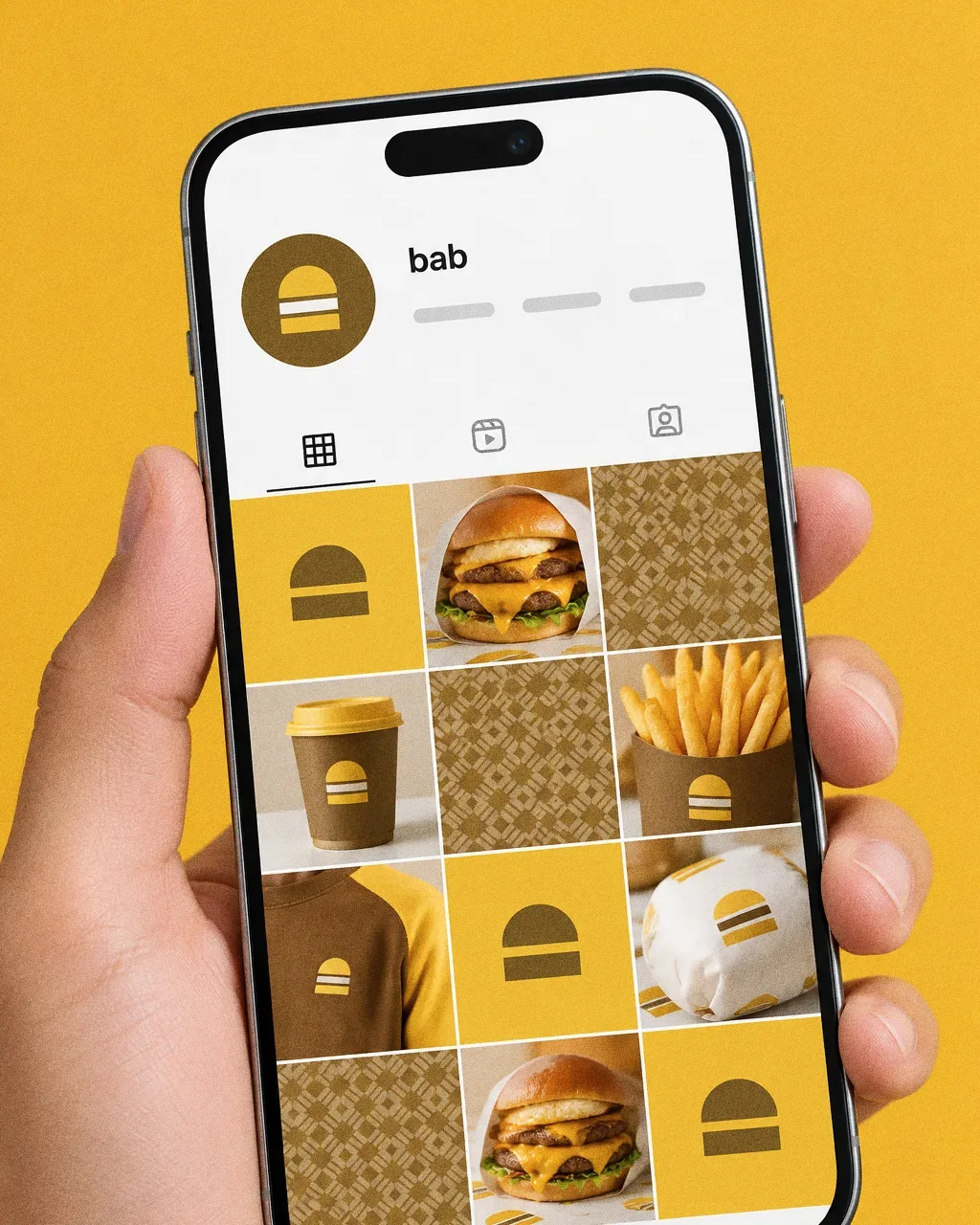
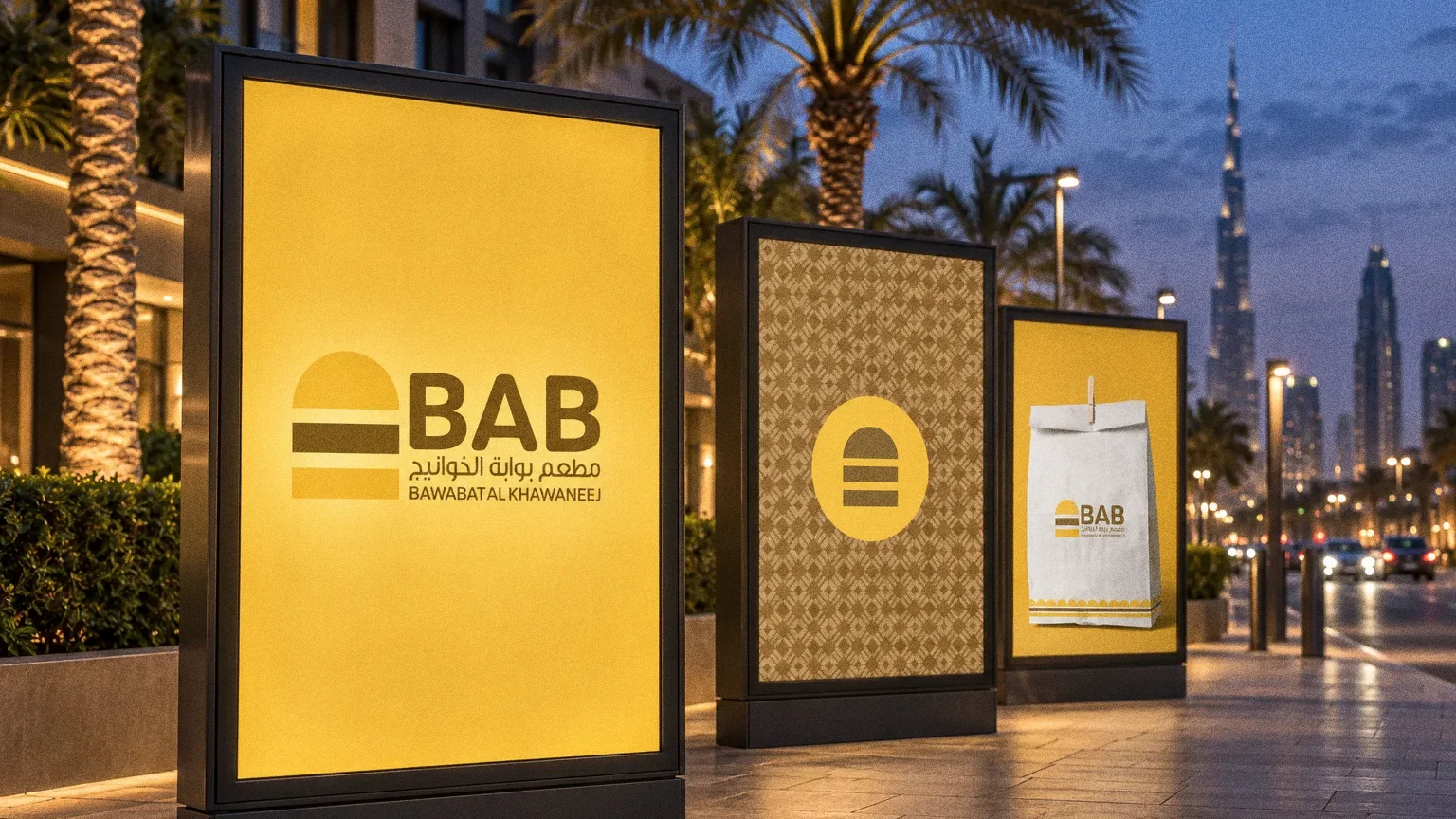
The symbol joins the arch of a gate with the layers of a burger, and the name appears in Arabic and English. The presentation applies the brown-and-yellow system to packaging, bags, a pattern and staff sweatshirts.
BriefBawabat Al Khawaneej brings a place and a food category into the same name. The design task is to make both ideas visible in an identity that works in Arabic and English.
Services
Scope
- Symbol and bilingual name
- Colour and pattern
- Packaging, bags and uniforms
Sources
How to read this deck
The deck pairs the client’s original presentation boards with new application scenes that show the identity in use.
Some of the older boards have been redrawn. Each one sits where the original stood, with the real original design in its corner and a View original button to open it in full.
Chapter 01
Concept and inspiration
Chapter 02
How the logo was formed
Chapter 03
The logo
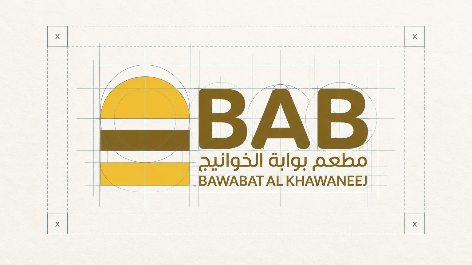
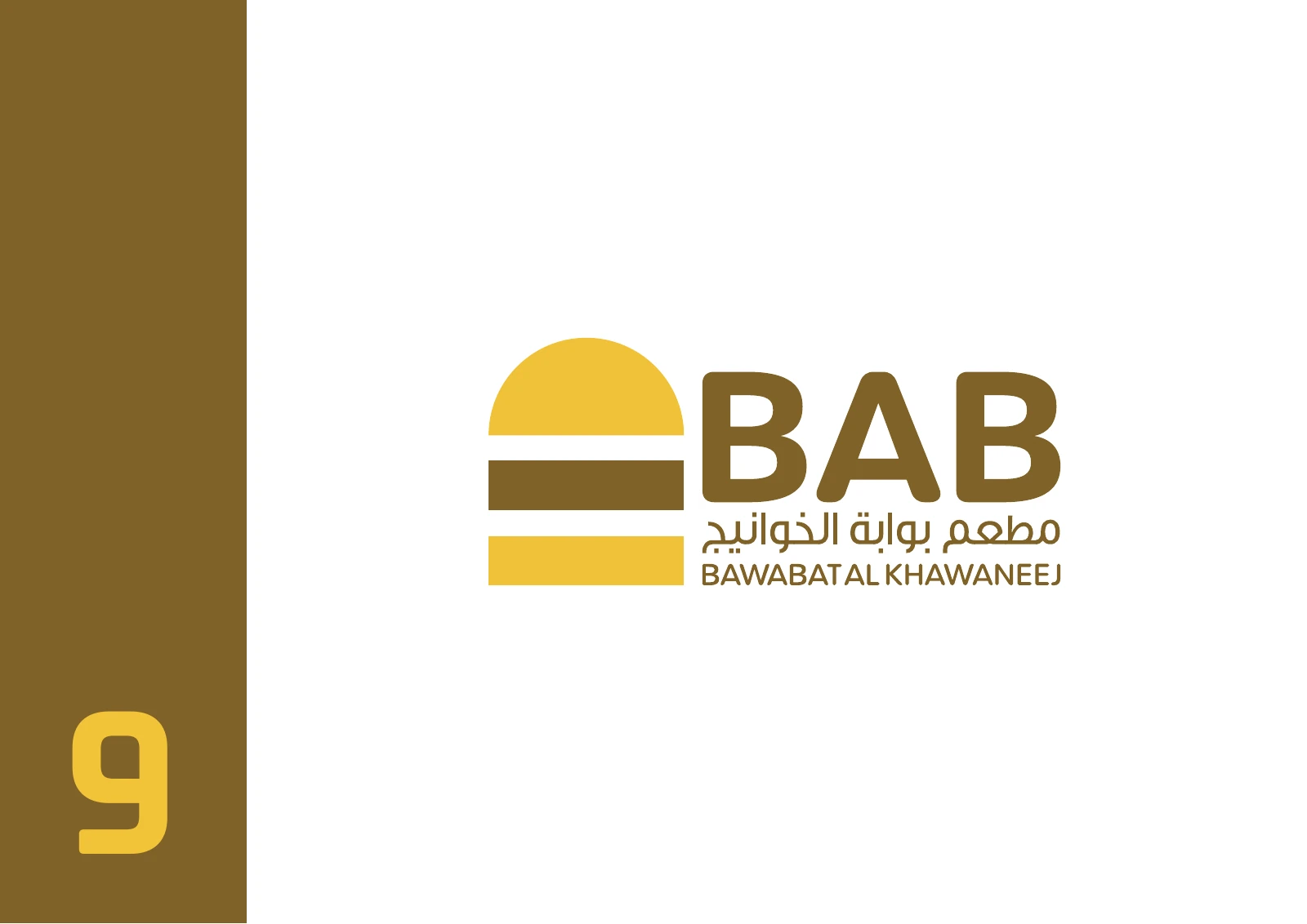
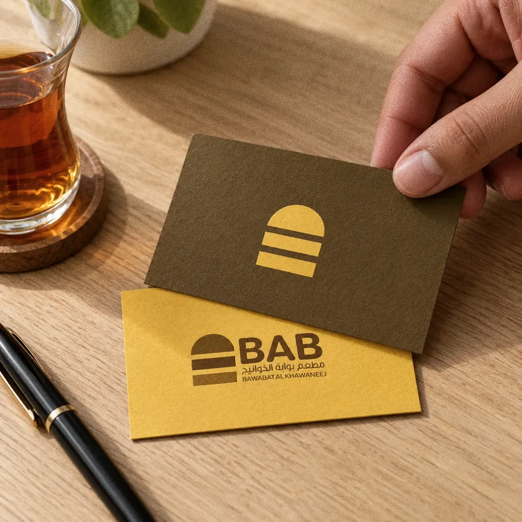
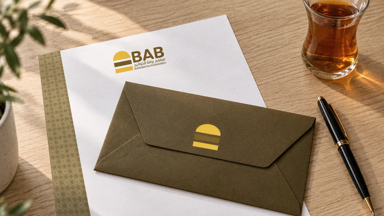
BAB combines an entry-gate silhouette with a burger reference, giving the food brand a compact emblem with a clear story. The Arabic and English name sit together in one lockup that carries through the original applications.
A gate and a burger
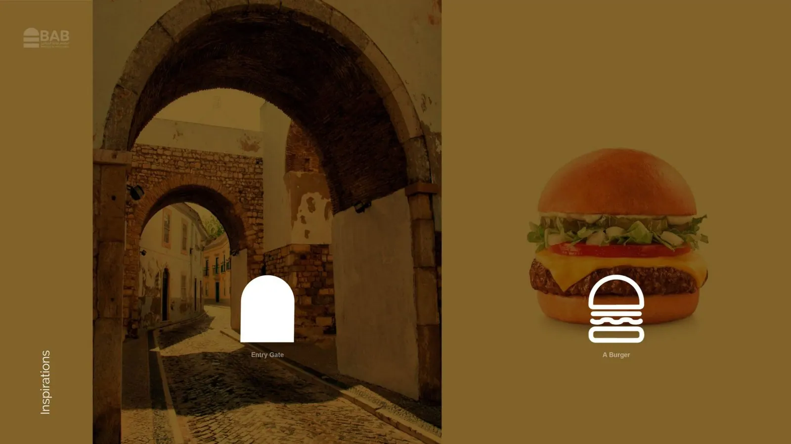
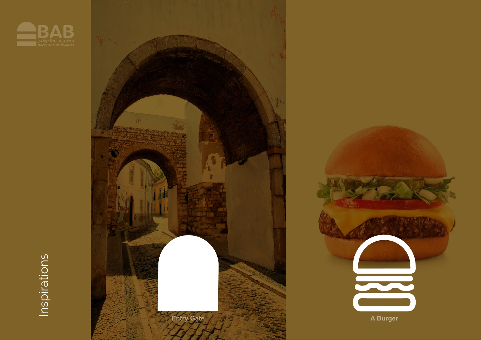
The inspiration board pairs an old stone gateway with a burger. The symbol reduces both to the same stacked shape, a nod to the name, which means "gate".
Chapter 04
Logo variations

Chapter 05
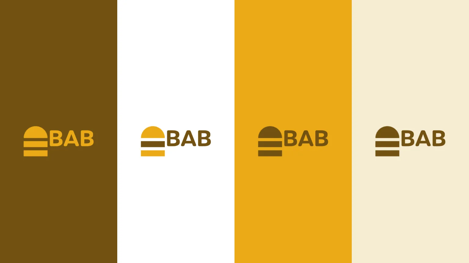
Colour
- Accent
#F0C334 - Surface
#3A2A0A - Ink
#FFFFFF
Colours sampled from the original identity boards.

Chapter 06
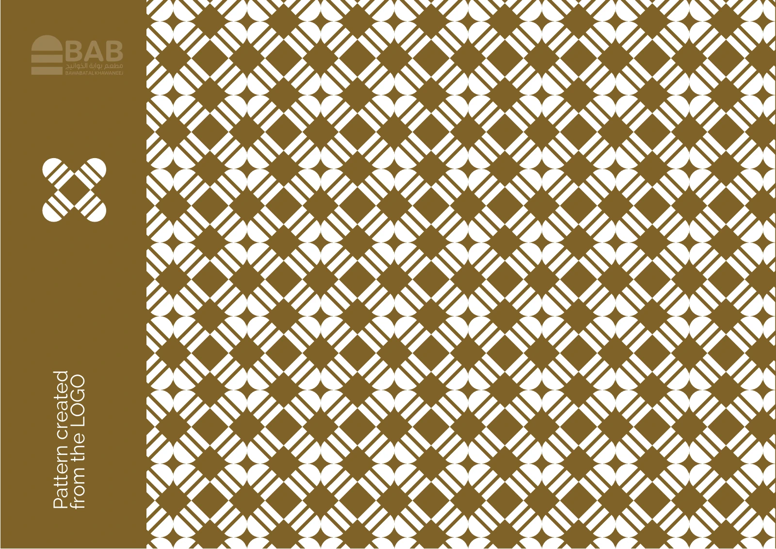
Pattern and graphic elements

Chapter 07
Packaging
Arabic and English together
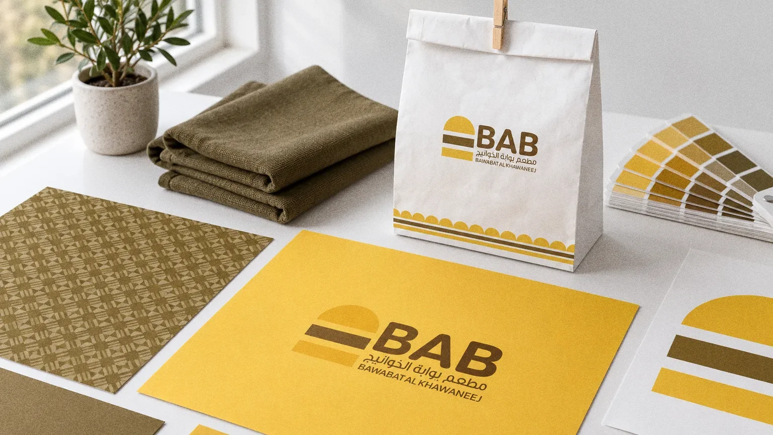
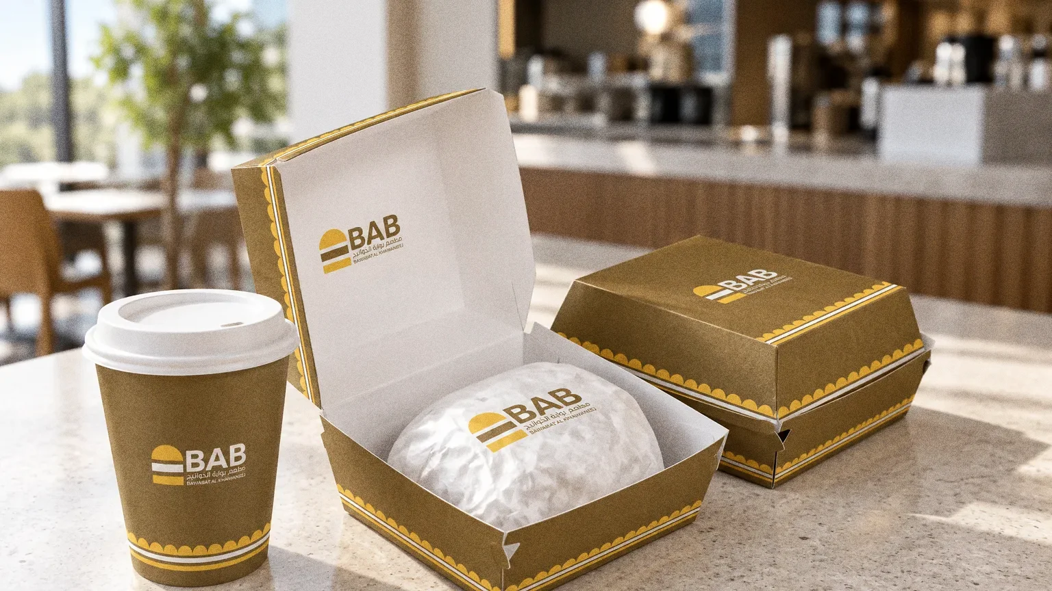
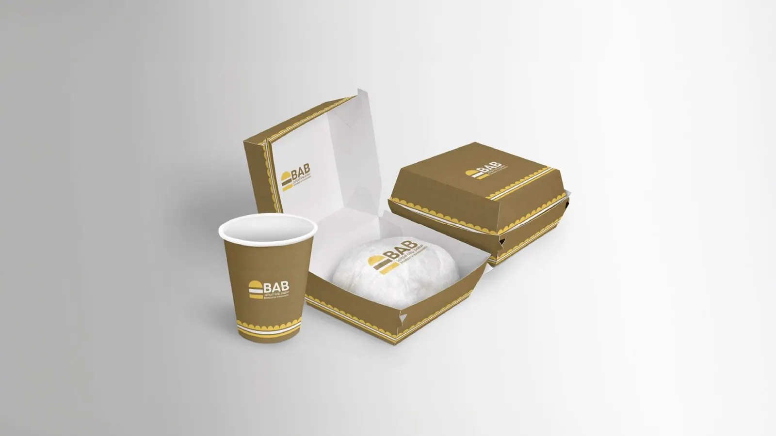
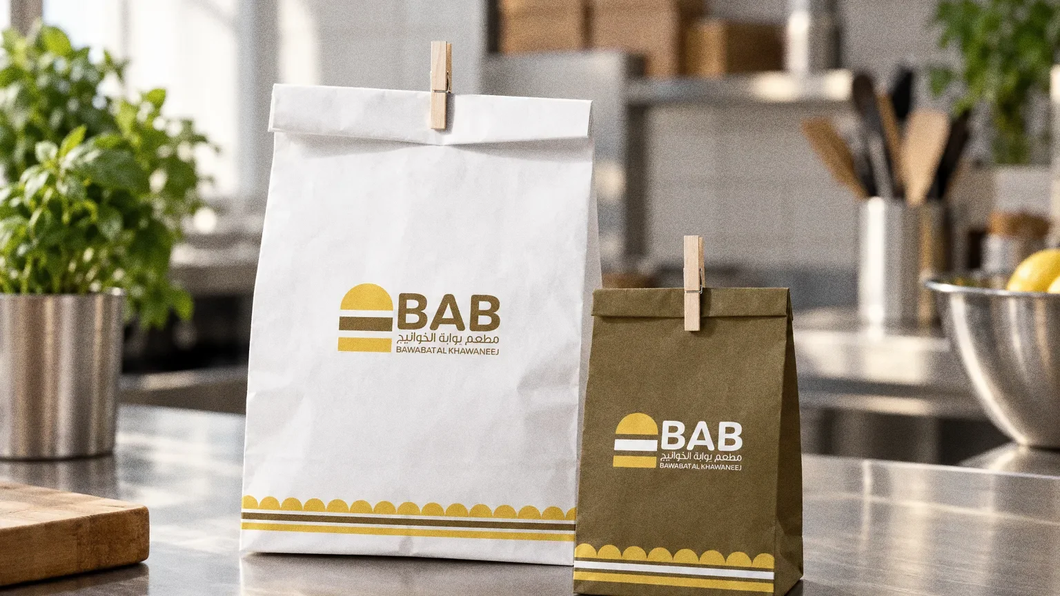
The logo sets the Arabic name and "Bawabat Al Khawaneej" beneath the symbol and wordmark. The pattern, boxes, cups, bags and sweatshirts all use the brown-and-yellow palette.
Chapter 08
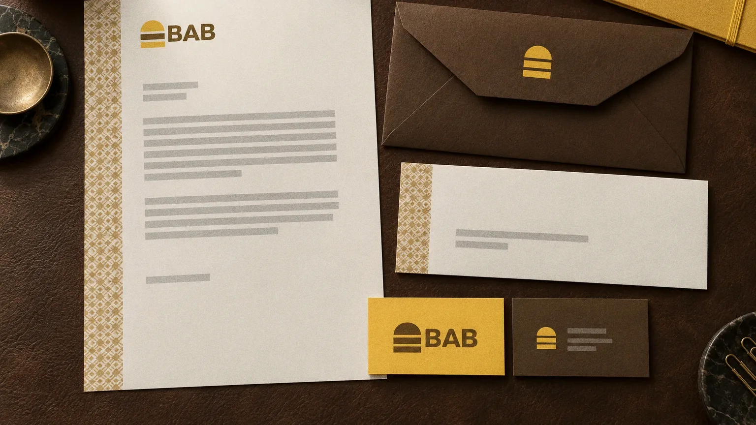
Stationery
Chapter 09
Uniforms and merchandise
Chapter 10
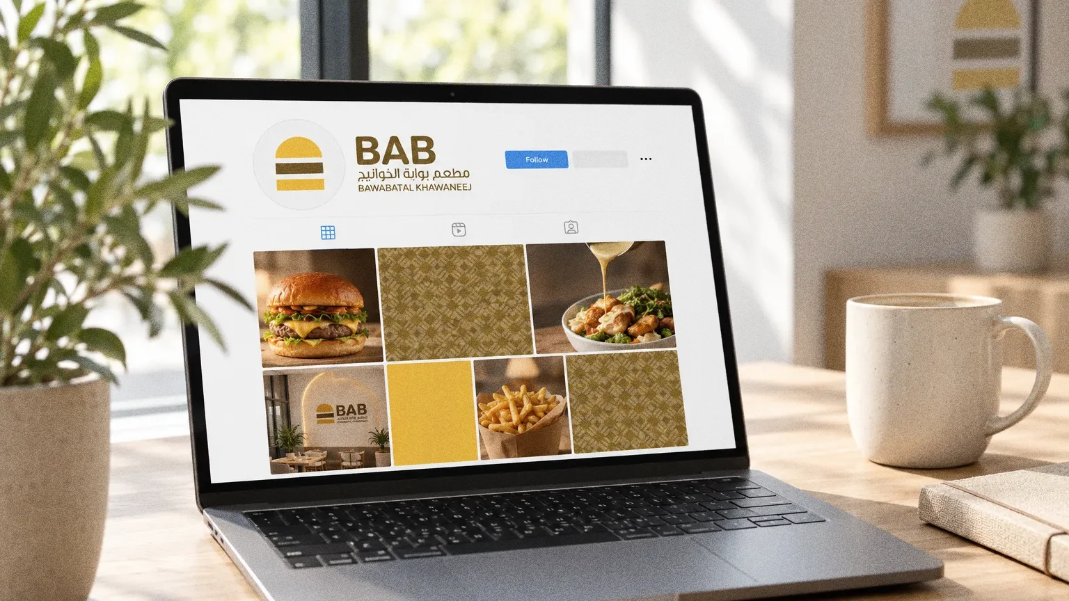
Digital
Chapter 11
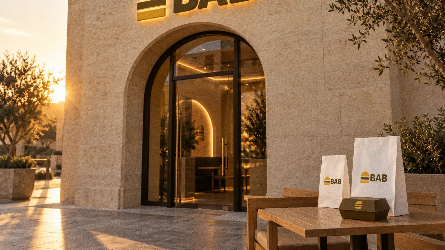
The brand in the world
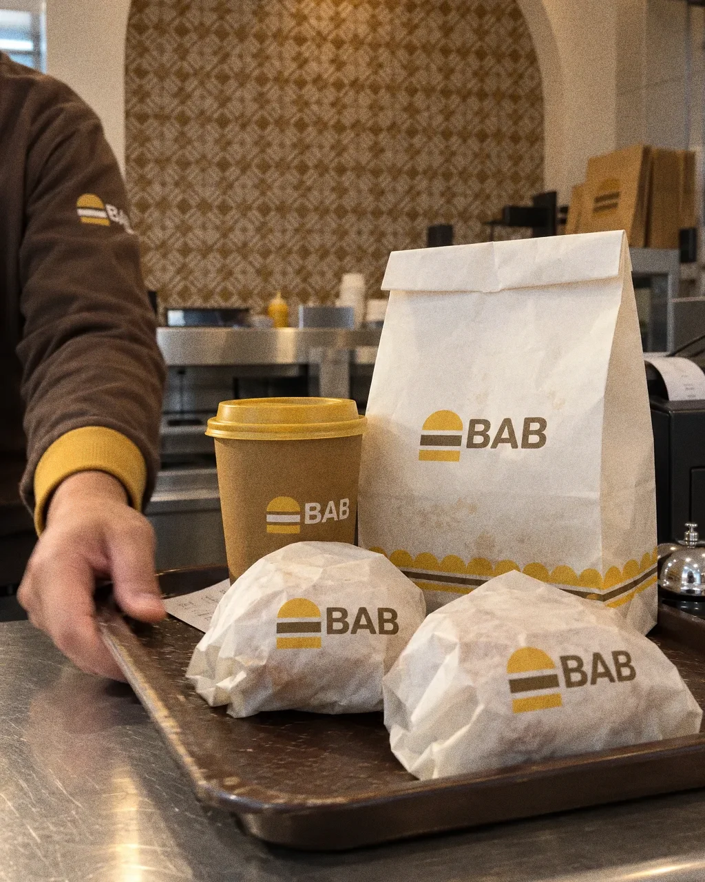
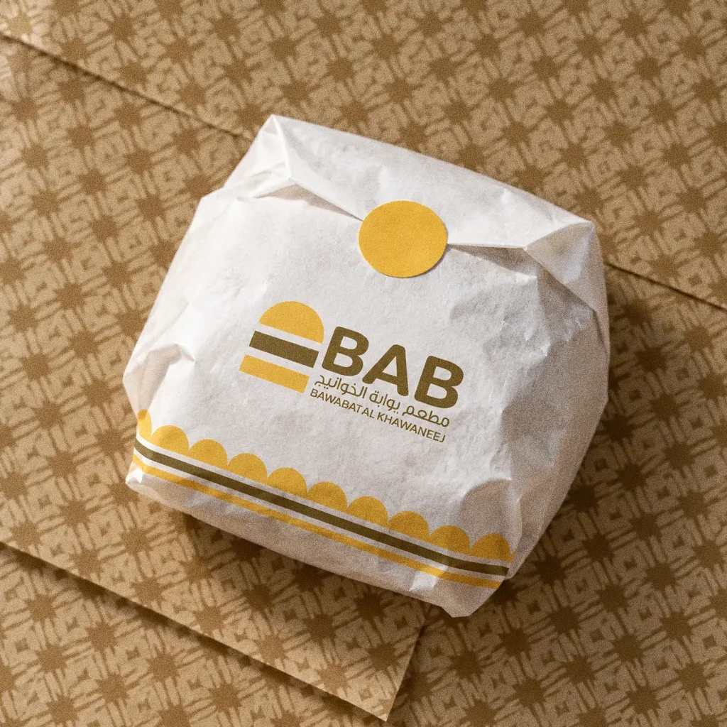
Takeaway cups, food boxes and paper bags carry the same bilingual identity as the staff sweatshirts. The original boards show how the lockup and supporting graphics adapt to food packaging and clothing.
Chapter 12
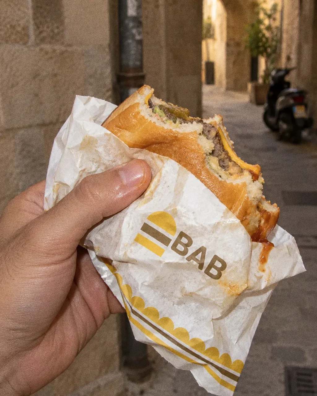
In people’s hands
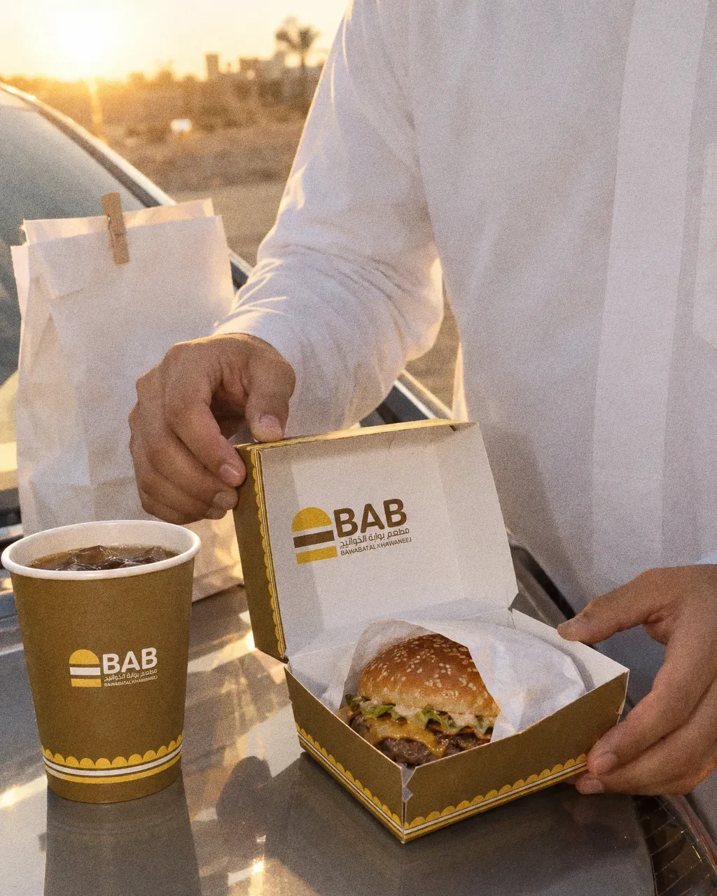
Burger on the bonnetThe Bab identity in a lifestyle photograph of a burger box held open on a car bonnet. 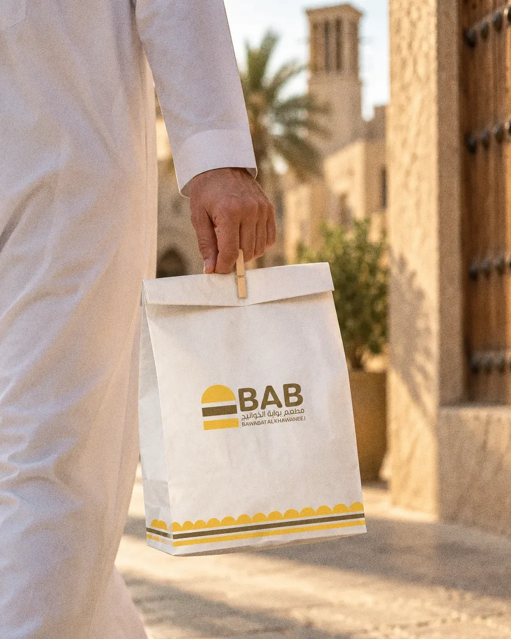
Pegged bag on the streetThe Bab identity in a lifestyle photograph of a pegged paper bag carried along a street. 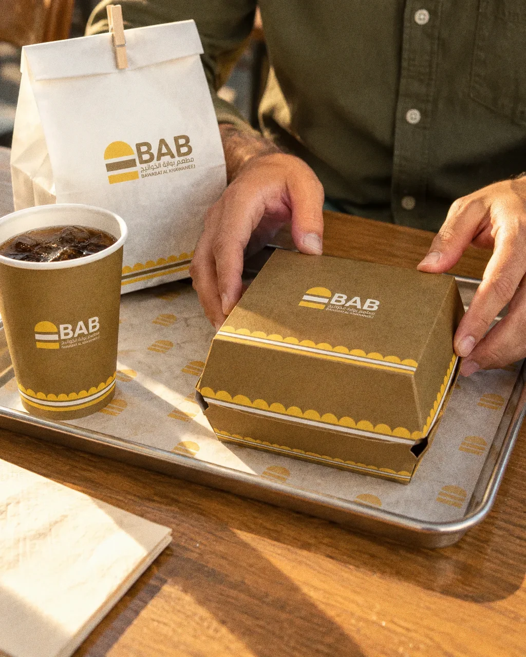
Tray at the tableThe Bab identity in a lifestyle photograph of a tray with cup, box and bag at a restaurant table. 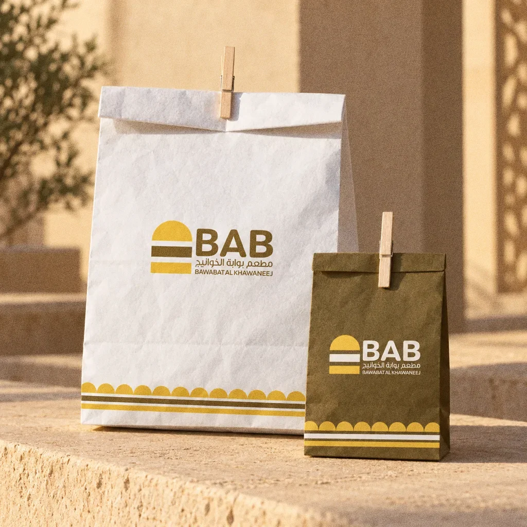
Bags on sandstoneThe Bab identity in a lifestyle photograph of paper bags on a sandstone ledge at golden hour. 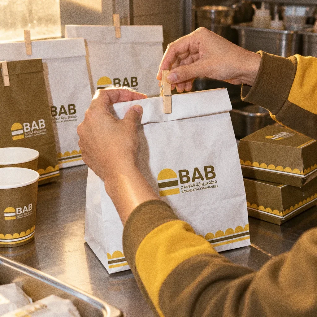
Pegging the bagThe Bab identity in a lifestyle photograph of hands closing a bag with a wooden peg.
Chapter 13
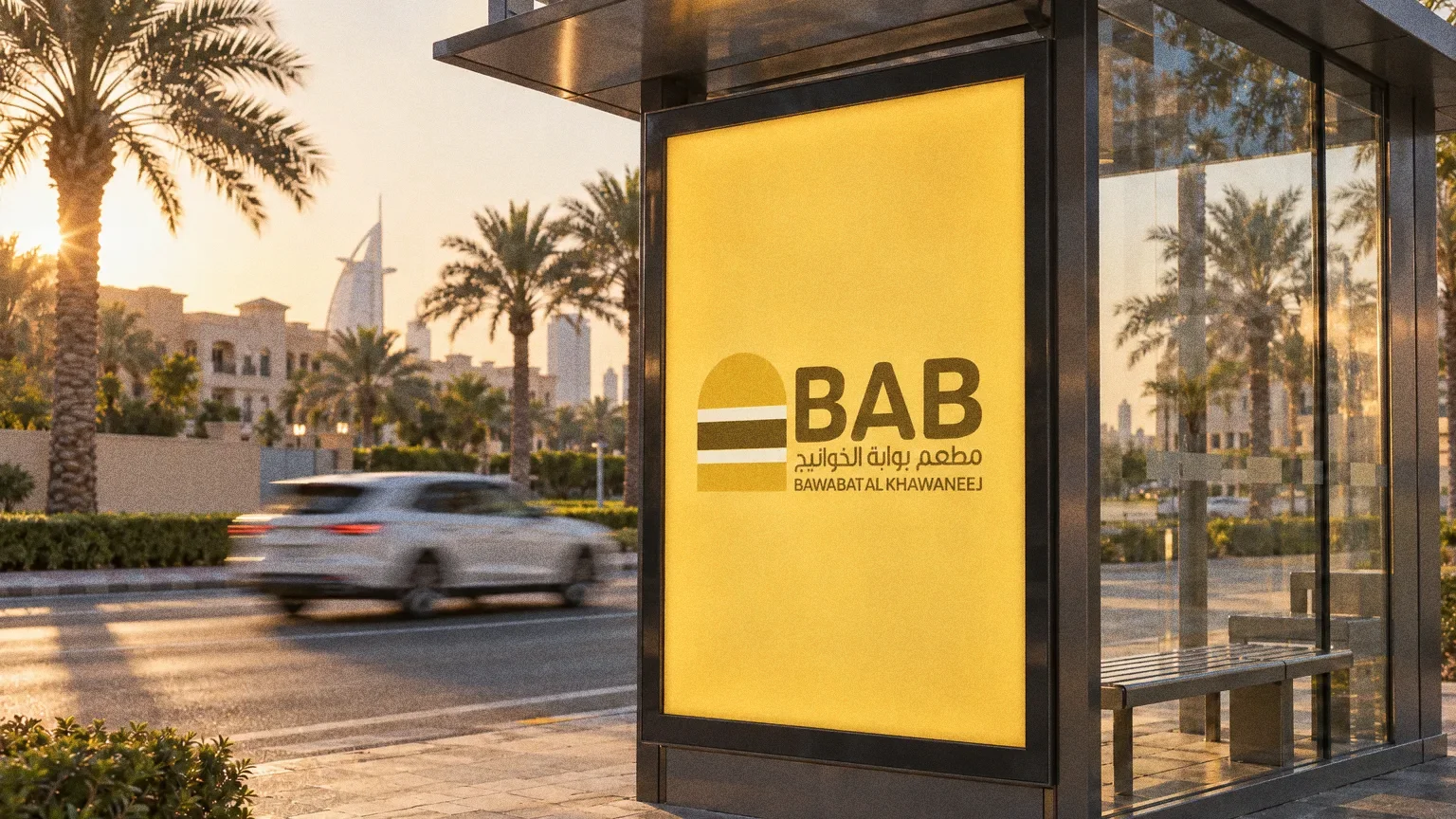
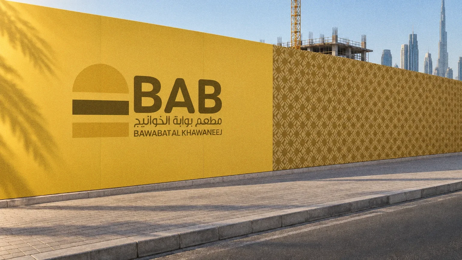
Campaign
About this deck
What we built
A gate-and-burger symbol, paired language versions and a brown-and-yellow system, demonstrated on takeaway packaging, bags, pattern and staff clothing.
About the originals
The original boards are from Abcon’s original project presentation and include application mockups.