Branding / Cash-and-carry retail
Sara’s Cash & Carry
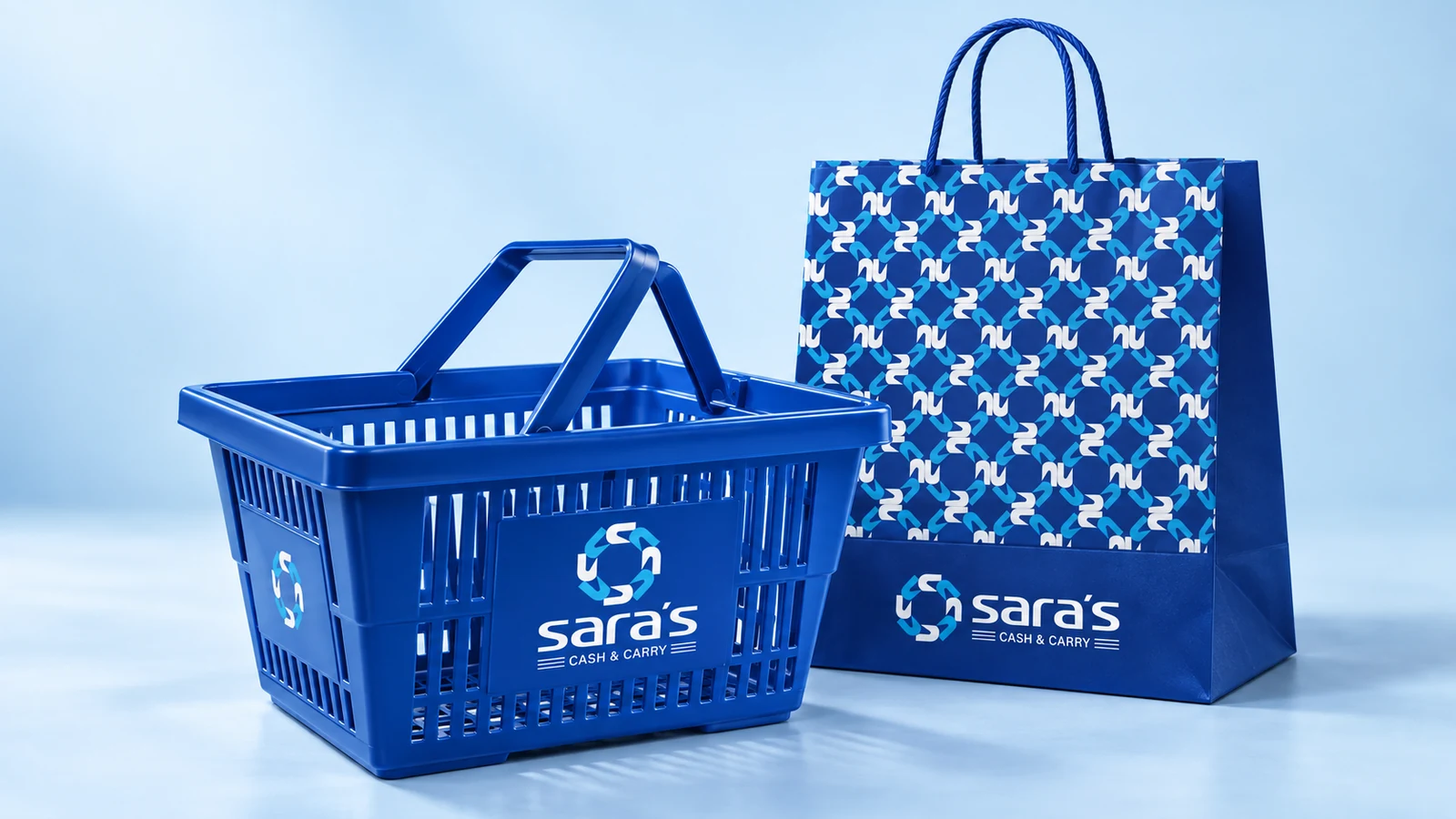
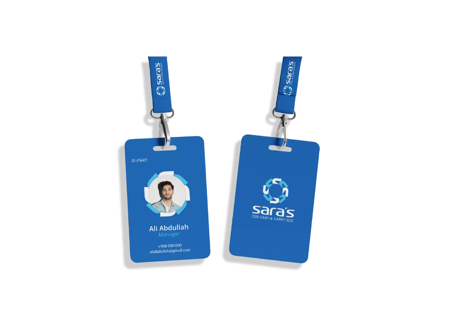
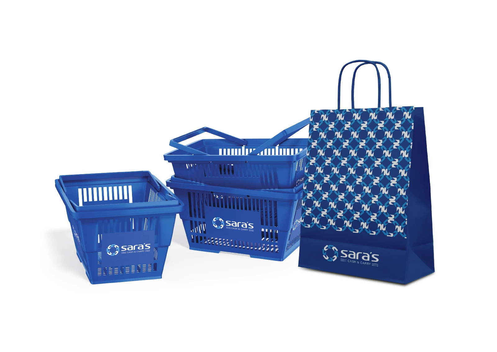
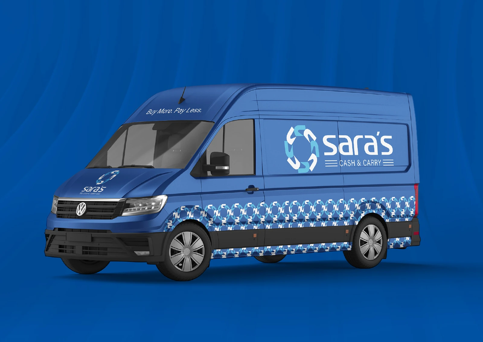
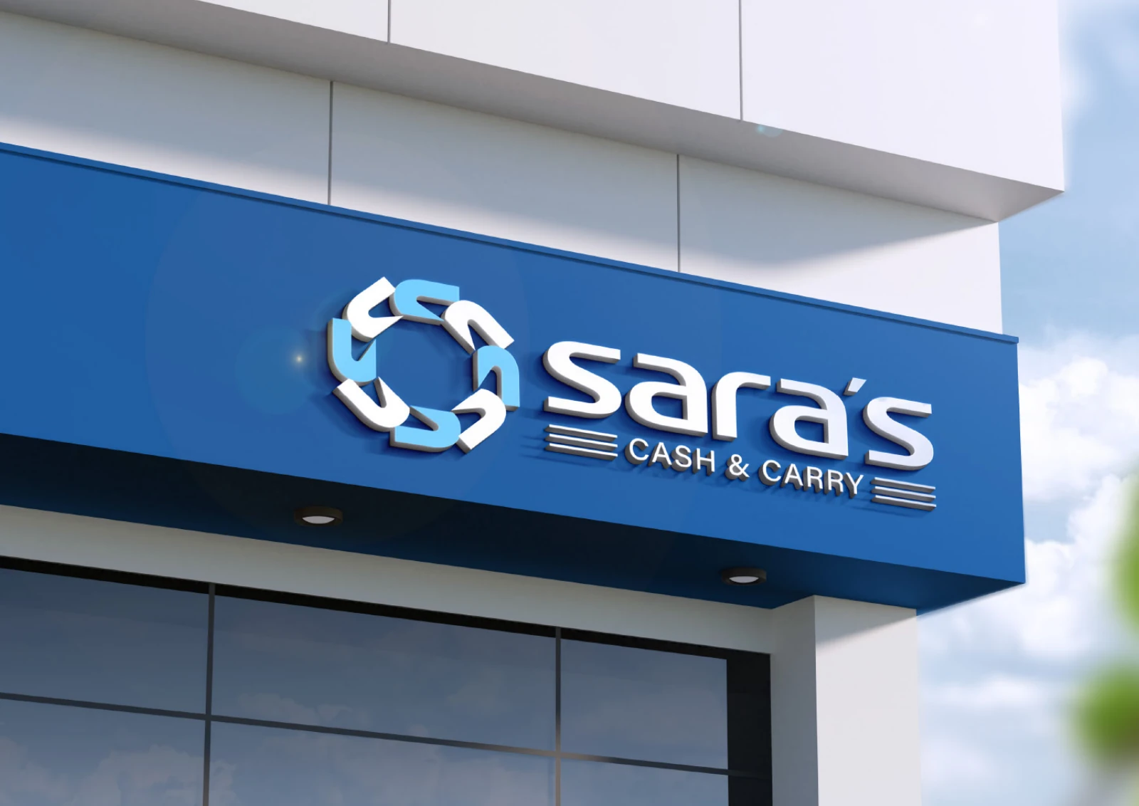
A blue retail identity with an interlocking S emblem and a lower-case wordmark. The source extends the symbol into a repeat pattern, then applies the system to shopping baskets, bags, staff cards, a delivery van and storefront signage.
Project scope
The original client-supplied presentation documents the identity and its application mockups.
- Emblem and wordmark
- Blue-and-cyan colour and pattern
- Retail, staff, vehicle and storefront applications
How the identity works
The design task
Make the retail name recognisable across shopping, staff and delivery touchpoints, with a symbol that can also create a useful pattern for larger surfaces.
Build a cycle from the initial
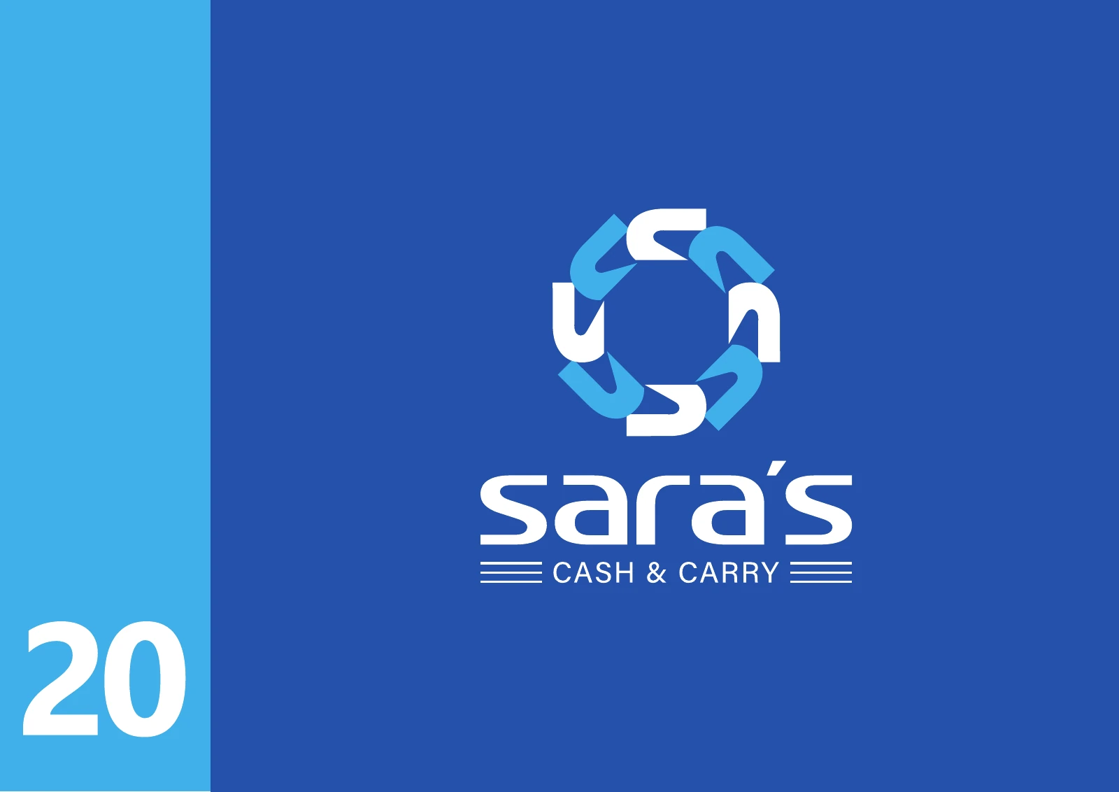
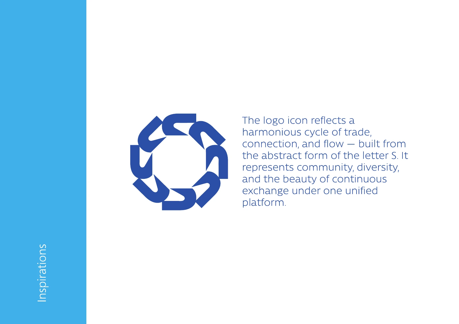
The source describes the emblem as abstract S forms arranged in a circle to express trade, connection and continuous exchange. Alternating white and cyan strokes distinguish the pieces on blue.
See the original boardKeep the retail system connected
The emblem repeats on the shopping bag while the full wordmark remains visible on baskets and the van. The staff and storefront applications carry the same blue identity across different scales.
See the original boardWhat we built
An identity and repeat pattern shown across six original logo, rationale and application boards, including vehicle branding.
The boards below are the original design pages from the supplied PDF presentation, including its application mockups.
Original source: ABCON NEW BRAND PORTFOLIO.pdf
What does your brand need next?
Let’s talk about your project Next projectTrus Holding