Branding / Protein-bar packaging
Vitness
A Vitness protein-bar identity with bold rounded lettering and a bite detail, carried through flavour-colour wrappers and retail display boxes.
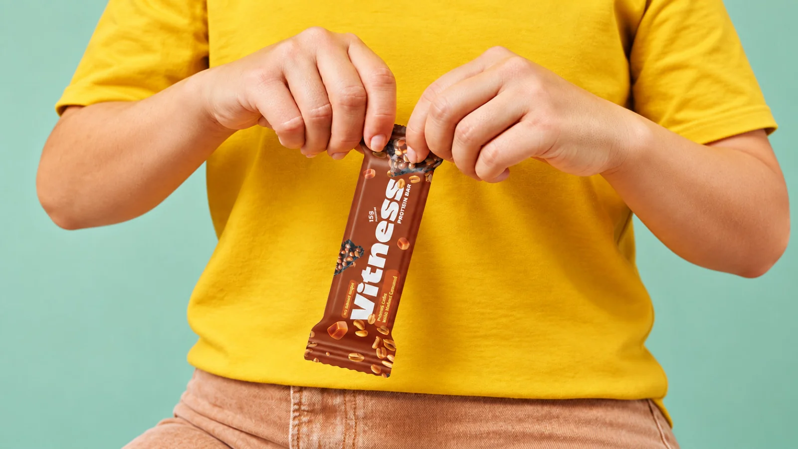
Project scope
- Wordmark and visual direction
- Product colour system
- Wrapper and display-box applications
How the identity works
The design task
The original brief connects a fitness-focused product with the enjoyment of a snack. The design task is to make the name memorable and keep the product family connected as flavours change.
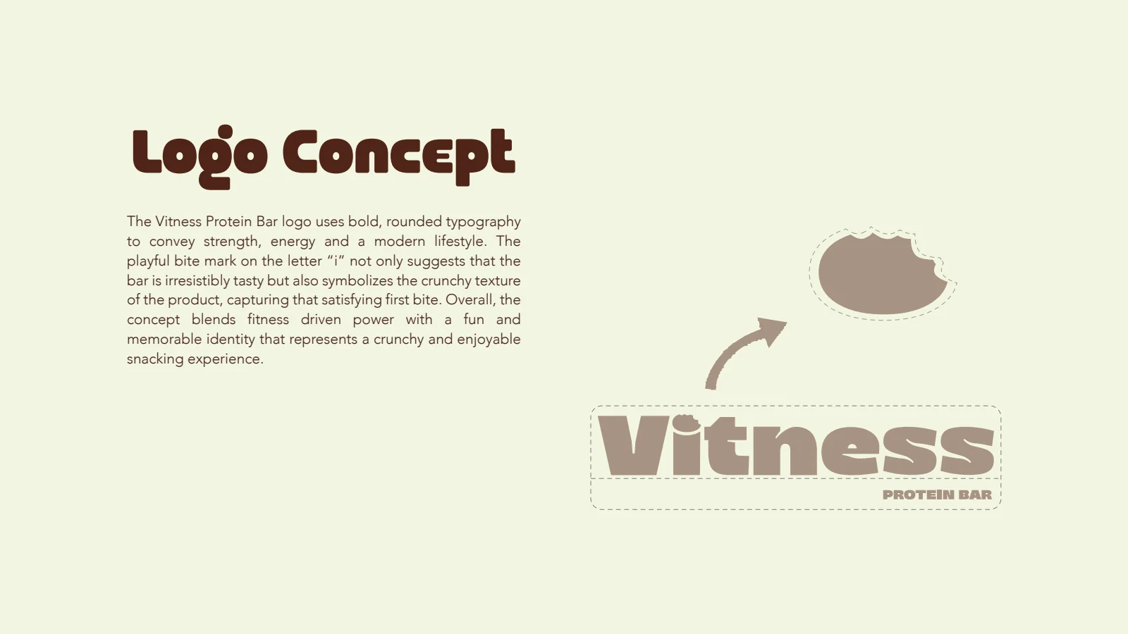
Make the product idea part of the name
The rationale identifies a bite detail in the lettering. It gives the wordmark a product-related feature without adding a separate illustration to every pack.
See the original boardKeep the range together
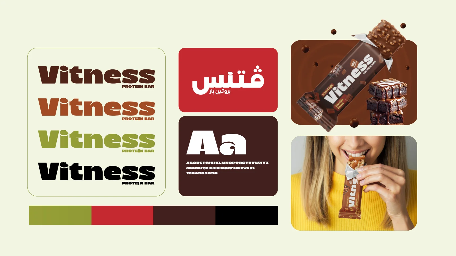
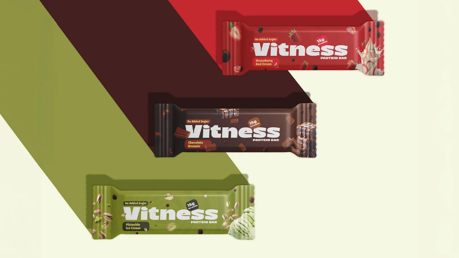
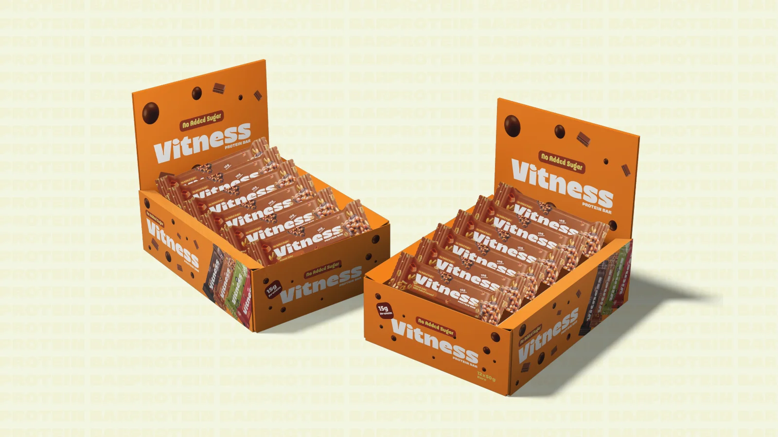
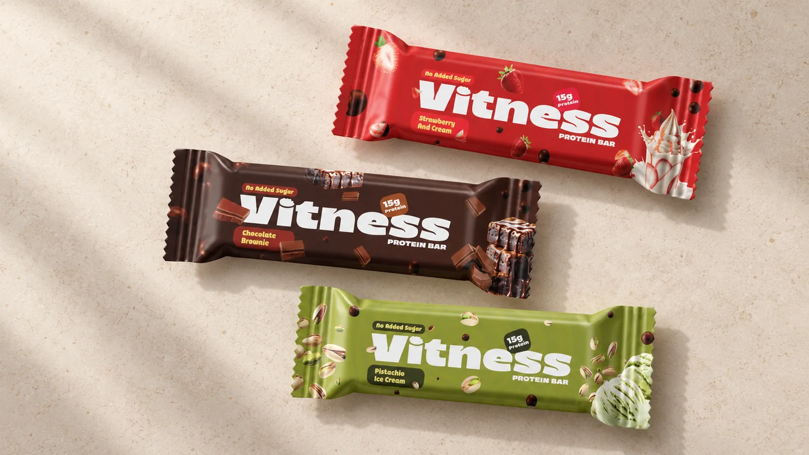
Green, red and brown wrappers use the same wordmark and composition. The retail display mockups bring several individually wrapped bars into the same family.
See the original boardWhat we built
A rounded wordmark with a bite detail, colour variations, individual bar wrappers and display-box applications.
The boards below are the original design pages from the supplied PDF presentation, including its application mockups.
Original source: Vitness Branding.pdf
Illustrative applications
The visual system in context
Additional scenes explore the design using the original project materials.
What does your brand need next?
Let’s talk about your project Next projectAl Ijaza Cafeteria