Tea and takeaway
Abooz
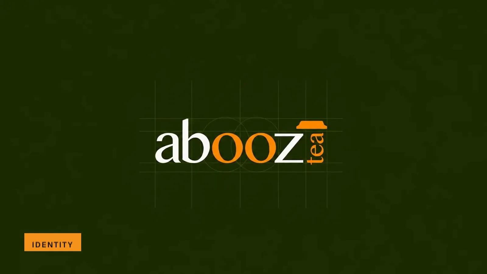
Abooz brand film. Motion film made from the original Abooz identity boards and brand applications.
Overview
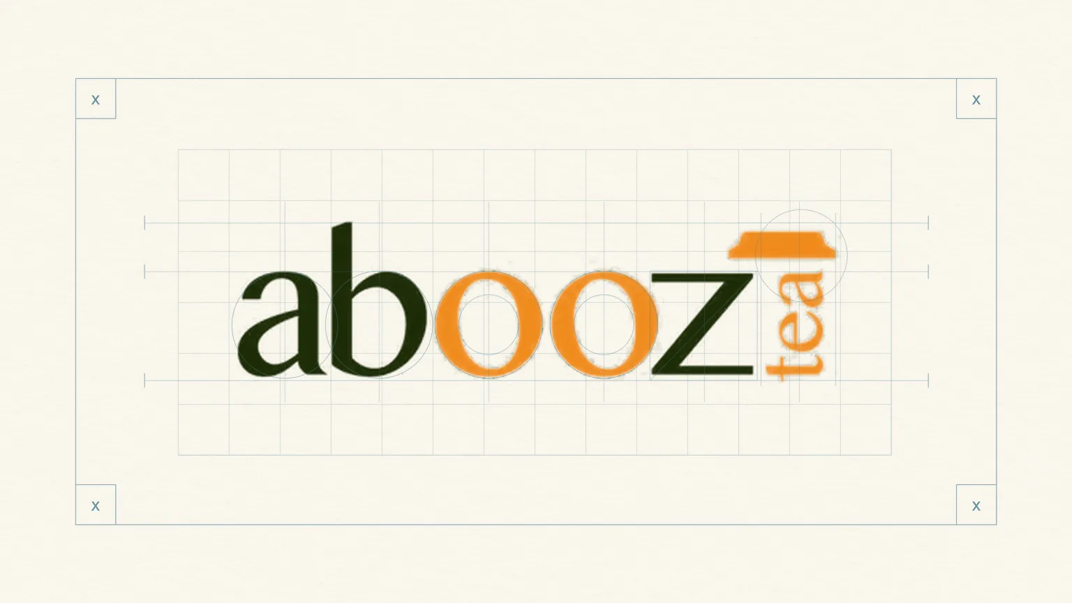
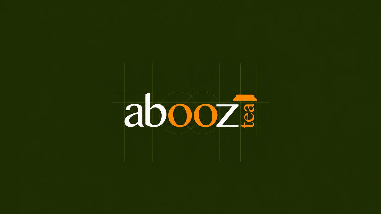
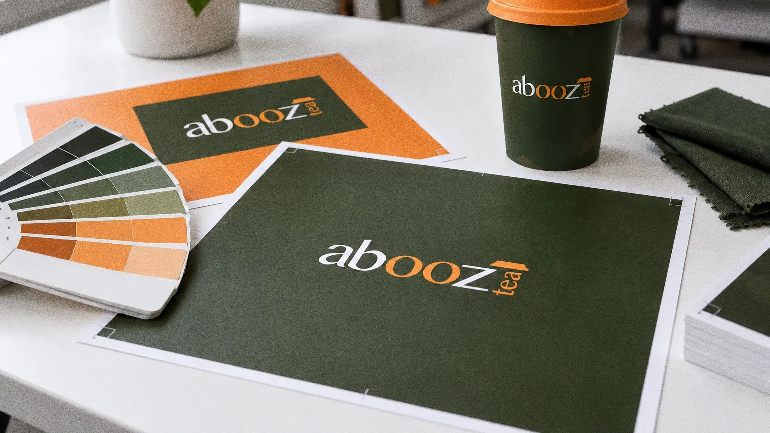
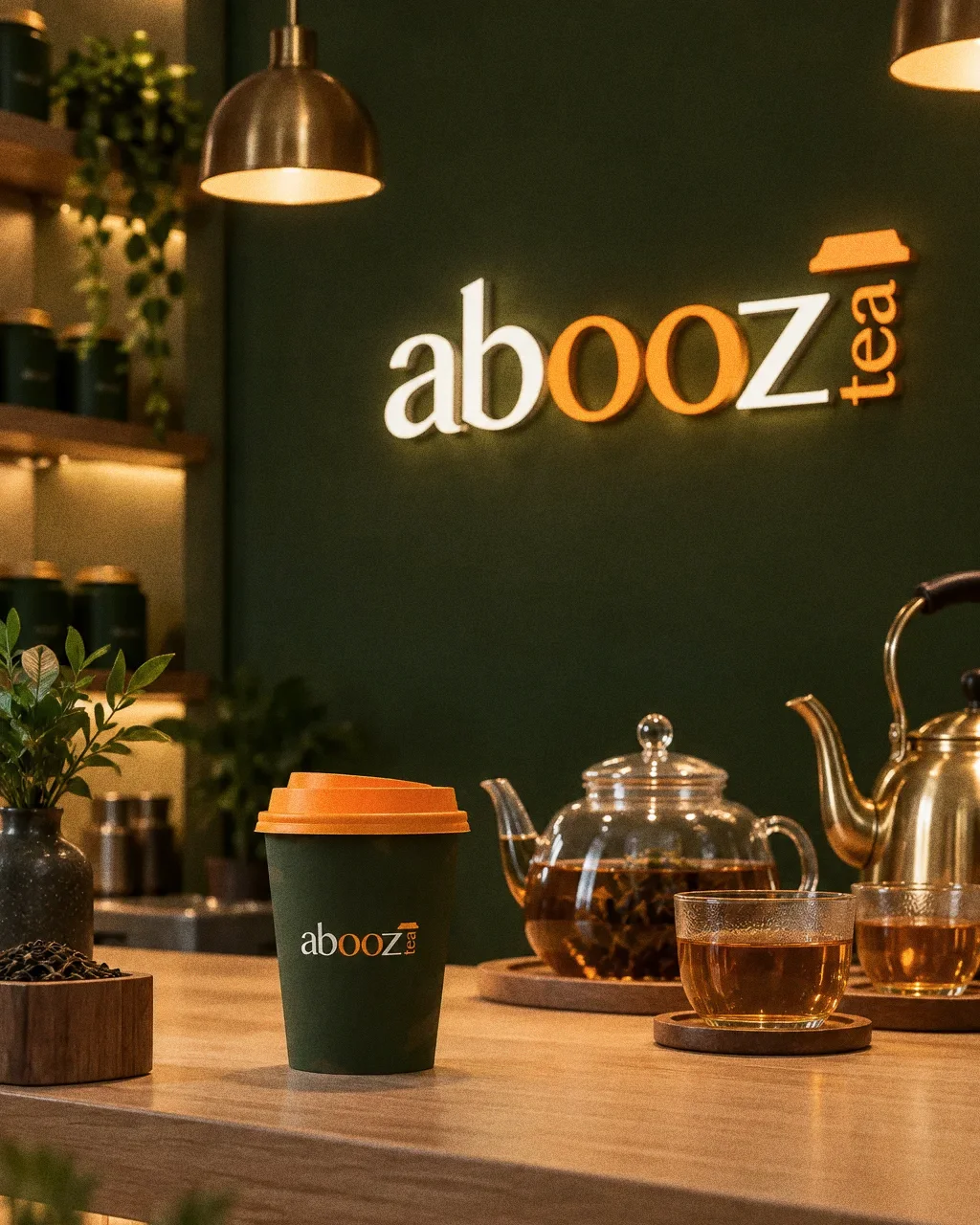
An identity for Abooz Tea: a lowercase wordmark where the double "o" is picked out in orange, with "tea" set vertically beside it, on a dark green field.
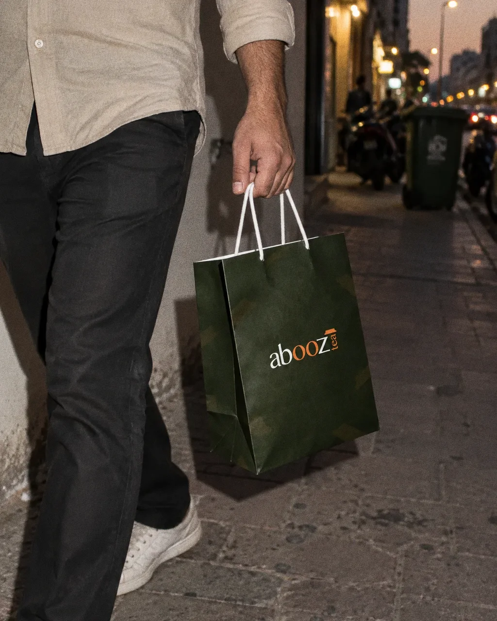
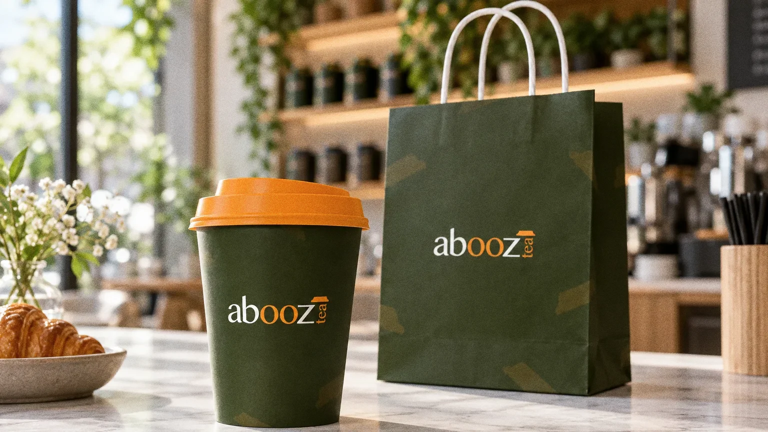
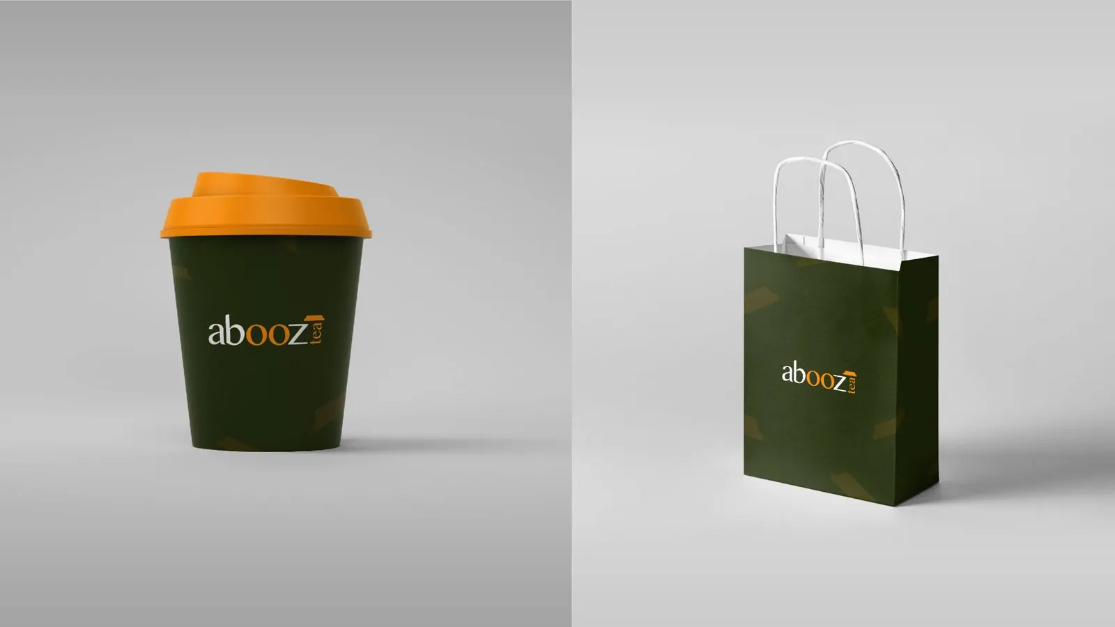
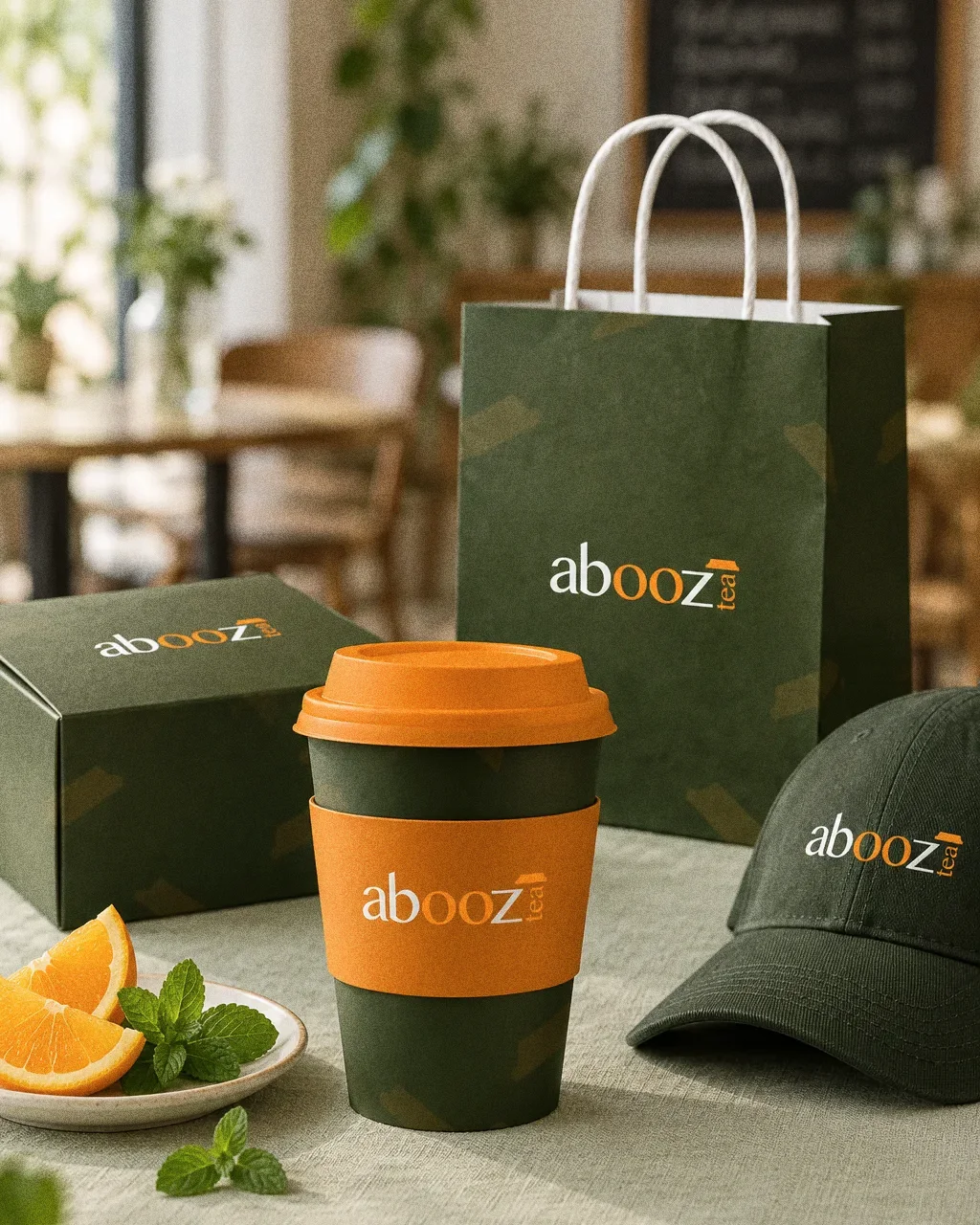
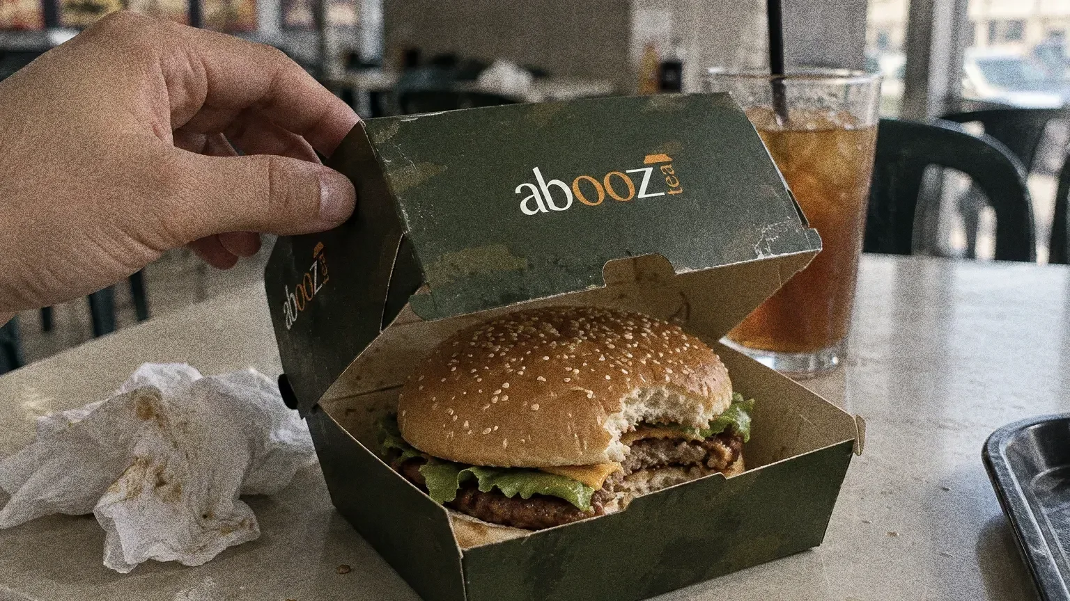
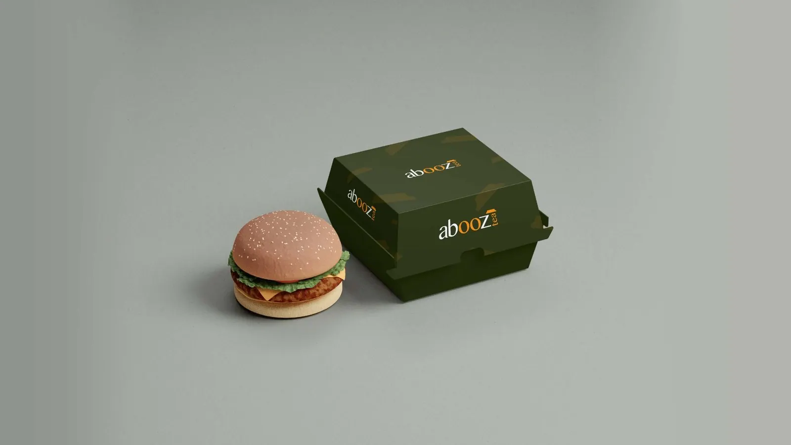
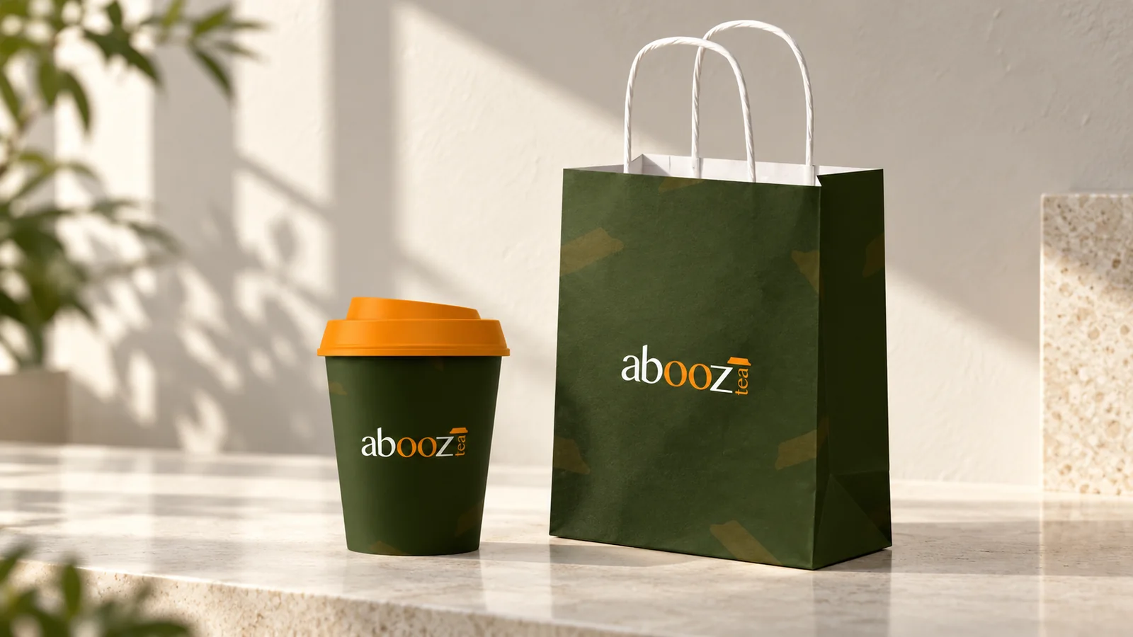
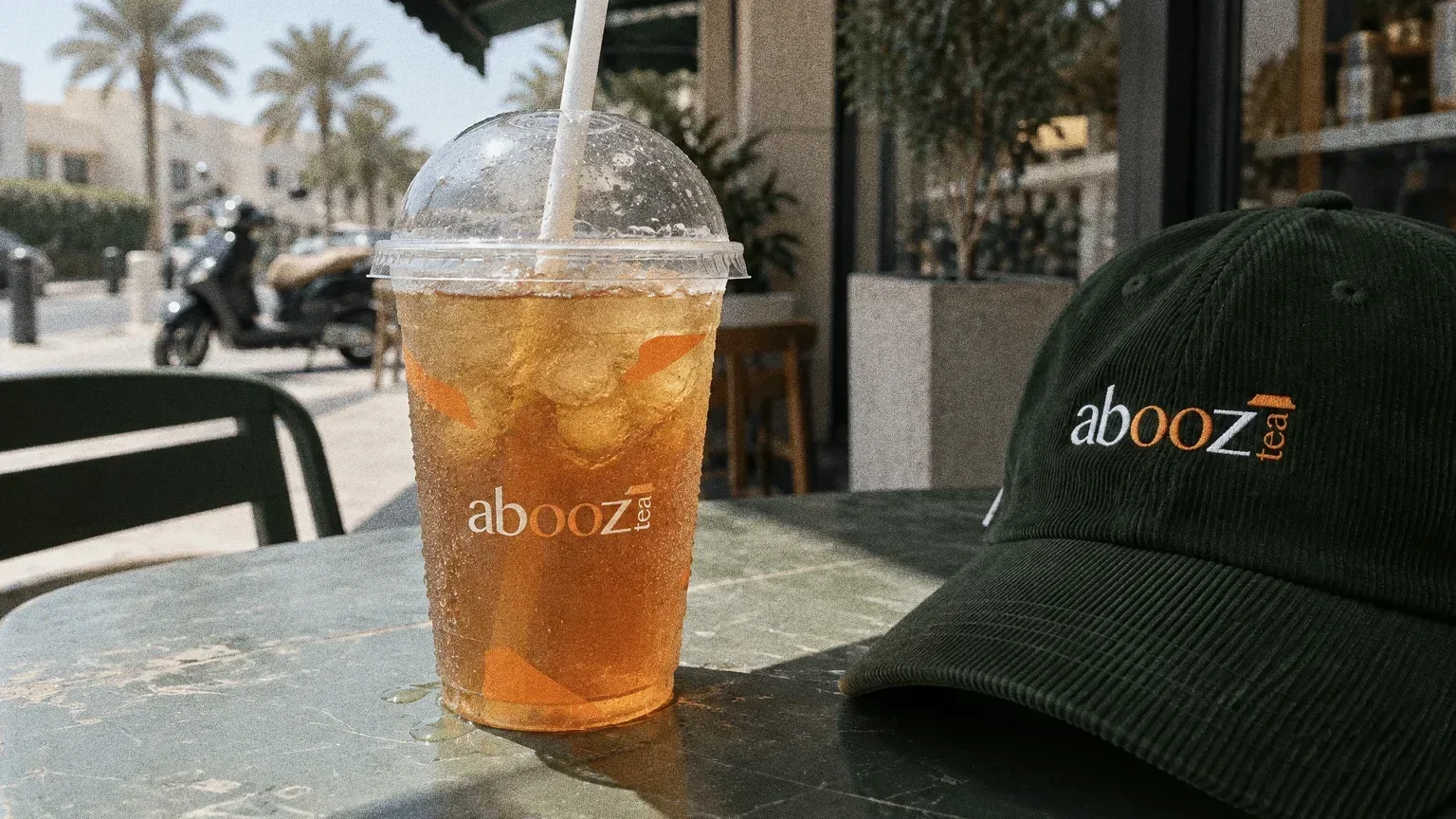
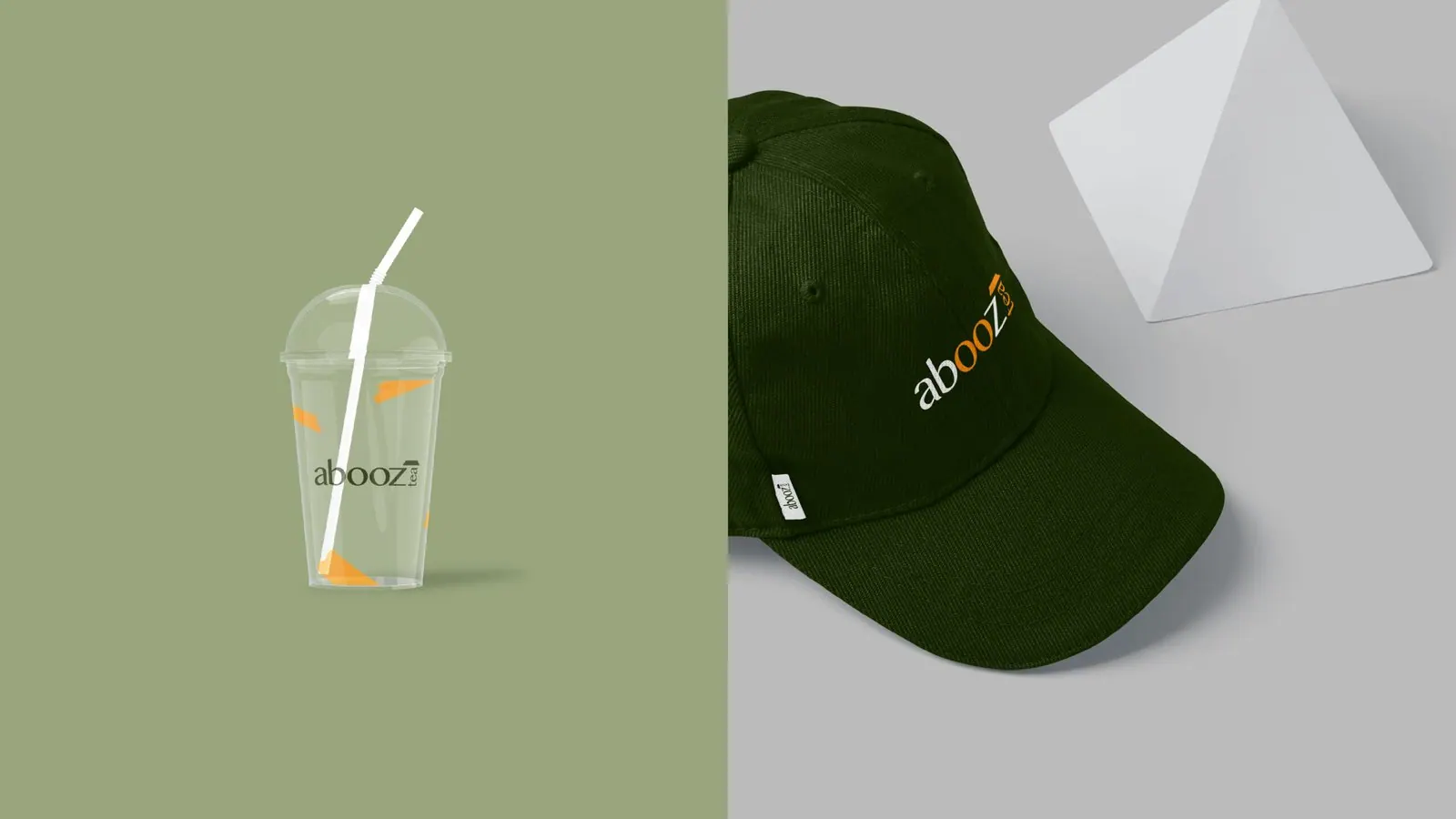
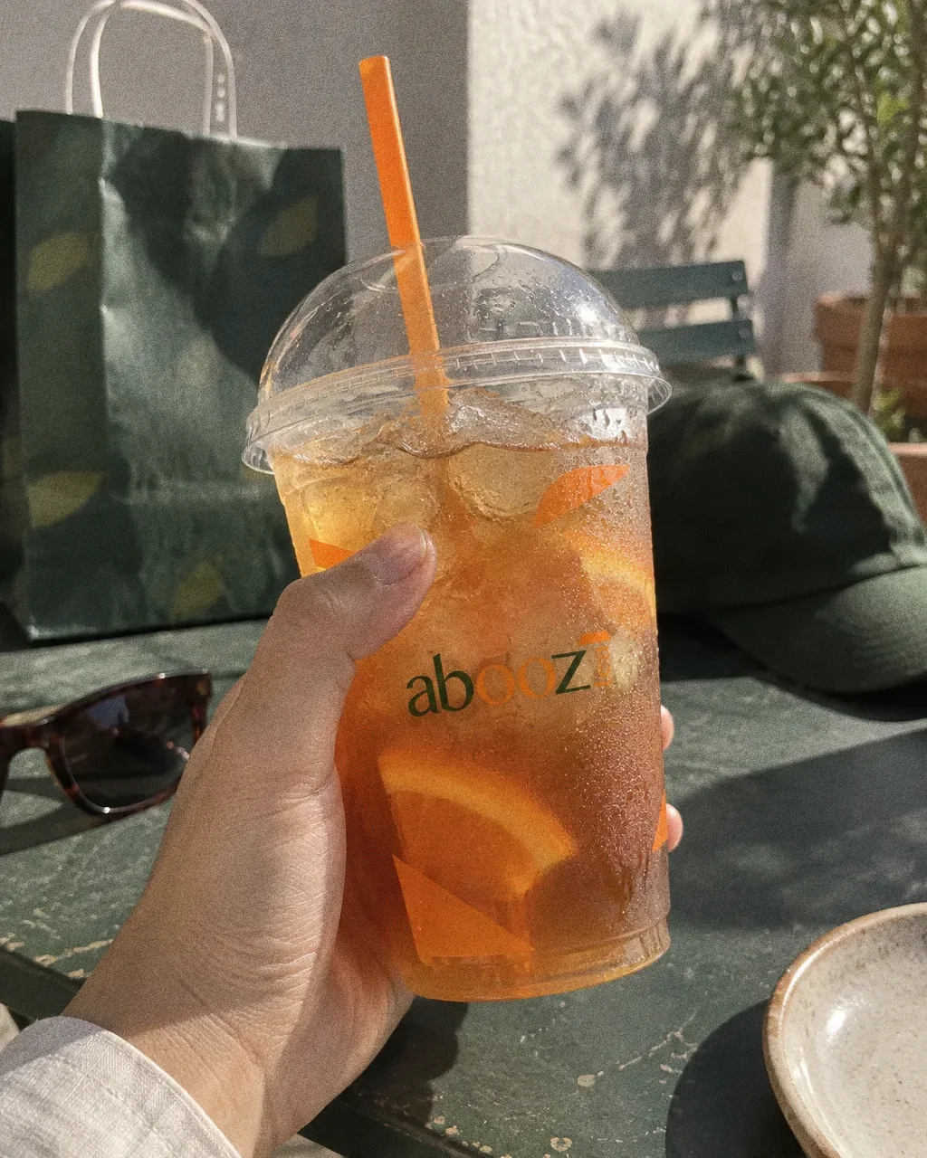
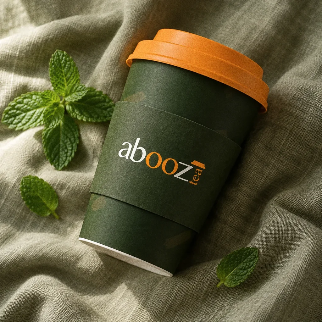
The presentation applies it to coffee cups, a paper bag, a burger box, a cold-drink cup and a cap.
BriefA tea identity needs to read quickly on a cup, then stay recognisable across the rest of a takeaway order. The design task is to find a simple feature in the name that can hold those applications together.
Services
Scope
- Wordmark
- Colour
- Packaging and merchandise applications
How to read this deck
The deck pairs the client’s original presentation boards with new application scenes that show the identity in use.
Some of the older boards have been redrawn. Each one sits where the original stood, with the real original design in its corner and a View original button to open it in full.
Chapter 01
How the logo was formed
Chapter 02
The logo
Orange as the accent
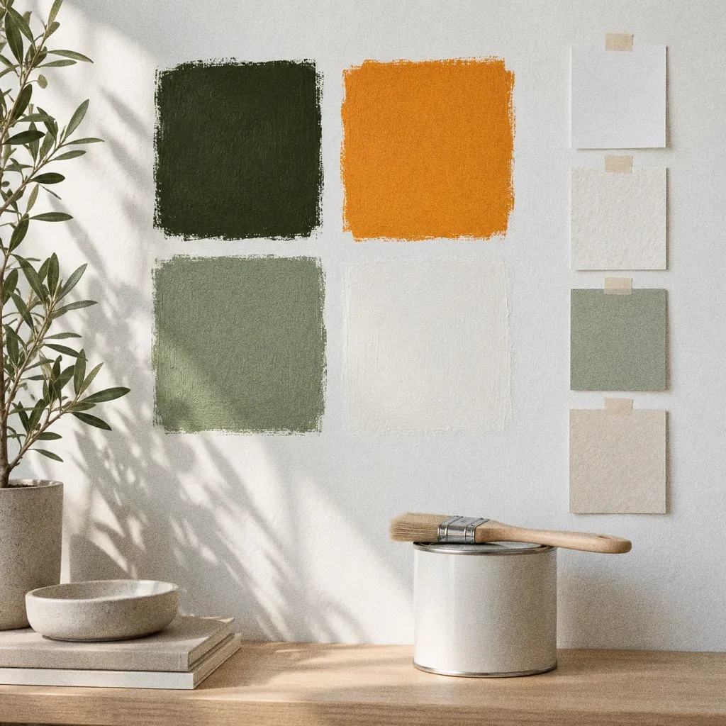
Dark green carries the brand, and orange is kept for the double "o", the small mark and the cup lid, so the accent stays recognisable.
Chapter 03
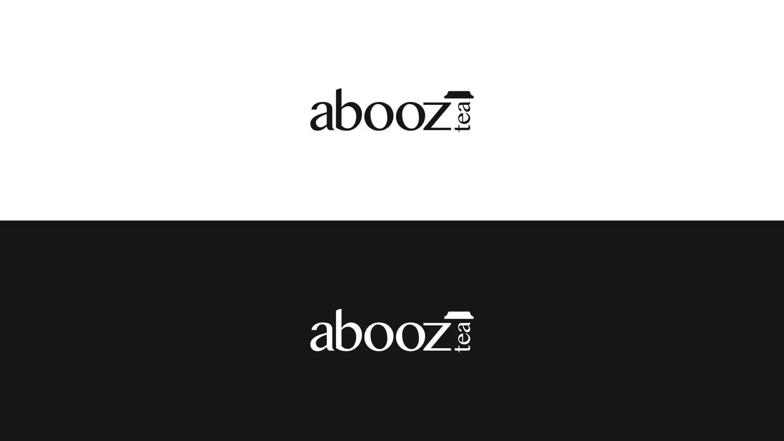
Logo variations

Chapter 04
Colour
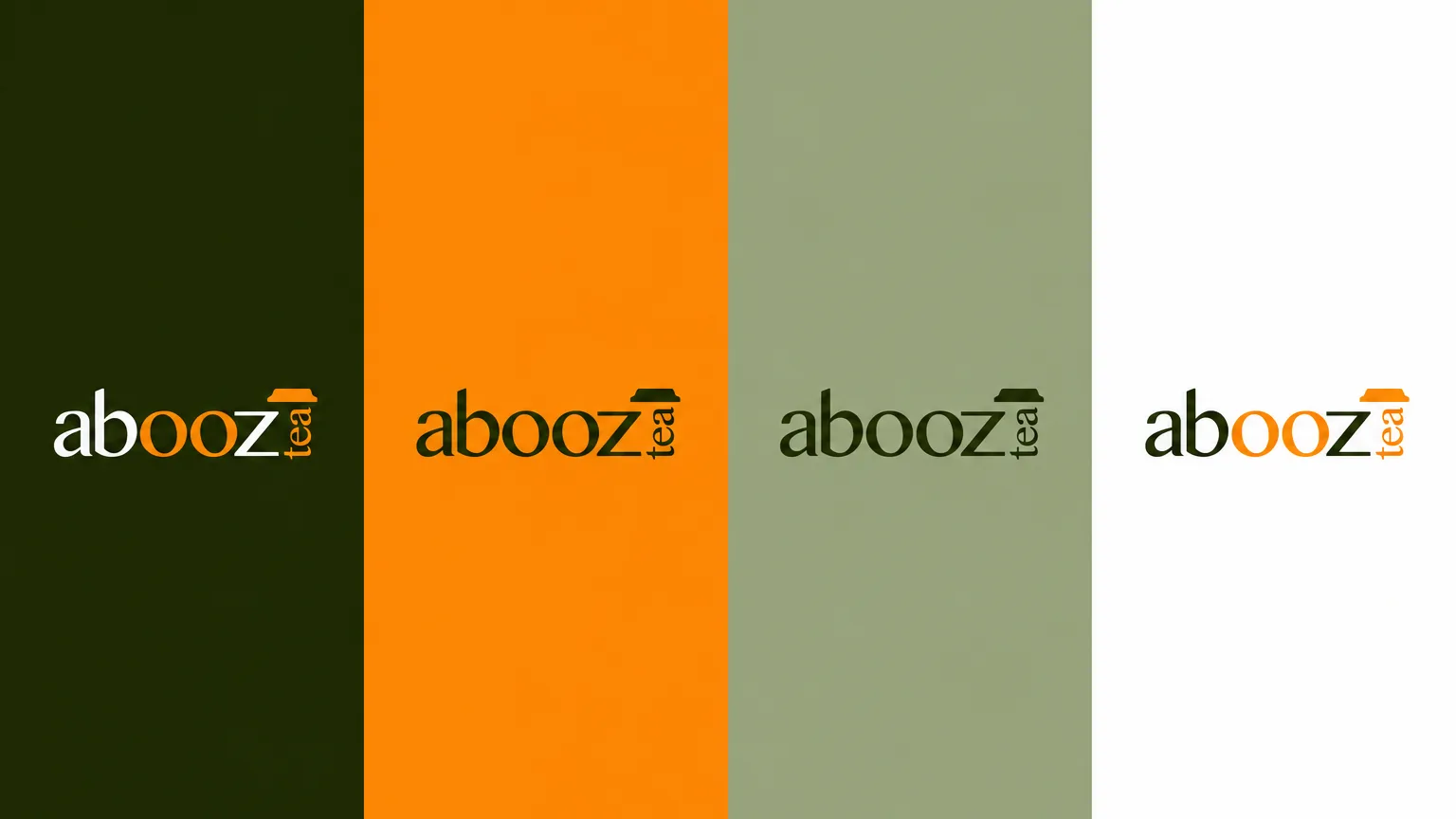
- Accent
#F7941D - Surface
#1D2808 - Ink
#FFFFFF
Colours sampled from the original identity boards.
Chapter 05
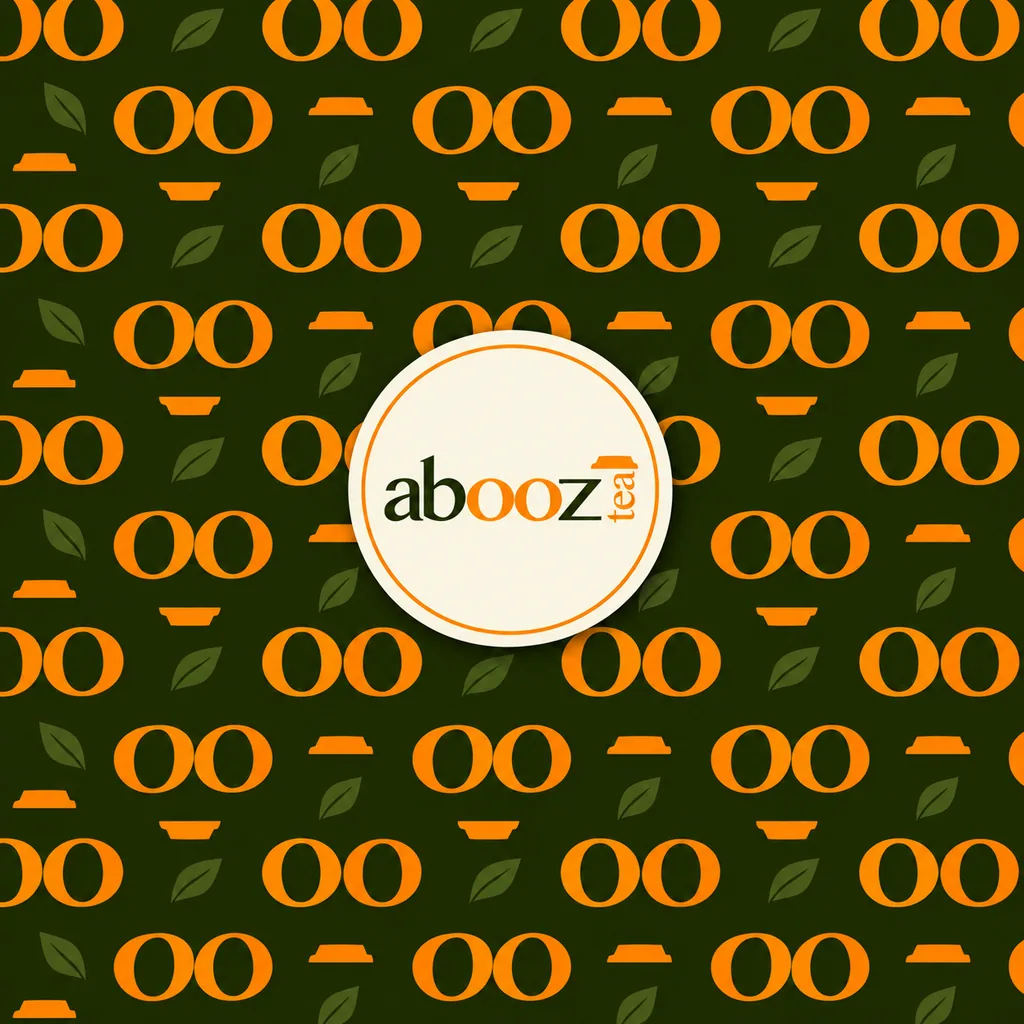
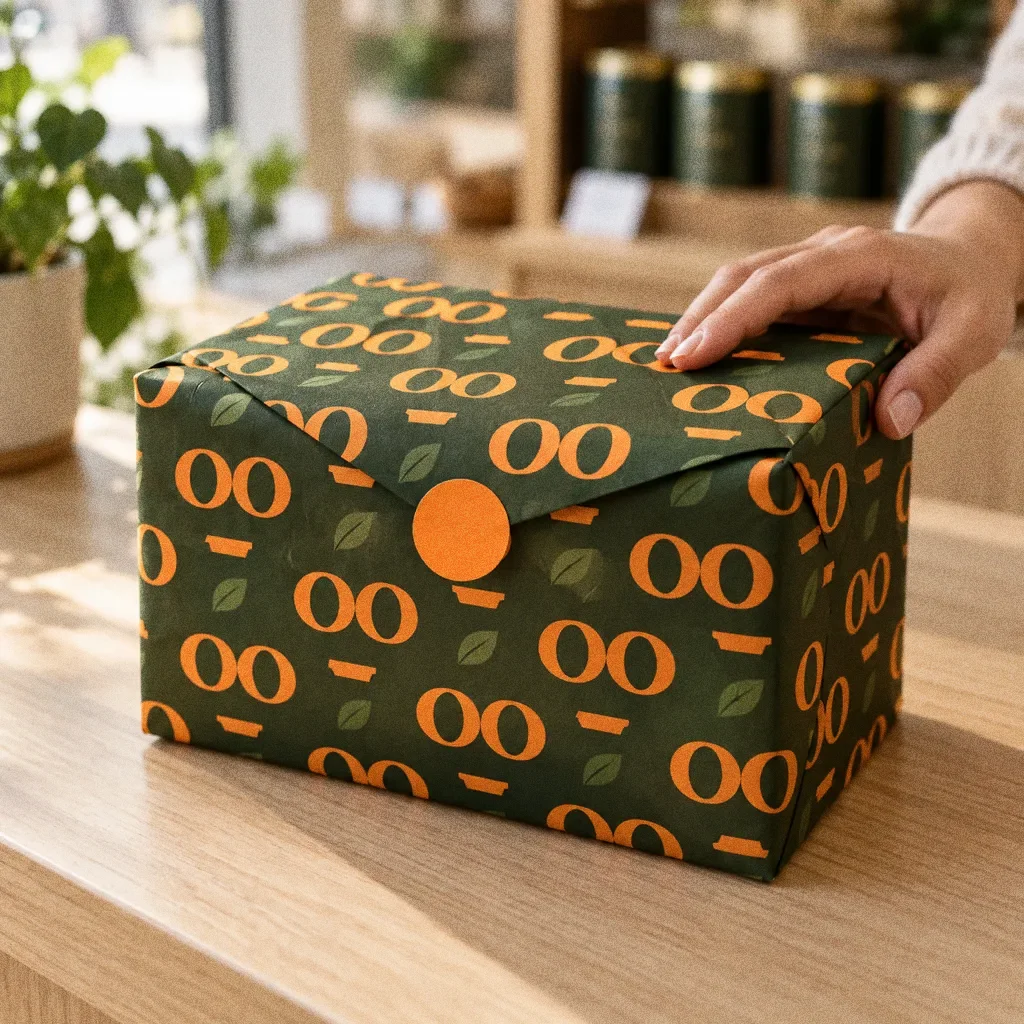
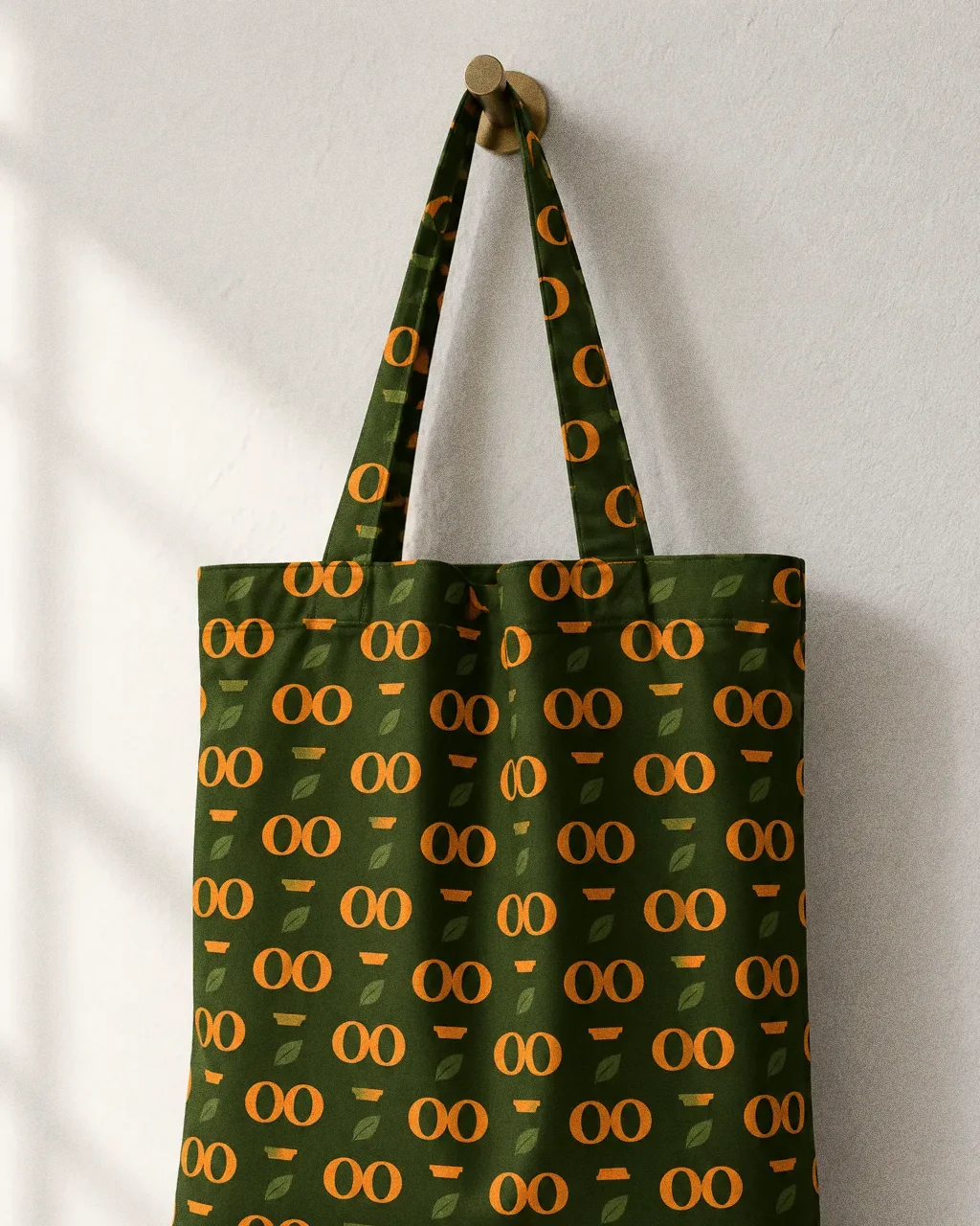
Pattern and graphic elements
Chapter 06
Packaging
From hot drinks to food
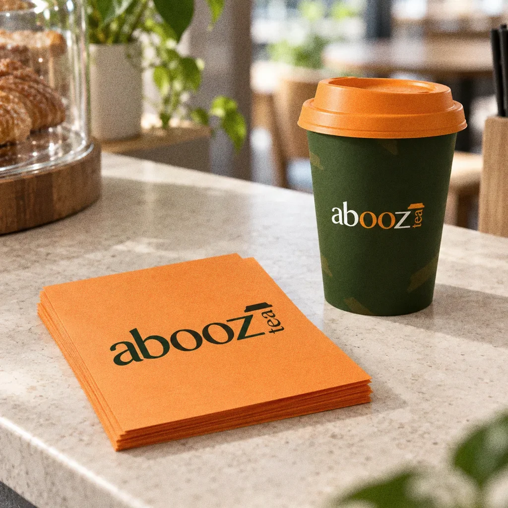
The same wordmark works on a hot cup, a paper bag, a burger box, a clear cold-drink cup and a cap, so the menu reads as one brand.
Chapter 07
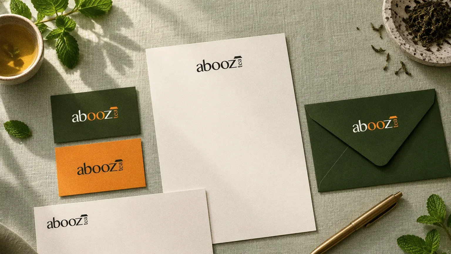
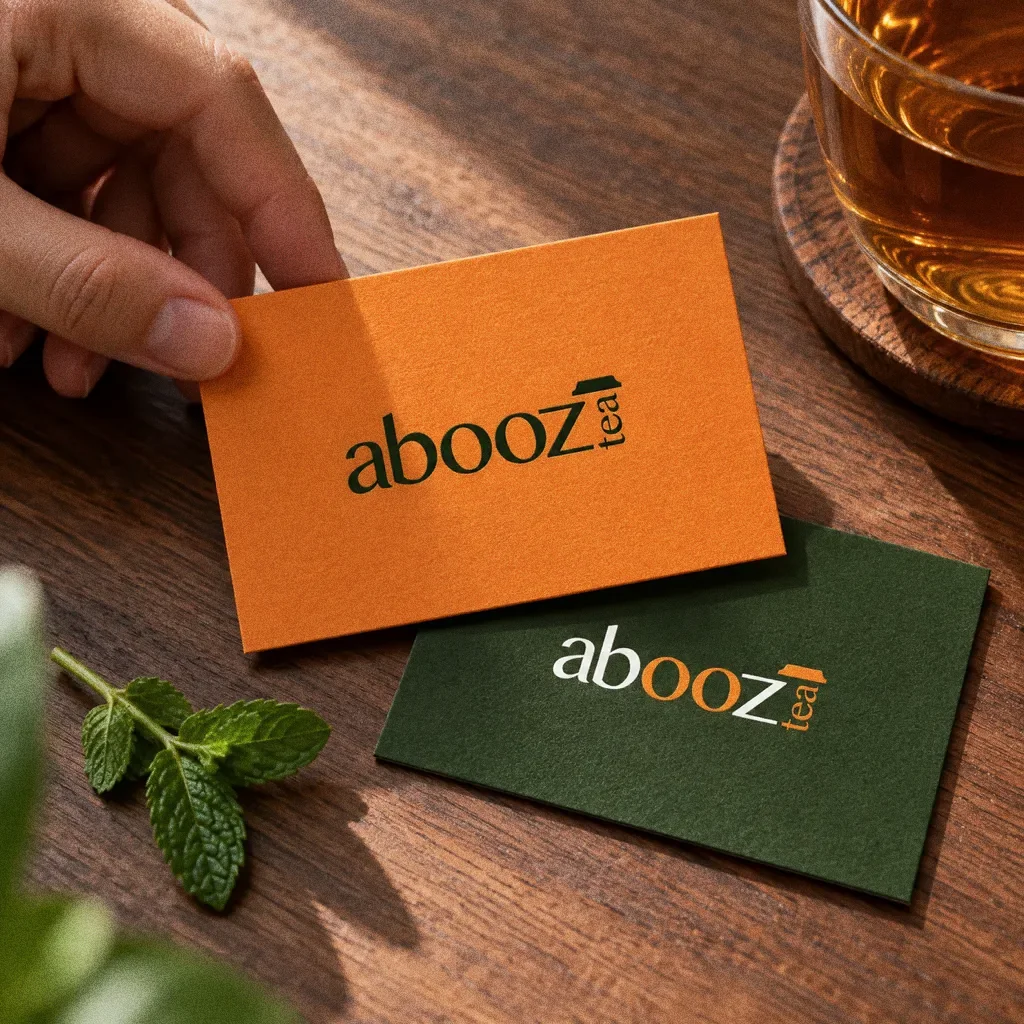
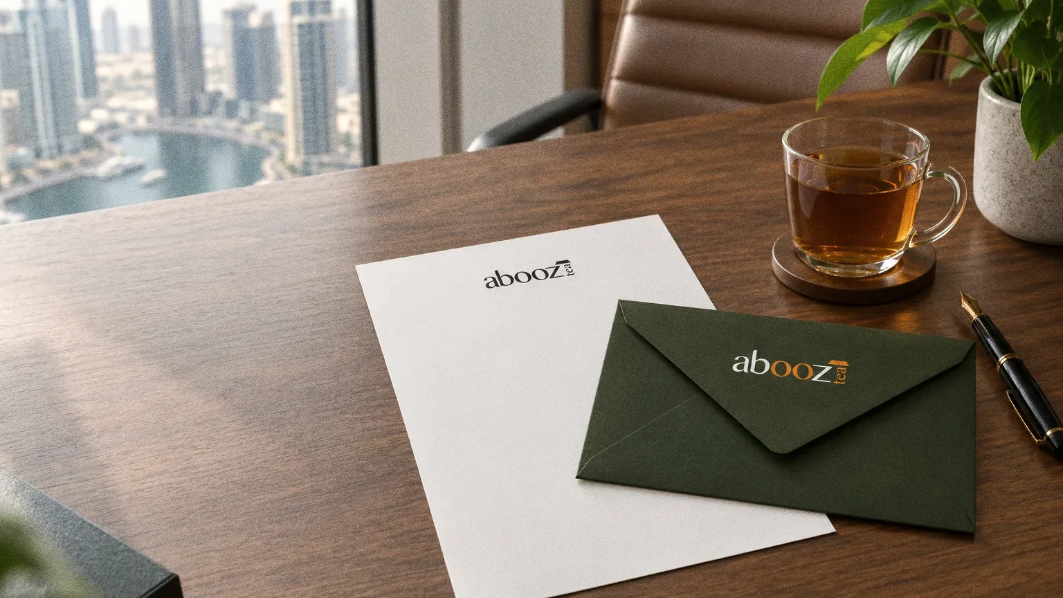
Stationery
Chapter 08
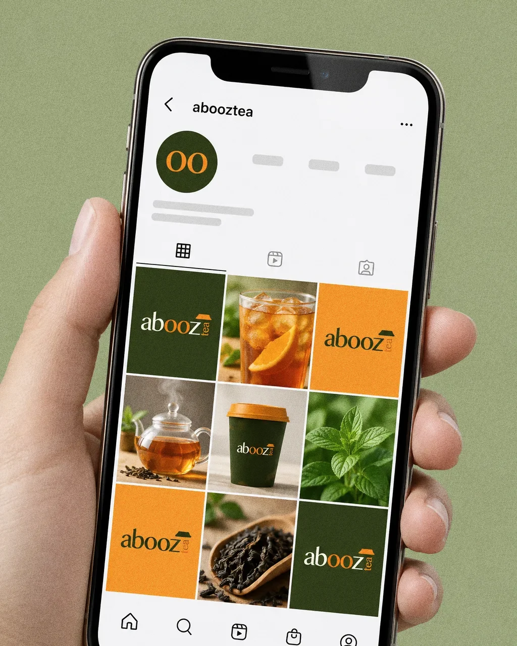
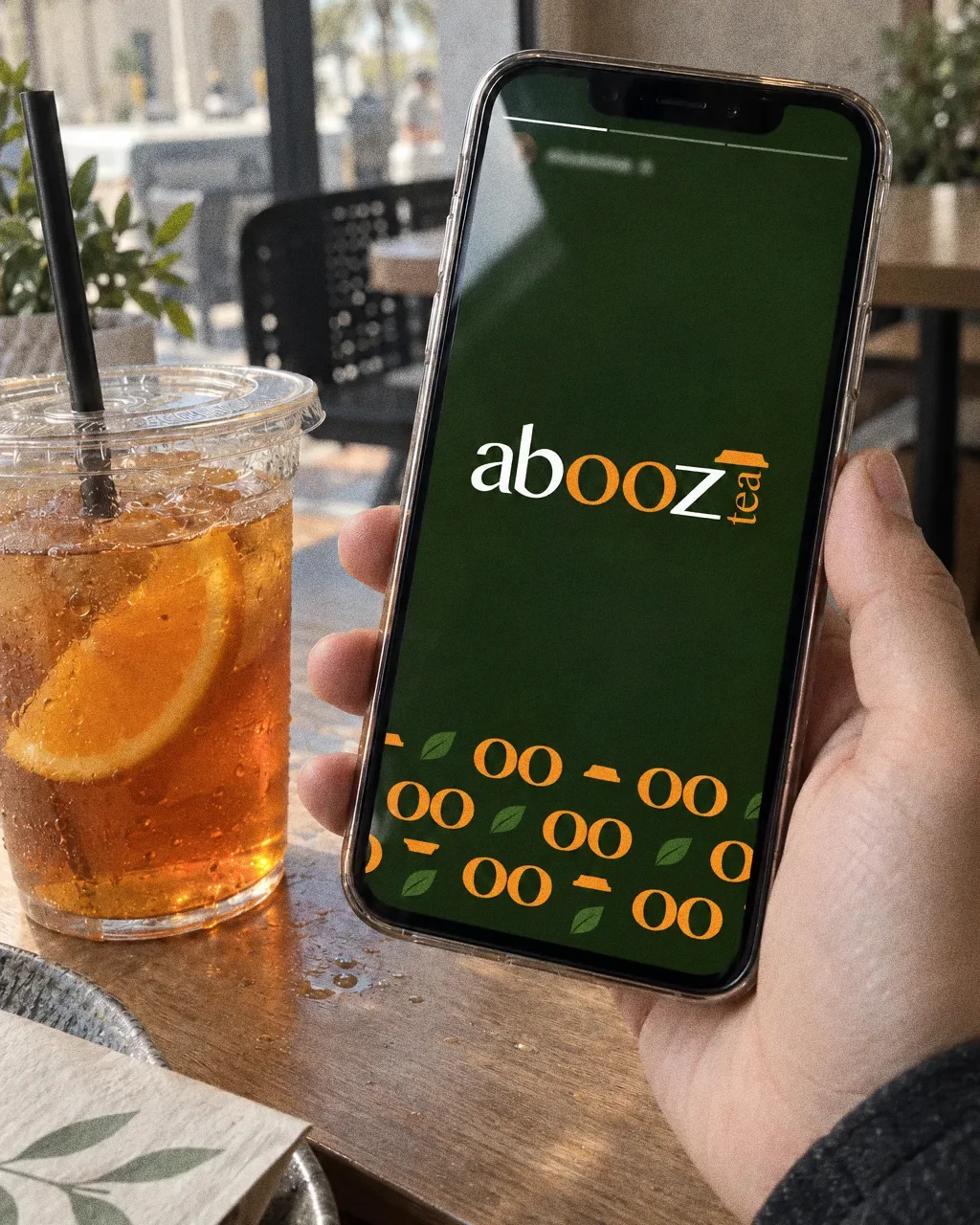
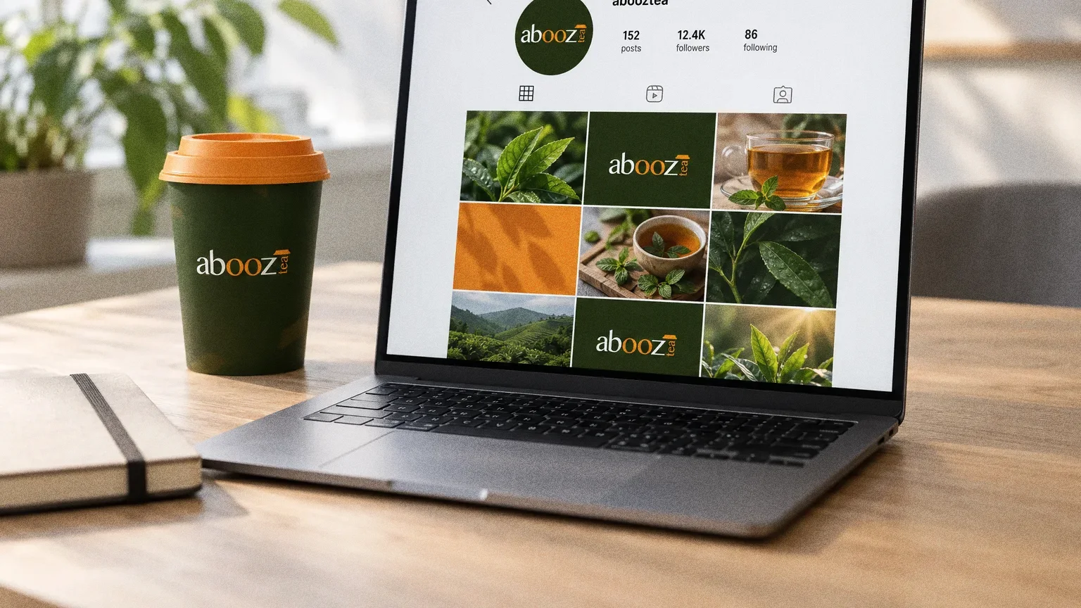
Digital
Chapter 09
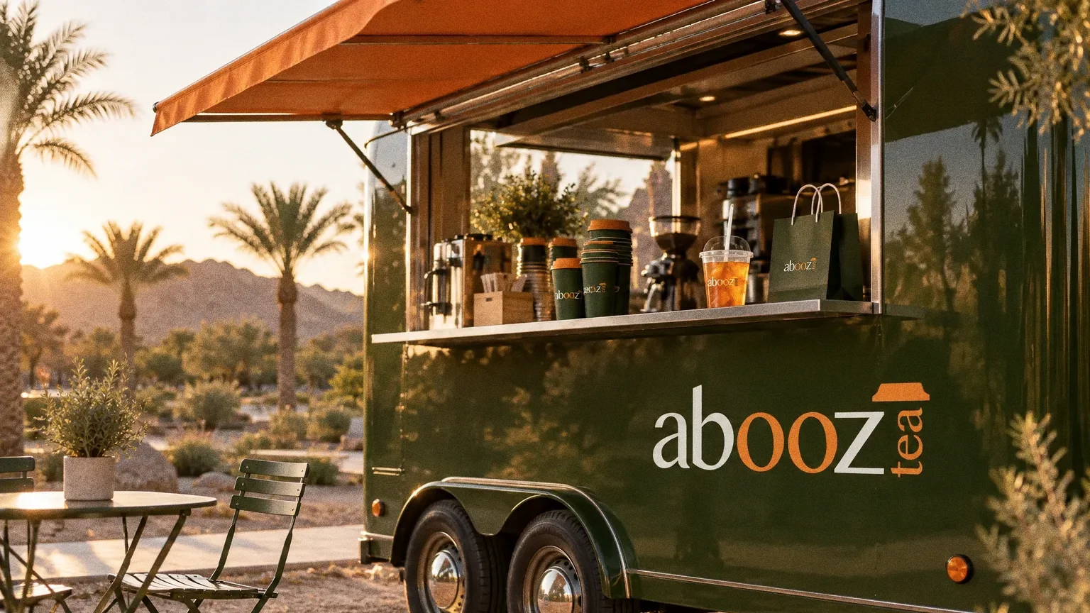
The brand in the world
Chapter 10
In people’s hands
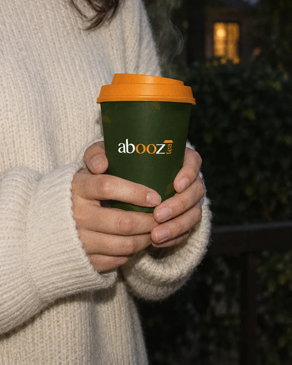
Cup with an orange lidThe Abooz identity in a lifestyle photograph of two hands around a steaming cup at dusk. 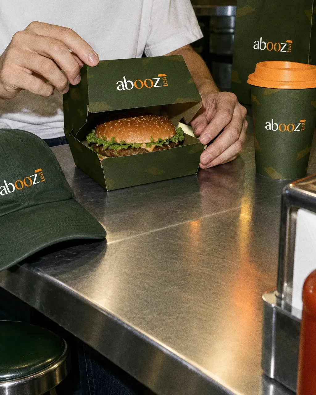
Burger box at the counterThe Abooz identity in a lifestyle photograph of a burger box opened at a diner counter. 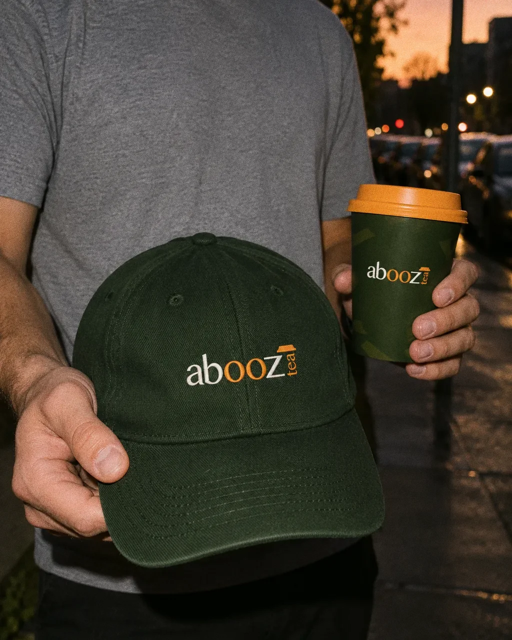
Cap and cupThe Abooz identity in a lifestyle photograph of a cap and cup held on a dusk street. 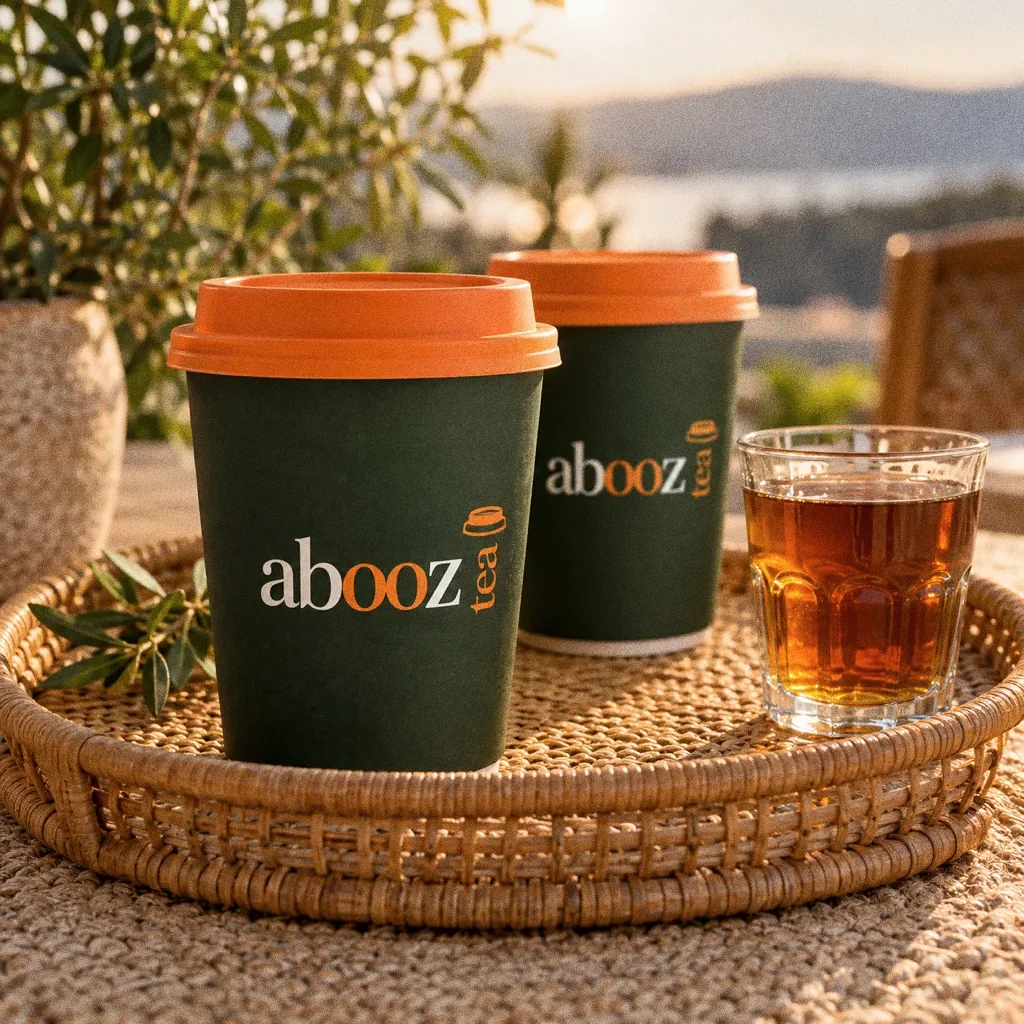
Tray on a sisal matThe Abooz identity in a lifestyle photograph of cups and a glass of tea on a rattan tray. 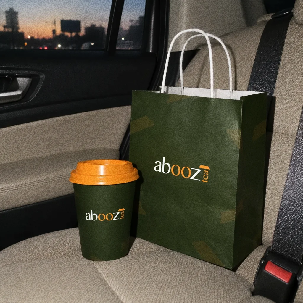
Bag and cup on the seatThe Abooz identity in a lifestyle photograph of a bag and cup on a car seat.
Chapter 11
Campaign
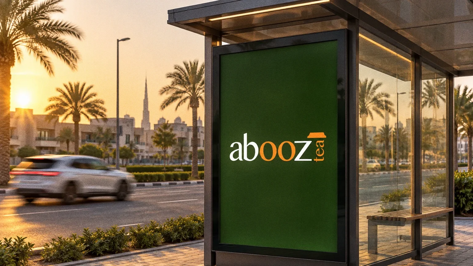
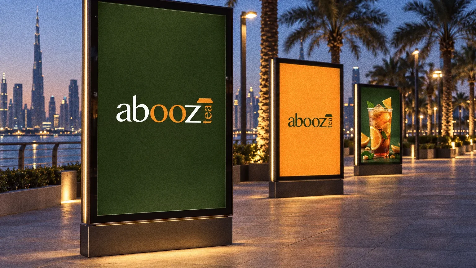
About this deck
What we built
A dark-green identity with an orange double-o detail, a vertical tea descriptor and applications for drink cups, a bag, a box and a cap.
About the originals
The original boards are from Abcon’s original project presentation and include application mockups.