Branding / Holding company
Trus Holding
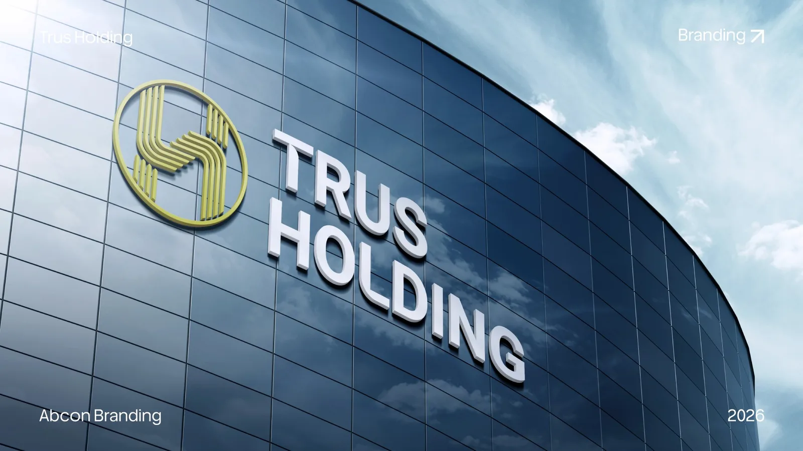
A holding-company identity presented through a gold circular emblem and a stacked white wordmark. The original portfolio image brings the two elements together in an architectural signage mockup on dark glass.
Project scope
- Emblem and wordmark
- Gold-and-white colour contrast
- Architectural signage presentation
How the identity works
The design task
A holding-company name needs a clear presence at architectural scale. The design task is to give the emblem and full name distinct roles while making them read together on a broad building surface.
Give the emblem a distinct silhouette
The gold circular emblem contains interlocking parallel strokes. Its contained outline gives the symbol a recognisable shape beside the much wider name.
See the original boardLet the full name hold the larger surface
TRUS and HOLDING sit on two lines in white. The broad lettering and gold emblem remain distinct against the dark glass, while their dimensional treatment is shown within the signage presentation.
See the original boardWhat we built
An emblem-and-wordmark composition shown as dimensional signage on a curved glass frontage. The case study follows the original presentation’s visual direction.
The image below is the original Trus Holding feature from Abcon’s portfolio, showing an architectural signage mockup.
Original source: Trus Holding original portfolio image
Illustrative applications
The visual system in context
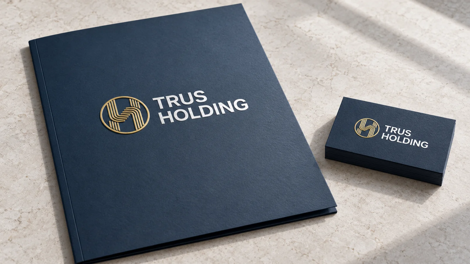
Additional scenes explore the design using the original project materials.
What does your brand need next?
Let’s talk about your project Next projectHotshay