Branding / Shawerma restaurant
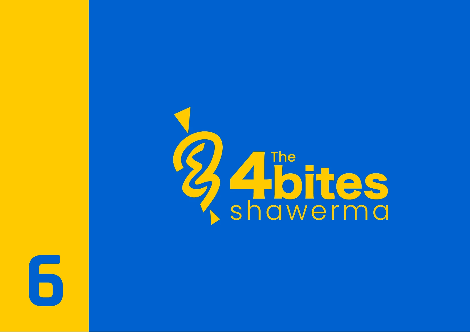
4 Bites Shawerma
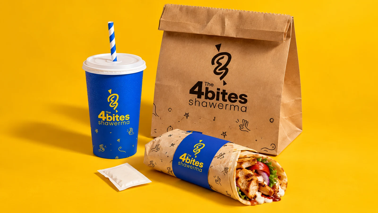
A blue-and-yellow restaurant identity that connects the number 4, Arabic letterforms and the letter B. The presentation carries the mark through takeaway packaging, staff clothing, stationery and signage.
Project scope
The original client-supplied presentation documents the identity and its application mockups.
- Symbol and wordmark
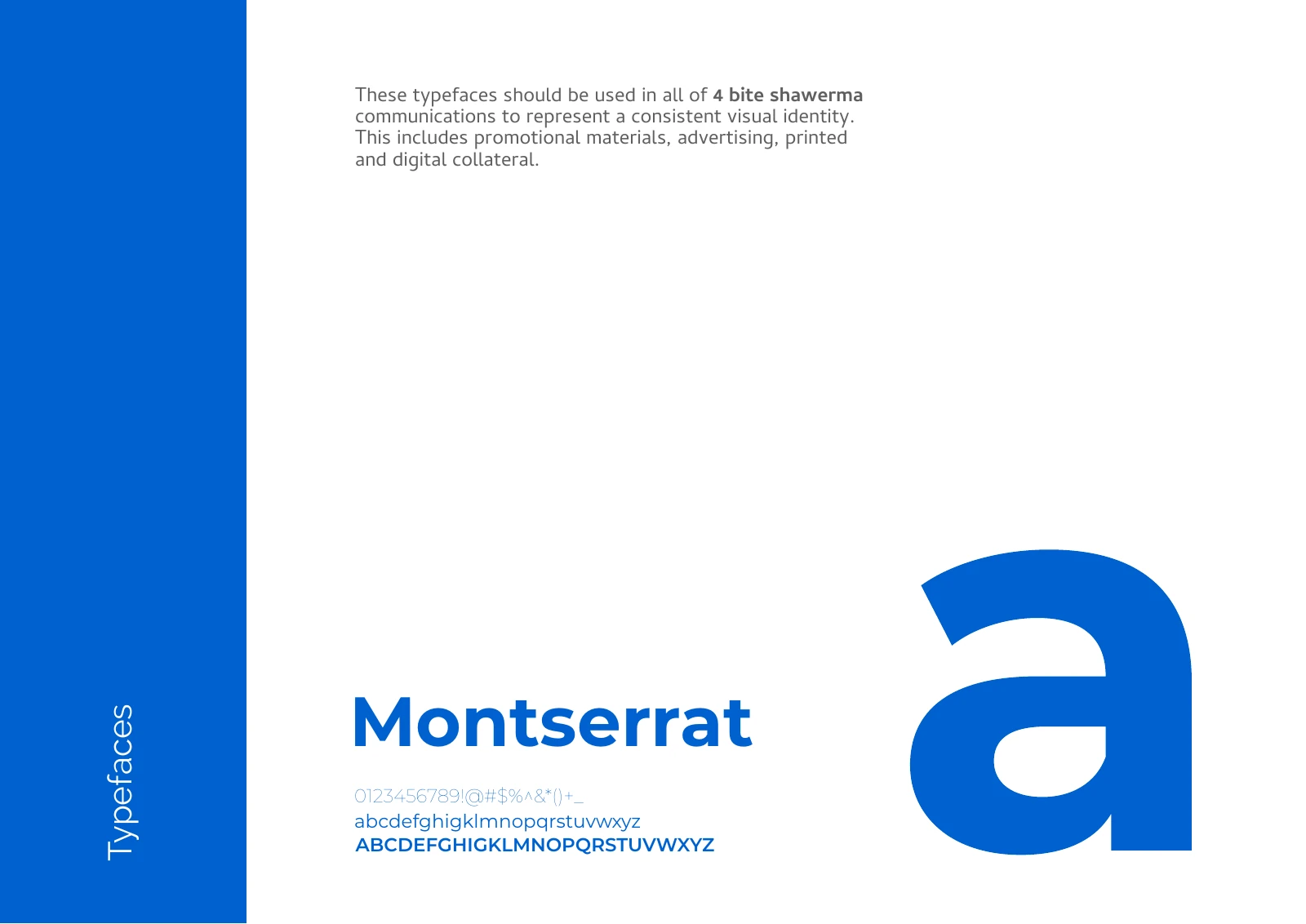
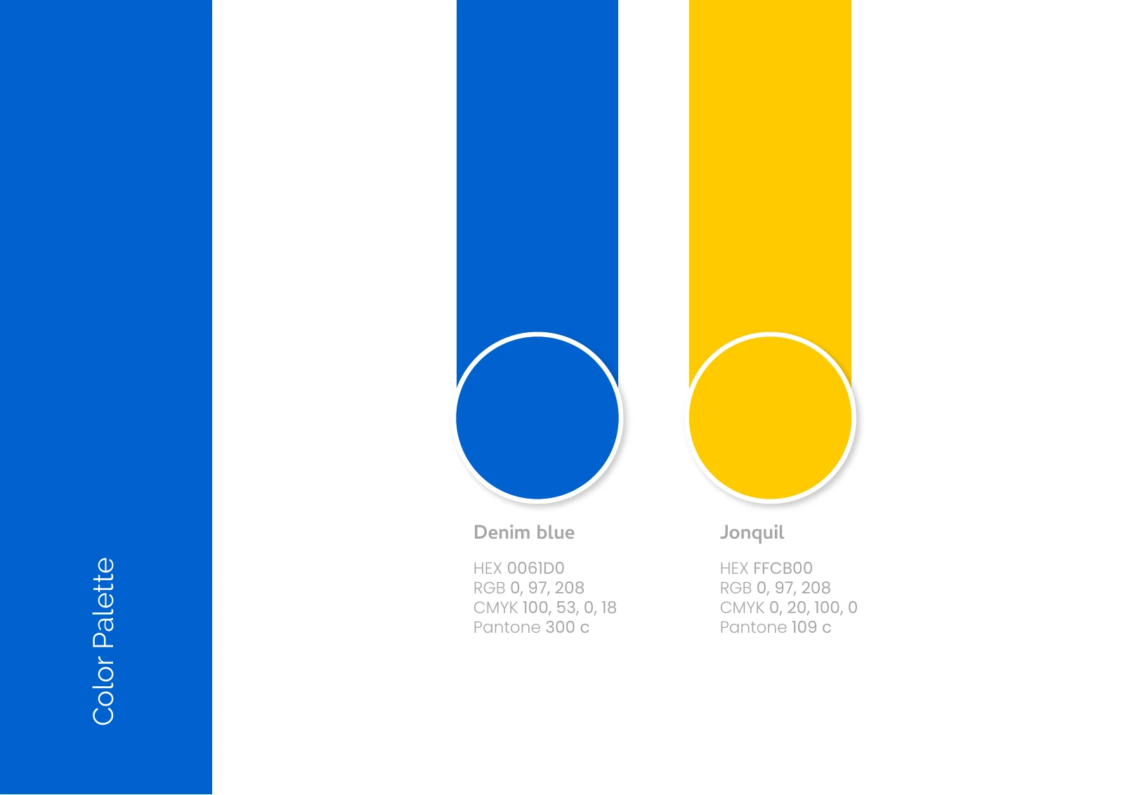
- Typography and blue-and-yellow palette
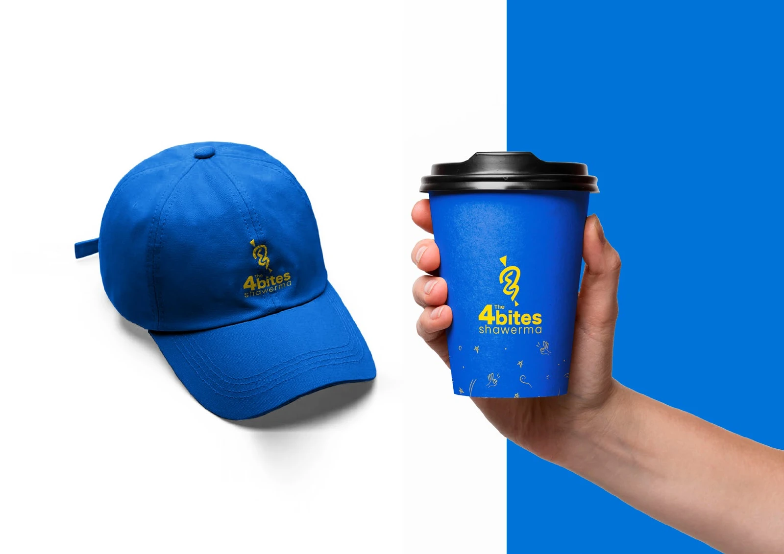
- Takeaway packaging, staff applications and signage
How the identity works
The design task
Give a short restaurant name a recognisable symbol, then keep that character consistent across the objects a customer carries and the frontage they see.
Connect the name through the symbol
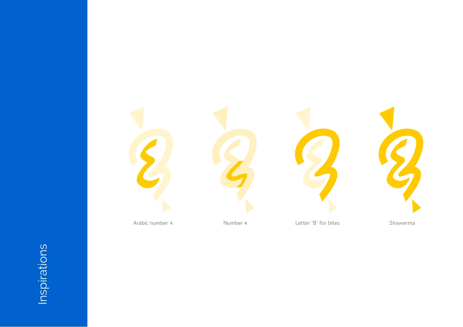
The construction board combines the Arabic 4, the number 4 and the letter B. The resulting curved mark appears above the name and can also stand alone on smaller applications.
See the original boardKeep the takeaway range recognisable
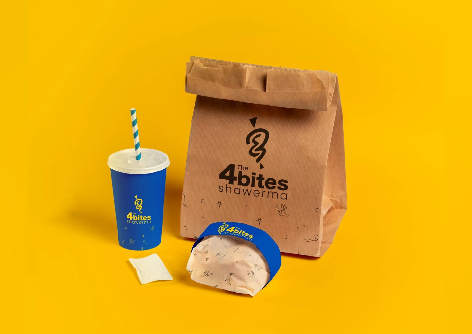
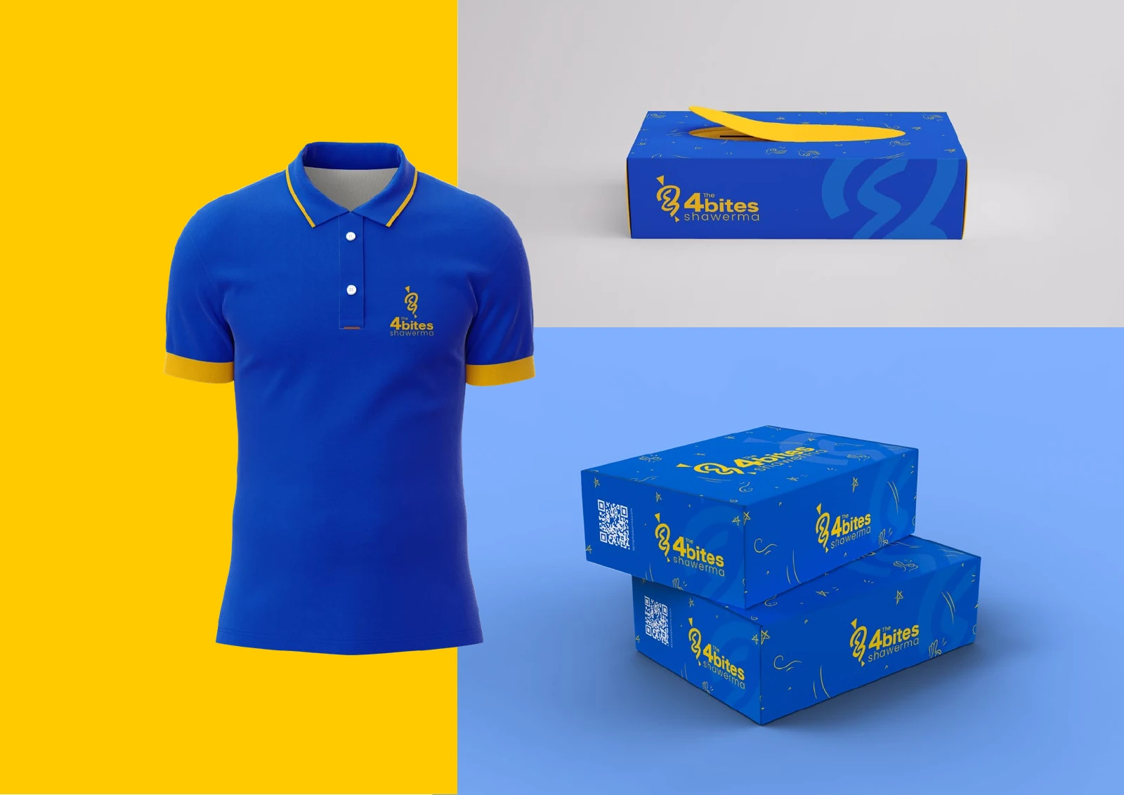
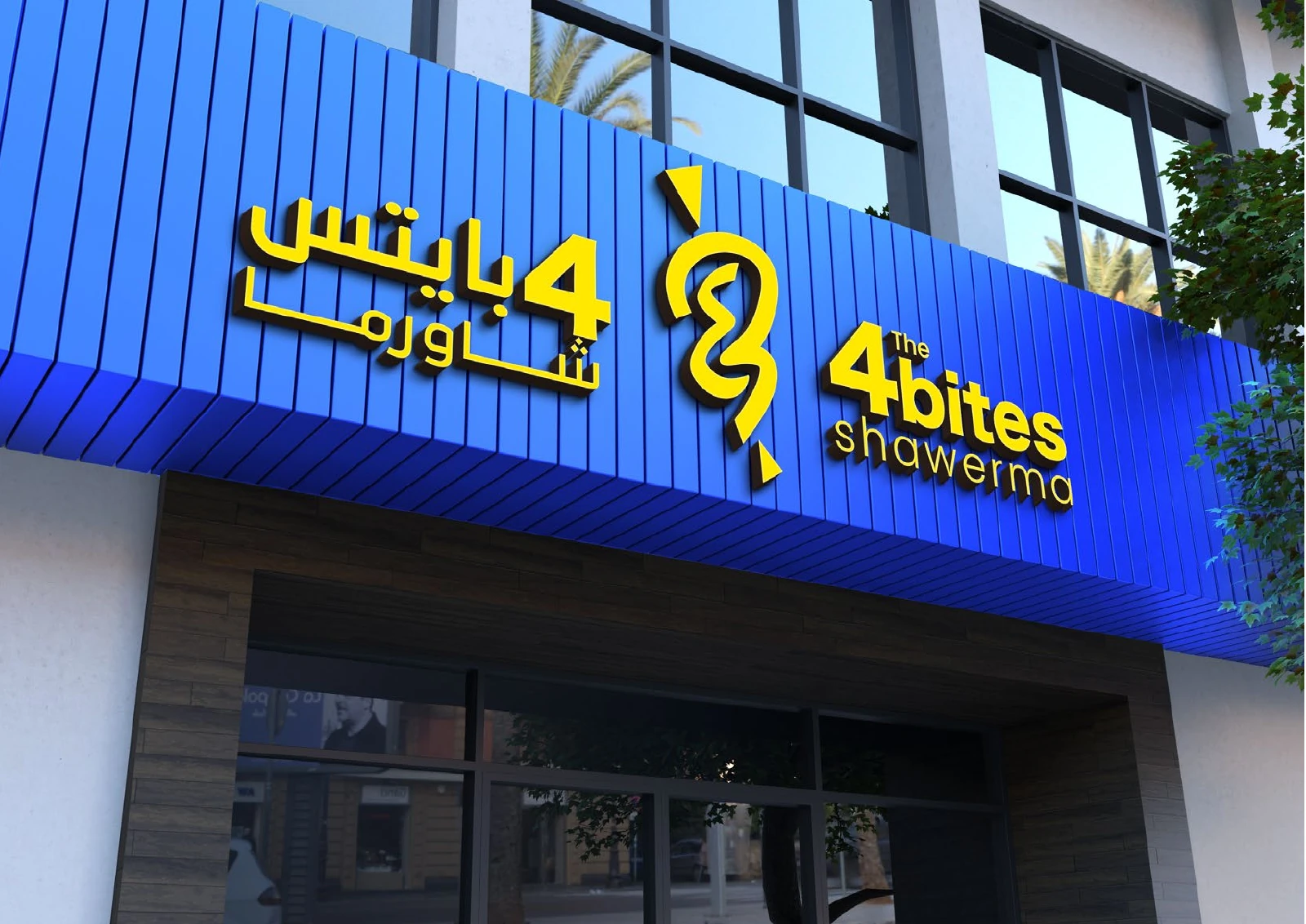
Blue, yellow and kraft paper recur across the cup, bag, wrap and boxes. The same identity continues onto the uniform and restaurant signage instead of changing between touchpoints.
See the original boardWhat we built
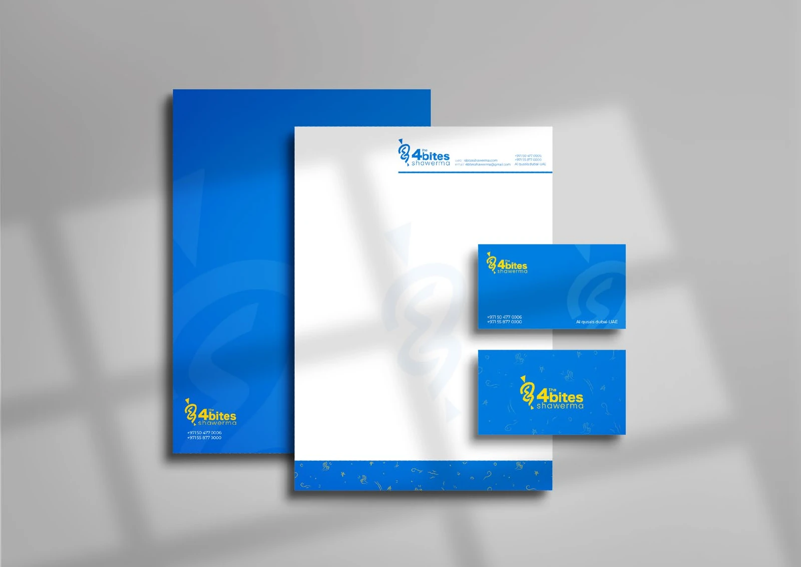
An identity system with typography and colour boards, packaging mockups, stationery, staff clothing and a signage presentation.
The boards below are the original design pages from the supplied PDF presentation, including its application mockups.
Original source: ABCON NEW BRAND PORTFOLIO.pdf
What does your brand need next?
Let’s talk about your project Next projectAl Mamzar