Branding / Logistics identity
Trusworld
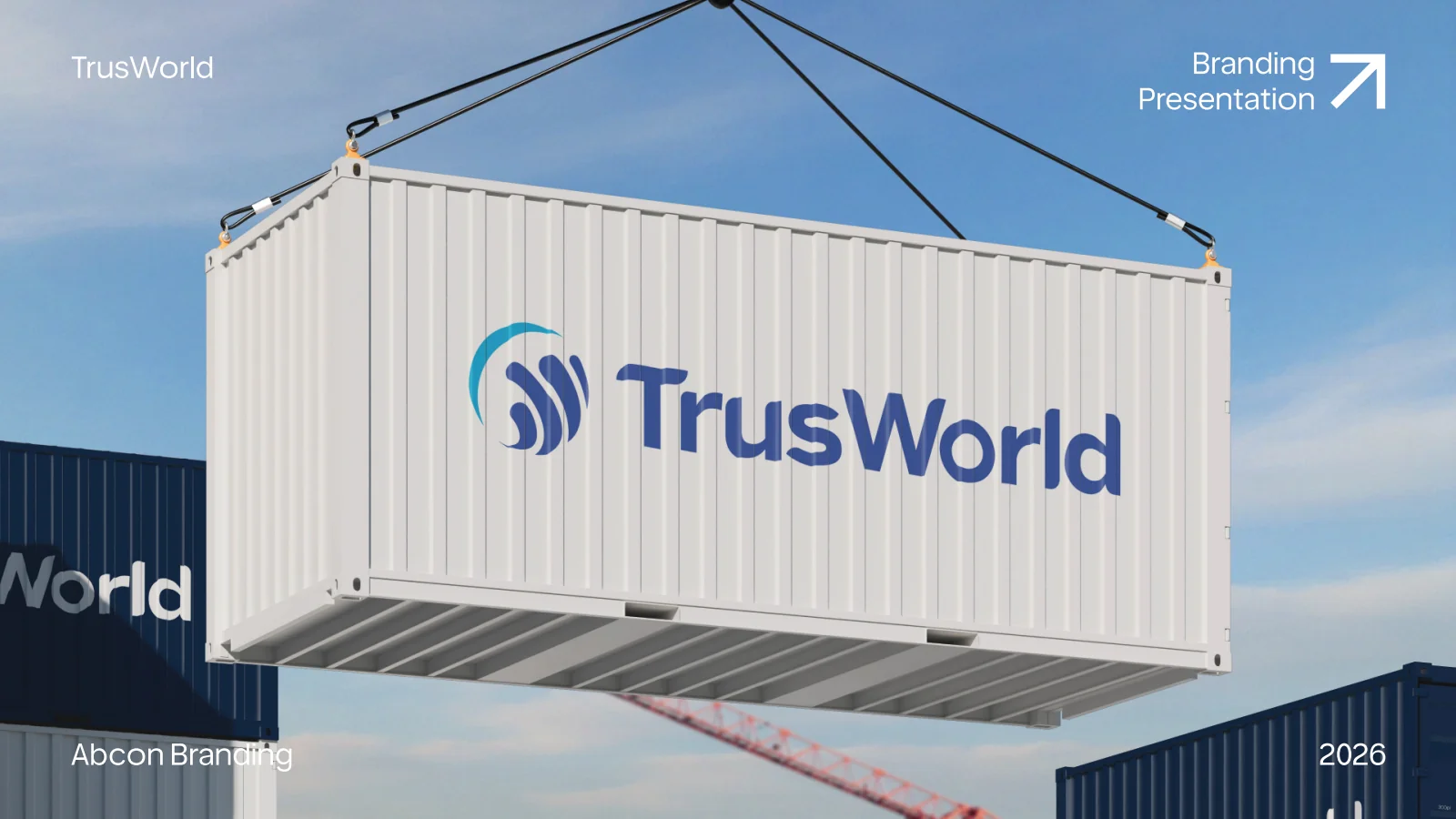
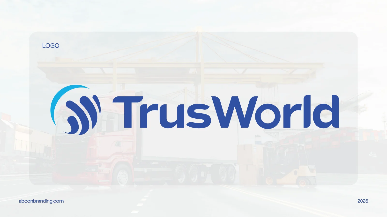
A corporate identity for Trusworld with a circular blue emblem and clear wordmark, carried through containers, vehicles, reception signage and shipping cartons.
Project scope
- Corporate identity
- Logo construction and colour
- Vehicle, workplace and carton applications
How the identity works
The design task
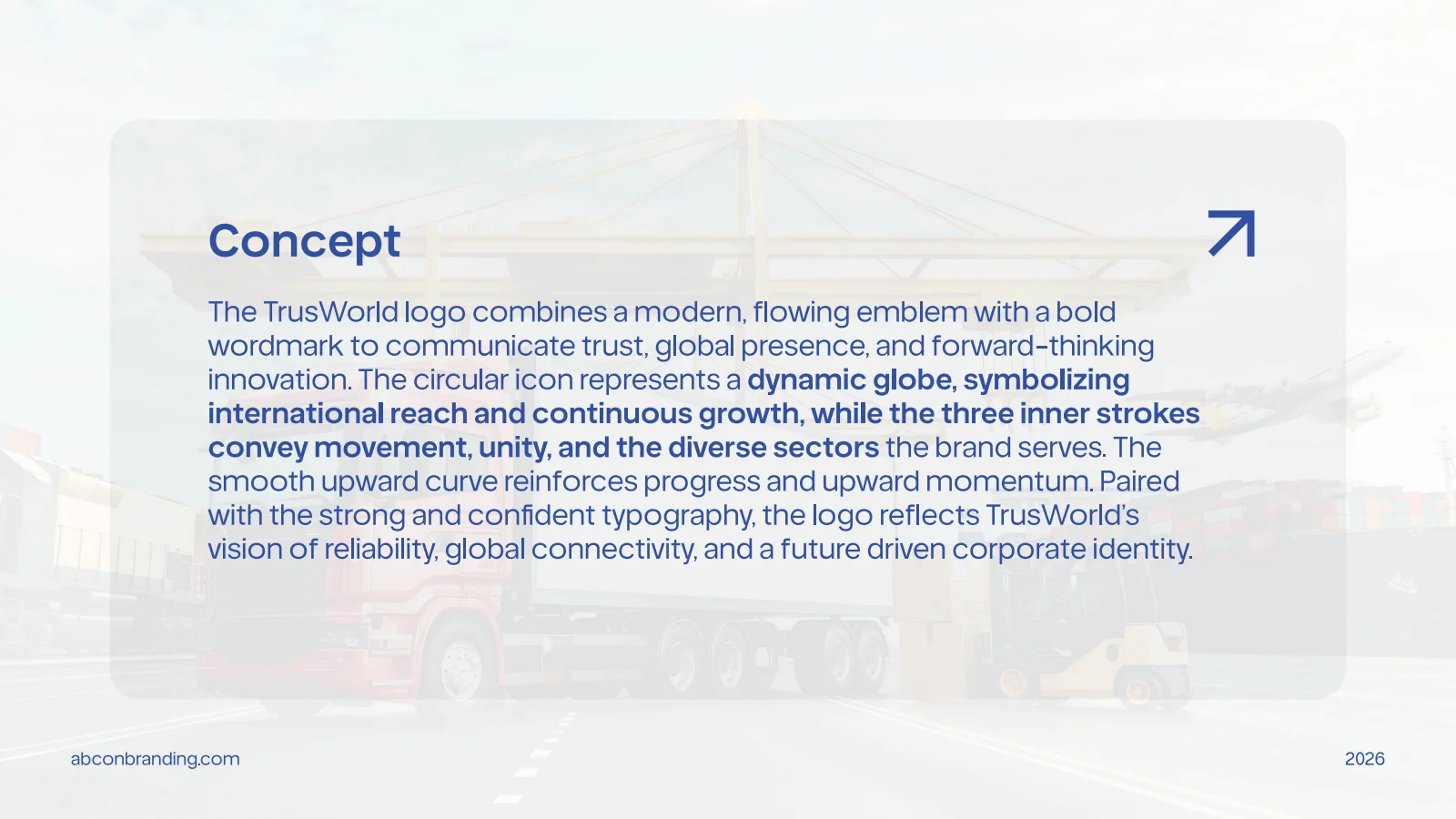
The supplied concept connects global reach, movement and reliability. The design task is to translate that story into a corporate mark that remains consistent across transport and workplace applications.
Combine movement with a stable name
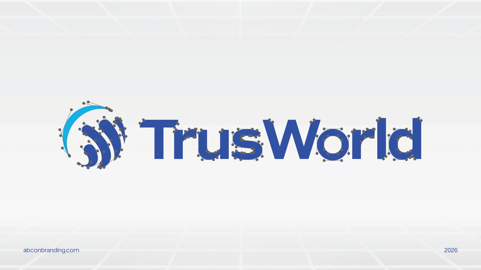
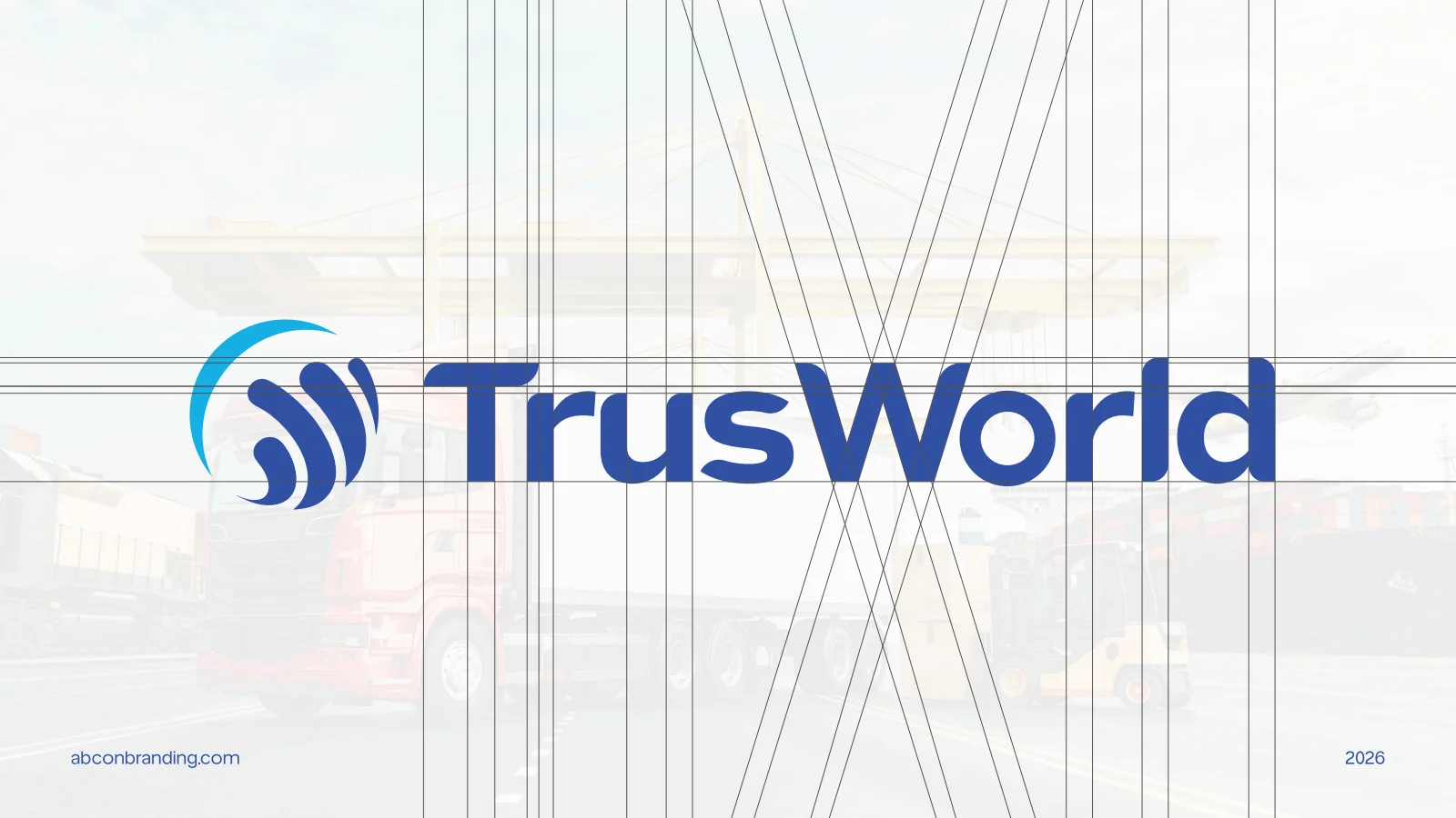
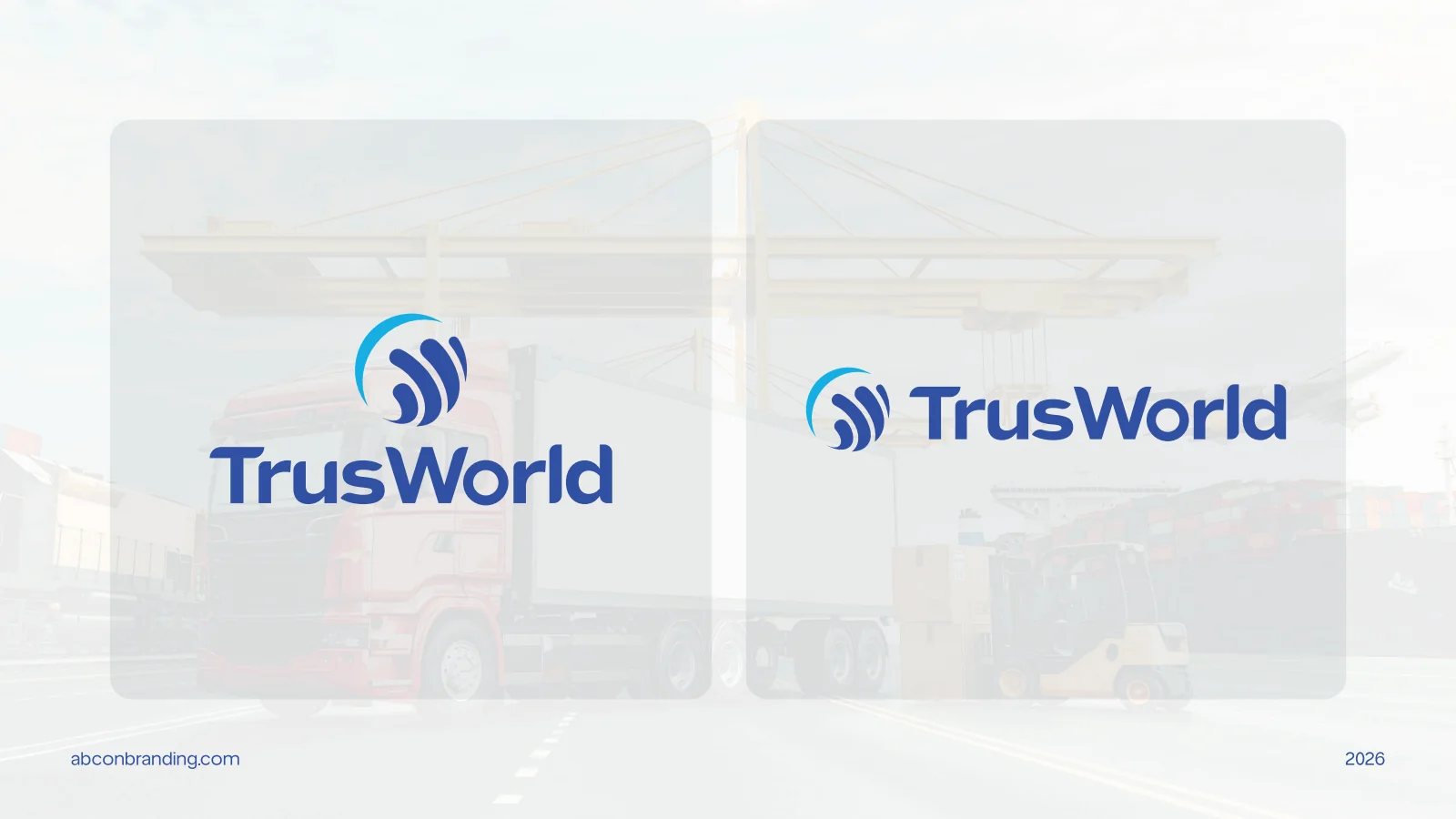
The concept board describes the emblem’s circular form and inner strokes. The presentation sets it beside a bold wordmark, then shows alternate arrangements without changing the underlying mark.
See the original boardCarry one identity across the operation
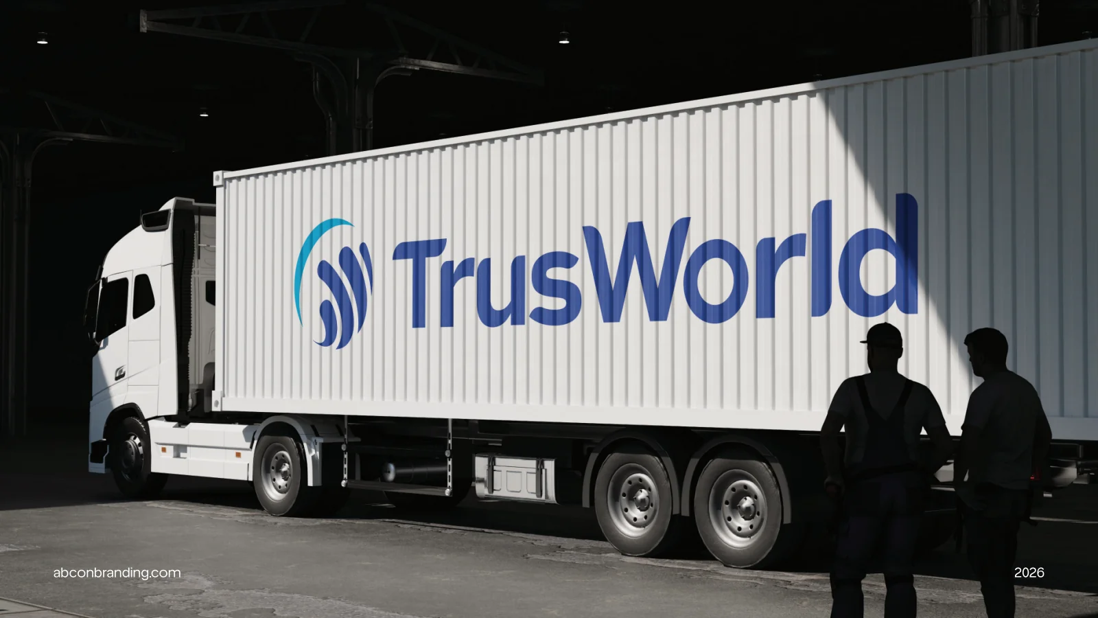
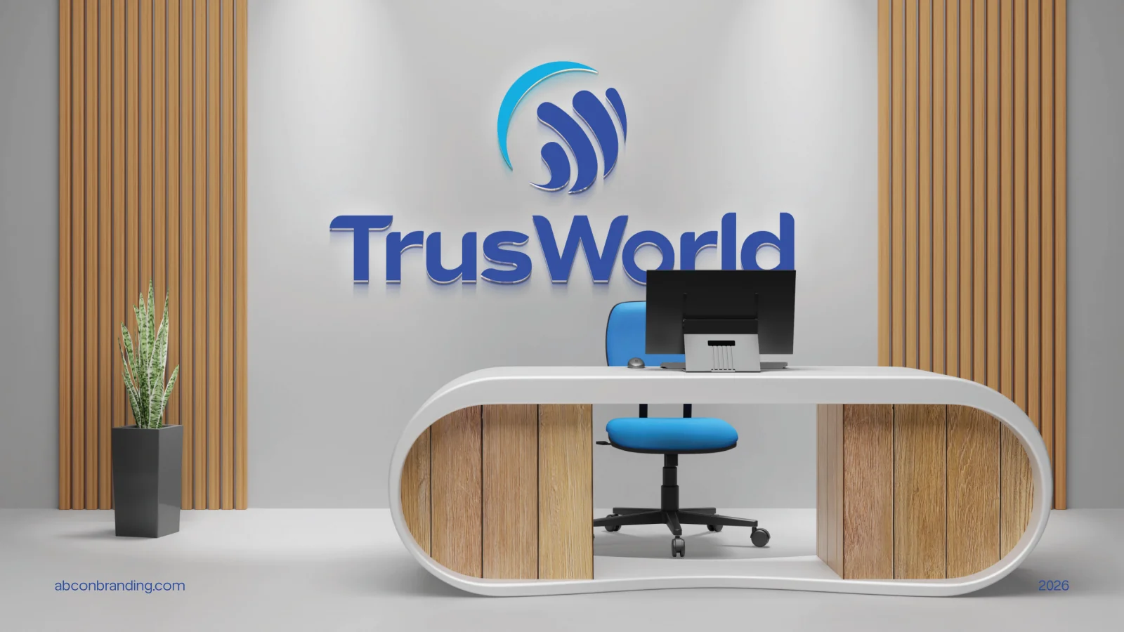
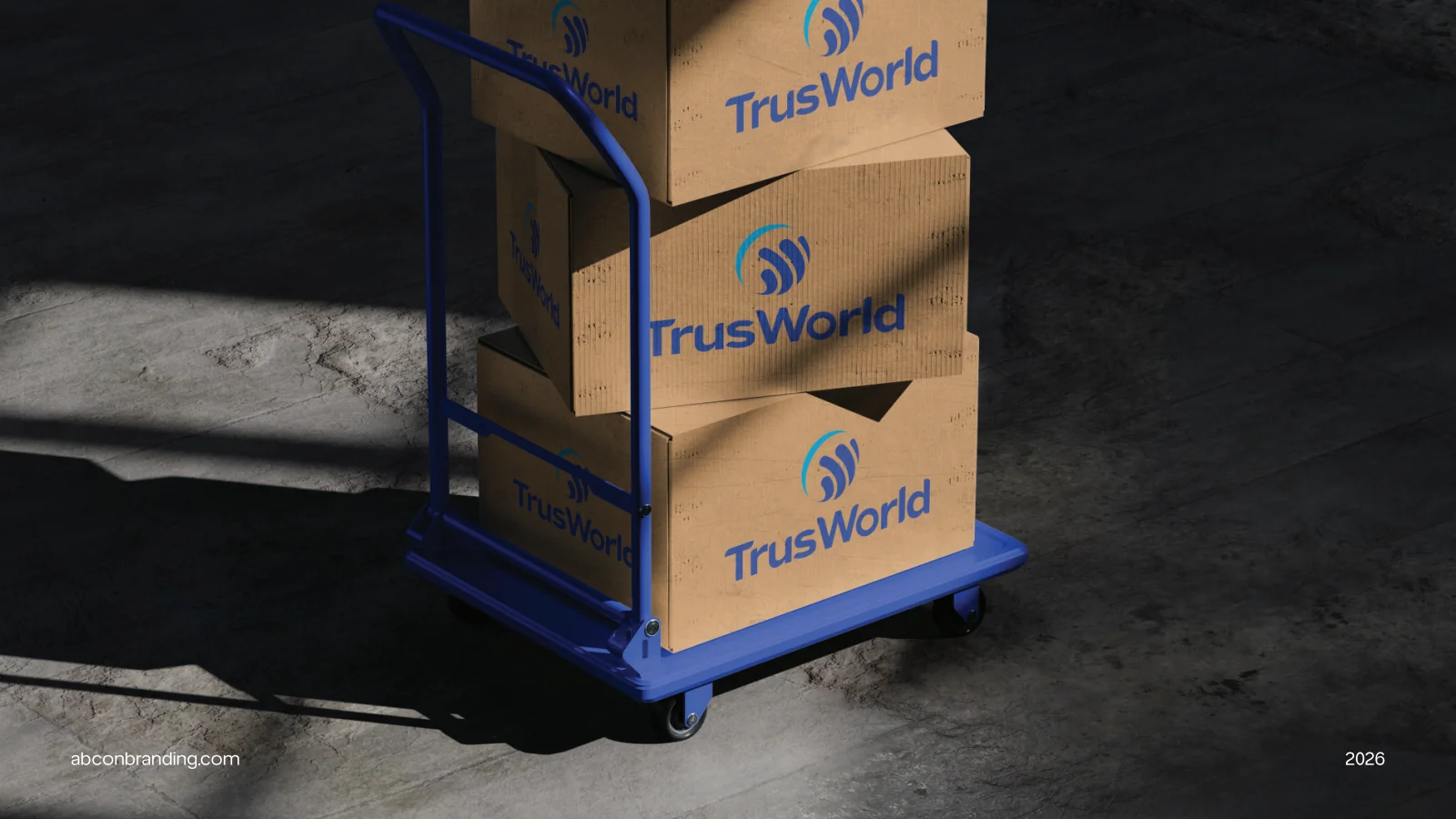
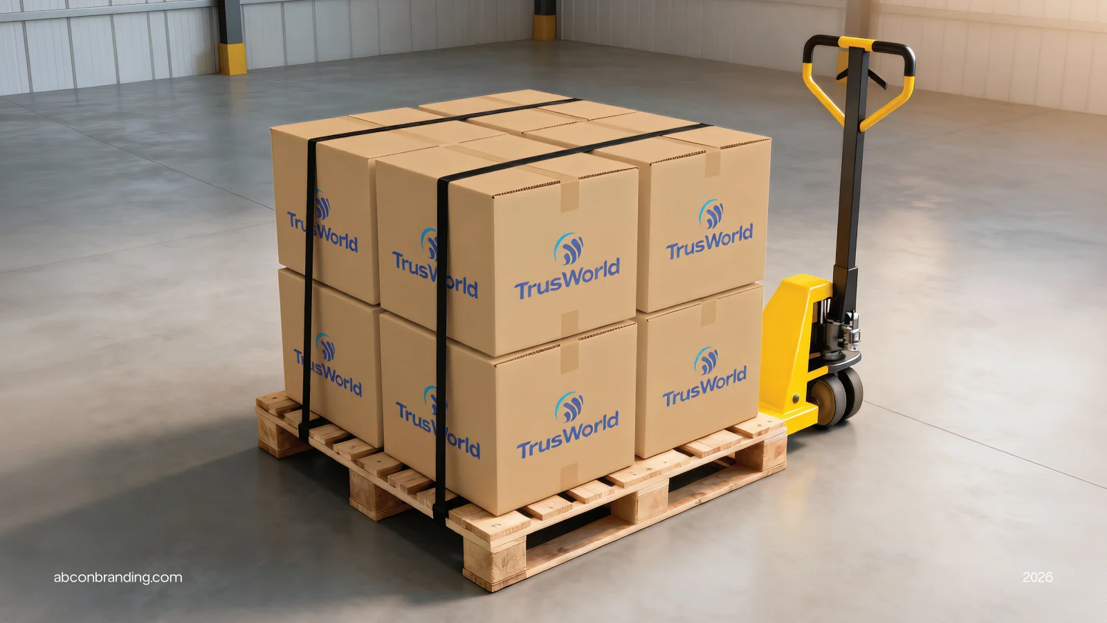
Containers, a truck, a reception wall and cartons use the same blue symbol and name. The application boards show the system at different sizes rather than treating each surface as a separate brand.
See the original boardWhat we built
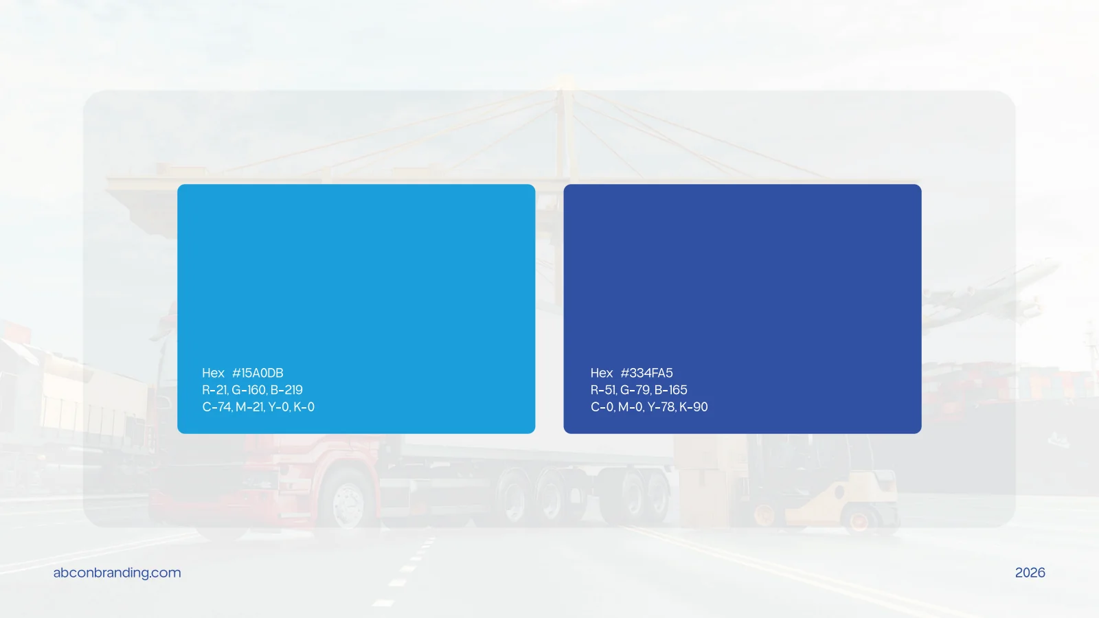
A circular emblem and wordmark, construction and lockup variations, a two-blue palette and logistics-related application mockups.
The boards below are the original design pages from the supplied PDF presentation, including its application mockups.
Original source: TRUSWORLD.pdf
What does your brand need next?
Let’s talk about your project Next projectVelvia