← All work

Branding / Foodstuff trading

Jumanah Foods

A bilingual Jumanah Foods identity that joins the Latin J and Arabic Jeem in one monogram, then carries it into guidelines, signage and business stationery.
Jumanah Foods branding by Abcon

Project scope

  • Bilingual monogram and logos
  • Colour, typography and pattern
  • Signage and stationery applications

How the identity works

The design task

The supplied brief calls for an identity that reflects cultural depth and a global presence. The design task is to bring the two scripts together in a single mark and make that mark practical across the company’s materials.

One mark, two readings

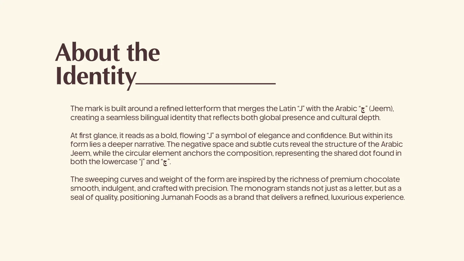
The rationale explains how the Latin J and Arabic Jeem share the same form and dot. The English, Arabic and combined lockups use that monogram as their common identifying element.

See the original board

Turn the mark into a working system

The guidelines specify the palette and type hierarchy, then repeat the monogram as a pattern. The application pages demonstrate the system on a frontage, letterhead and business-document templates.

See the original board

What we built

A bilingual monogram and lockups, colour and typography guidelines, a repeat pattern and applications for signage and business documents.

The boards below are the original design pages from the supplied PDF presentation, including its application mockups.

Original source: Jumanah Foods Branding.pdf
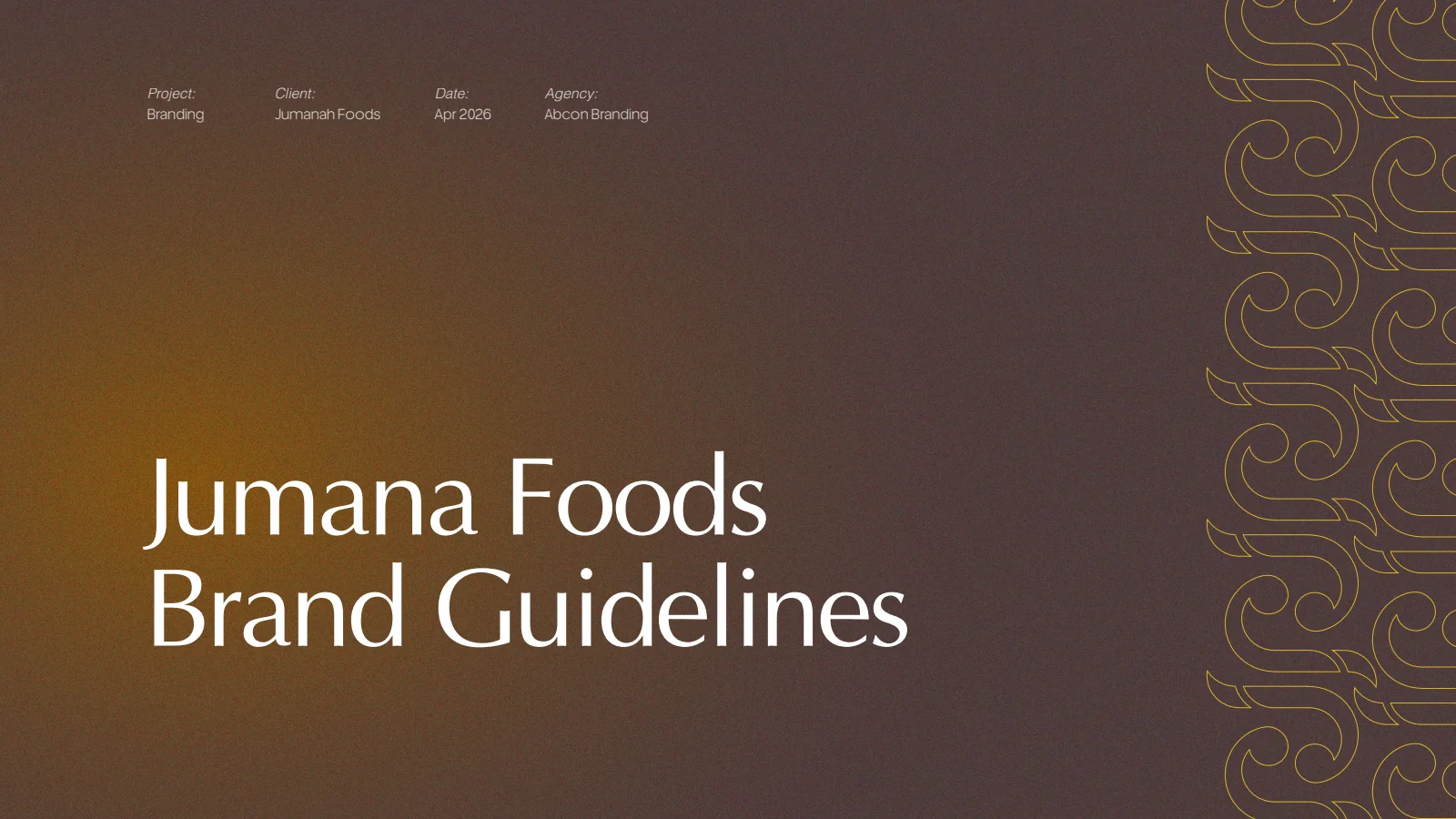
Jumanah Foods: Guidelines opening
Guidelines openingThe original Jumanah Foods guidelines introduce the project and agency.
Jumanah Foods: Monogram detail
Monogram detailThe J-and-Jeem monogram is presented in gold on a dark textured surface.
Jumanah Foods: Bilingual rationale
Bilingual rationaleThe original board describes the shared letterform and dot.
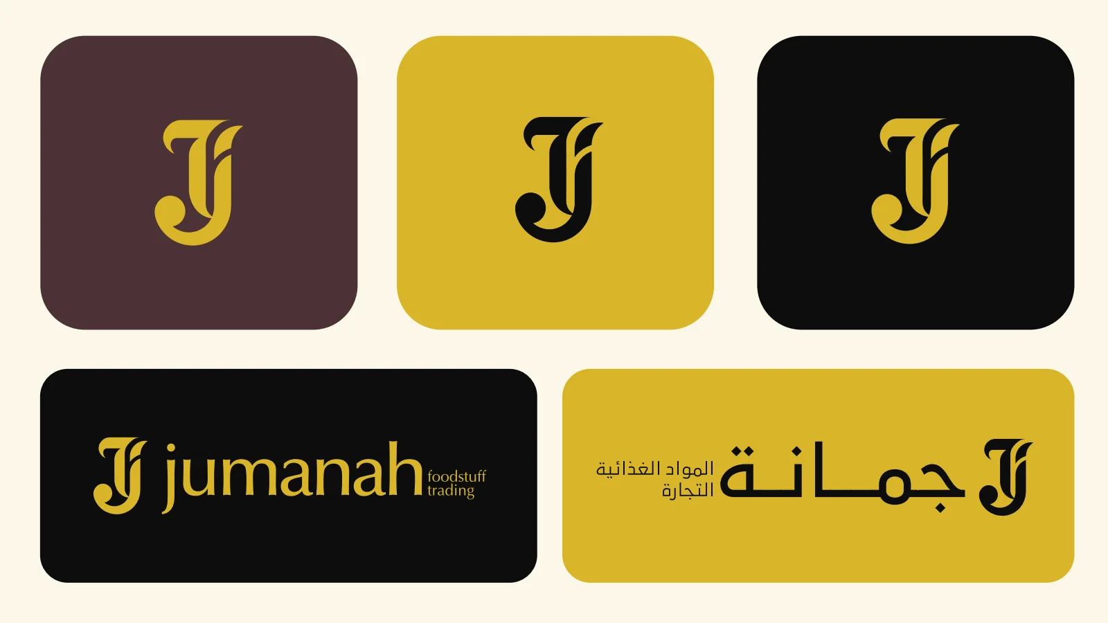
Jumanah Foods: Logo colour versions
Logo colour versionsThe monogram and wordmarks are shown across dark, gold and light backgrounds.
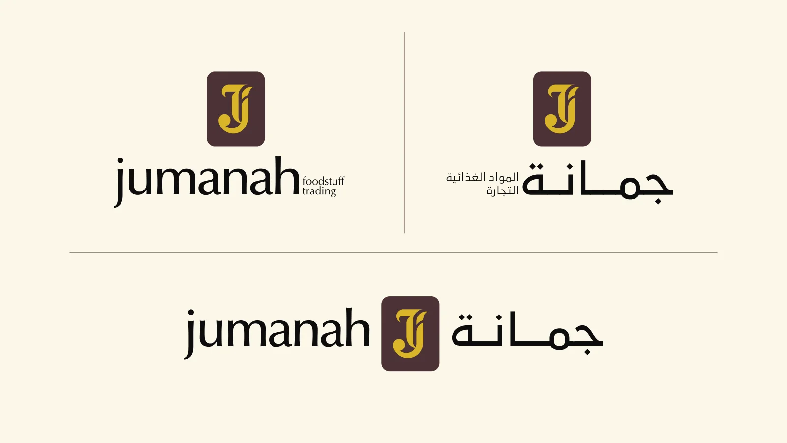
Jumanah Foods: English and Arabic lockups
English and Arabic lockupsSeparate and combined language versions share the same monogram.
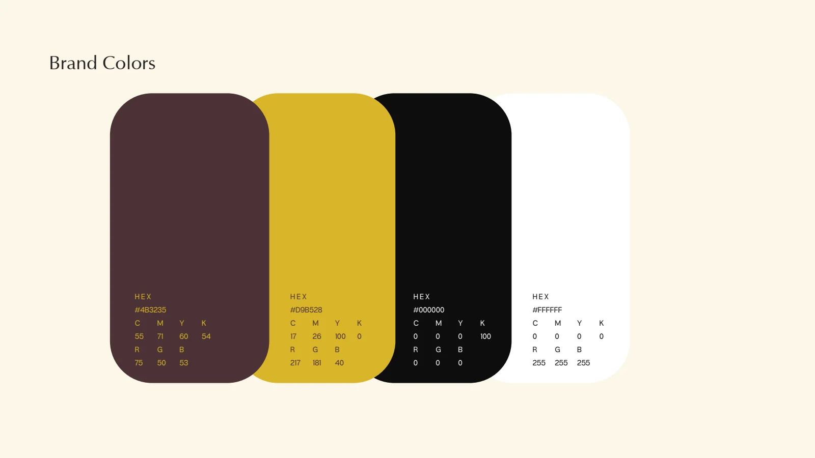
Jumanah Foods: Colour specification
Colour specificationBurgundy, gold, black and white are specified for the identity.
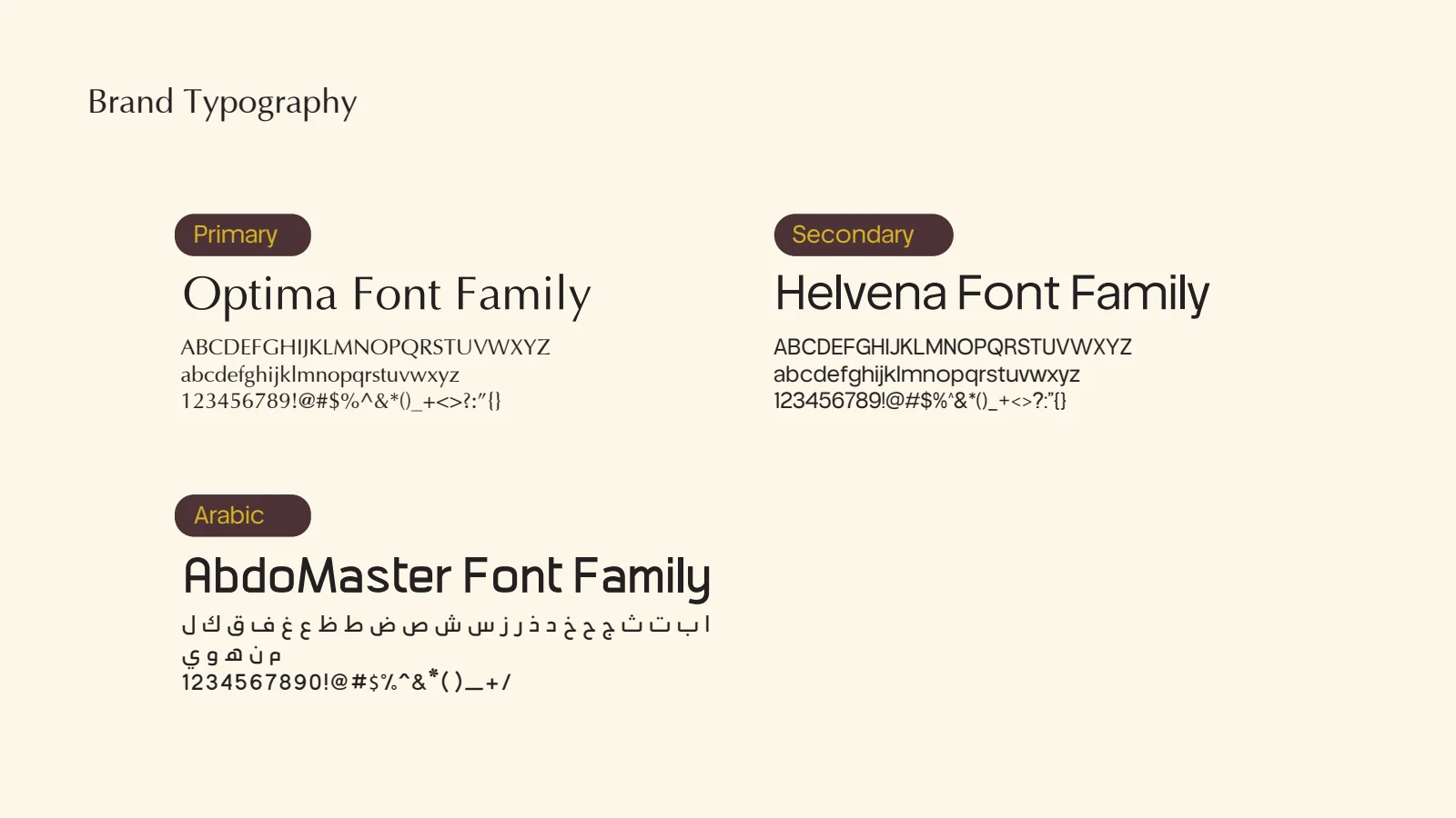
Jumanah Foods: Typography guidelines
Typography guidelinesThe source names the primary, secondary and Arabic type families.
Jumanah Foods: Brand pattern
Brand patternThe monogram becomes a repeating gold motif.
Jumanah Foods: Applications introduction
Applications introductionThe guidelines move from the identity rules into their applications.
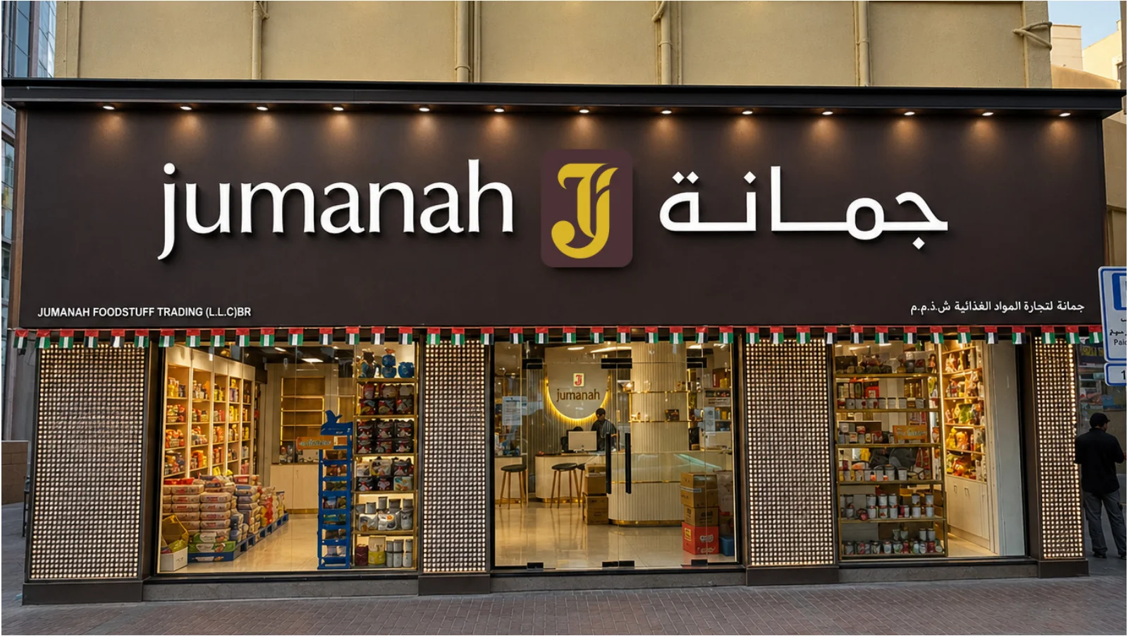
Jumanah Foods: Frontage application
Frontage applicationThe supplied frontage image shows the bilingual name and central monogram.
Jumanah Foods: Stationery mockup
Stationery mockupLetterhead and envelope mockups carry the colour and logo system.
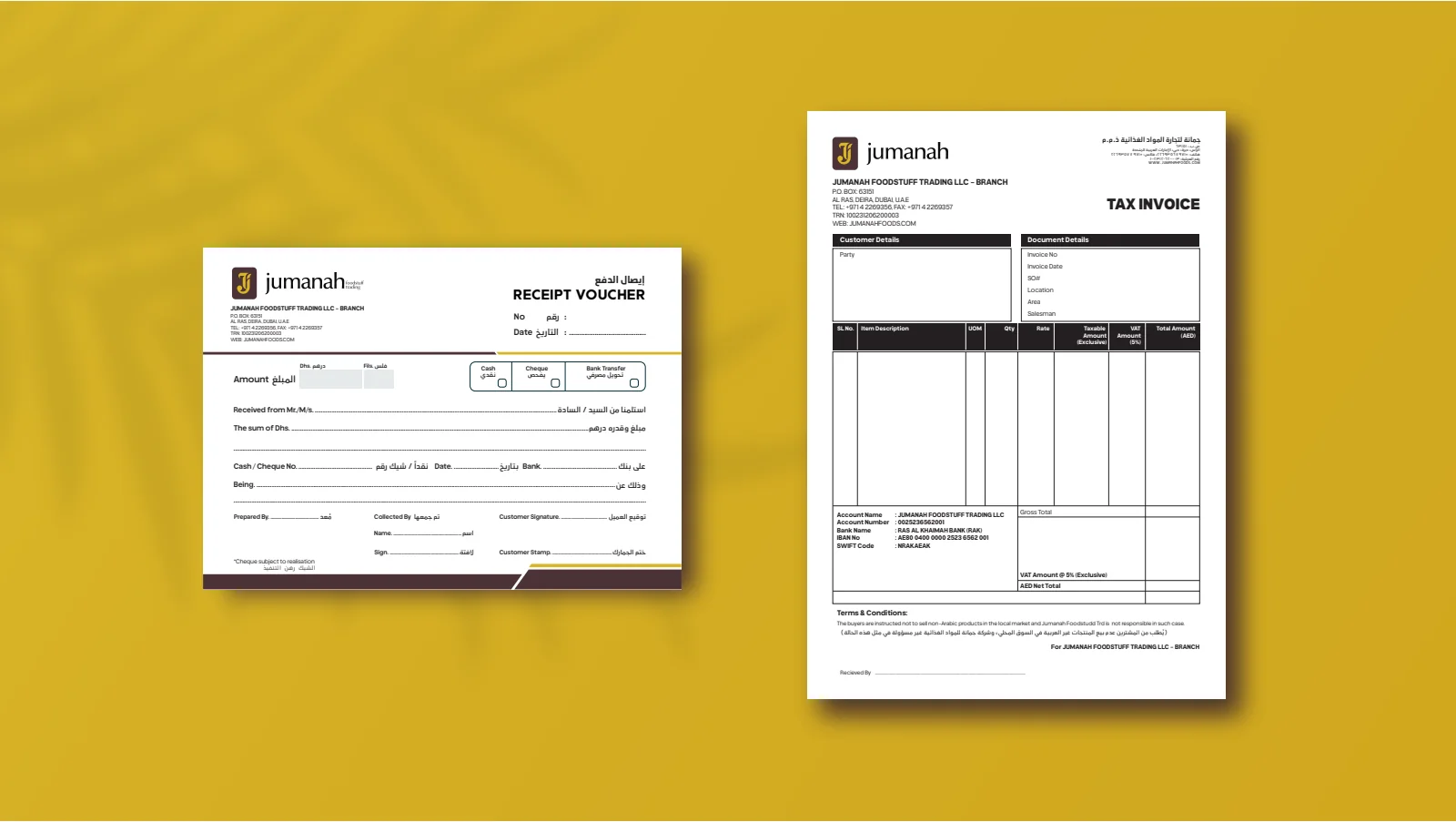
Jumanah Foods: Business-document templates
Business-document templatesBlank receipt and invoice layouts demonstrate the information hierarchy. No transaction or commercial result is claimed.
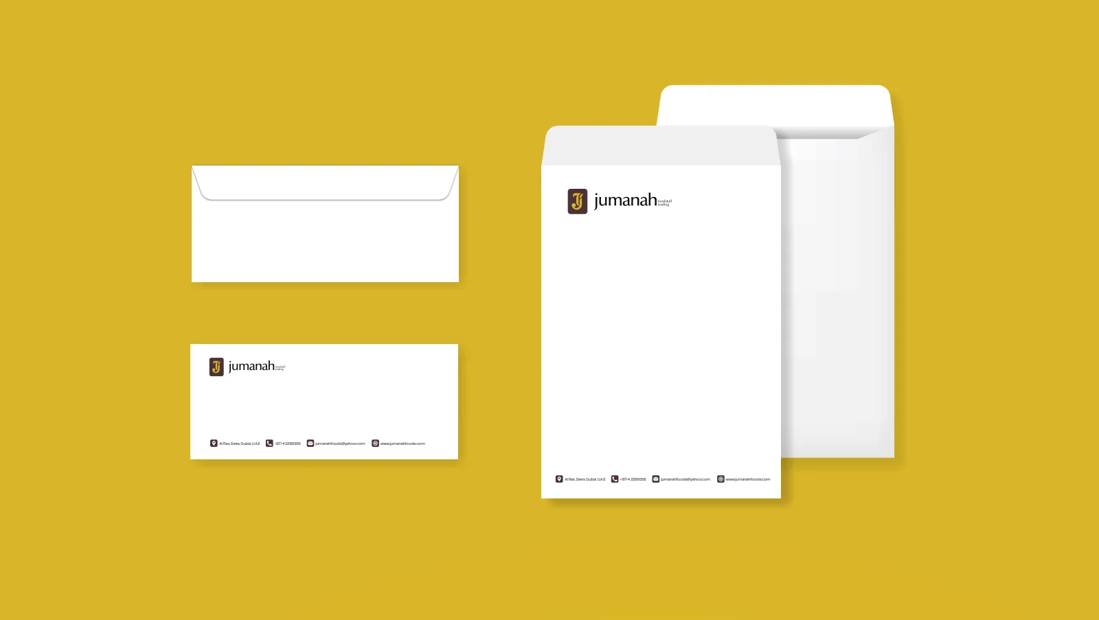
Jumanah Foods: Envelope applications
Envelope applicationsWhite envelope layouts use the logo and supporting contact hierarchy.

What does your brand need next?

Let’s talk about your project

Next projectStryv

Let’s talk

Tell us about your business.

You don’t need all the answers. A few lines about where you want to go is enough to start.