Restaurant
Aghadeer
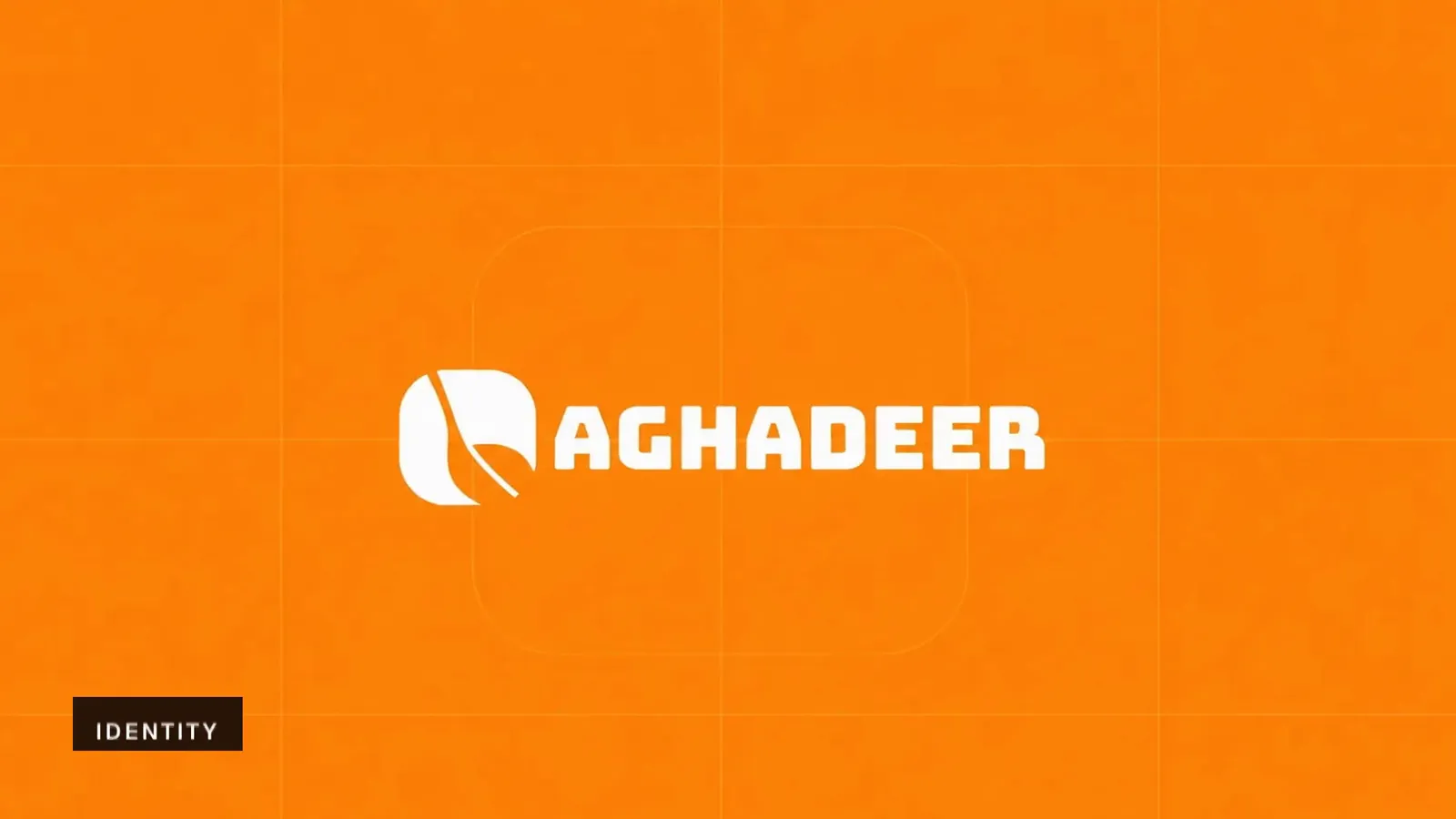
Aghadeer brand film. Motion film made from the original Aghadeer identity boards and brand applications.
Overview
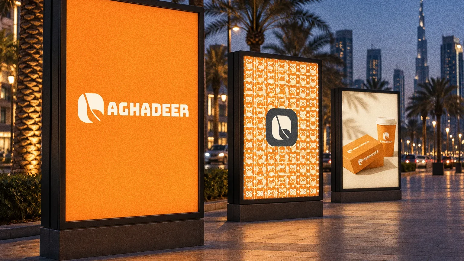
An identity for Aghadeer that combines a spoon, a leaf and a plate into one rounded symbol beside a bold wordmark.
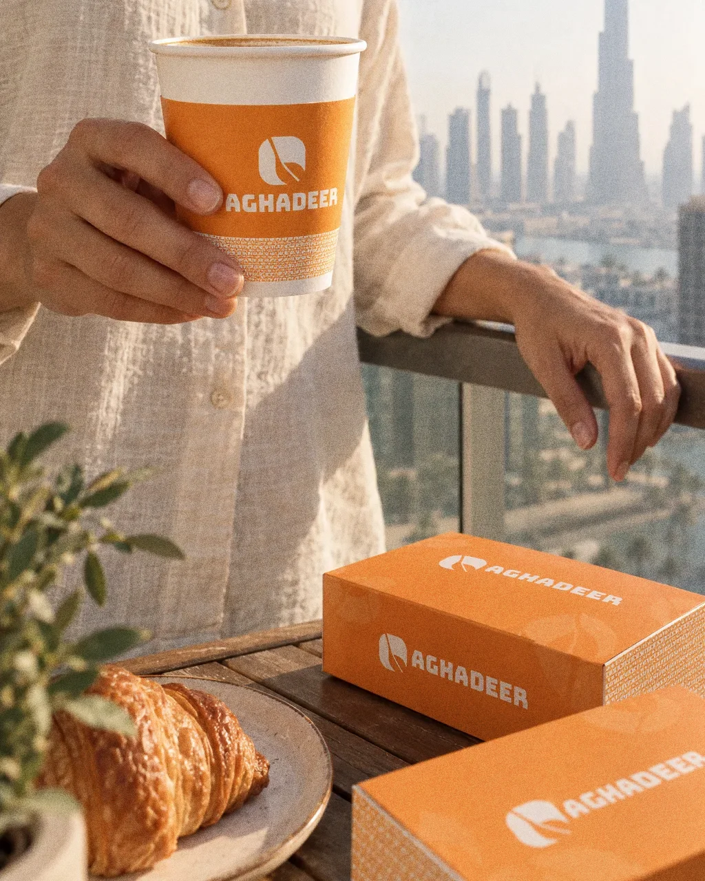
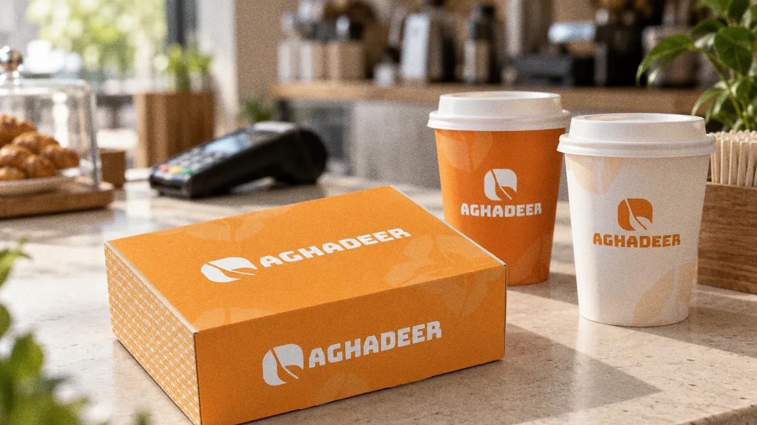
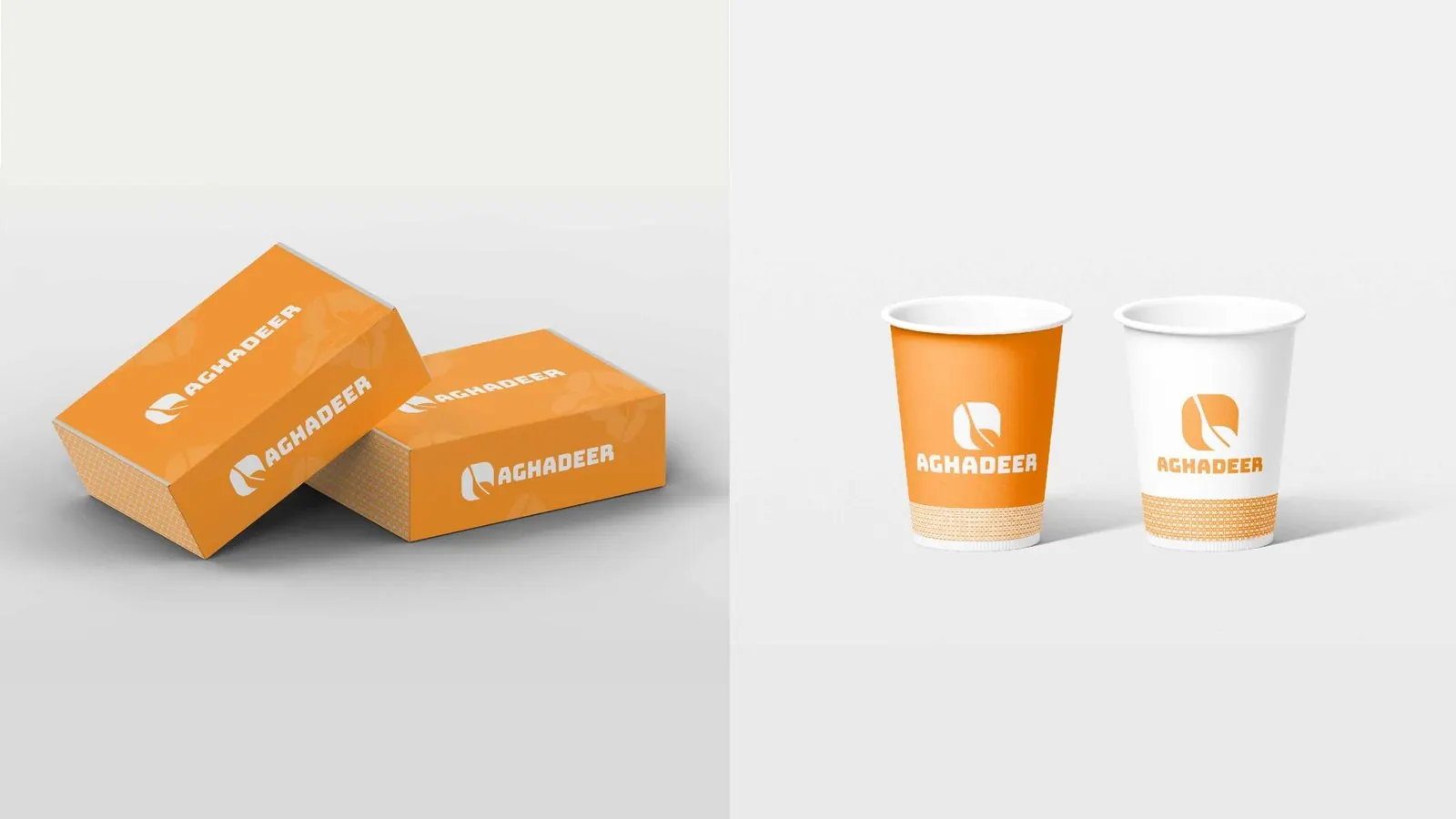
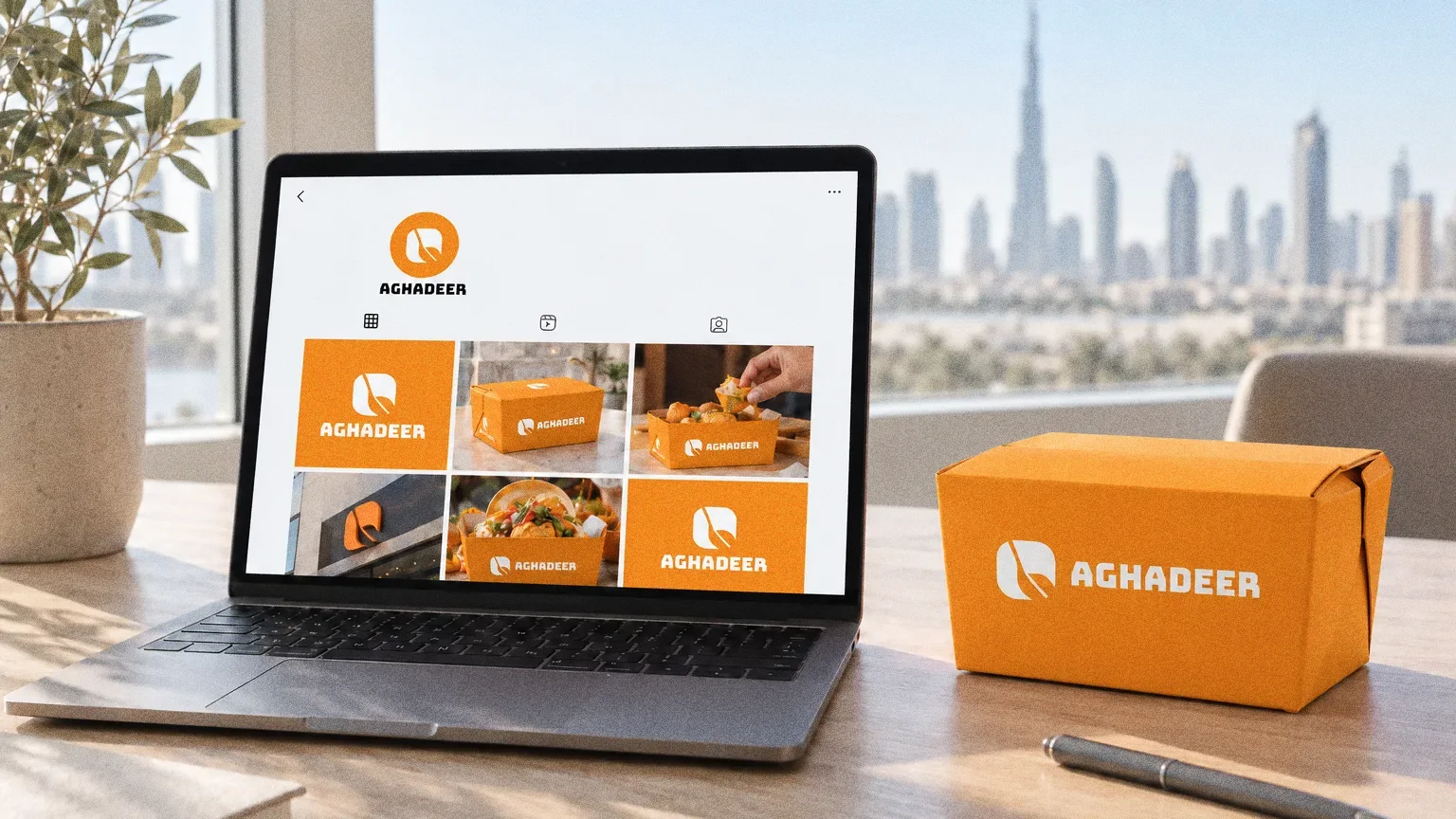
The presentation specifies an orange-led palette, Bungee typography and a pattern, and applies them to boxes and cups. Abcon also built the Aghadeer website.
BriefThe food identity needs to carry from a small cup to a broader restaurant presence. The design task is to connect the food-related symbol, bold name and supporting graphics in one usable system.
Services
Scope
- Symbol and wordmark
- Colour palette, typography and pattern
- Packaging applications
Sources
How to read this deck
The deck pairs the client’s original presentation boards with new application scenes that show the identity in use.
Some of the older boards have been redrawn. Each one sits where the original stood, with the real original design in its corner and a View original button to open it in full.
Chapter 01
Concept and inspiration
Chapter 02
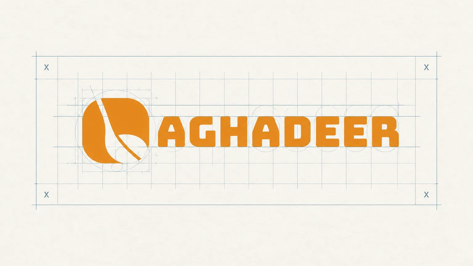
How the logo was formed
Chapter 03
The logo
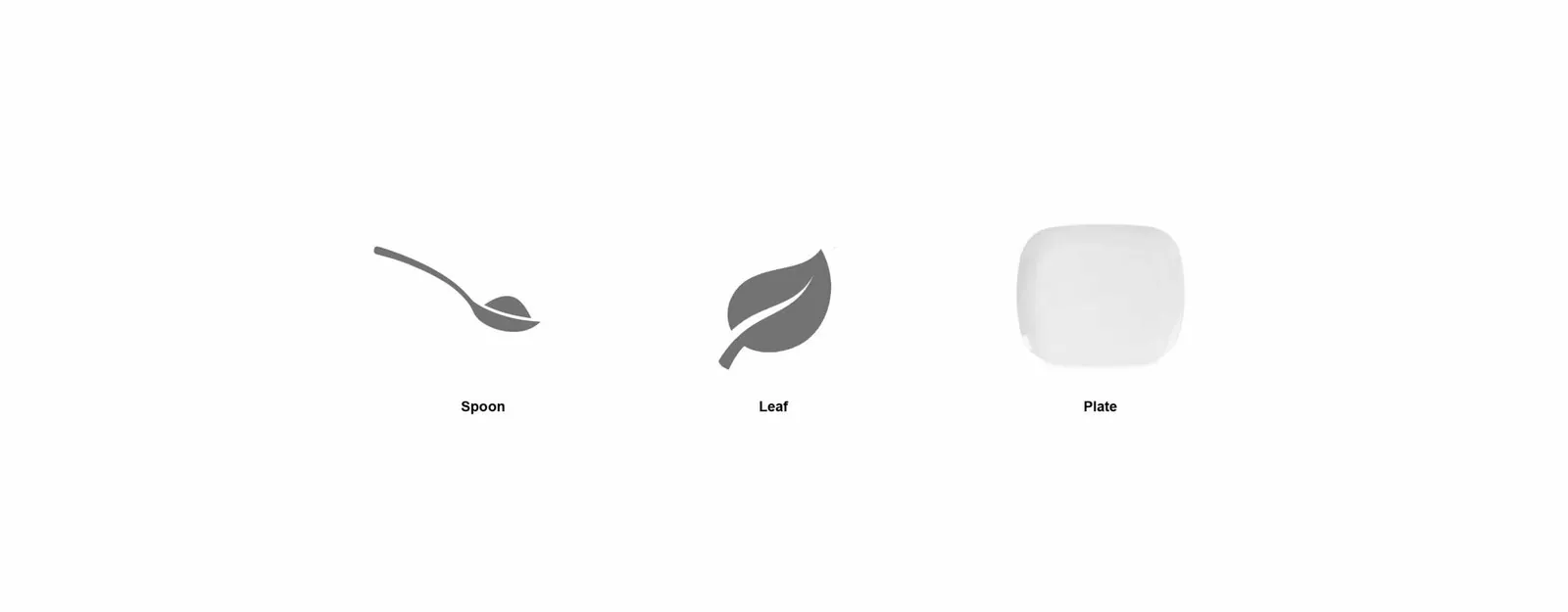
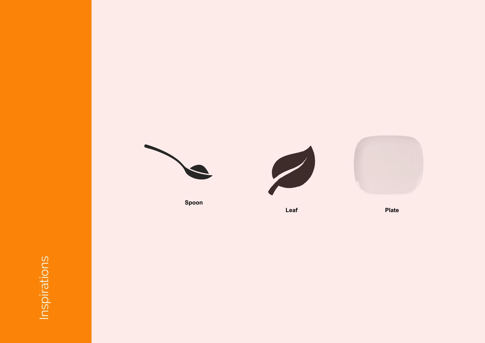
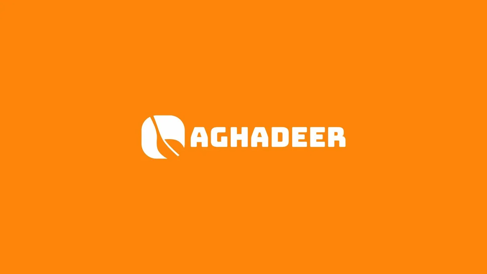
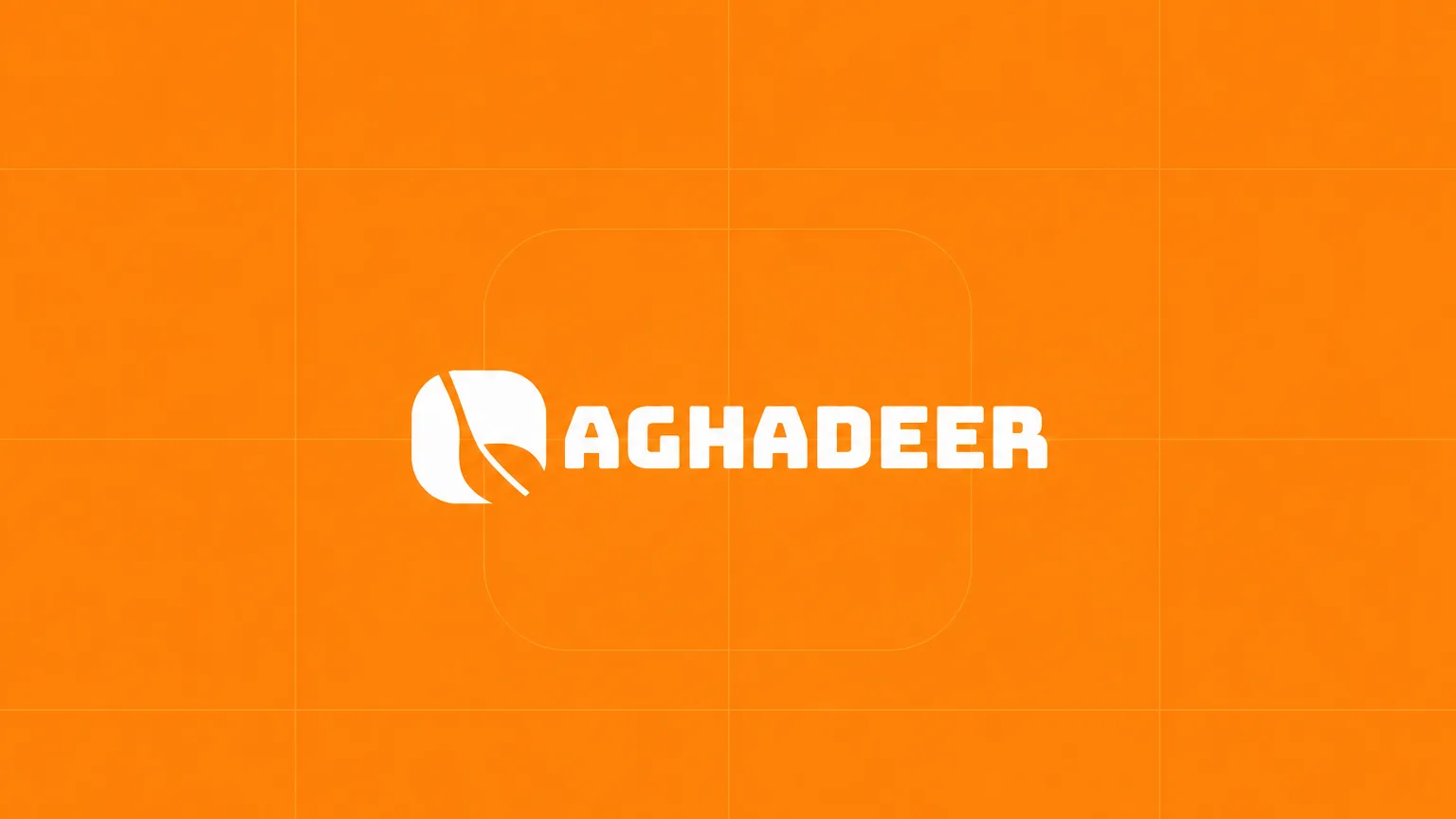
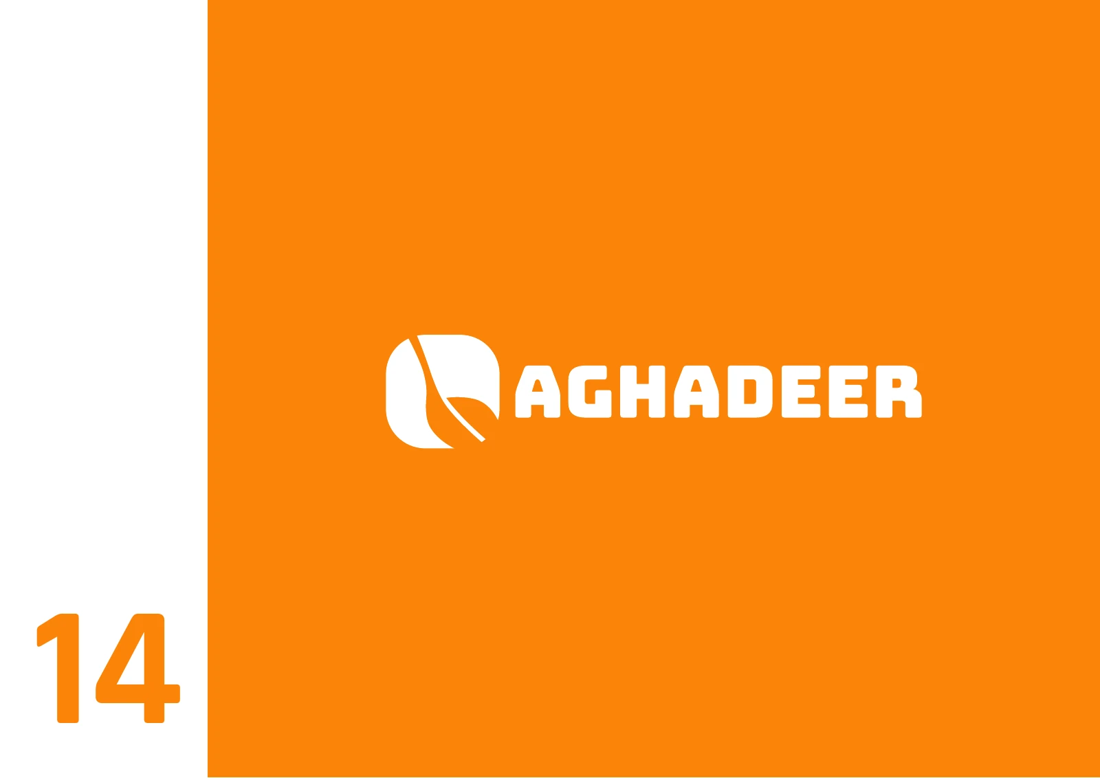
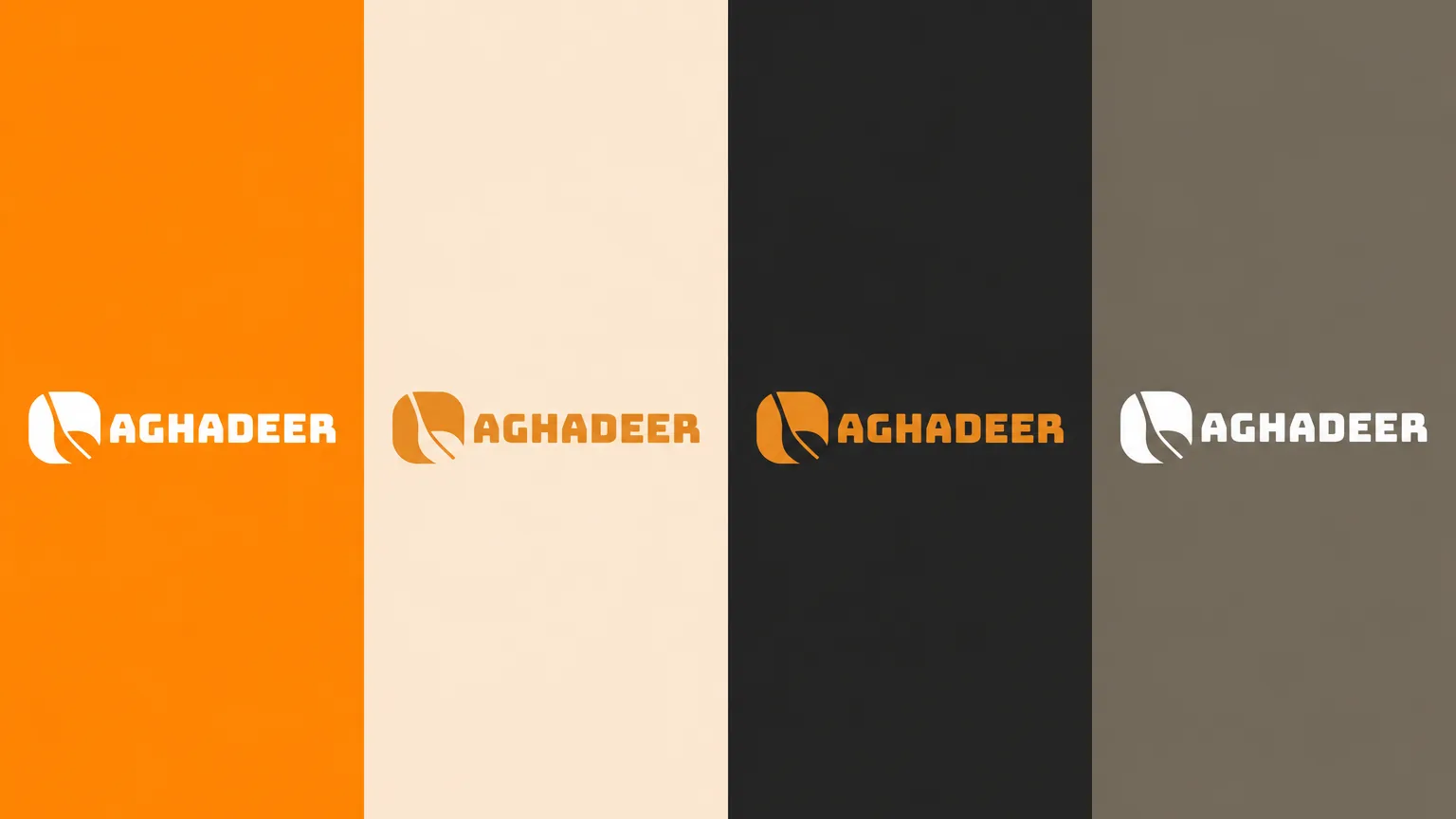
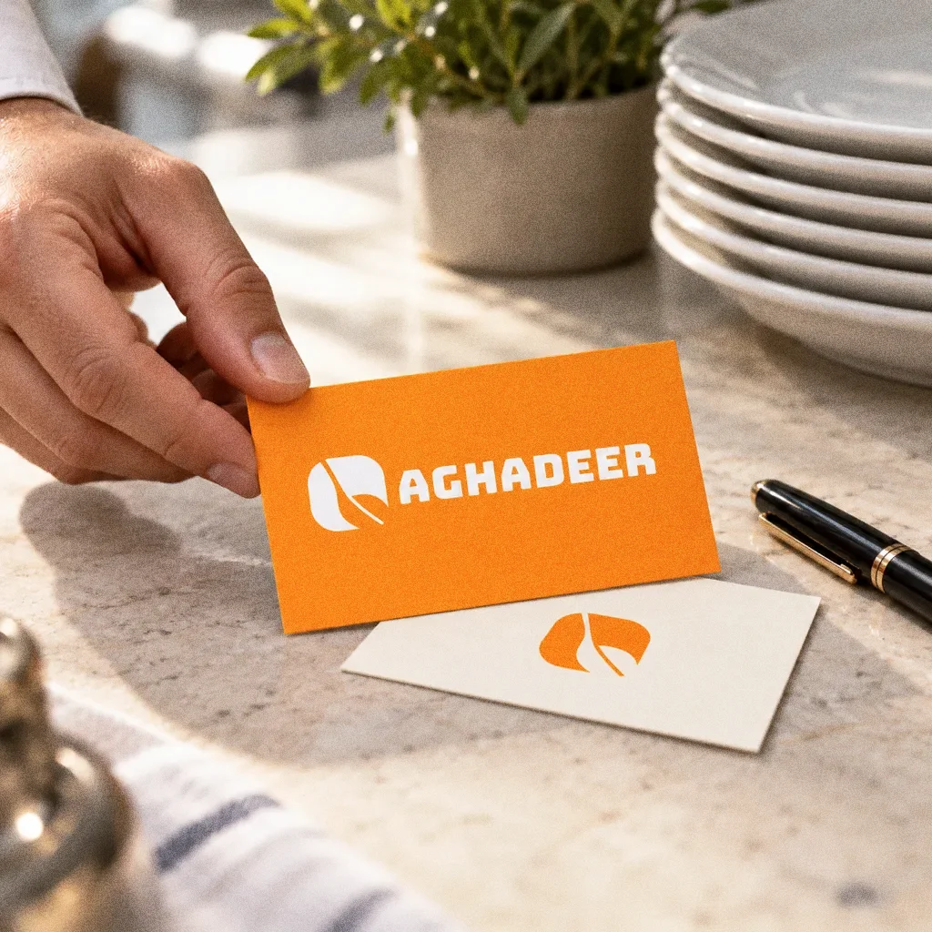
A spoon and leaf share one rounded emblem, with the plate reference explaining its outer shape. The compact symbol and bold AGHADEER wordmark give the original food packaging a clear focal point.
Three objects, one symbol
The inspiration board shows a spoon, a leaf and a plate. The symbol joins the leaf and spoon inside a rounded square, which works with the wordmark or on its own.
Chapter 04
Logo variations

Chapter 05
Colour
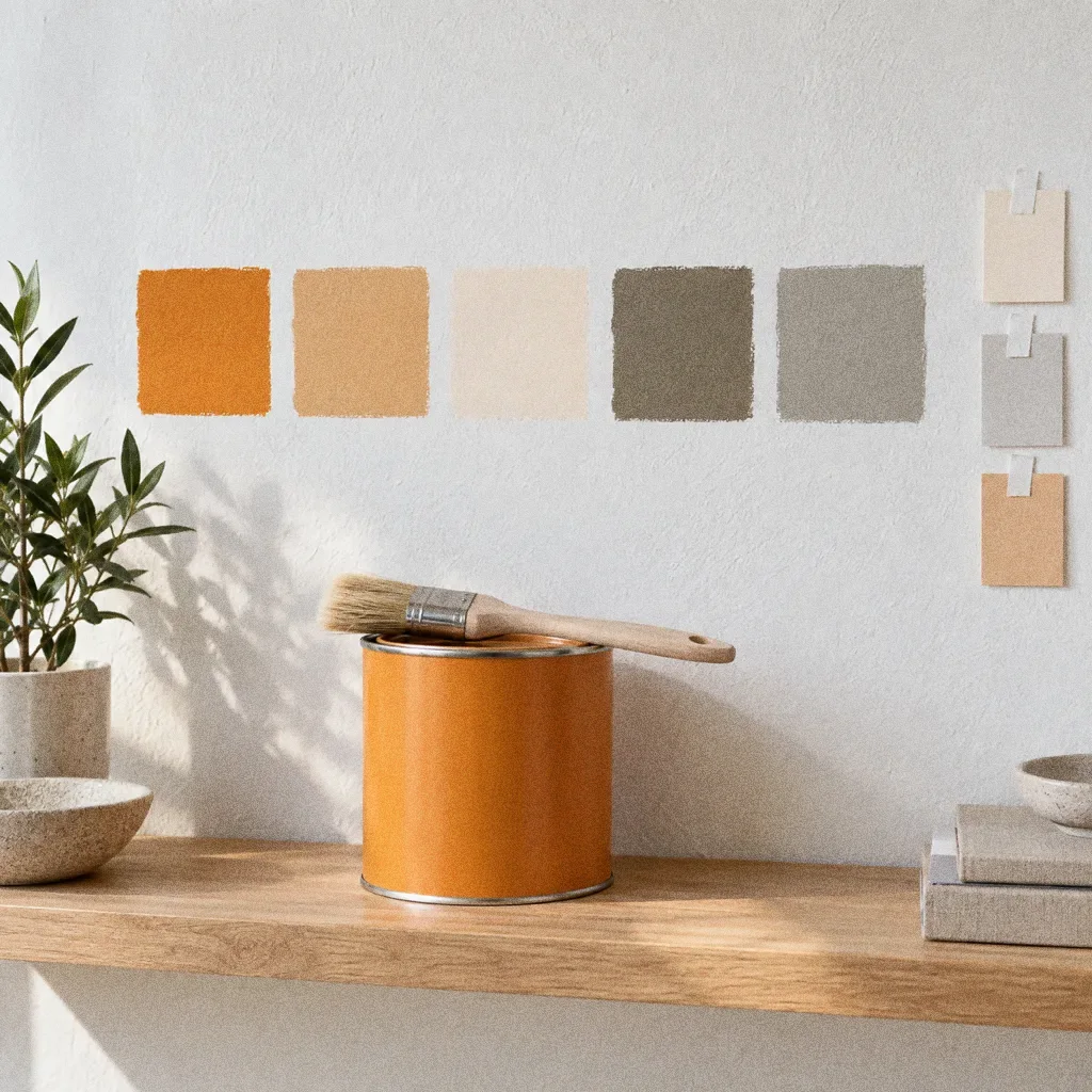
A specified system
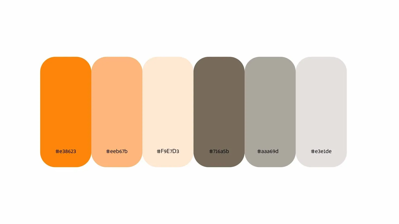
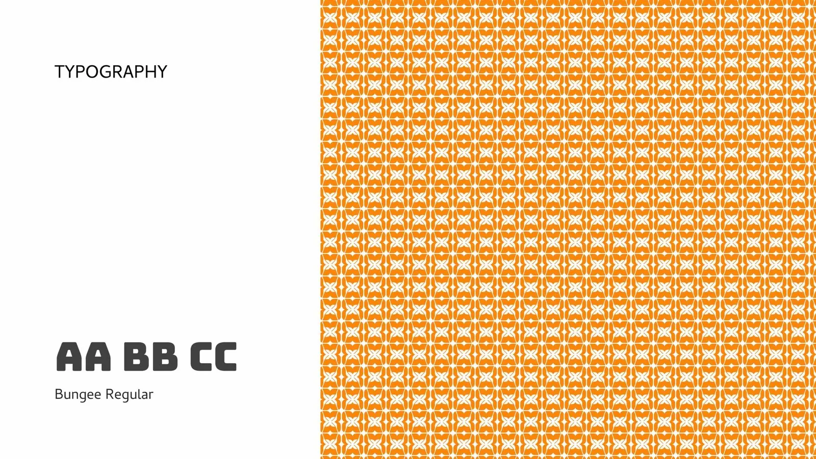
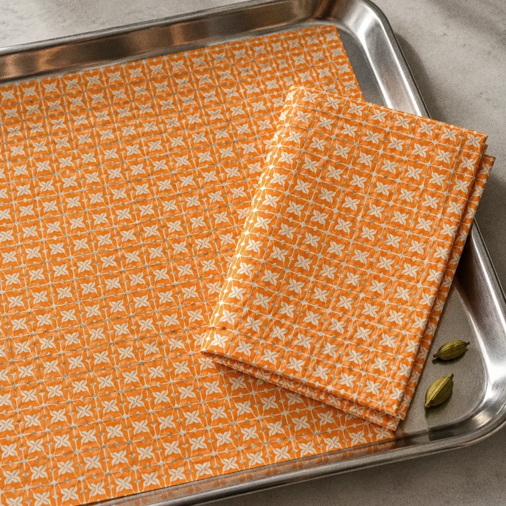
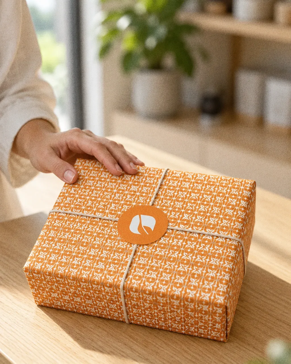
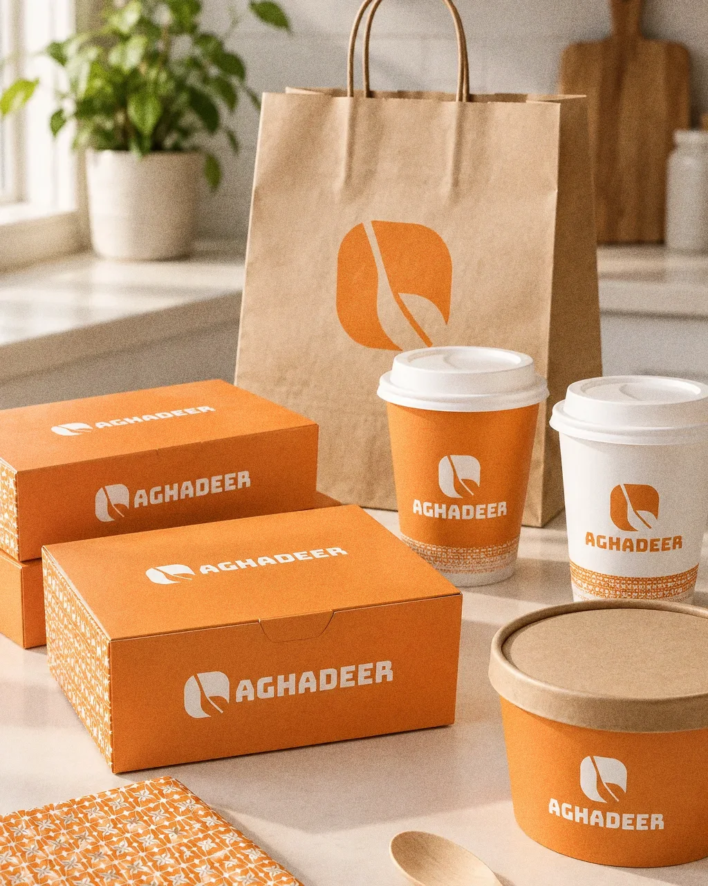
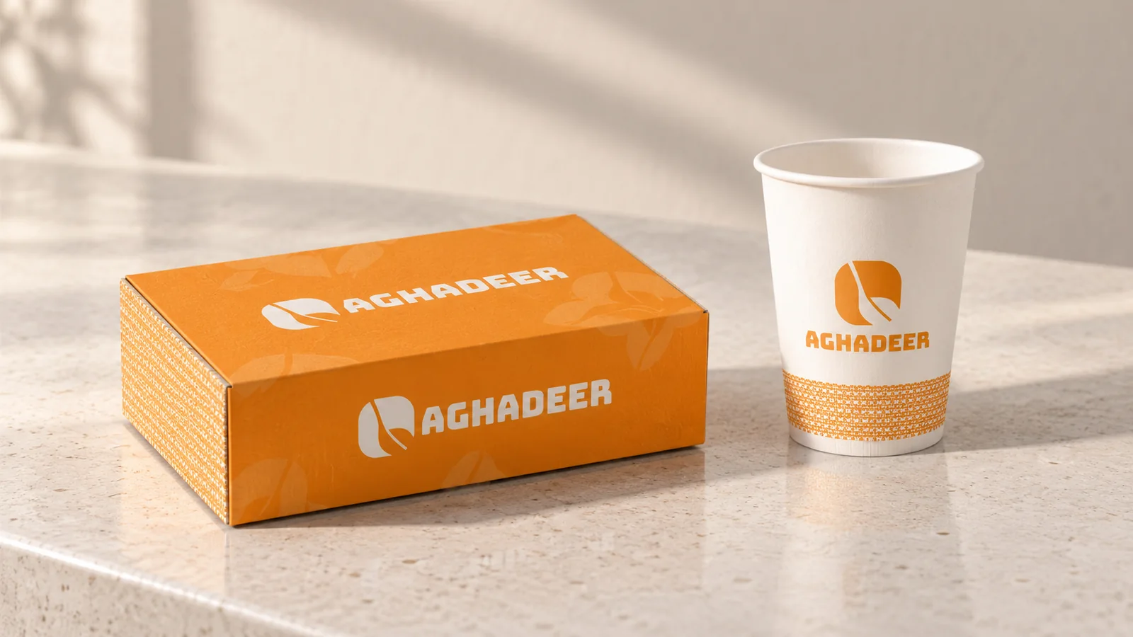
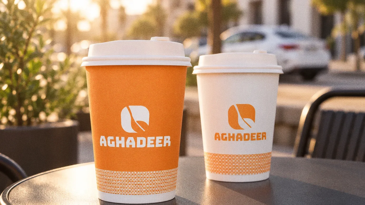
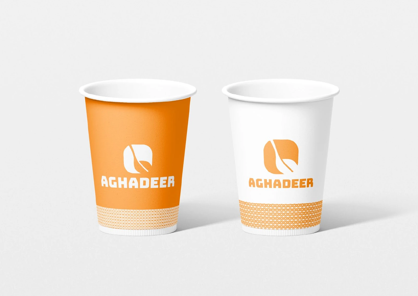
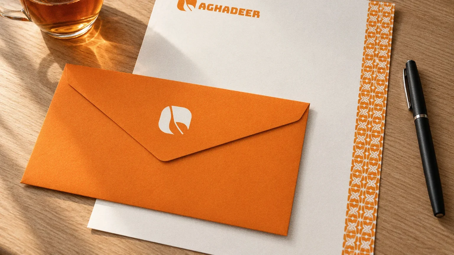
The palette board gives six colour values, from the lead orange (#e38623) to warm neutrals, and the typography board sets Bungee Regular beside an orange pattern. Boxes and cups use both.
- Accent
#FF8510 - Surface
#2B1608 - Ink
#FFFFFF
Colours sampled from the original identity boards.
Chapter 06
Typography
Chapter 07
Pattern and graphic elements
Chapter 08
Packaging
Chapter 09
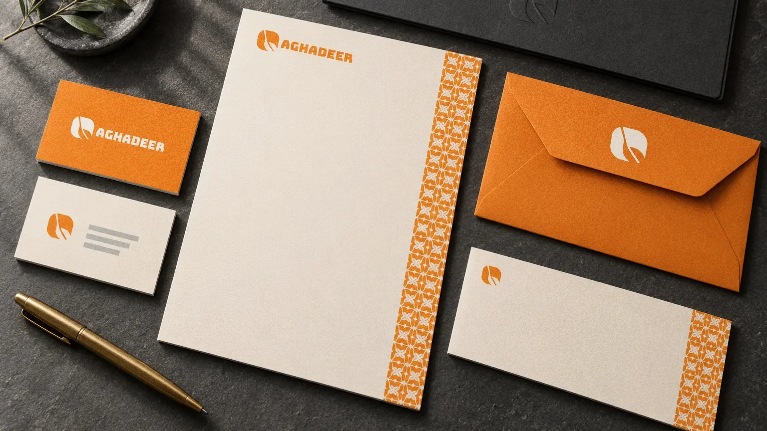
Stationery
Chapter 10
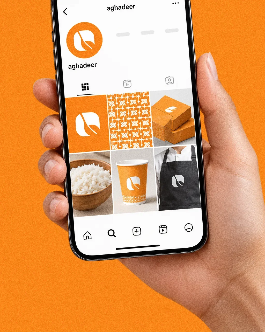
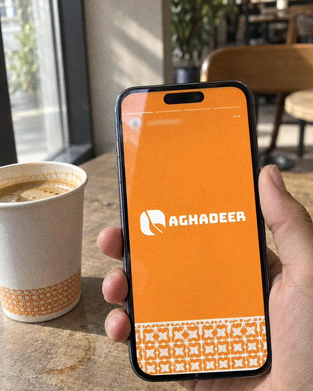
Digital
Chapter 11
The brand in the world
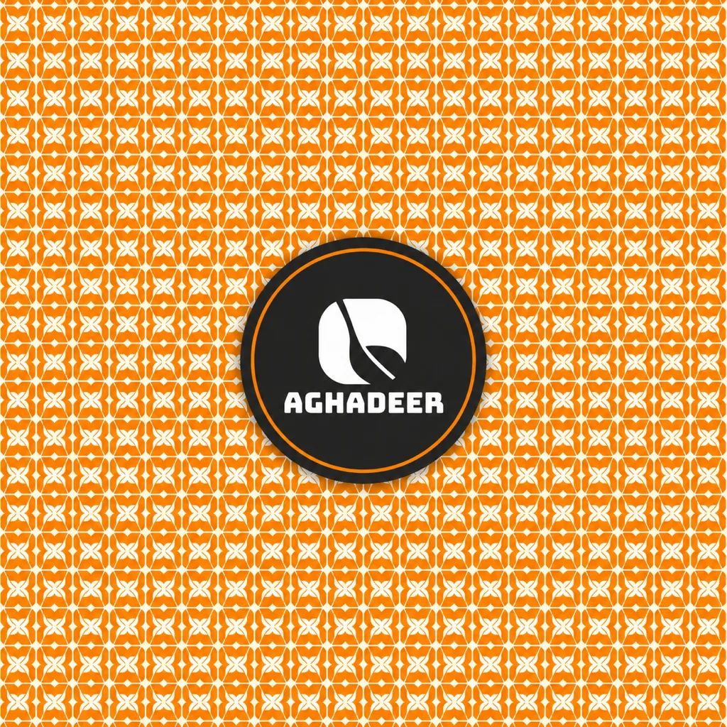
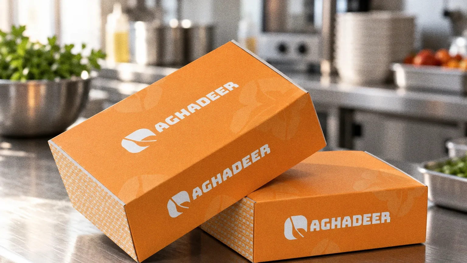
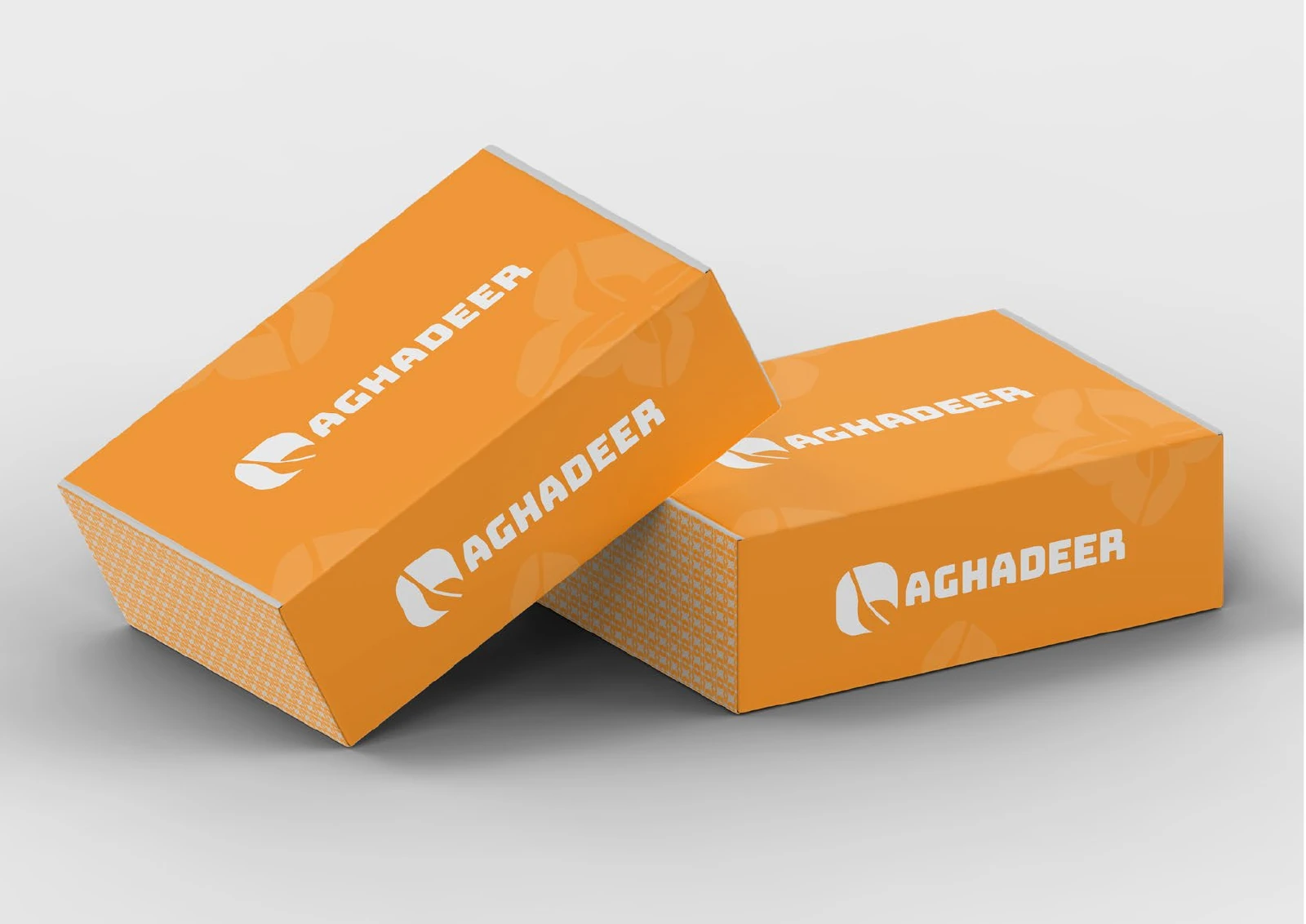
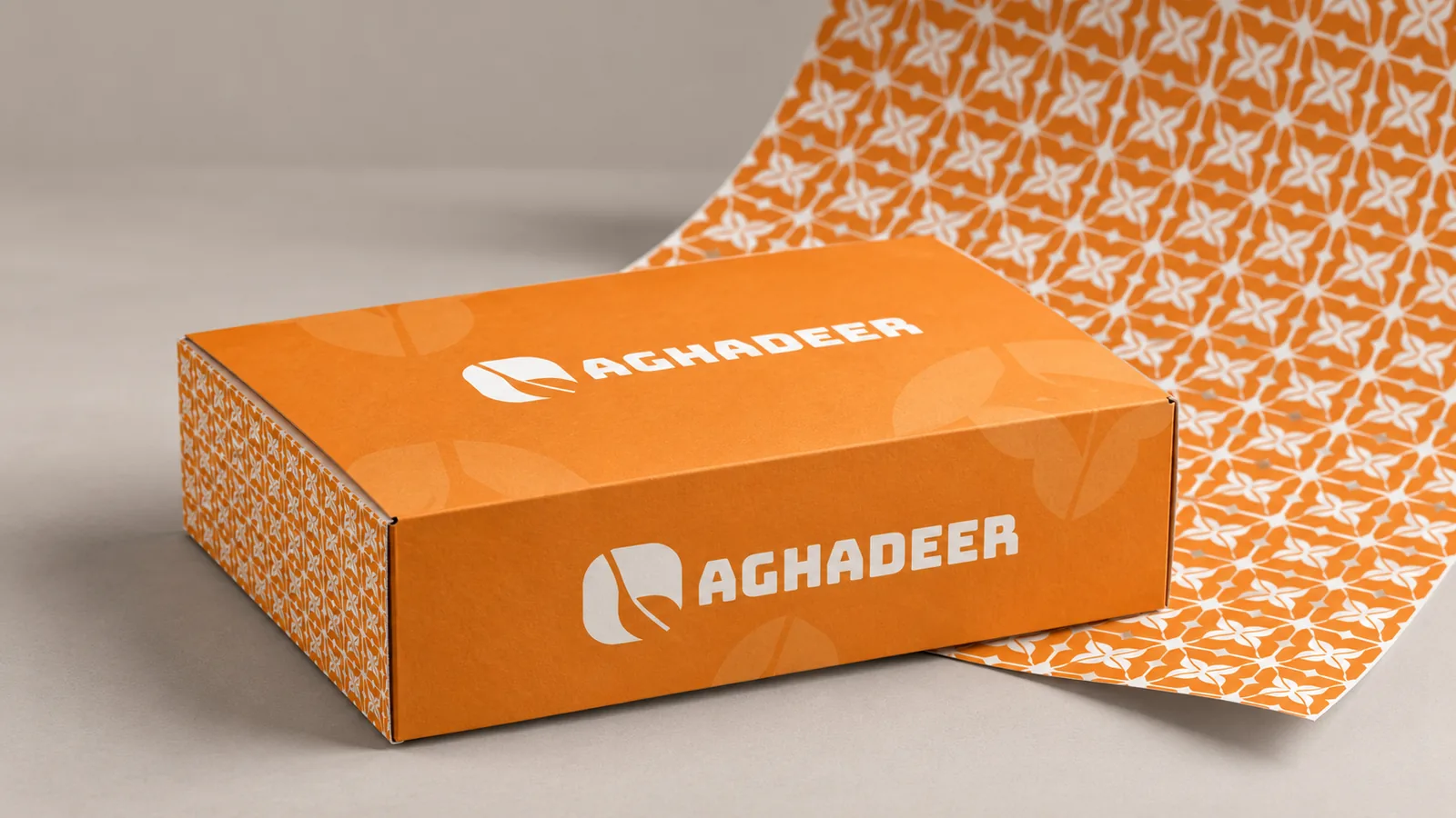
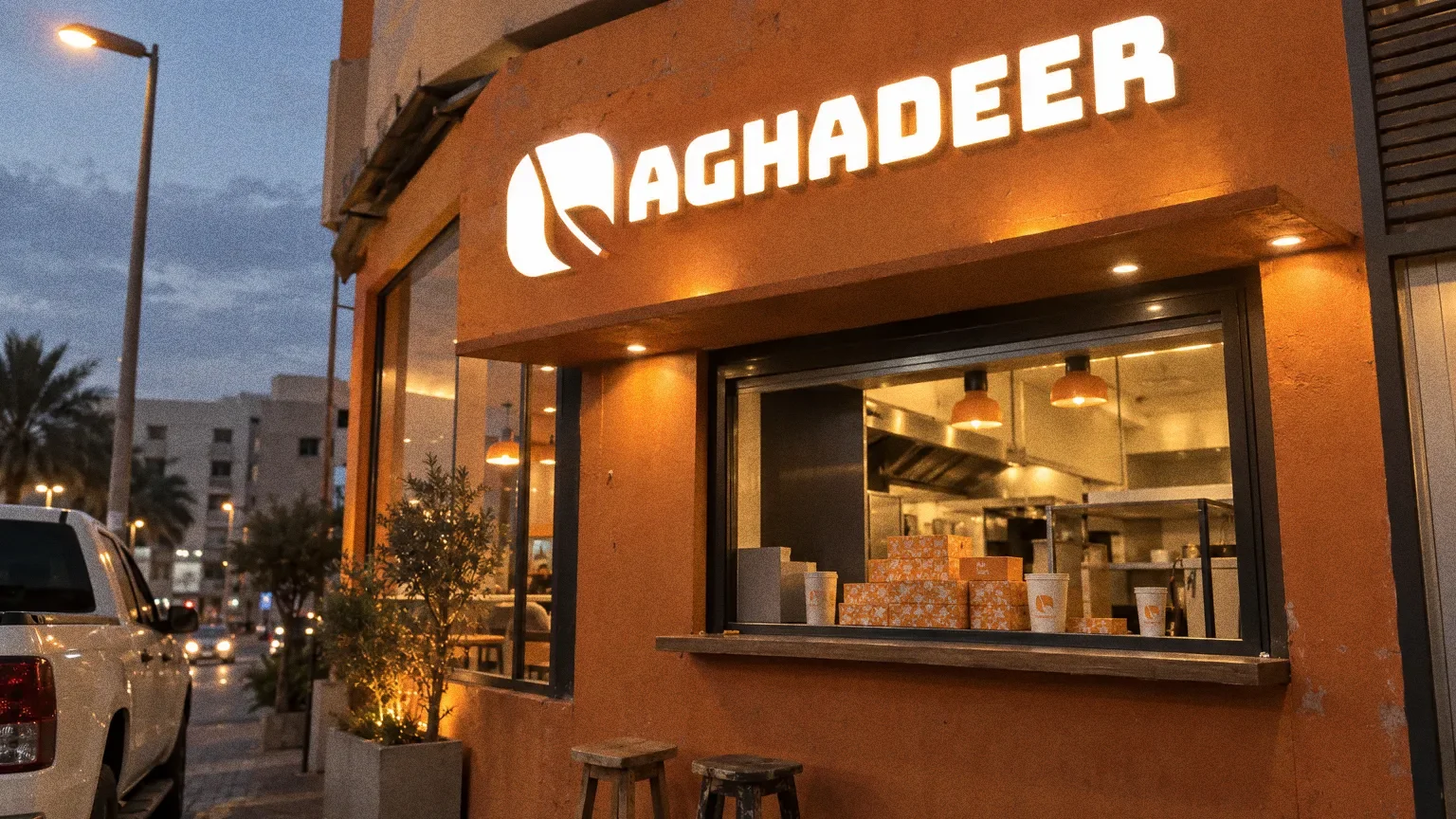
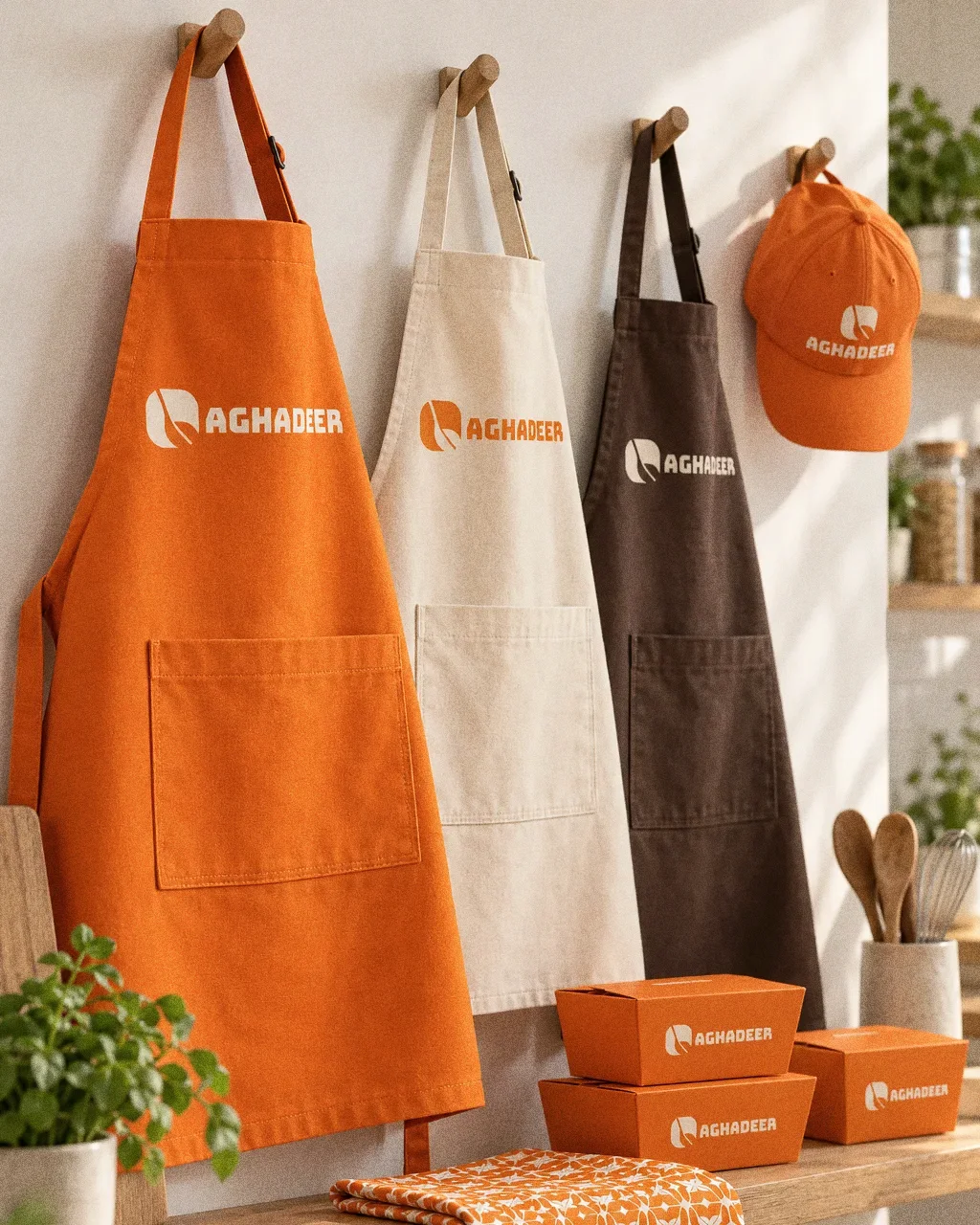
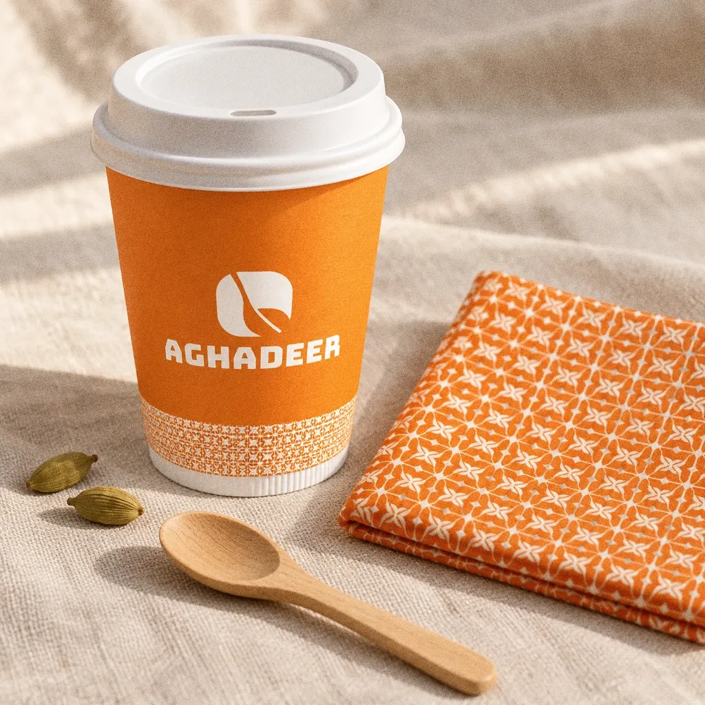
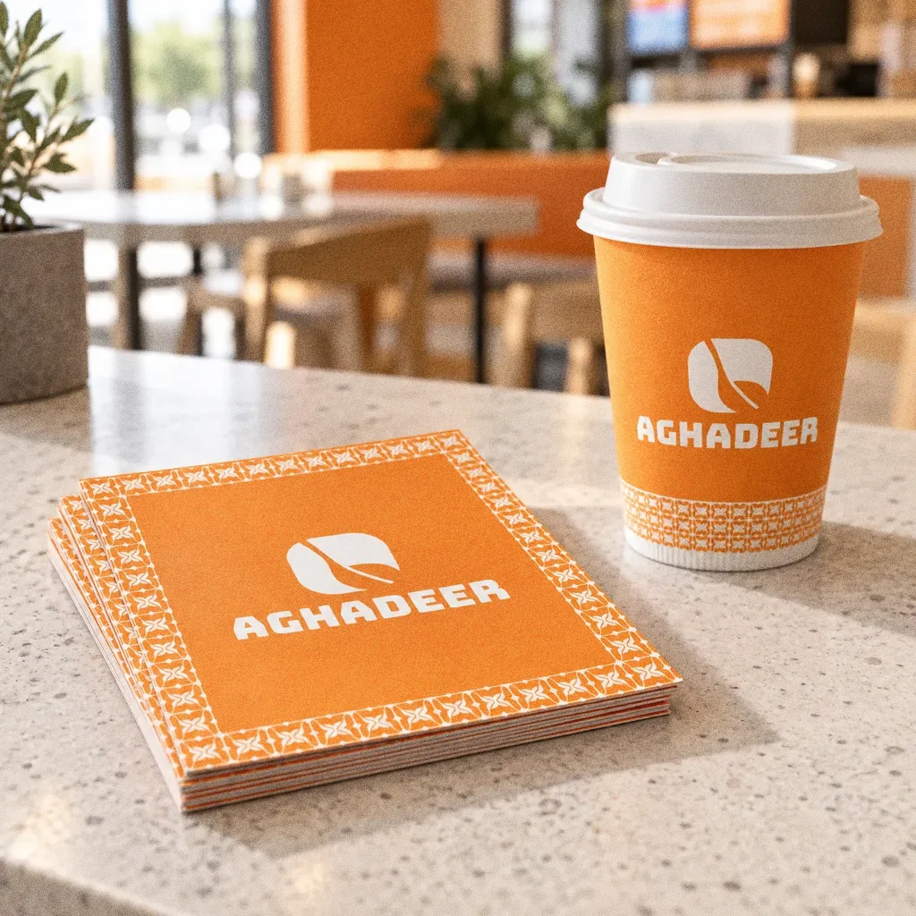
The original box and cup mockup applies the wordmark, emblem and repeat to takeaway packaging. Large orange areas and clear light-space placements keep the identity coherent across the two formats.
Chapter 12
In people’s hands
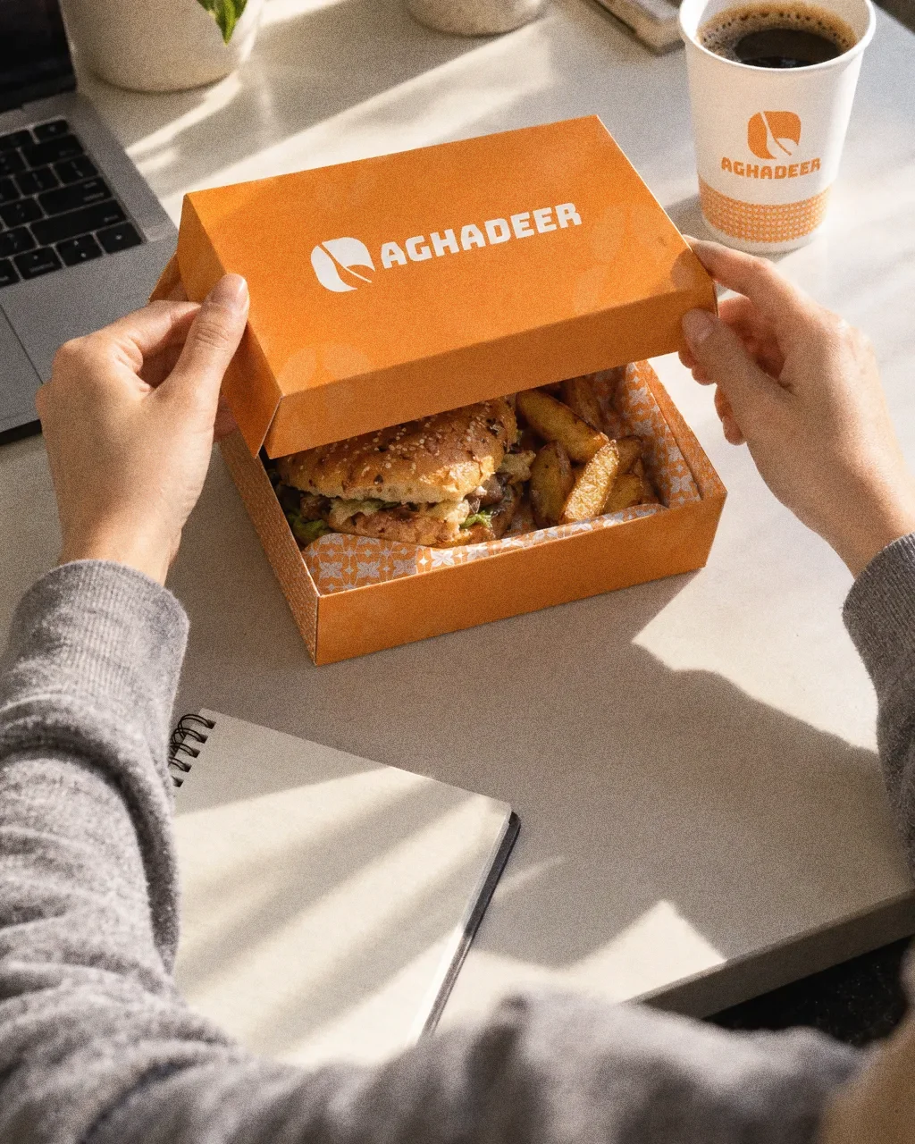
Orange box at the deskThe Aghadeer identity in a lifestyle photograph of an orange box opened on an office desk. 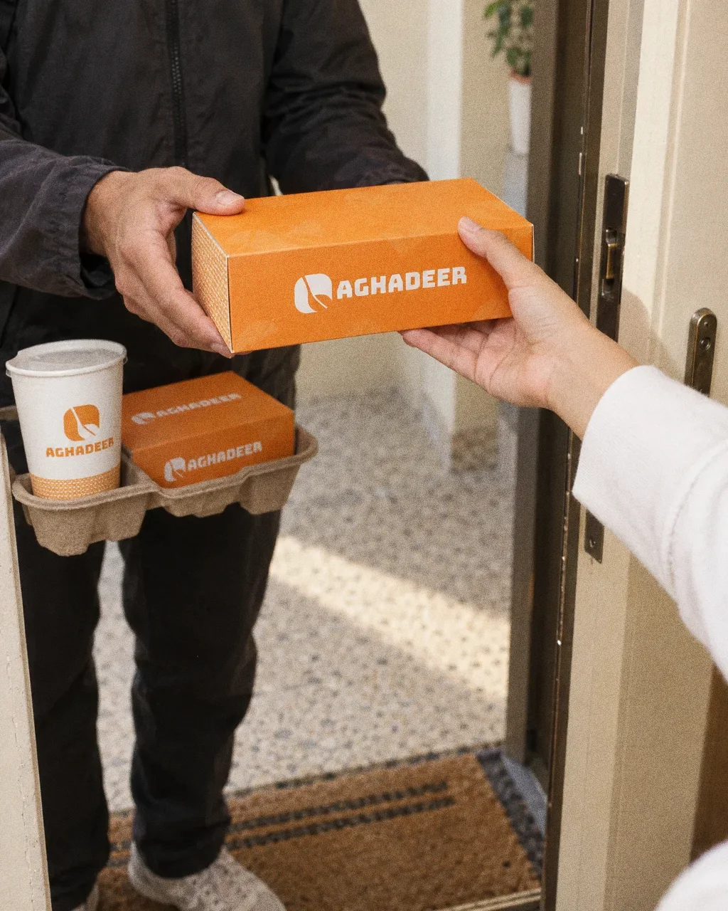
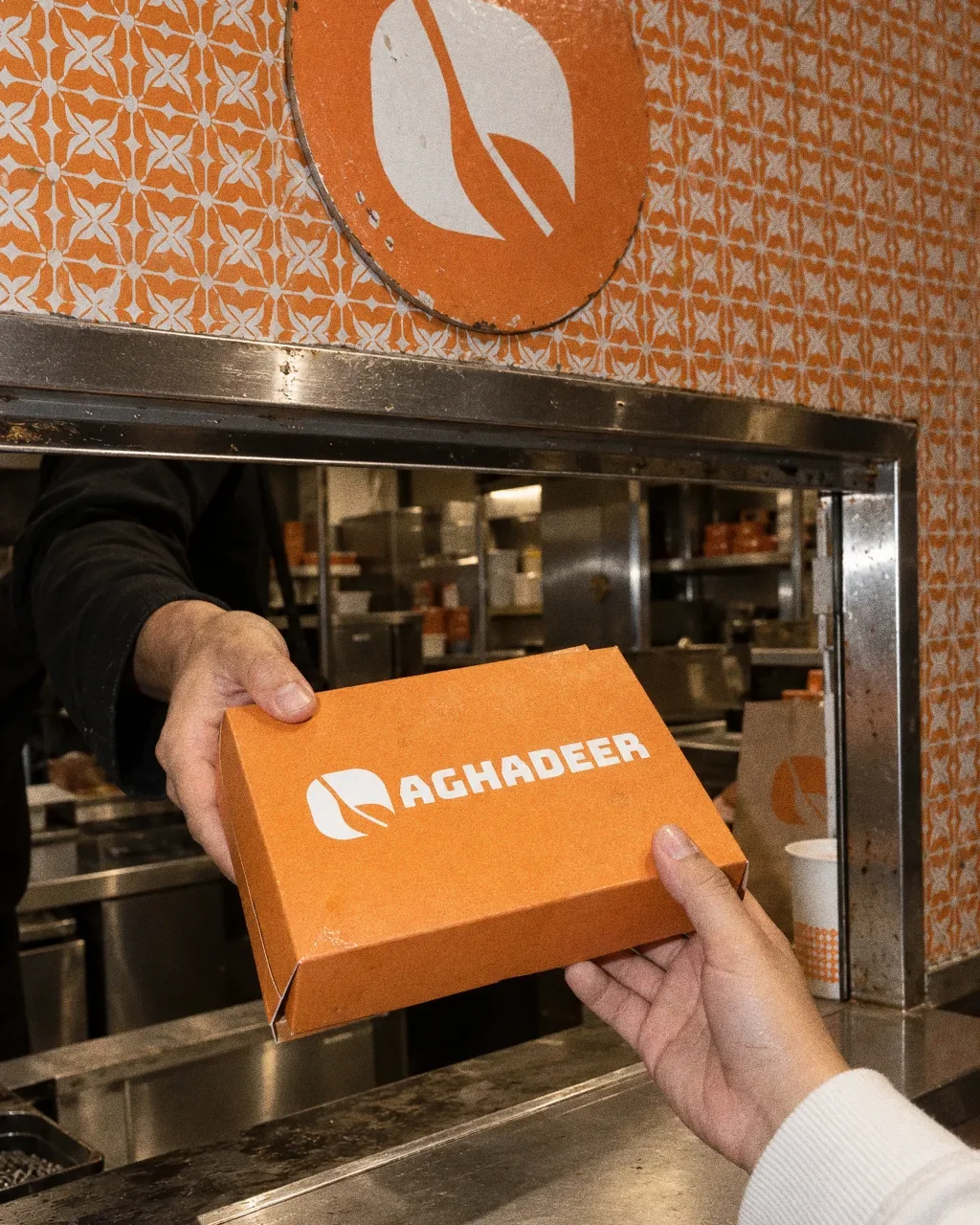
Doorstep handoverThe Aghadeer identity in a lifestyle photograph of a doorstep delivery handover. 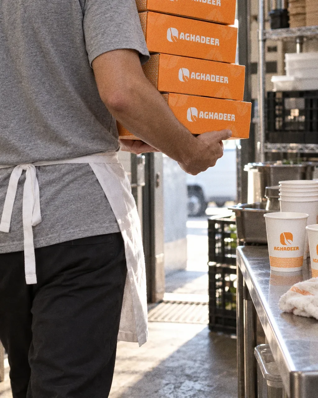
Boxes out the backThe Aghadeer identity in a lifestyle photograph of a stack of boxes carried through a kitchen. 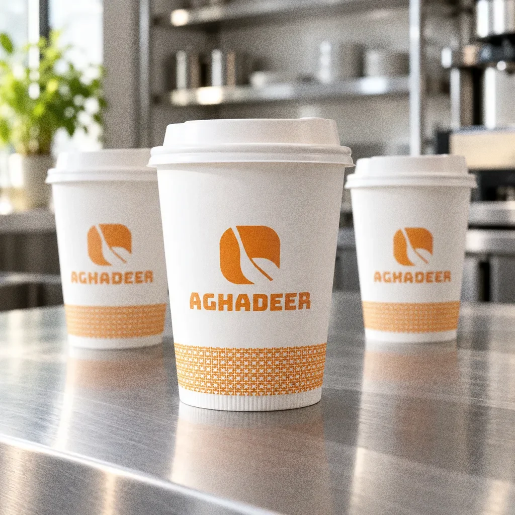
Three cups on steelThe Aghadeer identity in a lifestyle photograph of three cups on a steel counter. 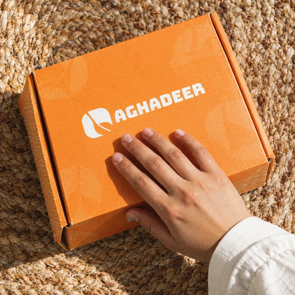
Box on a sisal matThe Aghadeer identity in a lifestyle photograph of an orange box on a woven mat.
Chapter 13
Campaign
About this deck
What we built
A spoon, leaf and plate symbol, orange-led palette, Bungee typography, repeat pattern and packaging applications. The portfolio also includes an Aghadeer website.
About the originals
The original boards are from Abcon’s original project presentation and include application mockups.