Branding / Fitness identity
Stryv
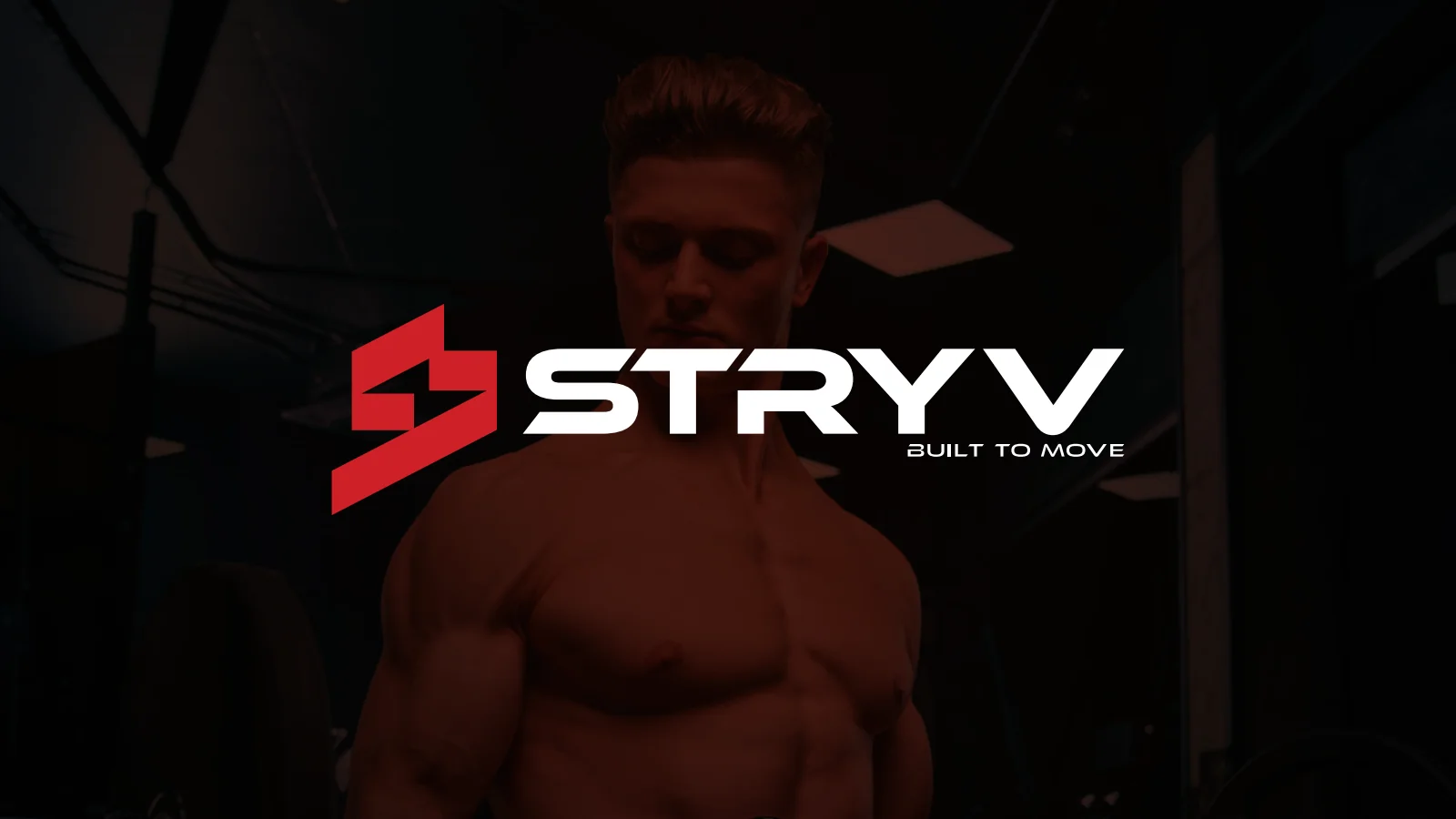
A red-and-black fitness identity with angular lettering, a compact S symbol and the line “Built to Move”, demonstrated across equipment, apparel and a digital icon.
Project scope
- Symbol and wordmark
- Logo construction and variants
- Fitness and digital application mockups
How the identity works
The design task
The original concept connects strength with movement. The design task is to make that idea visible in a mark that can work on an item of equipment, a piece of clothing and a small screen.
Build motion into the form
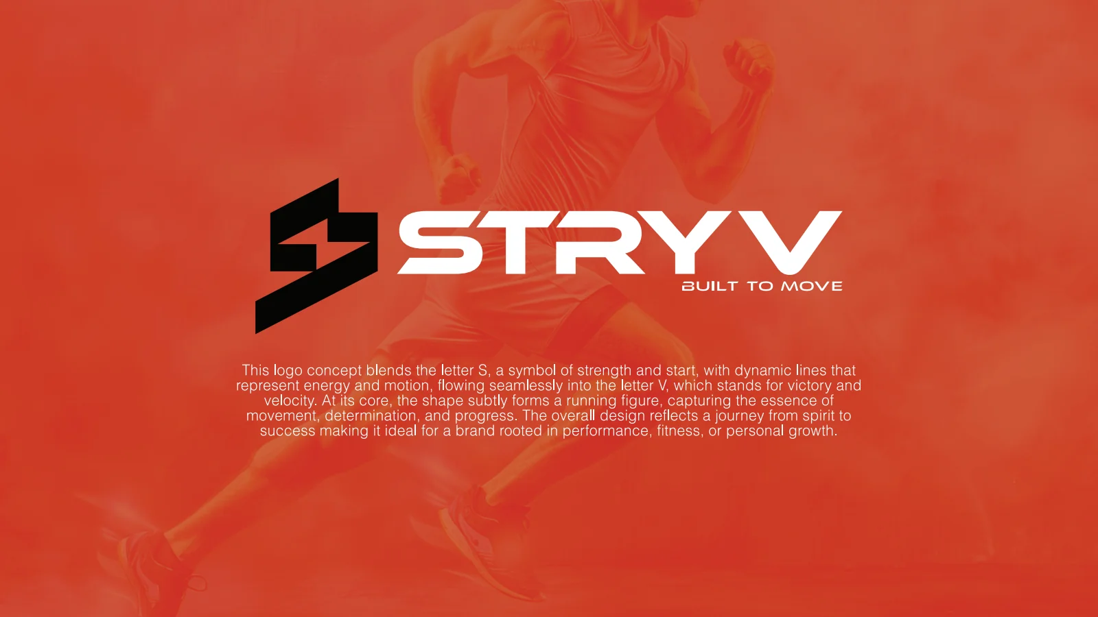
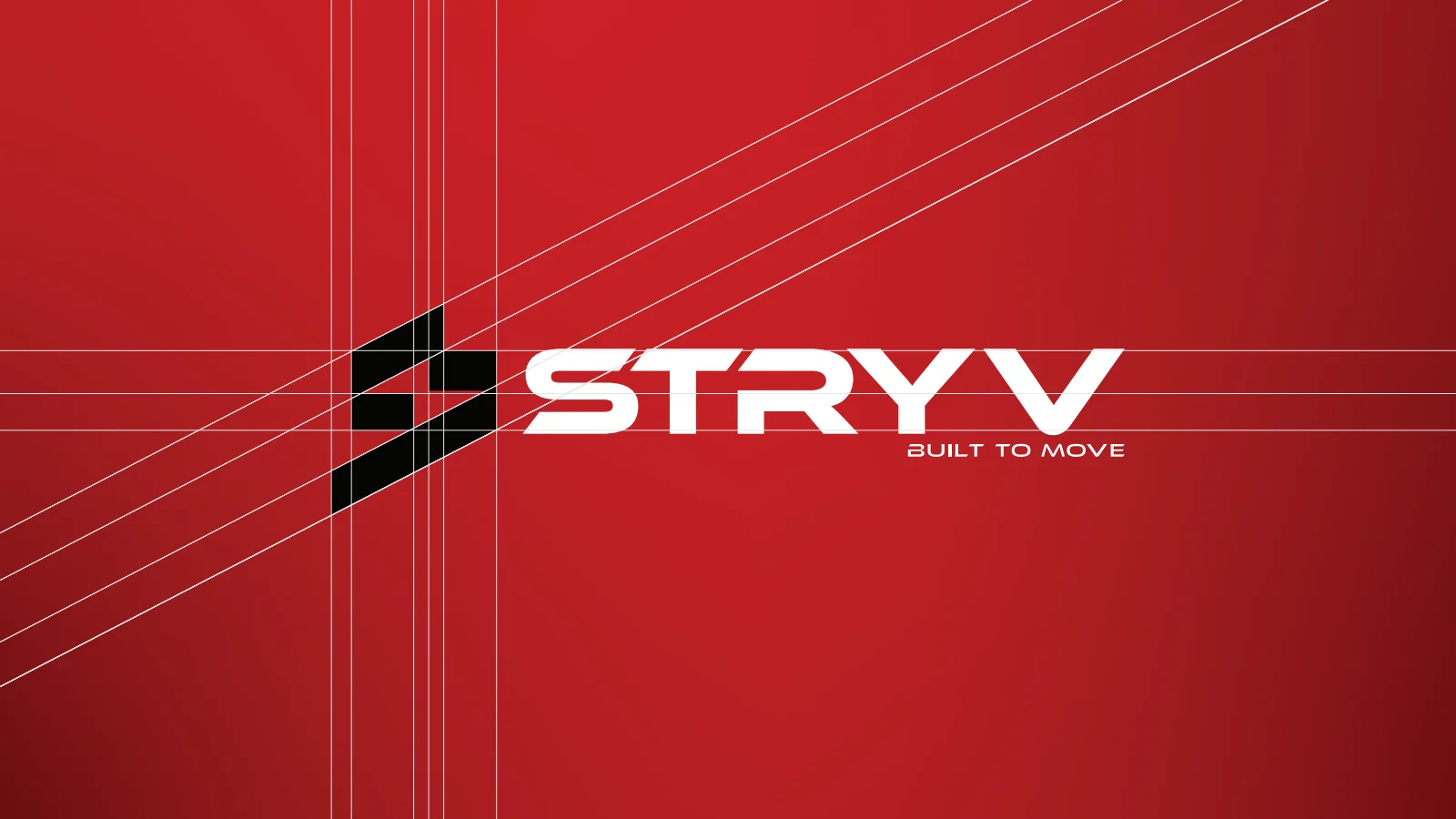
The supplied rationale connects dynamic lines with movement and energy. The construction board makes the relationship between the angular S symbol and slanted wordmark visible.
See the original boardKeep the symbol useful at a small scale
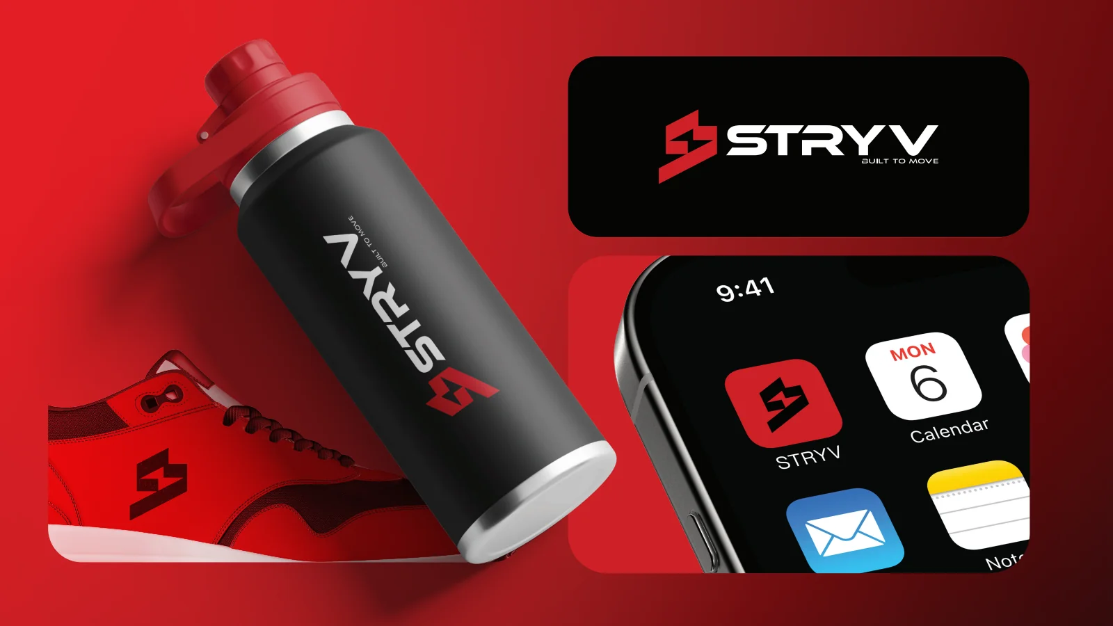
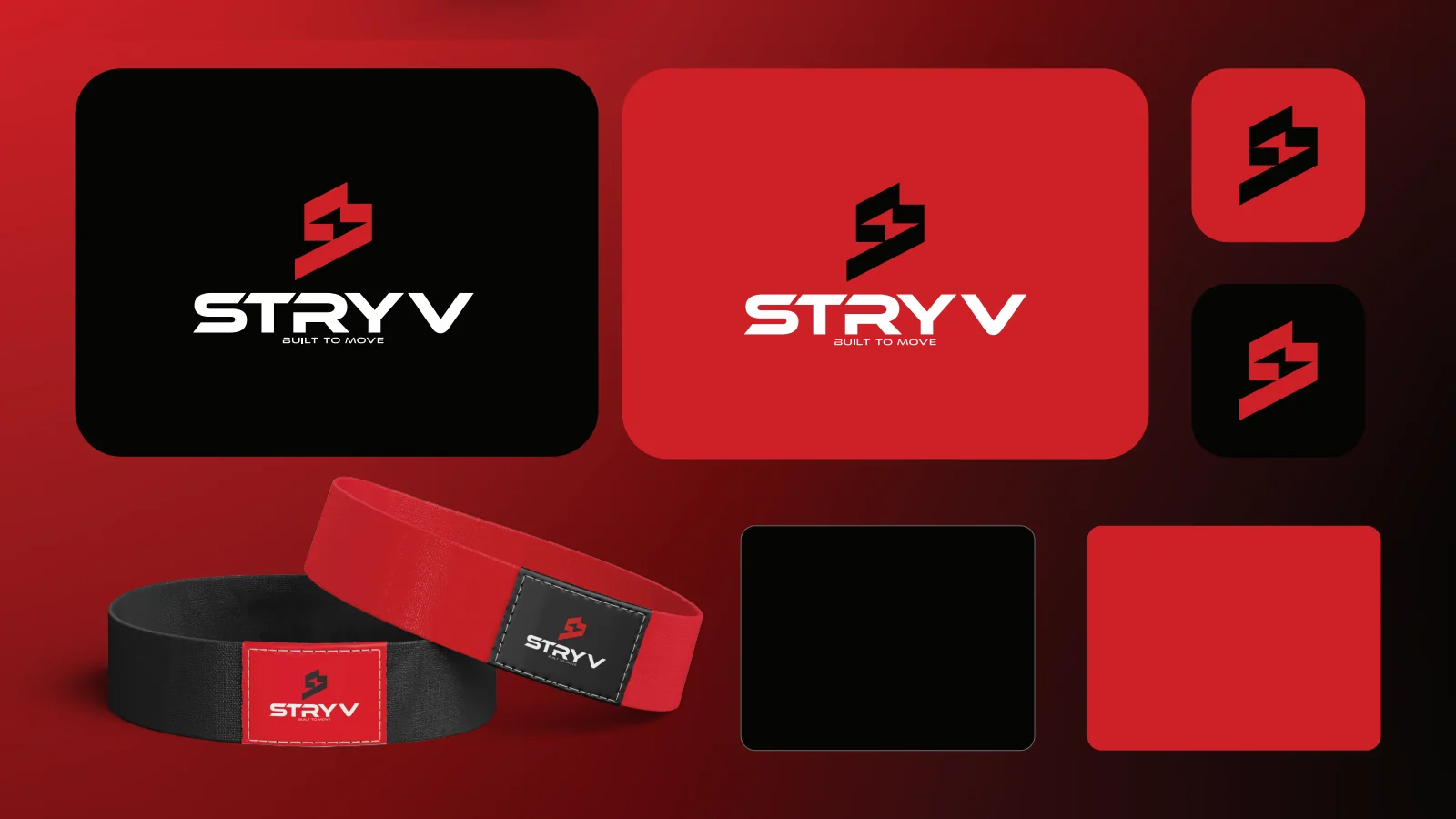
The presentation shows the full name on larger products and the compact symbol as an app icon. Red, black and white connect the different formats.
See the original boardWhat we built
An angular wordmark and symbol, logo construction and colour variants, with fitness-product, apparel and app-icon mockups.
The boards below are the original design pages from the supplied PDF presentation, including its application mockups.
Original source: STRYV.pdf
Illustrative applications
The visual system in context
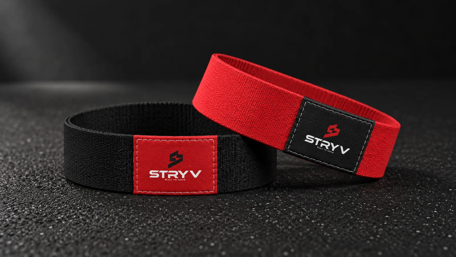
Additional scenes explore the design using the original project materials.
What does your brand need next?
Let’s talk about your project Next projectTrusworld