← All work

Case studyBranding

IdentityColourPatternPackagingEnvironmentDigital

Fast food

Kukit

Opening frame of the Kukit brand film

Kukit brand film. Motion film made from the original Kukit identity boards and brand applications.

Overview

A fast-food brand identity for Kukit, an Abcon Group venture.

The original brief centres on fresh burgers and fried chicken at accessible prices; the presentation connects that idea with a playful wordmark, yellow-and-green palette, packaging, menus and campaign artwork.

BriefThe original brief describes an Abcon Group venture offering burgers and fried chicken at accessible prices. The design task is to turn that straightforward food offer into a playful name and a consistent ordering and takeaway experience.

ContextAbcon Group venture

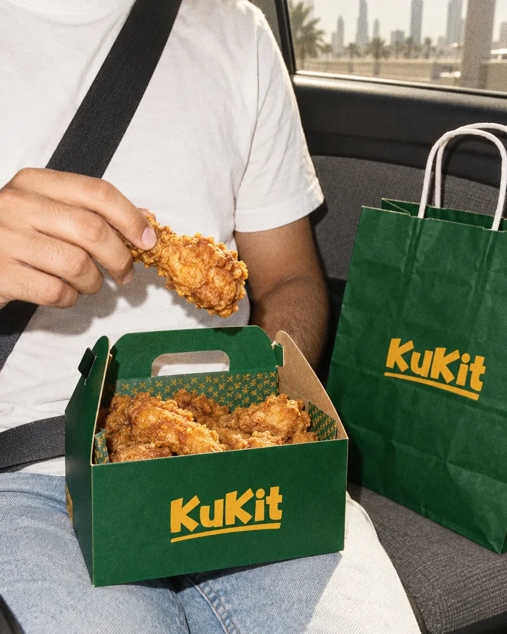
A passenger seen from the chest down in a parked car, eating from an open green KuKit gable box with a green KuKit paper bag on the seat beside them.
Fried chicken in the carThe KuKit identity in a lifestyle photograph of a green takeaway box and paper bag in a car.

How to read this deck

The deck pairs the client’s original presentation boards with new application scenes that show the identity in use.

Some of the older boards have been redrawn. Each one sits where the original stood, with the real original design in its corner and a View original button to open it in full.

Chapter 01

Concept and inspiration
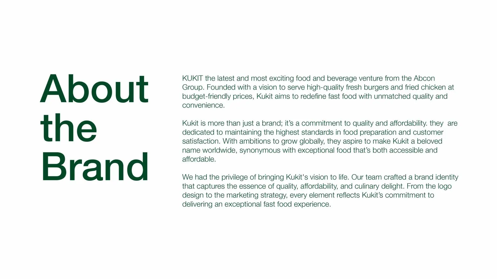
Kukit: Original brand brief
Original brand briefThe presentation describes Kukit as an Abcon Group food venture offering burgers and fried chicken at accessible prices.
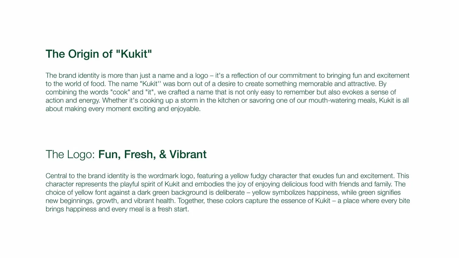
Kukit: Naming and logo rationale
Naming and logo rationaleThe original board explains the “cook” and “it” name construction and the yellow-and-green logo treatment.

Chapter 02

How the logo was formed

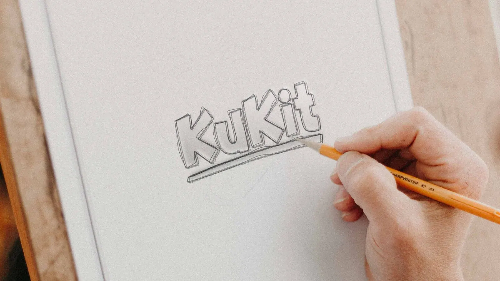
Kukit: Wordmark sketch
Wordmark sketchA drawn Kukit wordmark shows the rounded, playful lettering explored for the identity.

Chapter 04

Logo variations

A giant yellow capital K from the KuKit wordmark bleeding off the edge of a deep green field, with a small yellow KuKit logo in the corner.
Symbol on greenThe Kukit identity, with the K from the wordmark cropped large on Kaitoke Green.

Chapter 05

Colour

A recognisable family of applications

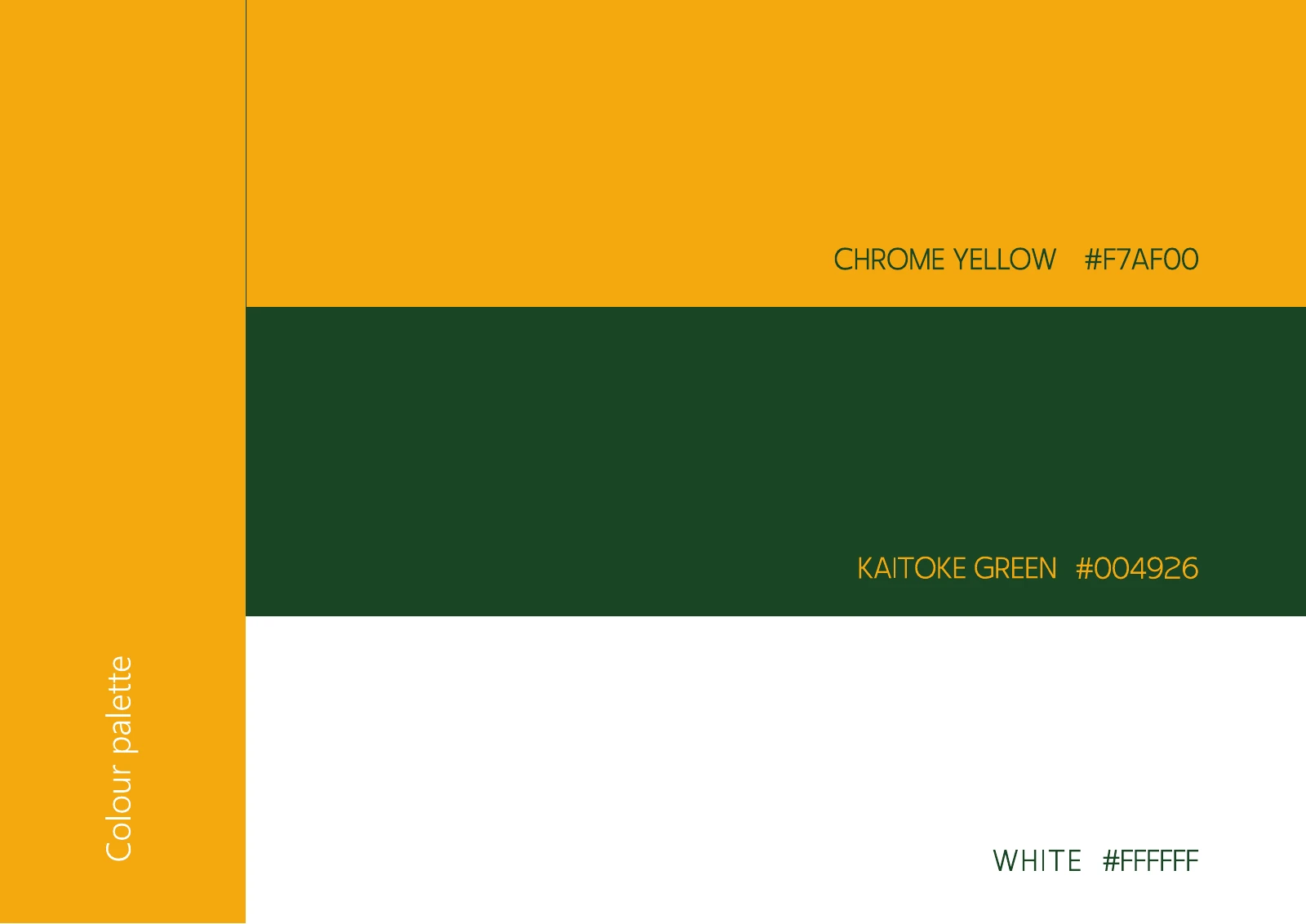
The identity boards specify yellow, dark green and white, with Bely Display typography and a repeating motif. Menu, takeaway-box, signage and campaign mockups then use that same visual vocabulary across ordering, carrying food and seeing the brand at a distance.

  • Accent#F7AF00
  • Surface#004926
  • Ink#FFFFFF

Colours sampled from the original identity boards.
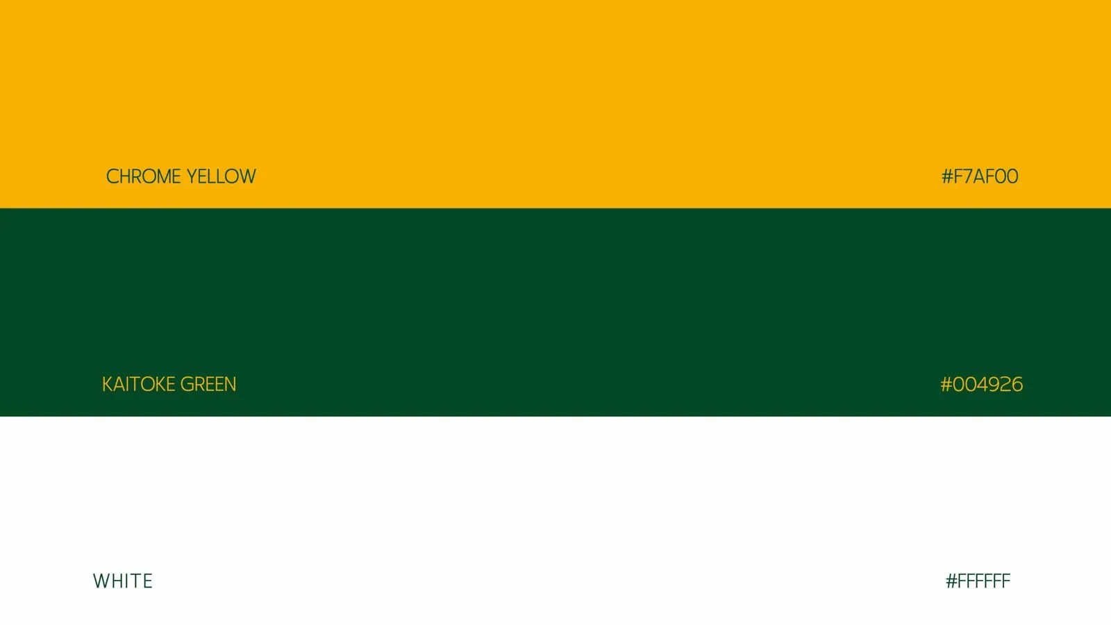
Kukit: Colour specification
Colour specificationThe palette board sets out Chrome Yellow, Kaitoke Green and white with their colour values.
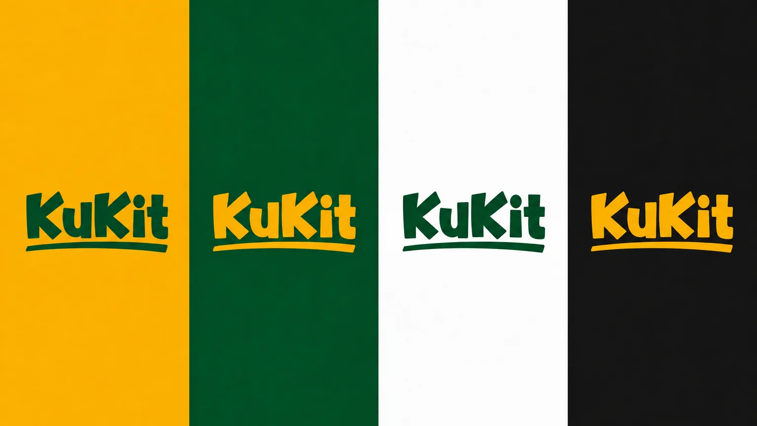
Four vertical panels in yellow, green, white and black, each carrying the KuKit wordmark in the readable colour.
Logo on colourThe Kukit identity as a logo-on-colour board across yellow, green, white and black.
Kukit: Kukit colour-palette presentation
Kukit colour-palette presentationChrome Yellow, Kaitoke Green and white form the three horizontal colour panels in the client PDF.

Chapter 06

Typography

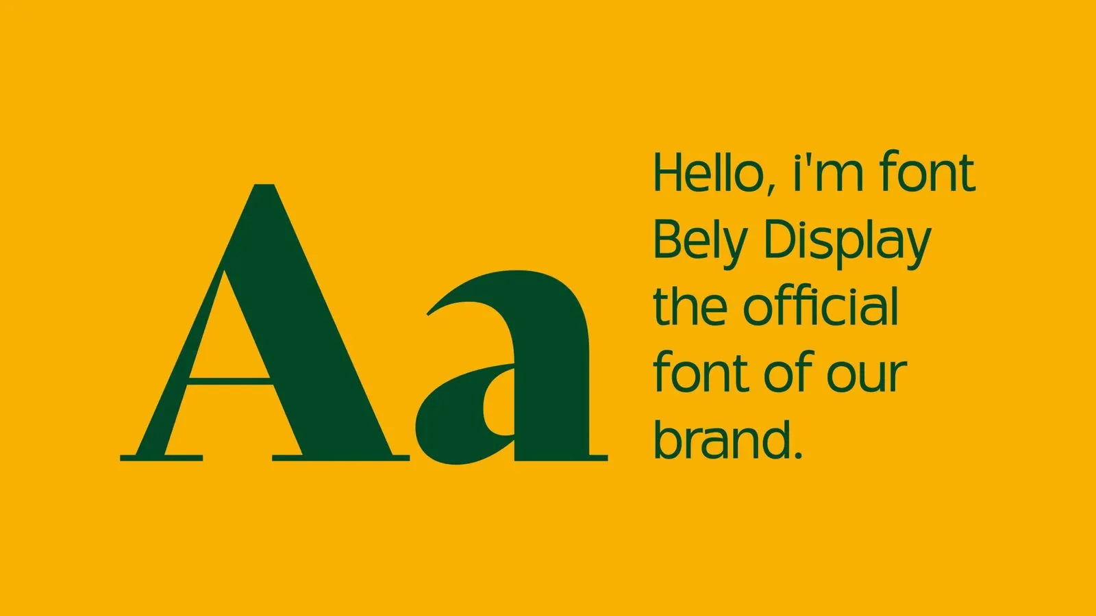
Kukit: Typography
TypographyThe typography board identifies Bely Display as the brand typeface.
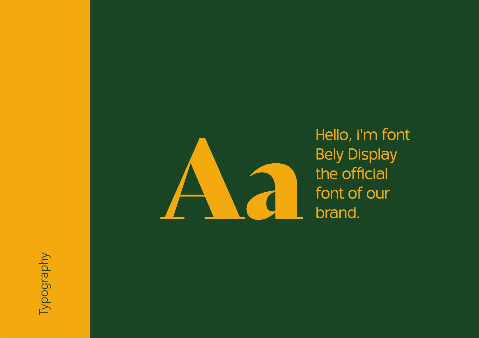
Kukit: Kukit typography on green
Kukit typography on greenThe Bely Display type specimen and font note appear in yellow on dark green in the client PDF board.

Chapter 07

Pattern and graphic elements

Kukit: Repeat pattern
Repeat patternA small yellow motif repeats across a white field to provide an additional brand element.
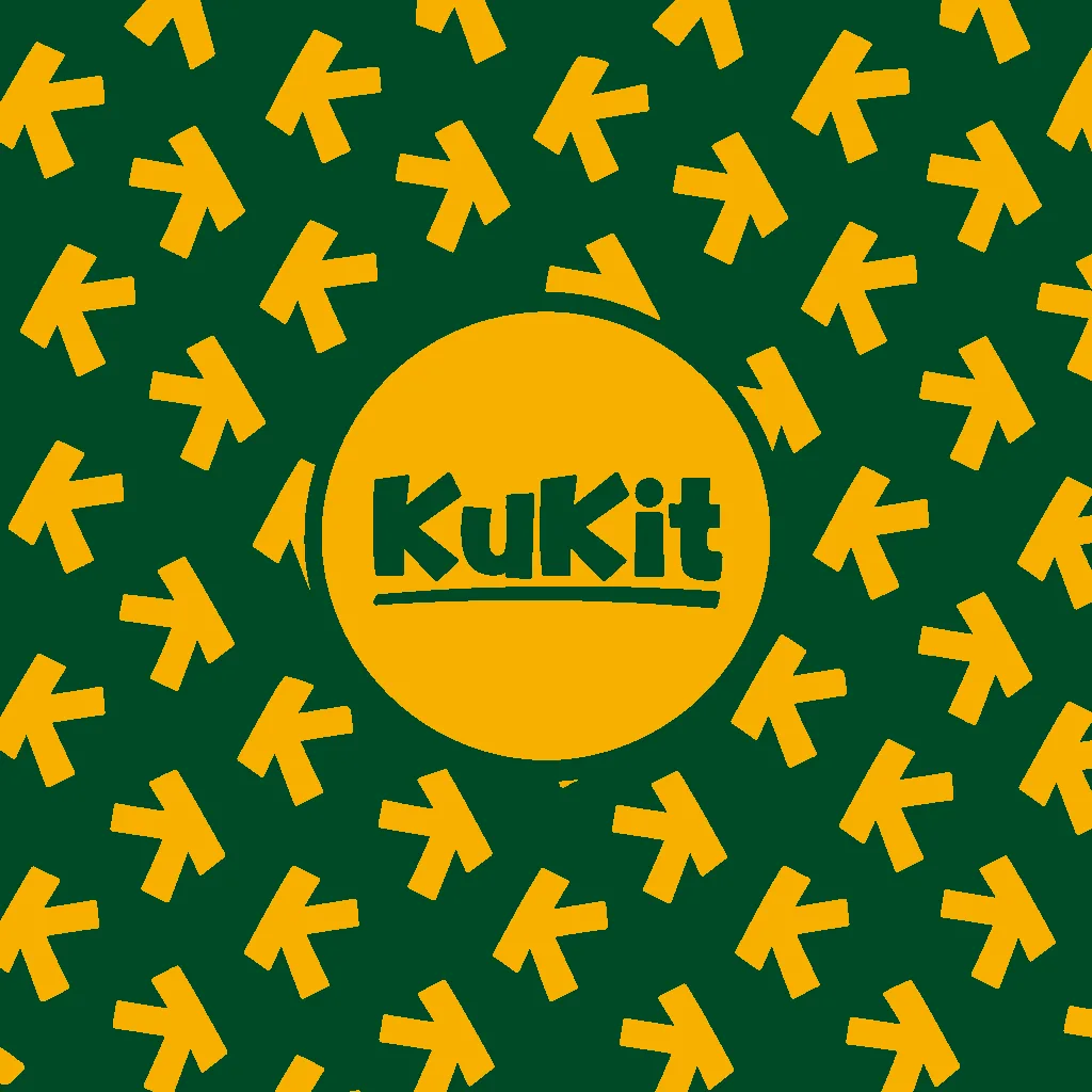
A flat green field covered in the yellow K arrow motif at different angles, with a round yellow badge carrying the green KuKit wordmark at the centre.
PatternThe Kukit identity as its arrow motif pattern on green with a logo badge.
Kukit: Kukit repeat-pattern presentation
Kukit repeat-pattern presentationThe yellow brand motif repeats across white beside a yellow presentation sidebar.

Chapter 08

Packaging

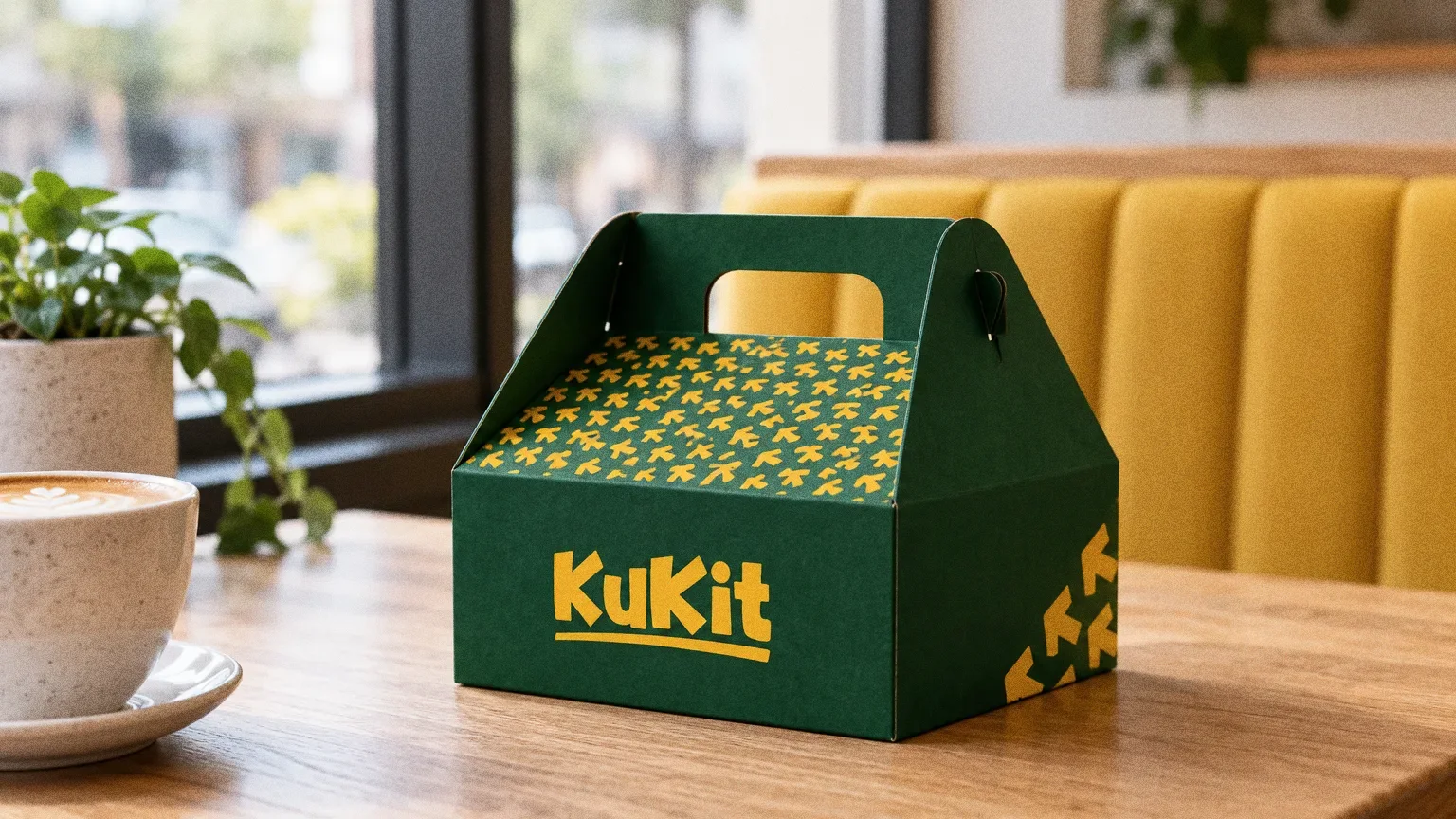
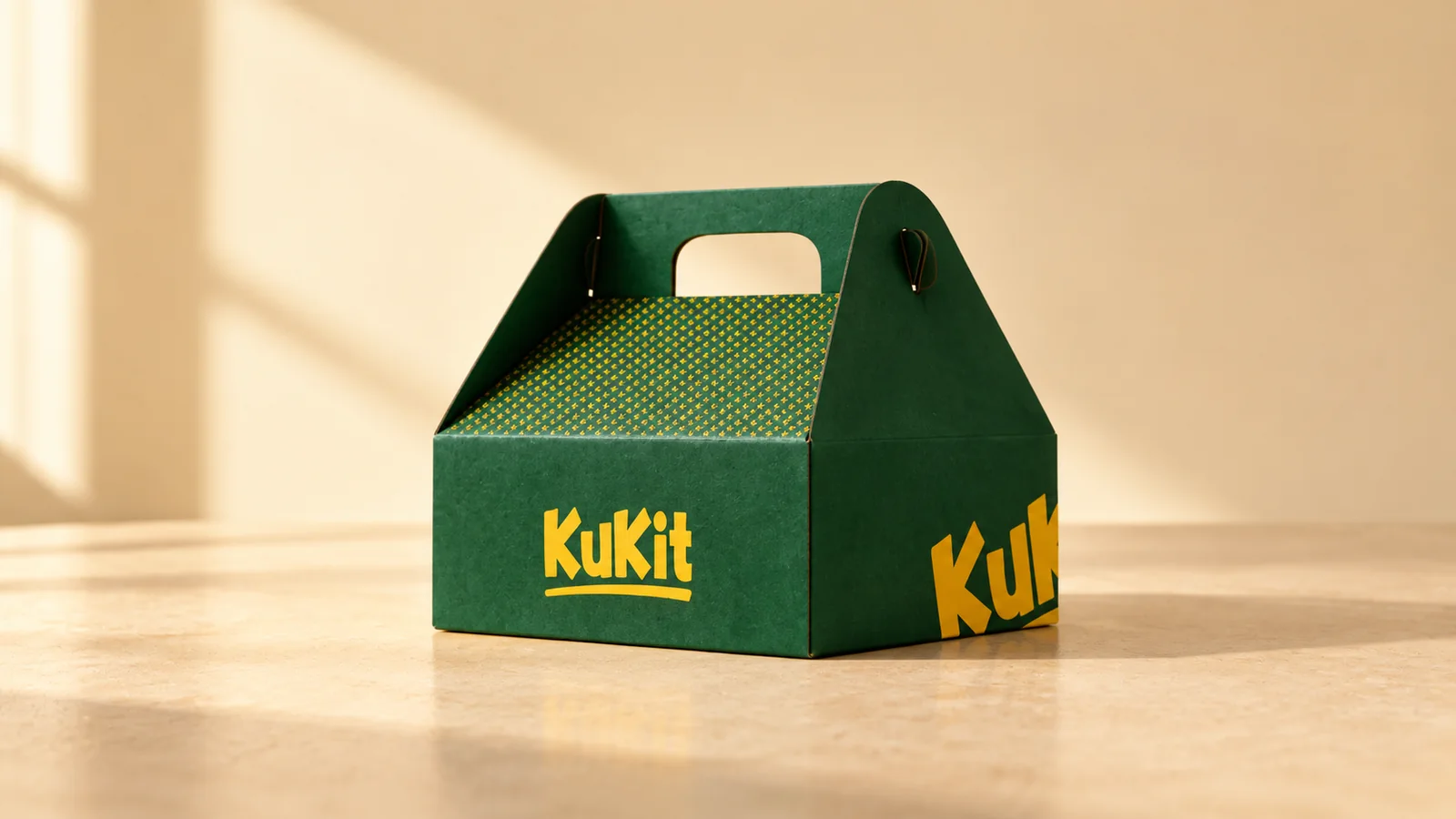
A deep green KuKit carry-out box with a fold-over handle and a yellow wordmark, on a light oak table in a sunlit food court.
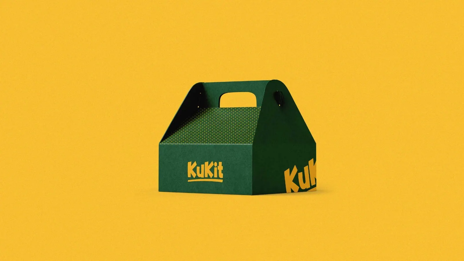
Kukit: Takeaway-box mockup
Takeaway-box mockupThe carry box uses a yellow wordmark on green, with the repeating motif across its upper panels.
Takeaway box at the food courtThe KuKit identity, remastered from the original board of takeaway box.
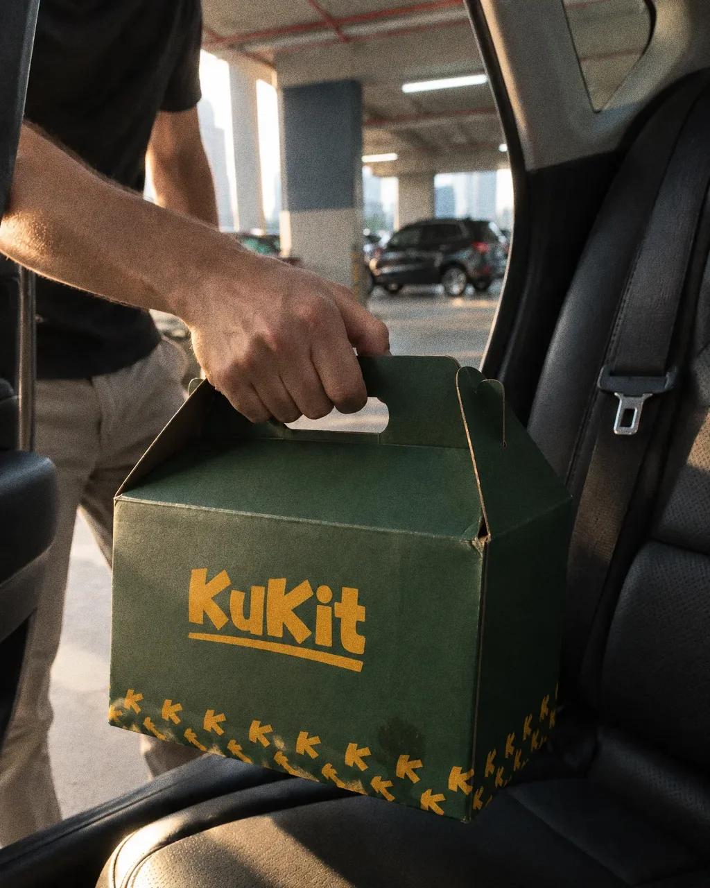
A hand lifting a dark green Kukit gable takeaway box by its handle from a car back seat in a car park.
Gable box lifted from the back seatThe Kukit identity: a hand lifting the green KuKit gable takeaway box from a car back seat.
Kukit: Kukit carry-box application
Kukit carry-box applicationThe Kukit identity on a takeaway carry box.

Chapter 09

Stationery

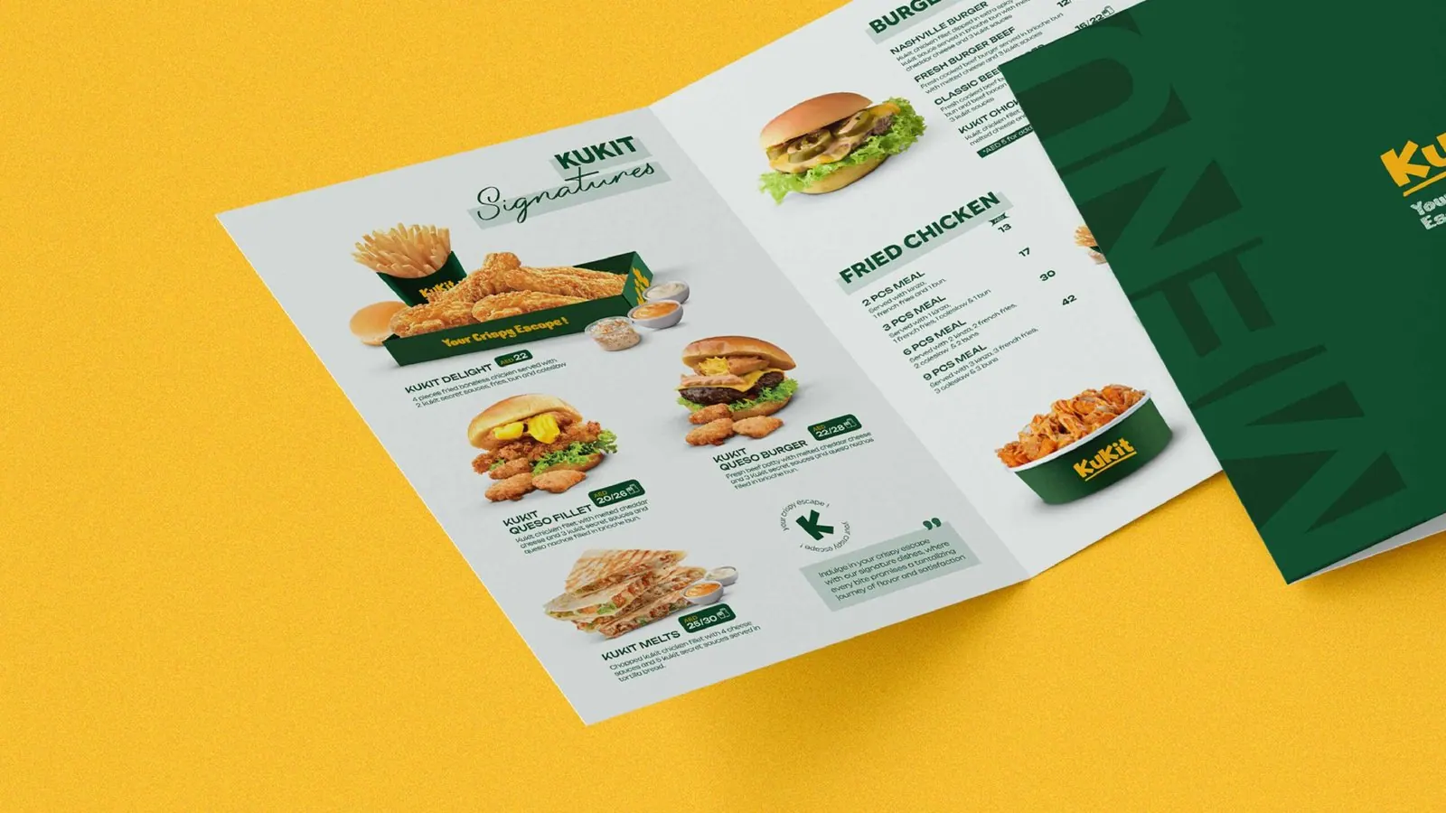
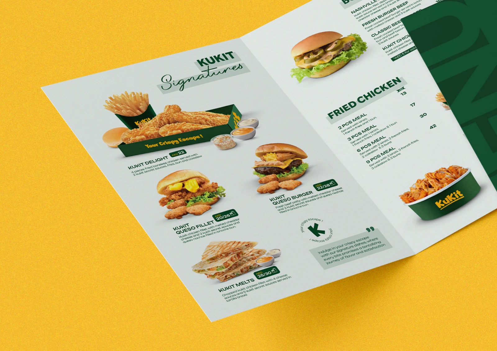
Kukit: Menu application
Menu applicationA printed-menu mockup brings together food images, categories and prices in the green-and-yellow system.
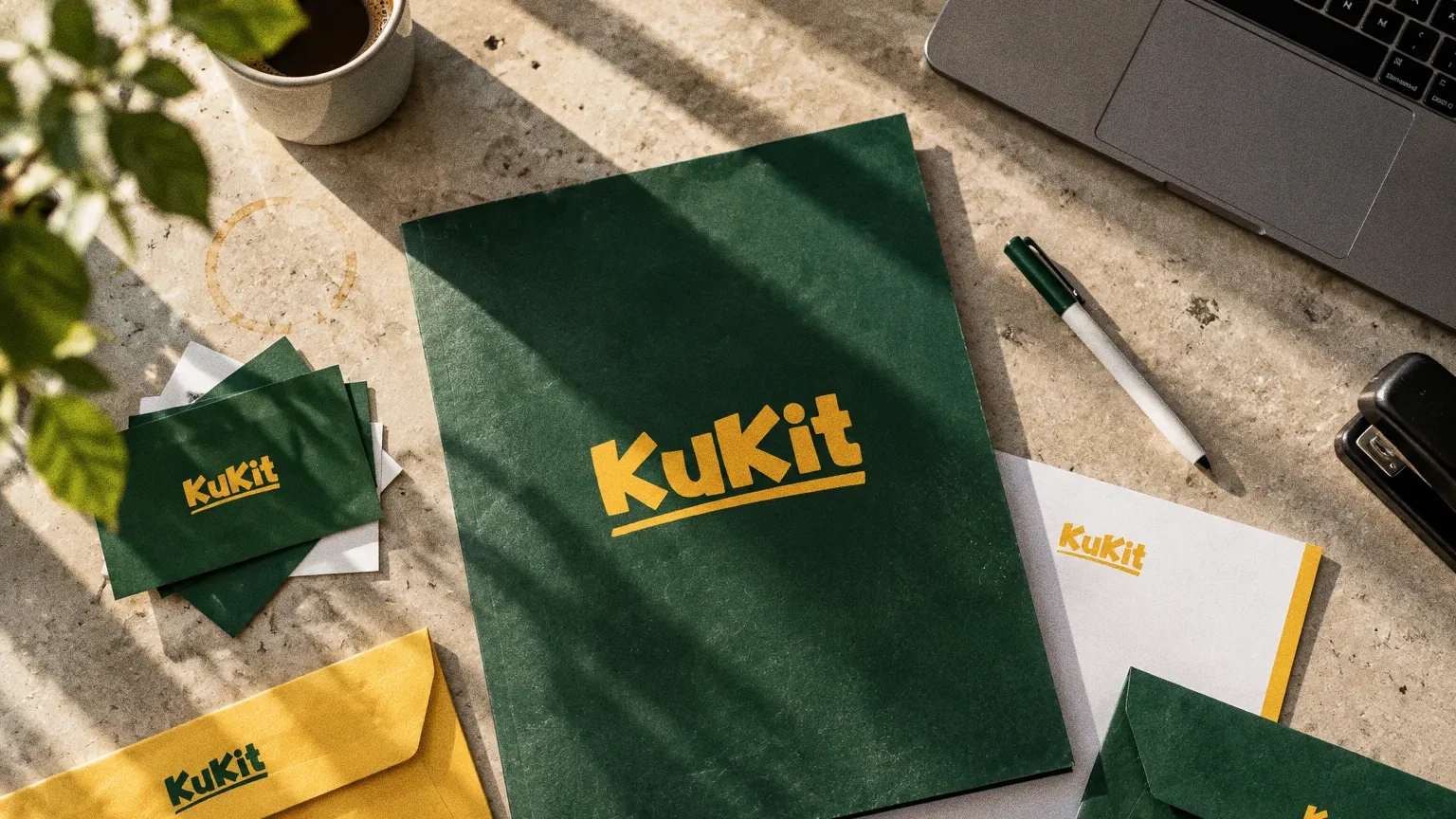
A flat-lay on pale stone of Kukit business cards, a letterhead with a yellow edge band, green and yellow envelopes, a green folder and a pen, all carrying the KuKit wordmark.
StationeryThe Kukit identity as stationery: cards, letterhead, envelopes and a folder in green and yellow.
Kukit: Kukit printed-menu presentation
Kukit printed-menu presentationThe complete client PDF shows a food-led printed menu using the green-and-yellow identity.

Chapter 10

Signage and spaces

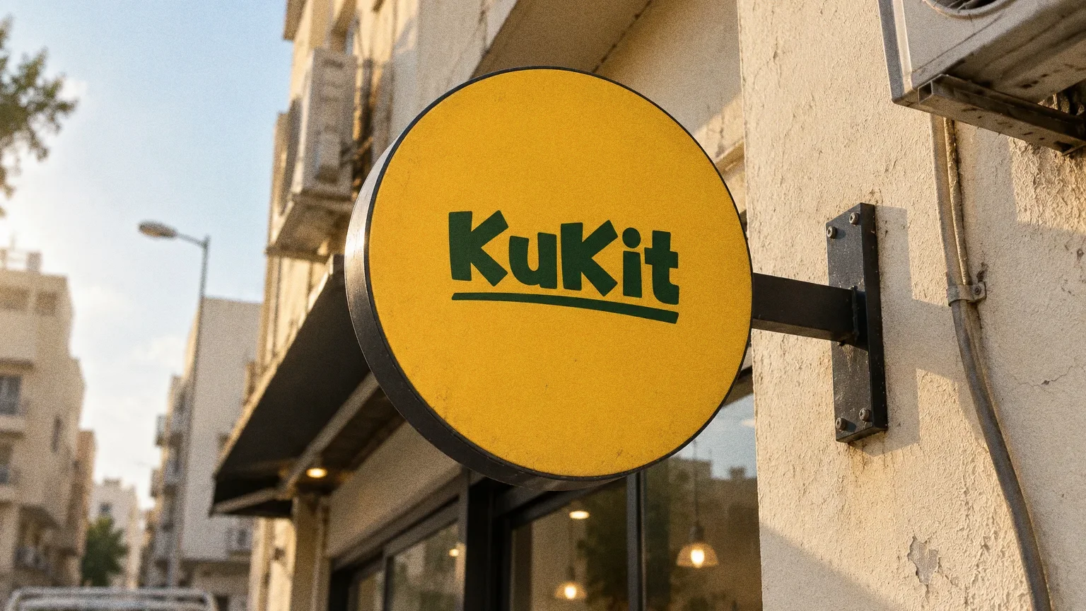
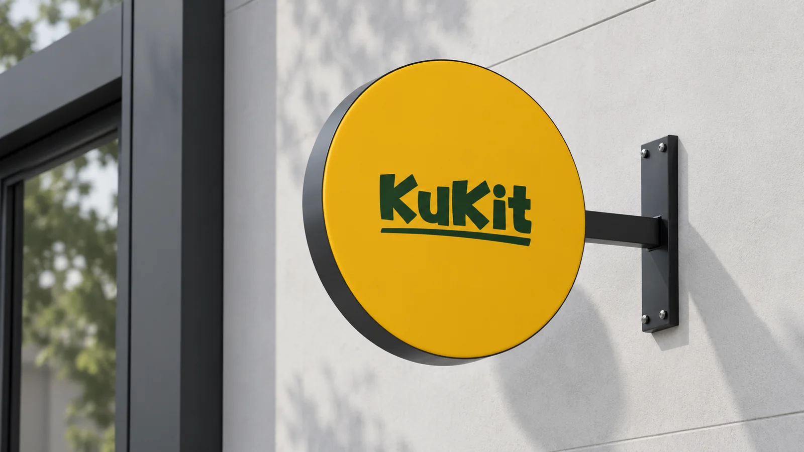
A round yellow KuKit blade sign on a black bracket, projecting from a cream wall at golden hour above a lit shopfront.
Kukit: Projecting-sign mockup
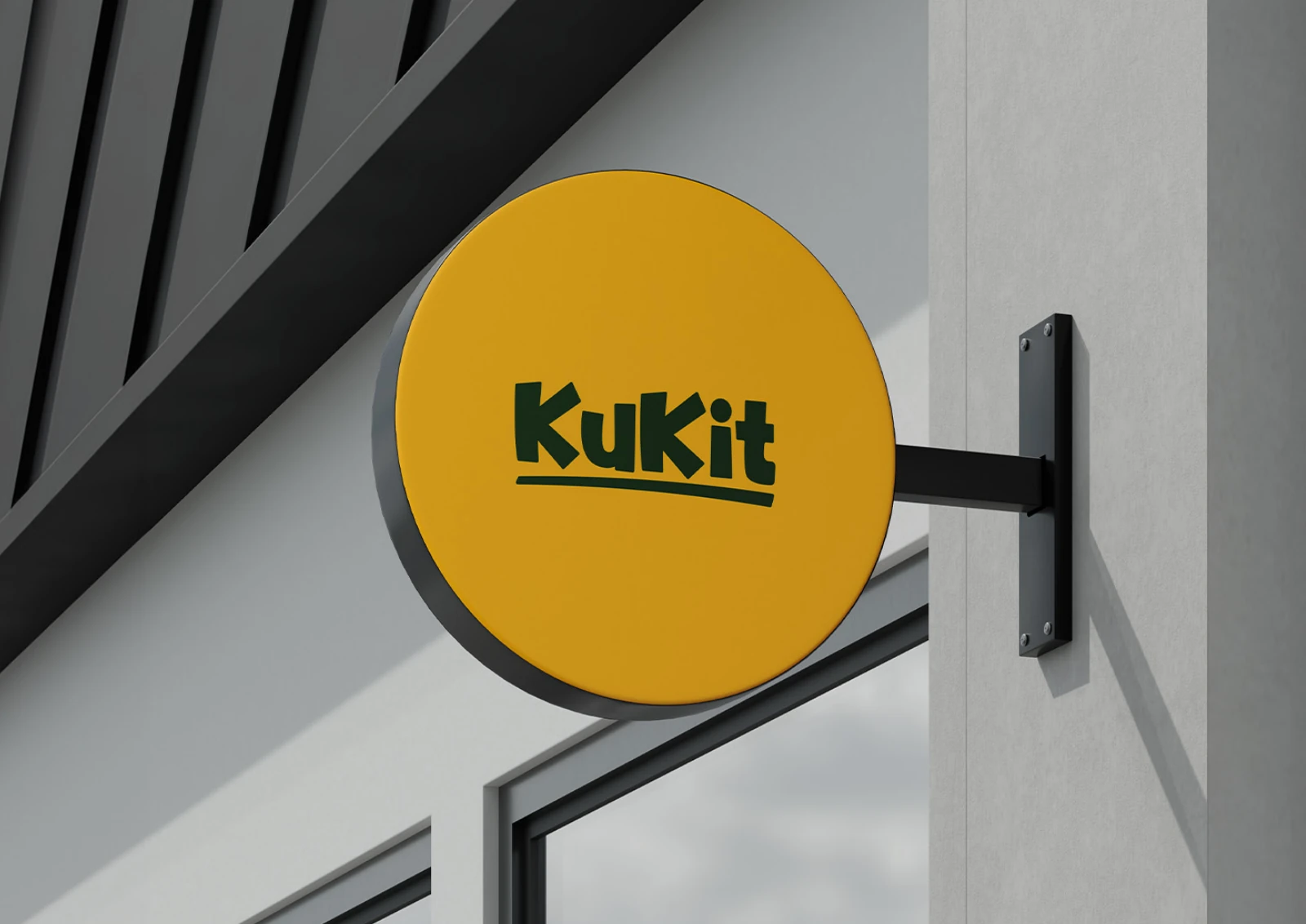
Projecting-sign mockupA circular yellow sign gives the green Kukit wordmark a distinct silhouette on a building frontage.
Hanging shop sign at golden hourThe KuKit identity, remastered from the original board of hanging shop sign.
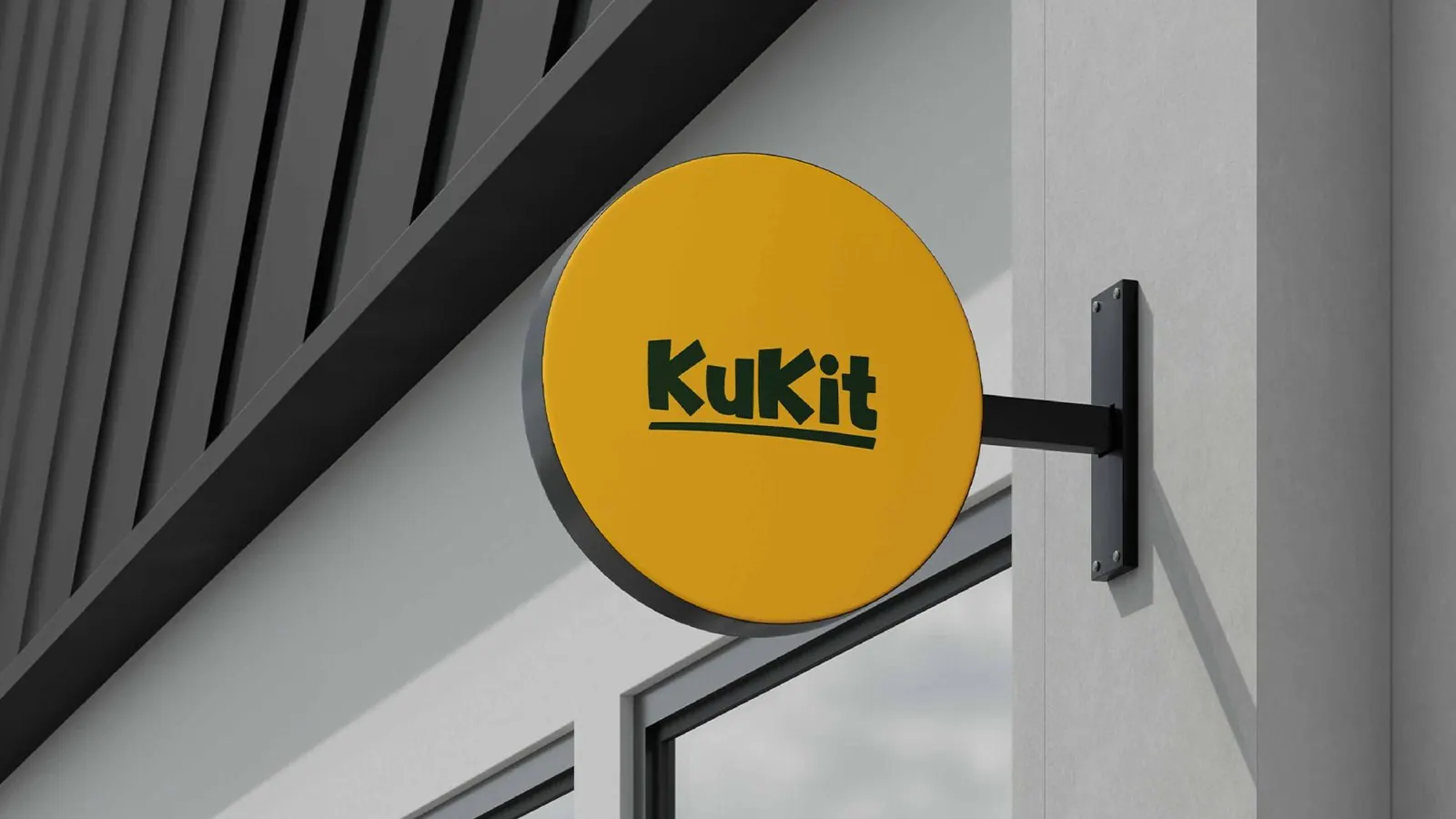
Kukit: Kukit circular sign detail
Kukit circular sign detailThe Kukit identity on its documented circular projecting sign.
Kukit: Kukit projecting-sign presentation
Kukit projecting-sign presentationThe green wordmark appears on a circular yellow projecting sign against a building-frontage mockup.

Chapter 11

Uniforms and merchandise
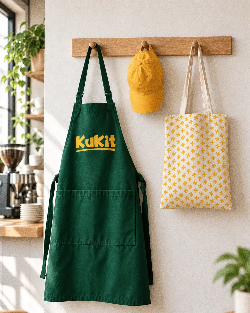
A green KuKit apron with the yellow wordmark, a yellow cap and a cotton tote printed with the yellow arrow pattern hanging from an oak peg rail on a white wall in a bright cafe.
MerchThe Kukit identity as staff and merchandise pieces: apron, cap and tote.
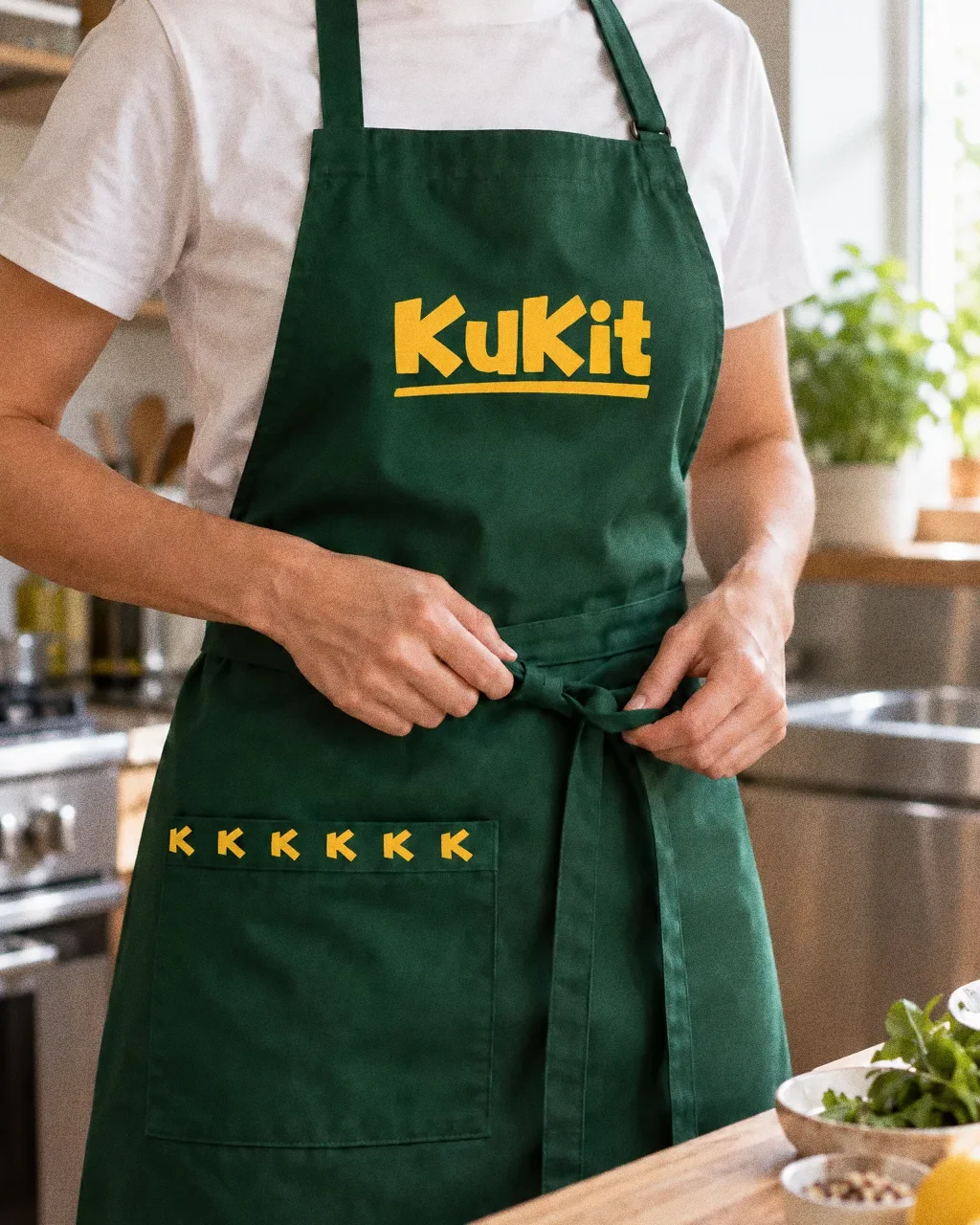
A kitchen worker tying a new dark green KuKit apron with a yellow wordmark and arrow-pattern pocket trim, cropped below the chin, in a bright clean kitchen.
Apron being tied in the kitchenThe Kukit identity: a green KuKit kitchen apron being tied.
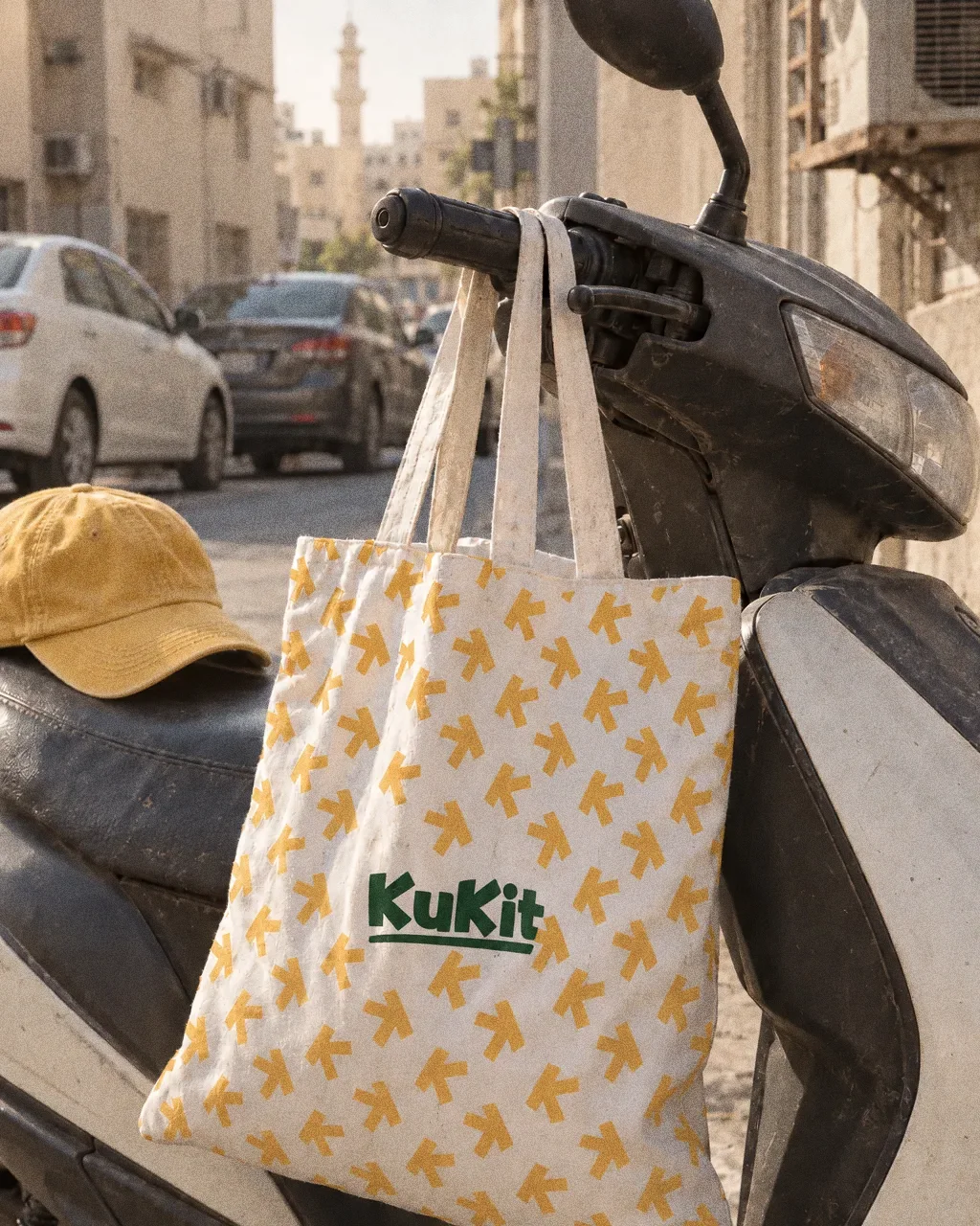
A white canvas tote bag printed with the yellow Kukit K pattern hanging from a parked scooter handlebar on a Deira side street.
Tote on a scooter handlebarThe Kukit identity: a canvas tote with the K pattern hung on a scooter.

Chapter 12

Digital

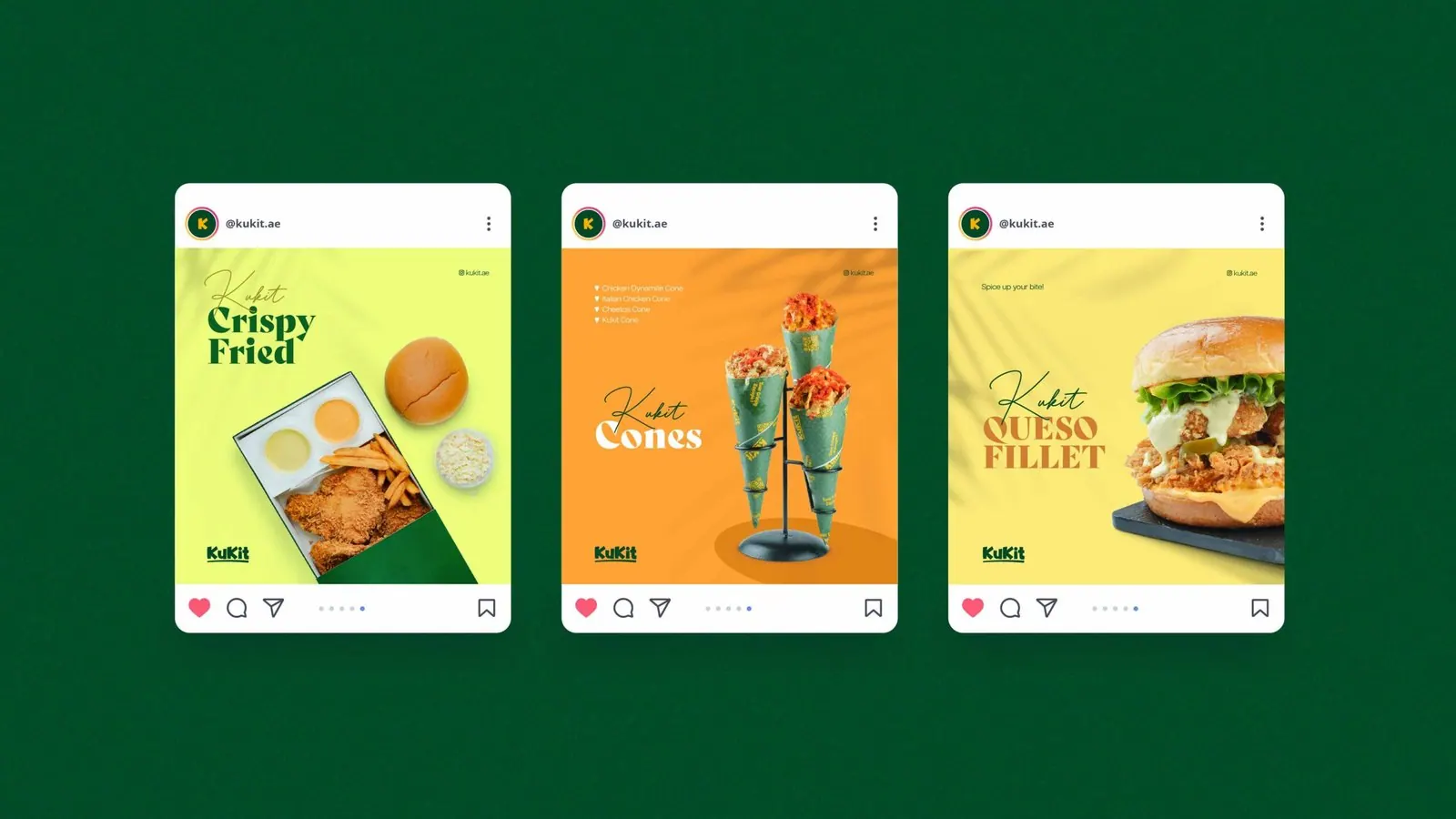
Kukit: Social creative mockups
Social creative mockupsThree social-post layouts combine food photography, display typography and variations of the brand palette.
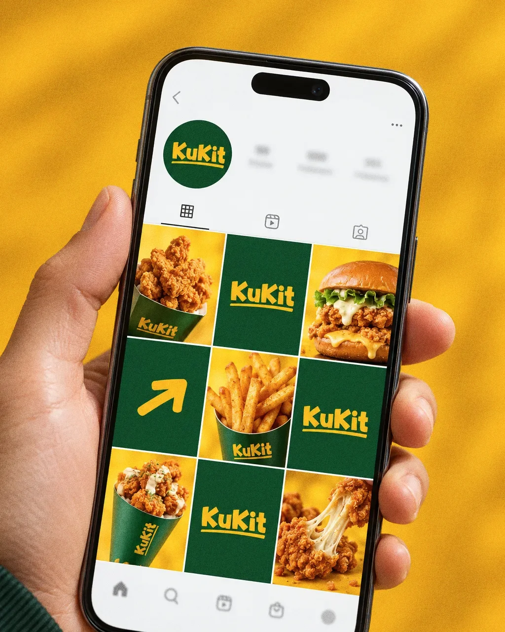
A hand holding a phone that shows the Kukit Instagram grid of fried chicken, burger and fries photos alternating with green tiles carrying the yellow KuKit logo.
Instagram gridThe Kukit identity as an Instagram profile grid on a phone.
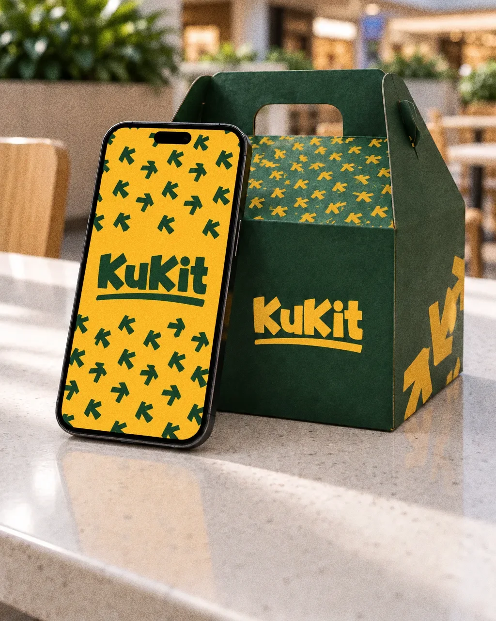
A phone leaning against a green KuKit takeaway box on a pale counter in a bright mall food court, the screen showing a yellow KuKit story frame with the arrow pattern.
Story on a food court counterThe Kukit identity: a Kukit story on a phone beside a takeaway box at a food court.

Chapter 13

The brand in the world

Carry boxes, a circular shop sign, menu artwork and food campaign posts extend the green and yellow identity into takeaway and promotional touchpoints.
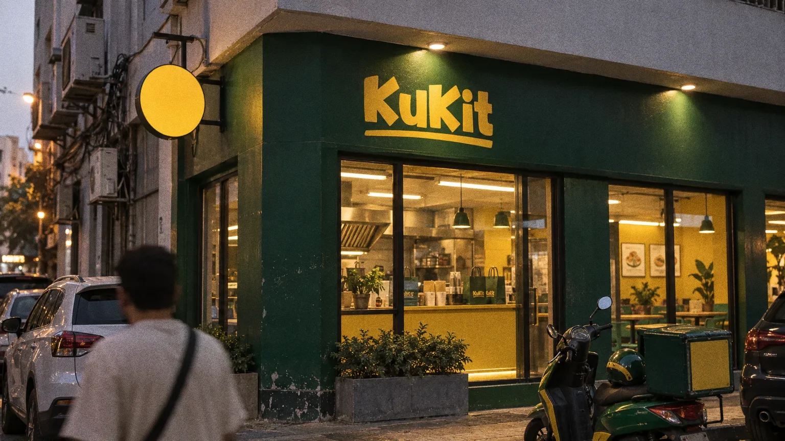
A deep green Kukit restaurant on a Dubai street at dusk, with the yellow KuKit wordmark on the fascia, a round yellow blade sign, a warmly lit yellow counter and a green delivery scooter at the kerb.
Kukit restaurant at blue hourThe Kukit identity on a street-corner restaurant at blue hour.
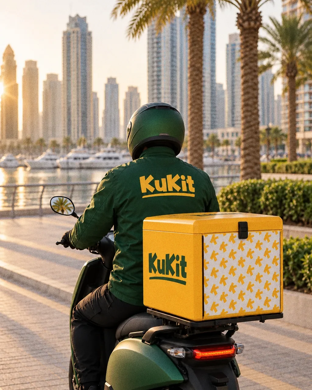
A delivery rider seen from behind on a scooter by a sunlit Dubai Marina promenade, wearing a green jacket and carrying a yellow top box, both marked with the KuKit wordmark.
Delivery rider in the afternoon sunThe Kukit identity on a delivery rider's jacket and top box.
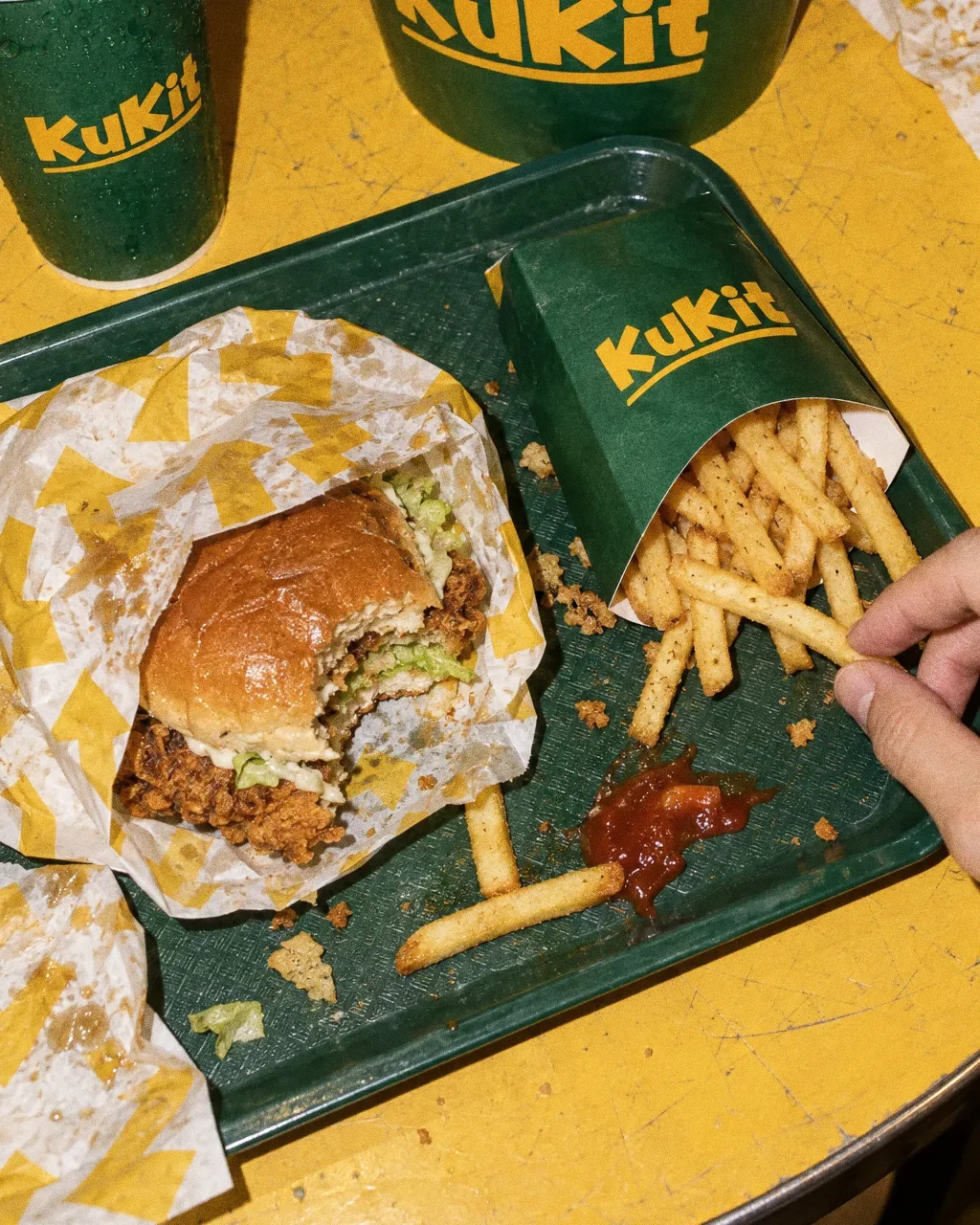
An overhead view of a Kukit meal on a yellow table: a chicken burger in pattern-printed paper, fries in a paper sleeve, a green bucket of fried chicken and a green cup, with a hand reaching for a fry.
Kukit meal on a yellow tableThe Kukit identity on takeaway packaging, a bucket, a cup and pattern-printed wrap.
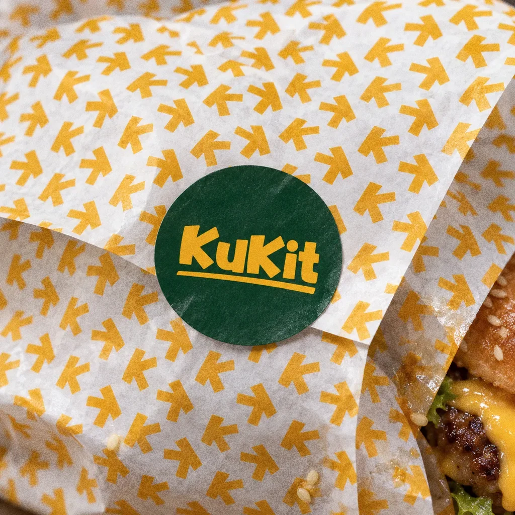
A close-up of white burger wrap printed with the yellow K-arrow pattern and sealed with a round green sticker carrying the yellow KuKit wordmark.
Pattern paper and sticker sealThe Kukit identity on pattern-printed burger wrap and a sticker seal.

Chapter 14

In people’s hands

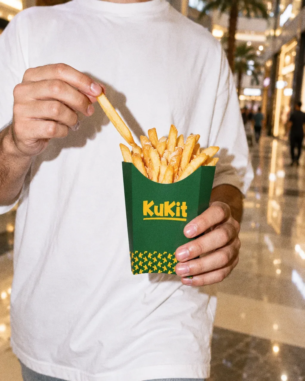
  • A person in a white t-shirt seen from the chest down in a Dubai mall, pinching a fry from a green KuKit fries sleeve with the yellow wordmark and pattern band.
    Fries on the mall concourseThe KuKit identity in a lifestyle photograph of a fries sleeve carried through a mall.
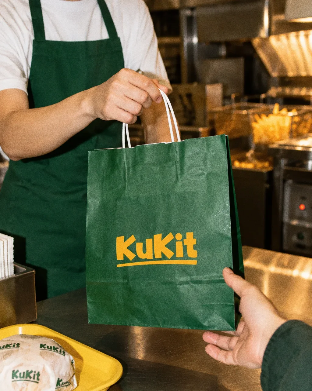
  • A staff member in a green apron hands a green KuKit paper bag across a steel counter to a customer, with a wrapped burger on a yellow tray.
    Bag across the counterThe KuKit identity in a lifestyle photograph of a counter handover of a branded paper bag.
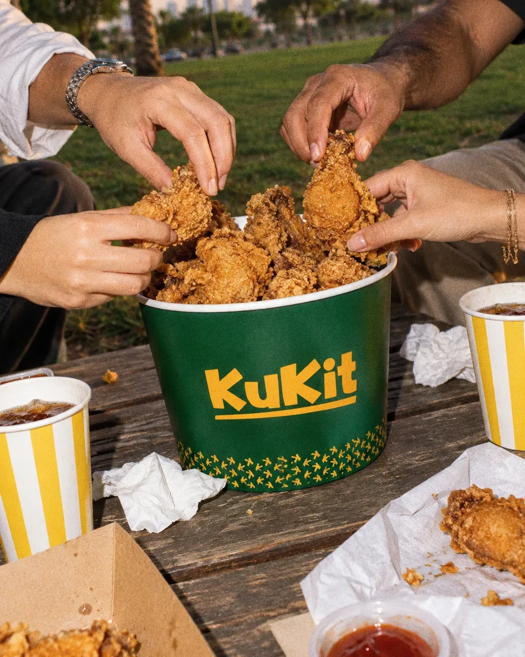
  • Several hands reach into a green KuKit chicken bucket on a park picnic table, with striped cups, napkins and a takeaway box around it.
    Chicken bucket in the parkThe KuKit identity in a lifestyle photograph of a shared chicken bucket at a park table.
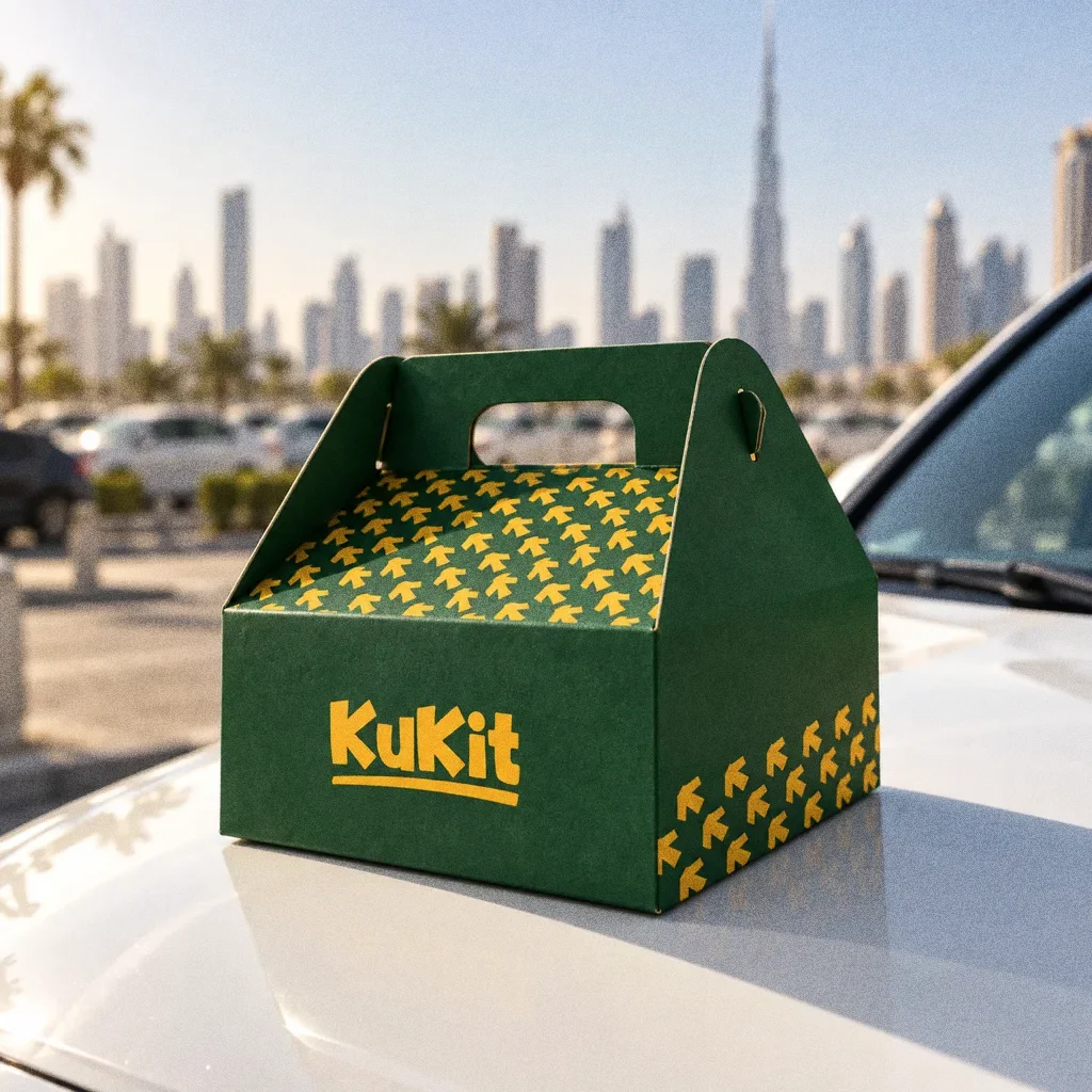
  • A green KuKit gable takeaway box with the yellow wordmark and arrow pattern on the white bonnet of a car in a sunny car park, with the Dubai skyline softly blurred behind.
    Gable box on a car bonnetThe KuKit identity in a lifestyle photograph of a takeaway box on a car bonnet.
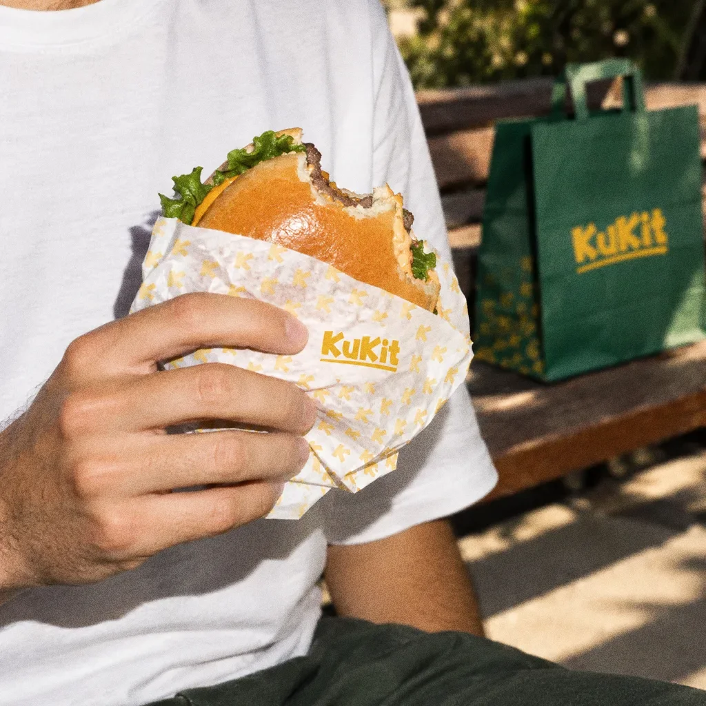
  • A hand holds a bitten burger wrapped in white paper printed with the yellow KuKit pattern, with a green KuKit bag on a bench behind.
    Burger in pattern paperThe KuKit identity in a lifestyle photograph of a burger in pattern-printed wrap.

Chapter 15

Campaign

A name tied to the food

The original naming board explains Kukit as a combination of “cook” and “it”. The identity uses a playful wordmark and the campaign line “Your Crispy Escape!” to connect the name with the food offer described in the brief.
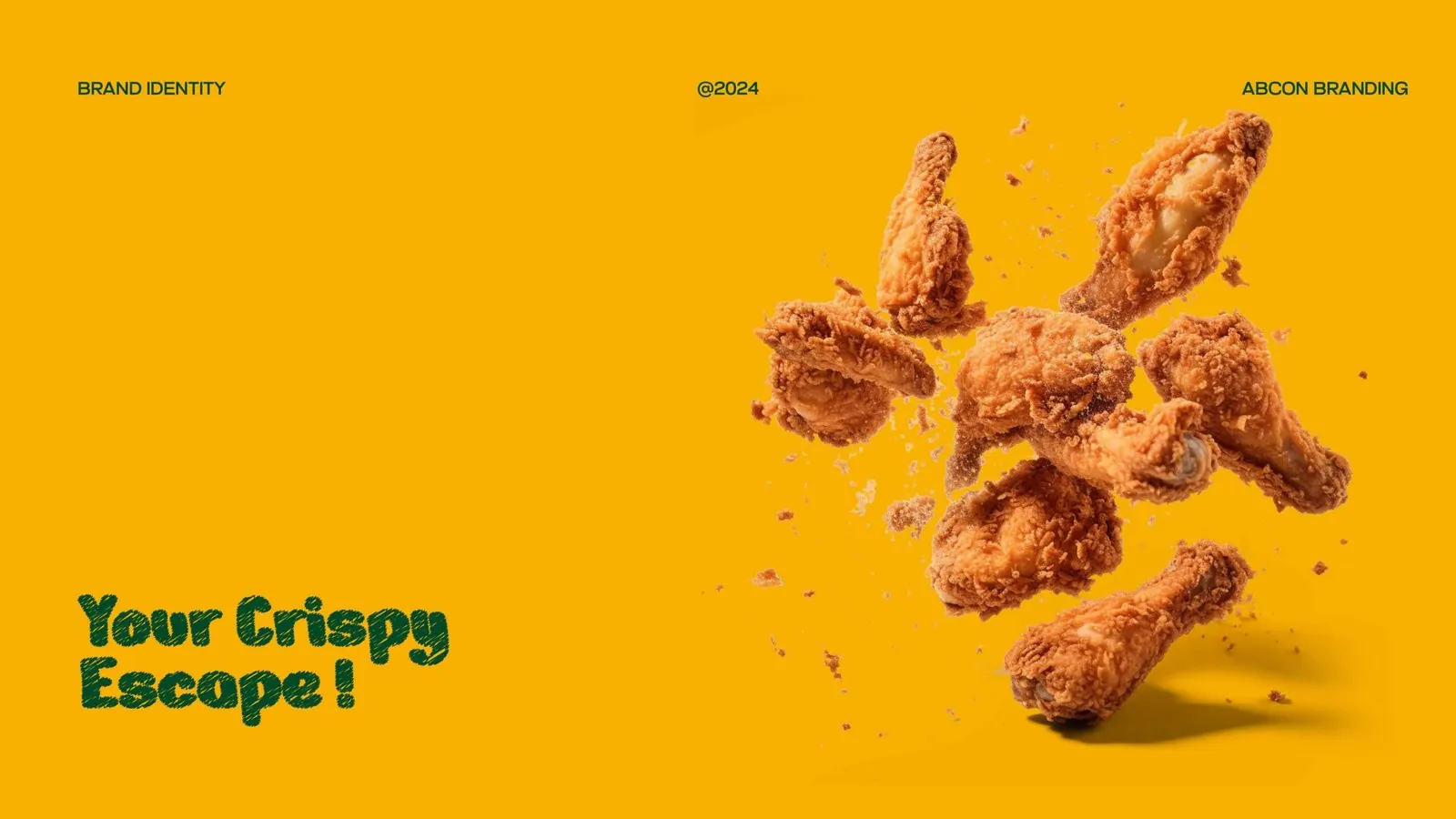
Kukit: Campaign direction
Campaign directionFried-chicken imagery and the line “Your Crispy Escape!” introduce the yellow-and-green identity.
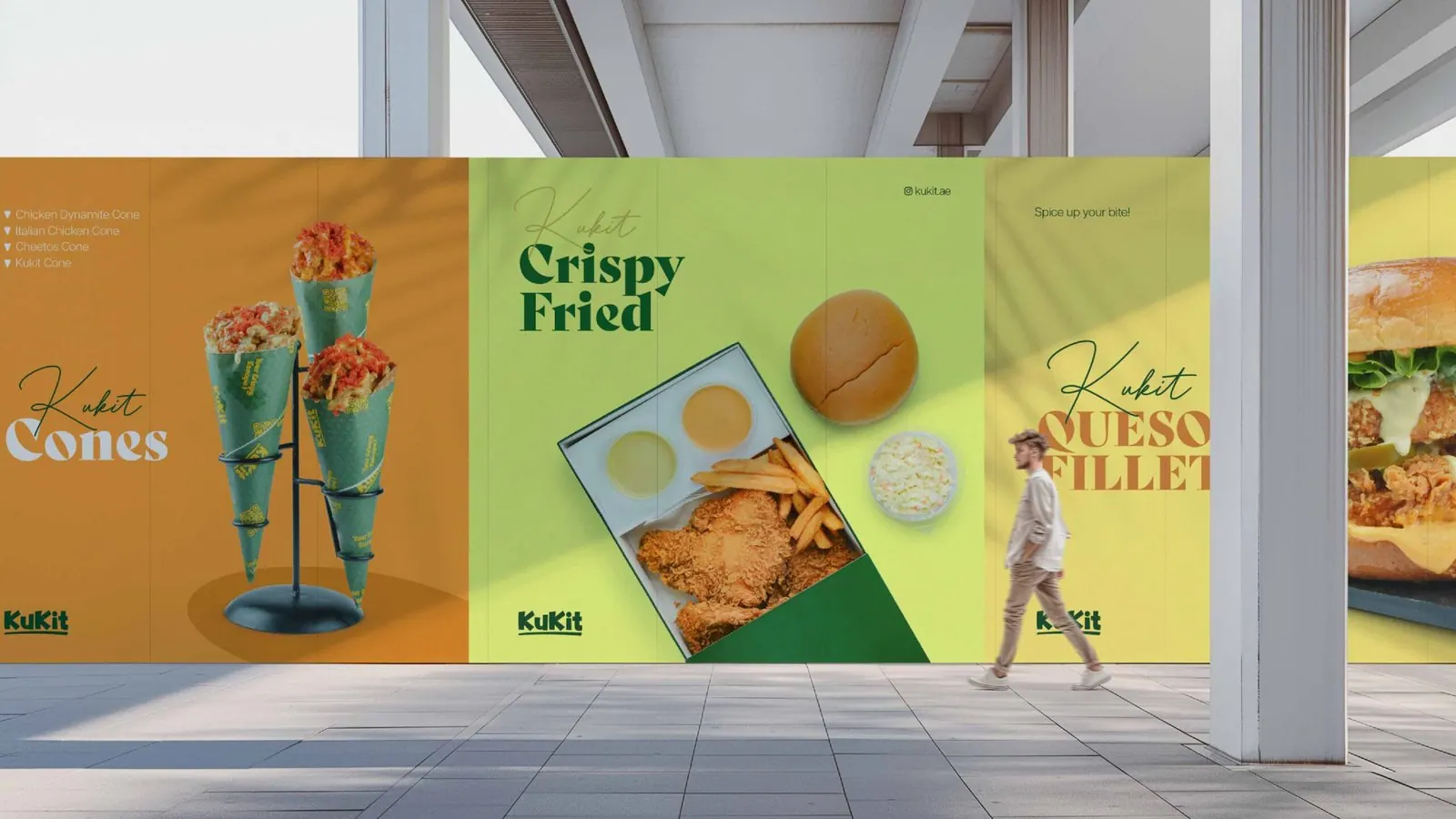
Kukit: Outdoor campaign mockups
Outdoor campaign mockupsLarge food-led campaign panels extend the same creative direction to an outdoor setting.
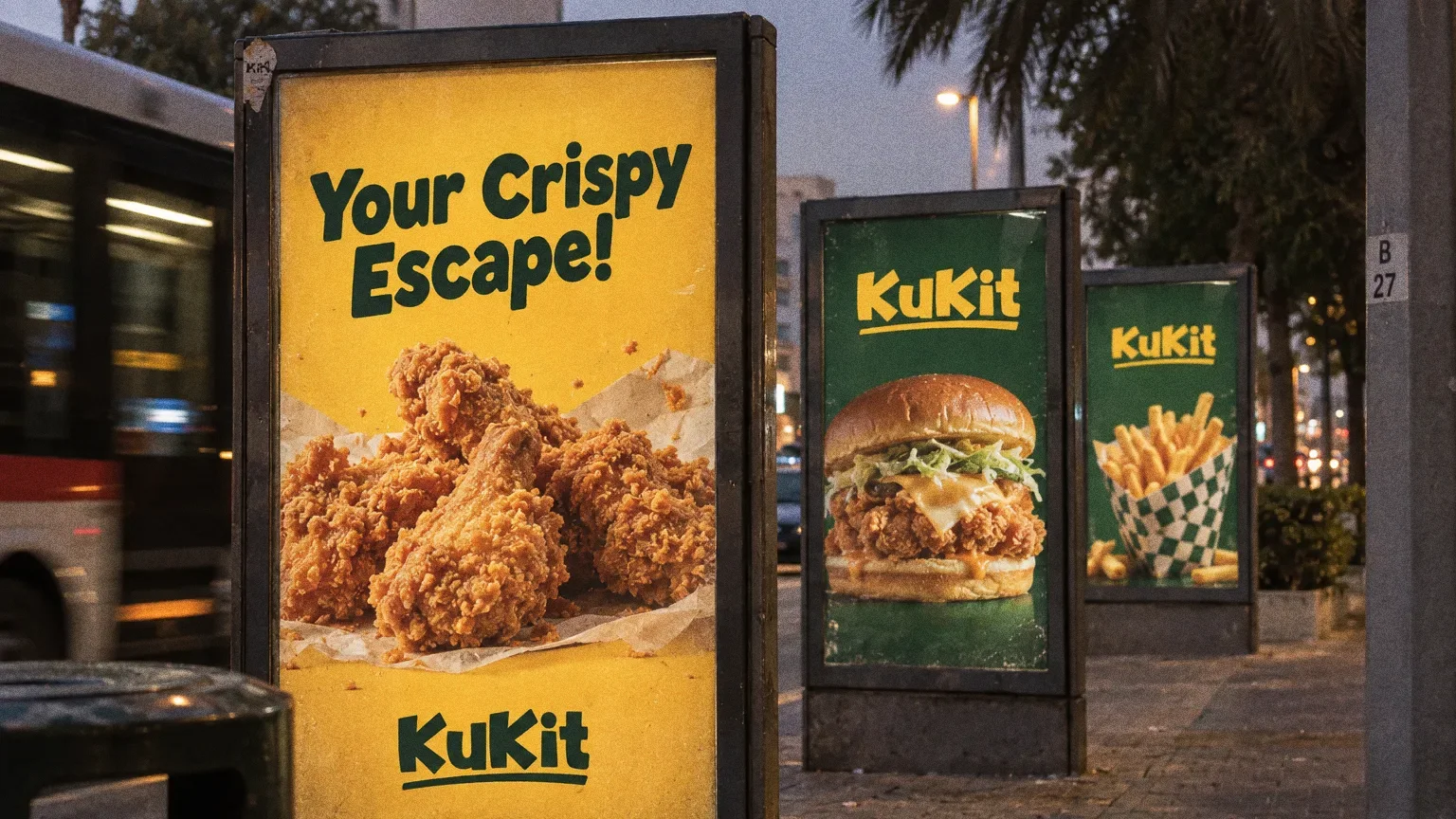
Three backlit street posters at dusk in Dubai: fried chicken on yellow with the line Your Crispy Escape!, a cheese chicken burger on green and fries in a patterned cone, each with the KuKit wordmark.
Street postersThe Kukit identity as a row of backlit street posters, using the campaign line from the original boards.

About this deck

What we built

The Kukit naming story, a yellow-and-green identity, typography and pattern, with menus, takeaway packaging, signage and campaign artwork.

What this case establishes

The original brief, naming rationale, colour specifications and typography show how the food offer became a defined identity system. Menu, packaging, signage and campaign mockups demonstrate its range. Kukit is an Abcon Group venture; this presentation does not include measured sales or growth results.

About the originals

The original boards are from Abcon’s original project presentation and include application mockups.

What does your brand need next?

Let’s talk

Let’s talk

Tell us about your business.

You don’t need all the answers. A few lines about where you want to go is enough to start.