
Packaging / Fast-food packaging
Kukit Packaging
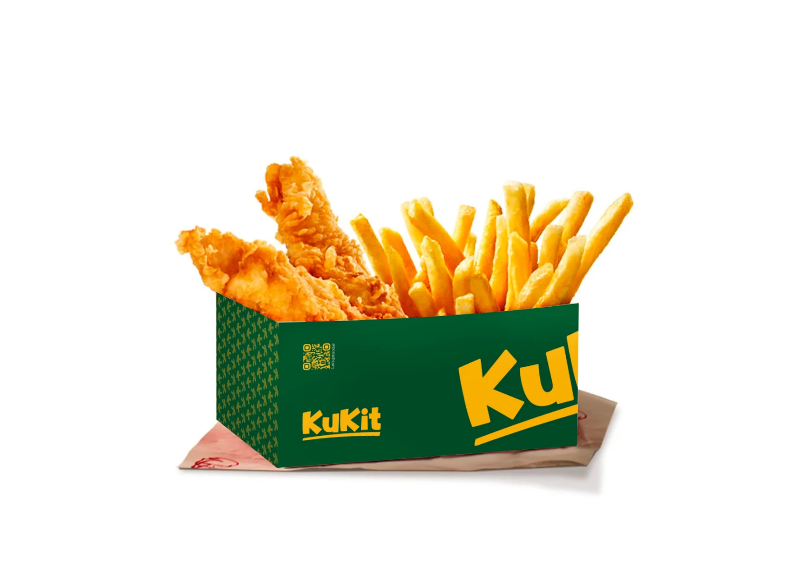
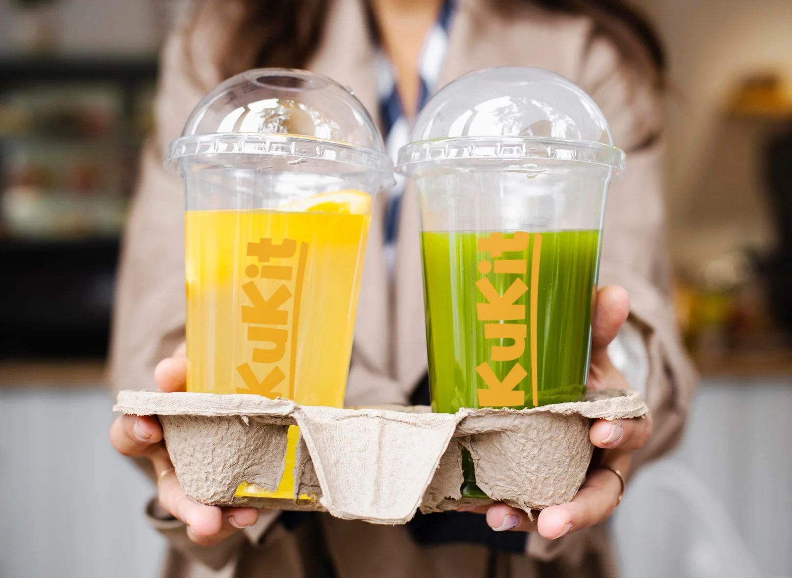
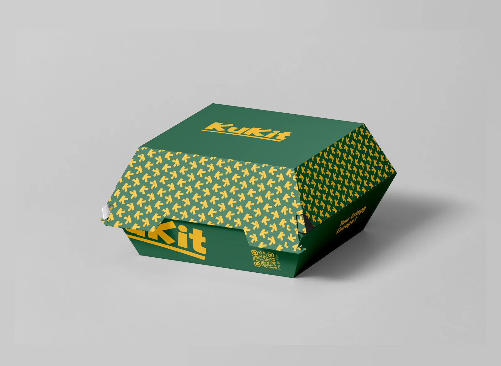
Kukit’s yellow-and-green identity becomes a connected takeaway range, from fries and fried chicken to bags, burger wraps and drink cups.
Project scope
Abcon Group venture
- Packaging system
- Food and drink containers
- Carry bags and wrapping applications
How the packaging works
The design task
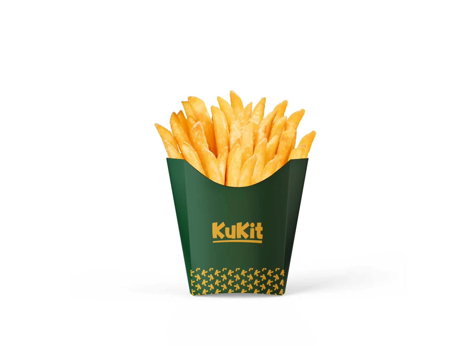
The Kukit identity needs to stay recognisable through the whole food order. The design task is to adapt the playful name, colour and motif to small sleeves, larger boxes and transparent drink cups.
Keep the name visible as the shape changes
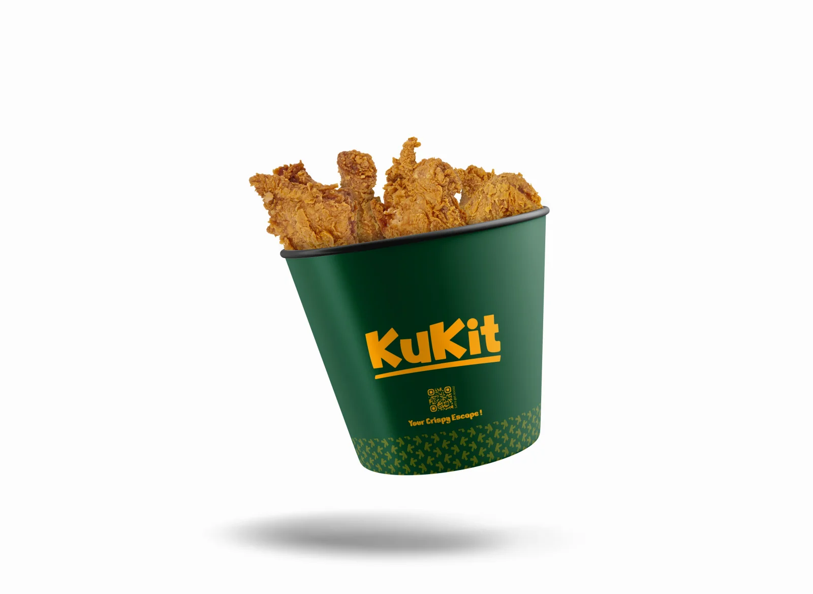
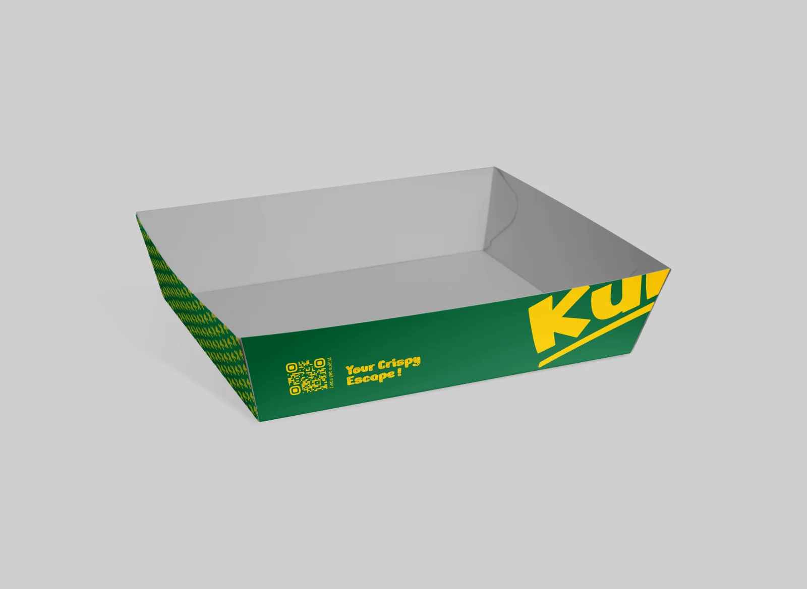
The larger boxes use an oversized crop of the name while smaller containers use the full logo. Both retain the green-and-yellow identity.
See the original boardUse the motif as a connecting element
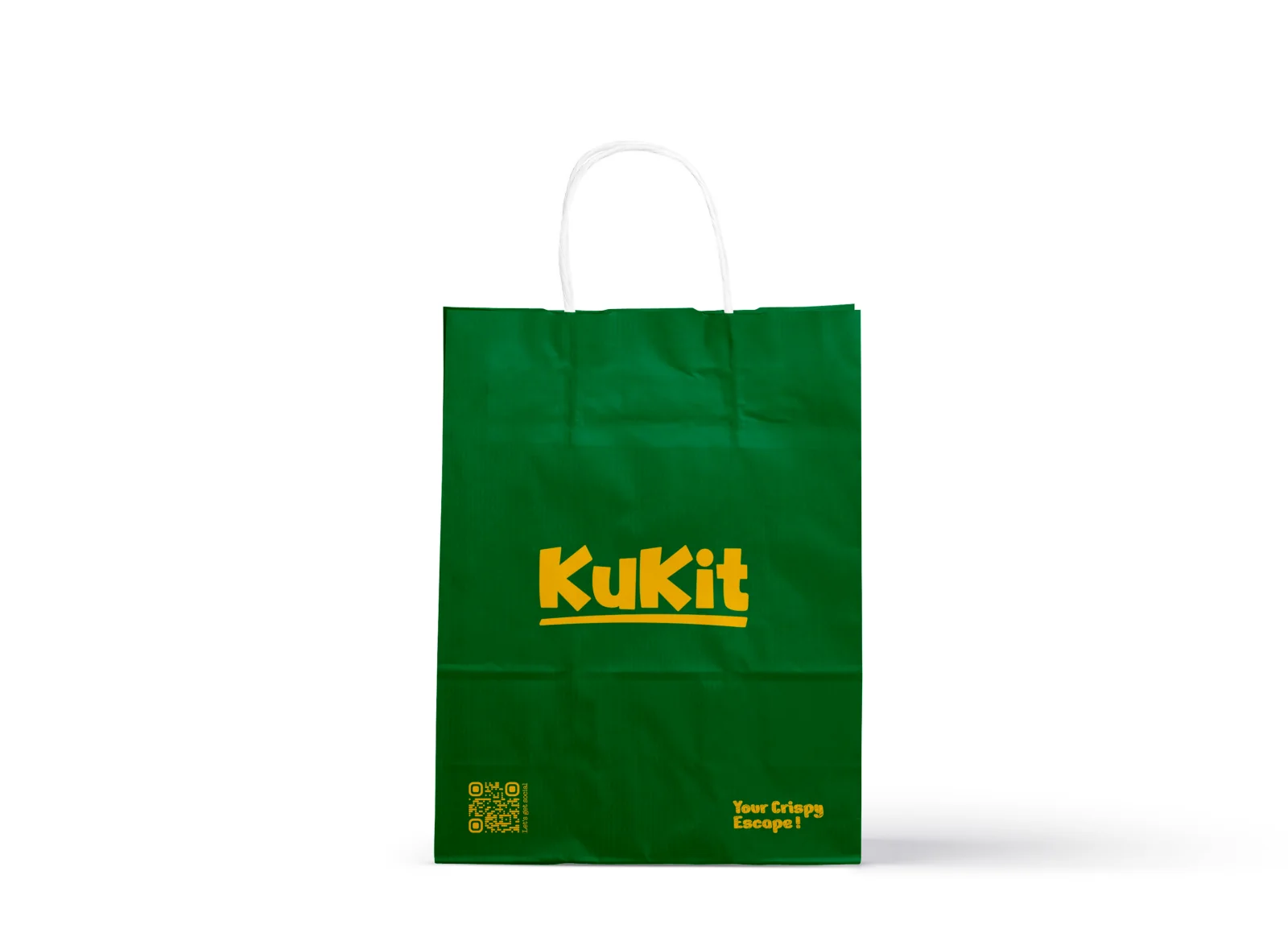
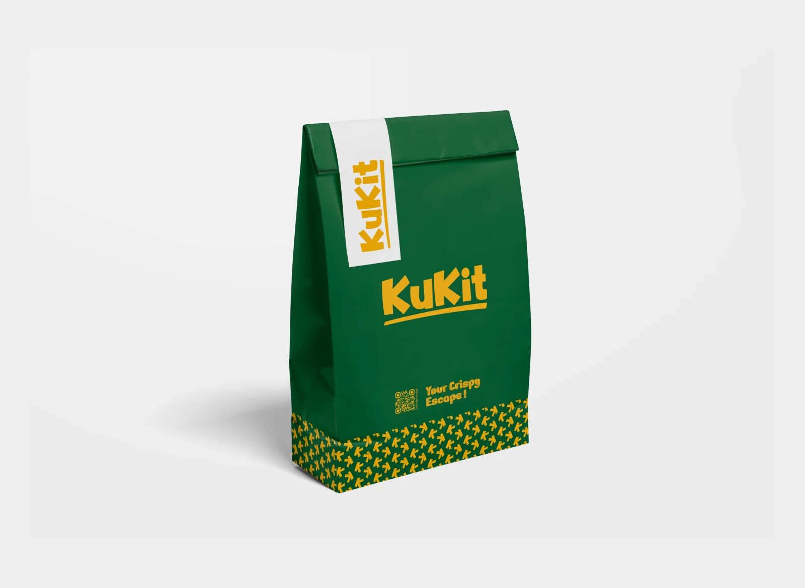
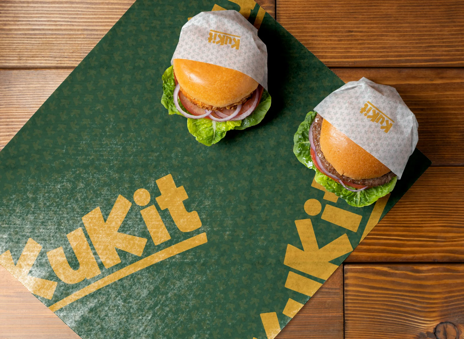
The repeat motif appears on wraps, cartons and carrier bags. Transparent cups adapt the same colours into a different printing context.
See the original boardWhat we built
A packaging presentation covering takeaway boxes, fries sleeves, carriers, a chicken bucket, wraps, drink cups and a burger carton.
The boards below are the original design pages from the supplied PDF presentation, including its application mockups.
Original source: Kukit Packaging.pdf
Explore the Kukit brand identity →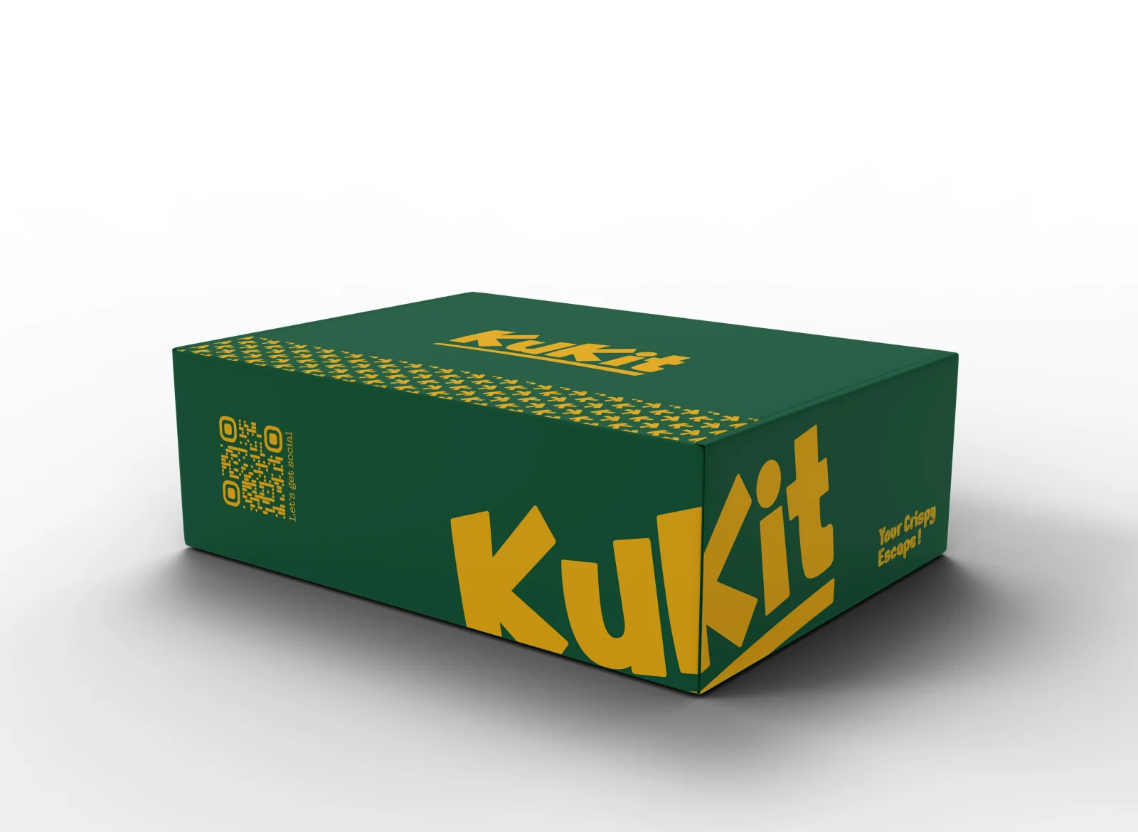
What does your brand need next?
Let’s talk about your project Next projectTayn Roastery