
Tea café
Hotshay

Hotshay brand film. Motion film made from the original Hotshay identity boards and brand applications.
Overview
An identity for Hotshay, "a perfect tea spot", built on a stacked wordmark with a flame-like leaf above the letters and a deep purple colour.
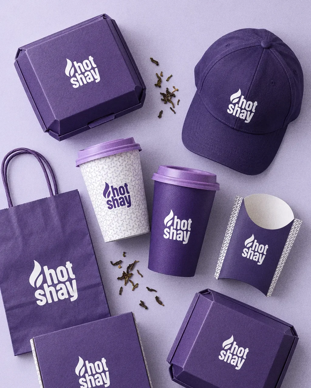
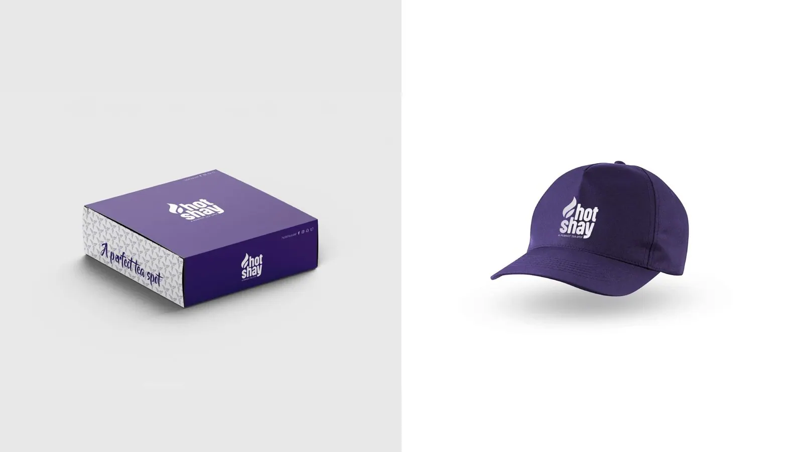
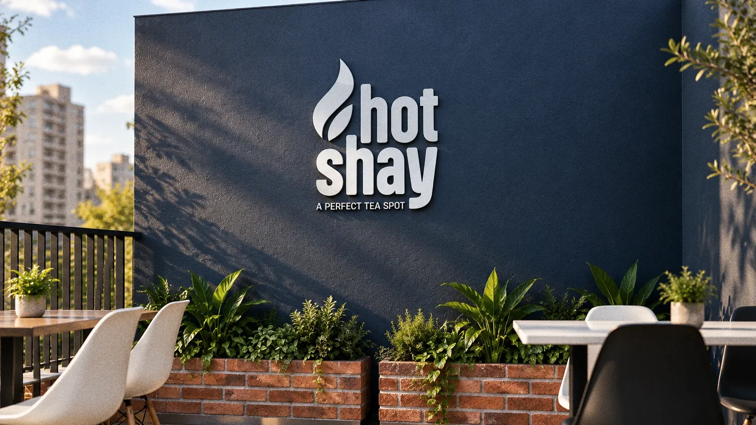
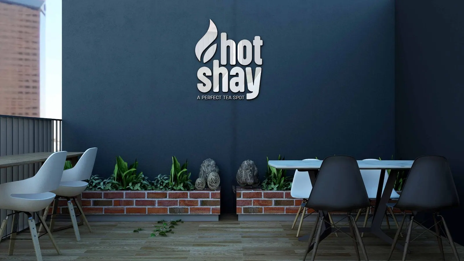
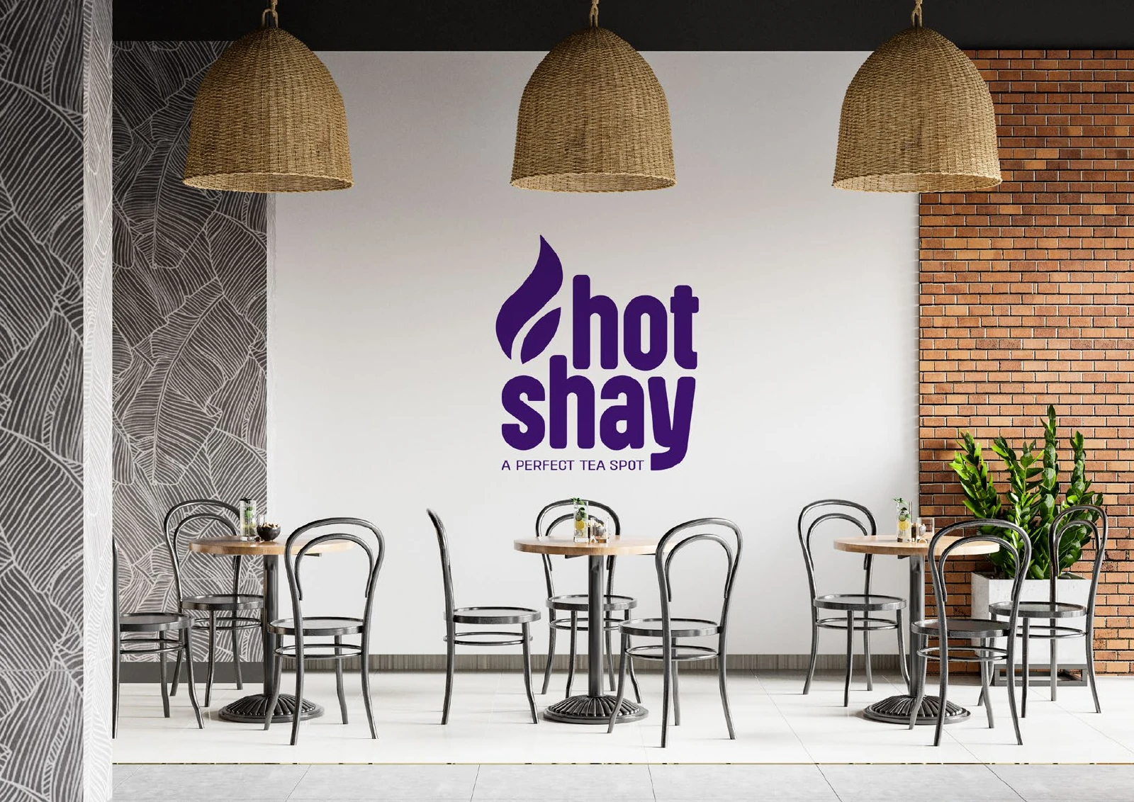
The presentation carries the system from cups and takeaway boxes to a cap and two café signage mockups.
BriefA tea spot needs an identity people can recognise both on the street and in their hand. The design task is to connect that small everyday purchase with the name of the place it came from.
Services
Scope
- Wordmark and tagline
- Colour and brand pattern
- Takeaway packaging, merchandise and café signage applications

How to read this deck
The deck pairs the client’s original presentation boards with new application scenes that show the identity in use.
Some of the older boards have been redrawn. Each one sits where the original stood, with the real original design in its corner and a View original button to open it in full.
Chapter 01
Concept and inspiration


Chapter 02
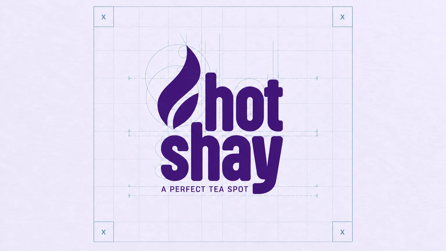
How the logo was formed
Chapter 03
The logo
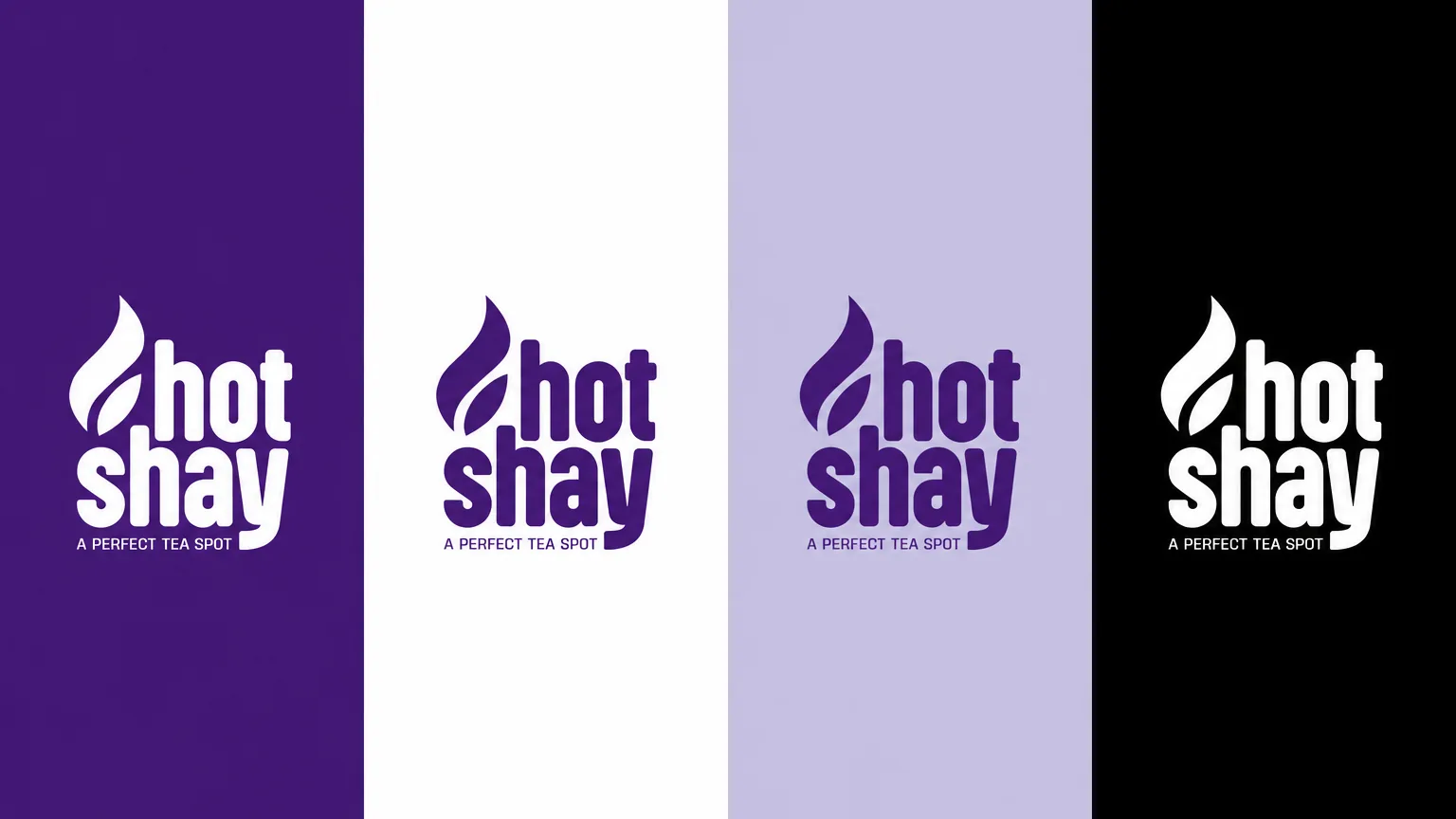
The stacked Hotshay name and tea-inspired symbol give the café a compact identity rooted in its tea focus. The original inspiration board connects a steaming cup with tea leaves, and monochrome versions keep the same distinctive shape.
Tea, steam and a leaf
The inspiration board sets a steaming cup over tea leaves. The wordmark picks up that idea with a leaf-like flame rising from the first letter, and the purple field carries through every board.


Chapter 04
Logo variations


Chapter 05
Colour
- Accent
#4B2A8C - Surface
#1C1033 - Ink
#FFFFFF
Colours sampled from the original identity boards.

Chapter 06
Pattern and graphic elements
A pattern for small surfaces
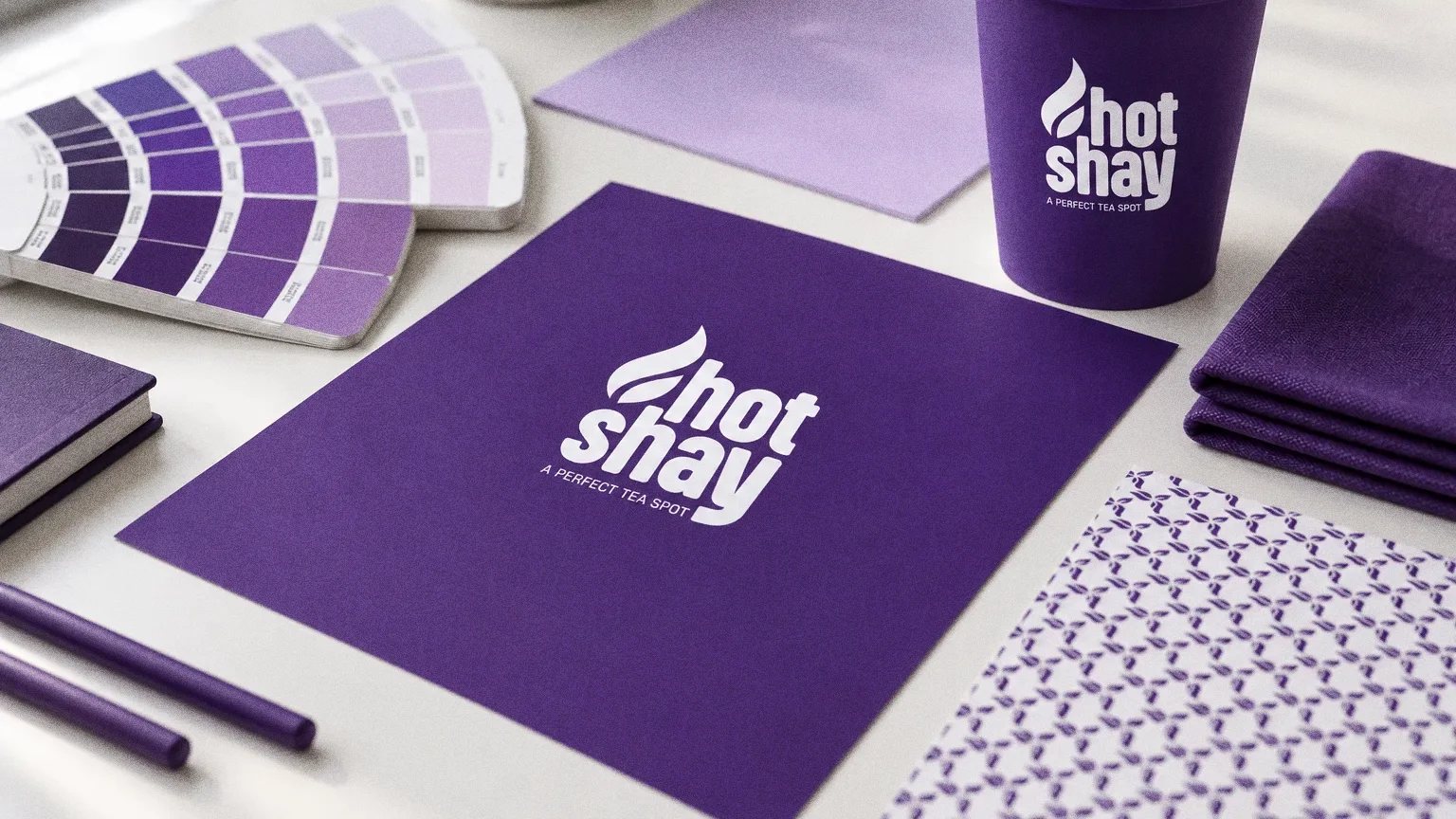
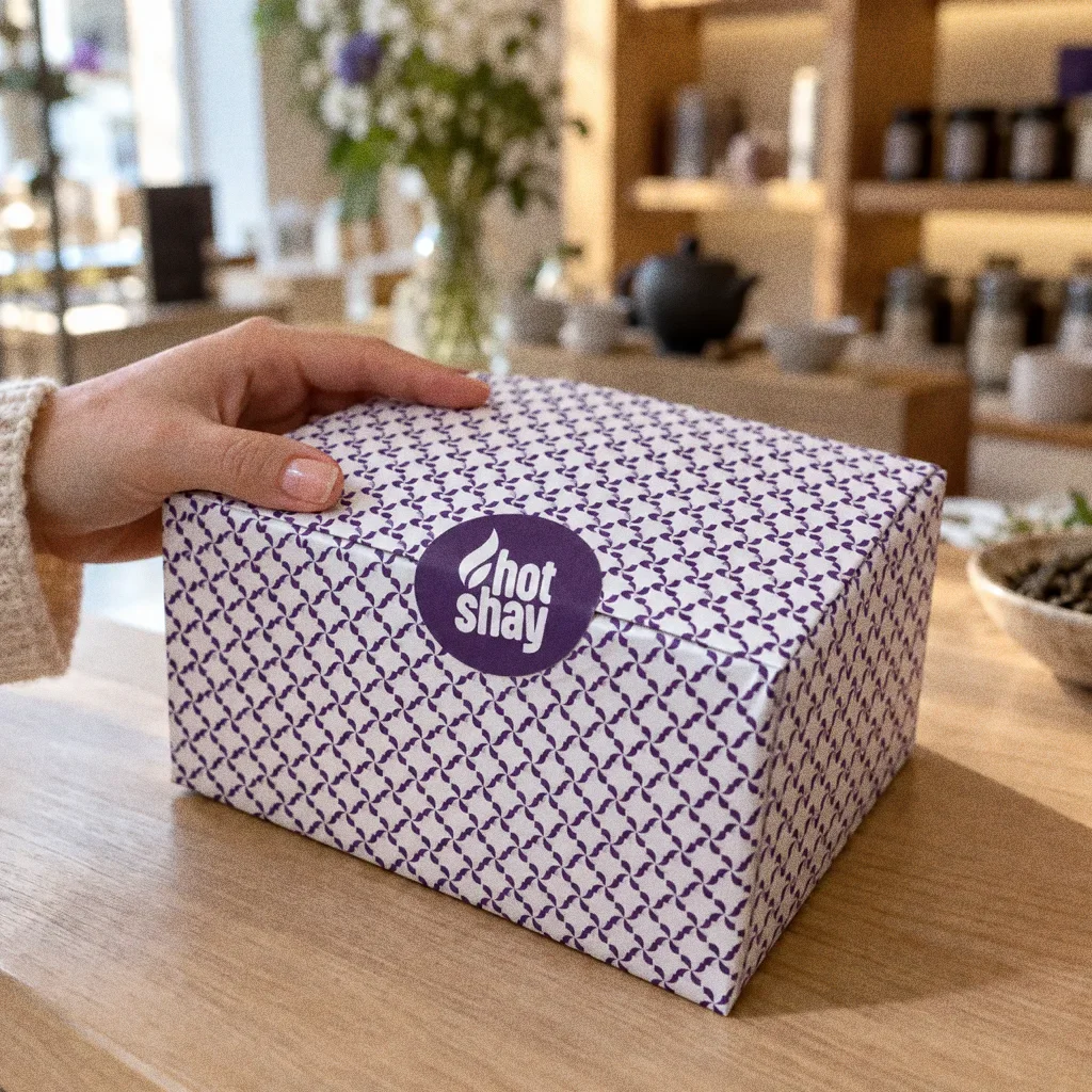
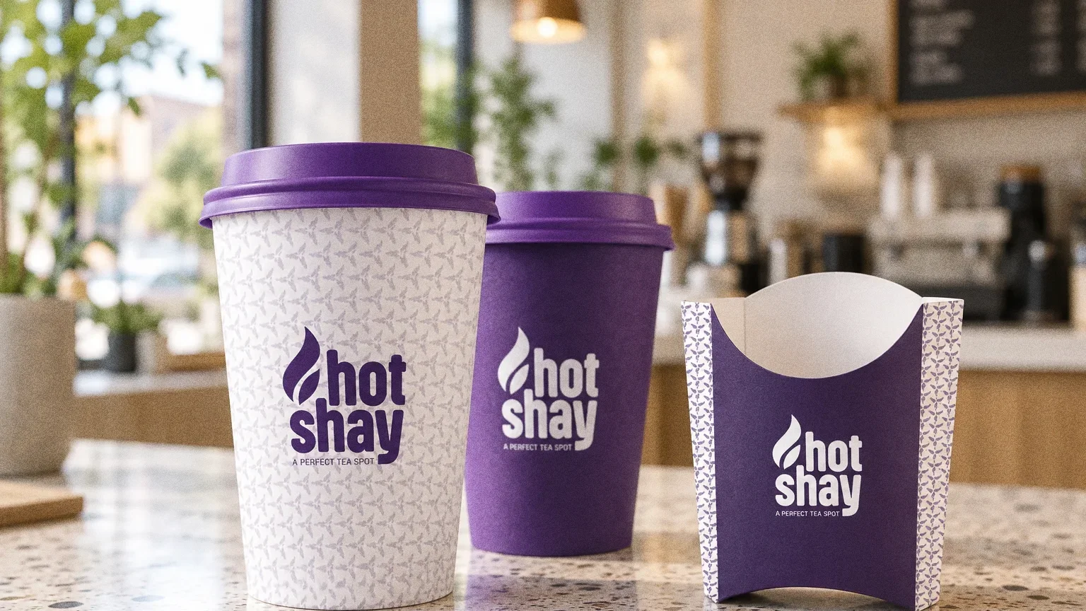
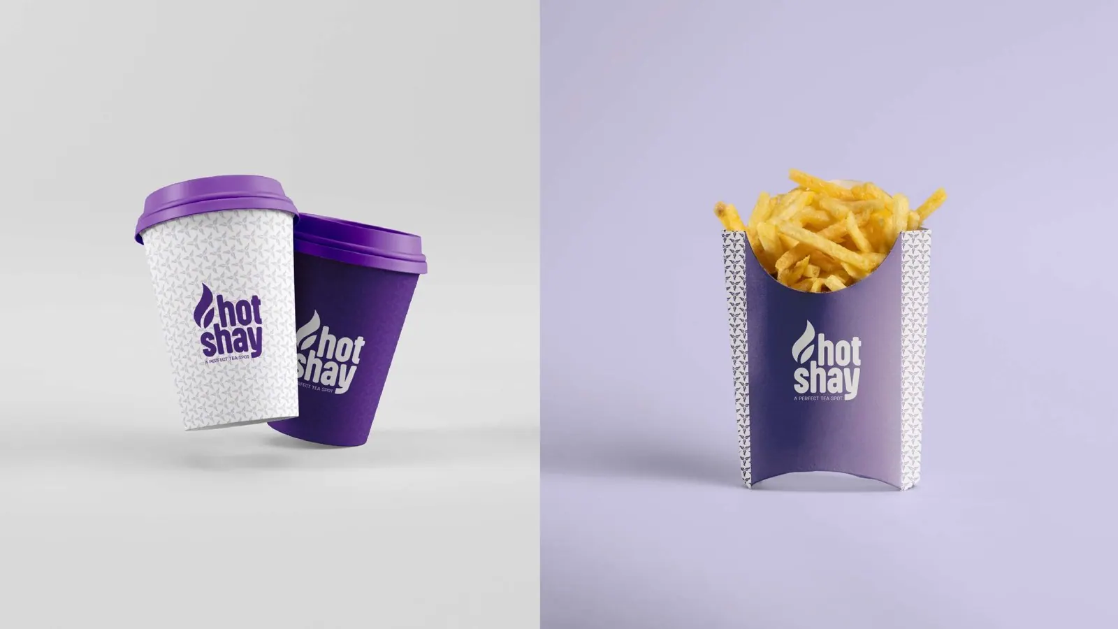
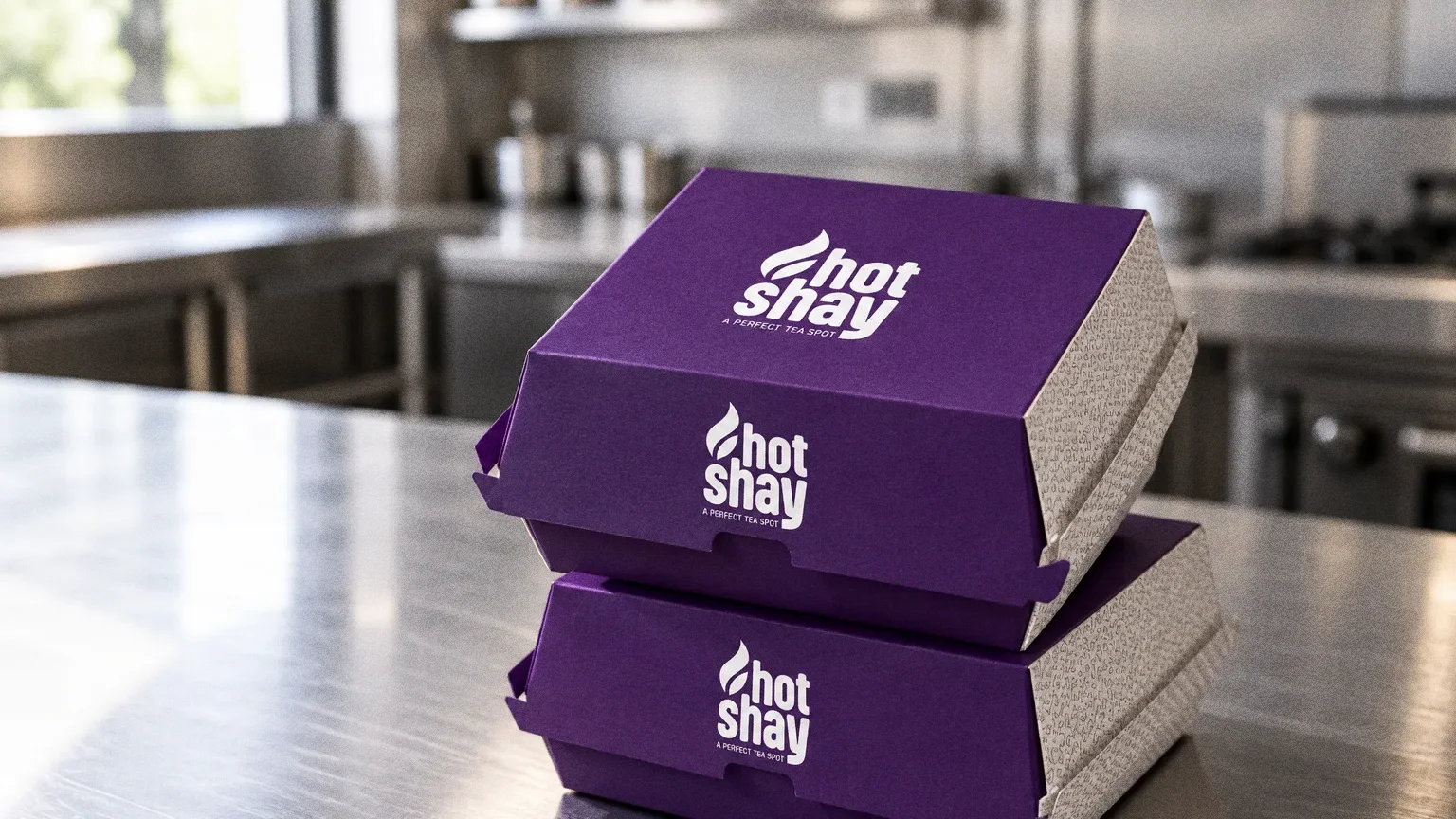
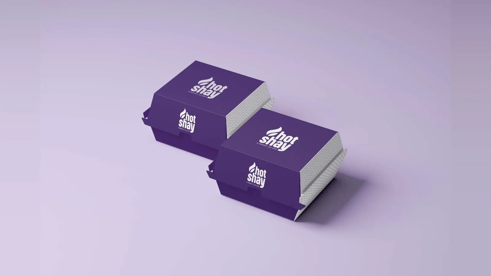
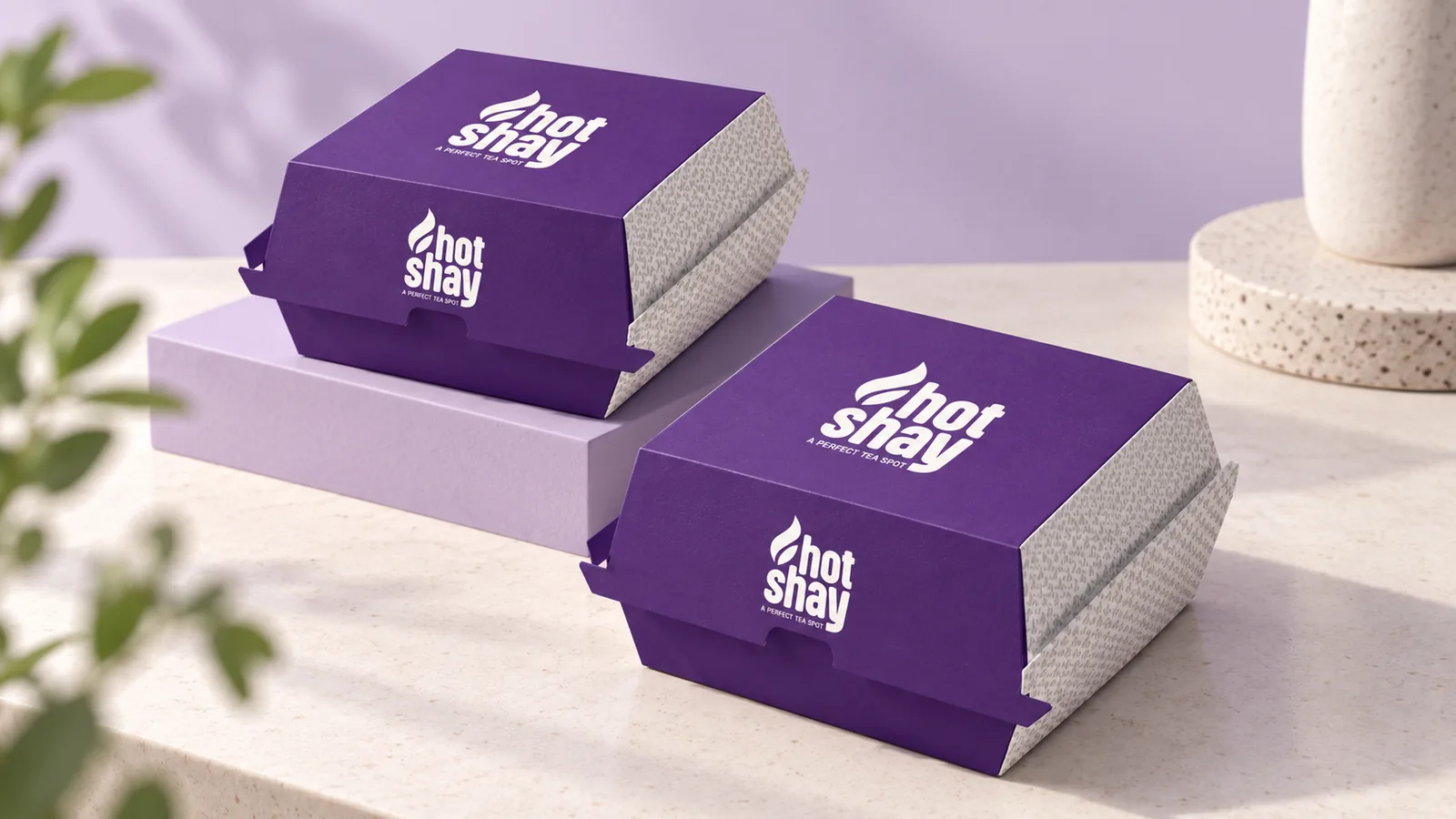
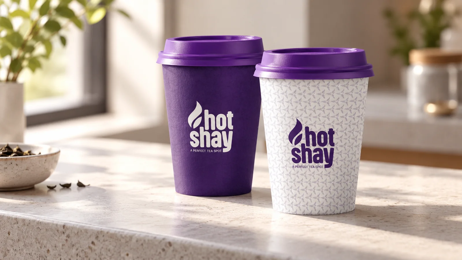
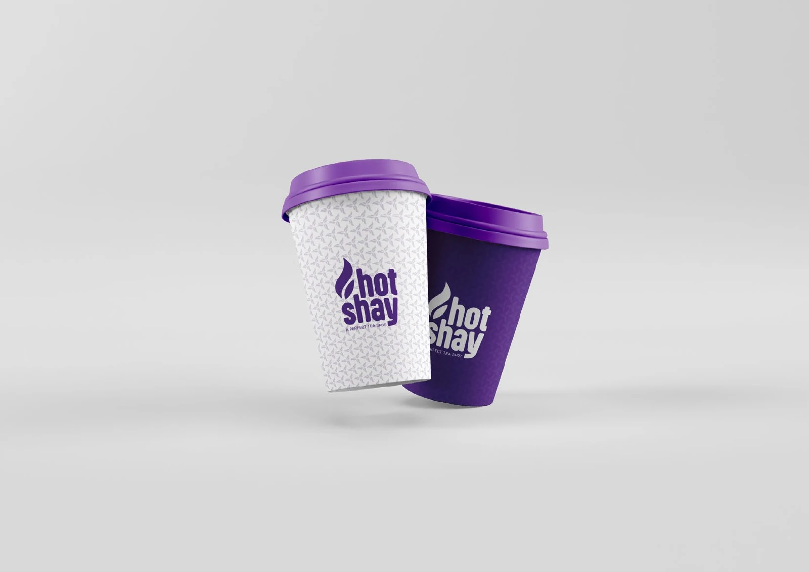
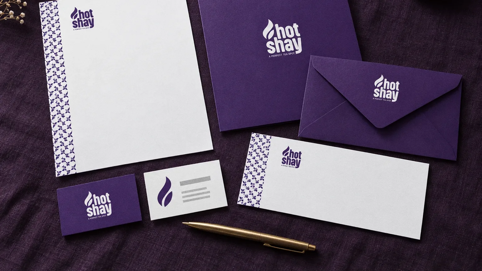
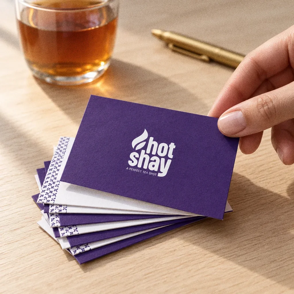
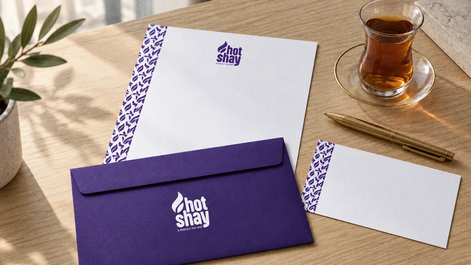
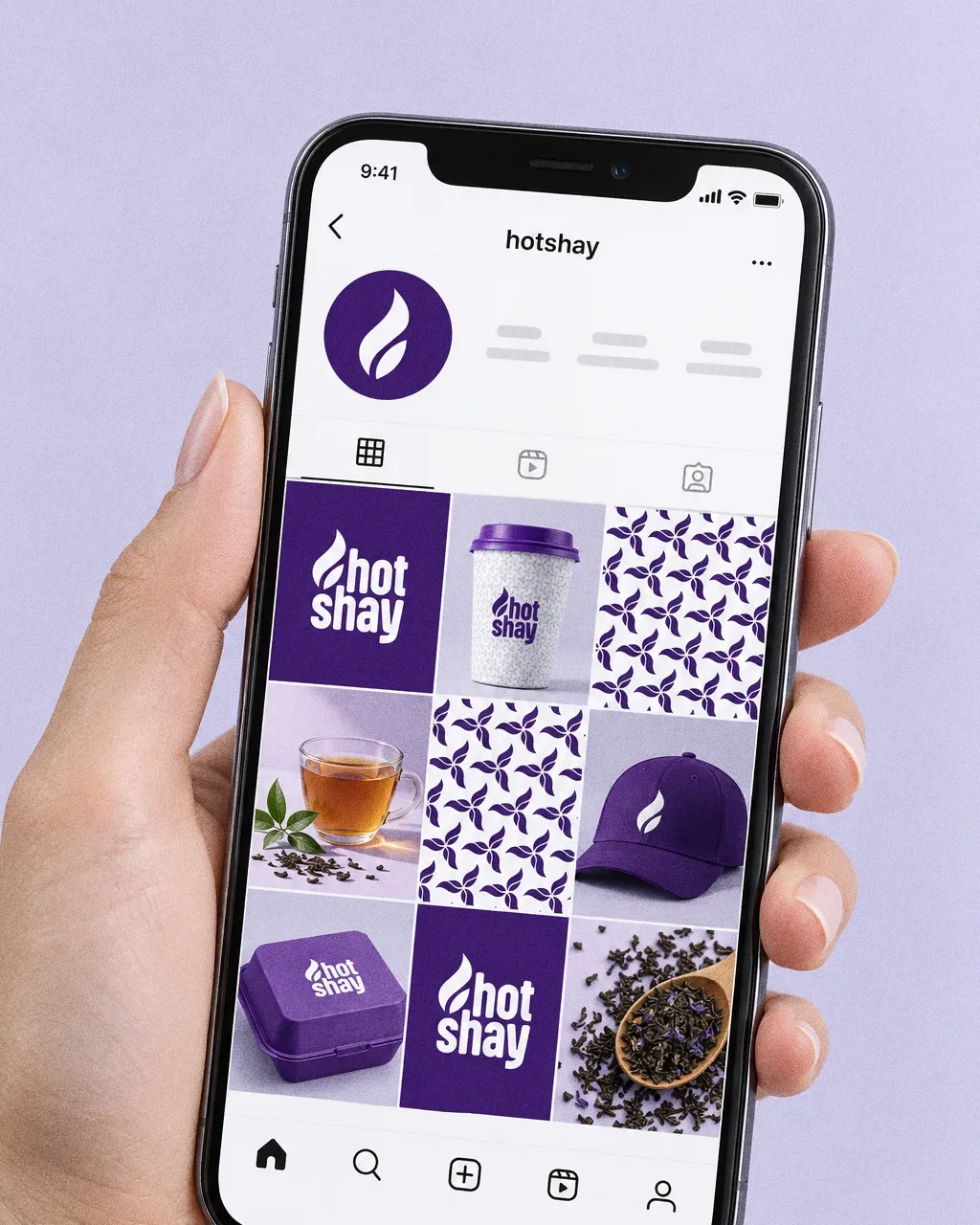
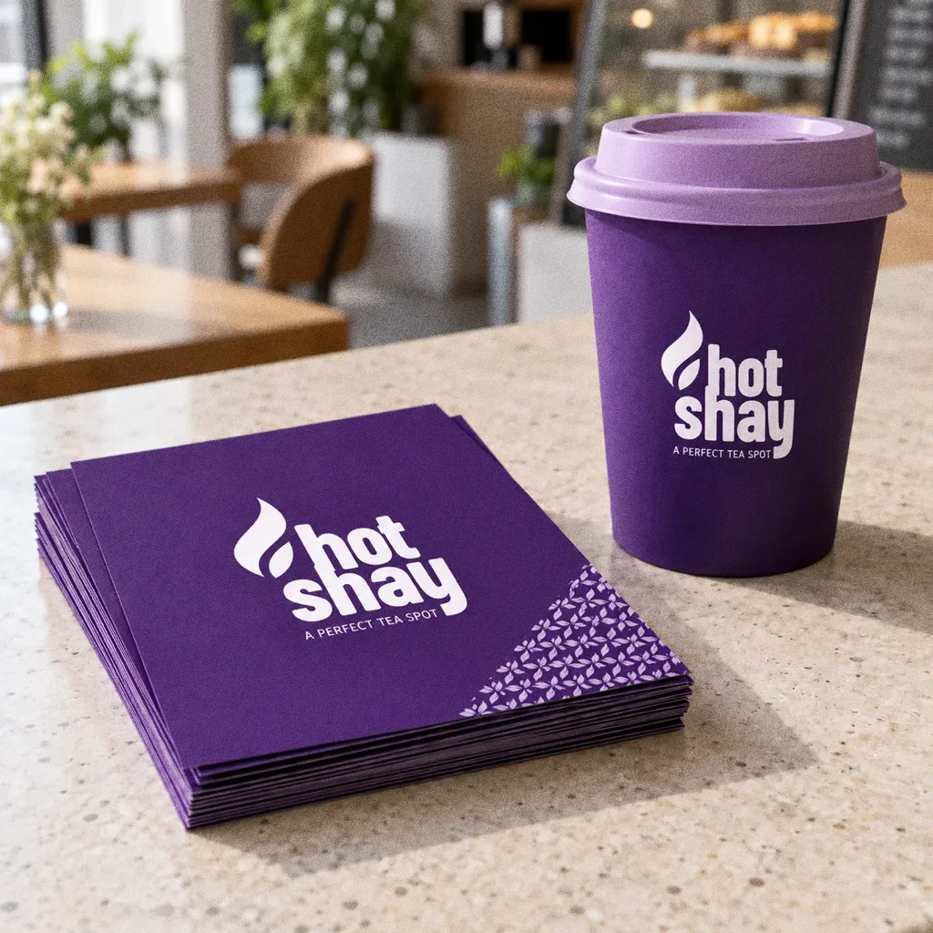
A repeating brand pattern fills the space the logo cannot: cup sleeves, the fries holder and the side panels of the boxes. The full wordmark is kept for the larger café walls.


Chapter 07
Packaging
Chapter 08
Stationery
Chapter 09
Signage and spaces
Chapter 10
Digital
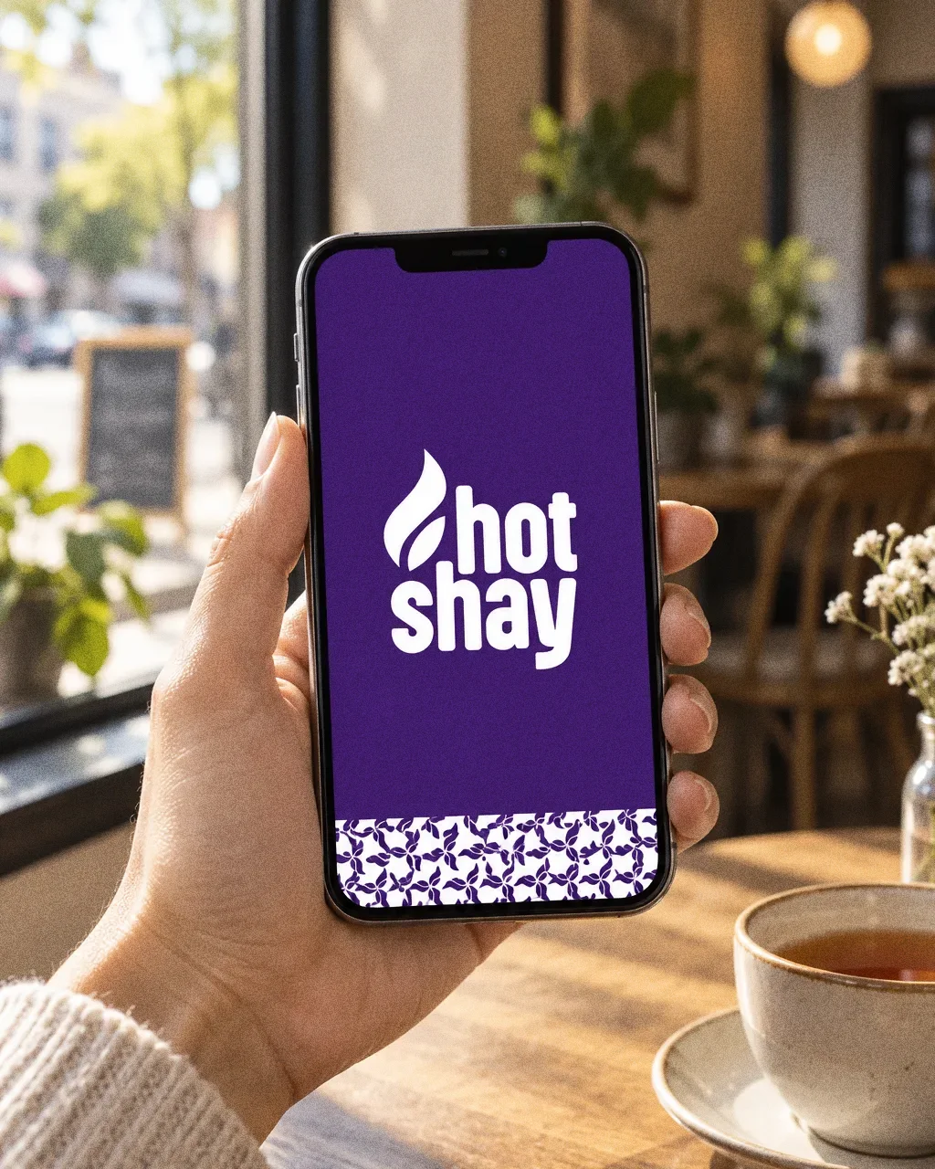
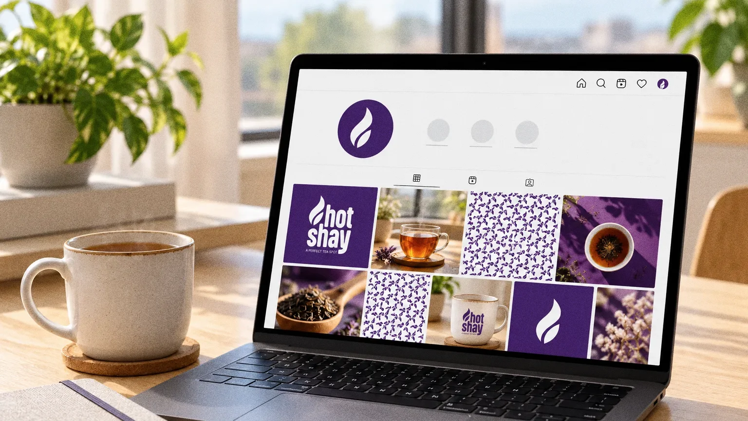
Chapter 11
The brand in the world
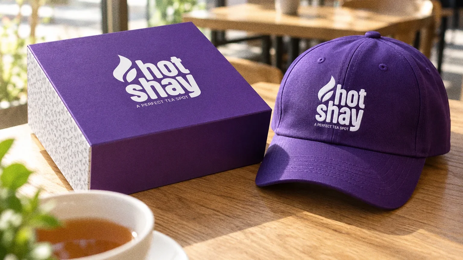
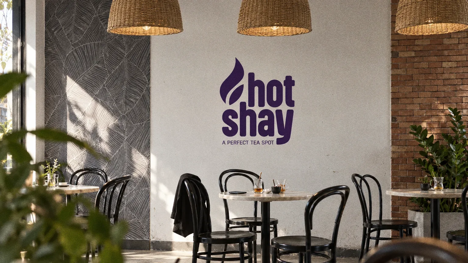
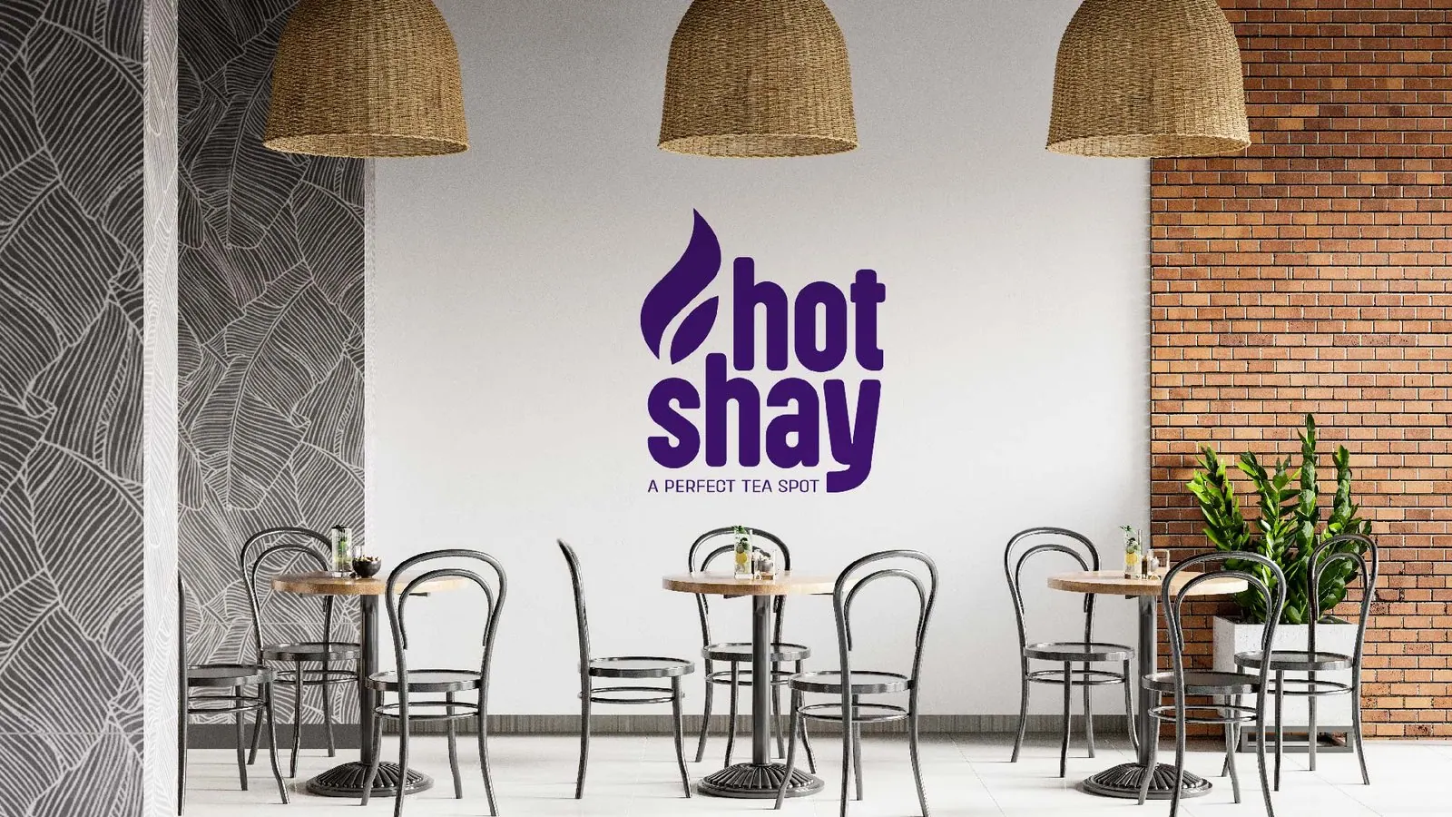
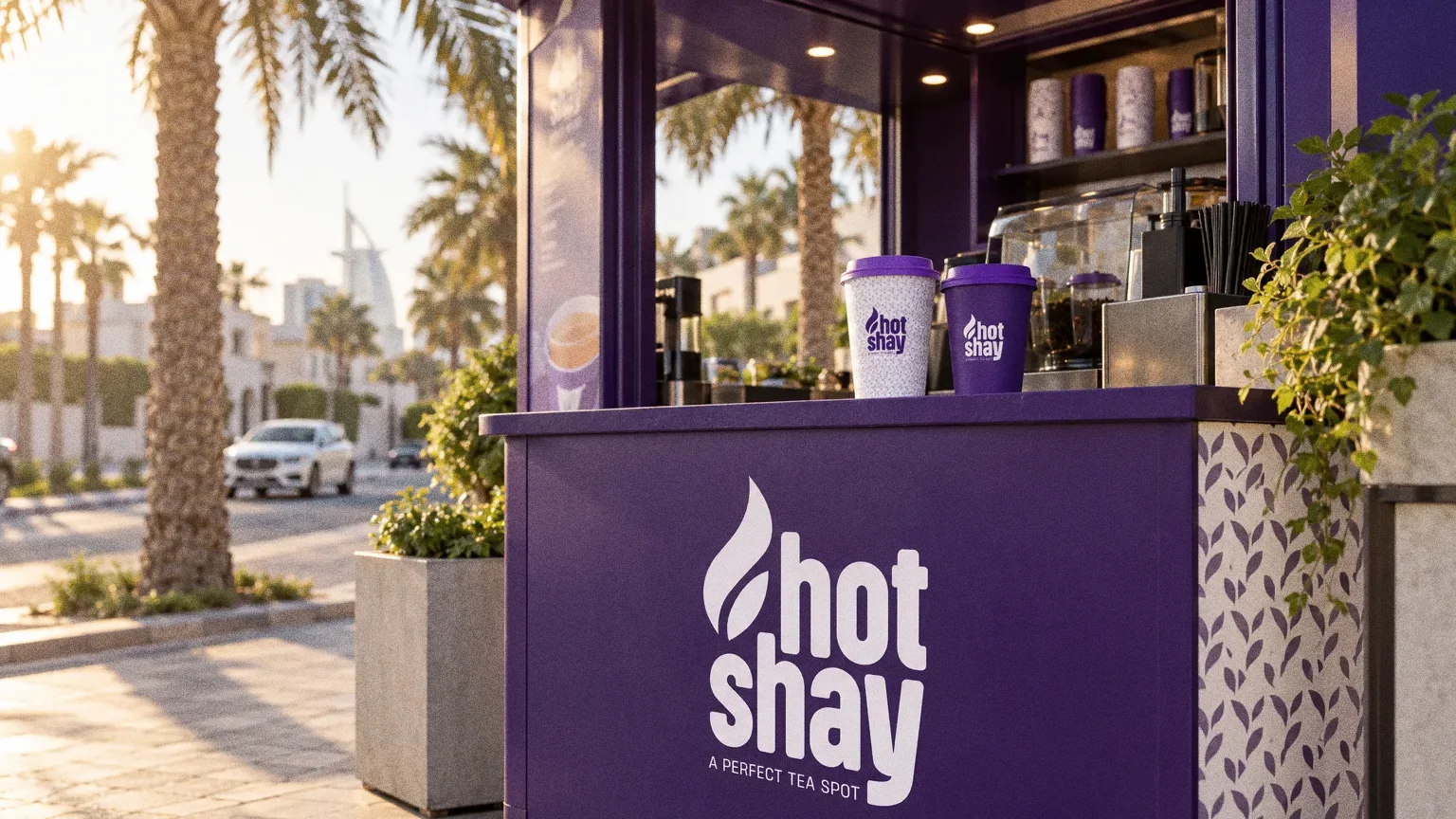
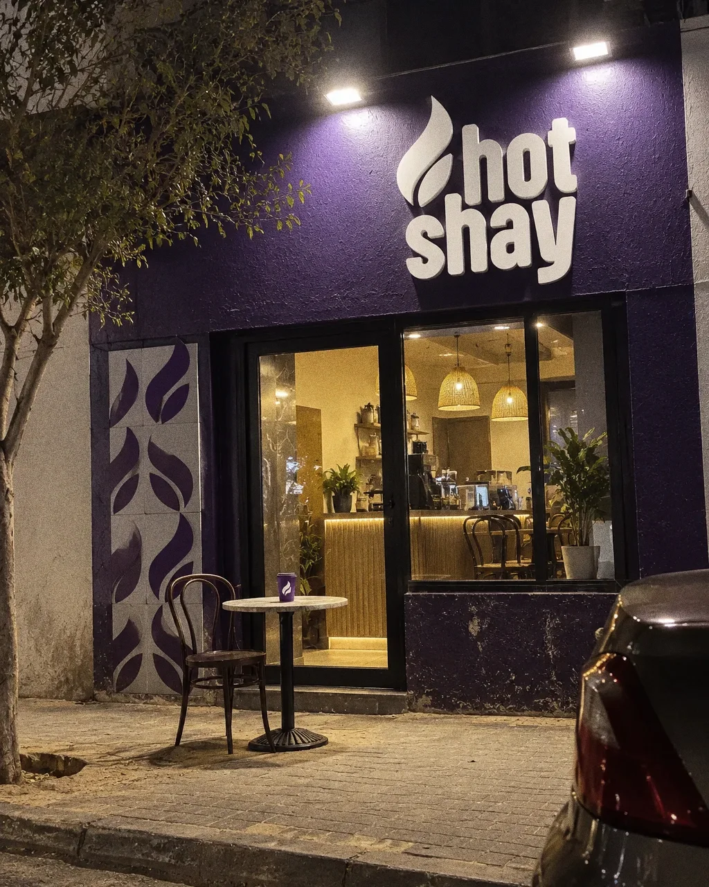
Cups, fries sleeves and food boxes bring the leaf pattern into takeaway service. A branded cap and café wall-sign mockups show how the same identity can extend to staff wear and the café environment.


Chapter 12
In people’s hands
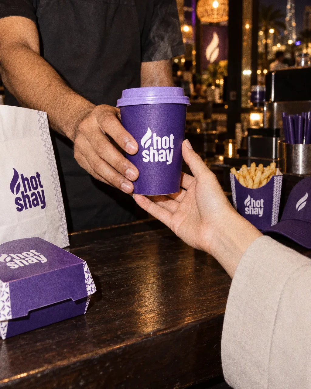
Cup across the counterThe Hotshay identity in a lifestyle photograph of a cup being handed across a tea counter at night. 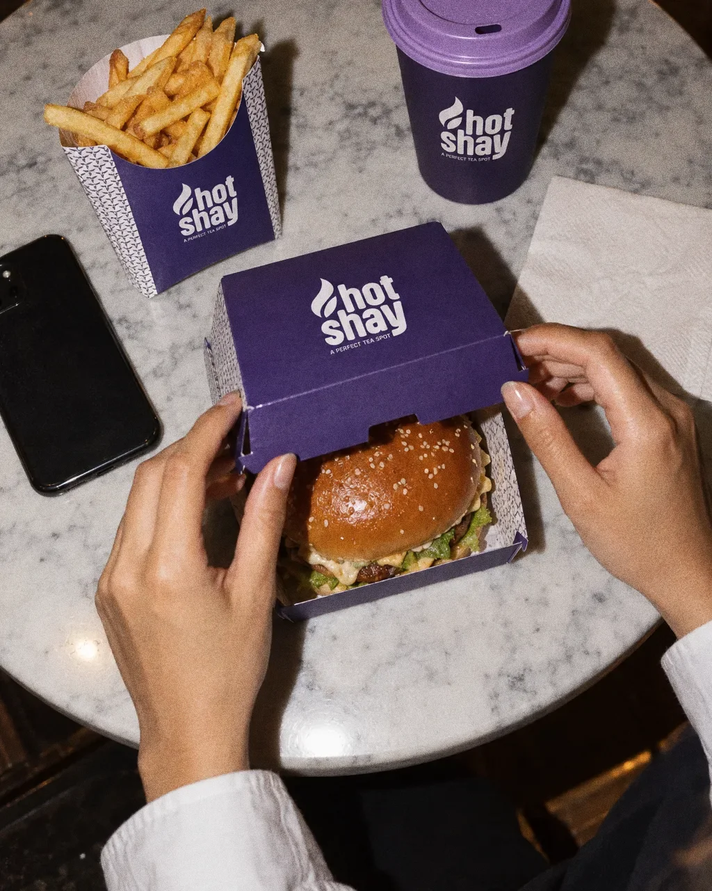
Burger box on marbleThe Hotshay identity in a lifestyle photograph of a burger box, fries pouch and cup on a cafe table. 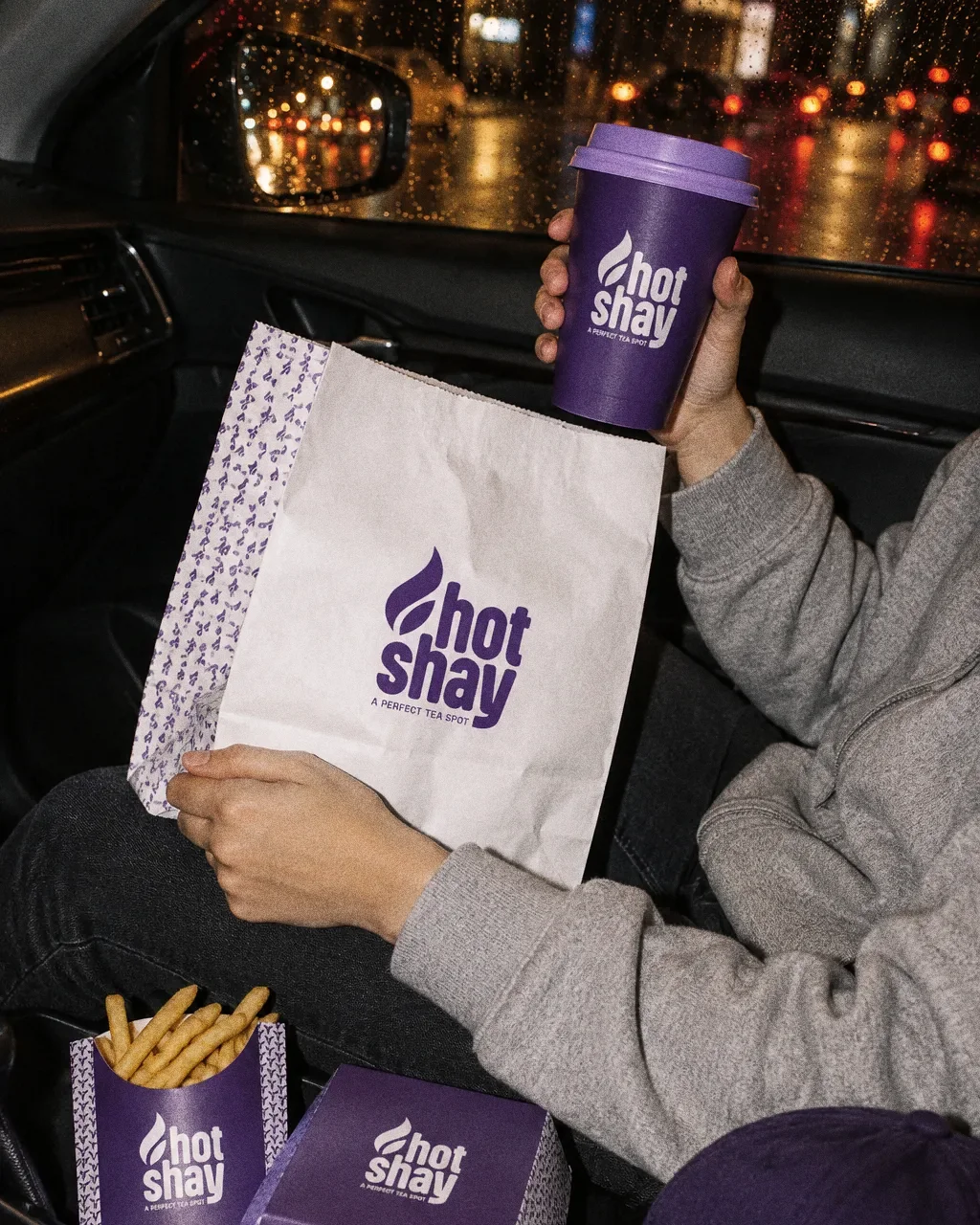
Tea on the ride homeThe Hotshay identity in a lifestyle photograph of a passenger with a bag, cup, fries and burger box in a car at night. 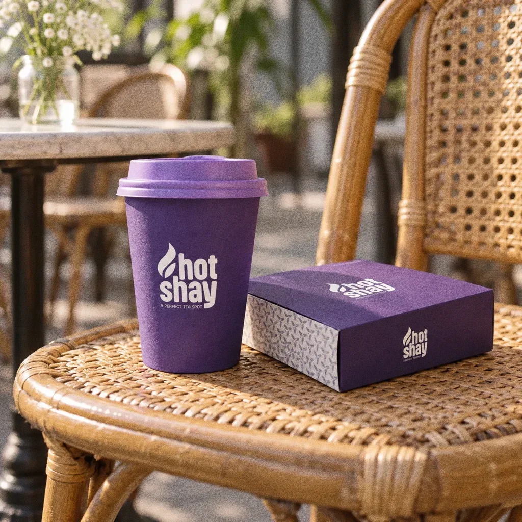
Cup on a rattan chairThe Hotshay identity in a lifestyle photograph of a cup and small box on a rattan cafe chair. 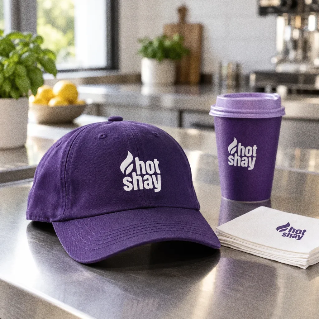
Cap on the steel counterThe Hotshay identity in a lifestyle photograph of a cap, cup and napkins on a steel kitchen counter.
Chapter 13
Campaign


About this deck
What we built
A purple-led identity with a flame-like leaf, a stacked wordmark and a repeat pattern, demonstrated across drinks, takeaway packaging, clothing and café signage.
About the originals
The original boards are from Abcon’s original project presentation and include application mockups.