Cafeteria
Snap Chay
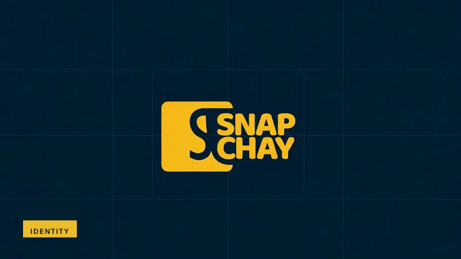
Snap Chay brand film. Motion film made from the original Snap Chay identity boards and brand applications.
Overview
A bilingual cafeteria identity for Snap Chay, with English and Arabic logo versions, a yellow-and-navy palette and a repeating symbol pattern.
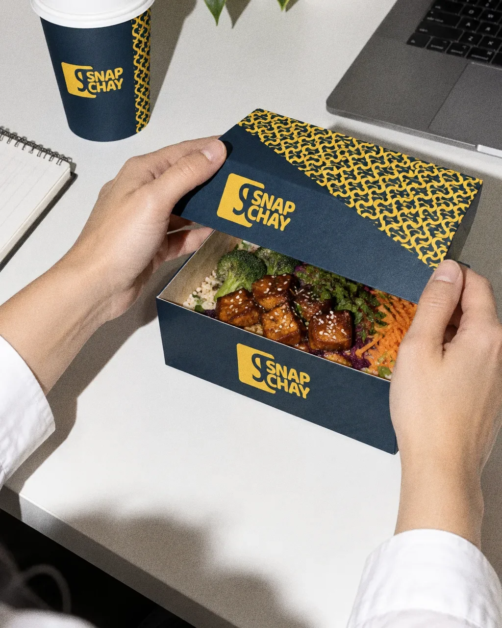
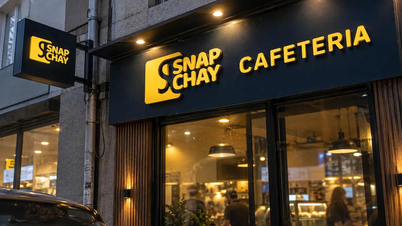
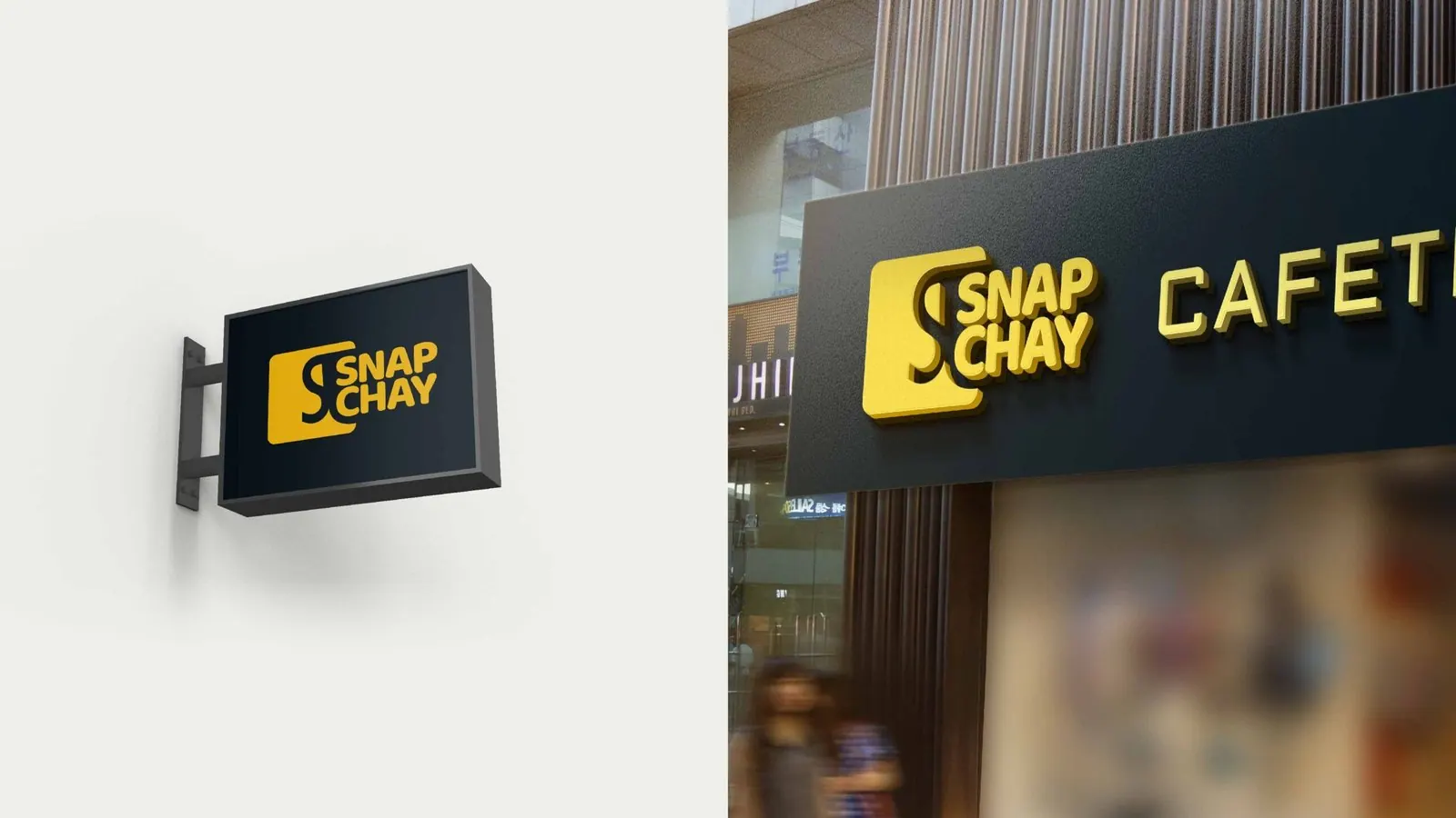
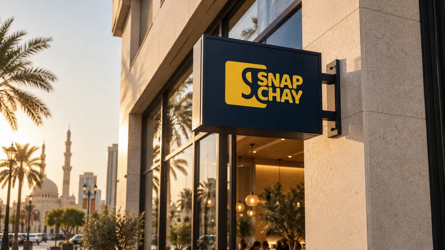
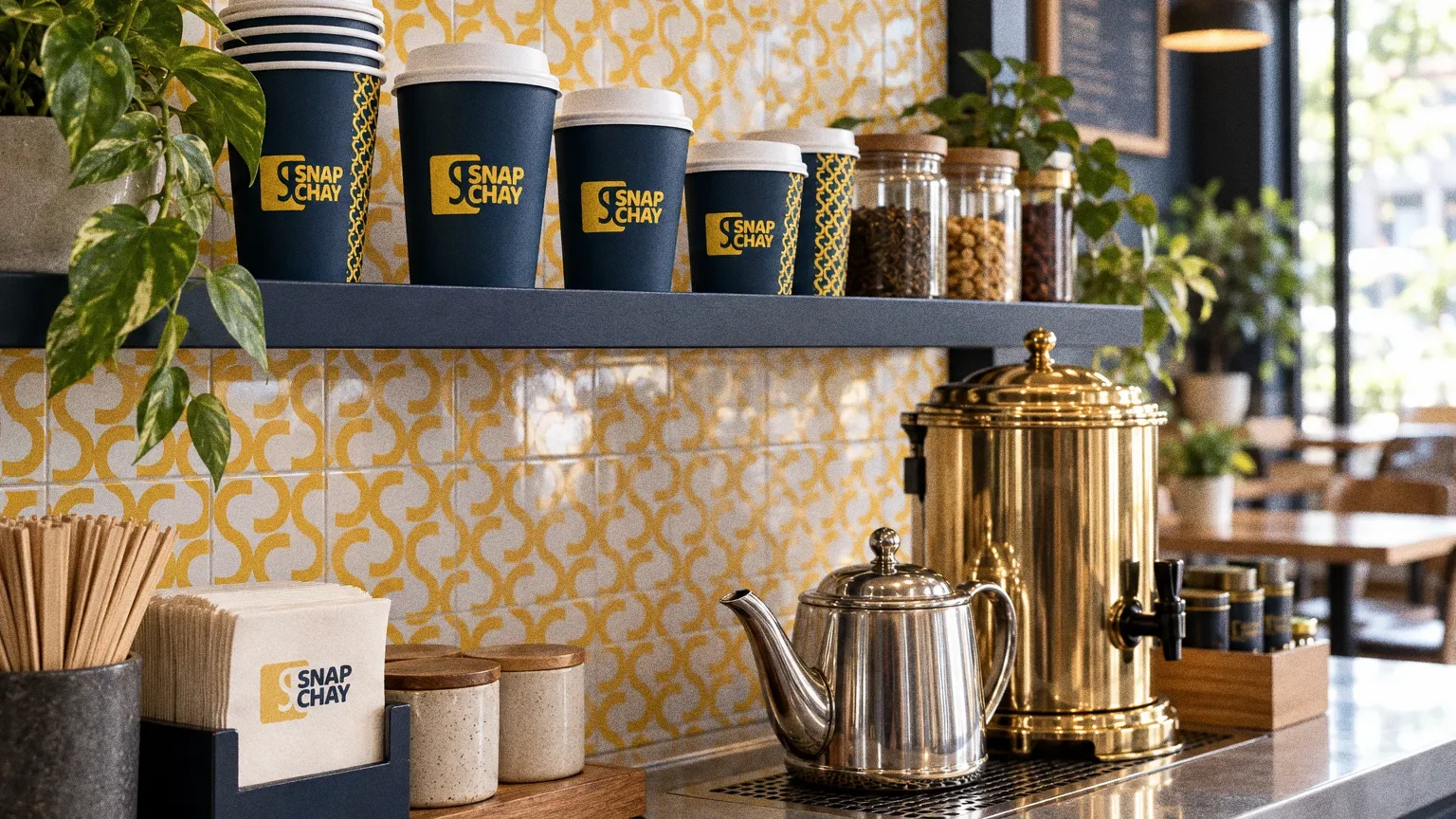
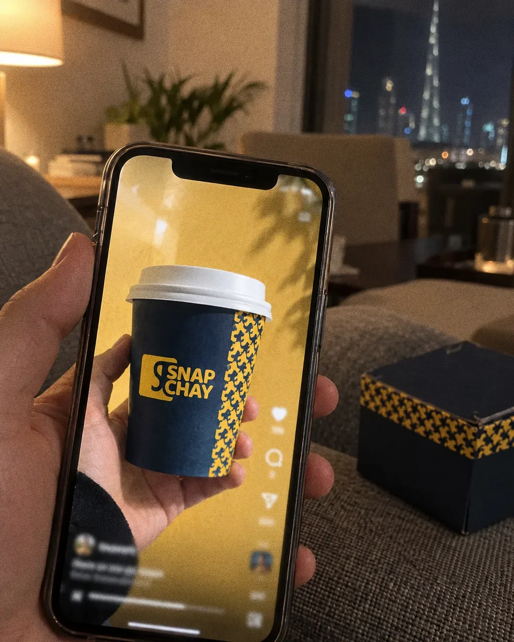
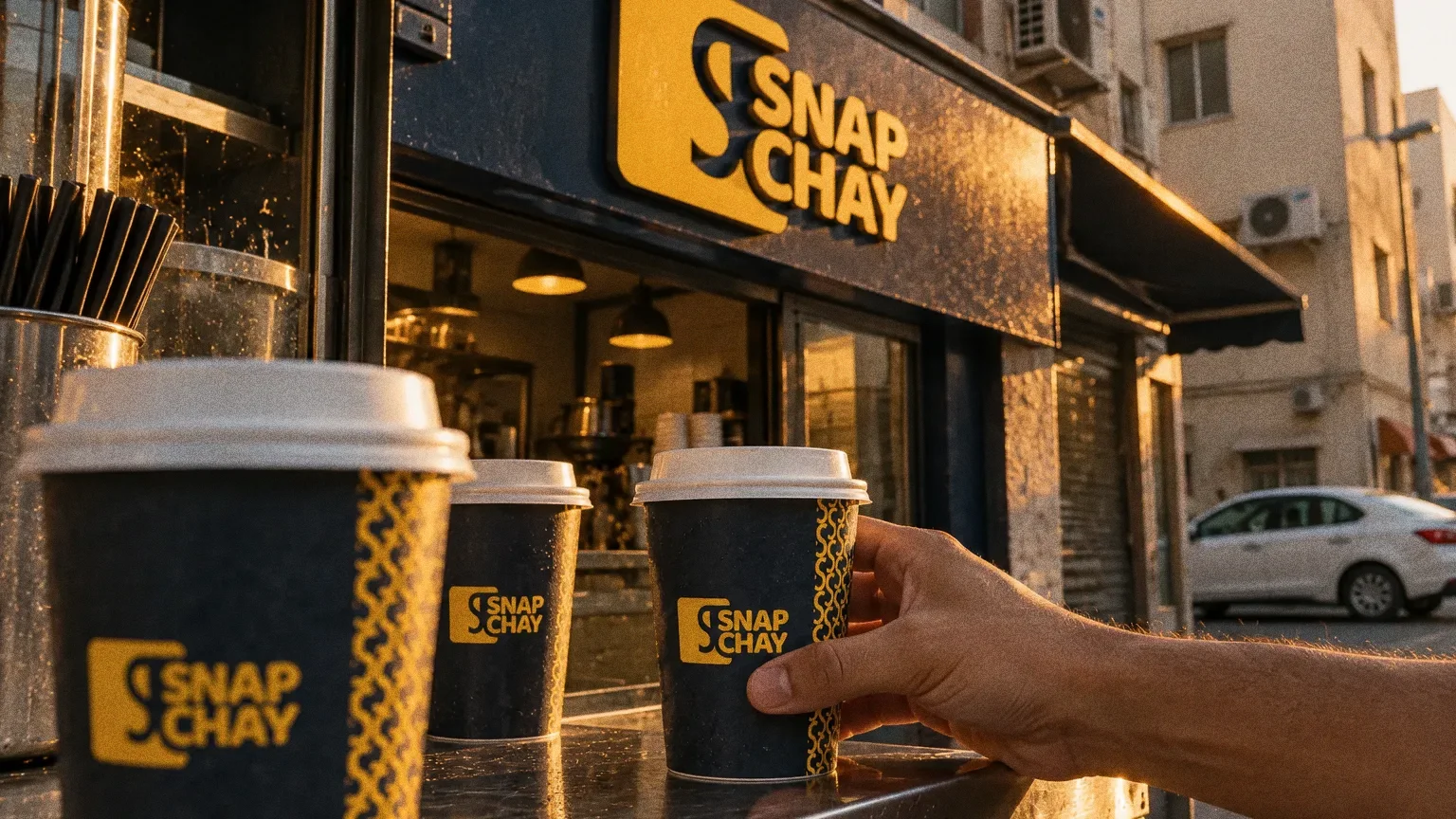
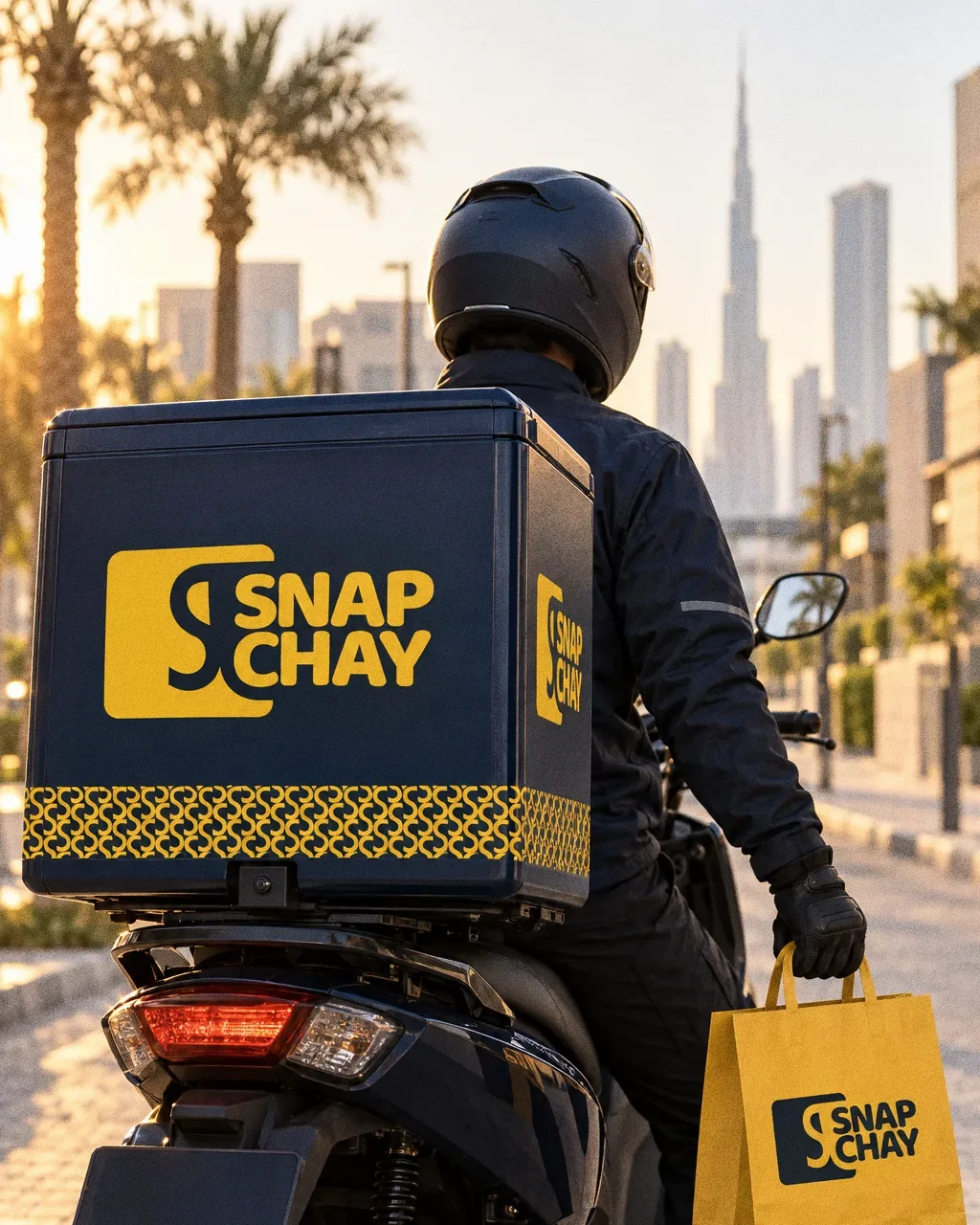
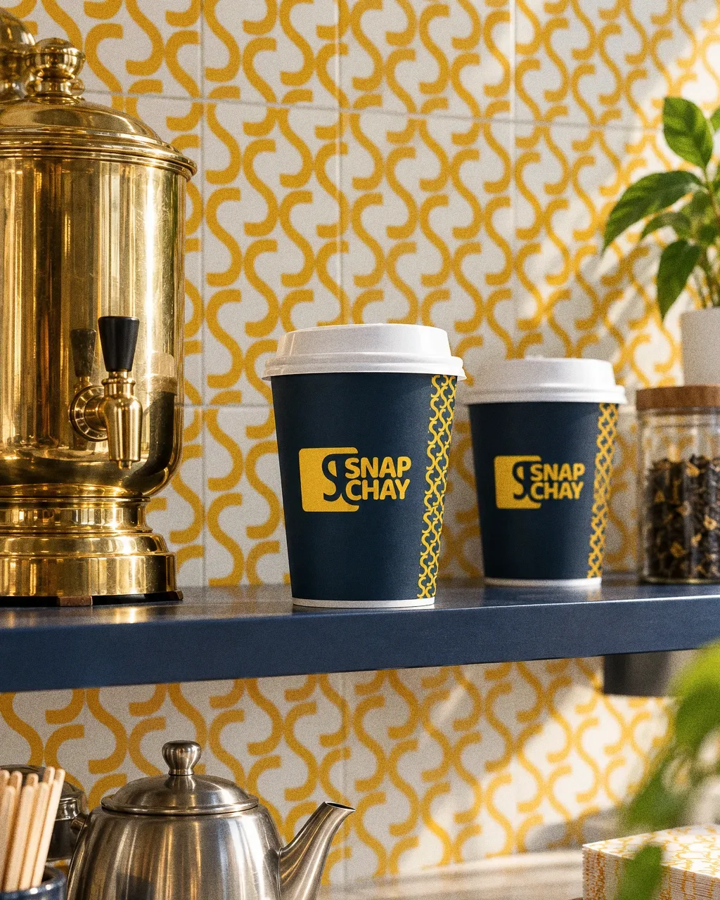
The presentation applies the system to takeaway boxes, cups and shopfront signage.
BriefA cafeteria identity needs to work across languages and across takeaway materials. The design task is to keep the business recognisable when the script, surface or size changes.
Services
Scope
- English and Arabic logos
- Colour and pattern
- Takeaway packaging and signage applications
Sources
How to read this deck
The deck pairs the client’s original presentation boards with new application scenes that show the identity in use.
Some of the older boards have been redrawn. Each one sits where the original stood, with the real original design in its corner and a View original button to open it in full.
Chapter 01
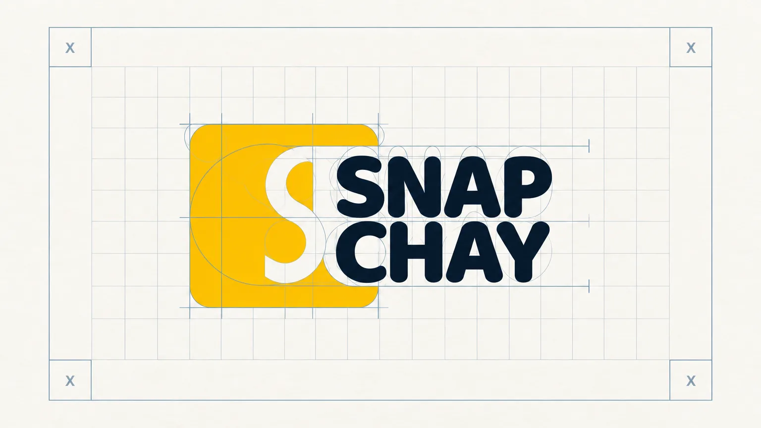
How the logo was formed
Chapter 02
The logo
Chapter 03
Logo variations
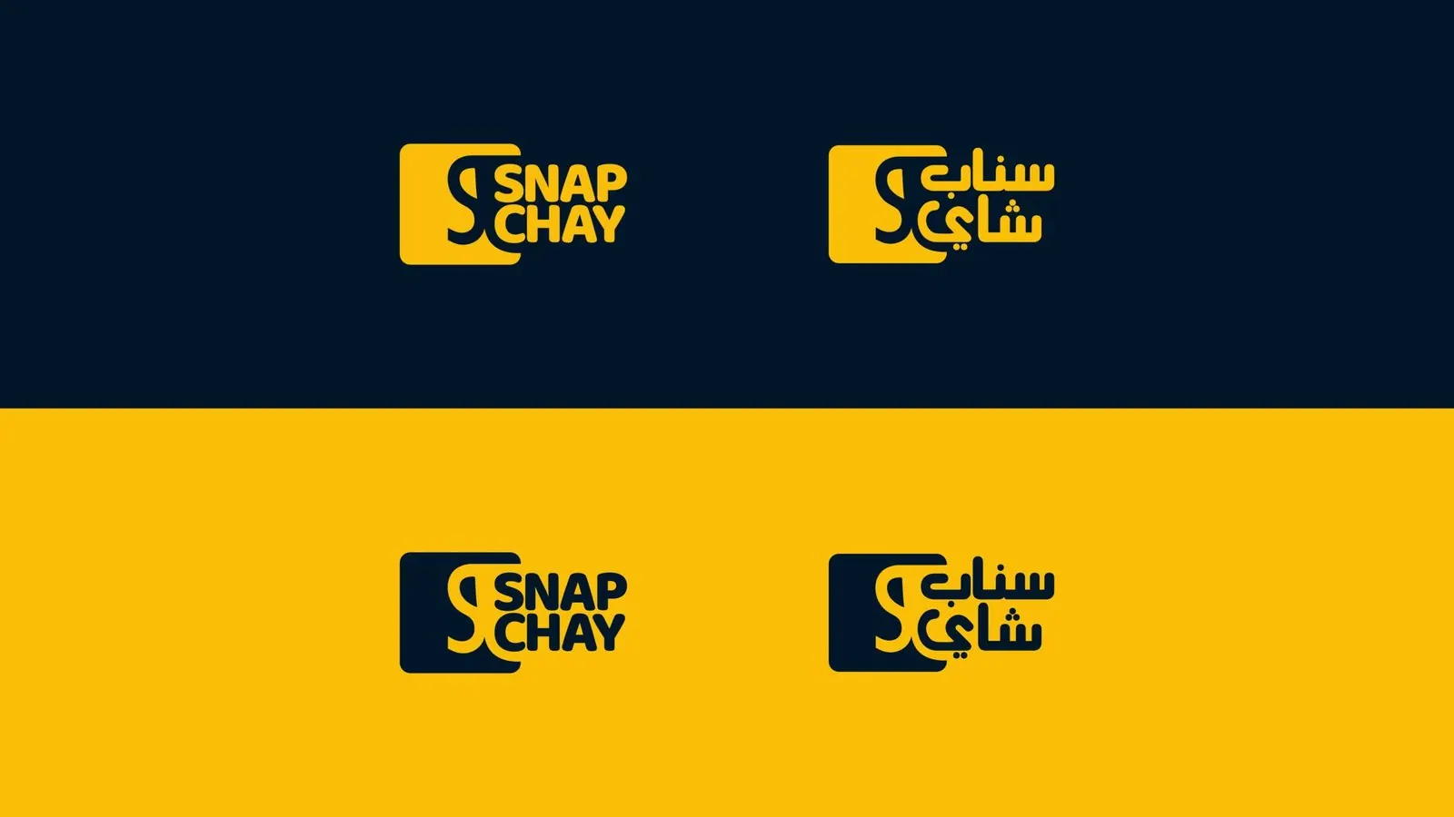
Two scripts, one visual system
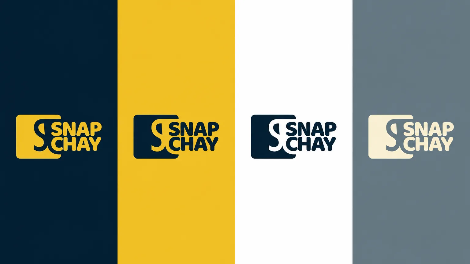
English and Arabic lockups share a square symbol and the same yellow-and-navy treatment. The paired logo board shows both versions on light and dark backgrounds, so the language changes while the identifying shape and colours remain consistent.

Chapter 04
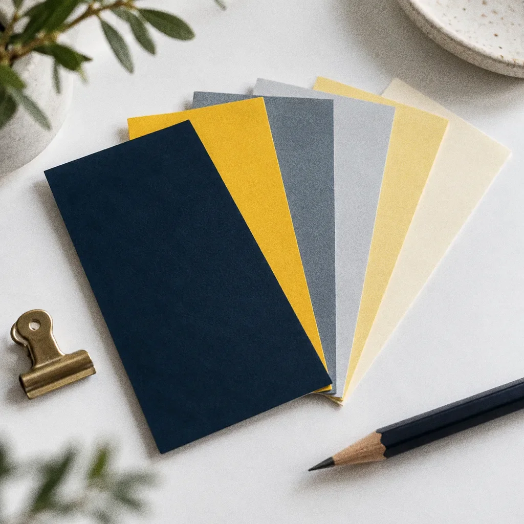
Colour
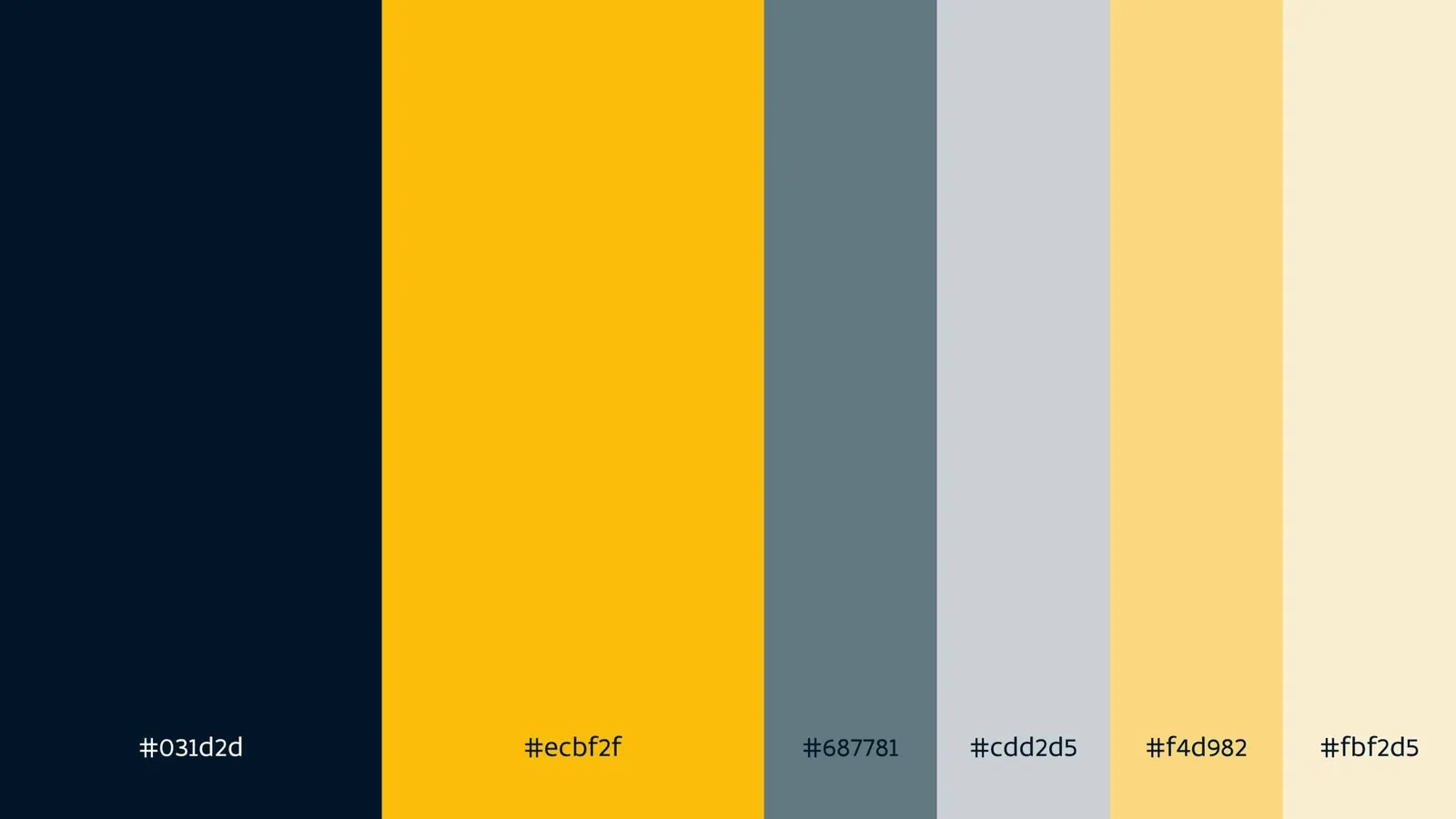
- Accent
#ECBF2F - Surface
#031D2D - Ink
#FFFFFF
Colours sampled from the original identity boards.
Chapter 05
Pattern and graphic elements

Chapter 06
Packaging
From the cup to the shopfront
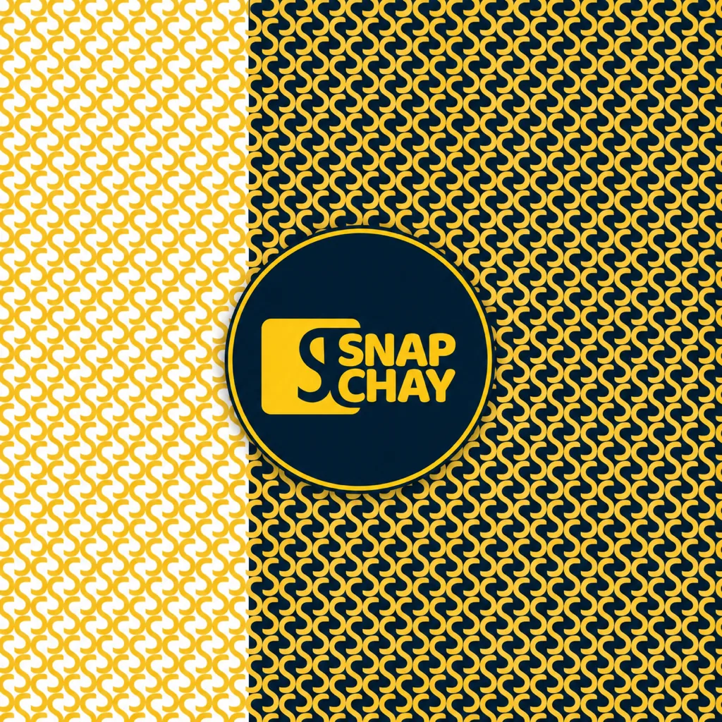
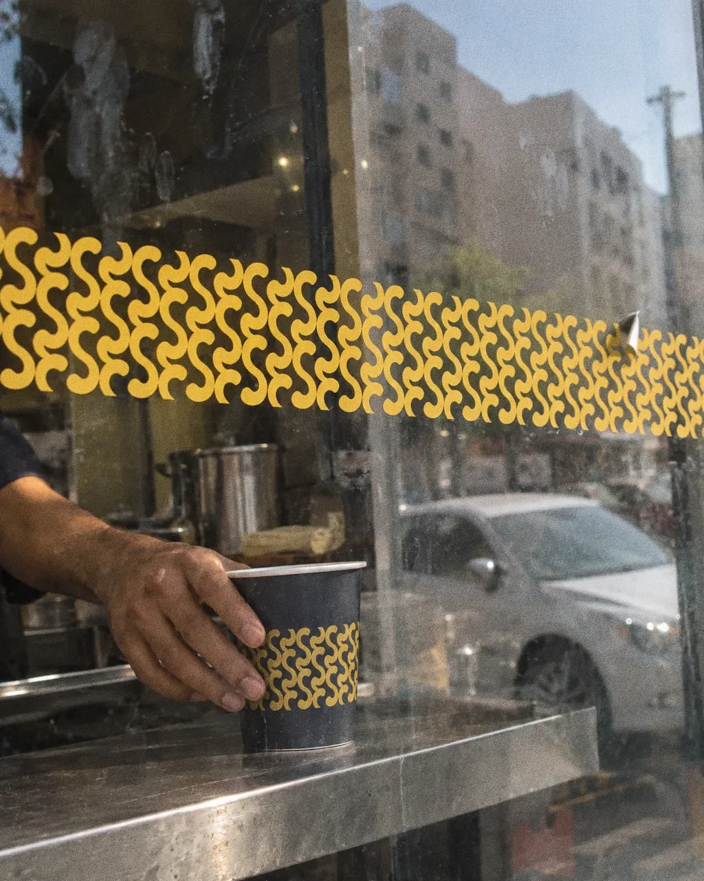
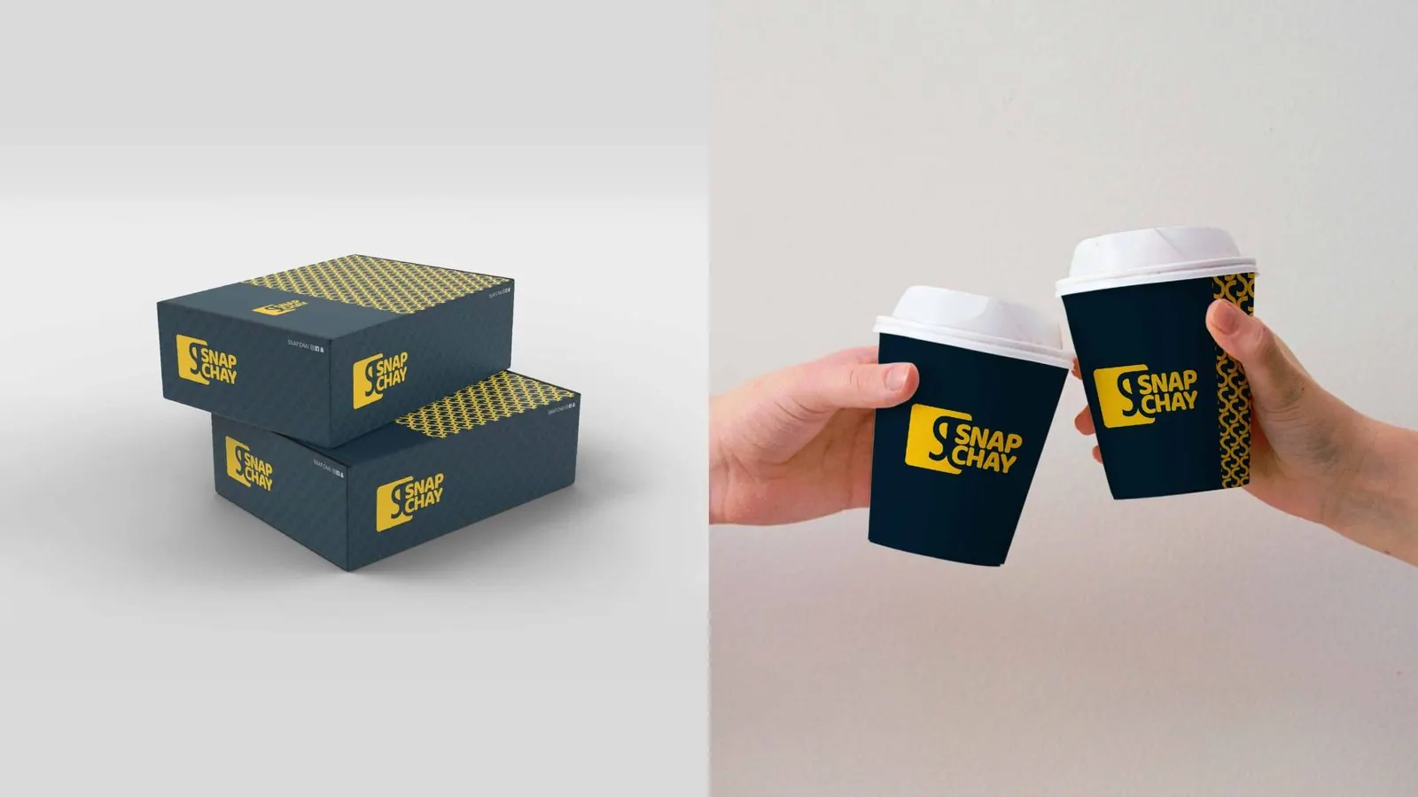
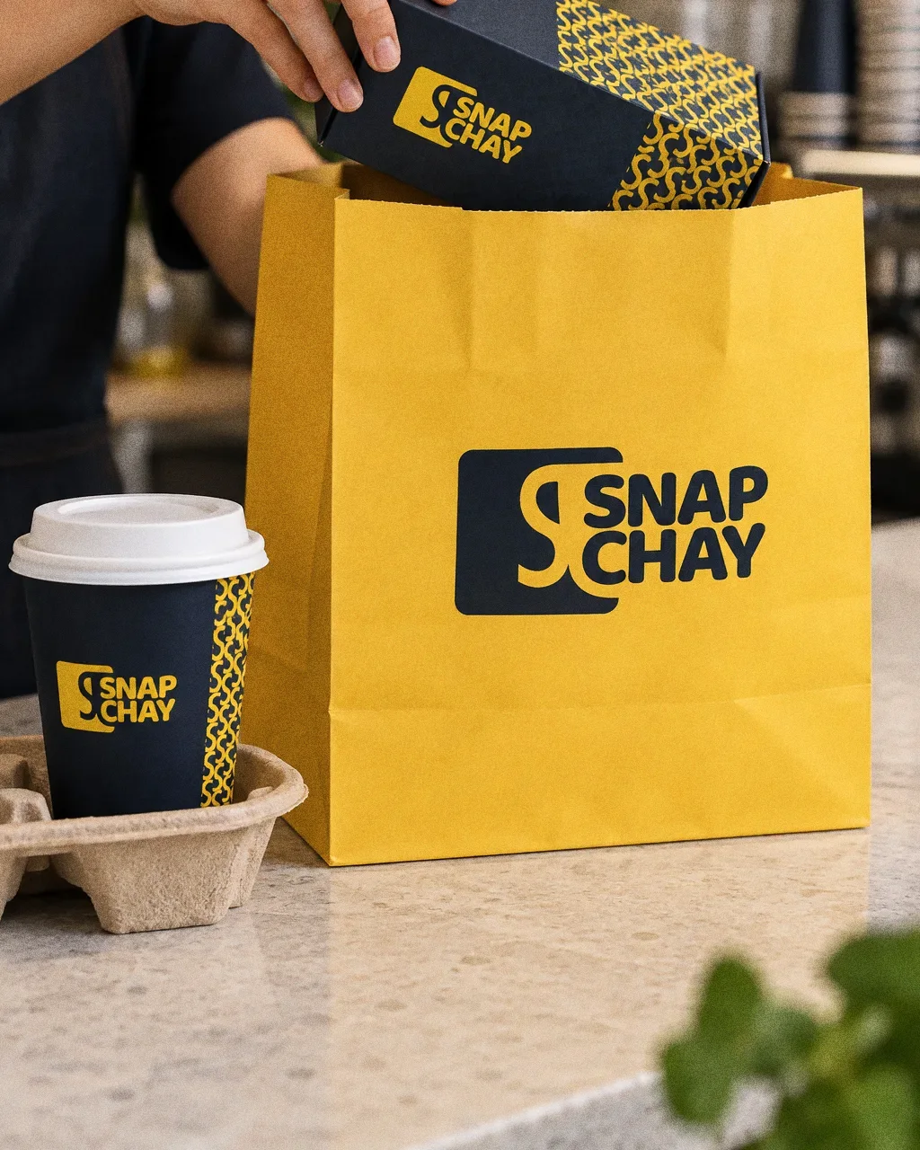
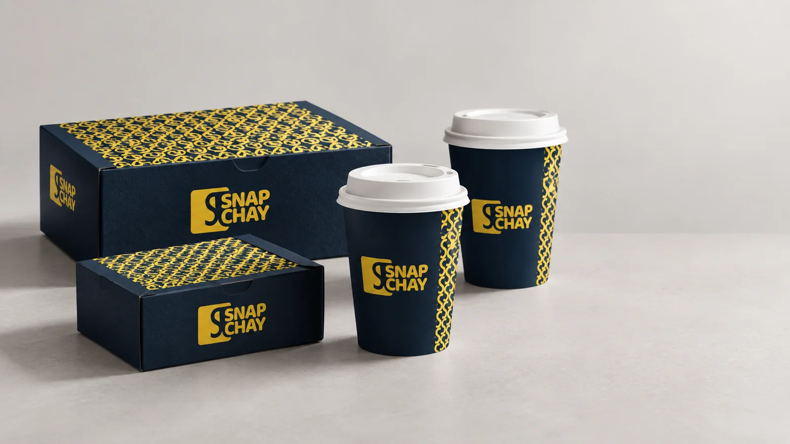
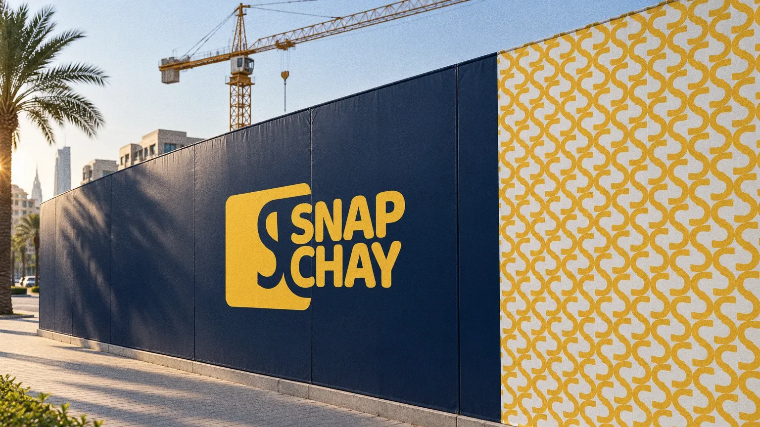
The symbol becomes a repeated pattern on the packaging board. Boxes, cup sleeves and signage mockups use different amounts of the pattern while retaining the same logo and palette. The presentation shows how a cafeteria identity can connect takeaway materials with the place customers find it.
Chapter 07
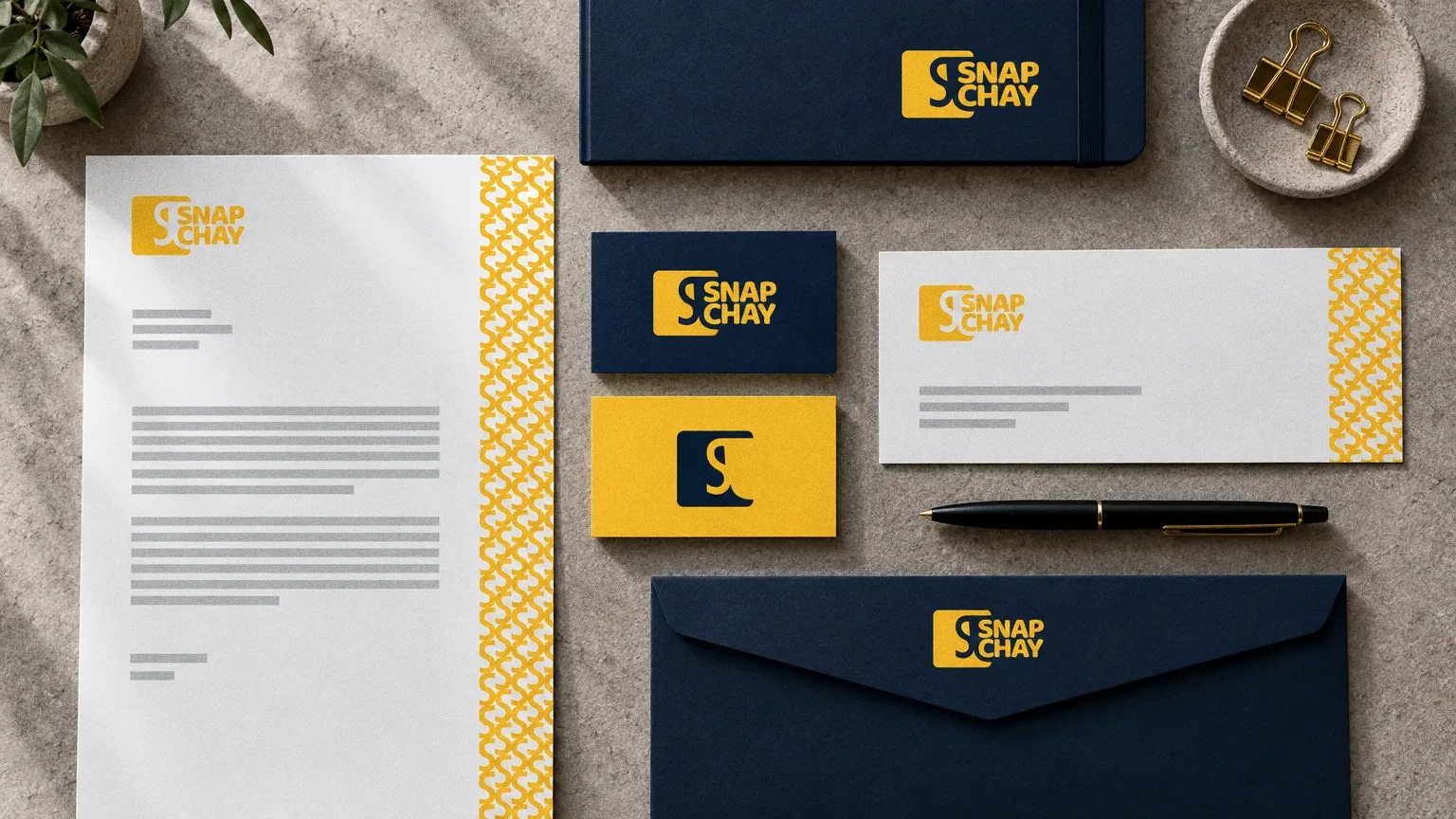
Stationery
Chapter 08
Signage and spaces
Chapter 09
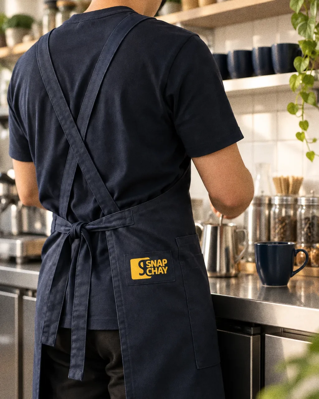
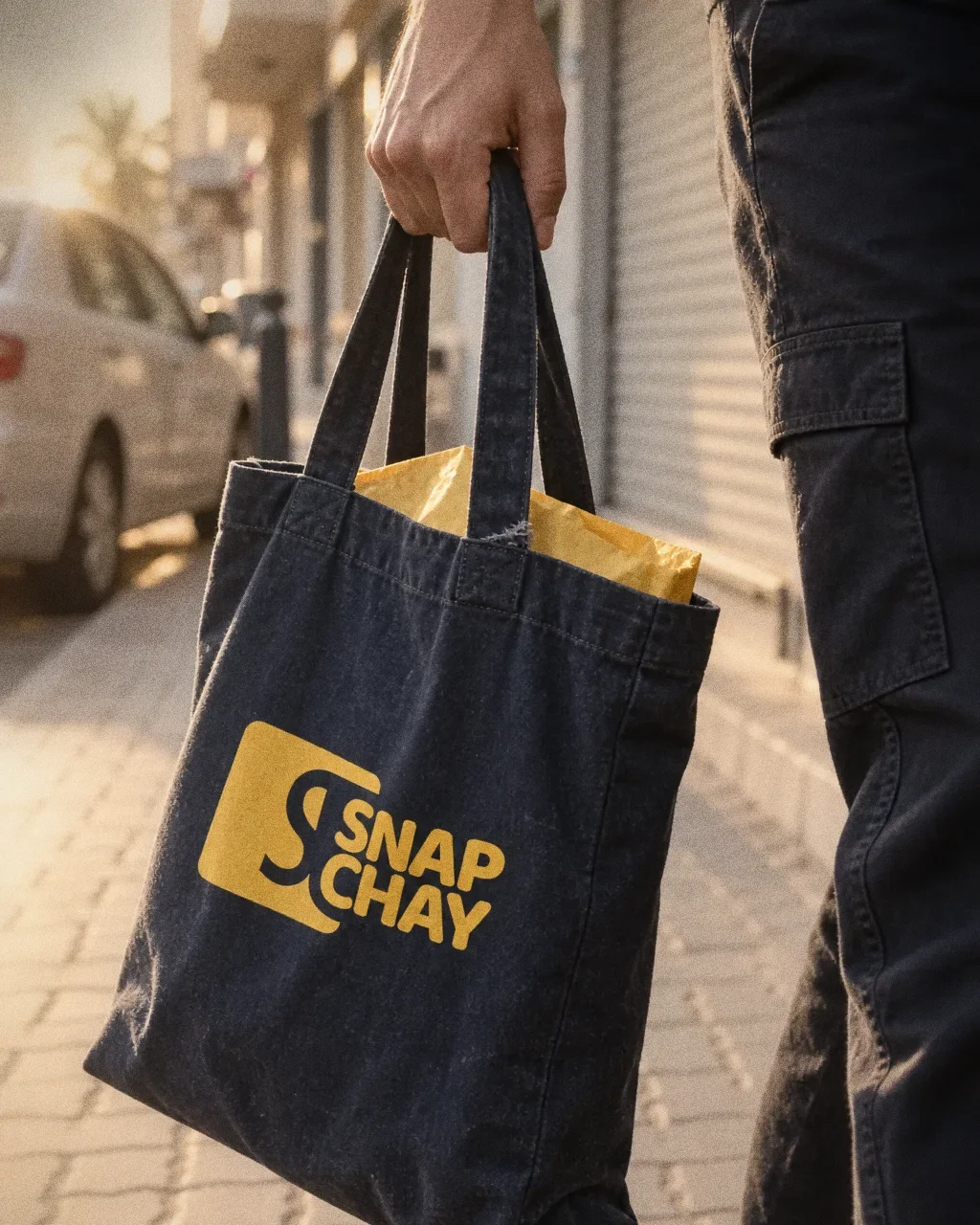
Uniforms and merchandise
Chapter 10
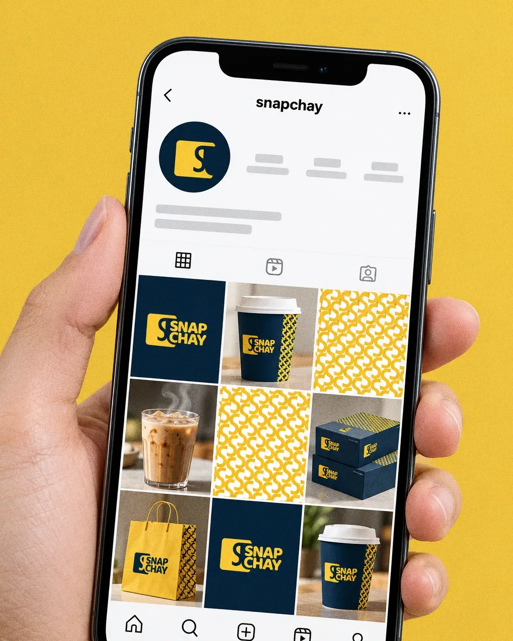
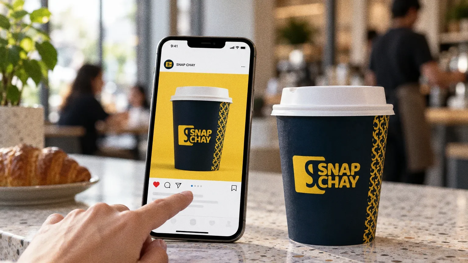
Digital
Chapter 11
The brand in the world
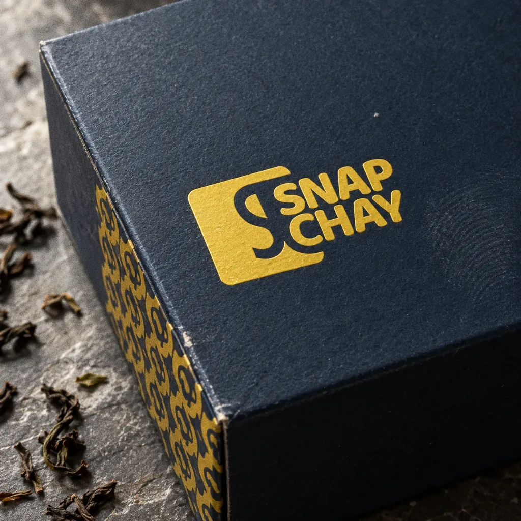
Chapter 12
In people’s hands

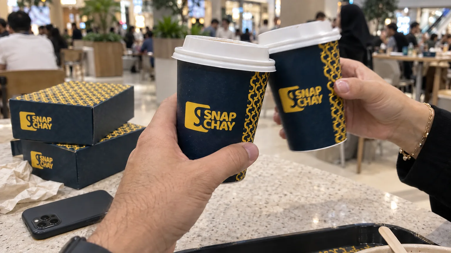
Cheers with chaiThe Snap Chay identity in a lifestyle photograph of two friends clinking cups outside a mall. 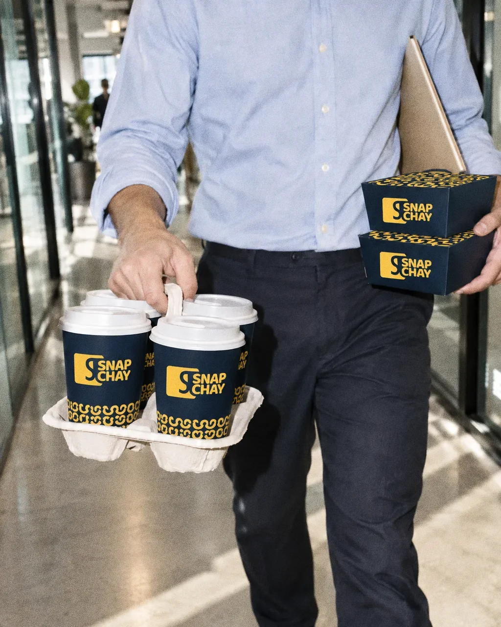
Cups for the officeThe Snap Chay identity in a lifestyle photograph of a cup carrier being walked through an office corridor. 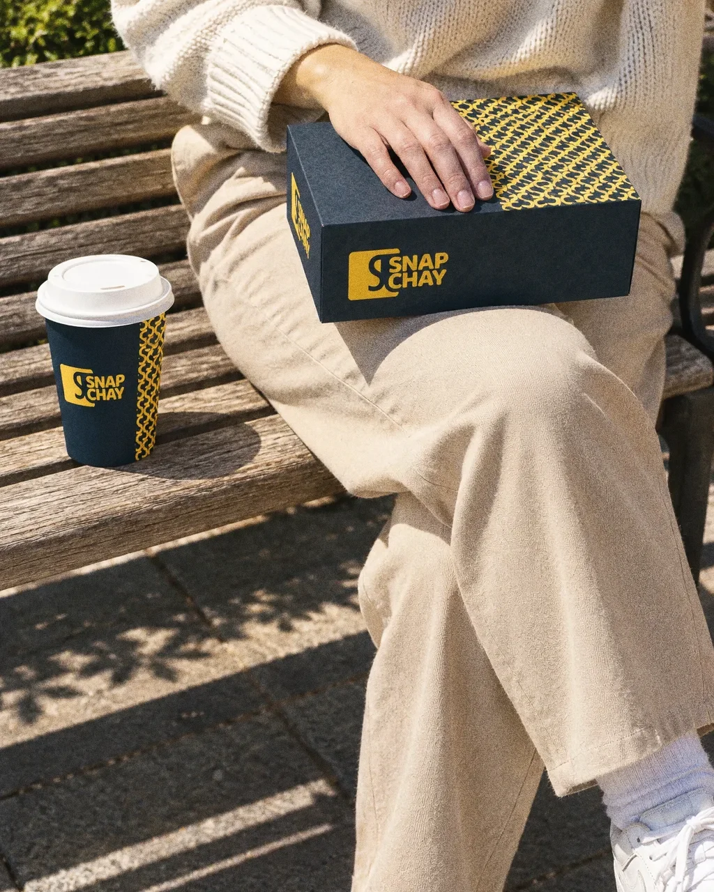
Lunch on the benchThe Snap Chay identity in a lifestyle photograph of a takeaway box and cup on an outdoor bench. 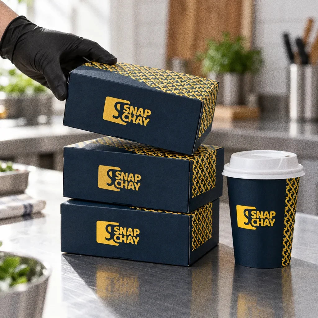
Boxes on the passThe Snap Chay identity in a lifestyle photograph of a stack of takeaway boxes on a kitchen counter. 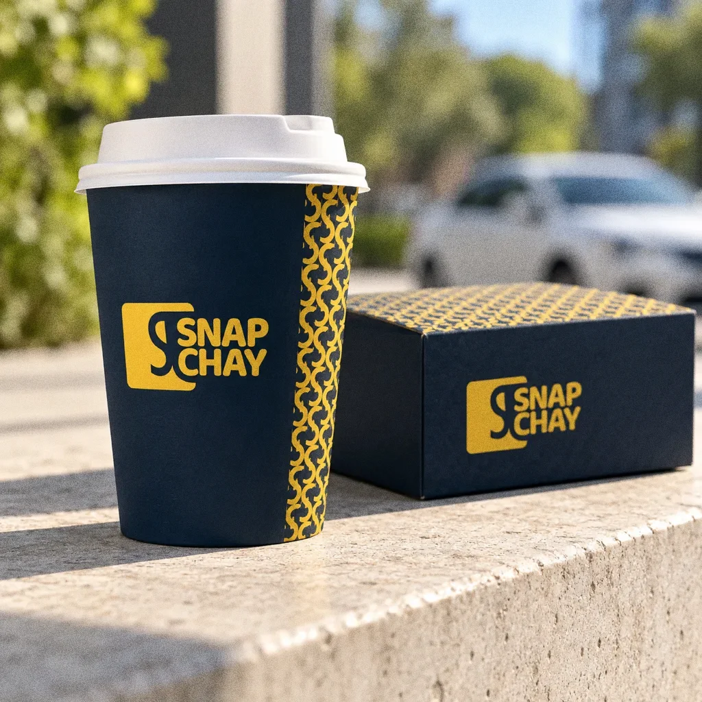
Cup on the stone ledgeThe Snap Chay identity in a lifestyle photograph of a cup and box on a stone ledge in morning sun.
Chapter 13
Campaign
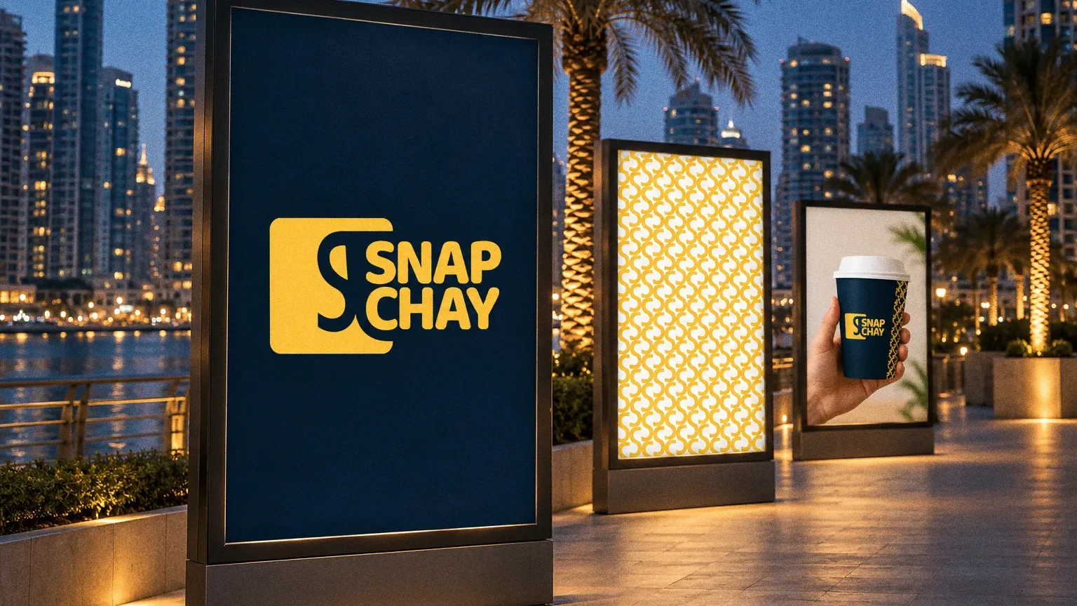
About this deck
What we built
English and Arabic logo lockups, a yellow-and-navy colour system and a repeated symbol, applied to packaging, cups and signage in the original presentation.
What this case establishes
The presentation establishes one bilingual identity across logo lockups, takeaway packaging and signage mockups. English and Arabic share the same symbol and palette. It documents the design and its applications; customer testing and post-launch commercial results are not included in this source.
About the originals
The original boards are from Abcon’s original project presentation and include application mockups.