
Website / Restaurant
Aghadeer
A restaurant website that carries Aghadeer’s orange identity into a food-led opening, category navigation and a company introduction.
Project scope
- Website design
- Homepage composition
- Content and navigation hierarchy
From the business to the screen
The design task
The restaurant identity needs to remain recognisable when a visitor moves from physical packaging to the website. The design task is to connect that visual system with food photography and useful information.
Connect the brand with the food
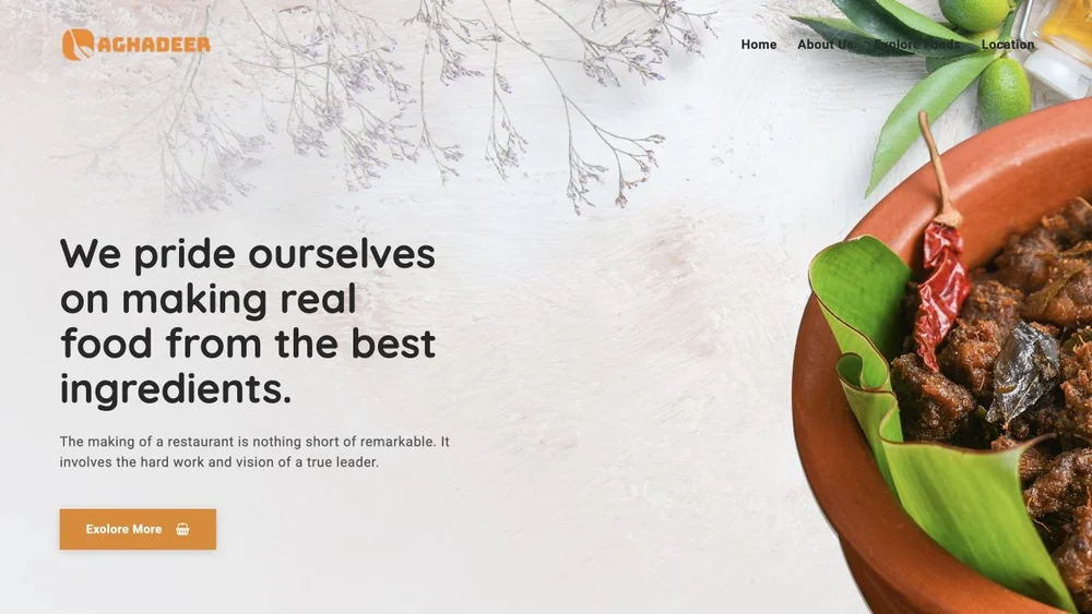
The captured opening pairs the orange identity with a close food photograph and a short statement about ingredients. It gives the restaurant a recognisable visual starting point.
See the original boardContinue the story below the opening
An orange category strip separates the hero from a second section with food imagery and company copy. The brand colour connects both parts of the page.
See the original boardWhat we built
A homepage that brings the orange brand colour, food imagery, introductory copy and a category strip into one composition.
The image below is the original website capture from Abcon’s portfolio. The client site may have changed since this presentation.
Visit the client website ↗Explore the Aghadeer brand identity →What does your brand need next?
Let’s talk about your project Next projectTree Ring