The problem that is easiest to miss sits a step earlier. If the brand has no Arabic lockup and no named Arabic typeface, whoever builds the deck invents them, and the Arabic version ends up looking like a different company. Check that first. The rest of this guide follows the order we work in.
What flips and what stays the same way round
| Element | In the Arabic deck | Why |
|---|---|---|
| Titles and body text | Aligned right, with the paragraph direction set to right to left | The reader starts at the top right |
| Bullets and numbered lists | Markers on the right of each line | They lead into the line |
| Columns, cards and tables | Order reversed, first item on the right | The eye takes the right-hand item first |
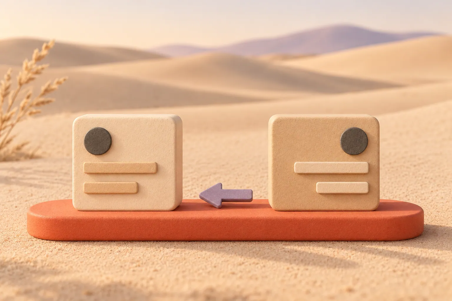
| Arrows, timelines and process steps | Run from right to left | The sequence follows the reading direction |
| Logo and symbol | Never flipped; use the Arabic or bilingual lockup | A mirrored mark is a different mark |
| Photographs | Not flipped; move them to the other side if the layout needs it | Flipping reverses any writing in the picture |
| Latin names, emails, web addresses | Stay left to right inside the Arabic line | They are still written in English |
| Digits in a number | Same order as in English | Arabic writes the digits of a number left to right |
| Charts | Checked one at a time | Reversing an axis can change what the chart says |
Check the brand is ready to read right to left
Before a single slide is mirrored, open the brand guidelines and look for the four things below. If any is missing, settle it with whoever looks after the brand, not inside the deck, or every presentation after this one will improvise it again.
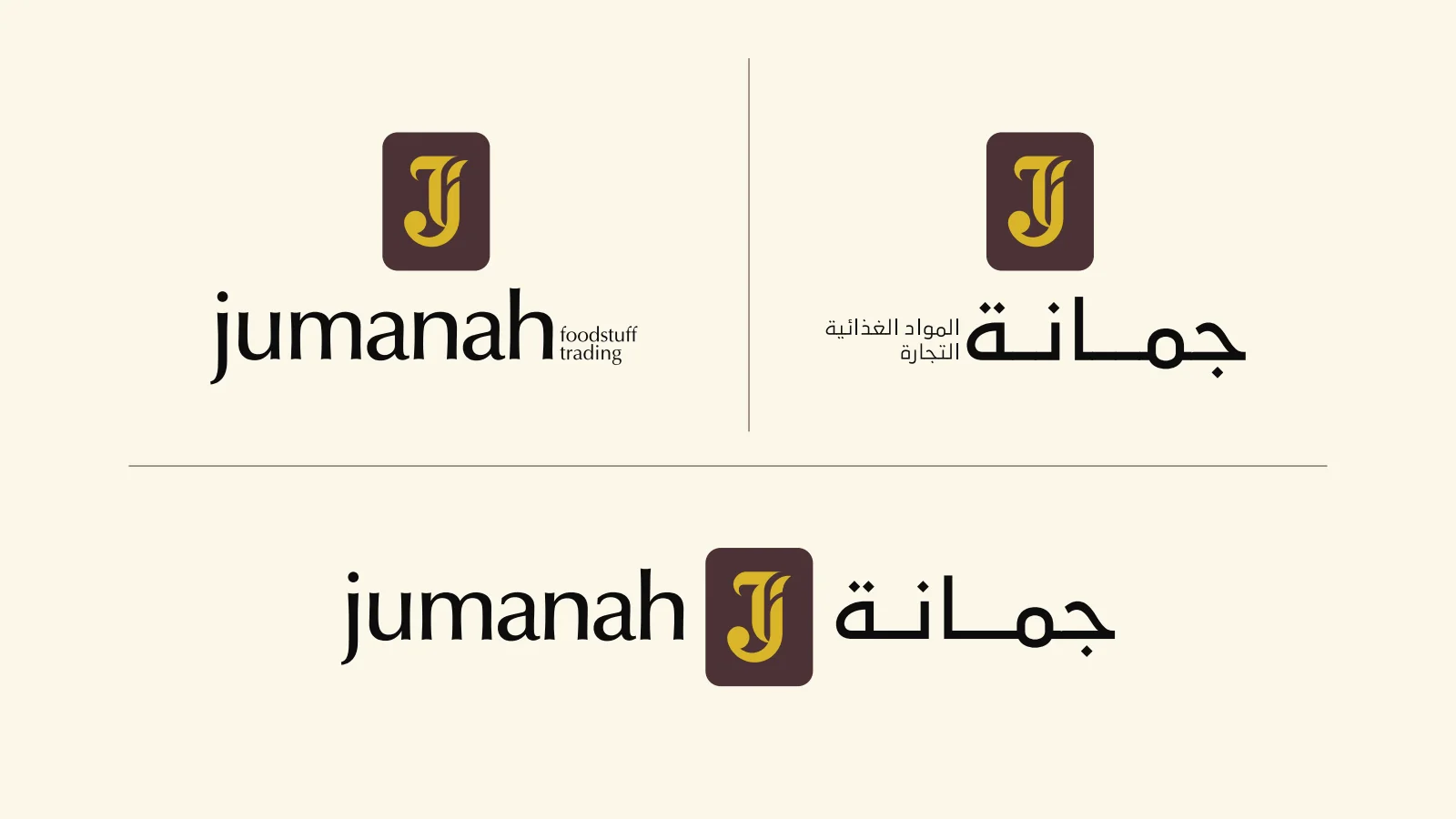
A brand that already reads right to left
Jumanah Foods’ original lockup board shows the English, Arabic and combined versions of the logo. The descriptor follows the name in each language’s own direction, while the J and Jeem monogram never changes. The typography board names an Arabic type family beside the two Latin ones, so an Arabic slide has a font to use from the start.
Jumanah Foods Branding.pdf · Read the Jumanah Foods case study
- An Arabic lockup. Not the English logo with Arabic typed beside it, but a version drawn for Arabic. Jumanah Foods’ identity has three: English, Arabic and a combined lockup, all built around the same monogram.
- Which way the lockup reads. In Jumanah’s English lockup the words “foodstuff trading” follow the name on the right. In the Arabic lockup the Arabic descriptor follows the name on the left, where an Arabic line ends. The J and Jeem monogram is exactly the same way round in all three. A deck should do the same: the logo moves to the top right corner of an Arabic slide, but the mark itself is never flipped.
- A named Arabic typeface. Jumanah’s typography board lists an Arabic family, AbdoMaster, beside its two Latin families. Without one, PowerPoint falls back to whatever Arabic font the theme or the computer supplies, which may not suit the brand and may change from one laptop to the next.
- Approved Arabic names. The company, its divisions and its products, spelt one way. A deck is often the first place these are written in Arabic, and a name translated three ways across forty slides is hard to undo.
The same rule is easy to see on a vehicle. On Talal Market’s delivery van the Arabic side carries the Arabic wordmark and the rewards line at the top right of the panel, and the English side carries them at the top left. The picture of gifts bursting out of a phone is the same way round on both sides, and the app store badges stay in English.
Mirror the master first, then the slides
Mirror the slide master and its layouts once: the title placeholder on the right, text placeholders set to right-to-left paragraph direction, the logo in the top right corner, and the footer items swapped to the opposite sides. Every slide built on those layouts then starts in the right place. Mirroring slide by slide on top of an English master is where stray left-aligned boxes and bullets on the wrong side come from.
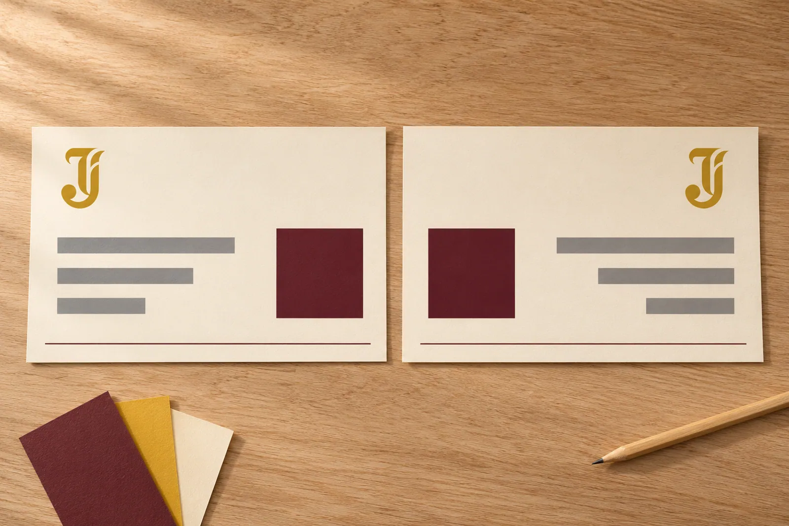
Right-aligning an English text box is not the same thing. The text sits on the right, but the line still runs left to right, so full stops, brackets and list markers can end up at the wrong end. Set the direction, not just the alignment.
If one template has to serve both languages, keep two sets of layouts in it, named so nobody can pick the wrong one, for example “Title, English” and “Title, Arabic”. That is easier to maintain than two separate template files that slowly drift apart.
Give Arabic its own size and spacing
The same point size rarely looks the same size in both scripts. Set the Arabic by eye against the English on a real slide, using real headings, not by matching numbers. Arabic letters are joined and carry dots and marks above and below the line, so give body text a little more line spacing than the English, and check that nothing is clipped at the top or bottom of a text box.
Many Arabic typefaces have no italic, and a slanted Arabic word made by the software usually looks wrong. Use weight or colour for emphasis instead. Translation also changes how long a line is, sometimes longer and sometimes shorter, so if a heading no longer fits, rewrite or rebreak it before you reduce the size. Two readable lines are better than one crowded one.
Numbers, names and mixed lines
Most corporate decks mix Arabic sentences with English names, acronyms, emails and figures. Latin words and the digits inside a number keep their own left-to-right order inside the Arabic line. What goes wrong is the order of the pieces around them: a Latin name followed by a number, a word in brackets, or a percentage at the end of a line can come out in the wrong order once the paragraph runs right to left.
We met exactly this on our own Arabic pages. A café name written in Latin letters with a number, 52 Cafe, sat inside an Arabic sentence and displayed in the wrong order. It looked fine in the text we wrote and was only caught when we checked the finished pages. A deck behaves the same way, so read every mixed line in the final file, on the computer that will run the presentation.
Agree with the client whether figures use Western digits or Eastern Arabic digits, and how dates and currency are written, then keep that choice on every slide.
Charts, tables and diagrams
Do not flip a chart as a picture. Rebuild it with Arabic labels and decide each axis on purpose. Categories in a bar or column chart can start from the right, and the value axis can move to the right-hand side. Time is the hard one: decide with the client which way time runs, write the rule down and apply it to every chart in the deck. A deck where one chart runs one way and the next runs the other is the real mistake.
In tables, put the label column on the right and read across to the left, keeping every value under its own heading. Process diagrams, timelines and organisation charts are mirrored, then checked arrow by arrow so each one still points from one step to the next.
One bilingual deck or two?
- Two separate decks when each audience will read or watch it in its own language. There is room for detail in both, but every change has to be made twice.
- Both languages on each slide when a mixed room needs to read the same slide together and the text is short. English usually sits on the left half and Arabic on the right, as in the combined Jumanah lockup.
- Presented in one language, with a handout in the other, when the speaker uses one language but the document will be read later by people who prefer the other.
Whichever you choose, keep the slide numbers matched between the versions where you can, so that a reviewer can say “slide 12” and mean the same content in both.
Before the Arabic deck goes out
- The Arabic or bilingual lockup is on the cover, and no logo anywhere is flipped.
- The master and layouts are mirrored, and text boxes are set to right-to-left direction.
- The brand’s Arabic typeface is installed on the presenting computer or embedded in the file, or the deck travels as a PDF.
- Every arrow, timeline and process step runs from right to left.
- No photograph has been flipped with writing, a car or a sign in it.
- Every mixed line with names, numbers or brackets has been read in the final file.
- Charts follow one written rule for time and axes.
- A fluent Arabic reader who did not translate the text has read the finished slides.
- The editable file and the PDF have both been opened on the screen they will run on.
Frequently asked questions
Can we just translate our English deck into Arabic?
You can start from it, and the content and the order of the argument usually carry over. Expect to rebuild the master, re-flow every slide, adjust the type and check each chart and diagram, so plan for a redesign rather than a text swap. Our Arabic presentation design page explains how we handle it.
Should photographs be flipped for the Arabic version?
No. Move a photograph to the other side of the slide if the layout needs it, but do not mirror the picture itself. It reverses any writing in it and makes cars, signs and products look wrong.
Where does the logo go on an Arabic slide?
Usually the top right corner, where the reader starts, but the brand guidelines decide. If the brand has no Arabic lockup yet, sort that out before the deck, because every later document will need it too. Our guide to Arabic and English logo design covers how the two versions are drawn together.
Who should check the Arabic?
A fluent reader who did not do the translation, reading the finished slides rather than the translation document. Text that reads well in a document can break when a heading is shortened to fit or a line wraps in the wrong place.
How Abcon can help
We design presentations in Arabic, English or both for companies across the UAE from our offices in Dubai (Al Qusais) and Sharjah (Muweilah), and we design the bilingual identities those decks sit on. See presentation design in Dubai, or read the same service in Arabic on our تصميم العروض التقديمية page.
For practical support with this decision, explore our presentation and powerpoint design and bilingual branding services. Each page explains the scope, how we work and what to consider before commissioning the work. Talk to us about your business challenge.
Add Abcon as a preferred source on Google