← All work

Case studyPrint design

Print design

Product distribution

SAPCO

Opening frame of the SAPCO brand film

SAPCO brand film. Motion film made from the original SAPCO identity boards and brand applications.

Overview

A SAPCO category-and-brand portfolio that turns a broad product range into organised editorial spreads, with distinct sections for brands, FMCG and product categories.

BriefA broad product portfolio can be difficult to navigate. The design task is to organise the range so a reader can move from the company introduction to a relevant brand or category.

Scope

  • Product portfolio design
  • Brand and category hierarchy
  • Editorial print layout
A warehouse supervisor in a blue SAPCO polo holds the SAPCO Category and Brand Portfolio and a clipboard in front of pallets and a pallet jack.
Supervisor with the portfolio in the warehouseThe SAPCO identity in a lifestyle photograph of the brand portfolio held on a distribution warehouse floor.

How to read this deck

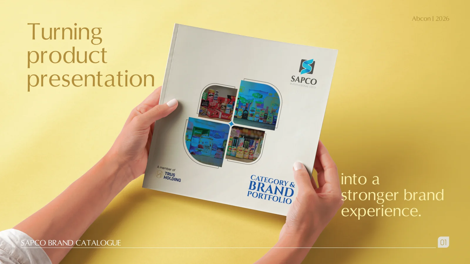
The deck pairs the client’s original presentation boards with new application scenes that show the identity in use.

Some of the older boards have been redrawn. Each one sits where the original stood, with the real original design in its corner and a View original button to open it in full.

Chapter 02

Logo variations

The SAPCO charcoal tile and twisting blue S ribbon drawn very large on a pale warm grey field, bleeding off the right edge.
Symbol on greyThe SAPCO identity with the S symbol alone, enlarged and cropped on its pale grey.

Chapter 03

Colour

  • Accent#2A5AA8
  • Surface#ECEAE4
  • Ink#1B2B4A

Colours sampled from the original identity boards.

Three vertical panels in royal blue, cream and charcoal, each carrying the SAPCO logo in white, full colour or reversed.
Logo on colourThe SAPCO identity as the logo on royal blue, cream and charcoal.
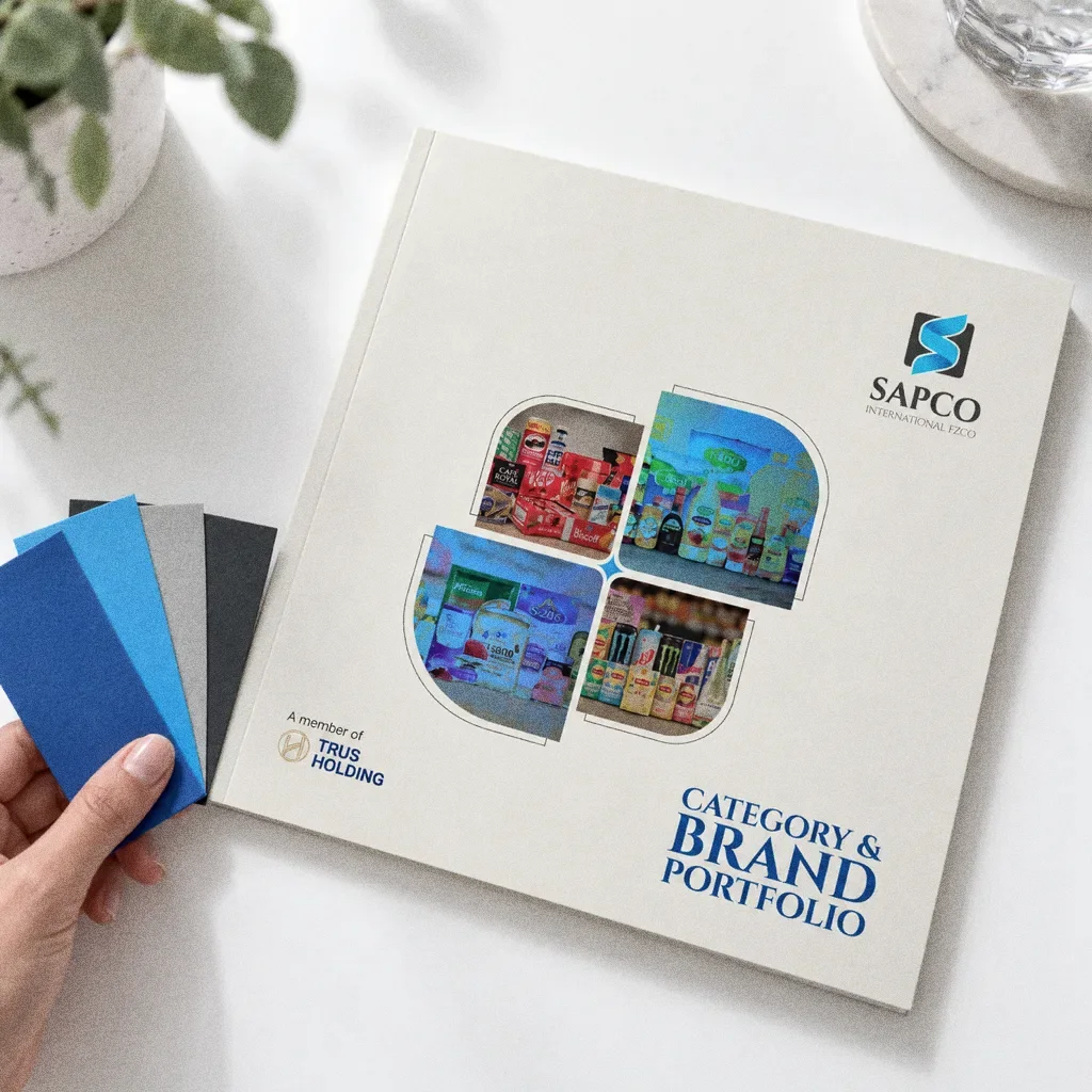
A hand holding a fan of royal blue, sky blue, grey and charcoal paper stock beside the cream SAPCO portfolio cover on a white table.
Blue paper stock fanThe SAPCO identity: paper stock swatches in the brand colours.
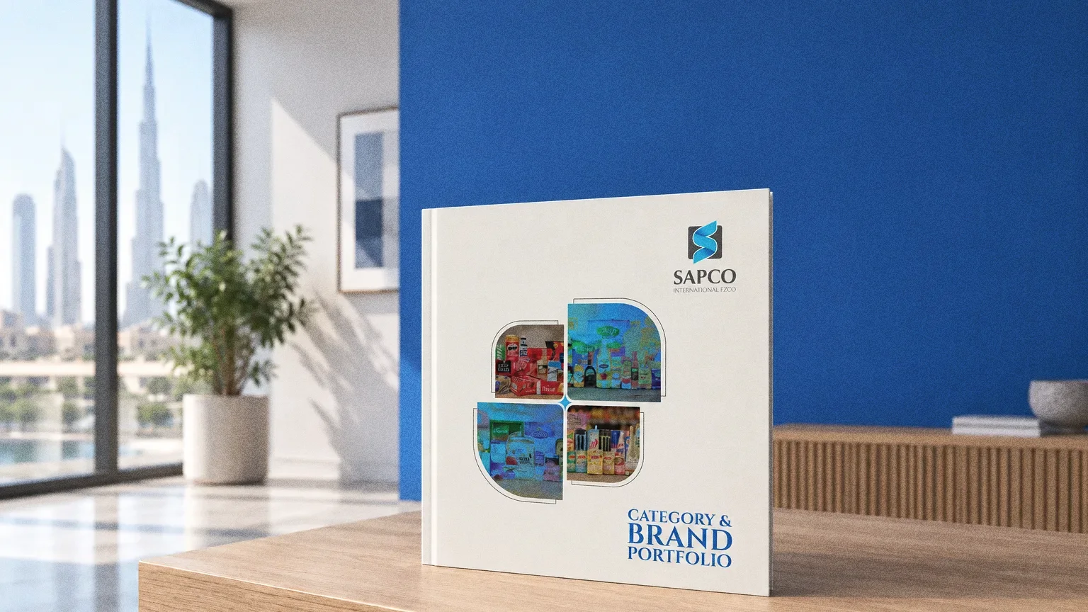
A bright showroom with a royal blue wall and a cream SAPCO portfolio standing on an oak ledge, with a large window onto the skyline.
Royal blue showroom wallThe SAPCO identity: the brand blue on a showroom wall.

Chapter 04

Pattern and graphic elements

A pale grey field of outlined rounded petal shapes in blue and cyan, a few filled solid, with large blue arcs rising from the bottom corners and a round SAPCO badge in the middle.
PatternThe SAPCO identity as a brand pattern. The original boards show no pattern, so it is built from the rounded photo windows and blue page arcs of the portfolio.
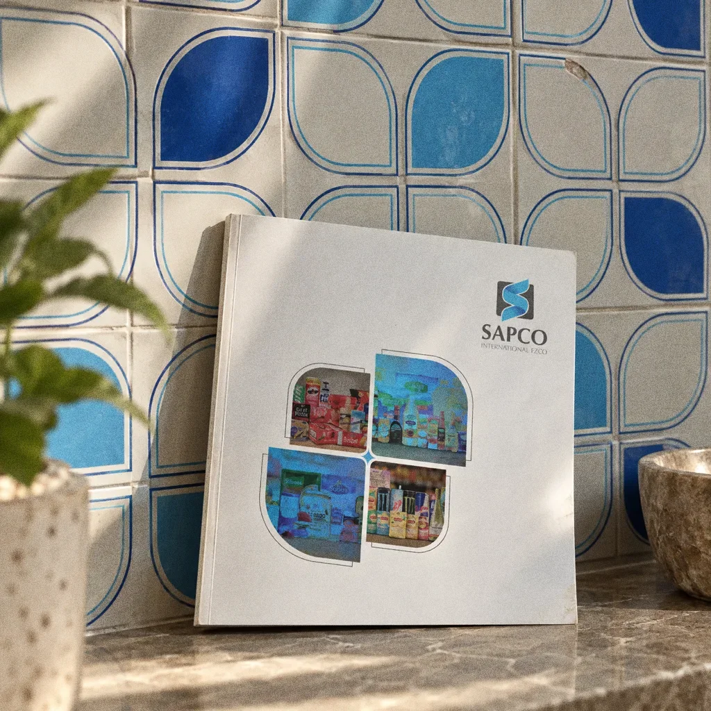
Glazed wall tiles with the SAPCO blue petal pattern and a catalogue leaning against the wall.
Petal pattern as wall tileThe SAPCO identity: the petal pattern on ceramic wall tile.
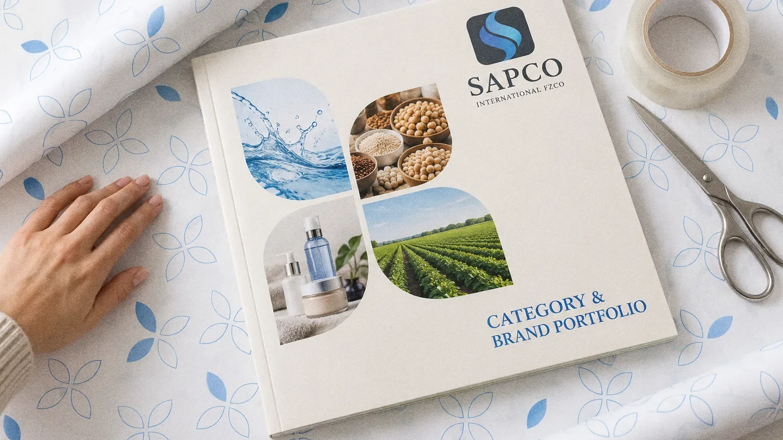
A cream SAPCO portfolio on white wrapping paper printed with a light blue petal pattern, with a roll of tape and scissors beside it and a hand smoothing the paper.
Petal pattern on wrapping paperThe SAPCO identity: the petal pattern on wrapping paper.

Chapter 05

Packaging

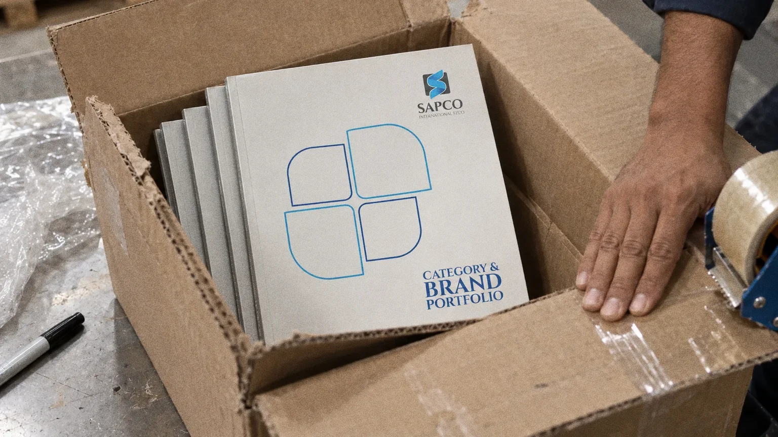
SAPCO portfolio catalogues being packed into a corrugated carton on a warehouse dispatch table.
Portfolios packed for dispatchThe SAPCO identity: the portfolios being packed for dispatch.
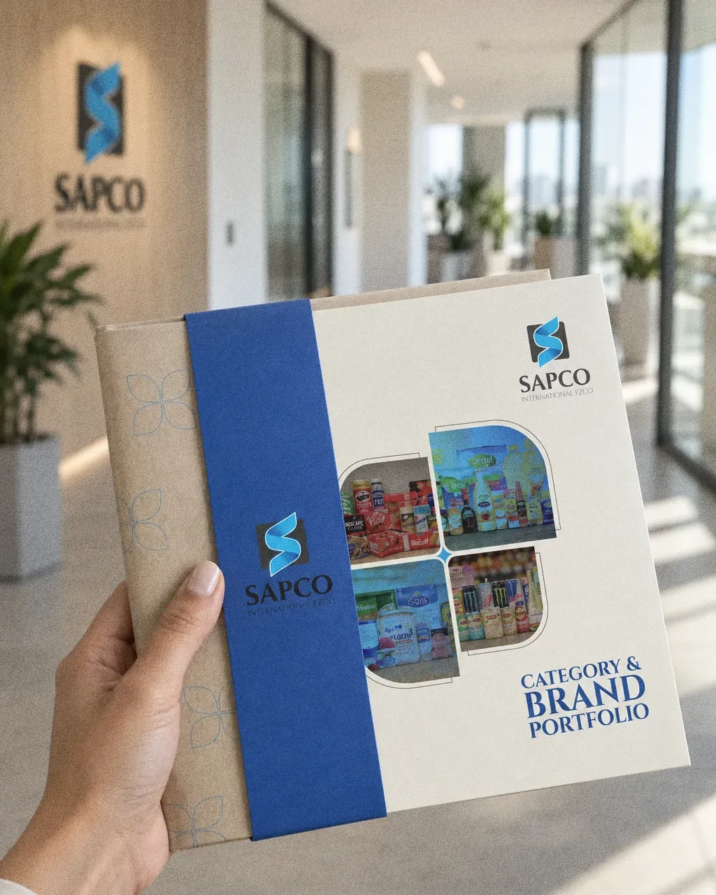
A hand holding the cream SAPCO portfolio wrapped in kraft paper with a royal blue band carrying the blue S emblem, in a bright office corridor.
Portfolio in a kraft wrapThe SAPCO identity: the portfolio carried in a kraft wrap.
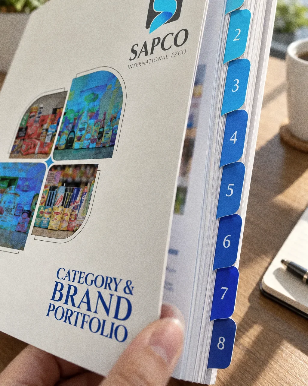
A close-up of the SAPCO portfolio page block with eight die-cut numbered index tabs stepping from cyan to royal blue down the edge, under the cover with the SAPCO logo.
Index tabsThe SAPCO identity as a print detail of numbered index tabs on the portfolio edge.

Chapter 06

Stationery

The SAPCO brand catalogue open at its About Us spread with Mission and Vision, lying on a trading desk beside a notebook and coffee.
SAPCO: Company introduction
Company introductionThe About Us spread combines company information with product imagery.
About us spreadThe SAPCO identity, remastered from the original board of the about us, mission and vision.
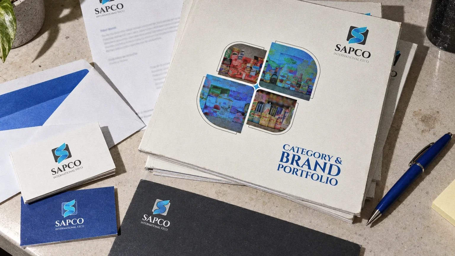
SAPCO stationery on pale limestone: letterhead with a blue arc, white envelope with blue lining, white and blue business cards, a charcoal compliment slip, a pen and a stack of portfolios.
StationeryThe SAPCO identity as a stationery suite beside the printed portfolio.
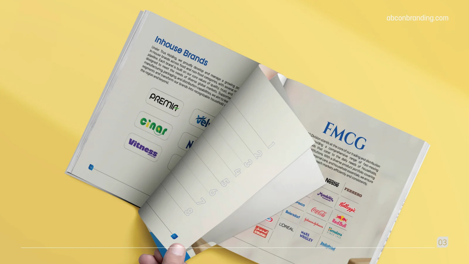
SAPCO: Brands and FMCG
Brands and FMCGSeparate headings group in-house brands and FMCG information.

Chapter 07

Digital

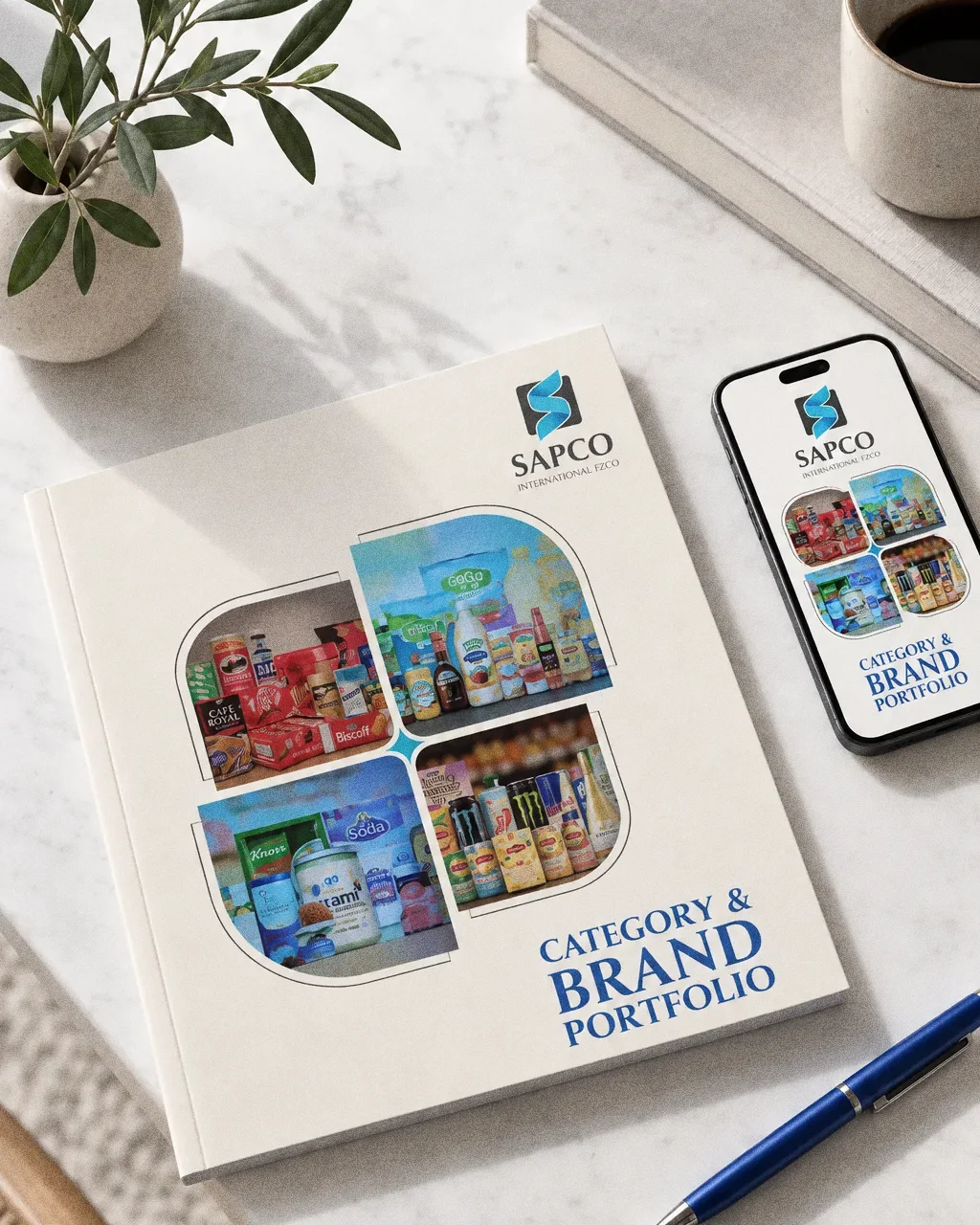
A phone on pale stone showing the SAPCO portfolio cover, beside the printed cream square portfolio with its four-petal collage and a blue pen.
Portfolio on phoneThe SAPCO identity on a phone, showing the category and brand portfolio as a digital flipbook.
A laptop on a bright office desk showing the SAPCO Category and Brand Portfolio cover with the blue S symbol.
Portfolio on a buyer laptopThe SAPCO identity: the portfolio on a laptop screen.
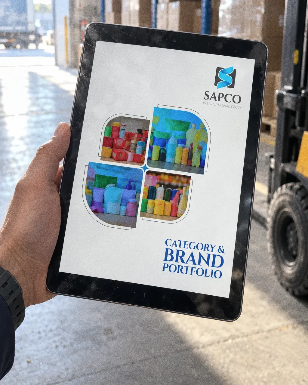
A hand holding a tablet in a warehouse aisle showing the SAPCO portfolio cover.
Portfolio PDF on a tabletThe SAPCO identity: the portfolio cover on a tablet.

Chapter 08

The brand in the world

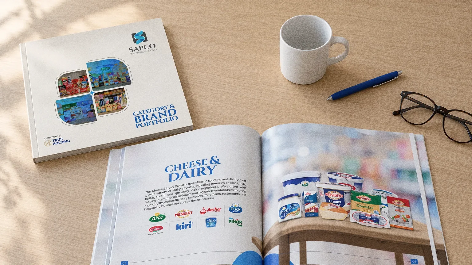
The cream SAPCO Category and Brand Portfolio and an open Cheese and Dairy spread on an oak desk with reading glasses, a blue pen and a white mug.
SAPCO catalogues on the deskThe SAPCO identity on printed catalogues in a showroom.
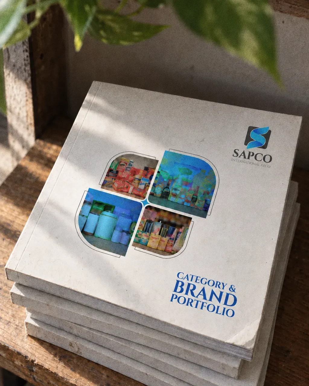
A stack of five square SAPCO Category and Brand Portfolio catalogues on an oak shelf in soft light, with the S emblem and blue serif title on the top cover.
SAPCO catalogue stackThe SAPCO identity on a stack of printed catalogues.
A hand holds an open SAPCO catalogue mid page turn in a warehouse office, with a blue serif Food and Beverage Solutions heading, fresh produce and a shelf of groceries on the spreads.
SAPCO catalogue spread in the warehouseThe SAPCO identity on an open category spread of the printed catalogue.
Close-up of the blue and teal S emblem in a dark grey rounded square with the serif SAPCO wordmark, printed on textured grey stock with a blue pen tip at the corner.
SAPCO emblem printed on cardThe SAPCO identity as a spot-gloss print on textured card stock.

Chapter 09

In people’s hands

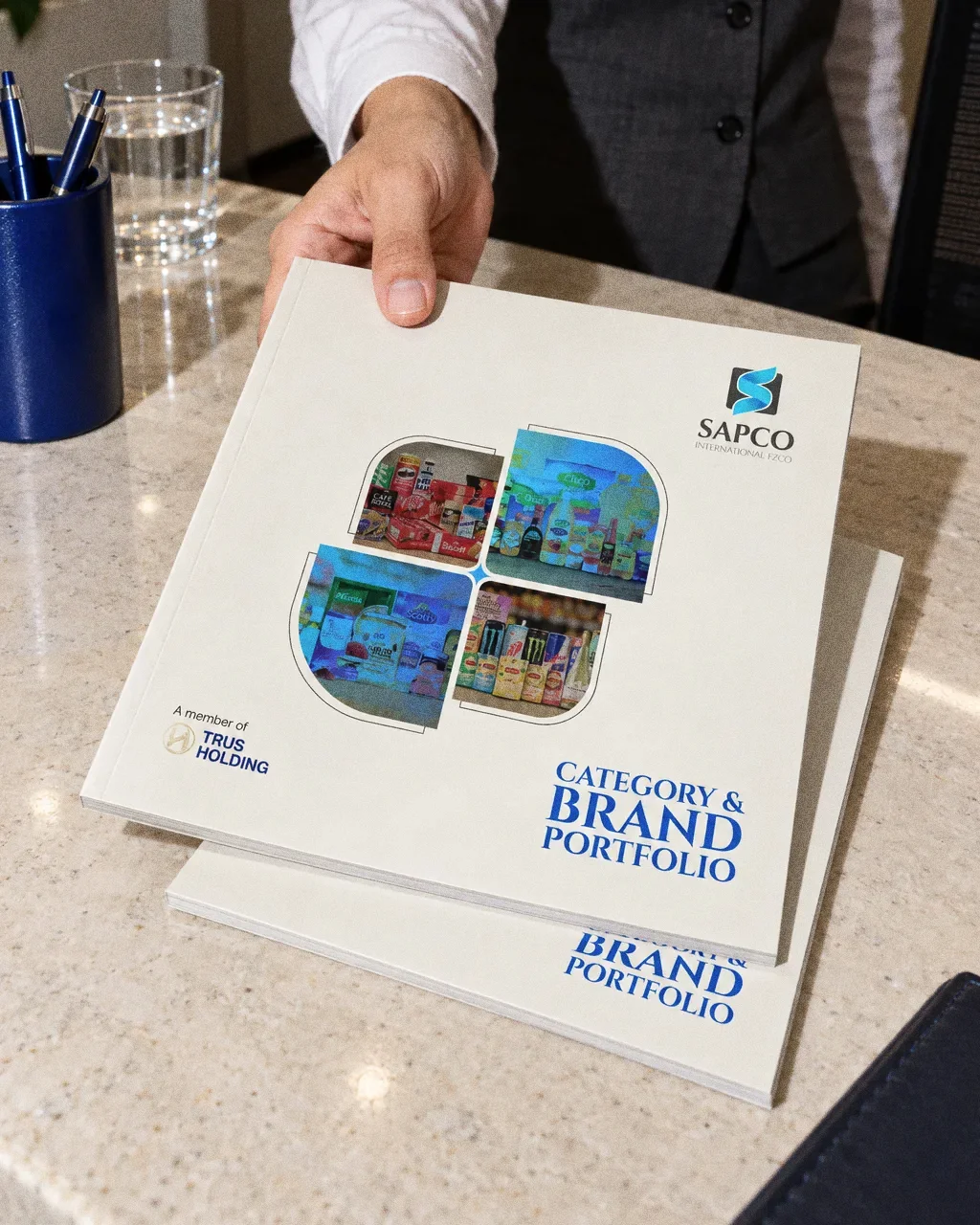
  • A hand in a white shirt cuff slides the SAPCO Category and Brand Portfolio across a stone reception counter, a second copy stacked below and a blue pen pot beside it.
    Portfolio slid across a reception counterThe SAPCO identity in a lifestyle photograph of the brand portfolio handed across a reception counter.

  • A driver in a blue SAPCO polo holds the open door of a white van and carries the SAPCO Category and Brand Portfolio under his arm.
    Delivery driver carrying the portfolioThe SAPCO identity in a lifestyle photograph of the brand portfolio carried at a delivery van.
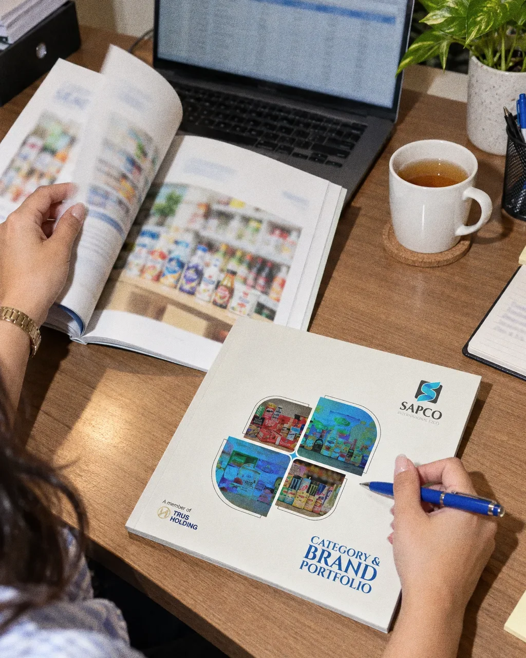
  • A woman at a trading office desk rests a blue pen on the closed SAPCO Category and Brand Portfolio while turning the page of a second copy next to a laptop and a cup of tea.
    Buyer's desk with the portfolioThe SAPCO identity in a lifestyle photograph of the brand portfolio on a buyer's desk.
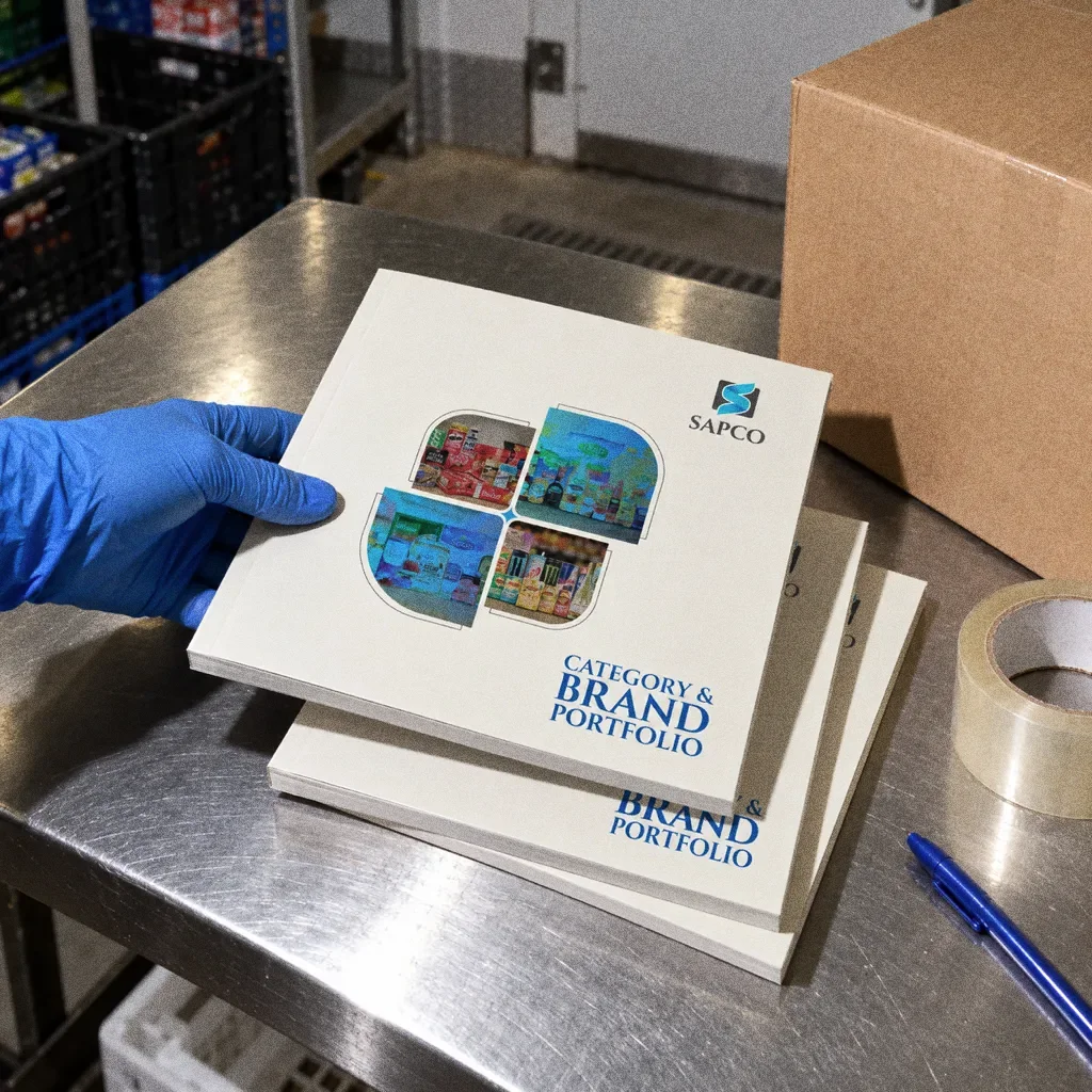
  • Three copies of the SAPCO Category and Brand Portfolio stacked on a stainless steel table beside a brown carton, tape and a blue pen, with a gloved hand placing the top copy.
    Portfolio copies on a steel packing tableThe SAPCO identity in a lifestyle photograph of portfolio copies on a stainless steel packing table.
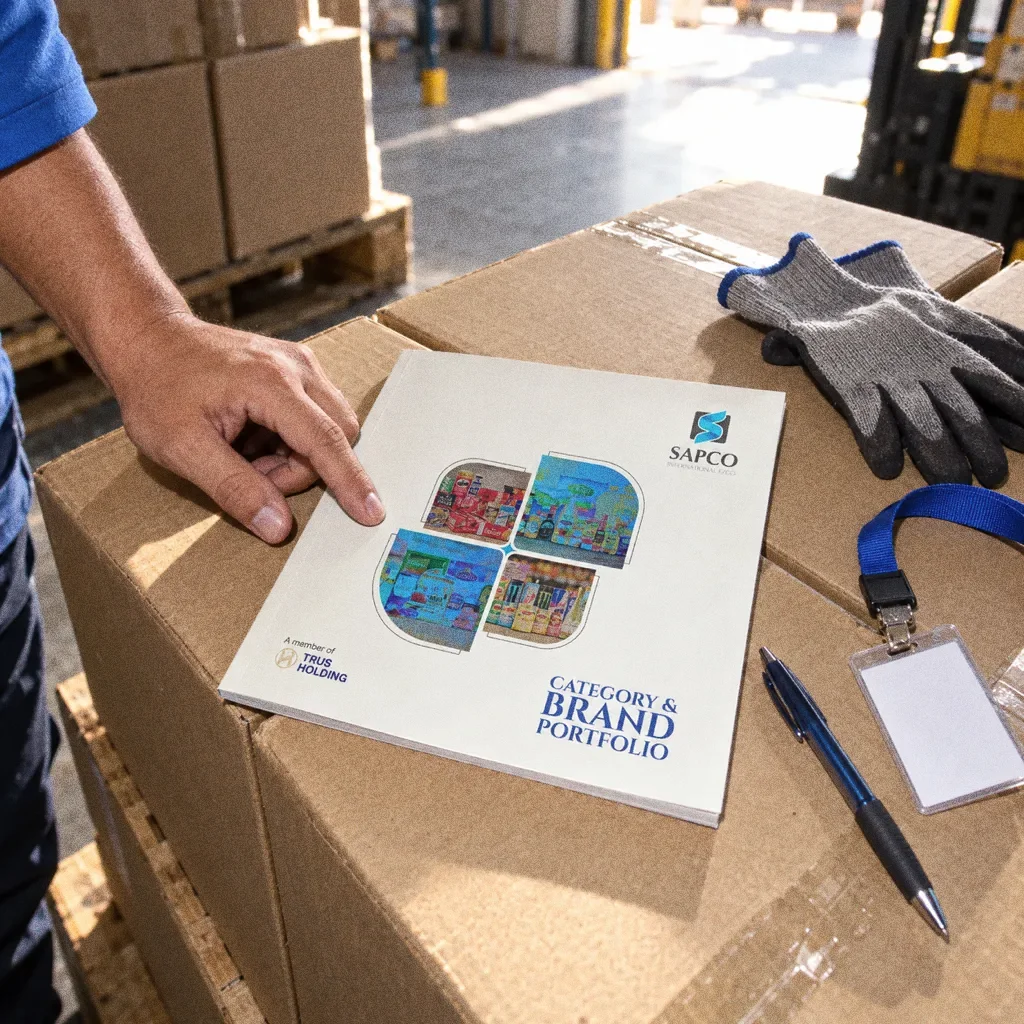
  • The SAPCO Category and Brand Portfolio resting on warehouse cartons beside work gloves, a pen and a lanyard holder, with a hand in a blue sleeve touching the cover.
    Portfolio on a stack of cartonsThe SAPCO identity in a lifestyle photograph of the brand portfolio on a stack of warehouse cartons.

Chapter 10

Campaign

Make categories visible

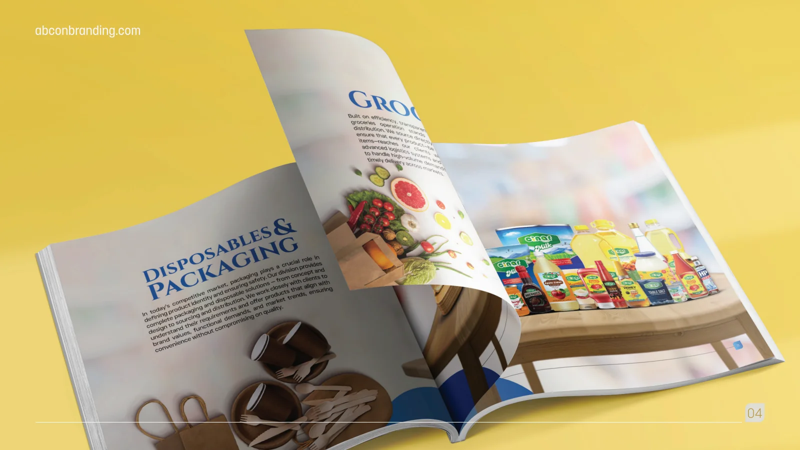
Product photography and large category headings give the groceries, disposables and dairy sections distinct entry points. The layout connects a broad range without presenting every item in the same uninterrupted list.
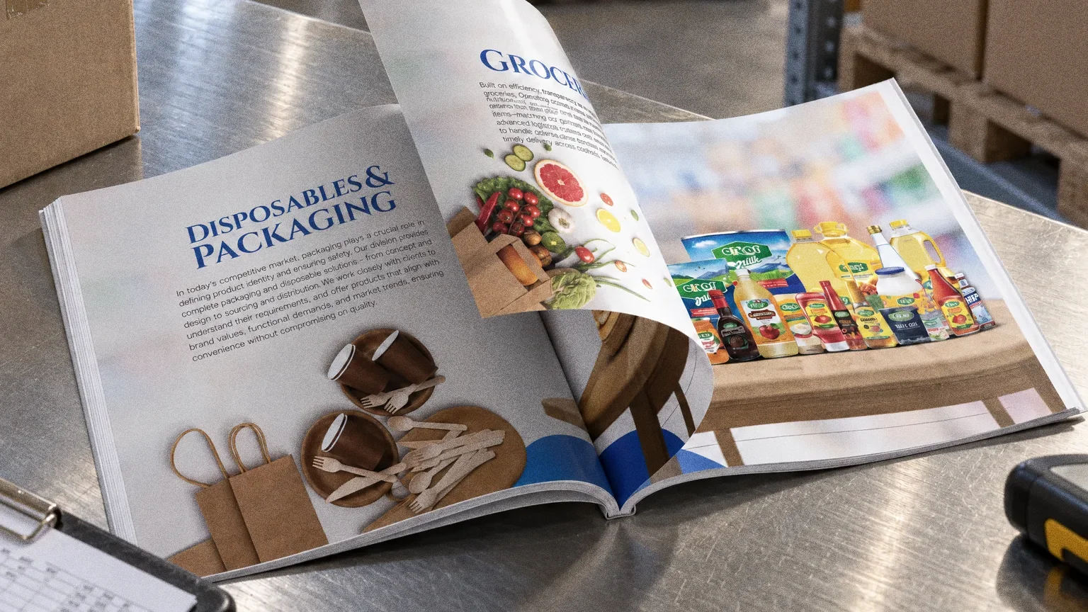
A SAPCO catalogue spread headed Groceries and Disposables with a lined-up grocery shelf photo, on a stainless steel counter in a stockroom.
SAPCO: Product-category spreads
Product-category spreadsDisposables, packaging and grocery examples use clear category headings.
Groceries and disposables spreadThe SAPCO identity, remastered from the original board of the groceries and disposables.
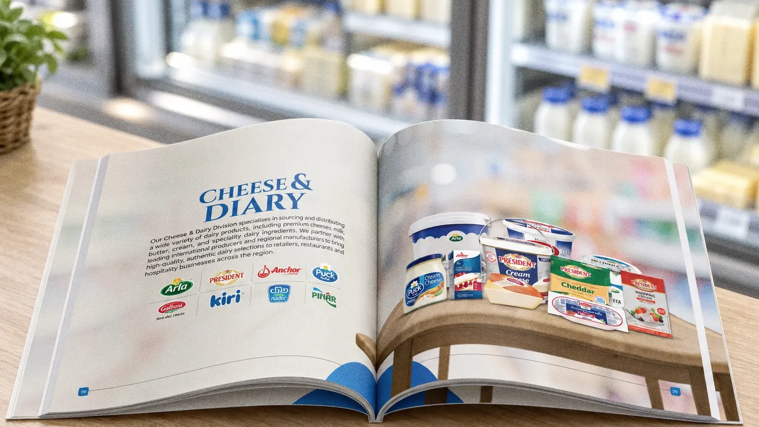
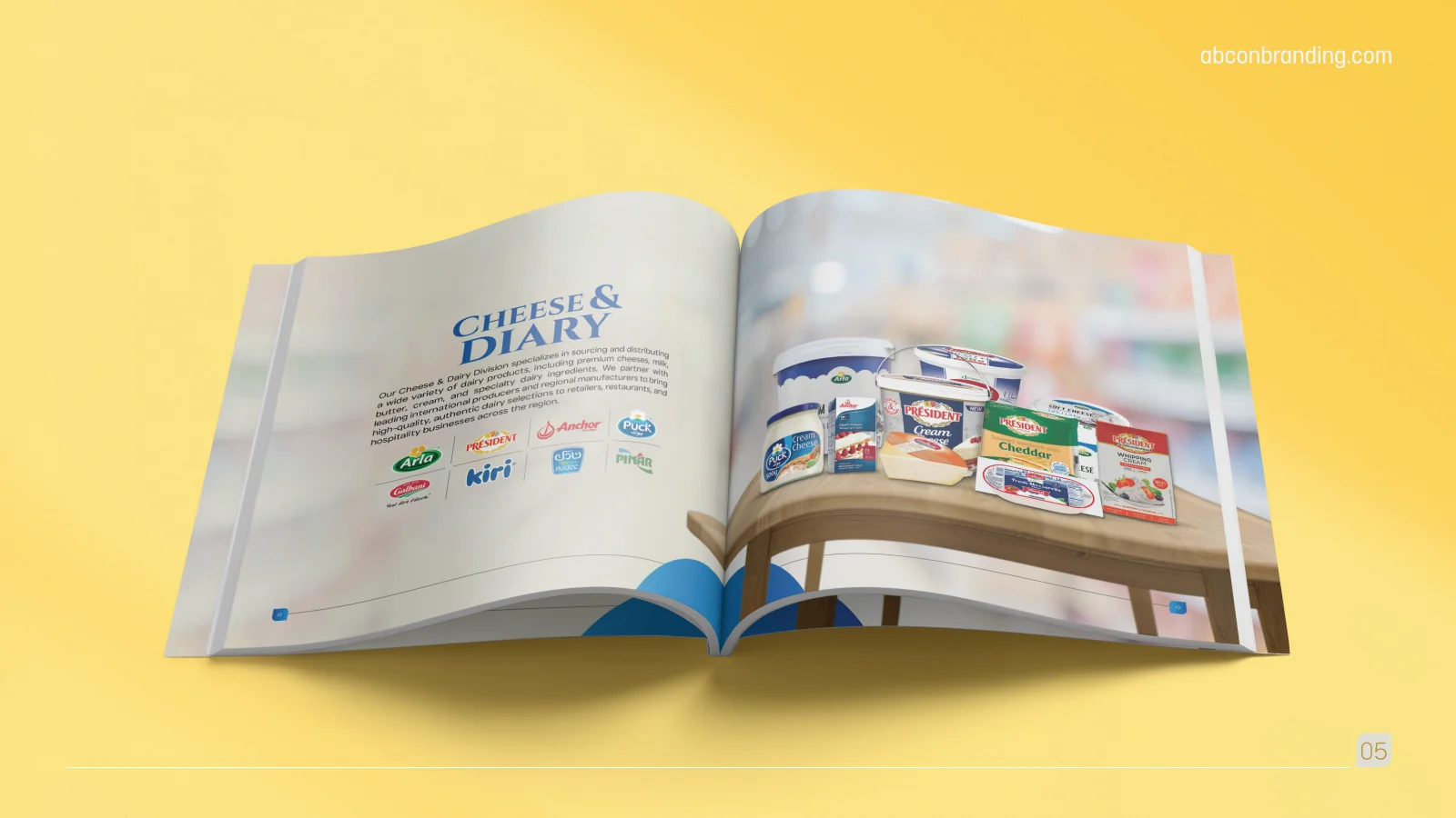
An open SAPCO catalogue spread headed Cheese and Dairy with dairy product photography, on a light counter near a cold display.
SAPCO: Dairy category
Dairy categoryA category spread brings together dairy product imagery and supporting brands.
Cheese and dairy spreadThe SAPCO identity, remastered from the original board of the cheese and dairy.
A bus shelter at dusk with three backlit posters: the white SAPCO logo on royal blue, the portfolio cover design, and a shelf of groceries with the SAPCO tile logo.
Bus shelter postersThe SAPCO identity as backlit bus shelter posters at dusk.

About this deck

What we built

A printed portfolio structure with company information, in-house brands and category spreads for products including groceries, packaging and dairy.

About the originals

The original boards are the original design pages from the supplied PDF presentation, including its application mockups.

What does your brand need next?

Let’s talk

Let’s talk

Tell us about your business.

You don’t need all the answers. A few lines about where you want to go is enough to start.