Media identity
Gulf Treat
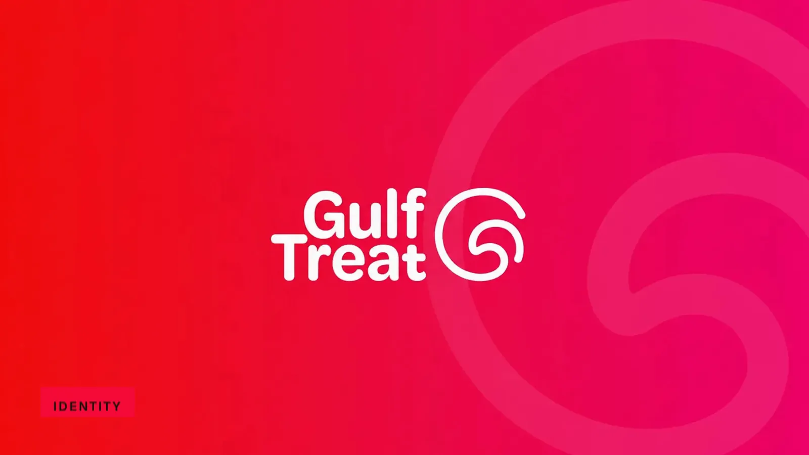
Gulf Treat brand film. Motion film made from the original Gulf Treat identity boards and brand applications.
Overview
A Gulf Treat identity built around a compact G symbol, a stacked wordmark and a red-to-pink palette.
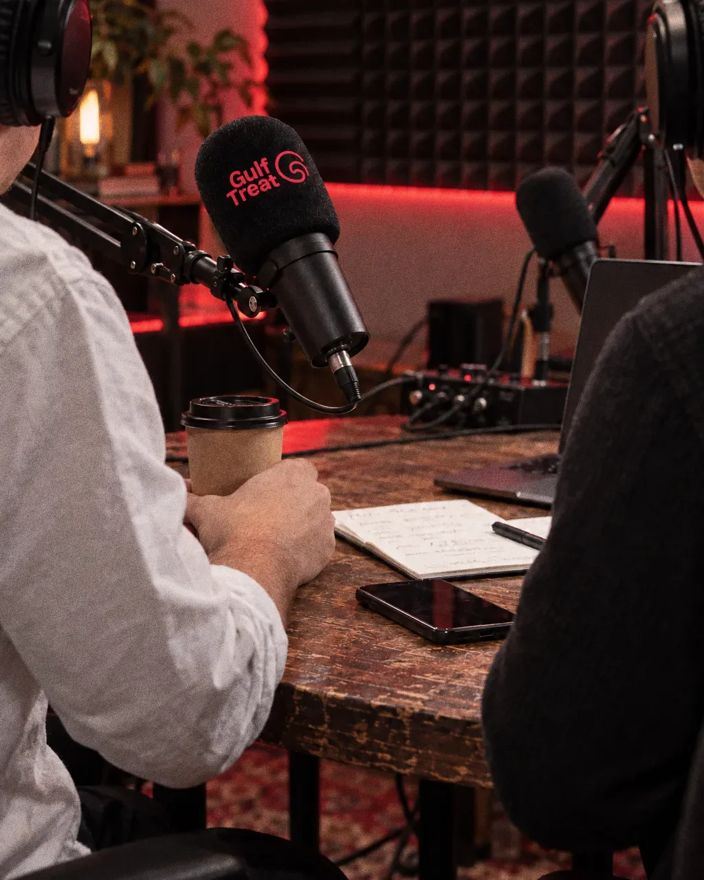
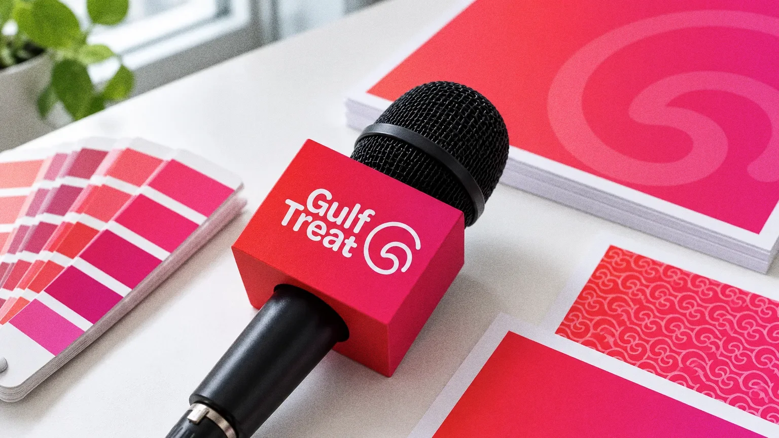
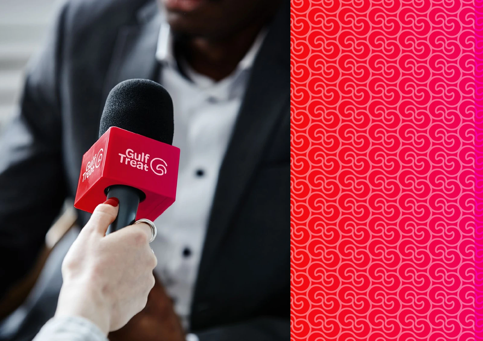
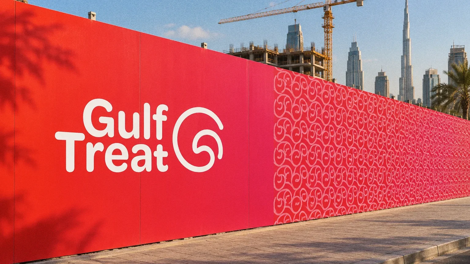
The presentation follows the system from business cards and microphone branding to a building-signage mockup.
BriefA media identity moves from a small microphone flag to a large sign. The design task is to make the name and symbol work together at those very different scales.
Services
Scope
- Logo and symbol
- Colour and pattern
- Stationery, microphone branding and signage applications
Sources
How to read this deck
The deck pairs the client’s original presentation boards with new application scenes that show the identity in use.
Some of the older boards have been redrawn. Each one sits where the original stood, with the real original design in its corner and a View original button to open it in full.
Chapter 01
Concept and inspiration
Chapter 02
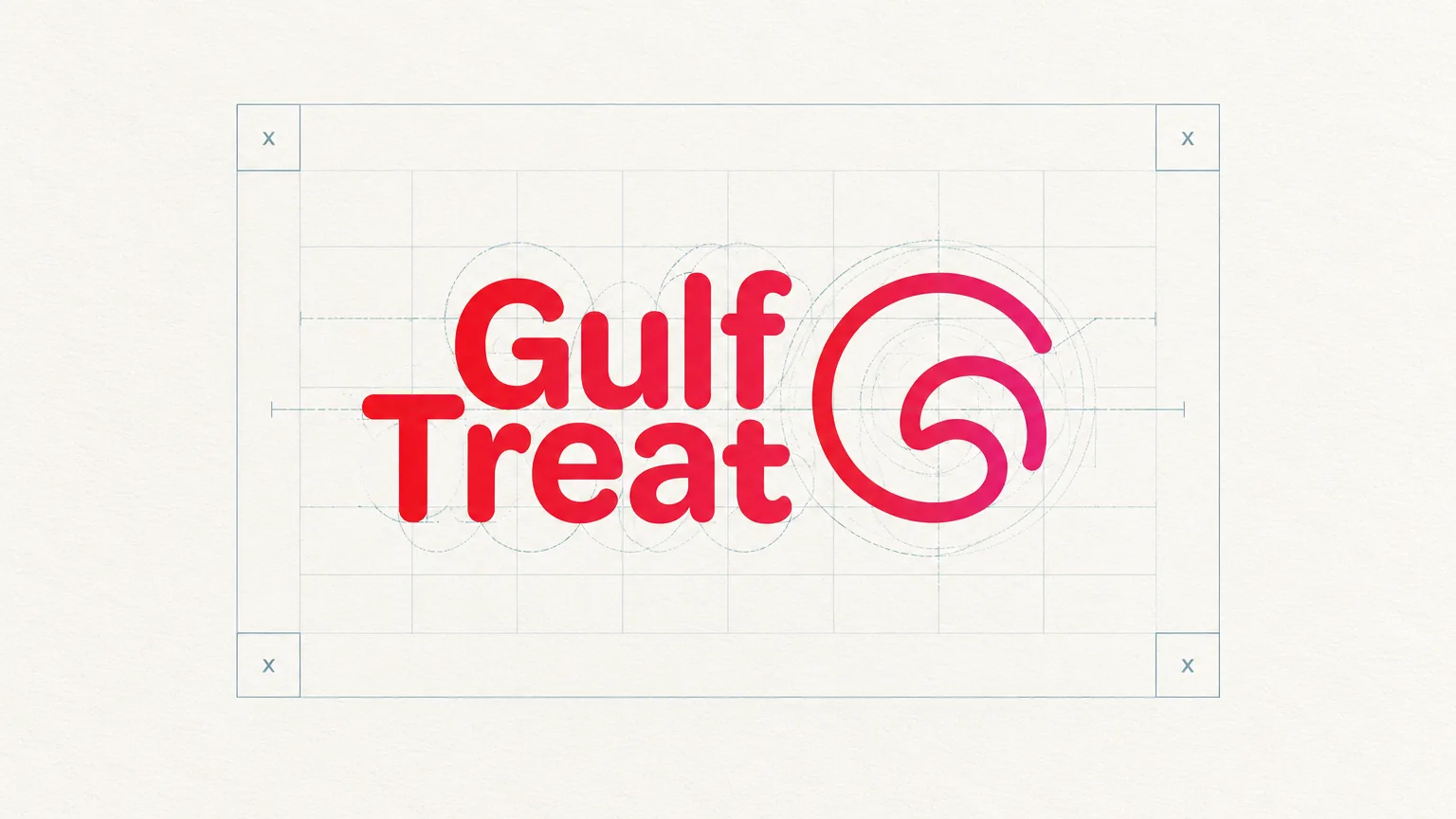
How the logo was formed
Chapter 03
The logo
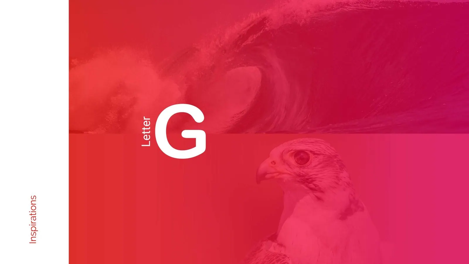
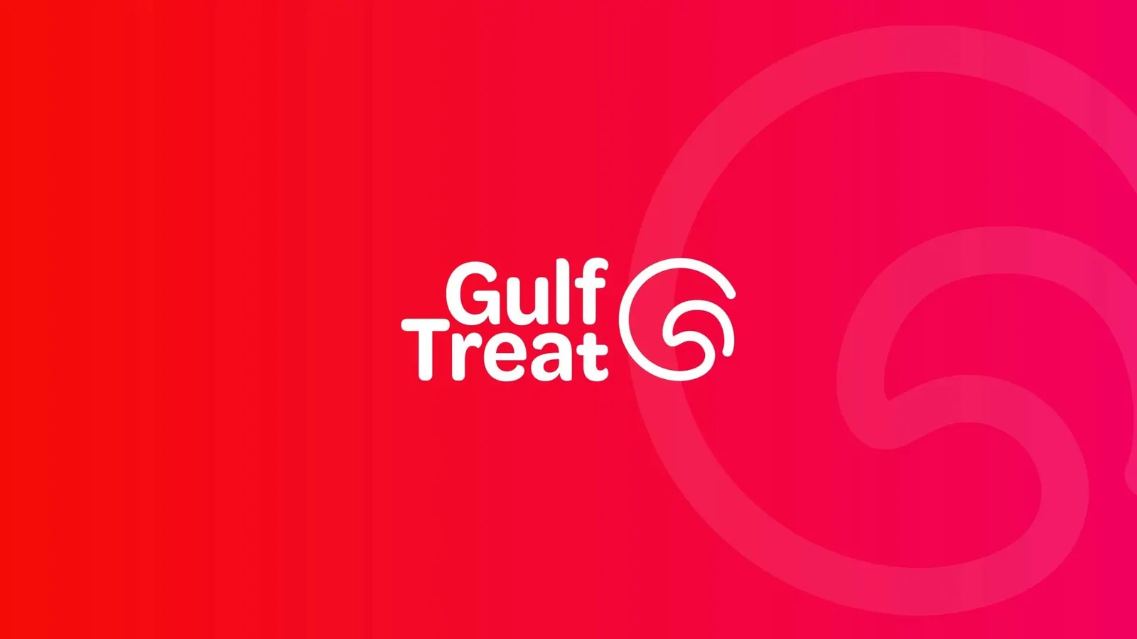
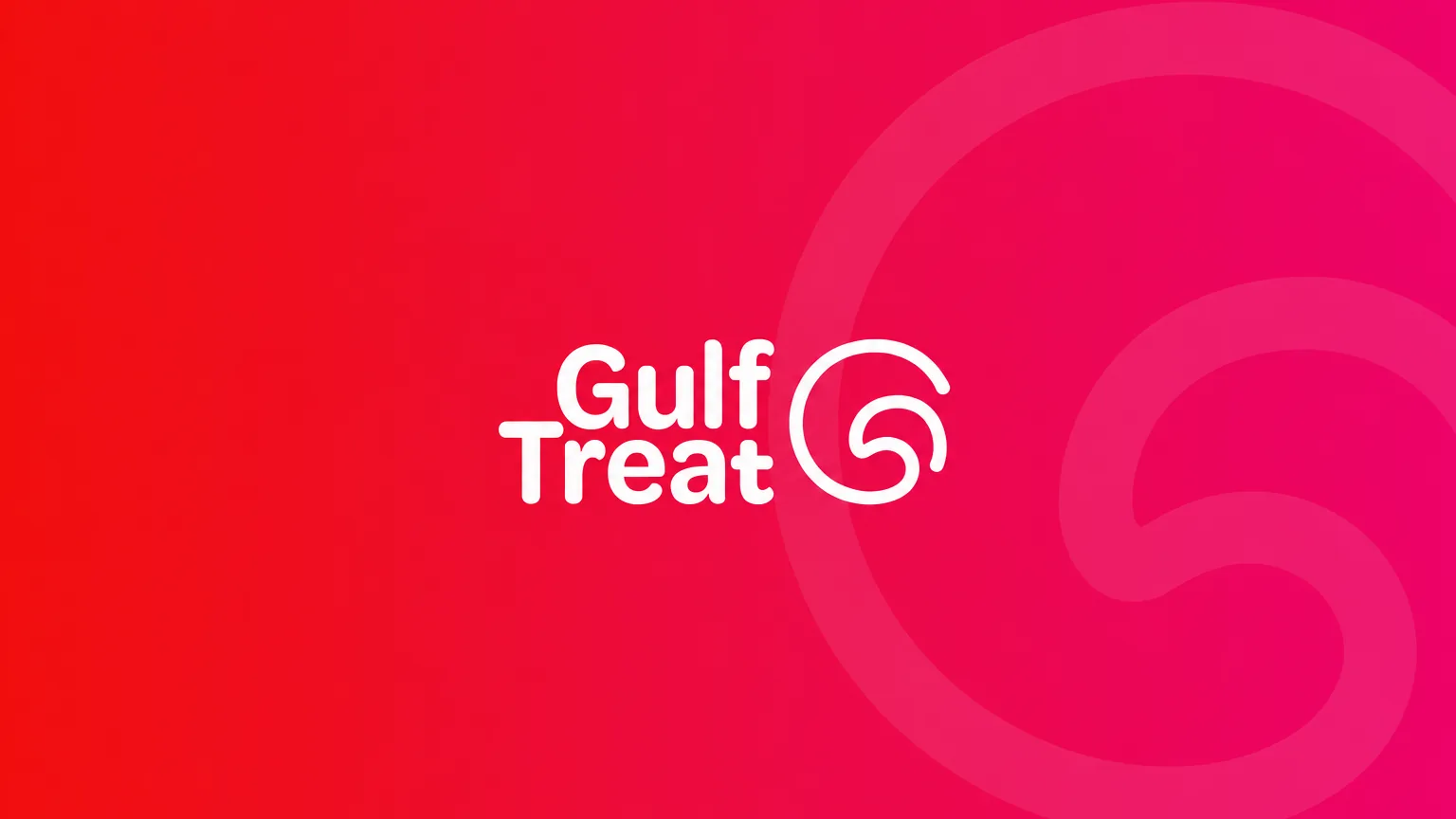
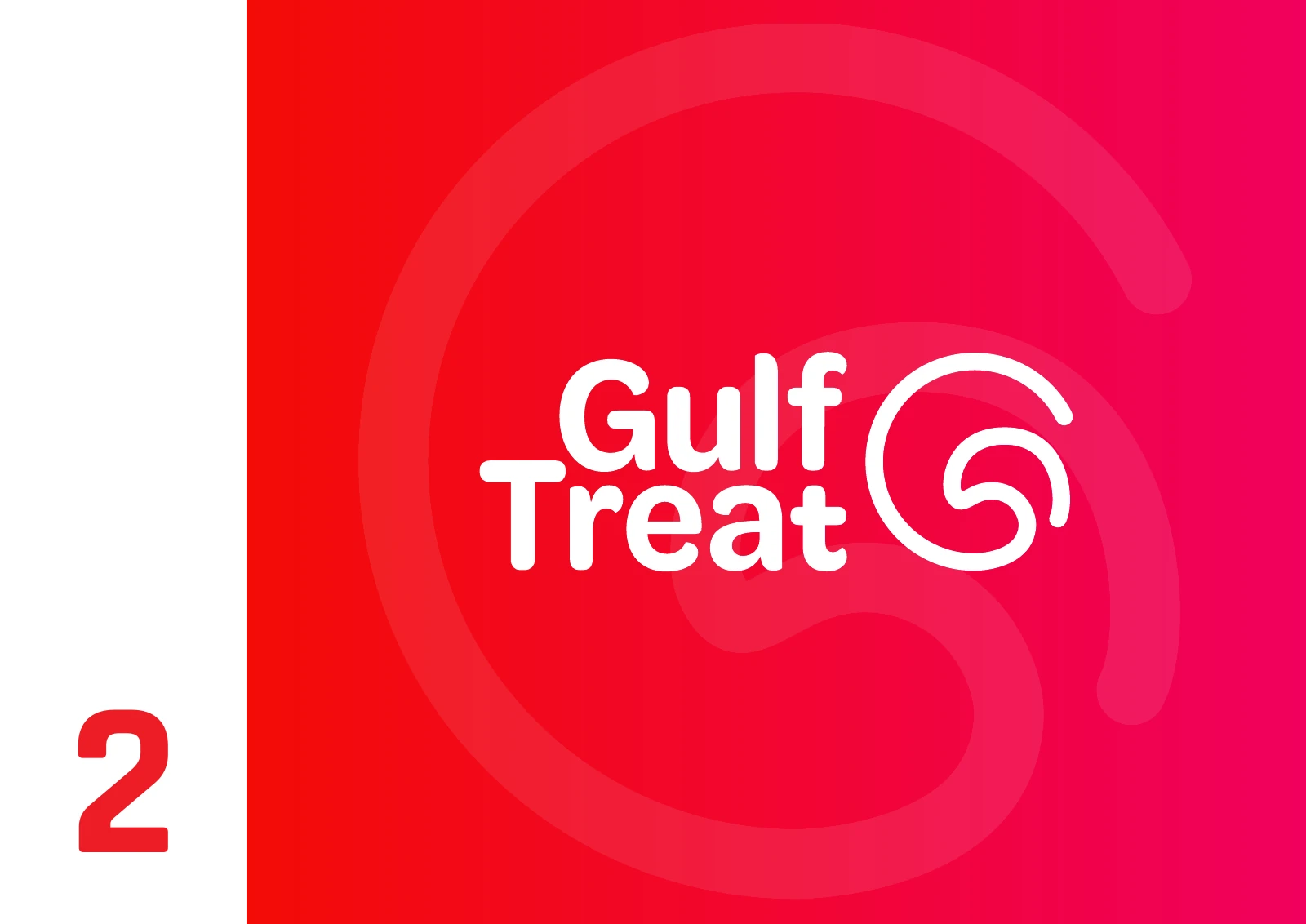
The Gulf Treat symbol draws on the letter G and eagle imagery, paired with a stacked wordmark that also appears in monochrome.
Chapter 04
Logo variations
Chapter 05
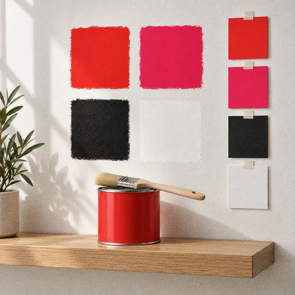
Colour
- Accent
#F50A3A - Surface
#2B0610 - Ink
#FFFFFF
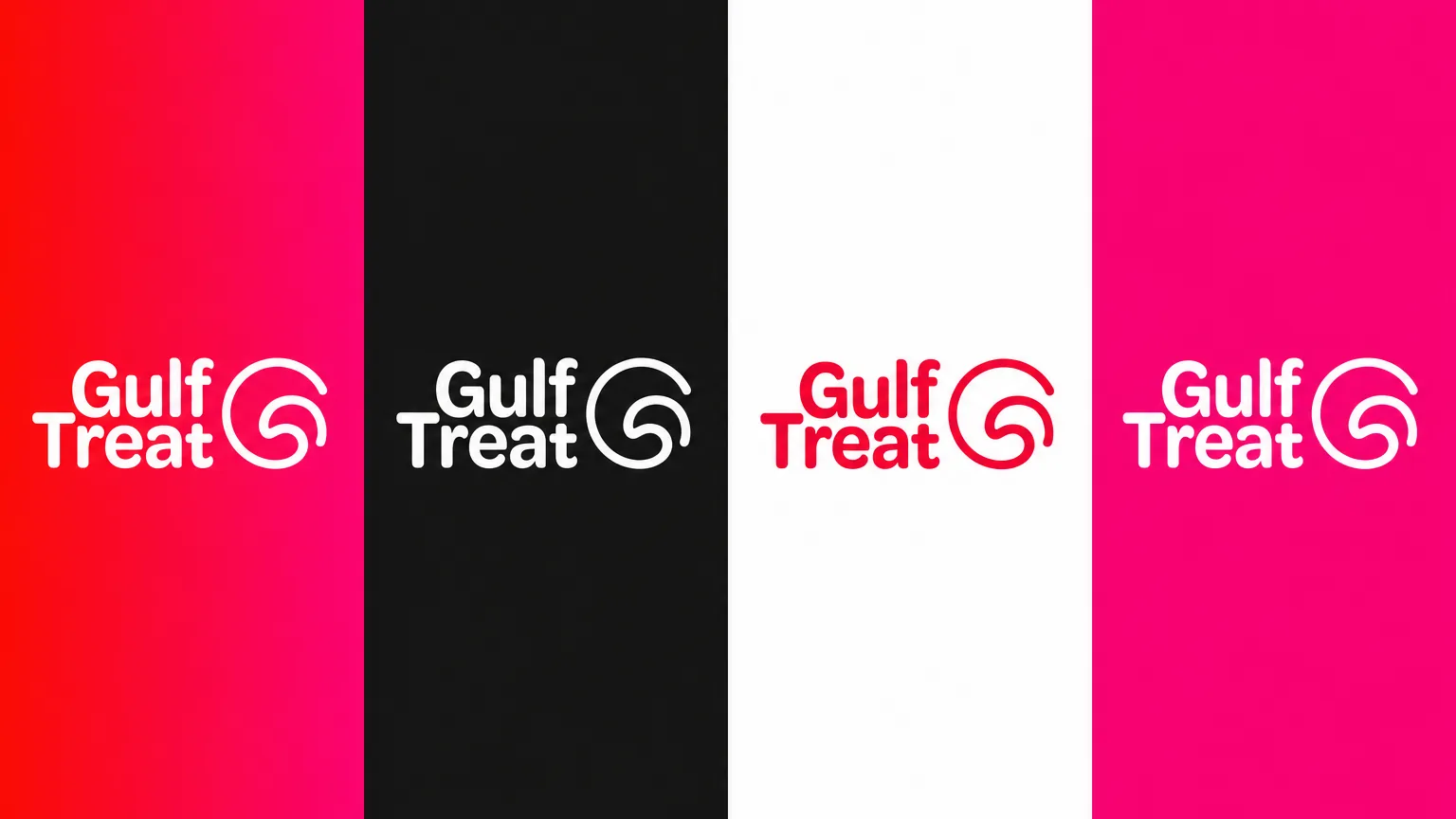
Colours sampled from the original identity boards.
Chapter 06
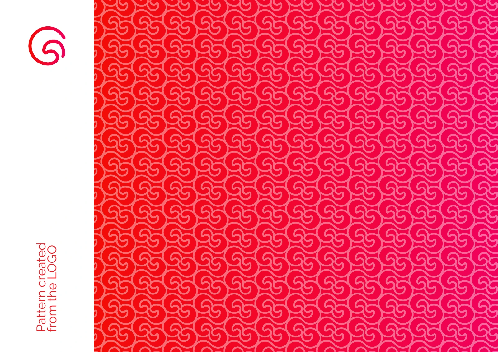
Pattern and graphic elements
Chapter 07
Packaging
Chapter 08
Stationery
One symbol, several scales
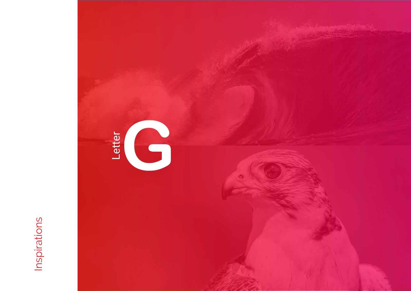
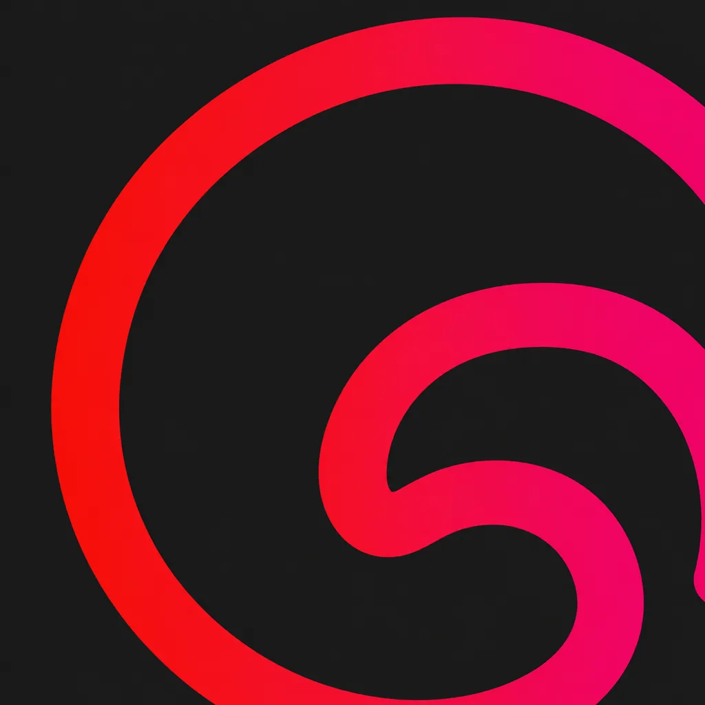
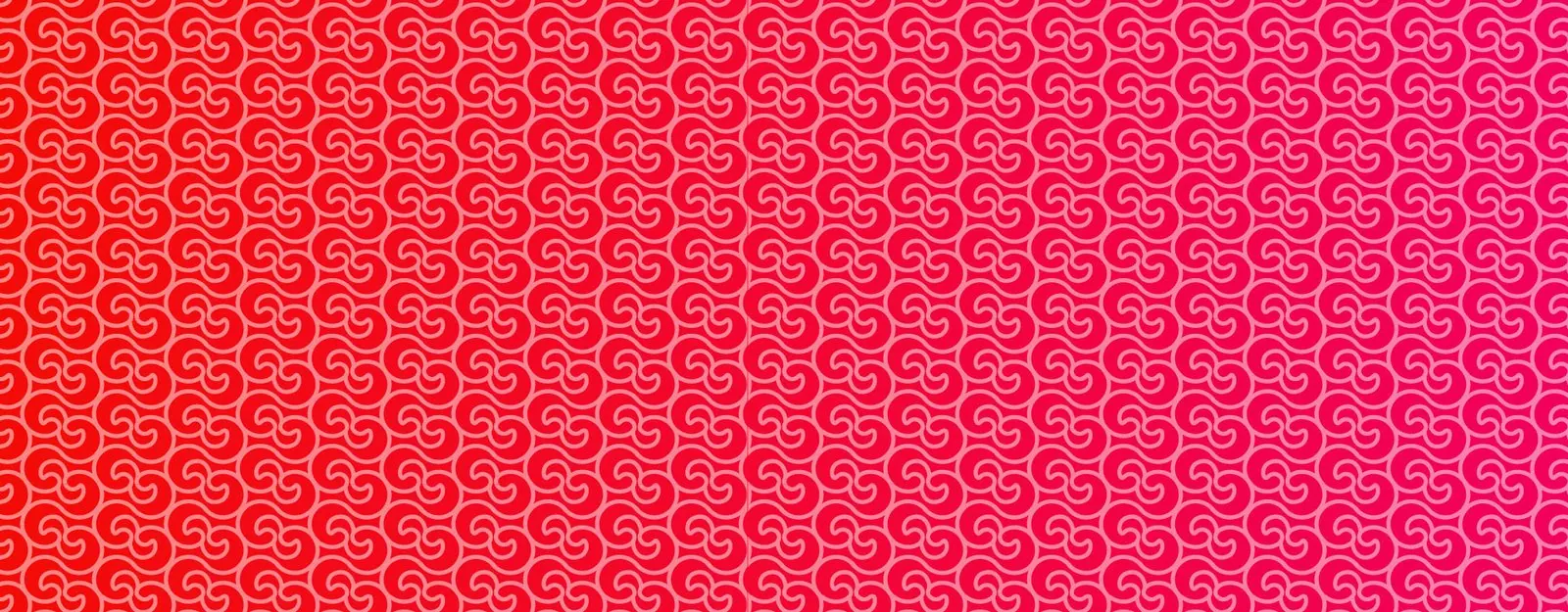
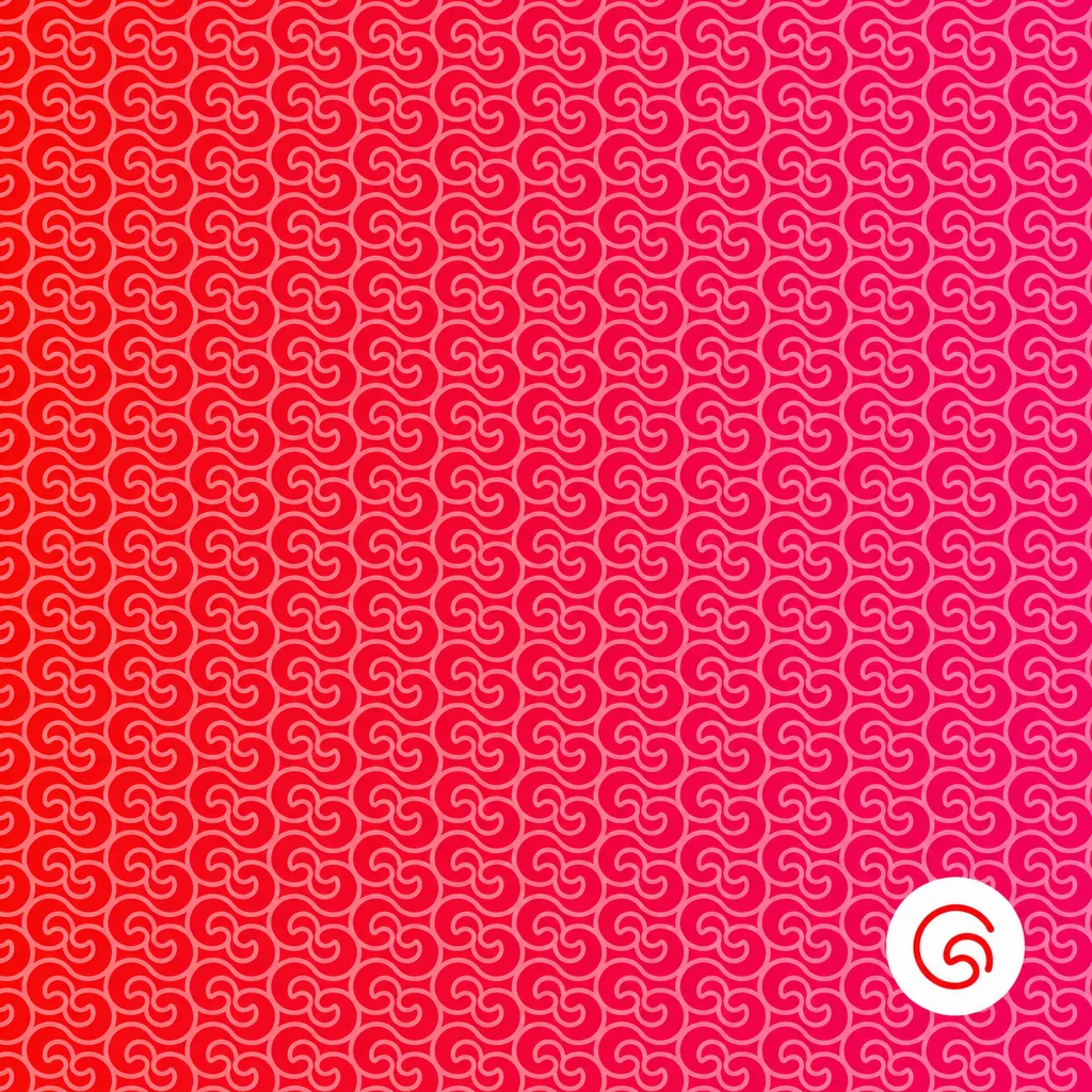
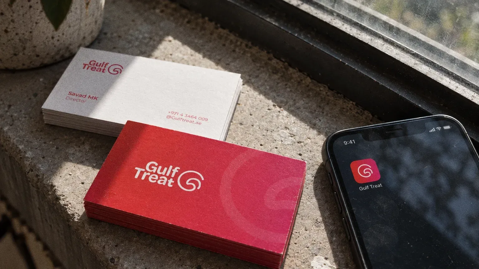
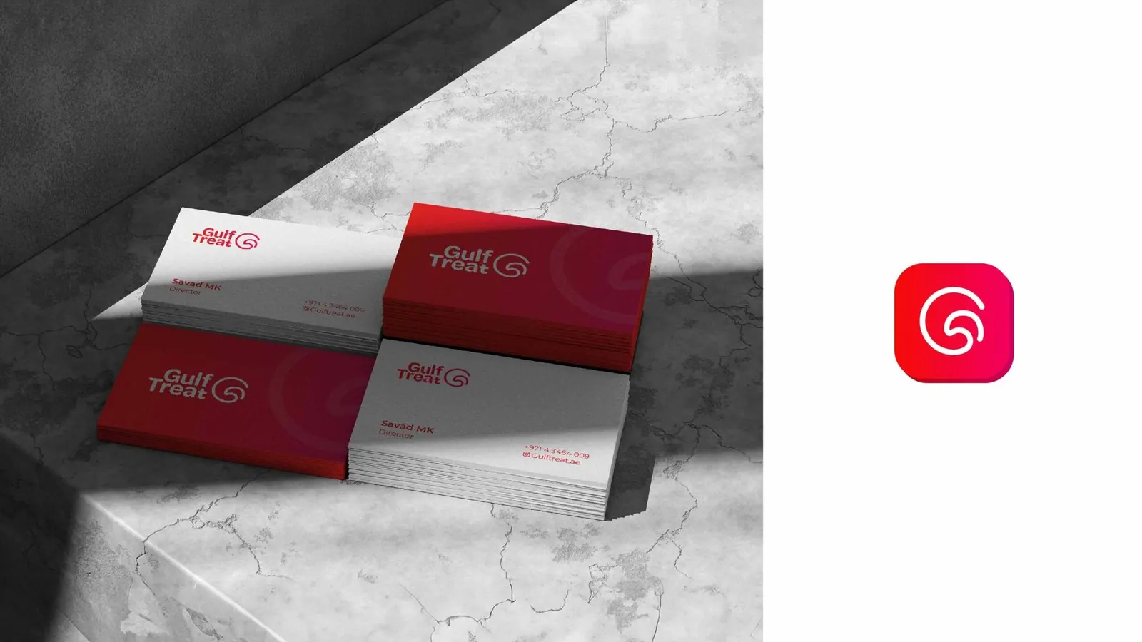
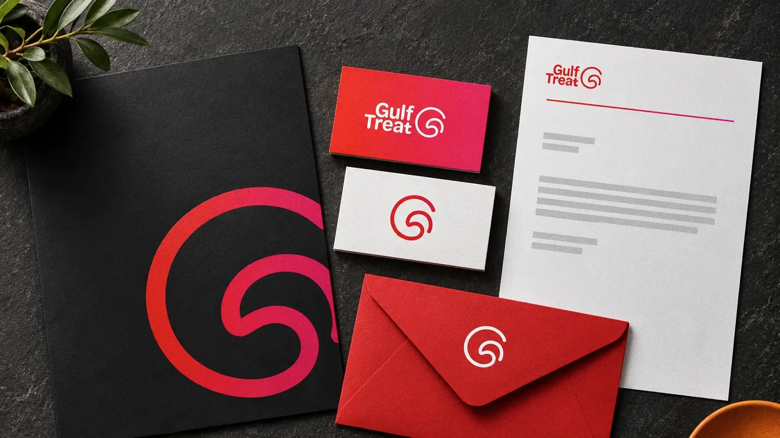
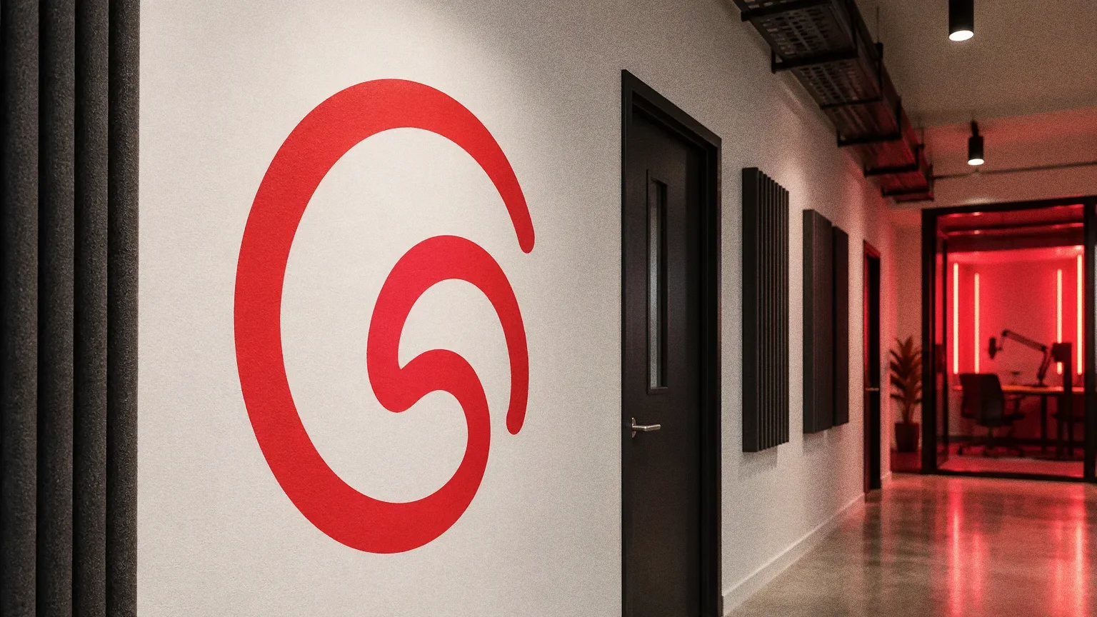
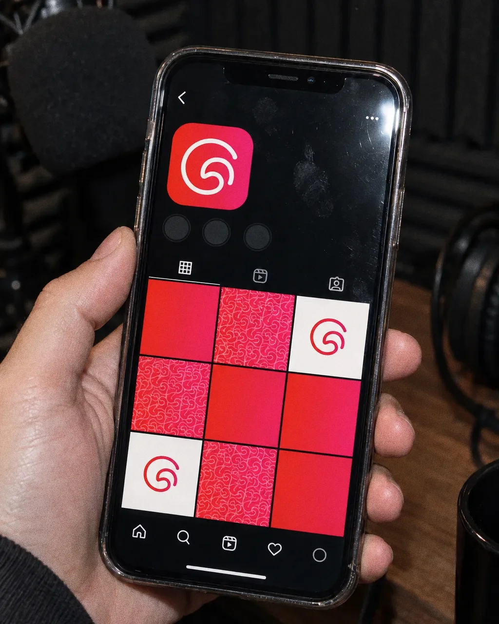
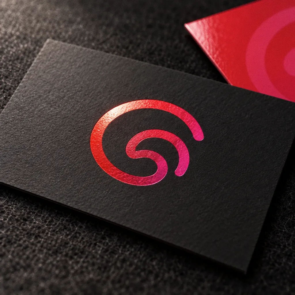
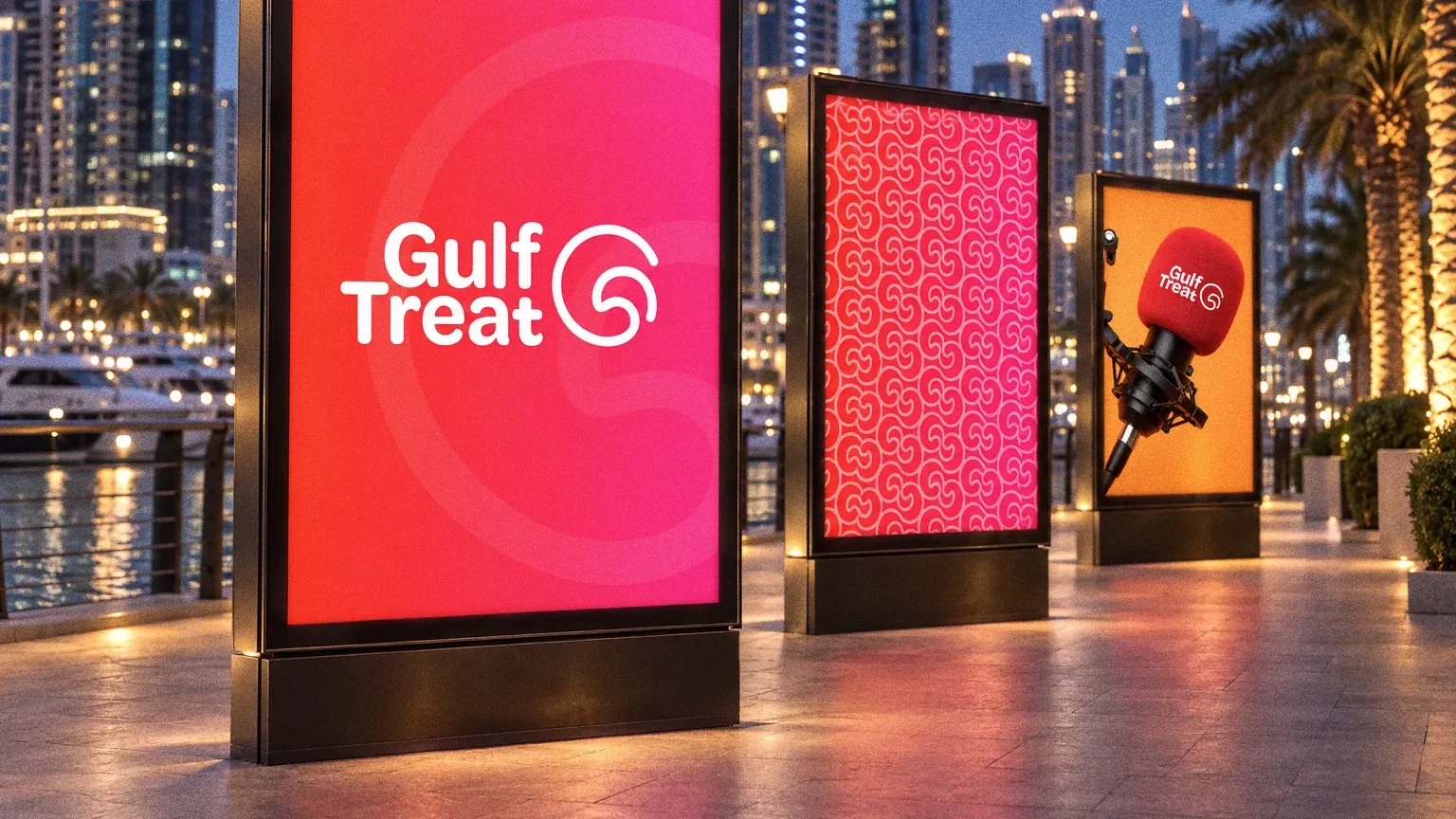
The inspiration board pairs the letter G with an eagle. The curved symbol then appears beside the full name, on its own as an icon and repeated as a pattern. Those variations show how the same identity can occupy a small card or a much larger surface.
Chapter 09
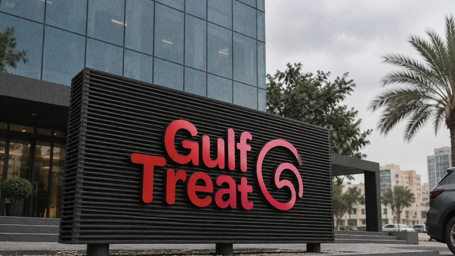
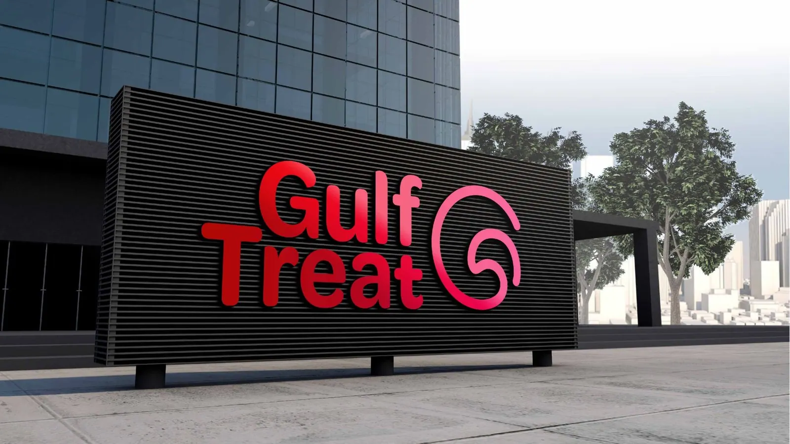
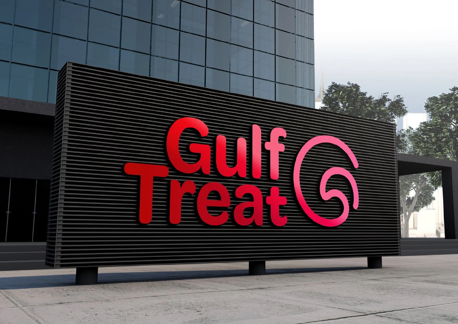
Signage and spaces
Chapter 10
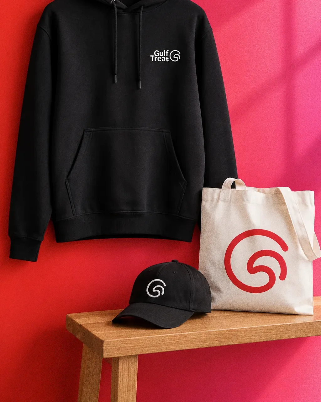
Uniforms and merchandise
Chapter 11
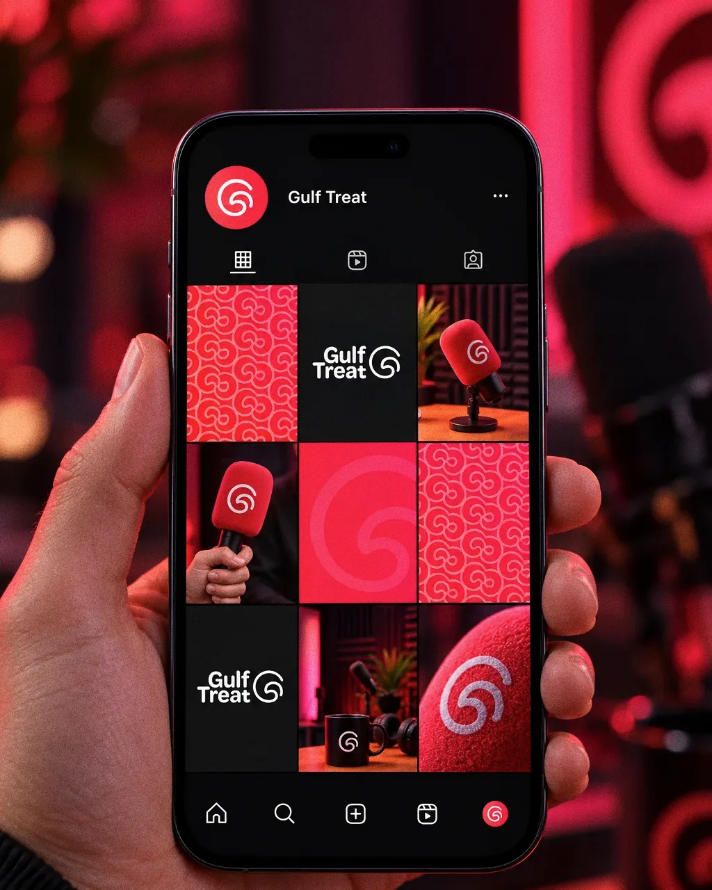
Digital
Chapter 12
The brand in the world
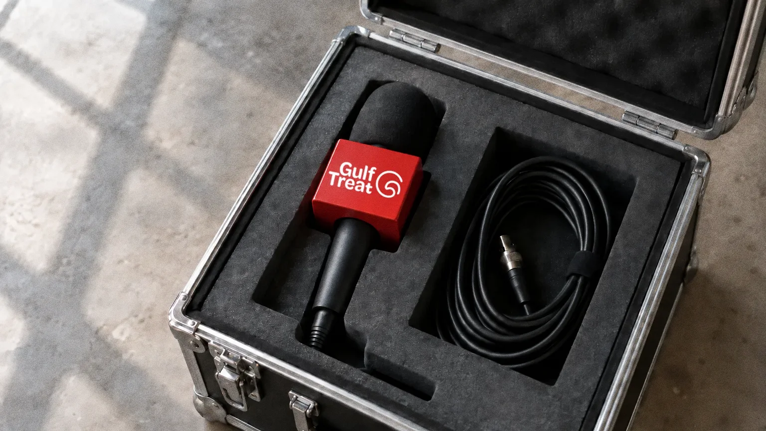
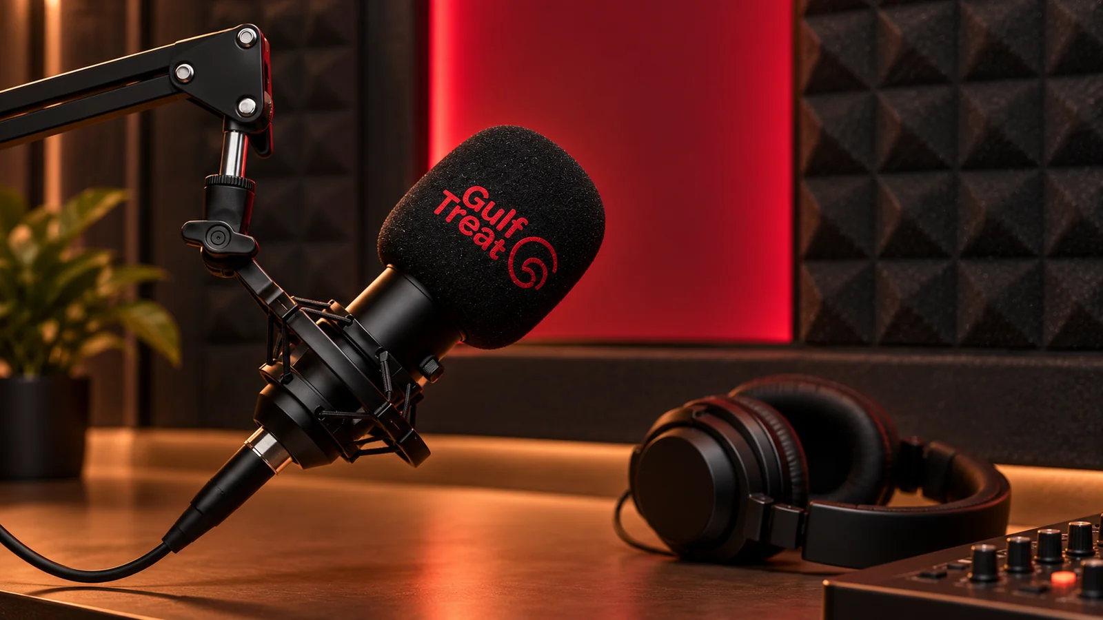
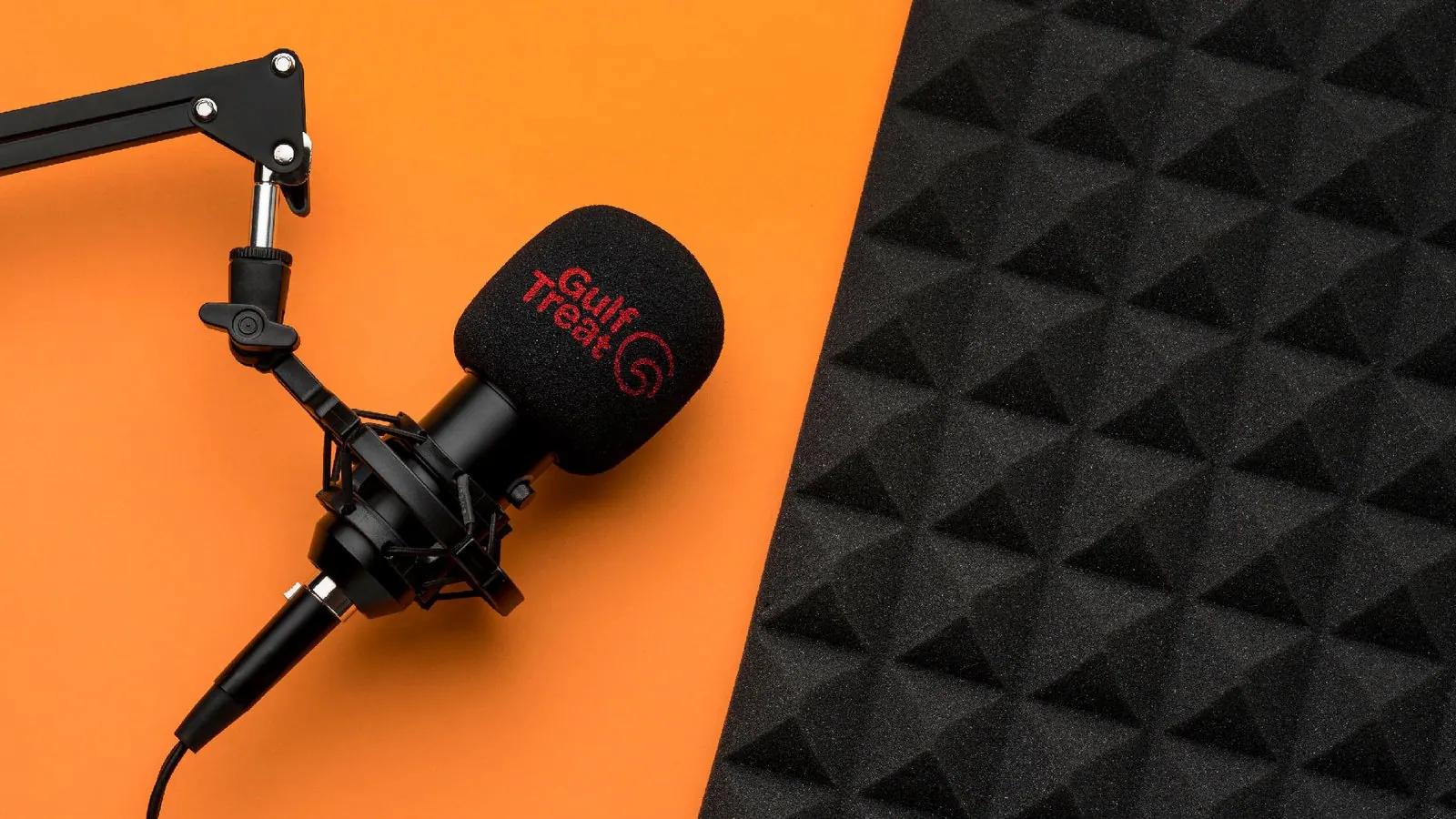
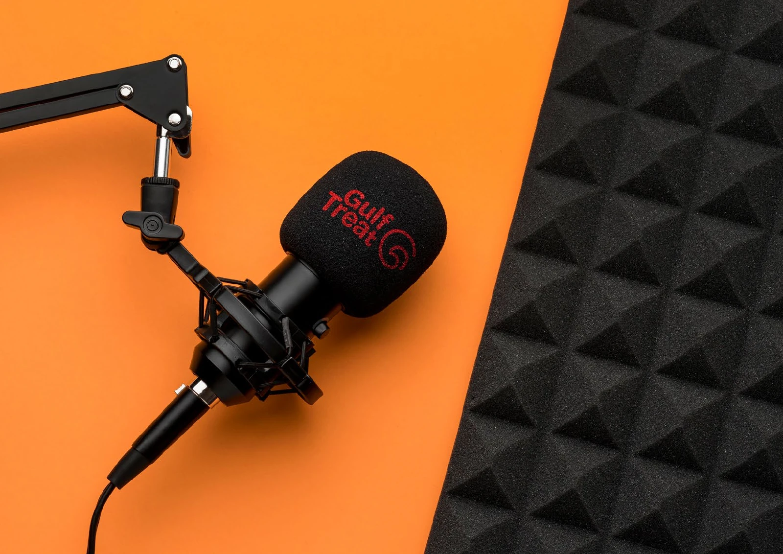
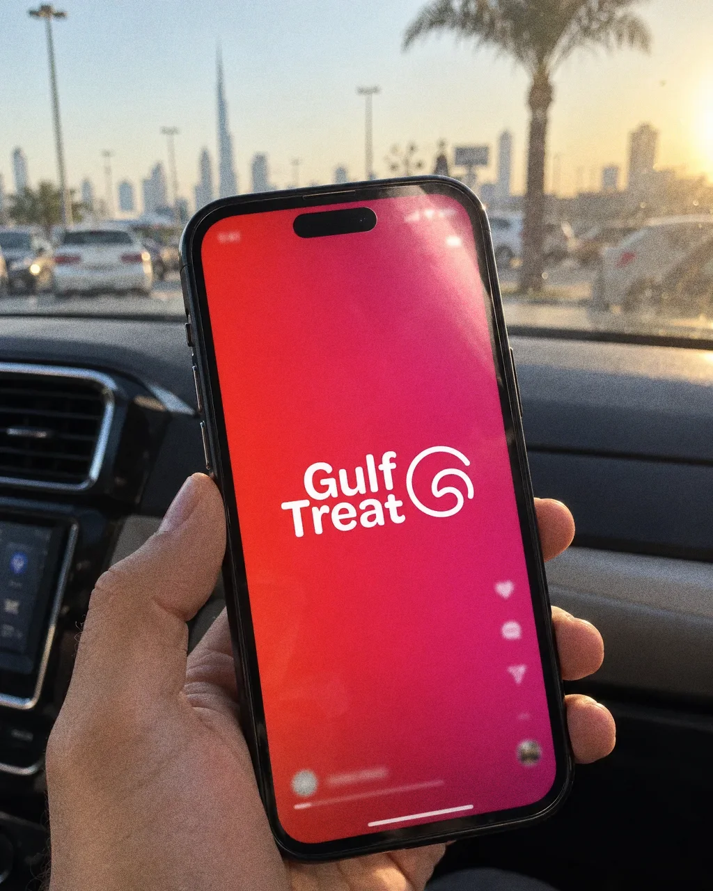
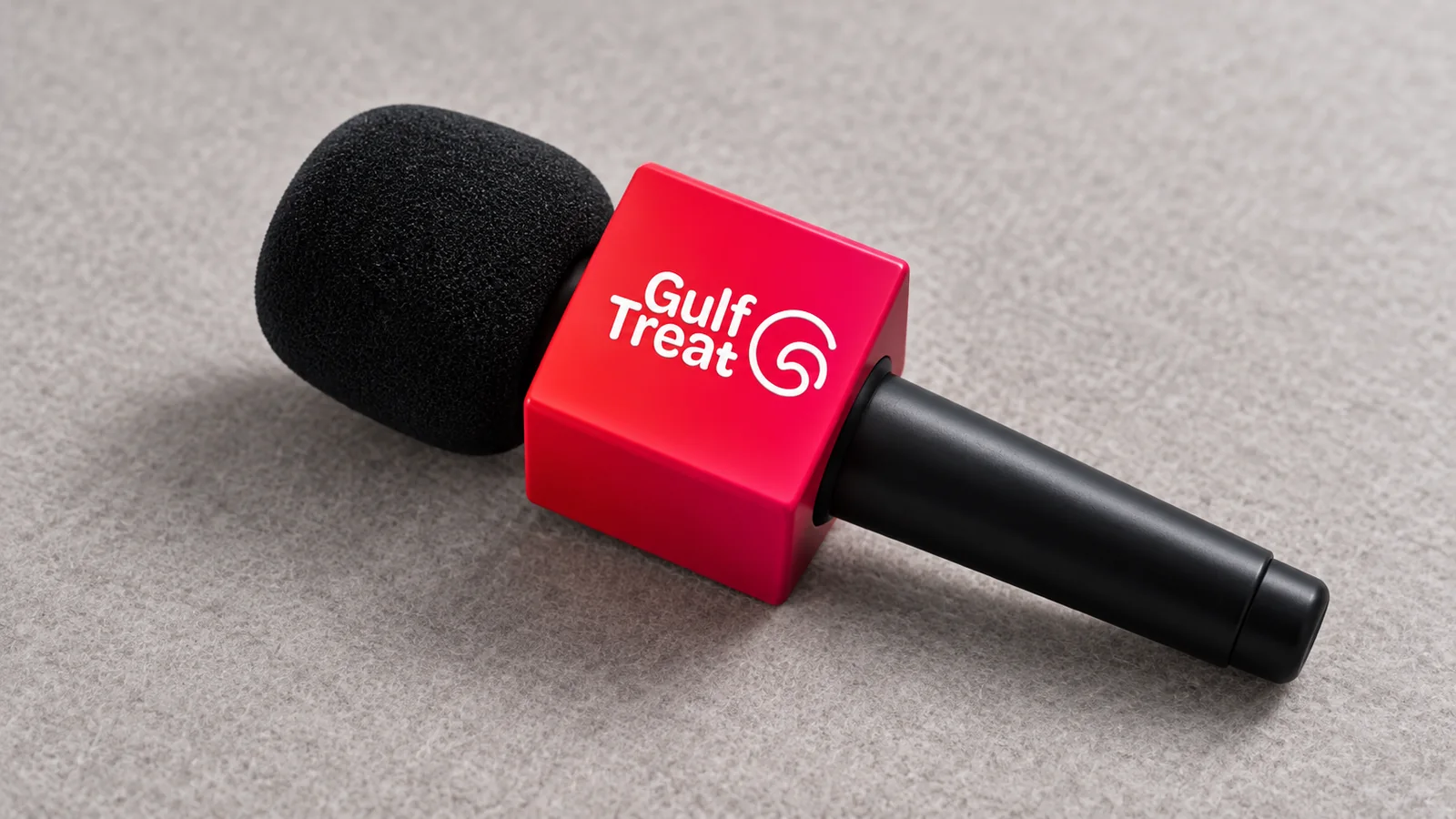
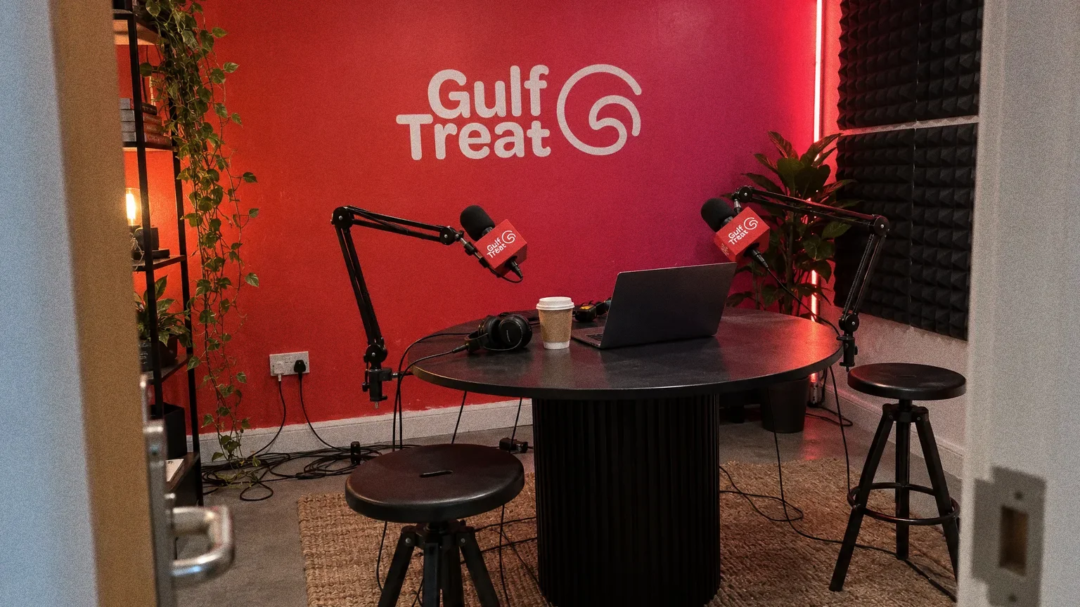
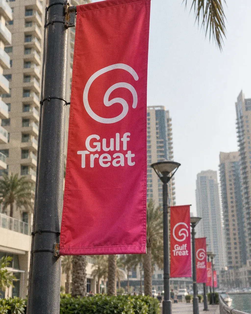
The source shows the media identity on business cards, an architectural sign and both interview and studio microphones.
Chapter 13
In people’s hands
Colour and monochrome versions
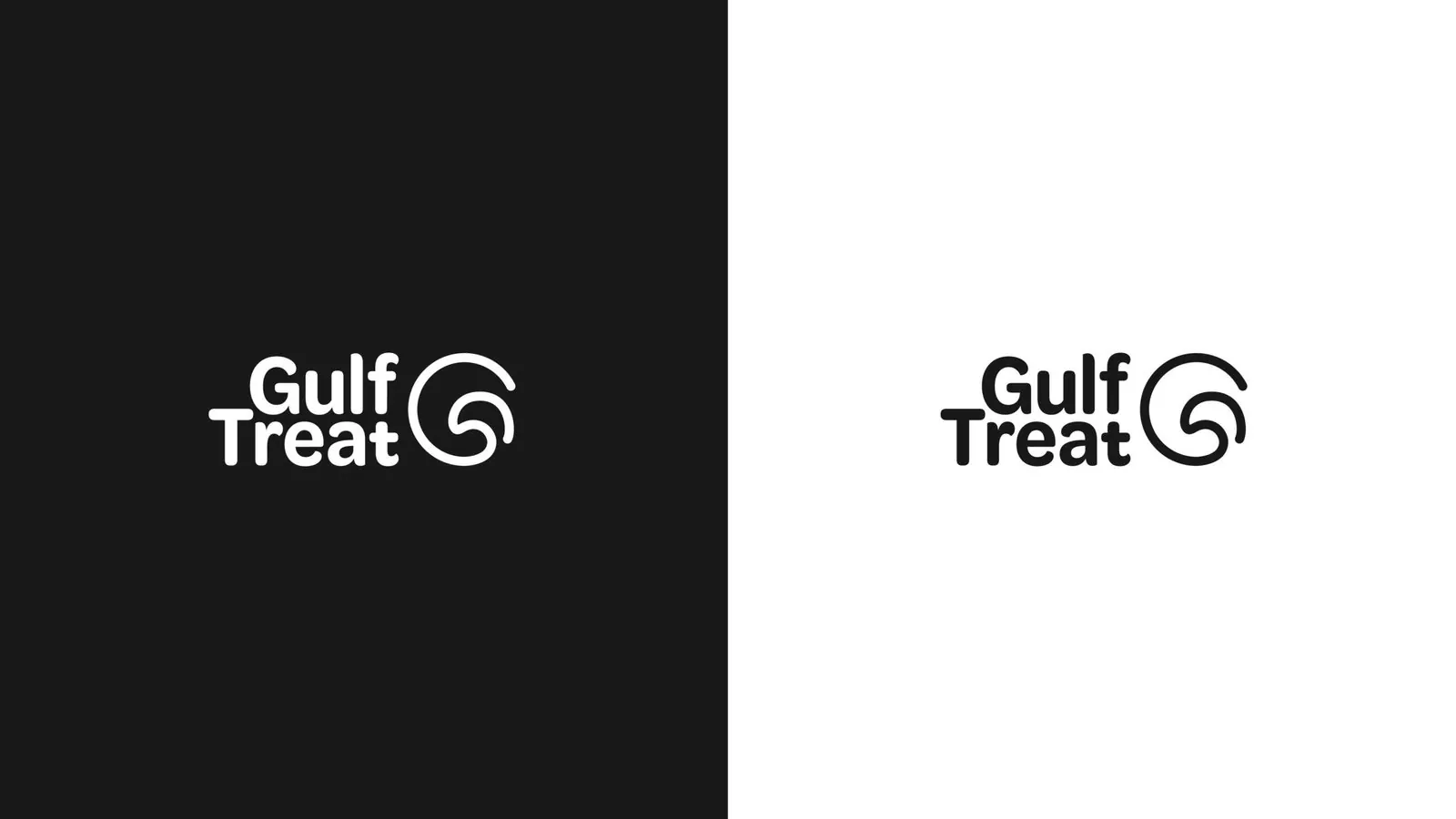
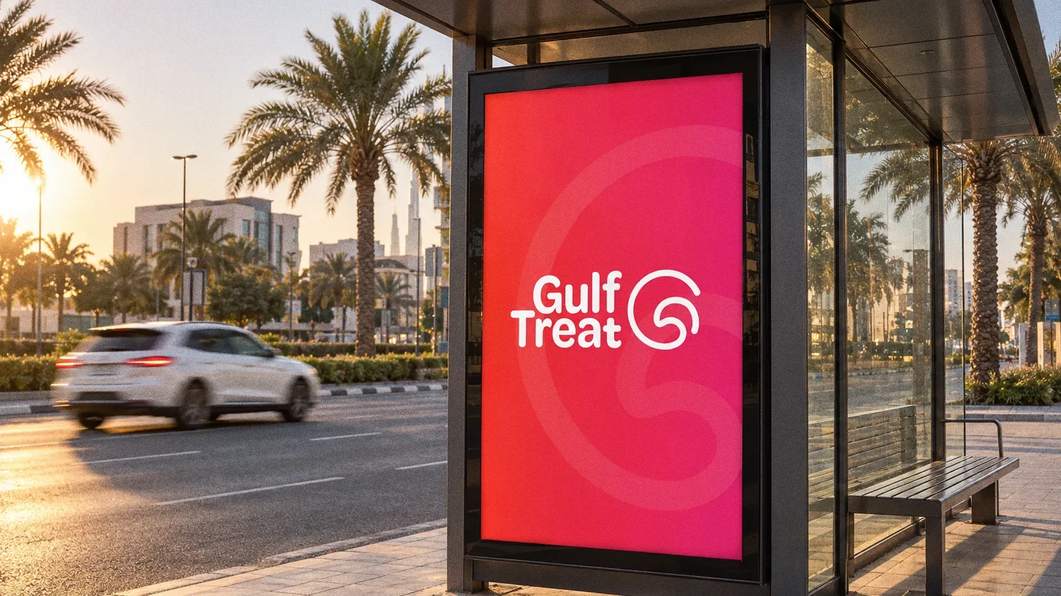
The logo board shows black and white versions alongside the red-to-pink treatment used in the application boards. The microphone and signage mockups show the name and symbol together on surfaces with very different proportions.
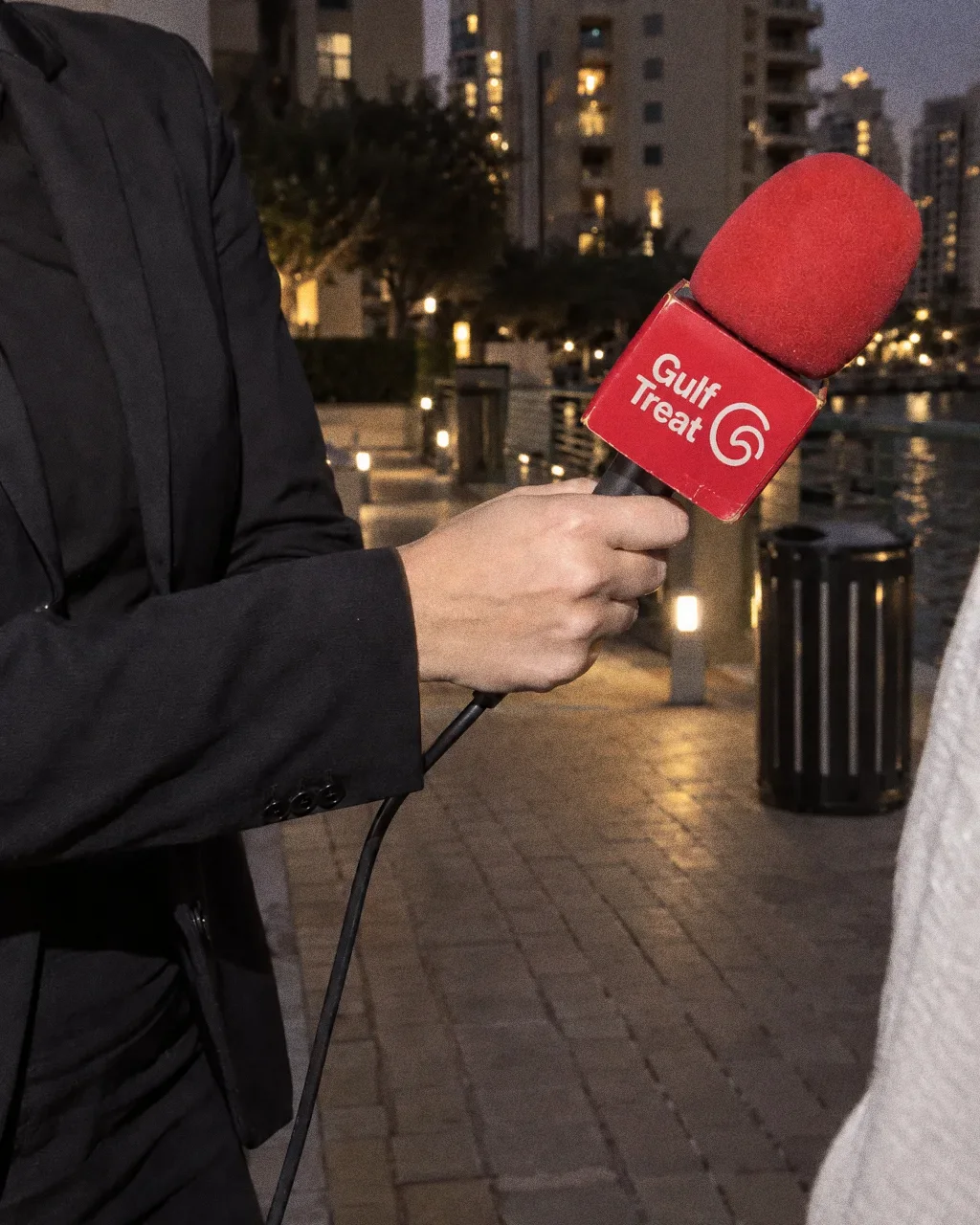
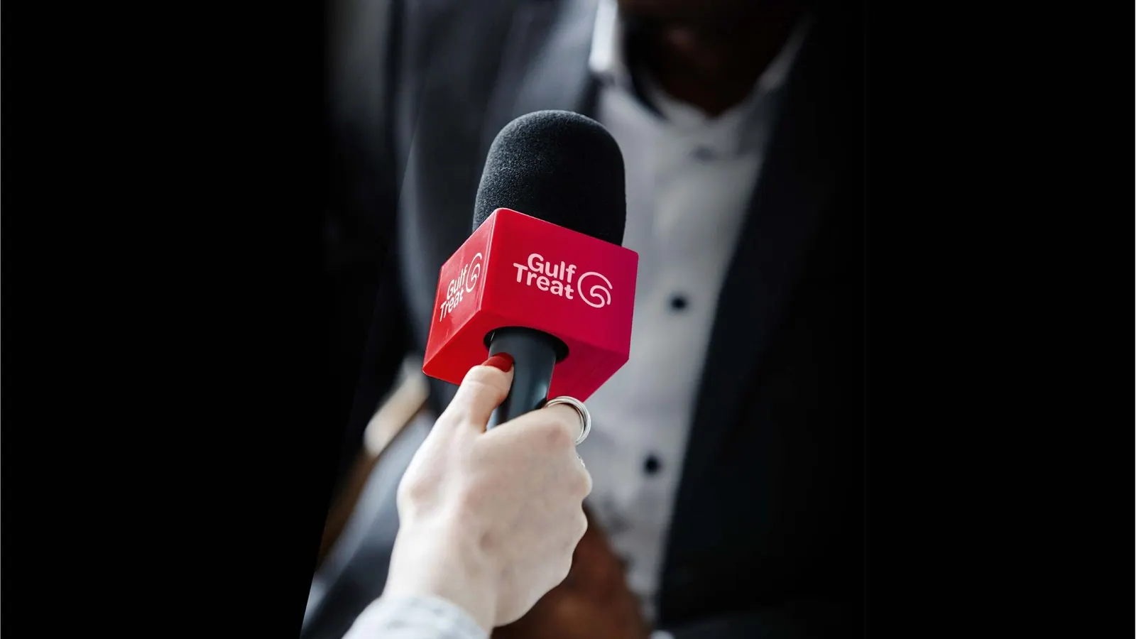
Street interview at duskThe Gulf Treat identity in a lifestyle photograph of a street interview on a waterfront promenade. 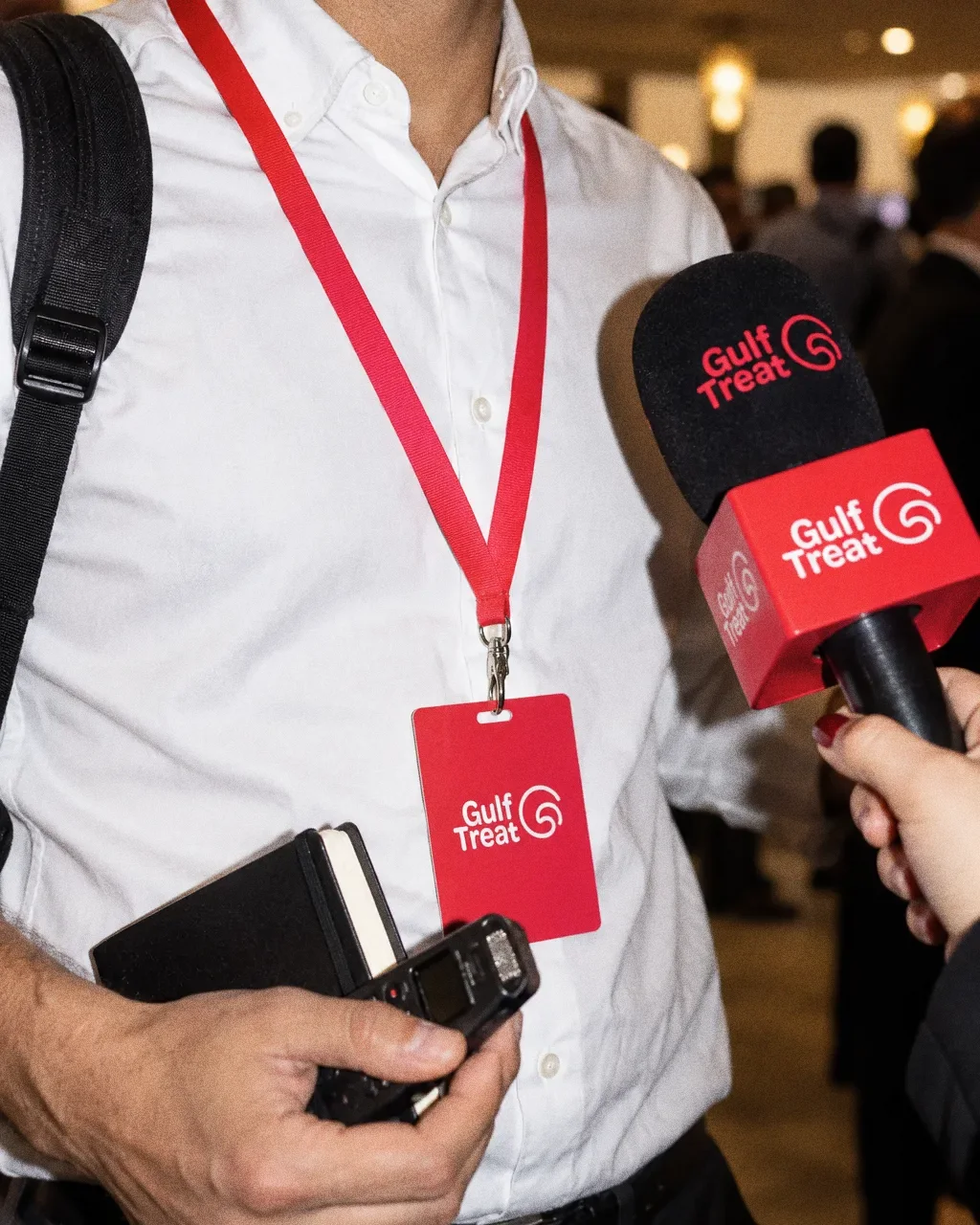
Press badge at the eventThe Gulf Treat identity in a lifestyle photograph of a press badge and microphone at a media event. 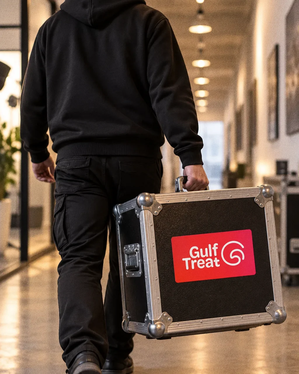
Crew carrying the kitThe Gulf Treat identity in a lifestyle photograph of a crew member carrying a flight case. 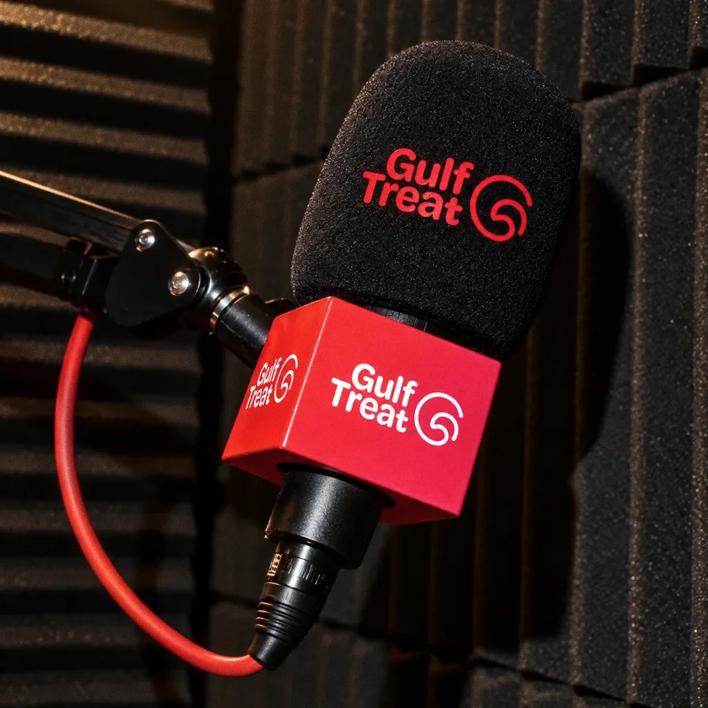
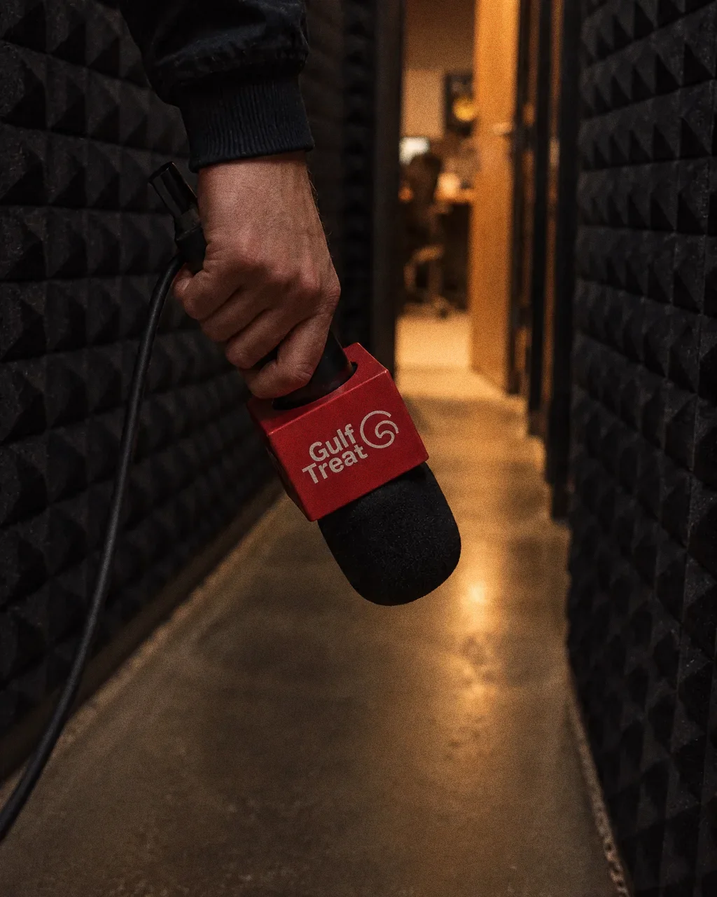
Windscreen against the foamThe Gulf Treat identity in a lifestyle photograph of a branded microphone against acoustic foam. 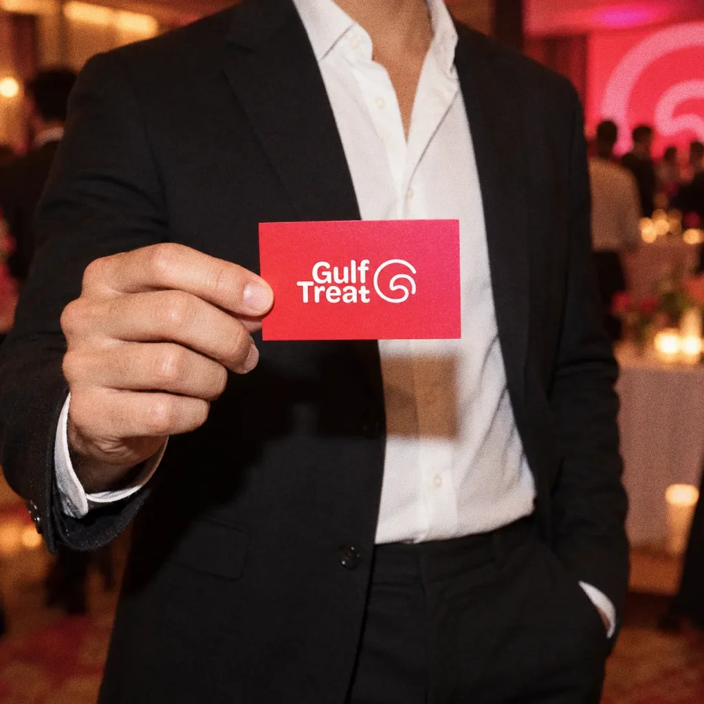
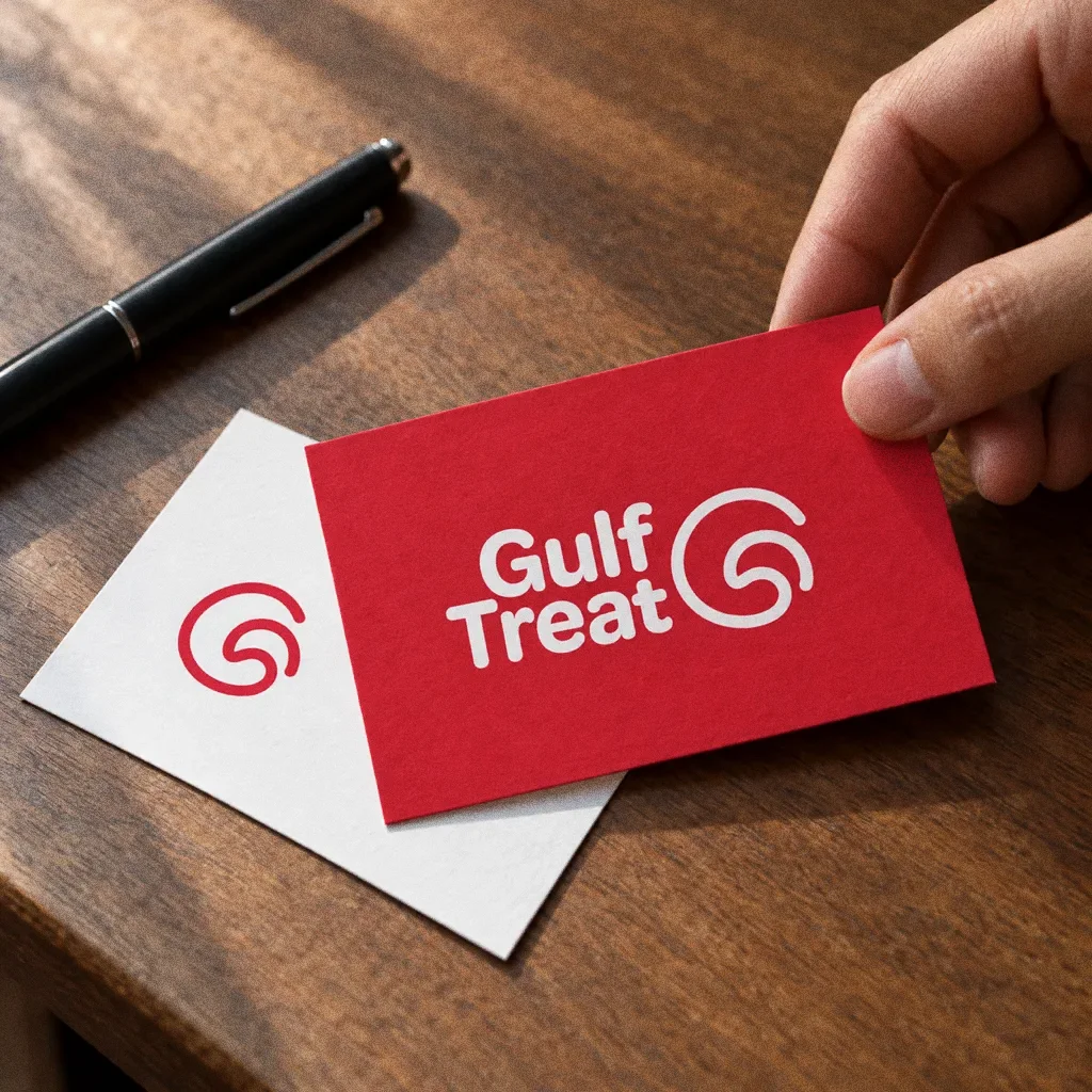
A card held out at the eventThe Gulf Treat identity in a lifestyle photograph of a business card held out at a media event.
Chapter 14
Campaign
About this deck
What we built
A G-and-eagle symbol, stacked wordmark, red-to-pink treatment and repeat pattern, with business-card, microphone and building-signage applications.
What this case establishes
The presentation establishes a coordinated identity: a compact symbol, full-name lockup, colour and monochrome versions, a repeat pattern and application mockups. It documents the design system; audience research, launch performance and commercial results are not included in this source.
About the originals
The original boards are from Abcon’s original project presentation and include application mockups.