
Mandi restaurant
Waqtal Mandi
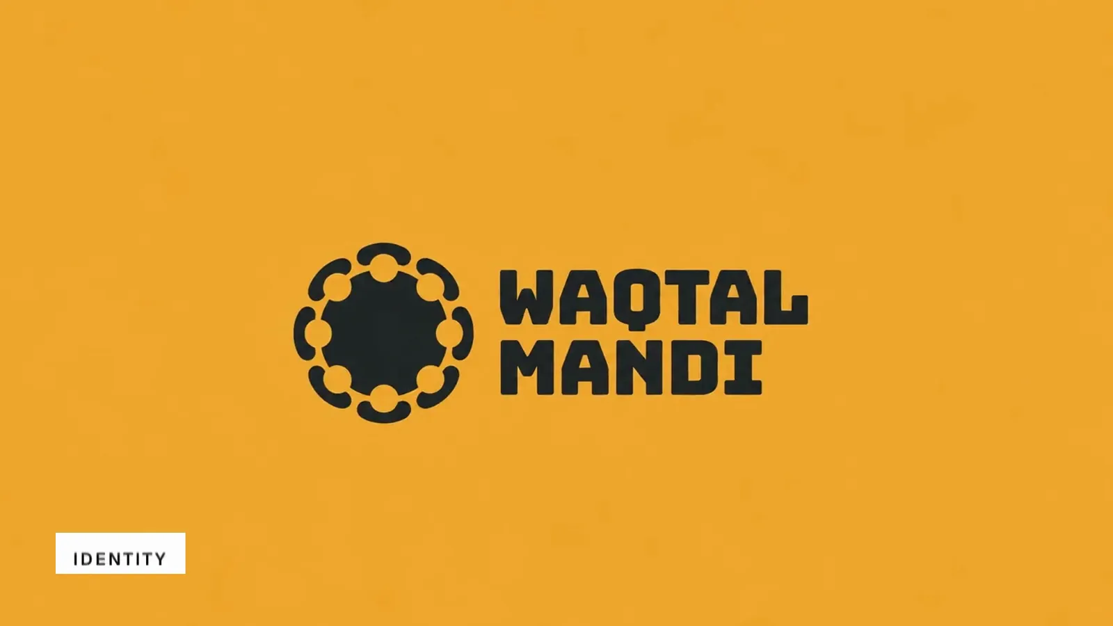
Waqtal Mandi brand film. Motion film made from the original Waqtal Mandi identity boards and brand applications.
Overview
An identity for Waqtal Mandi, a traditional mandi restaurant in the UAE.
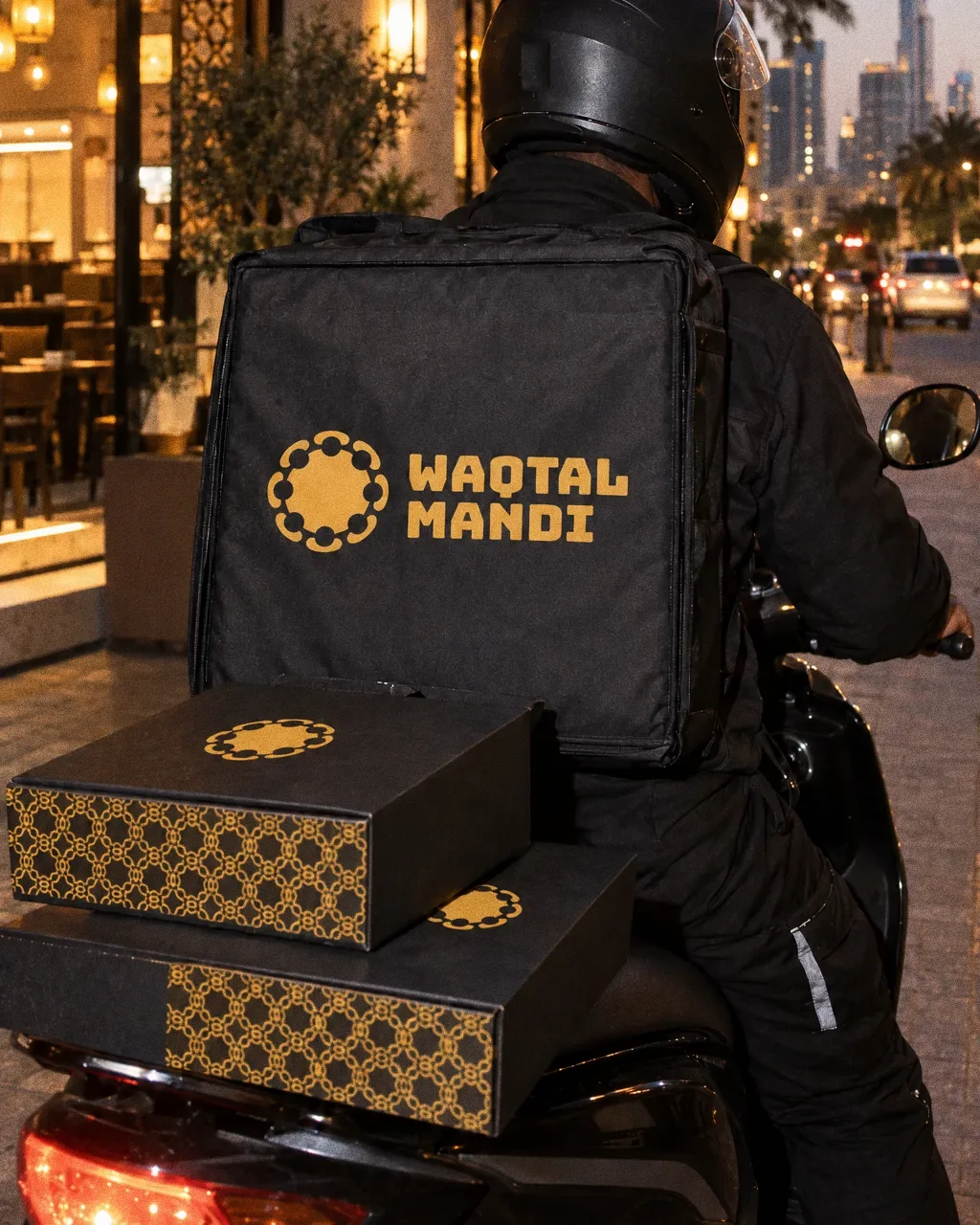
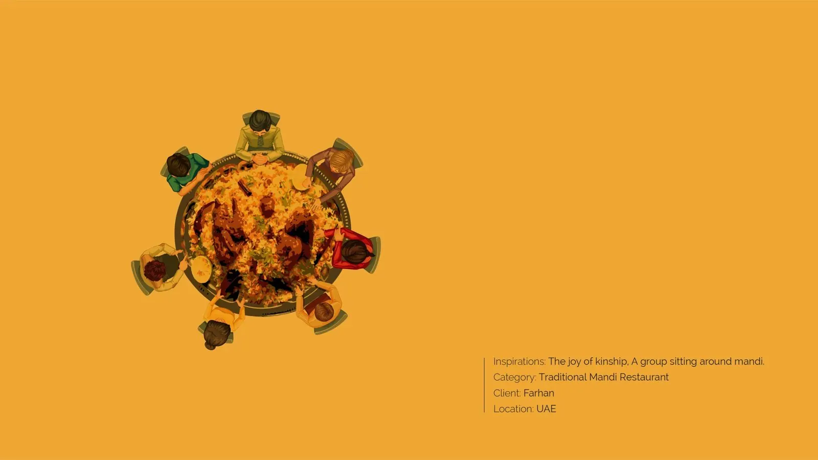
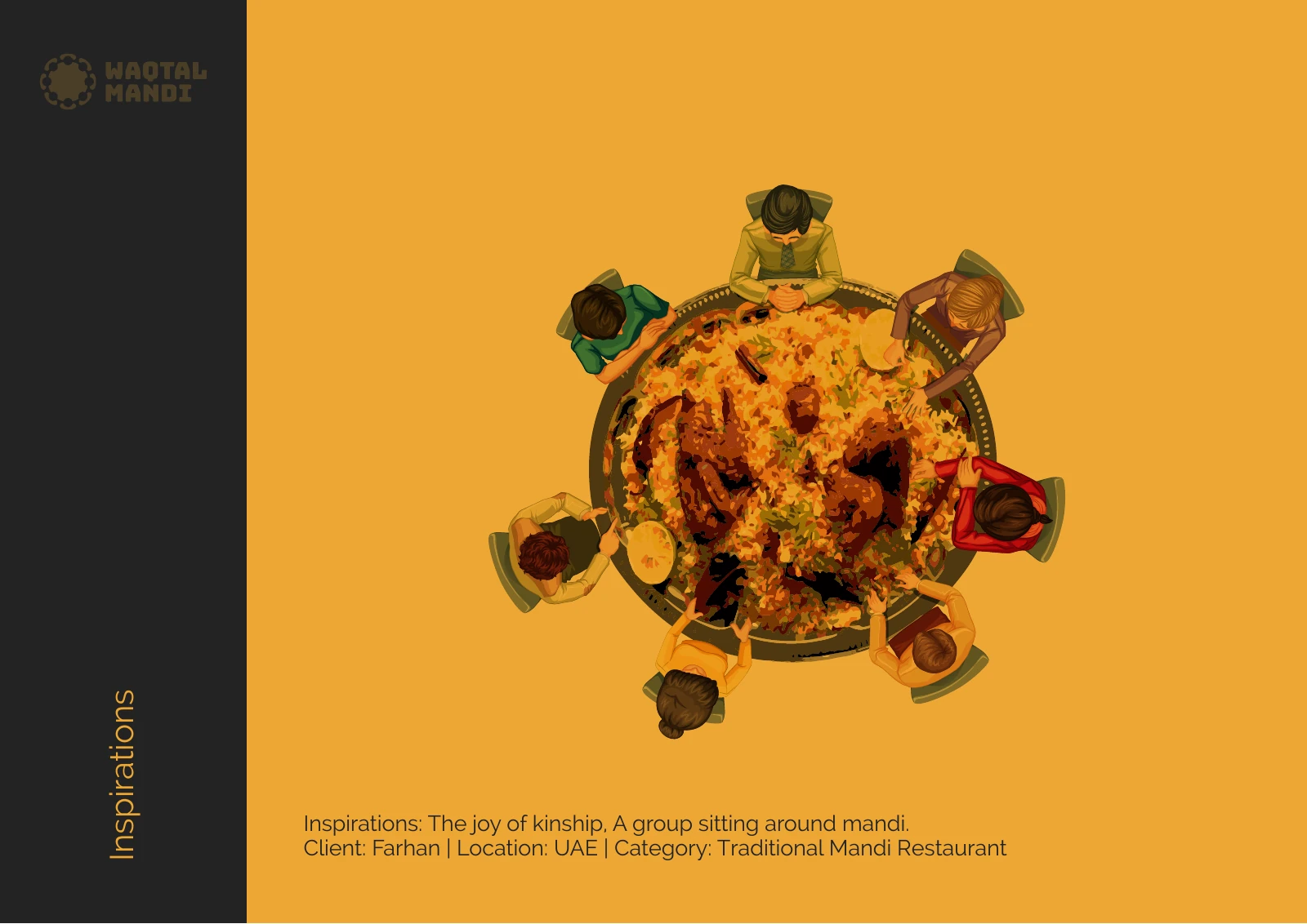
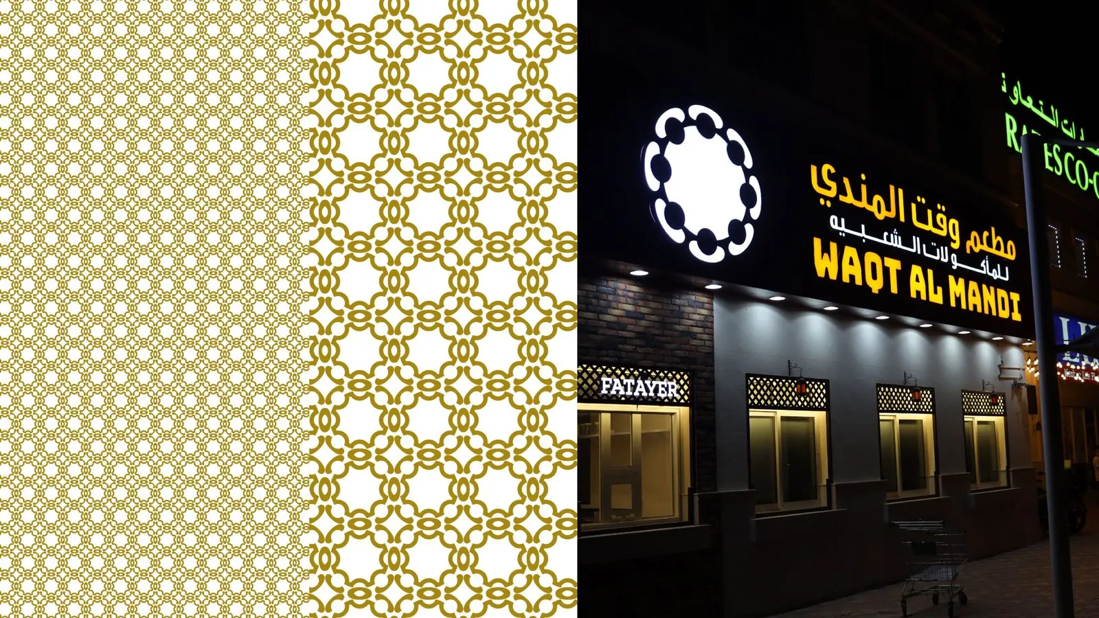
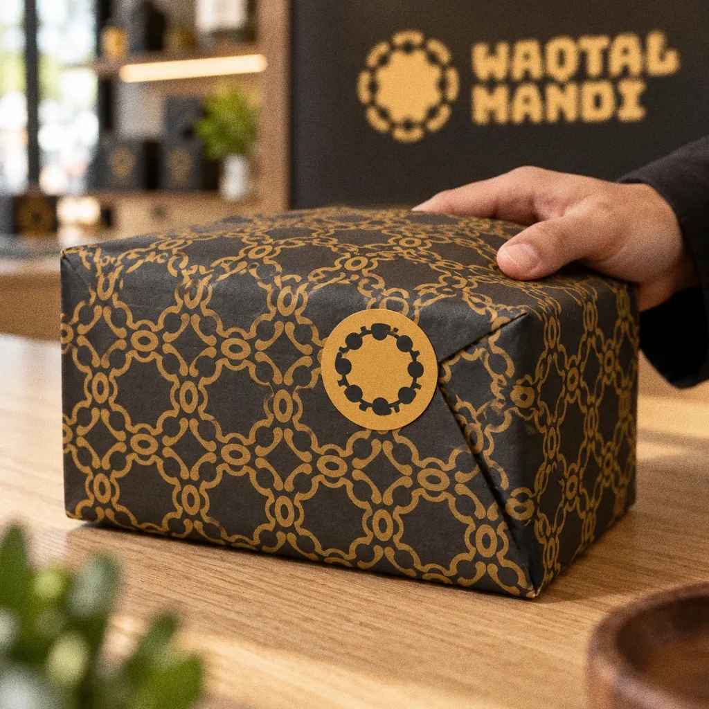
The symbol draws a group of people seated around a shared platter, from an inspiration board titled "the joy of kinship". The presentation applies it to a delivery box, a pattern and an illuminated Arabic and English shopfront.
BriefThe original inspiration centres on kinship and a shared meal. The design task is to turn that social occasion into an identity that can appear on a delivery order as well as a restaurant frontage.
Services
Scope
- Symbol and wordmark
- Colour and pattern
- Delivery packaging and shopfront applications
Sources
How to read this deck
The deck pairs the client’s original presentation boards with new application scenes that show the identity in use.
Some of the older boards have been redrawn. Each one sits where the original stood, with the real original design in its corner and a View original button to open it in full.
Chapter 01
Concept and inspiration
Chapter 02
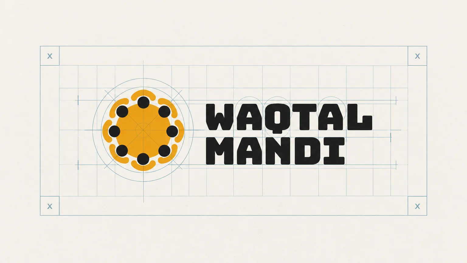
How the logo was formed
Chapter 03
The logo
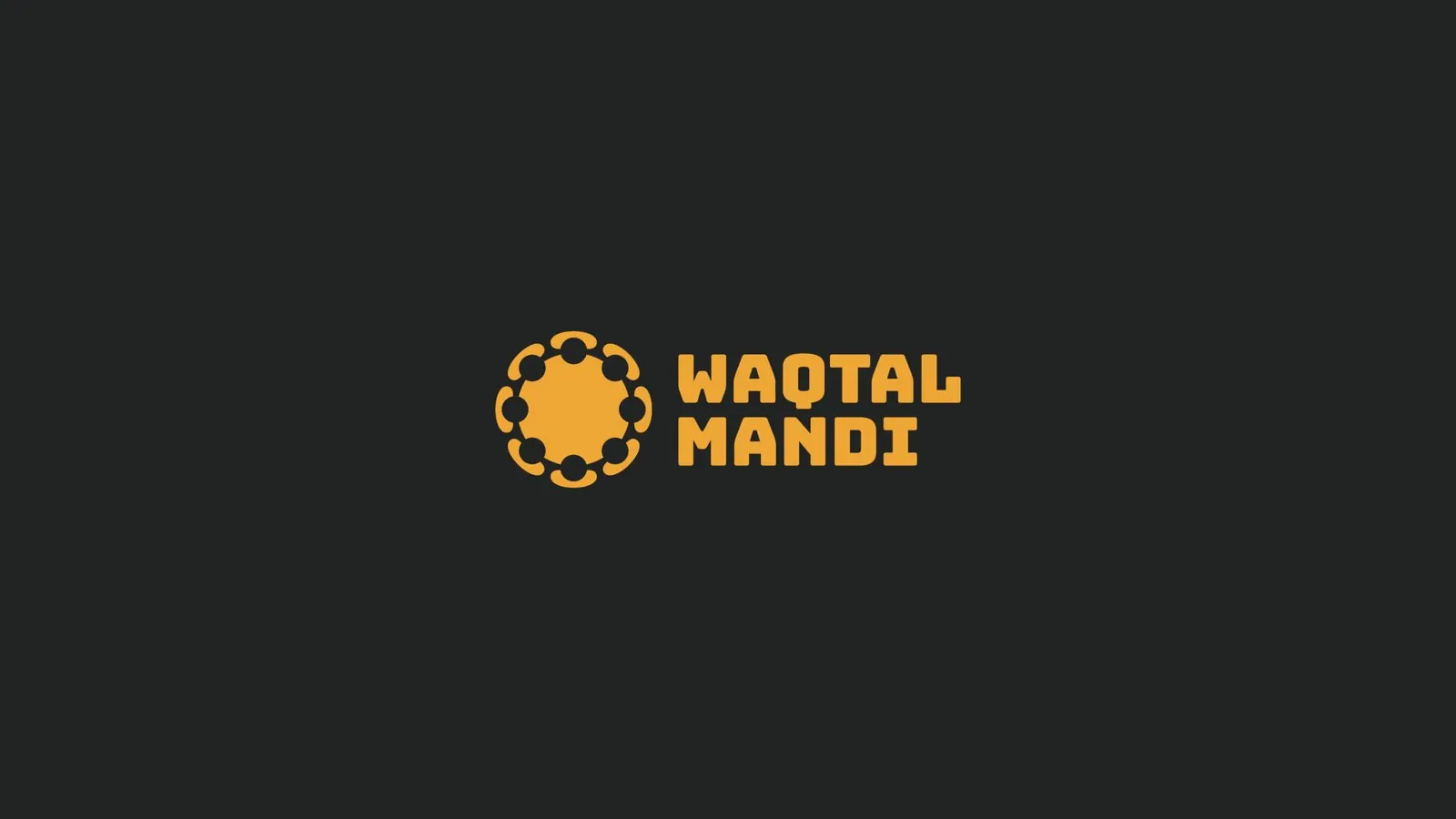
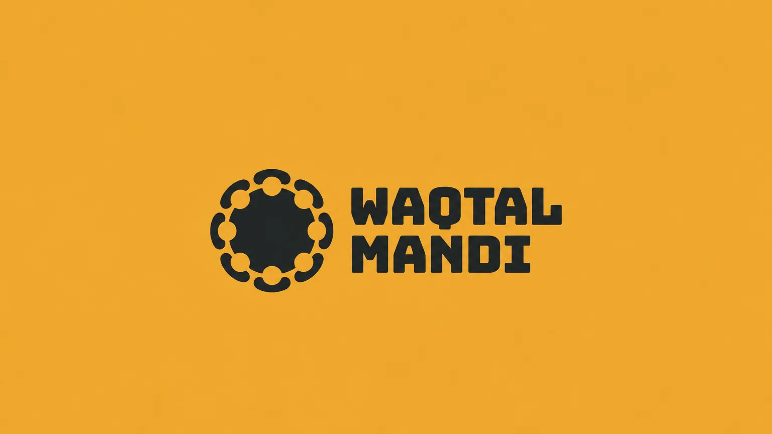
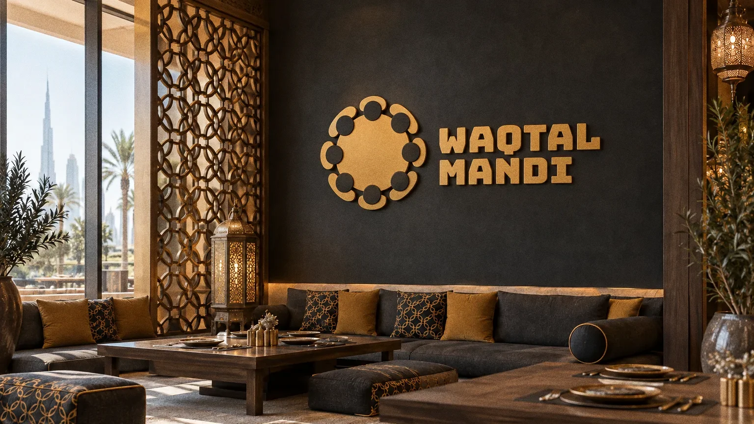
The Waqtal Mandi symbol draws on diners gathered around a shared meal, paired with the restaurant wordmark and an Arabic-and-English frontage application.
Kinship around the platter
The inspiration board shows a group sitting around mandi, and the symbol turns that circle of people into a single mark beside the wordmark.
Chapter 04
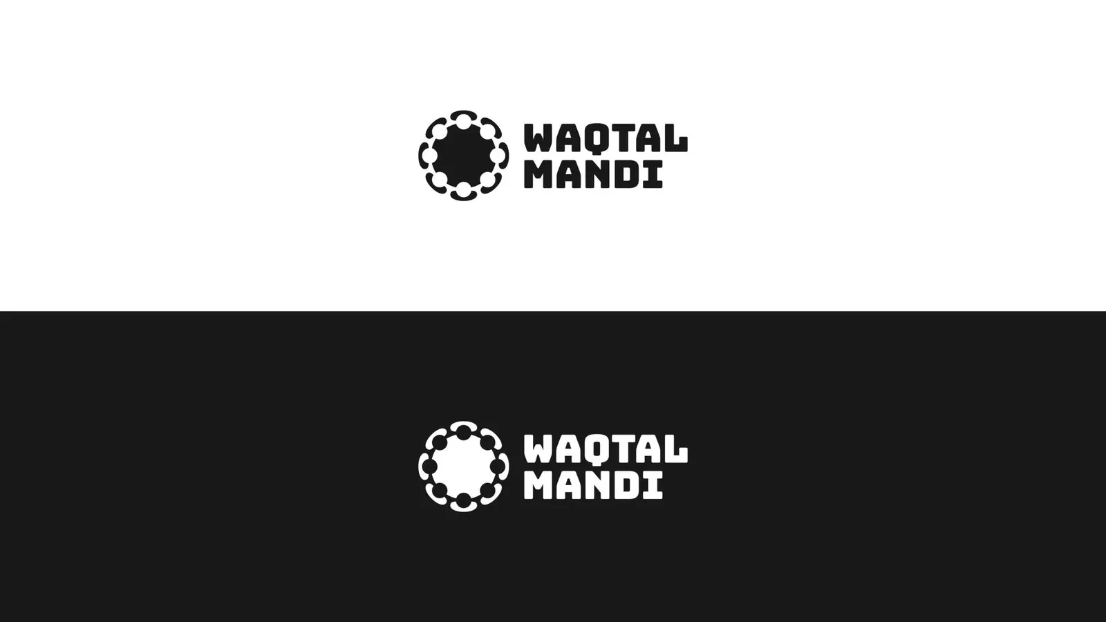
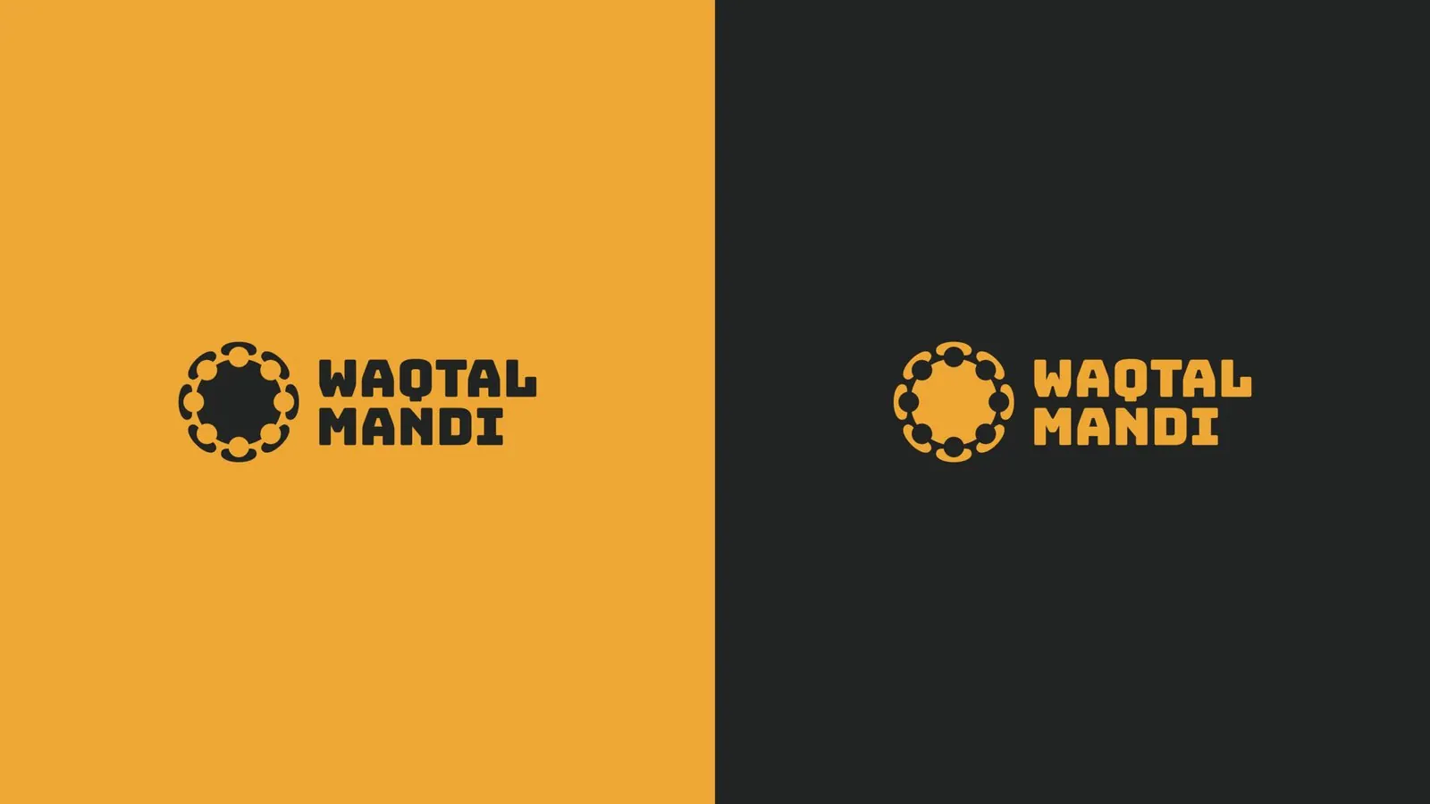
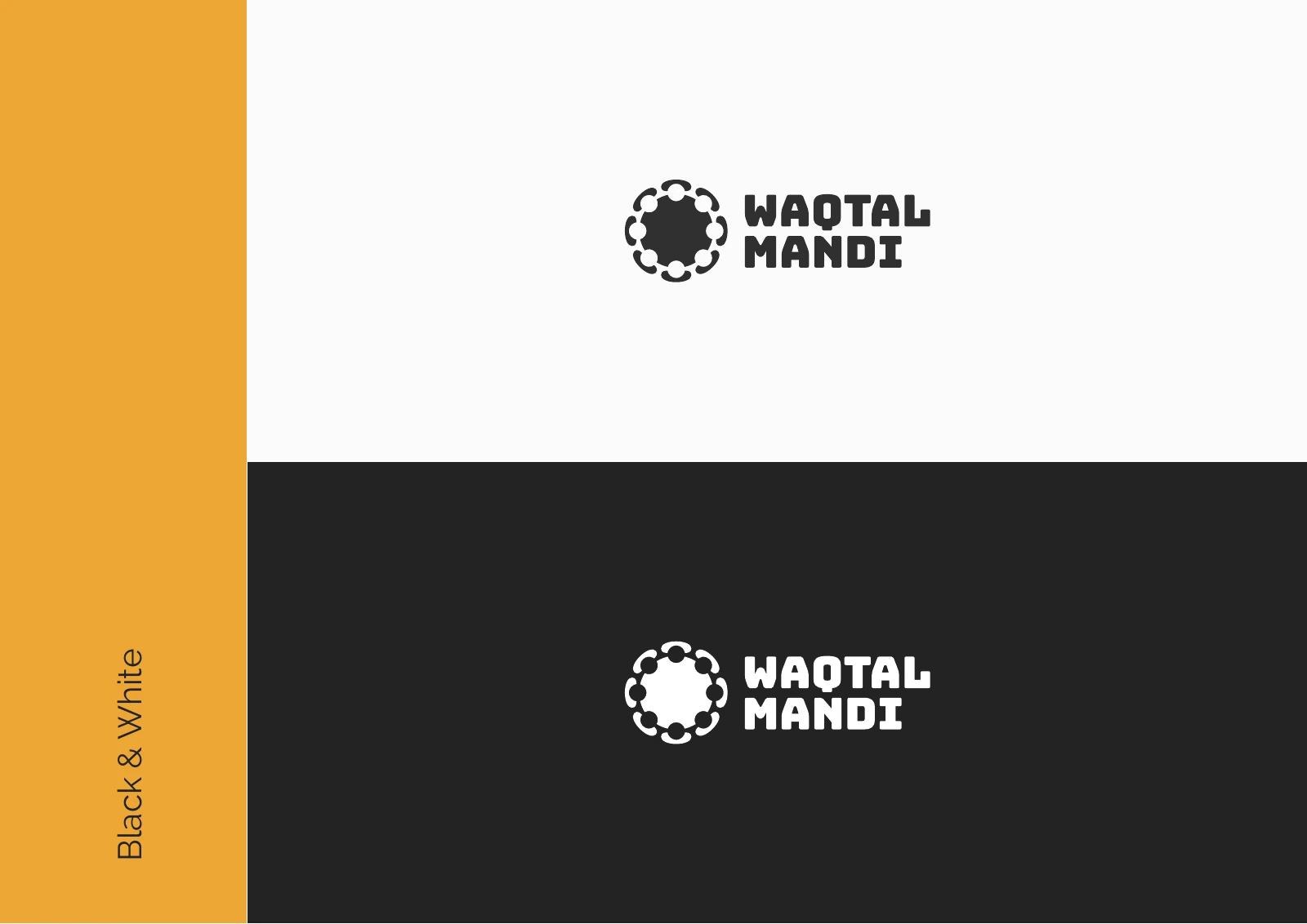
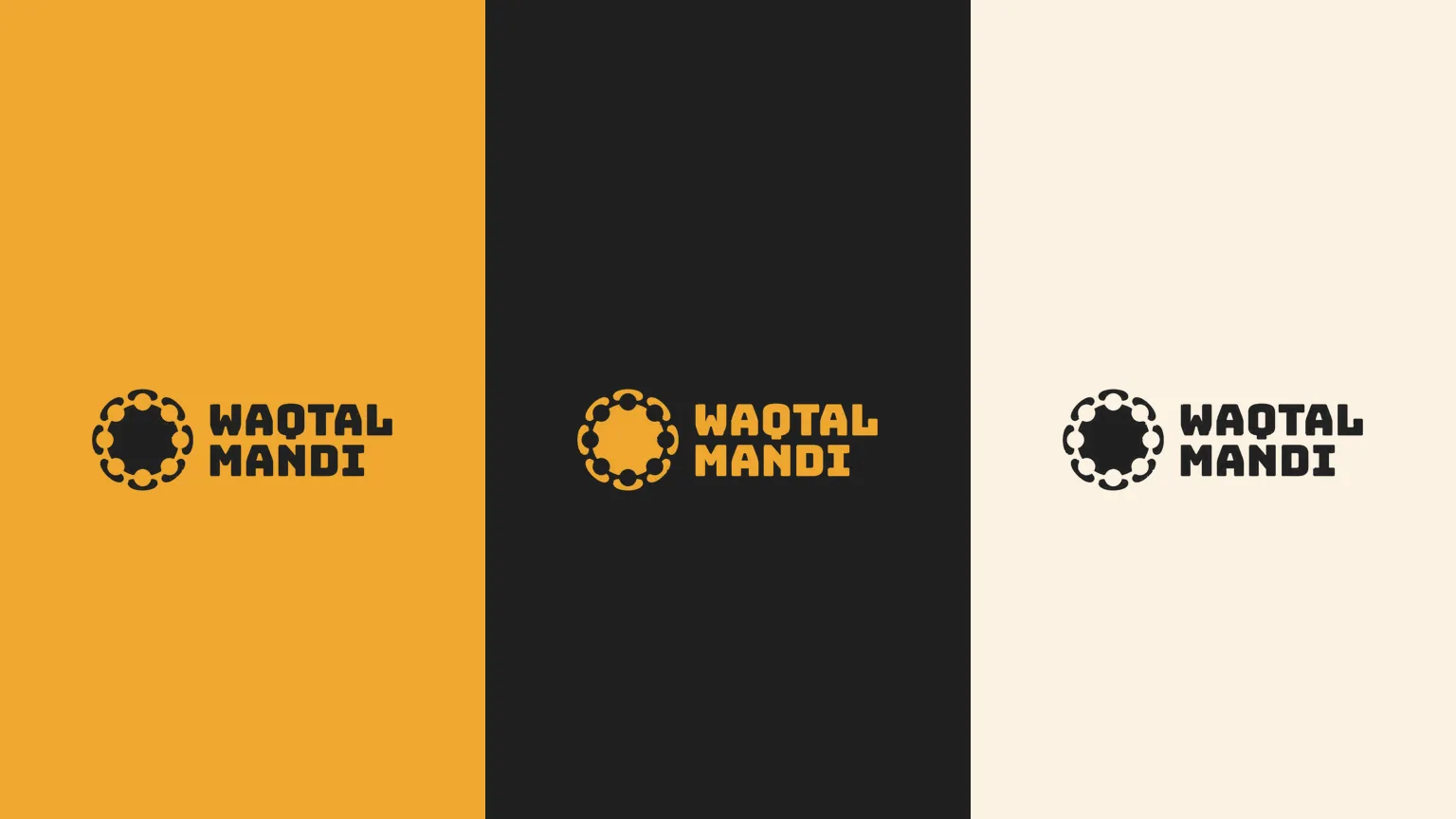
Logo variations

Chapter 05
Colour
- Accent
#F0A830 - Surface
#1B1B1B - Ink
#FFFFFF
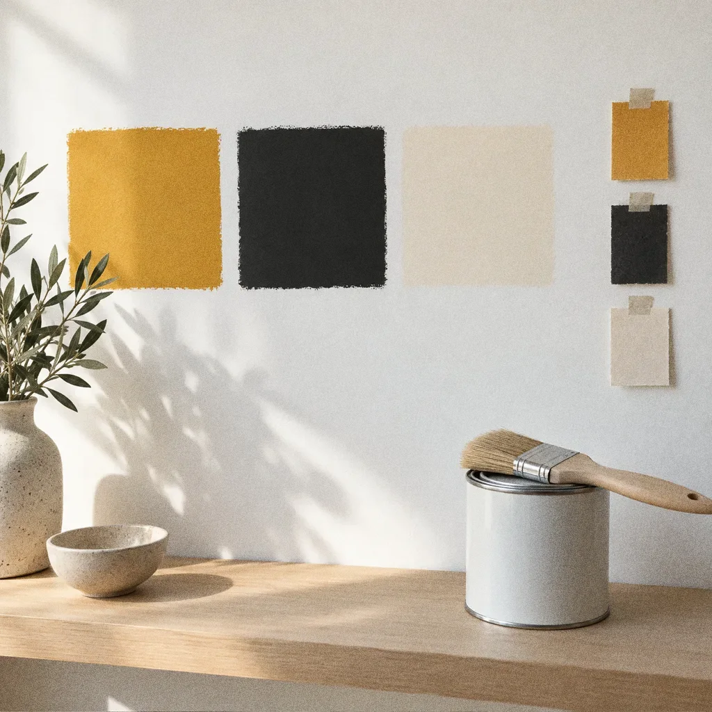
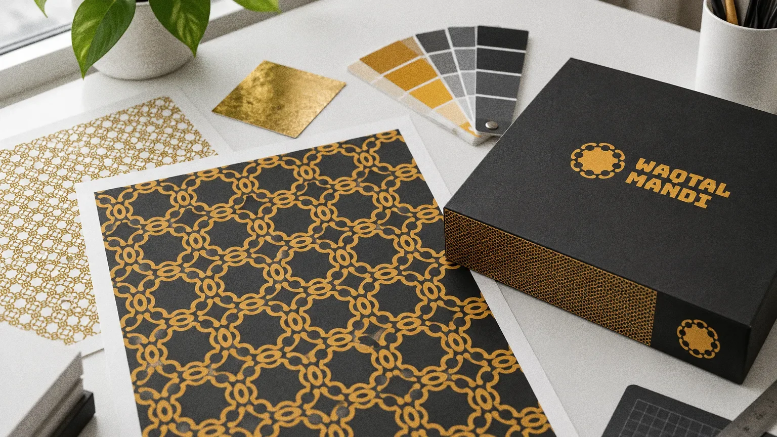
Colours sampled from the original identity boards.
Chapter 06
Pattern and graphic elements

Chapter 07
Packaging
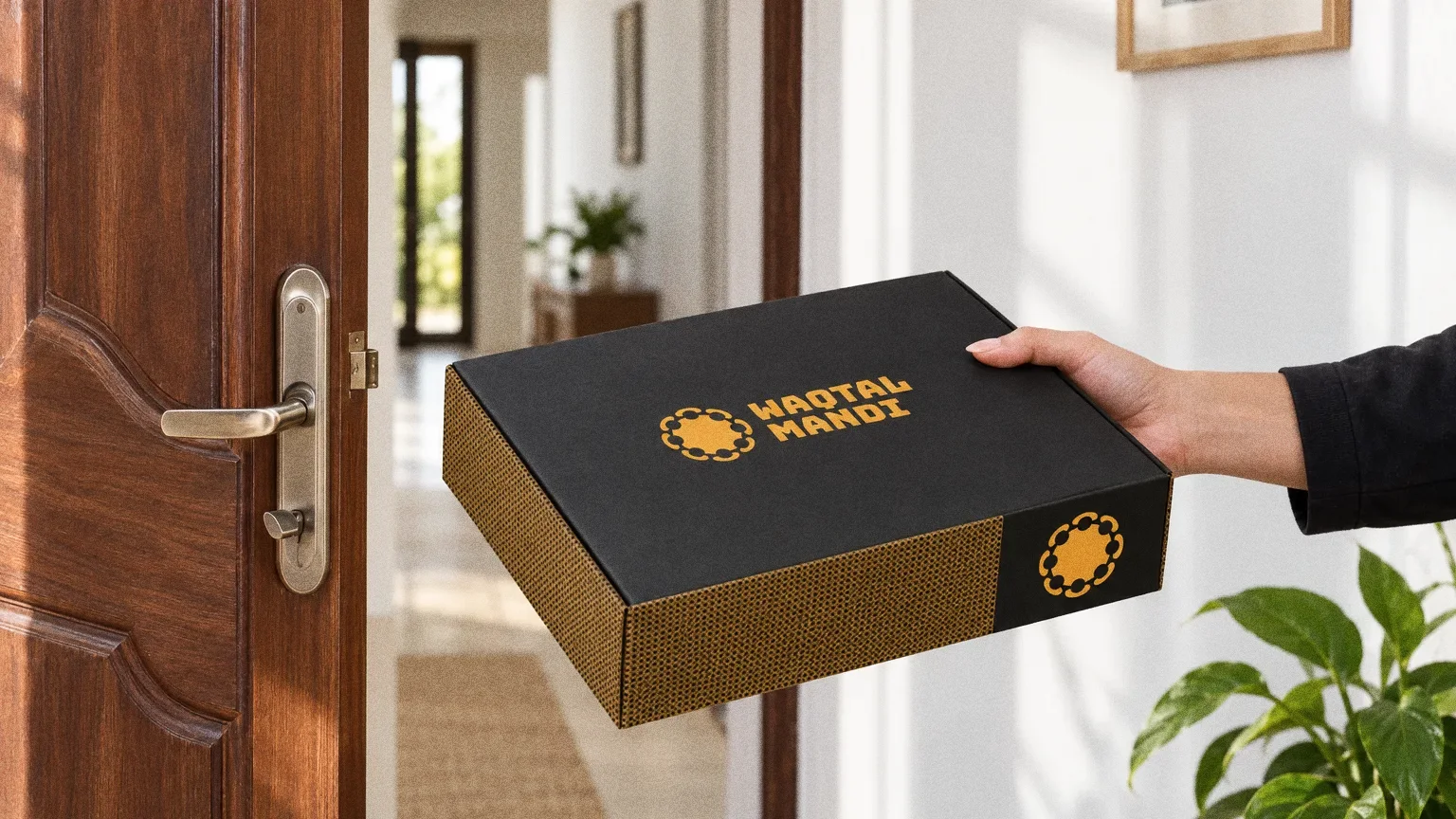
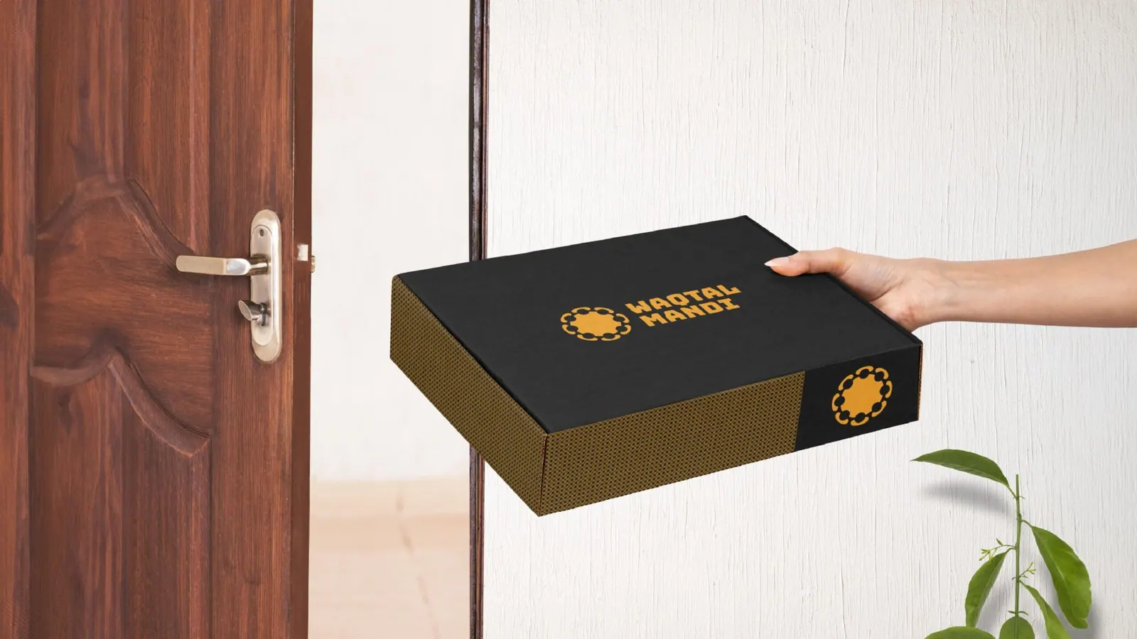
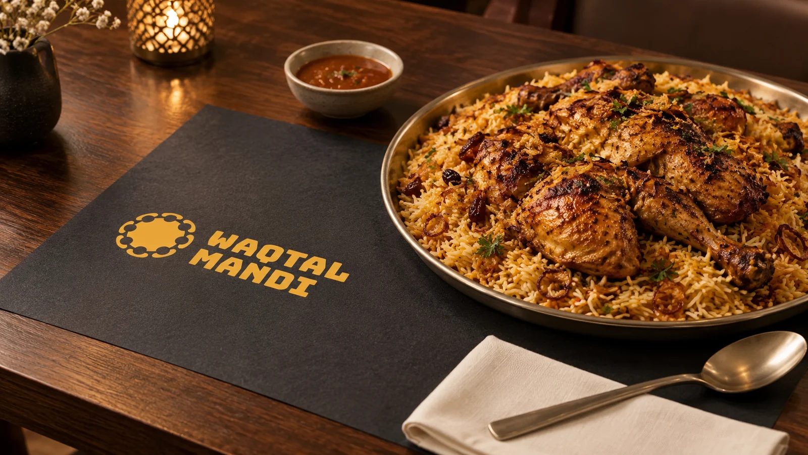
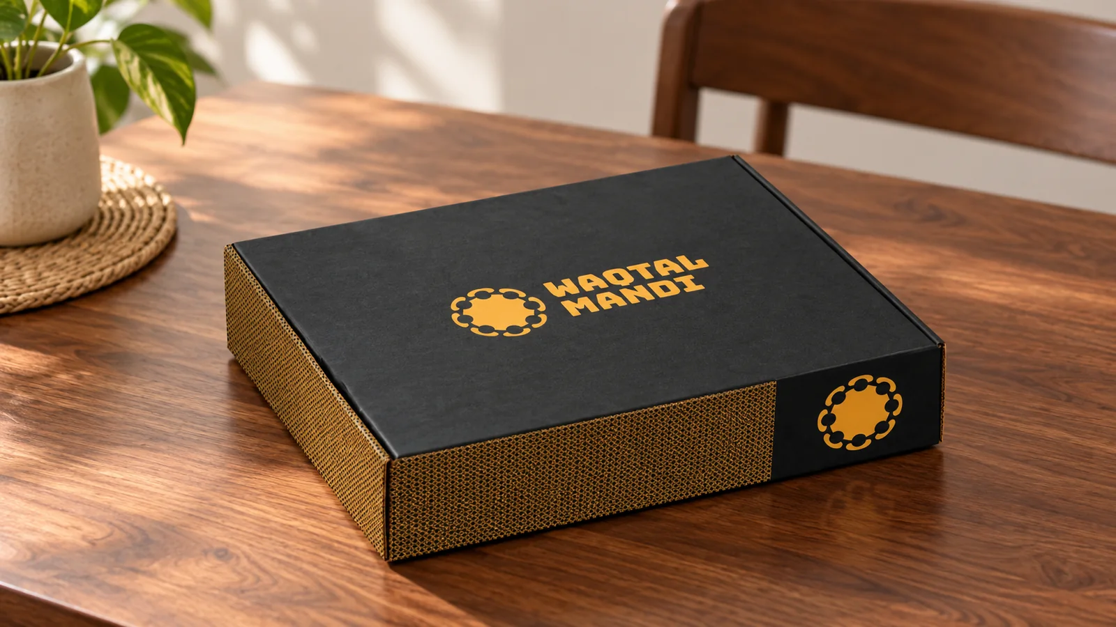
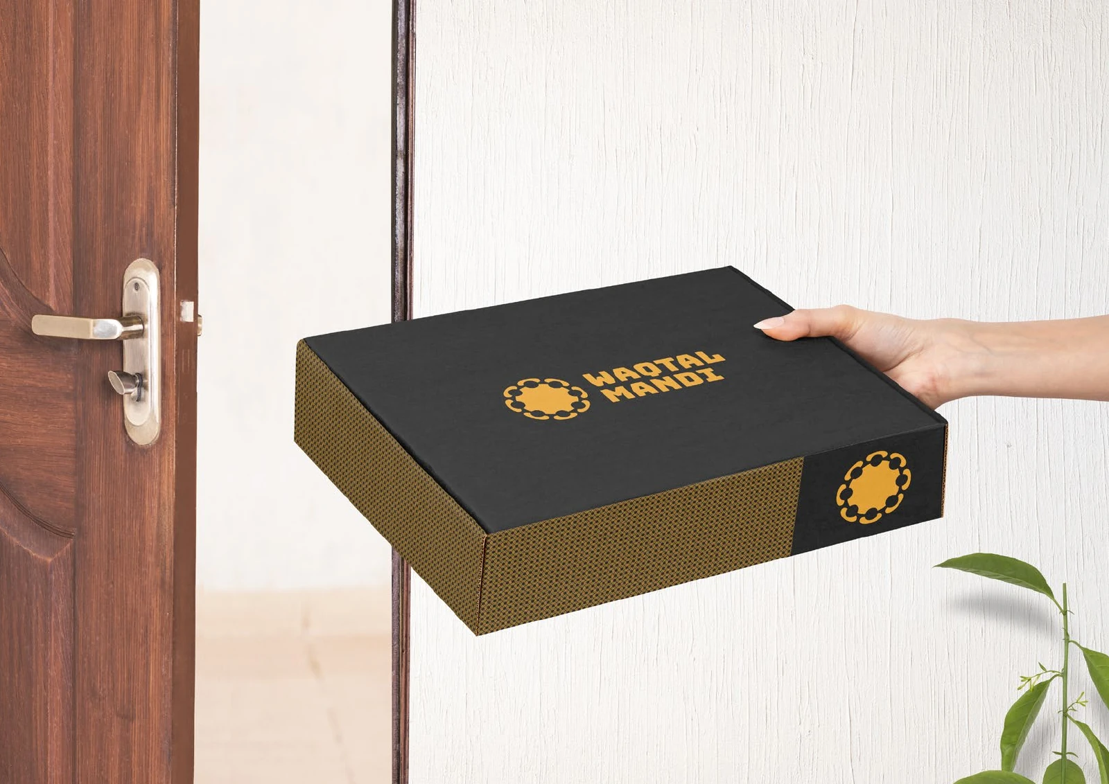
From the door to the street
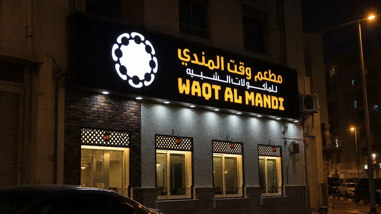
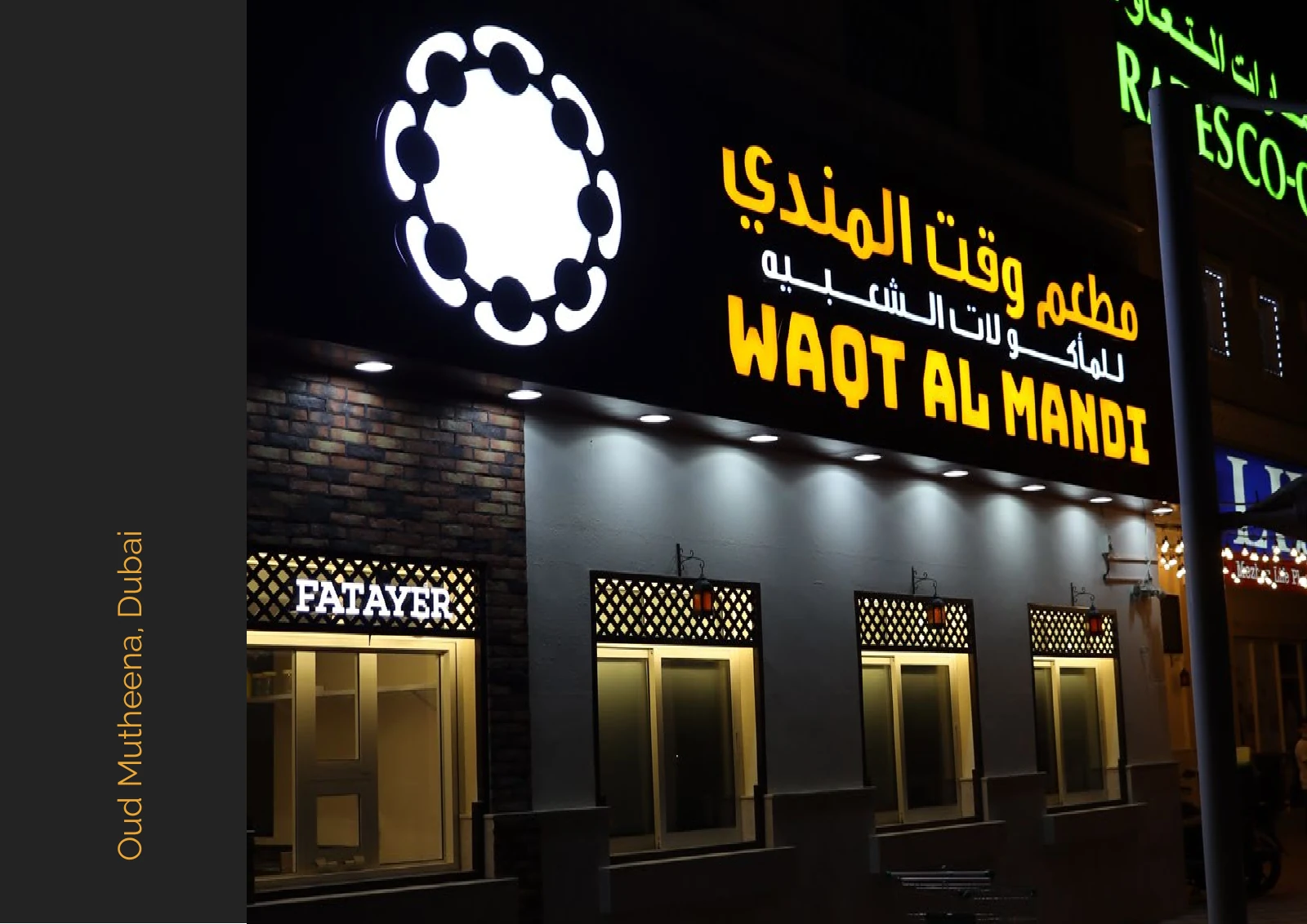
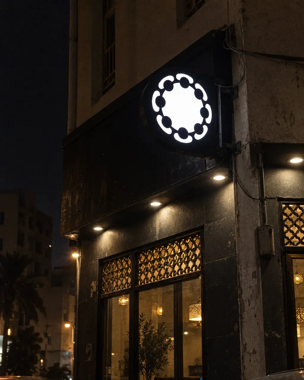
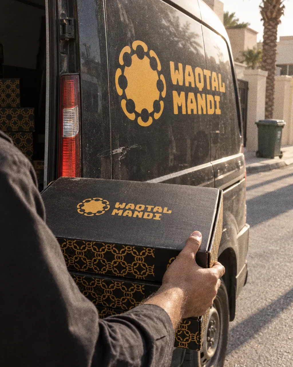
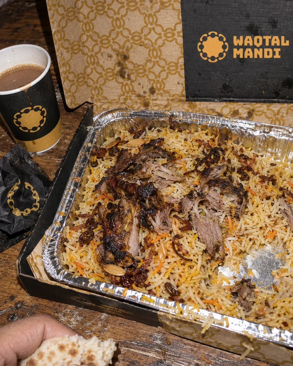
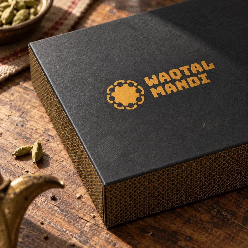
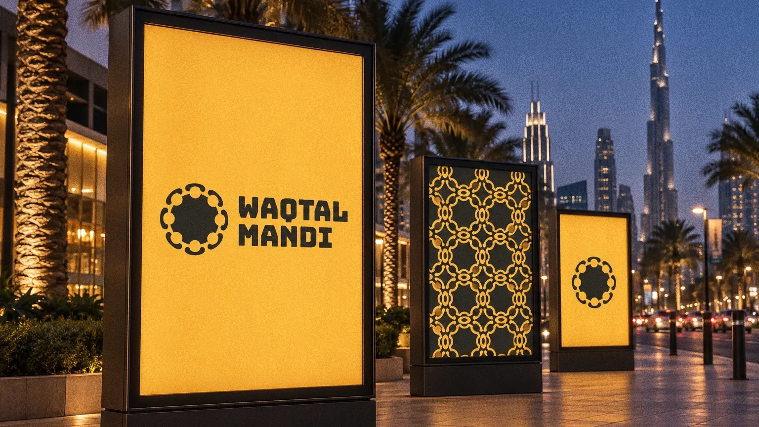
The delivery box and the illuminated shopfront, with its Arabic sign, use the same amber-and-charcoal palette and the pattern built from the symbol.
Chapter 08
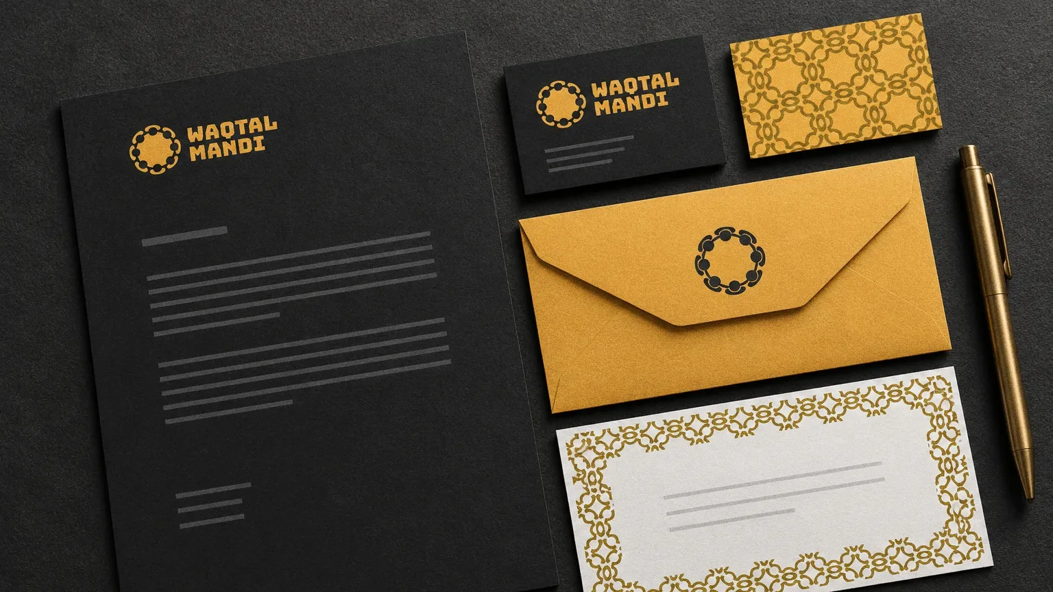
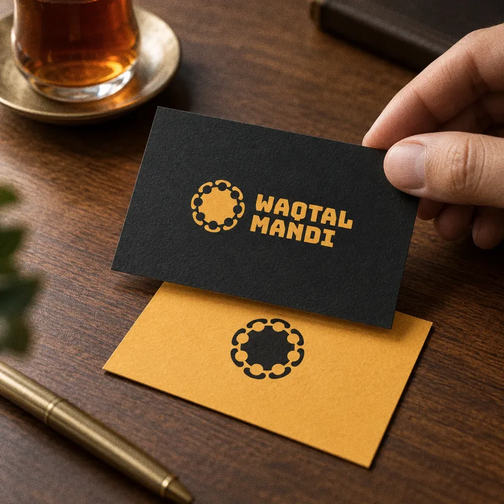
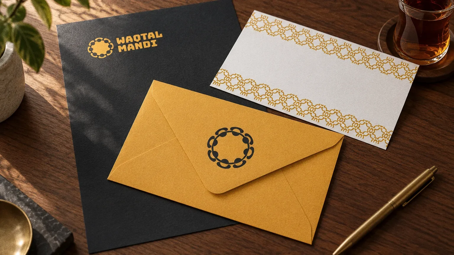
Stationery
Chapter 09
Signage and spaces
Chapter 10
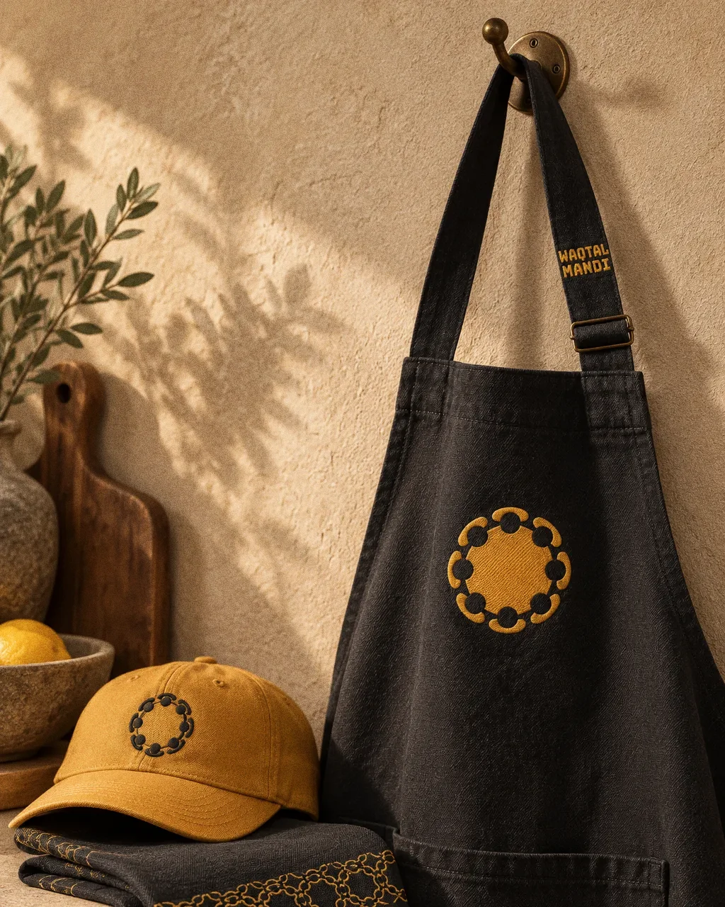
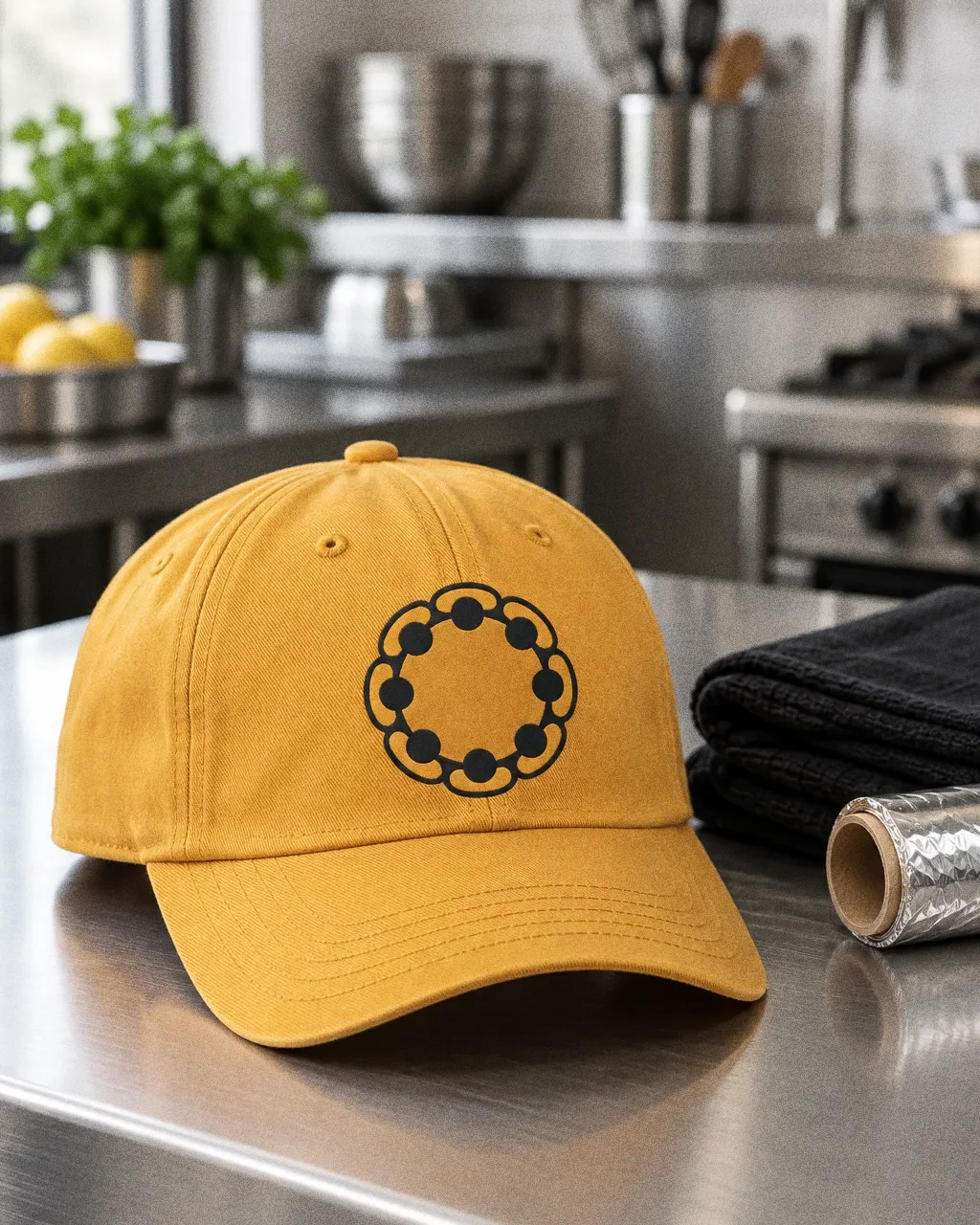
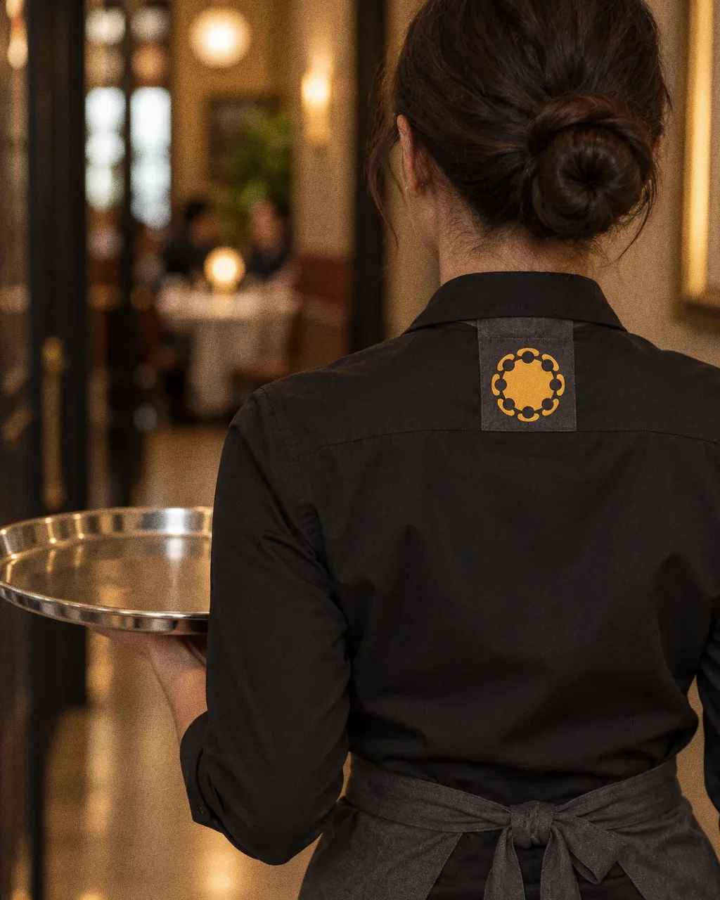
Uniforms and merchandise
Chapter 11
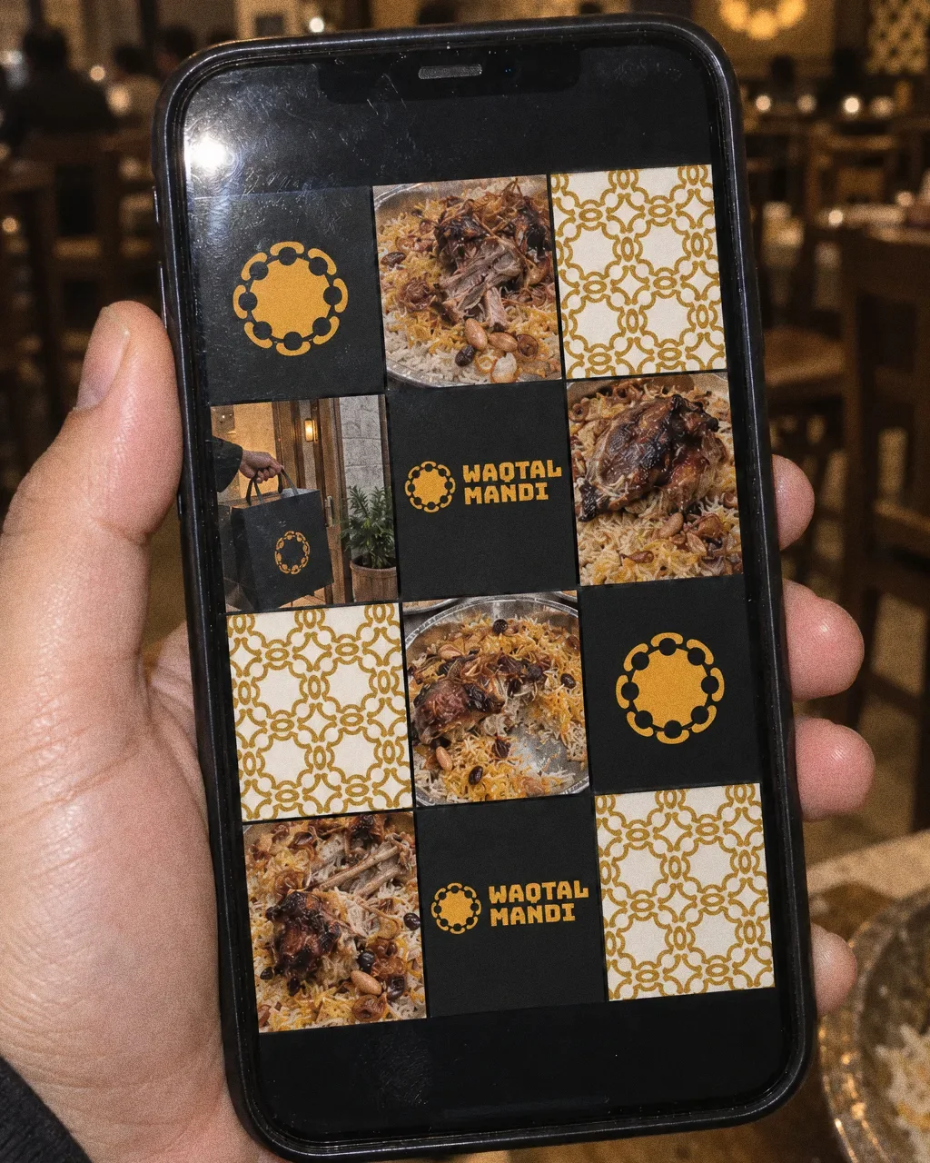
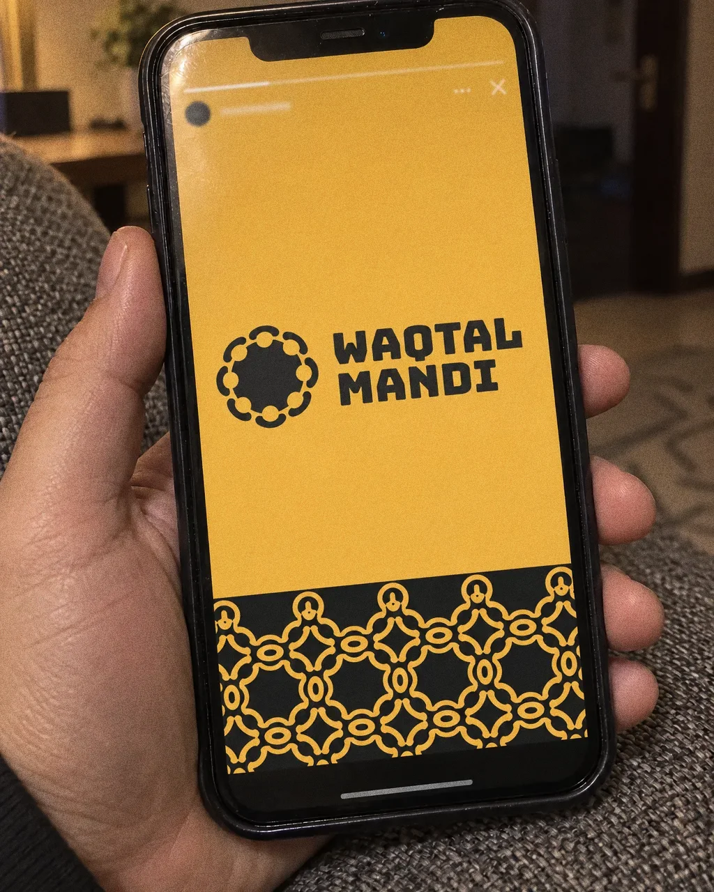
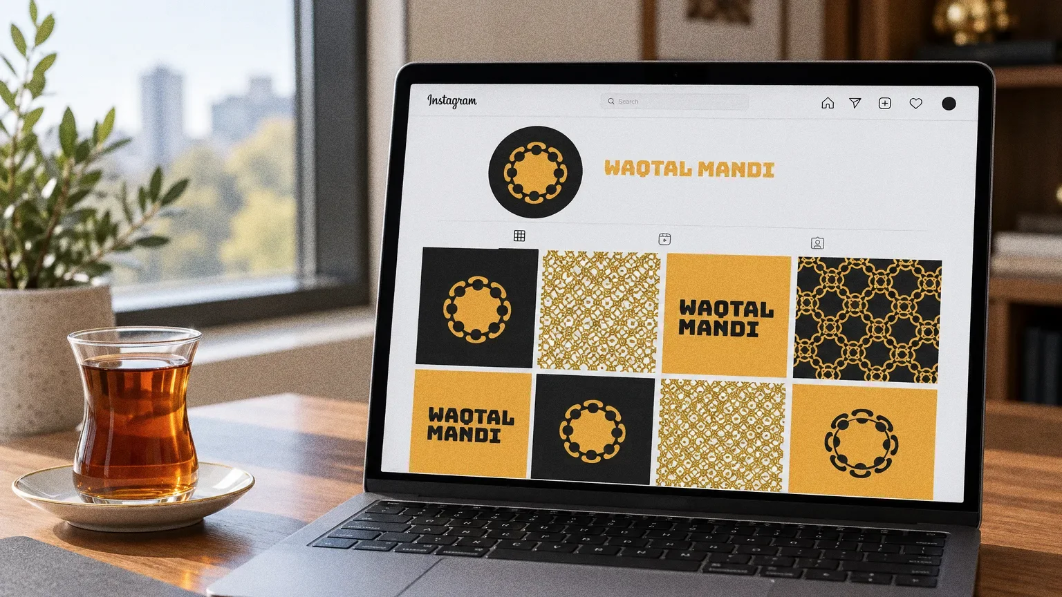
Digital
Chapter 12
The brand in the world
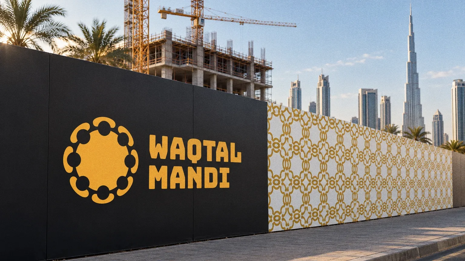
The source carries the restaurant identity onto a takeaway box and illuminated outdoor signage.
Chapter 13
In people’s hands
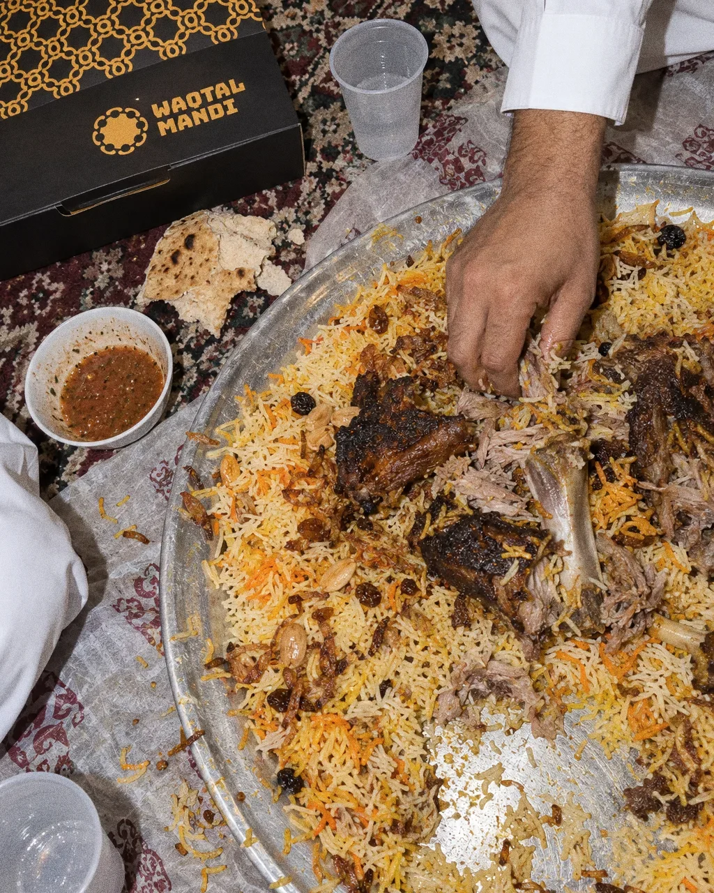
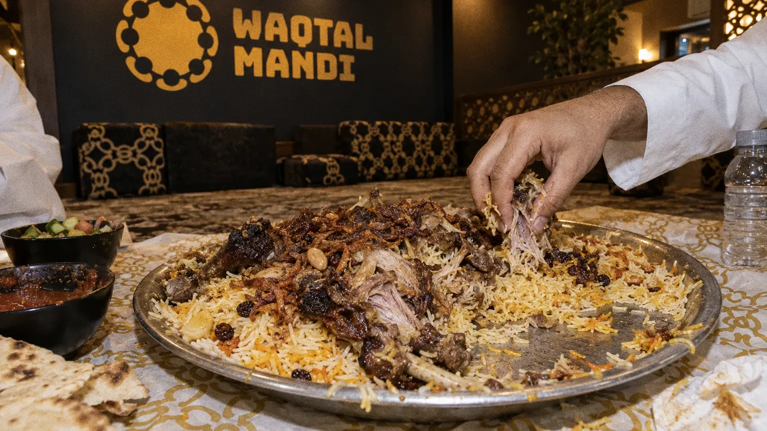
Shared platterThe Waqtal Mandi identity in a lifestyle photograph of a shared platter of mandi on the floor. 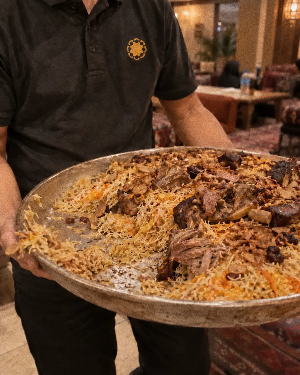
Platter to the tableThe Waqtal Mandi identity in a lifestyle photograph of a waiter carrying a platter of mandi. 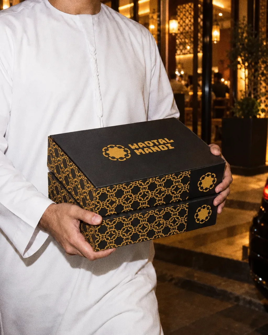
Two boxes out the doorThe Waqtal Mandi identity in a lifestyle photograph of a customer carrying two takeaway boxes at night. 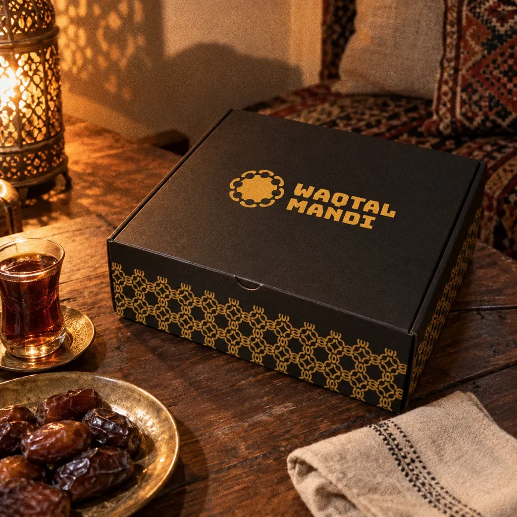
Box on the majlis tableThe Waqtal Mandi identity in a lifestyle photograph of a delivery box on a majlis table with tea and dates. 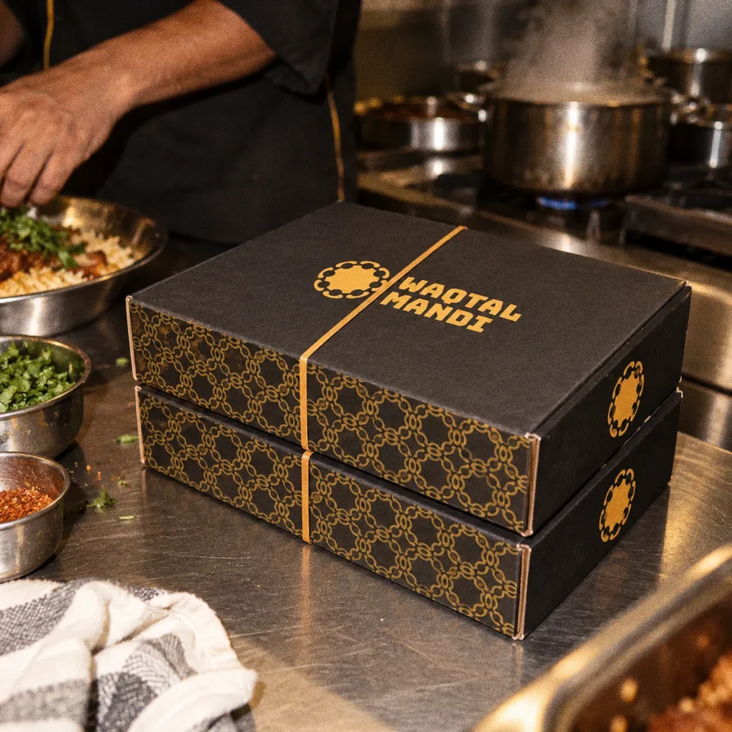
Boxes in the kitchenThe Waqtal Mandi identity in a lifestyle photograph of two boxes on a steel kitchen counter.
Chapter 14
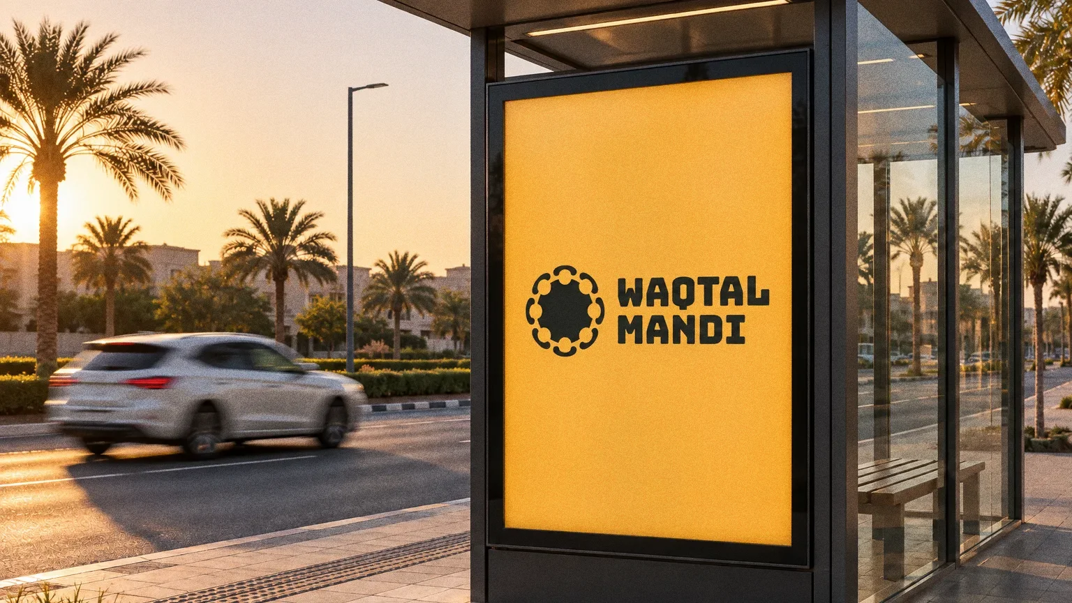
Campaign
About this deck
What we built
A shared-platter symbol and supporting pattern, with delivery-box applications and an illuminated Arabic-and-English shopfront mockup.
About the originals
The original boards are from Abcon’s original project presentation and include application mockups.