
Burger restaurant
Burger Hub
Burger Hub brand film. Motion film made from the original Burger Hub identity boards and brand applications.
Overview
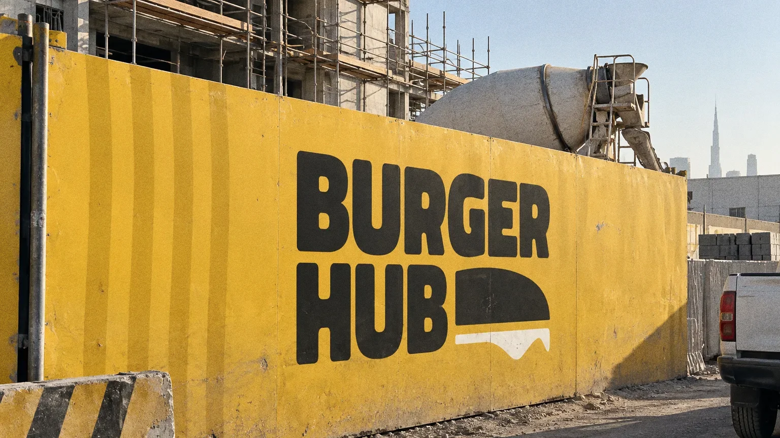
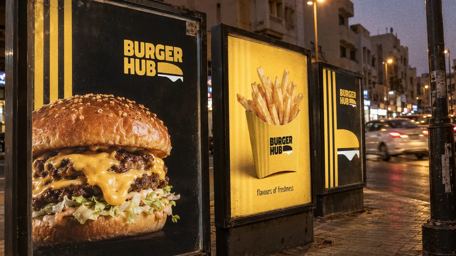
An identity for Burger Hub: a bold stacked wordmark with a burger silhouette and dripping cheese, and the line "flavours of freshness".
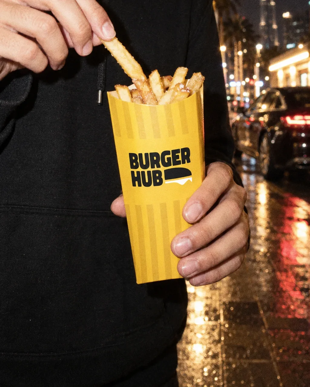
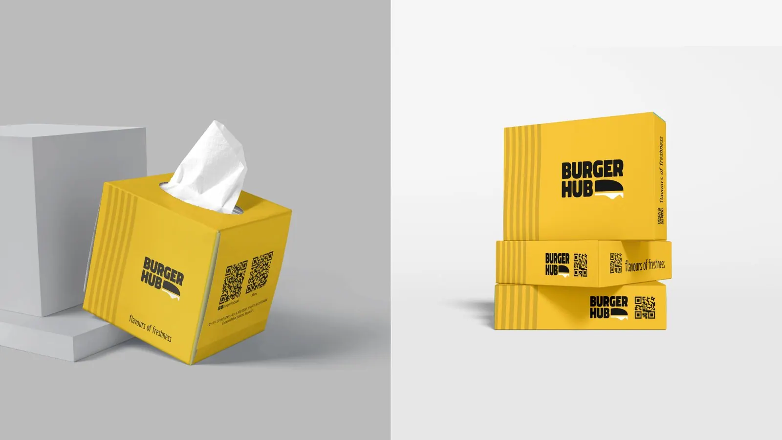
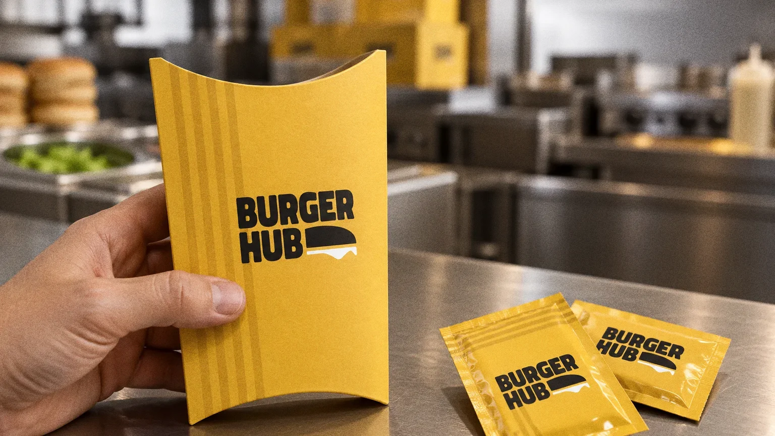
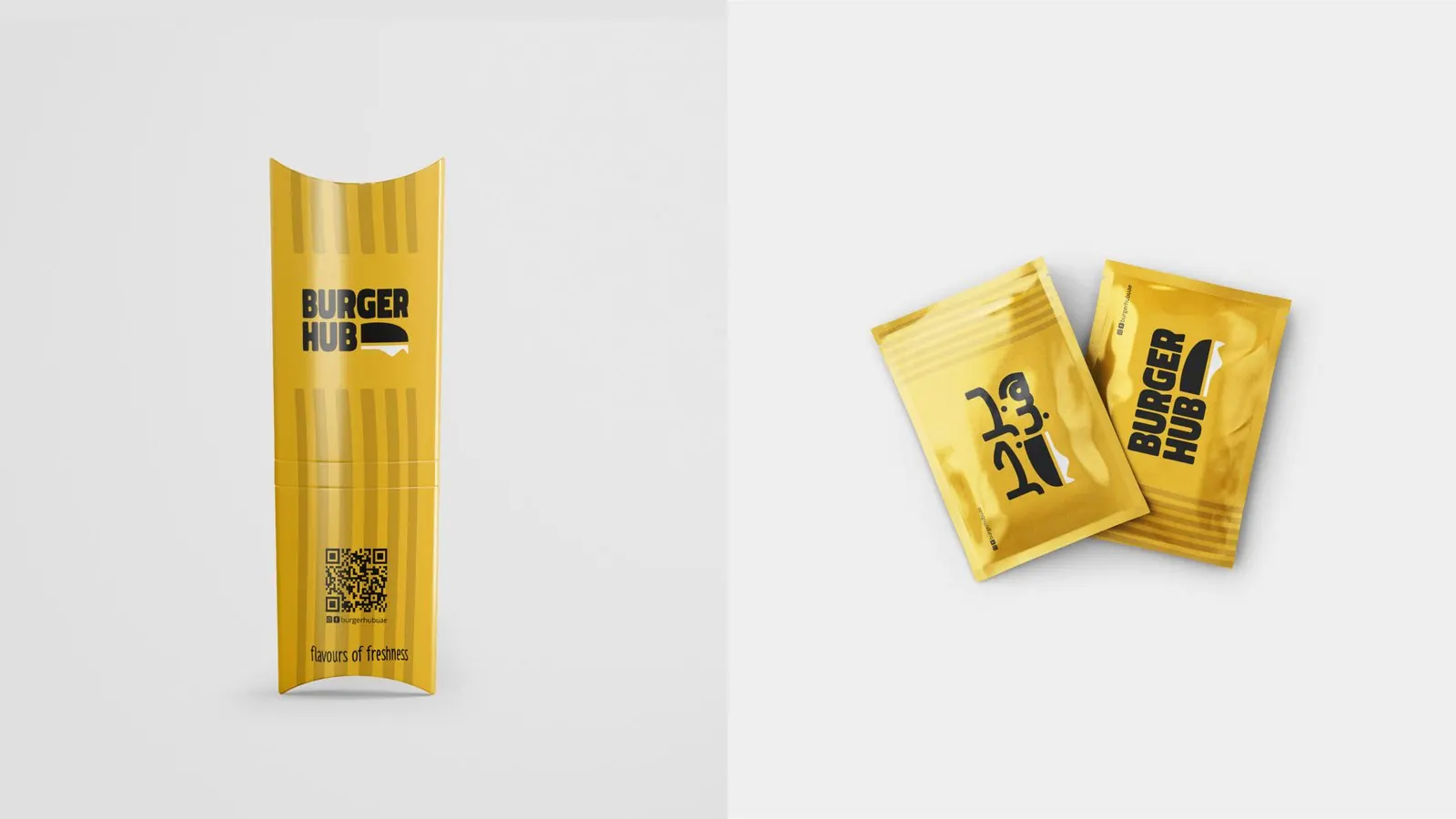
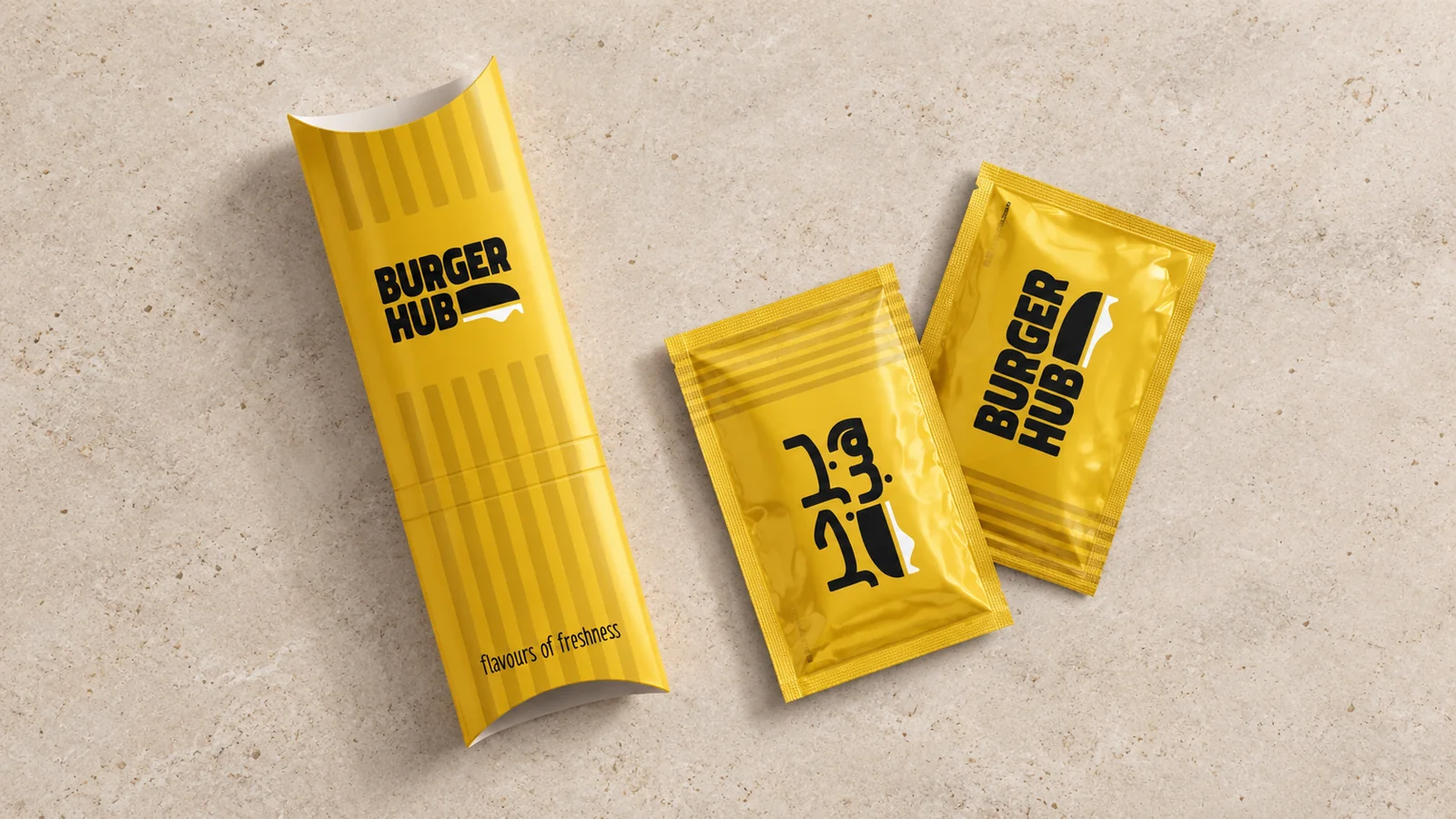
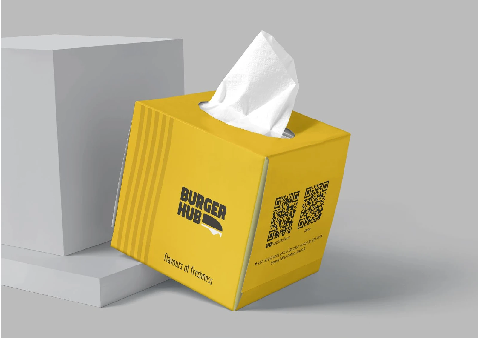
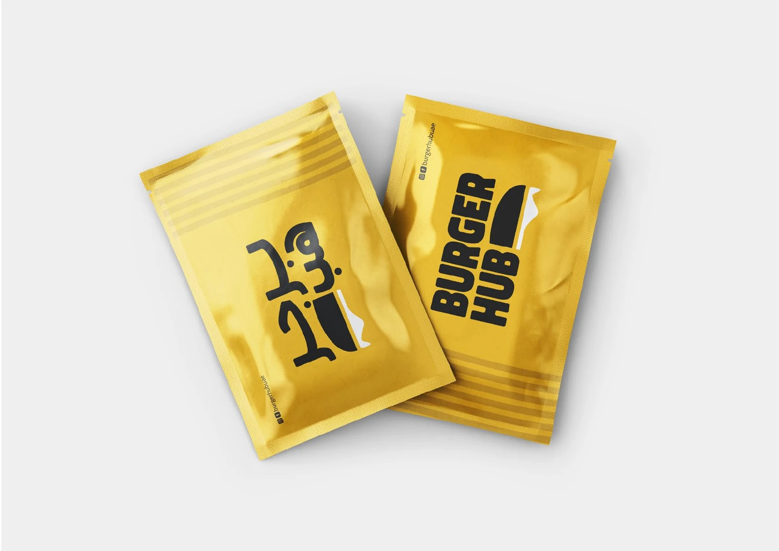
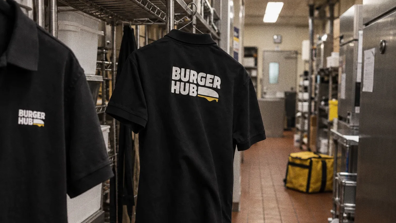
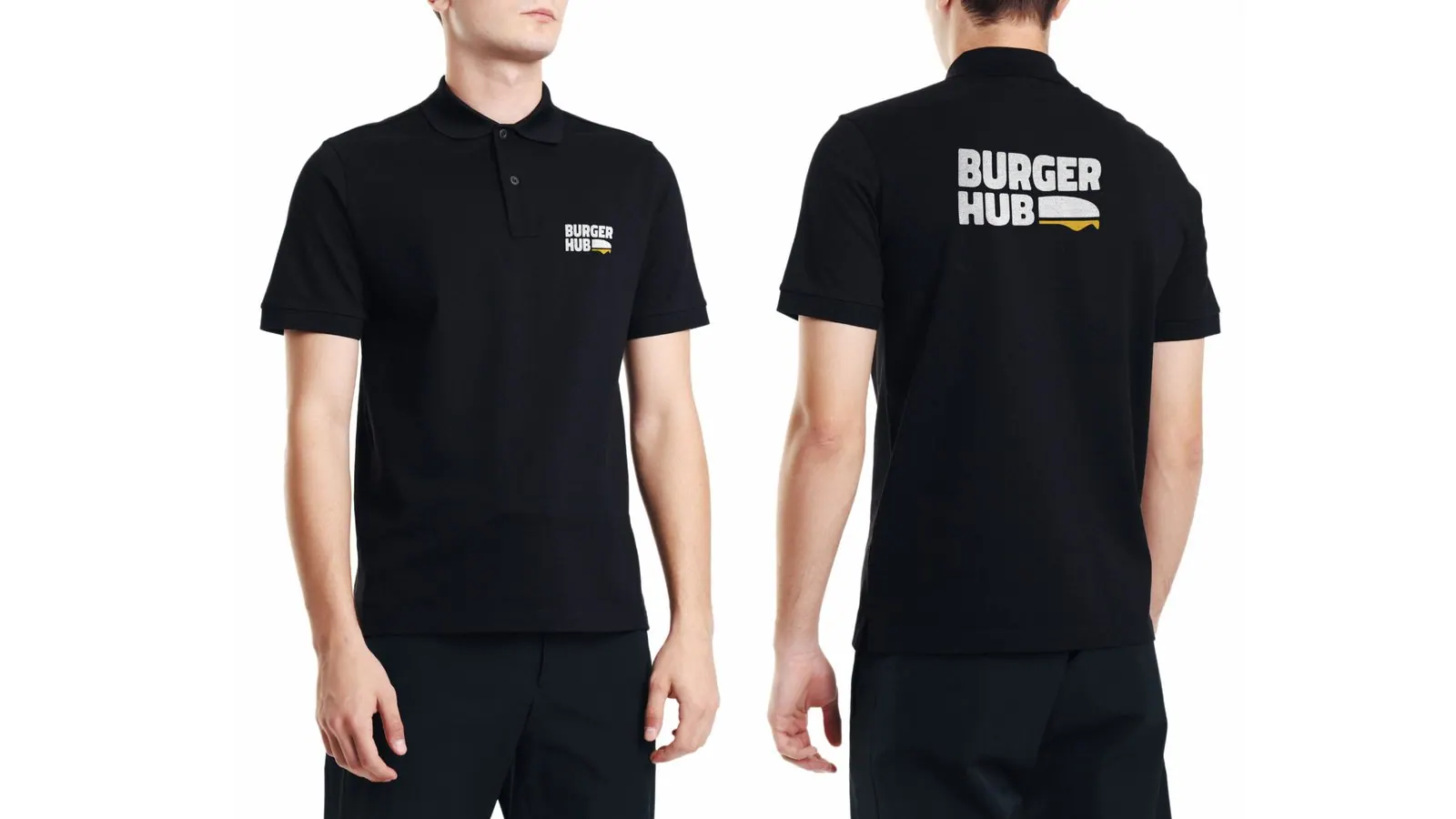
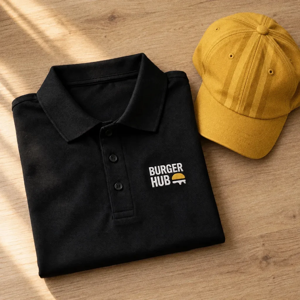
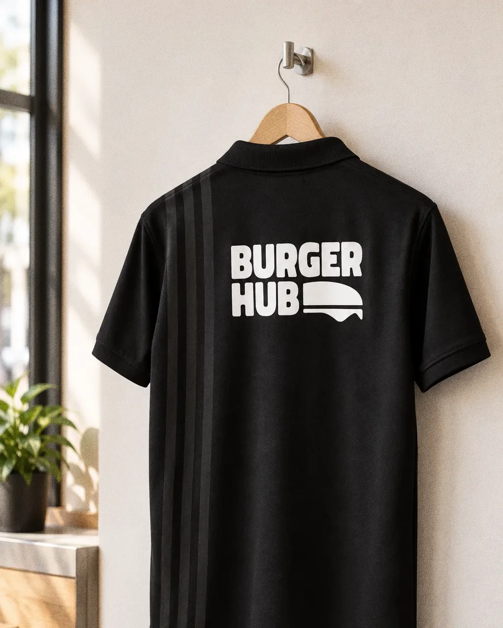
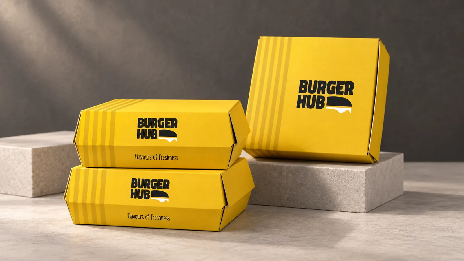
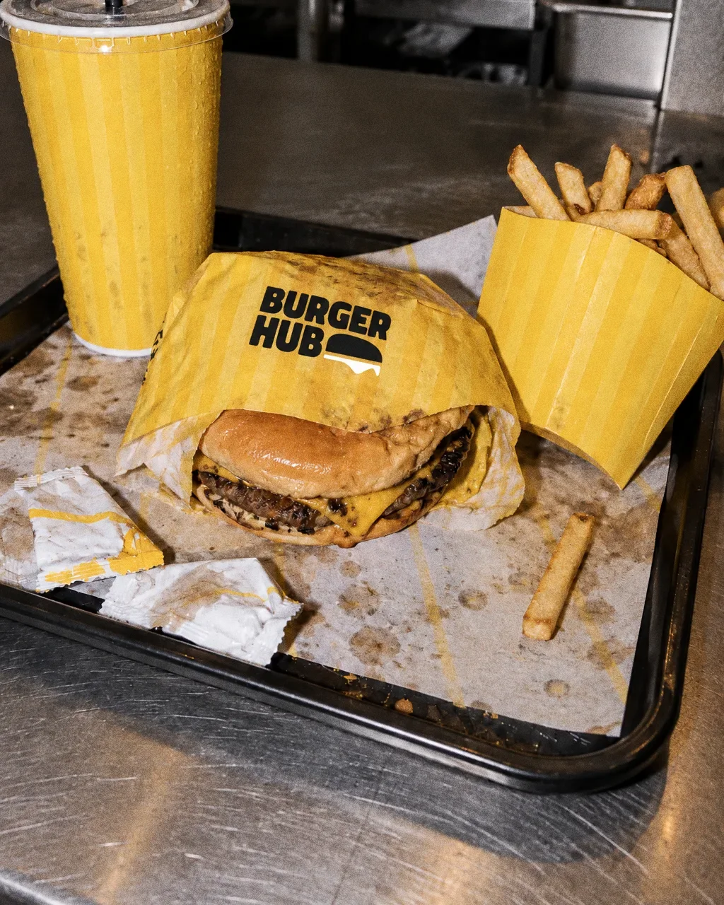
The presentation applies it in yellow and black to a full takeaway range, including boxes, cups, tissues, fries sleeves and sachets with the Arabic name, plus staff polo shirts.
BriefA burger takeaway identity needs to work on a whole order, not just one box. The design task is to connect the restaurant name with the food and carry the same visual system through cups, boxes and smaller packaging.
Services
Scope
- Wordmark and tagline
- Colour
- Takeaway packaging range and uniforms
How to read this deck
The deck pairs the client’s original presentation boards with new application scenes that show the identity in use.
Some of the older boards have been redrawn. Each one sits where the original stood, with the real original design in its corner and a View original button to open it in full.
Chapter 01
Concept and inspiration
Chapter 02
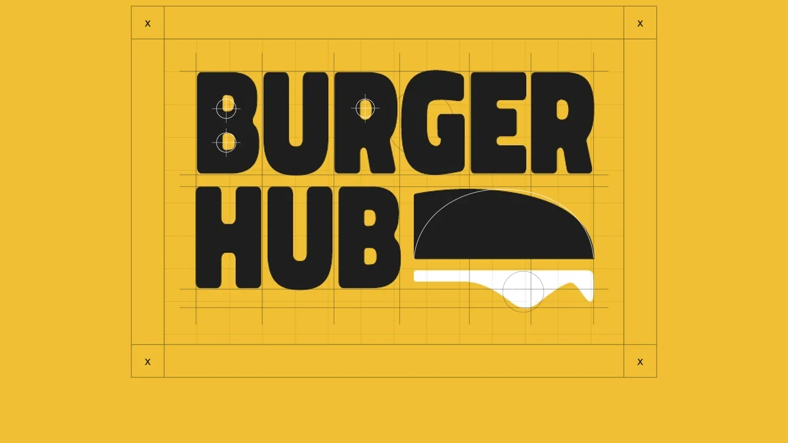
How the logo was formed
Chapter 03
The logo
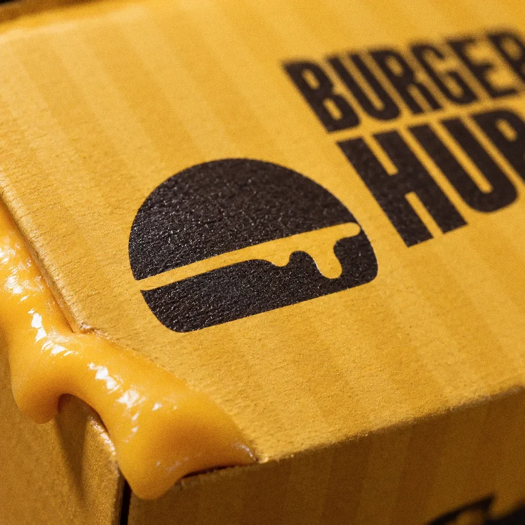
Burger Hub pairs a bun-and-cheese symbol with a bold stacked name, making the food reference immediate. Arabic and English versions retain the same burger motif across the original packaging.
A burger in the wordmark
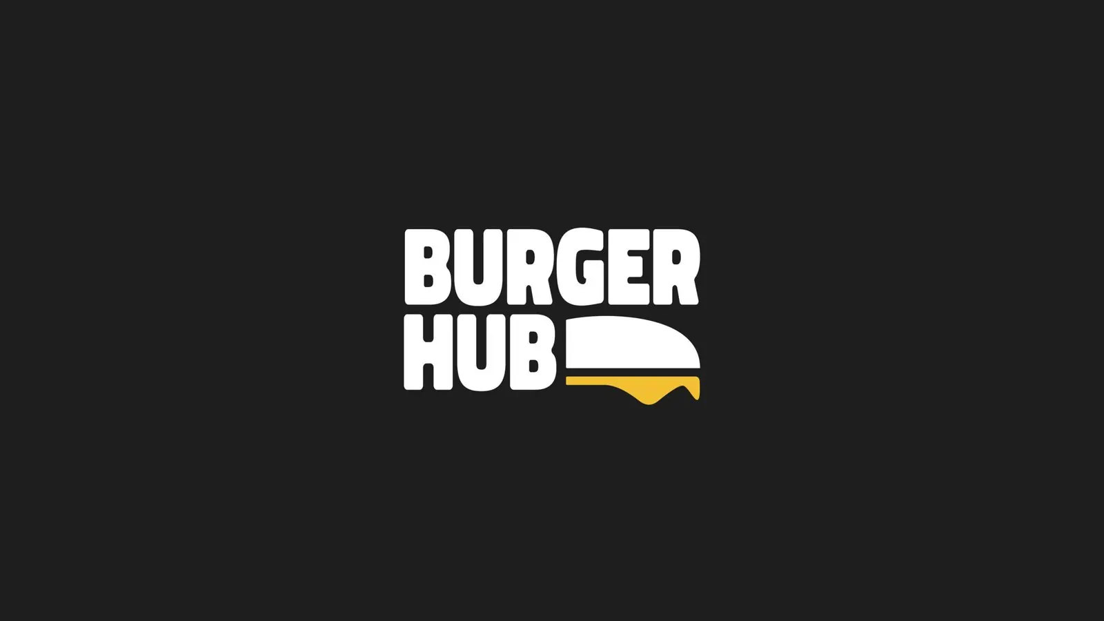
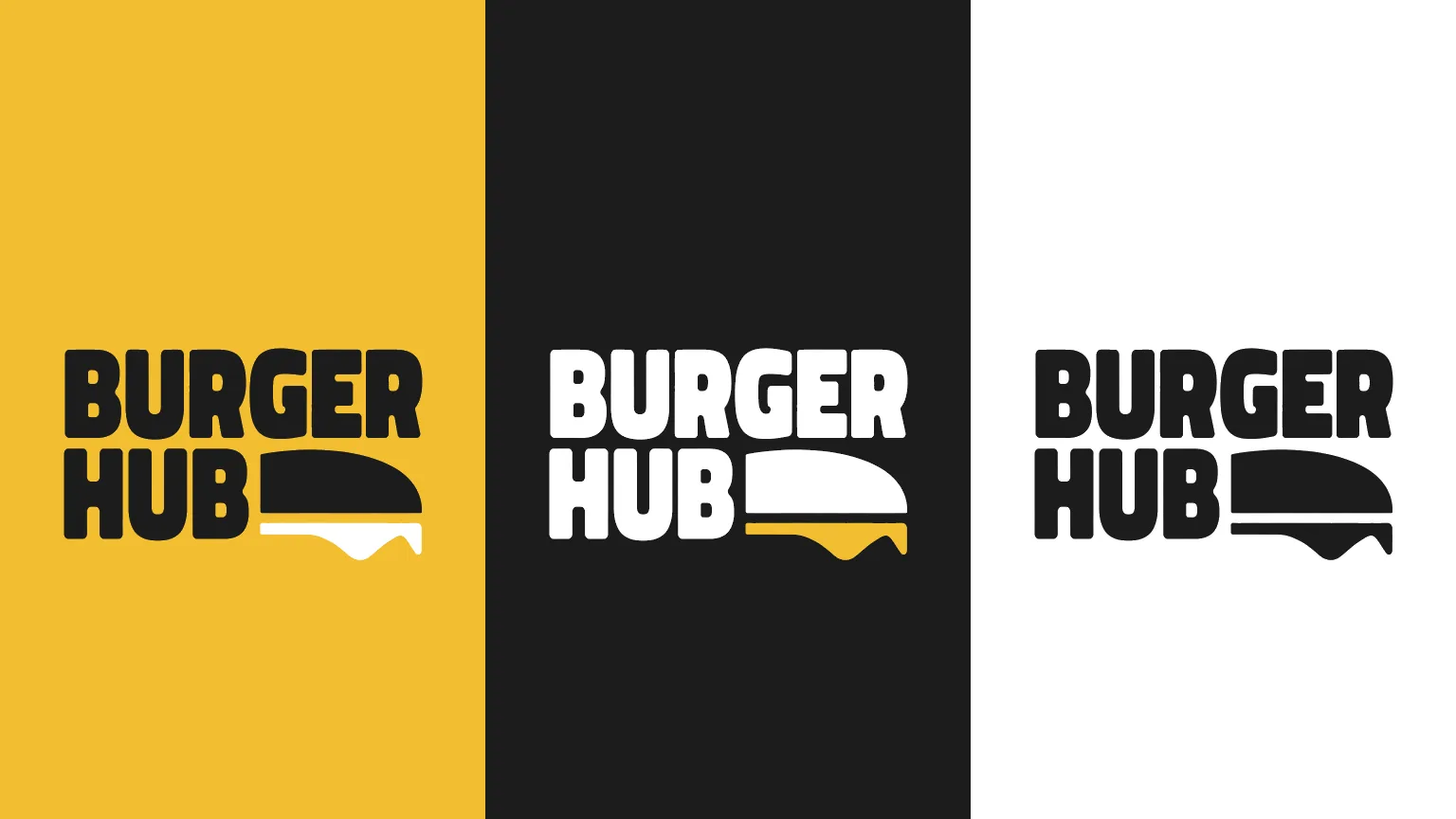
The burger silhouette with dripping cheese sits beside "Hub", so the mark reads as food even at small sizes. It works in black on yellow and in white on black.
Chapter 04
Logo variations

Chapter 05
Colour
- Accent
#F5BF32 - Surface
#1E1E1E - Ink
#FFFFFF
Colours sampled from the original identity boards.
Chapter 06
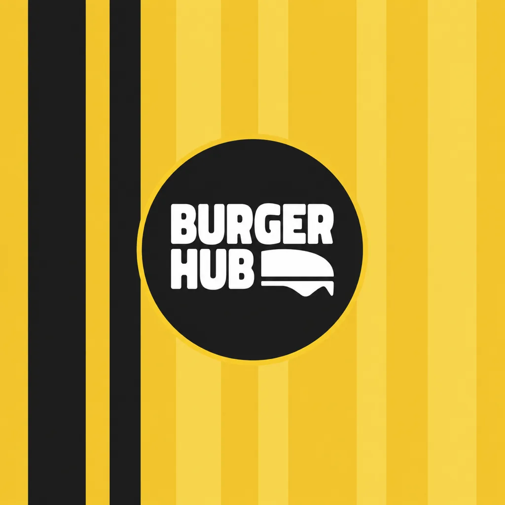
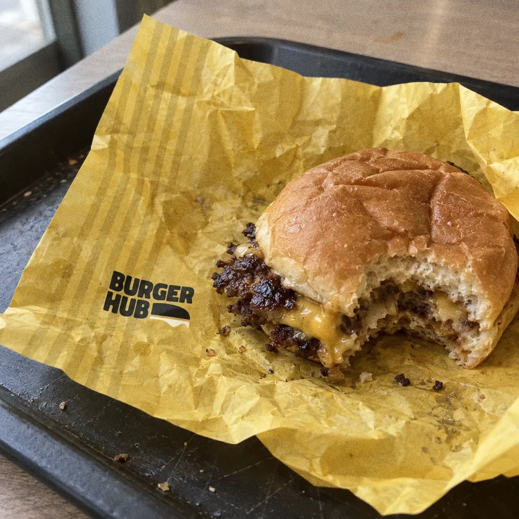
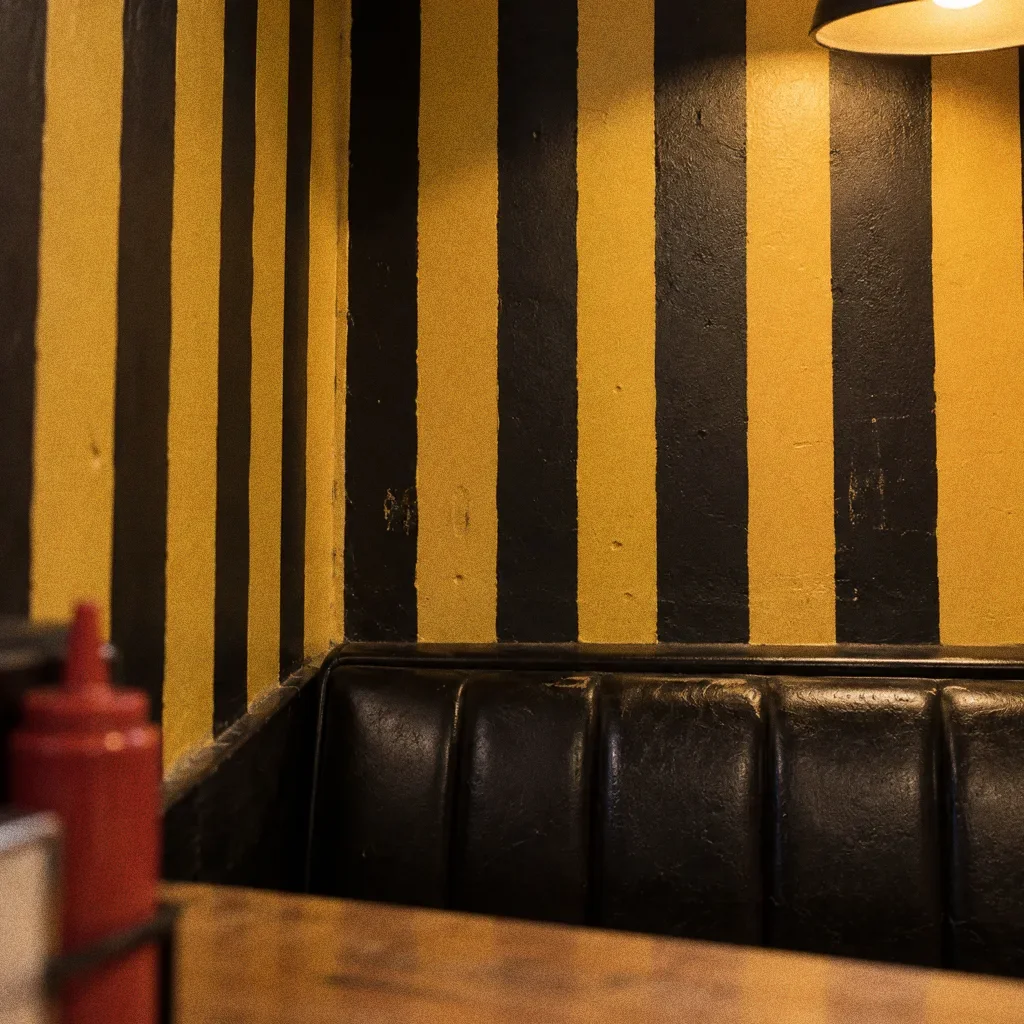
Pattern and graphic elements
Chapter 07
Packaging
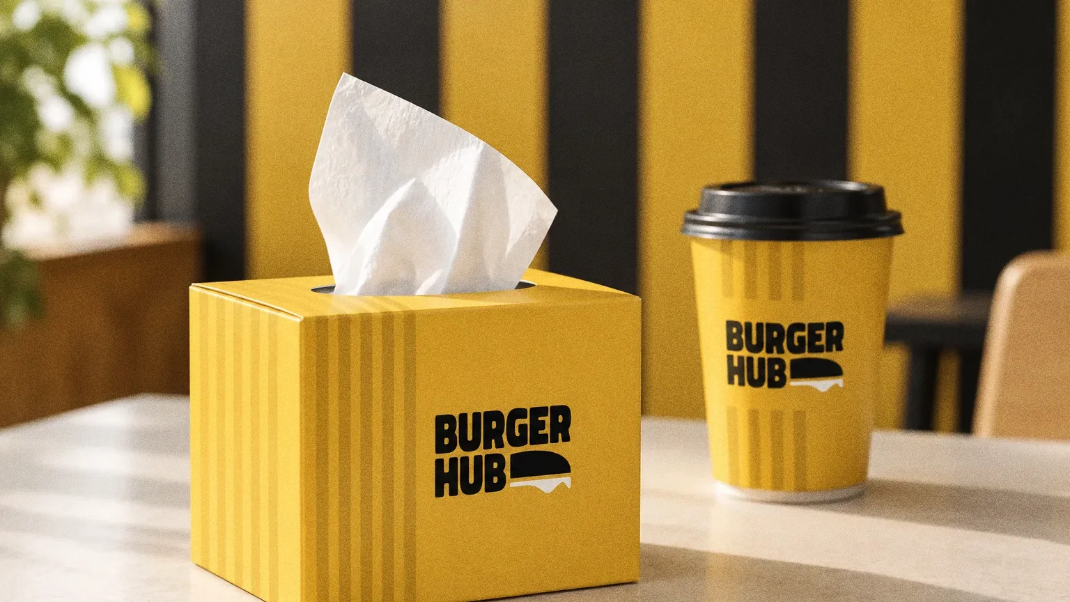
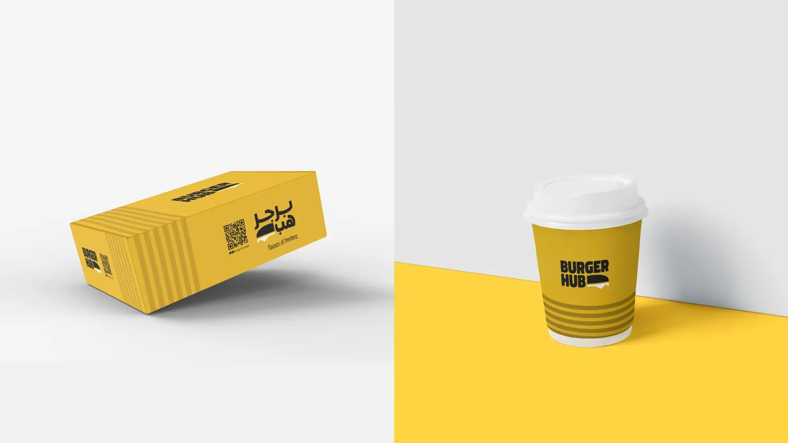
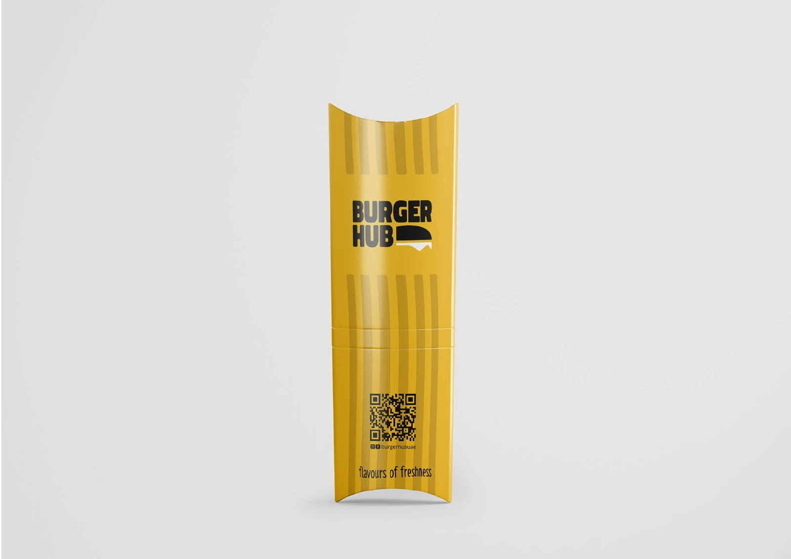
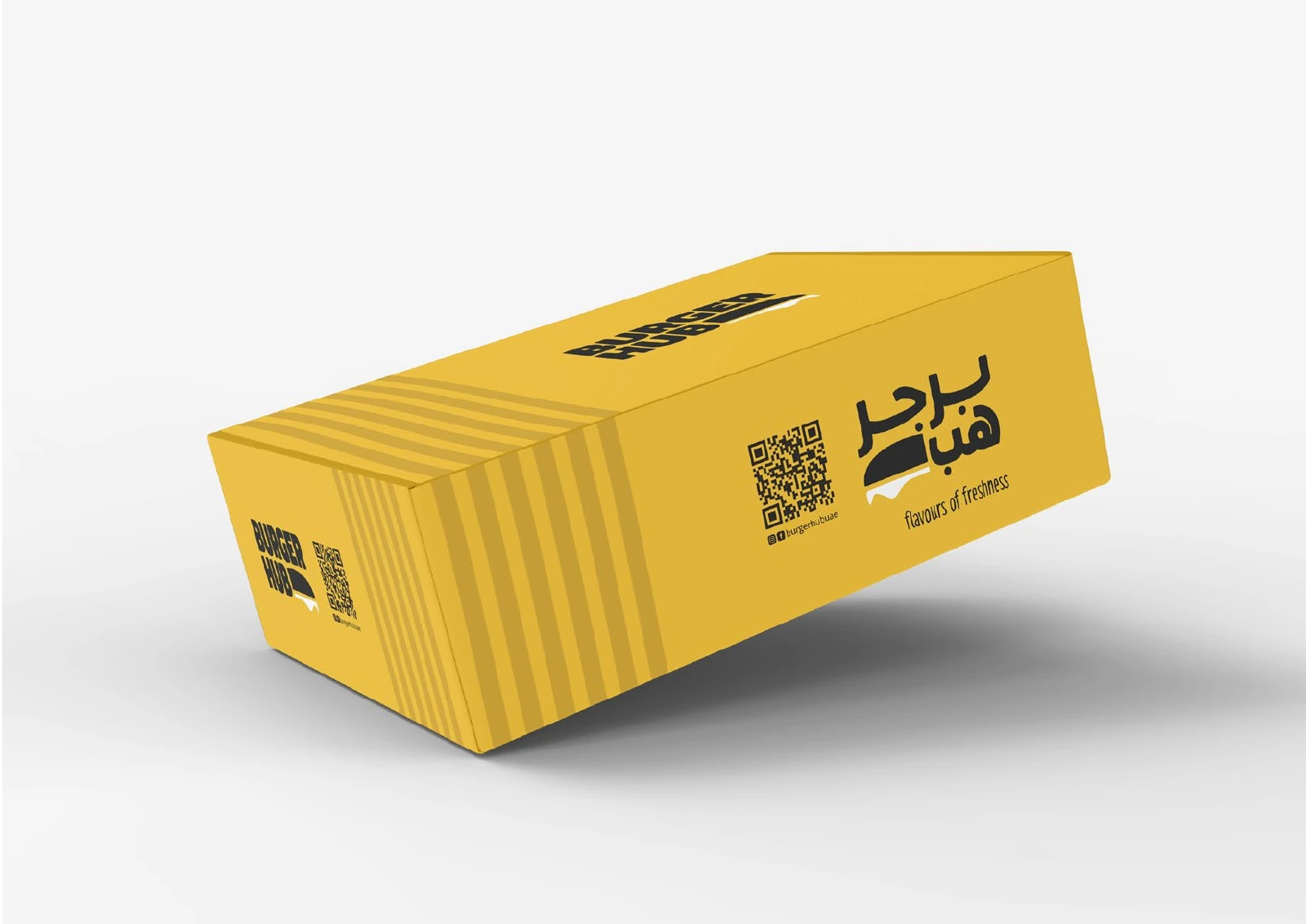
A full range in one colour
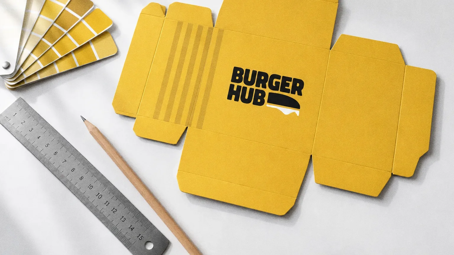
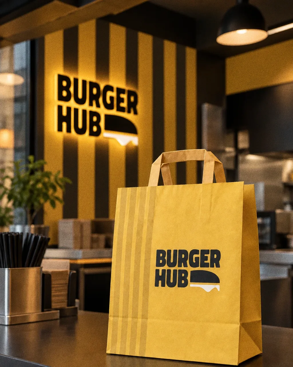
Every packaging item keeps the bright yellow with black type and stripes, and the Arabic name appears on the boxes and sachets, so the range is recognisable at a glance.
Chapter 08
Stationery
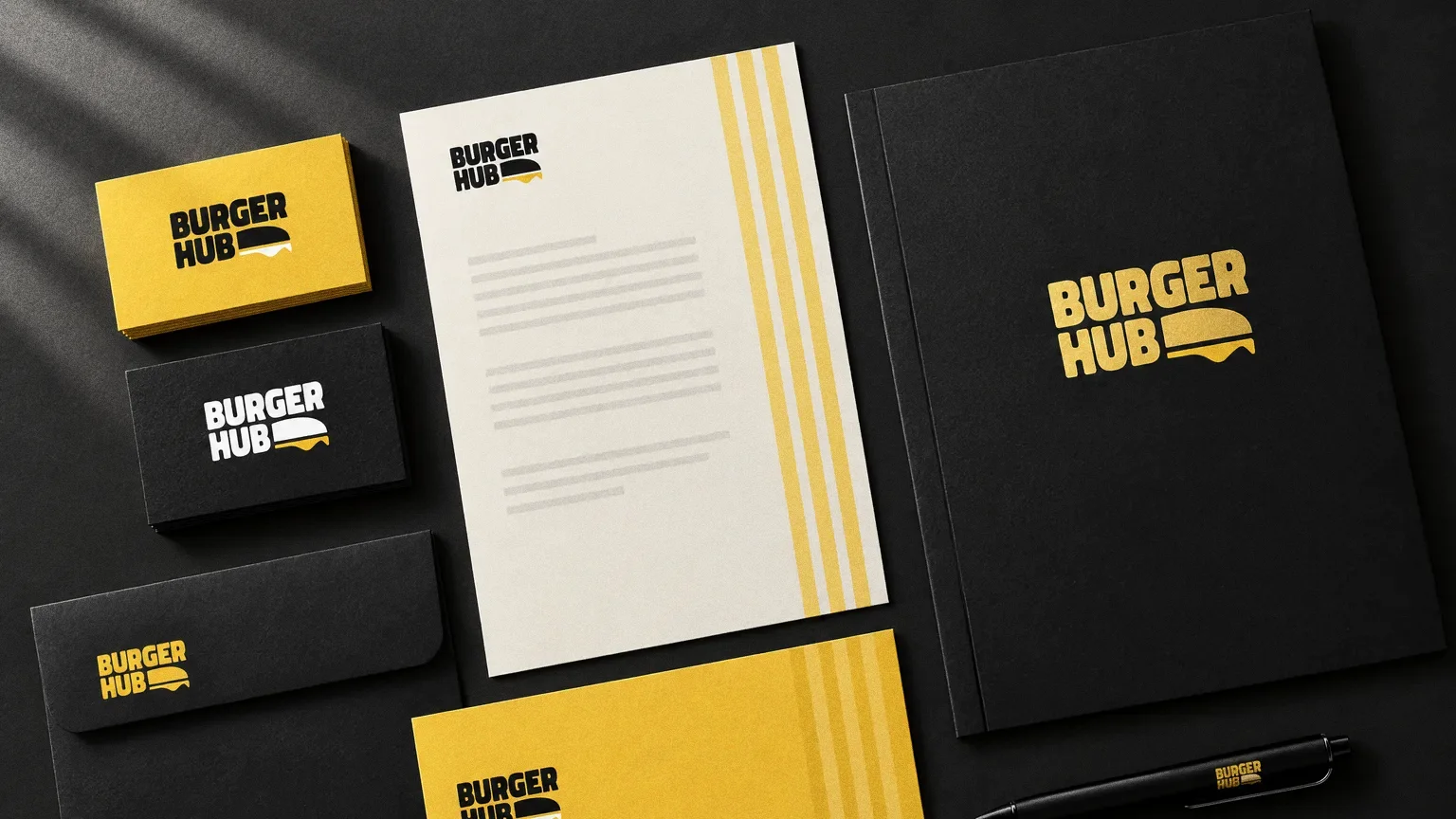
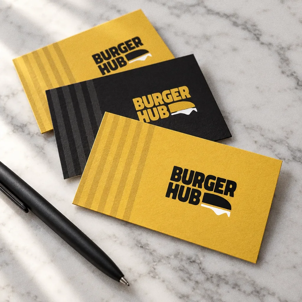
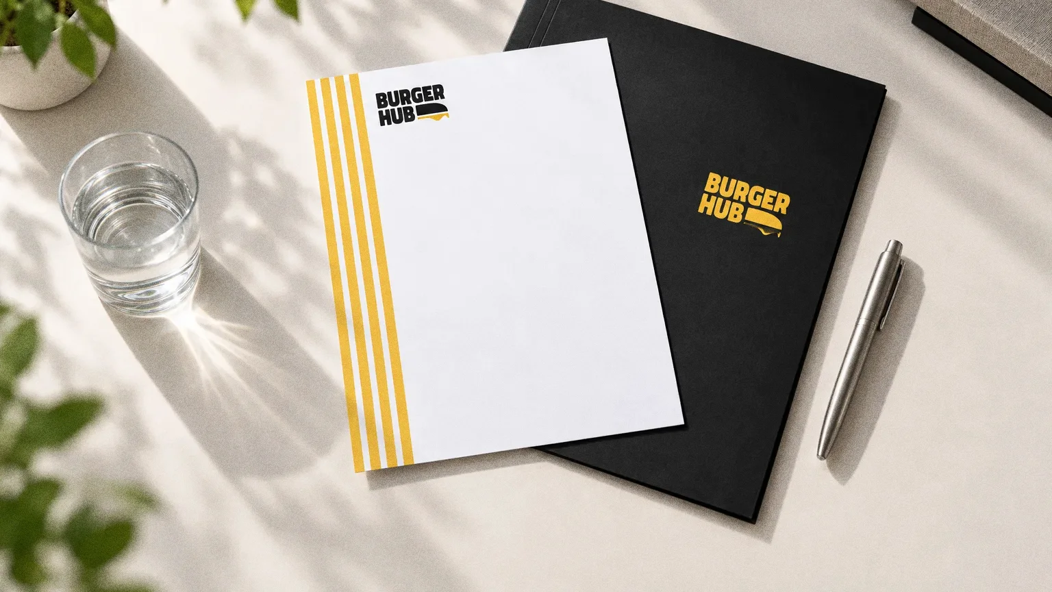
Chapter 09
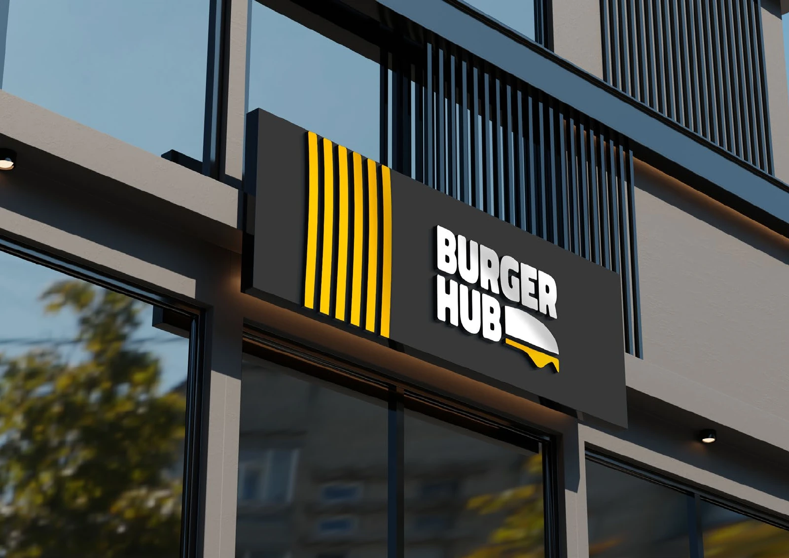
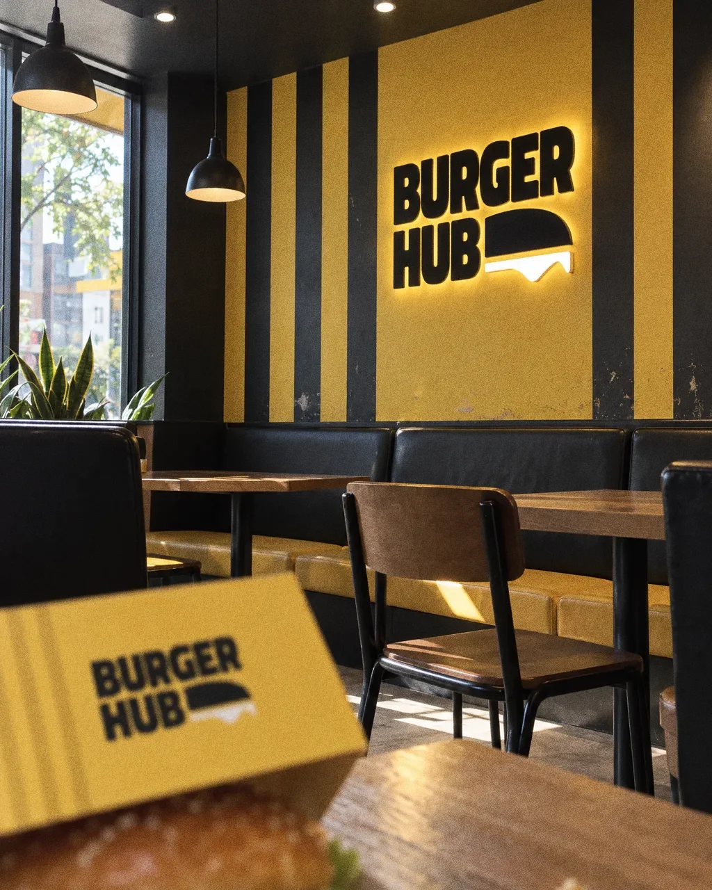
Signage and spaces
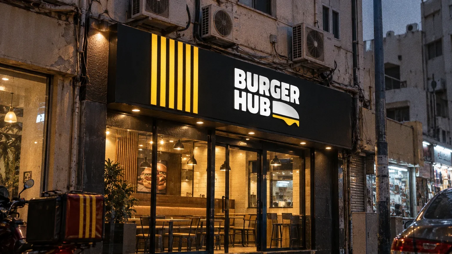
Chapter 10
Uniforms and merchandise
Chapter 11
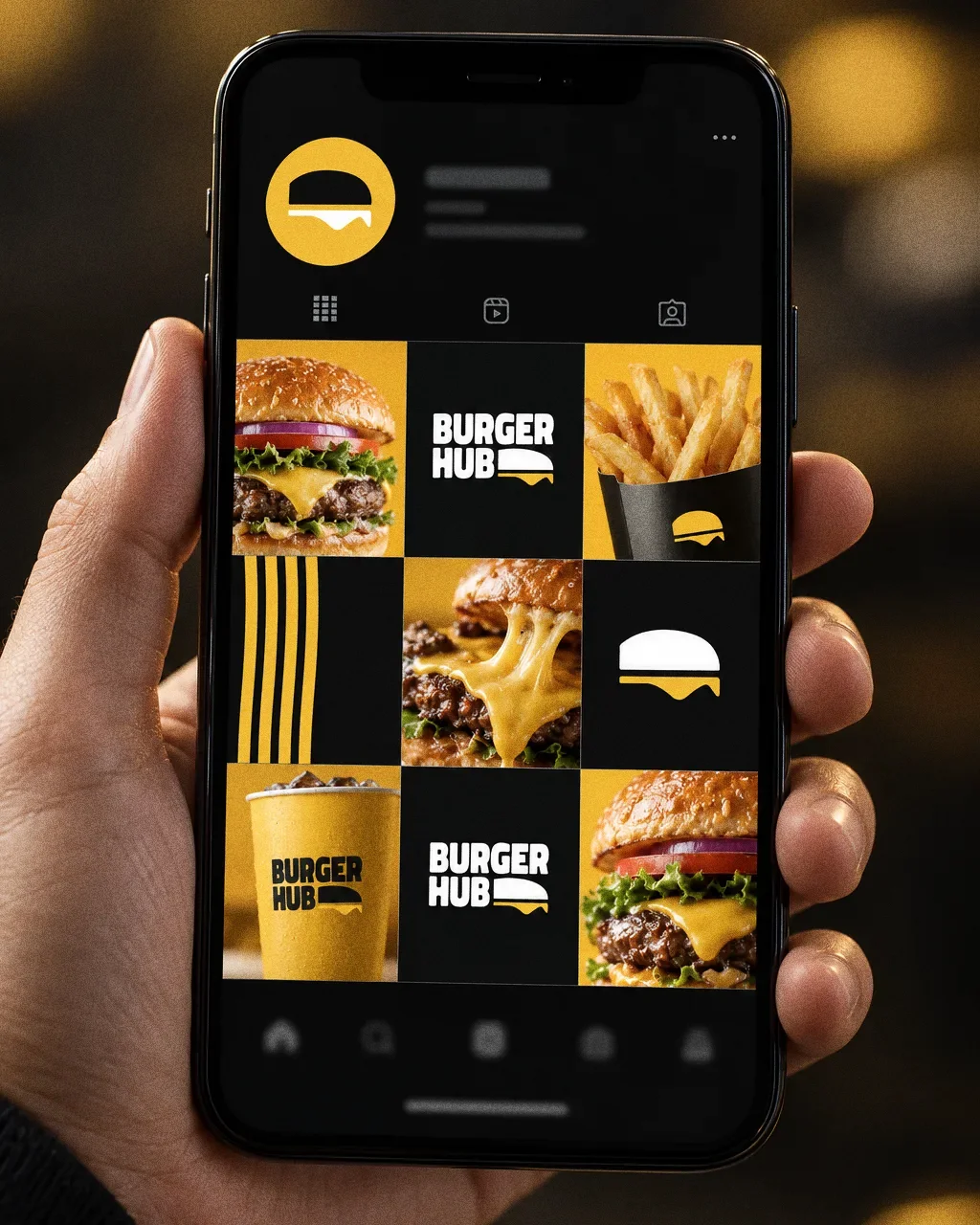
Digital
Chapter 12
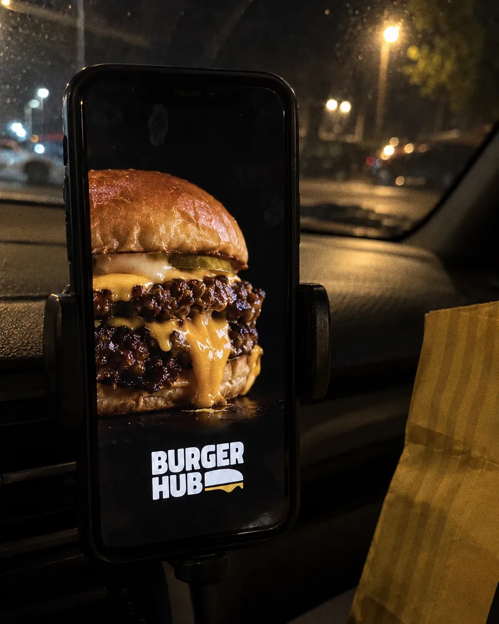
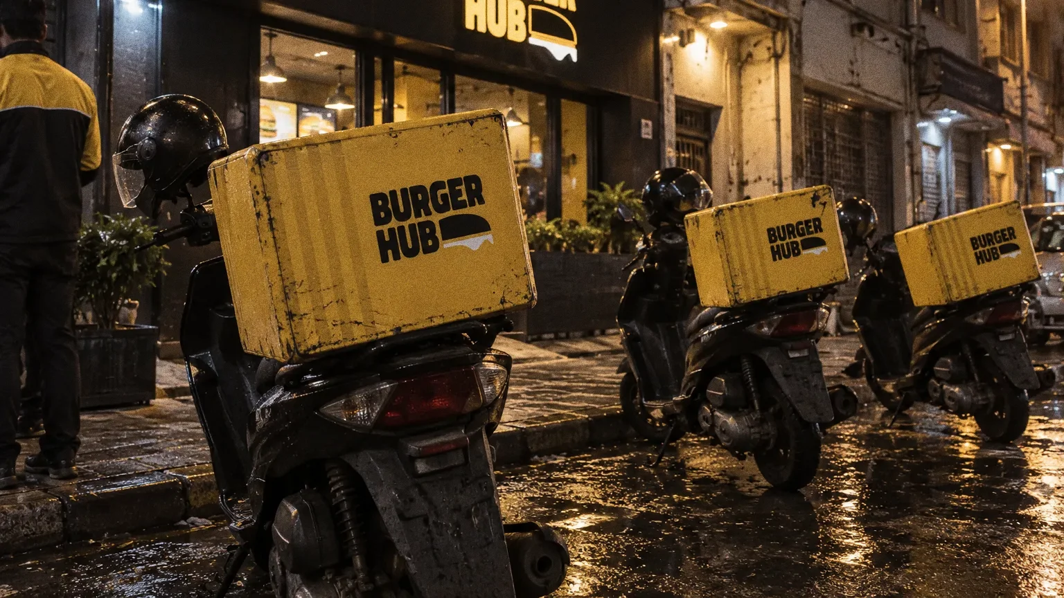
The brand in the world
The original packaging, staff polo and frontage mockup carry the same burger identity from takeaway service to the café exterior. Scale, colour contrast and stripe placement adapt to each surface.
Chapter 13
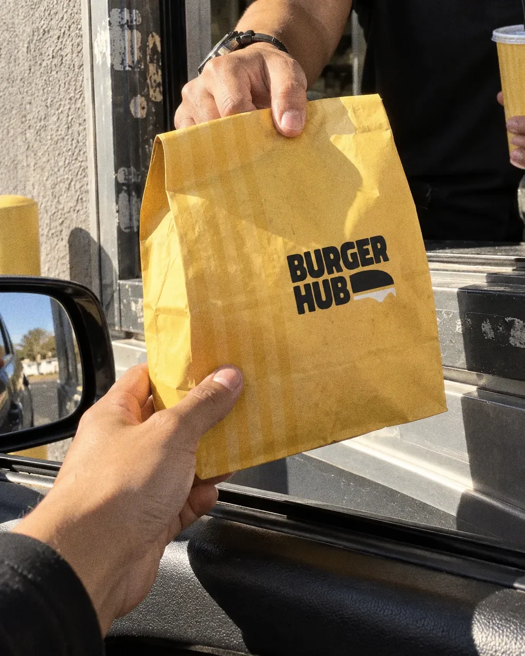
In people’s hands
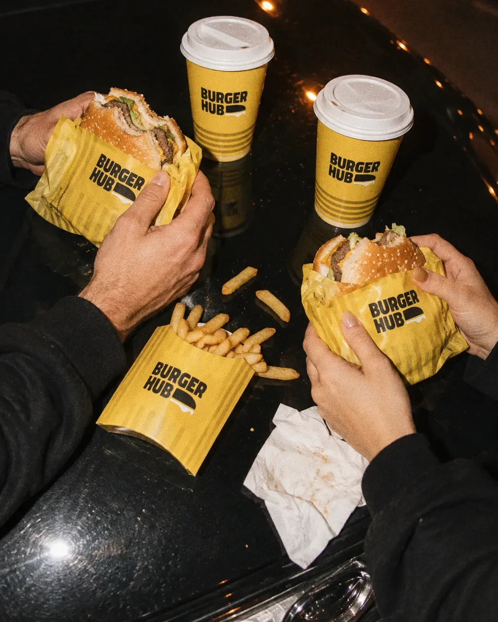
Late meal on a car bonnetThe Burger Hub identity in a lifestyle photograph of a shared late-night meal on a car bonnet. 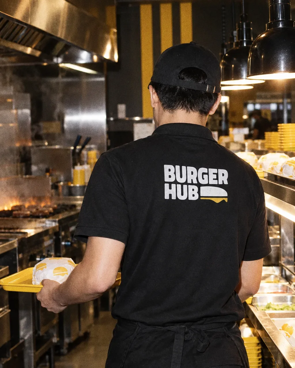
Back of the polo at the passThe Burger Hub identity in a lifestyle photograph of a staff member in the branded polo in the kitchen. 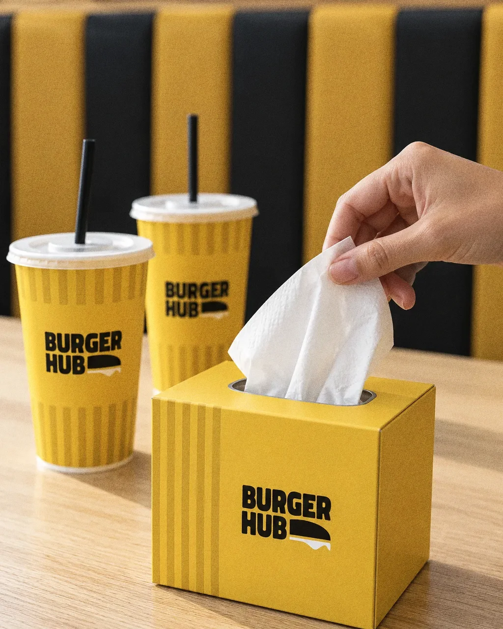
Tissue box on the tableThe Burger Hub identity in a lifestyle photograph of a dine-in table with the branded tissue box and cups. 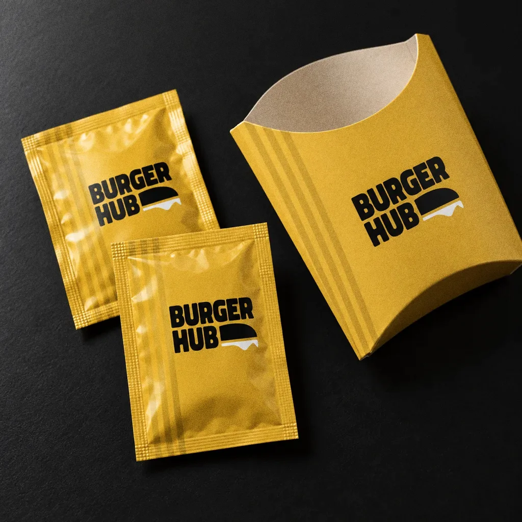
Sachets and fries sleeve on blackThe Burger Hub identity in a lifestyle photograph of sachets and a fries sleeve on a black table. 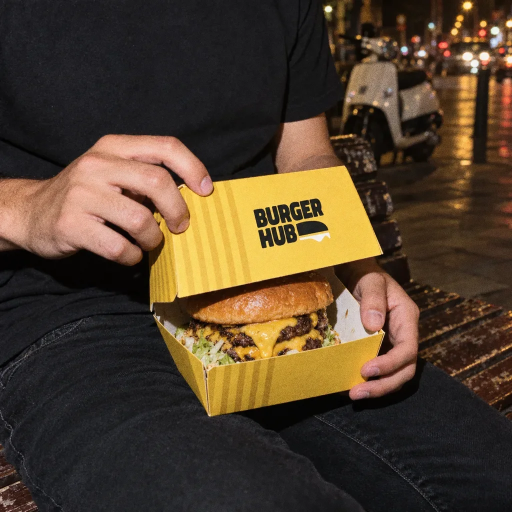
Opening the box on a benchThe Burger Hub identity in a lifestyle photograph of a burger box opened on a bench at night.
Chapter 14
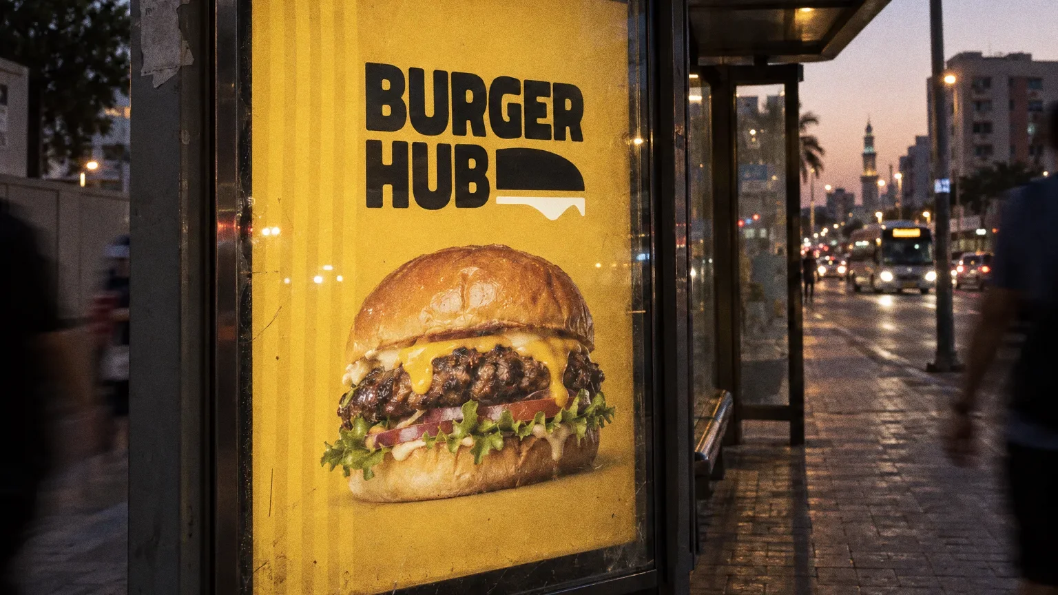
Campaign
About this deck
What we built
A stacked wordmark with a dripping burger symbol, a yellow-and-black palette and a takeaway range with English and Arabic naming, plus staff polo-shirt mockups.
About the originals
The original boards are from Abcon’s original project presentation and include application mockups.