
Branding / Personal and household care
Velvia
A floral-led Velvia identity that connects English and Arabic marks with blue and lavender, shown across handwash, tissues and soap packaging.
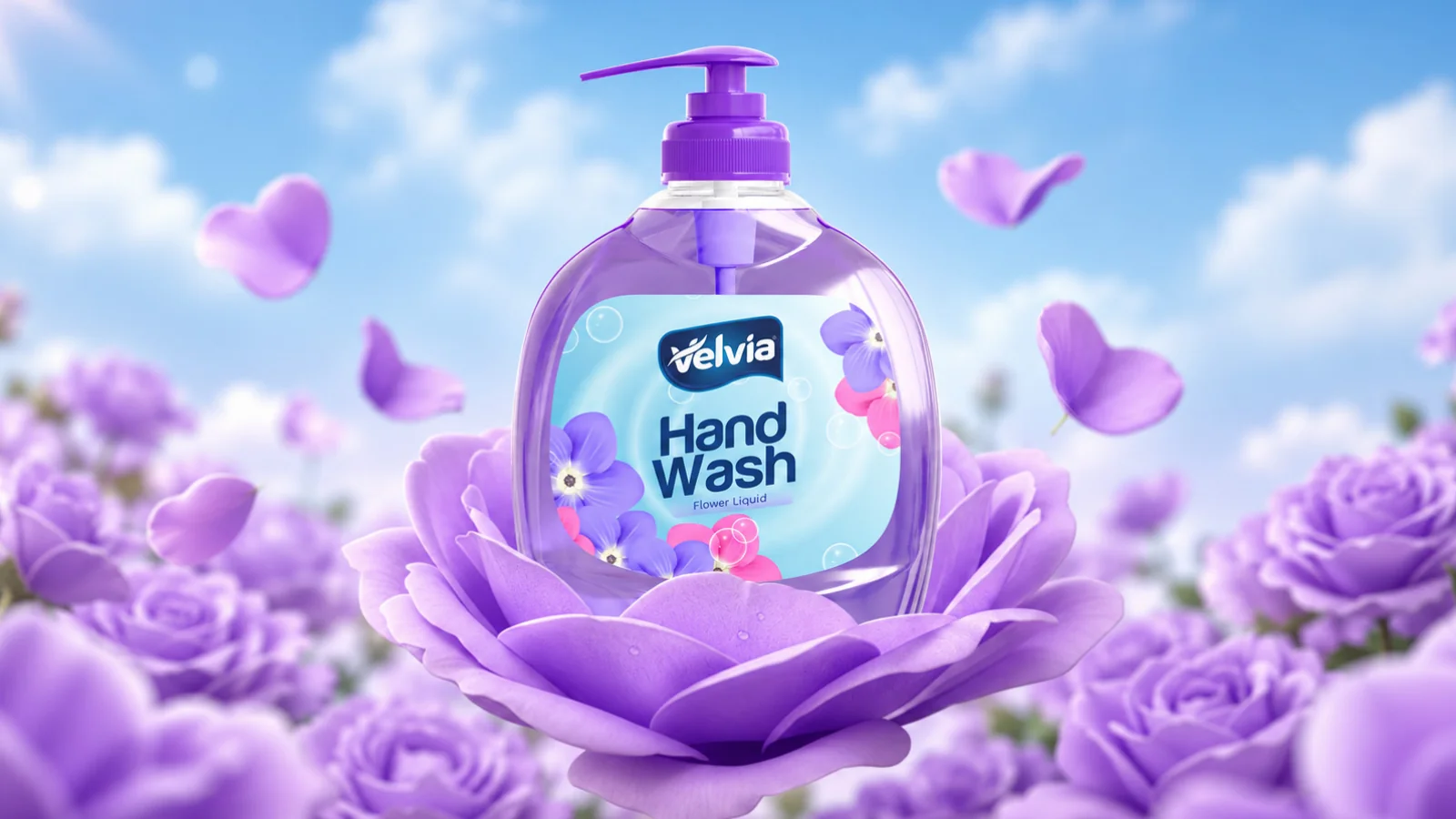
Project scope
- Brand identity
- Colour and visual direction
- Personal-care packaging applications
How the identity works
The design task
A personal-care range needs a family resemblance while keeping each product clear. The design task is to carry the same identity through bottles, cartons and smaller packs.
Connect the products through a visual family
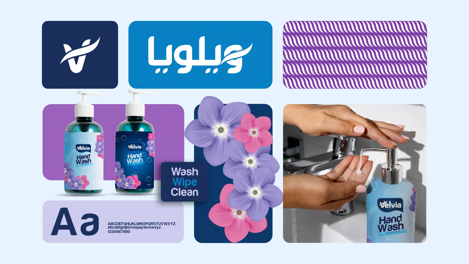
The supplied overview combines the wordmark, Arabic version, repeated motif and floral imagery. Those elements recur in the different packaging applications.
See the original boardLet the pack format change without losing the brand
A pump bottle, tissue carton and soap pack have different proportions. The blue and lavender treatment and consistent name connect them in the presentation.
See the original boardWhat we built
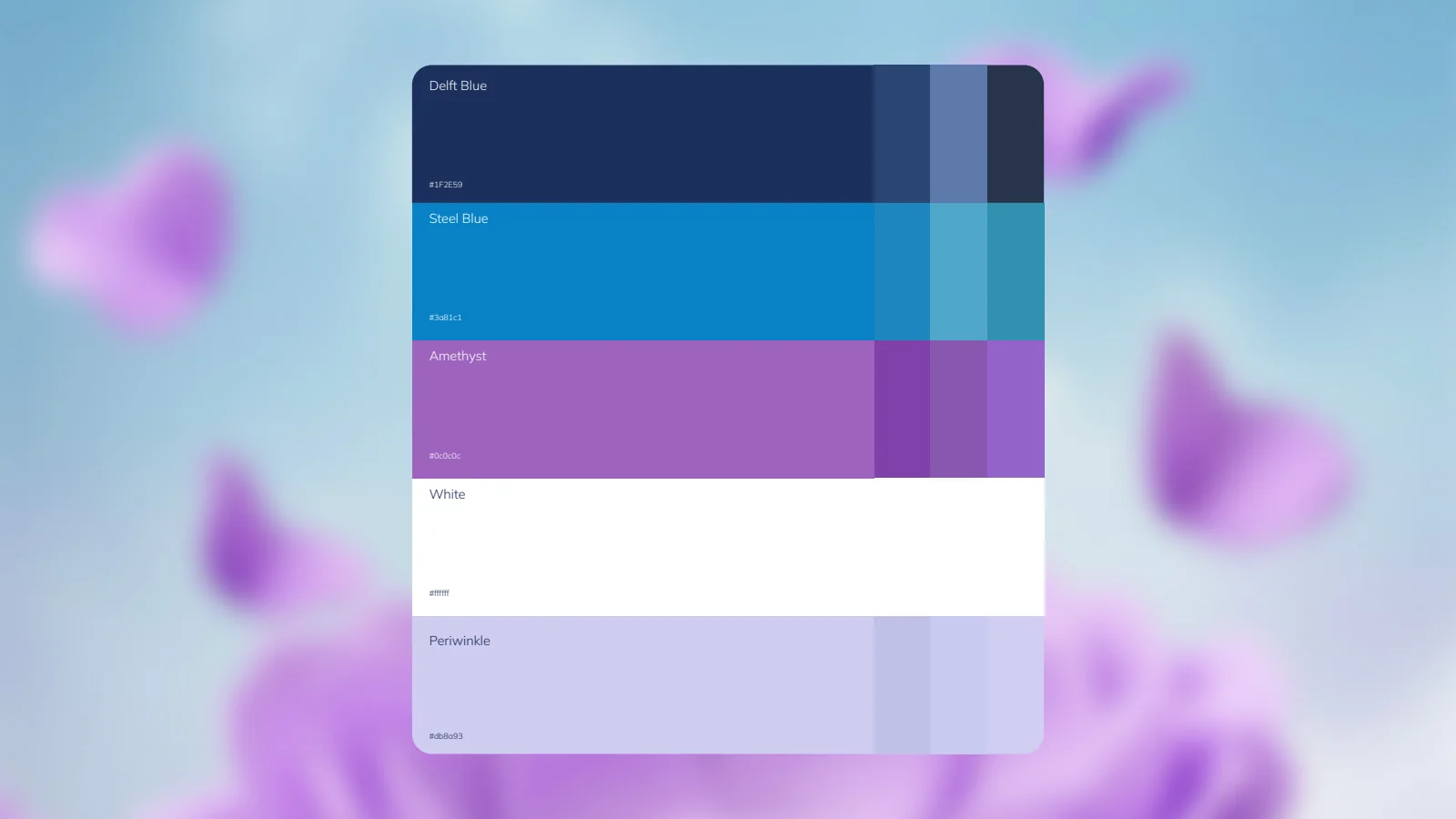
English and Arabic brand treatments, a blue-and-lavender palette and product applications for handwash, tissues and soap.
The boards below are the original design pages from the supplied PDF presentation, including its application mockups.
Original source: Velvia Branding.pdf
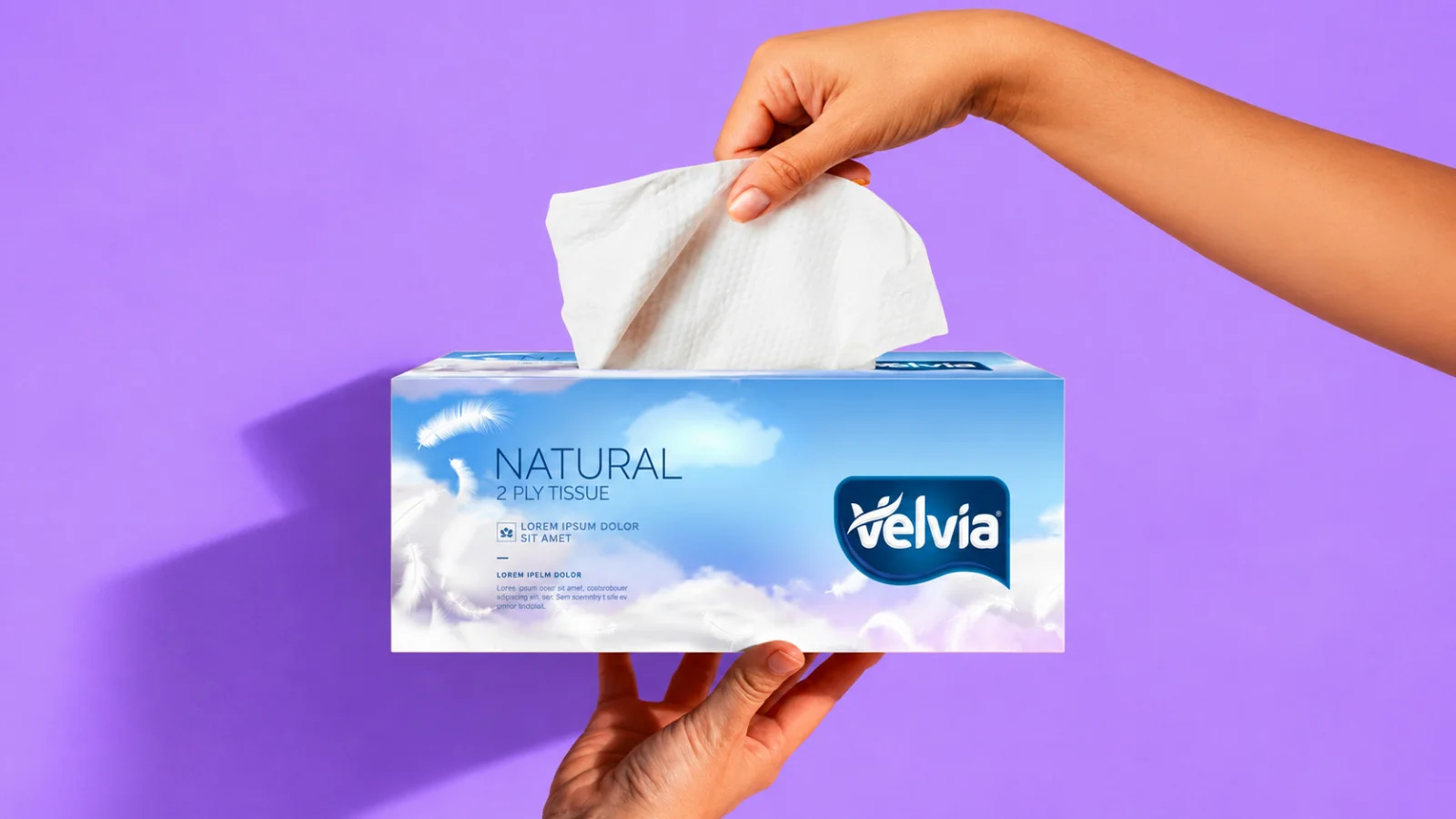
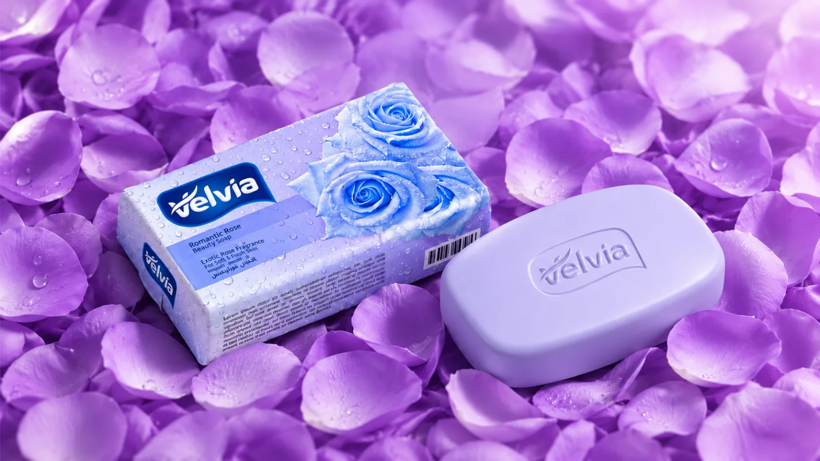
Illustrative applications
The visual system in context
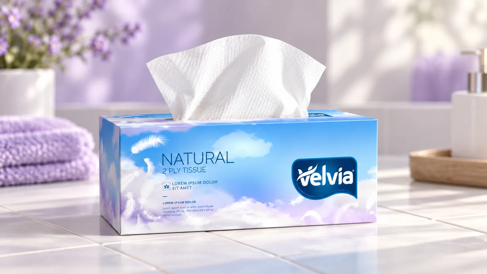
Additional scenes explore the design using the original project materials.
What does your brand need next?
Let’s talk about your project Next projectVitness