
Cash-and-carry retail
Truslink
Truslink brand film. Motion film made from the original Truslink identity boards and brand applications.
Overview
An identity for Truslink Stores, a cash-and-carry store selling groceries, fresh produce, household essentials and electronics.
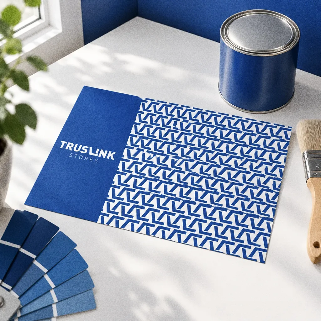
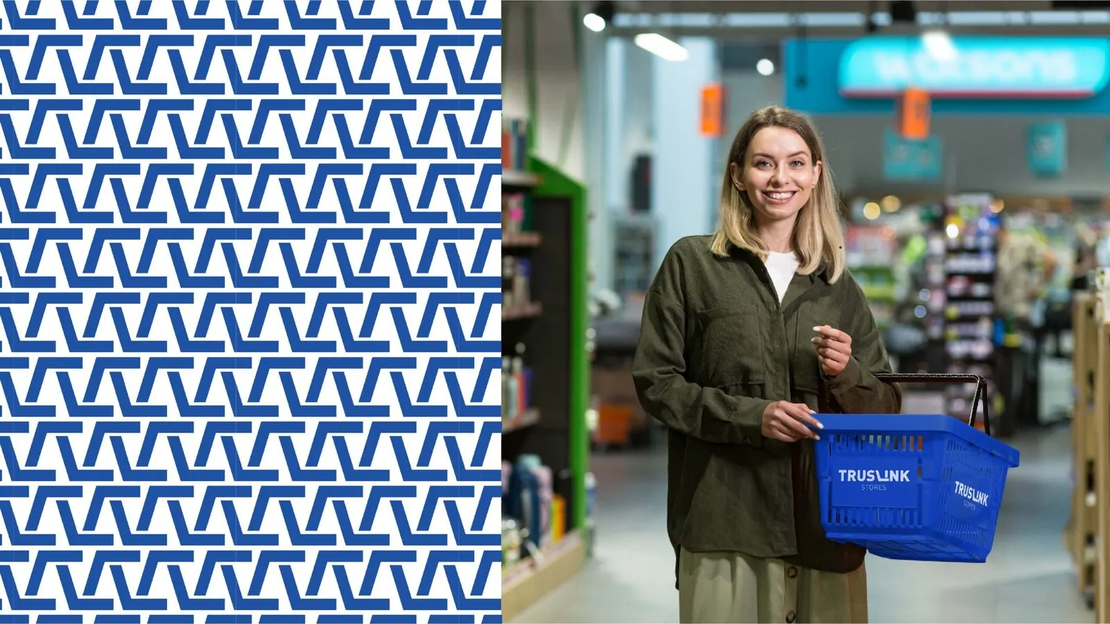
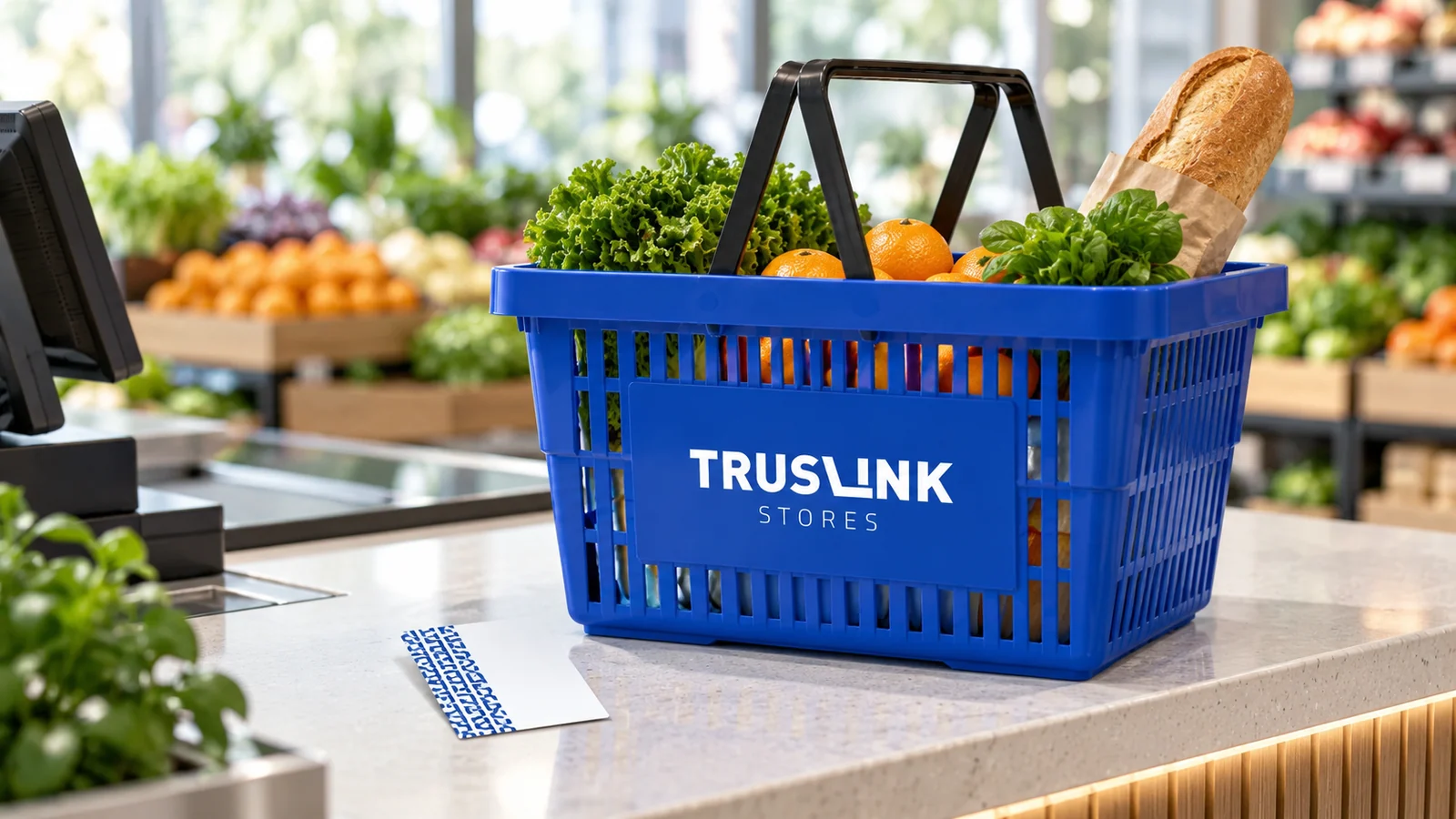
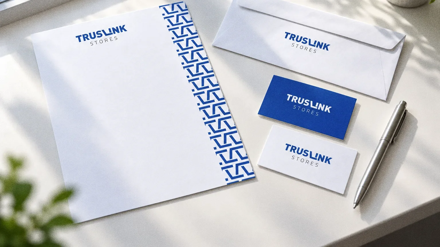
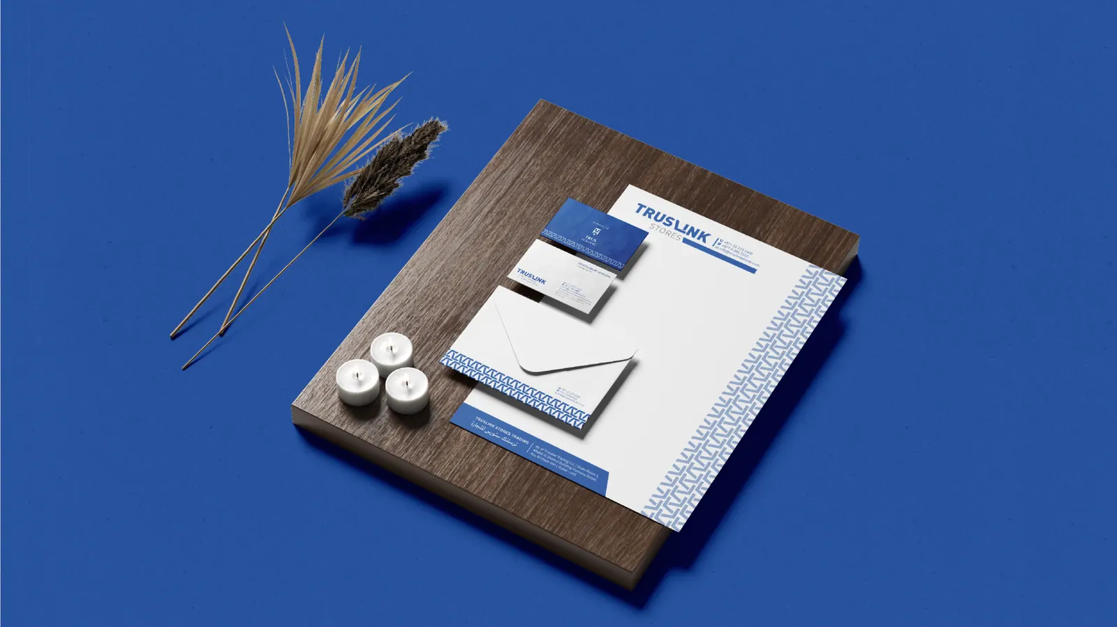
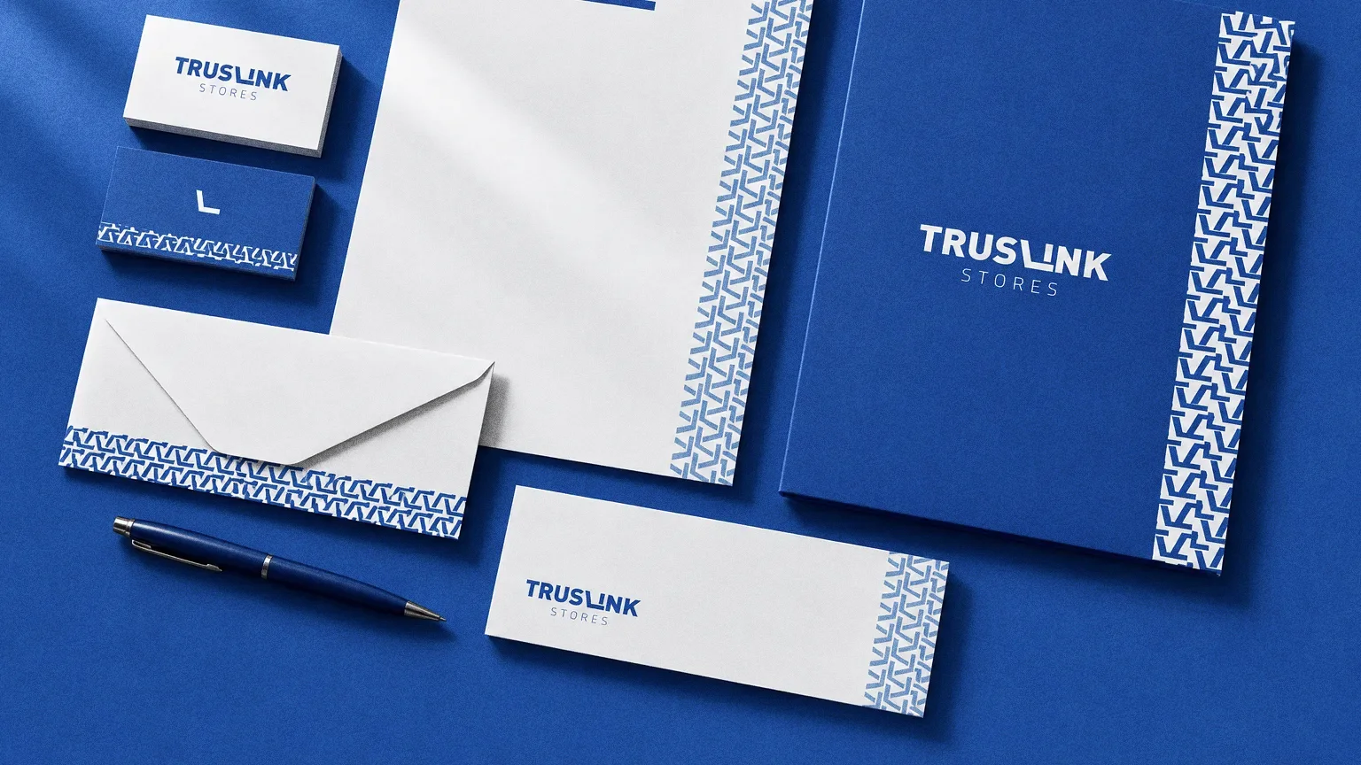
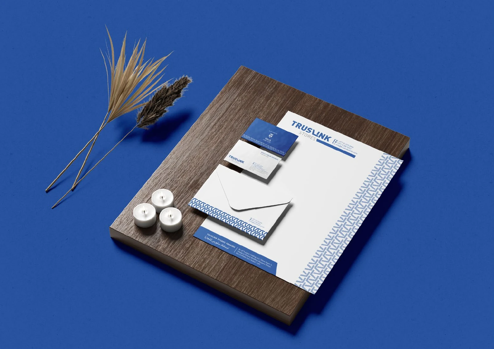
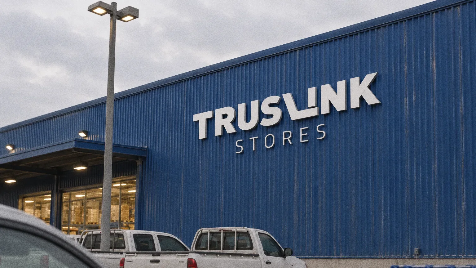
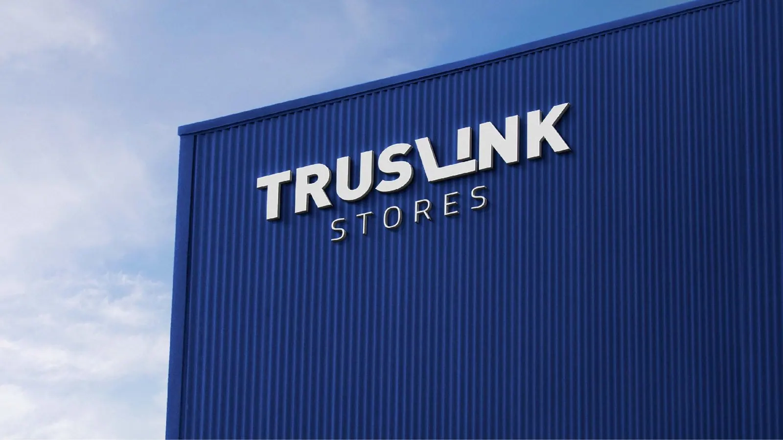
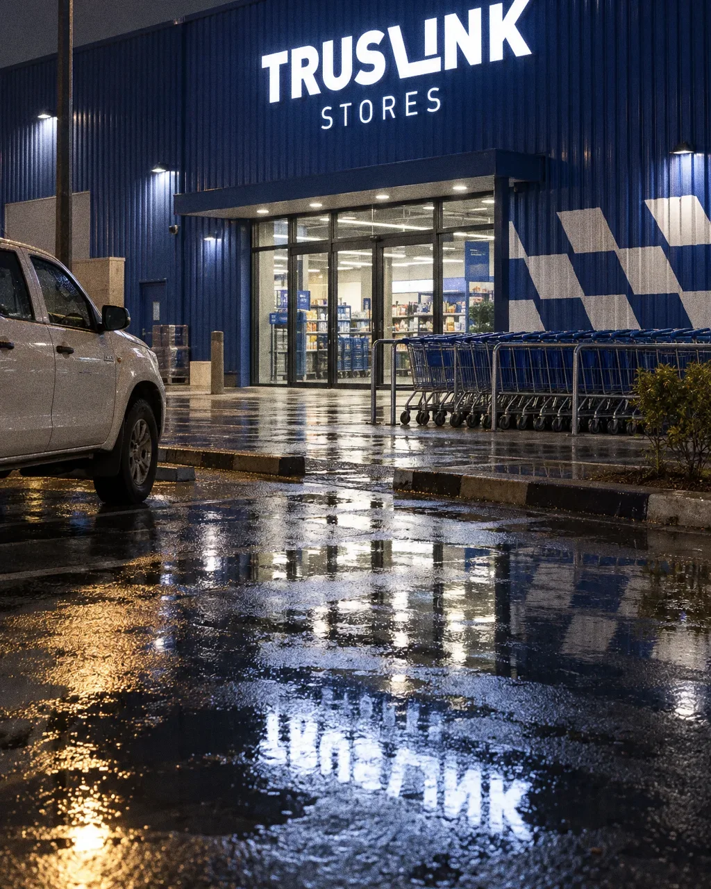
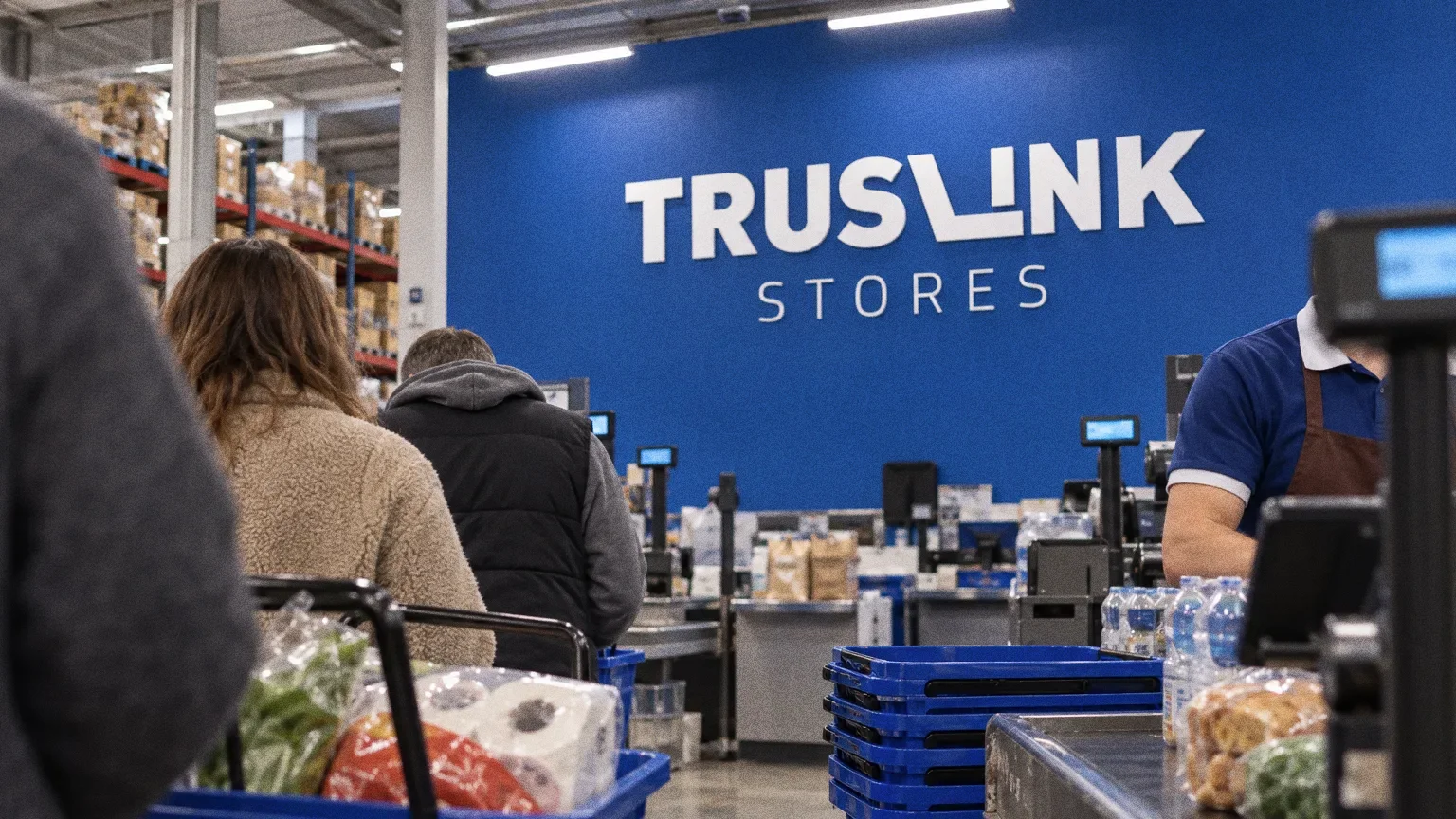
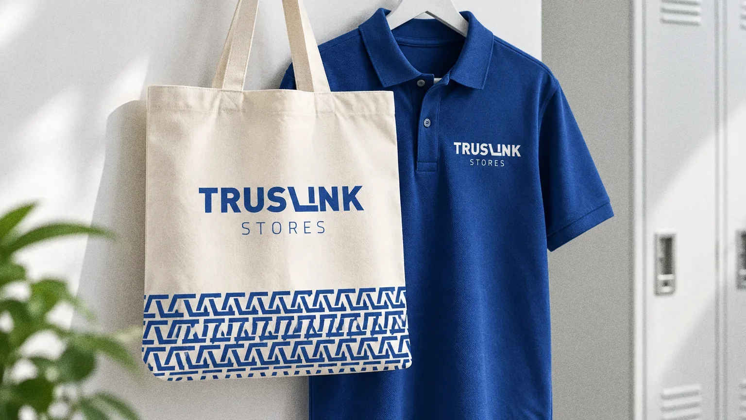
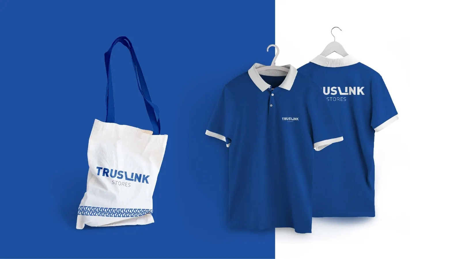
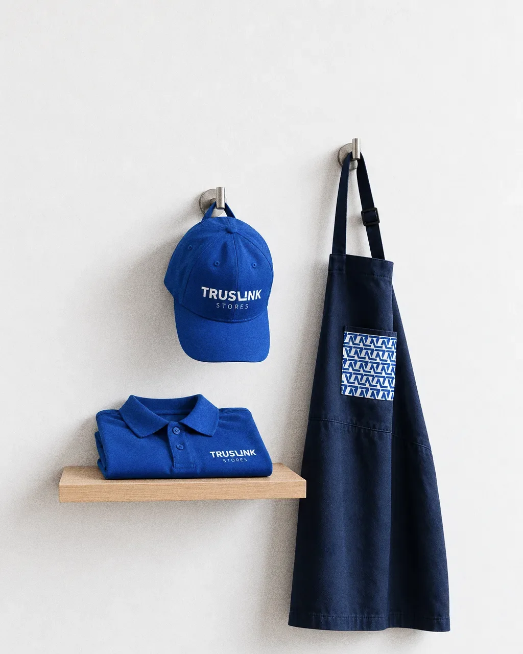
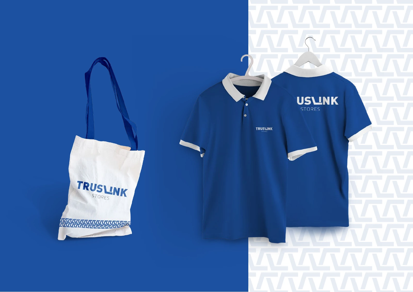
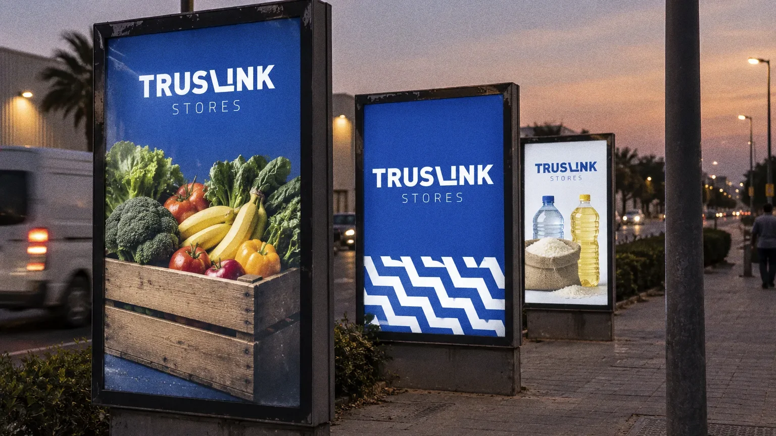
The wordmark builds a shopping-cart form into the letter L, and the presentation specifies one blue (Pantone 288 C) for the building, stationery, uniforms, bags and baskets.
BriefA cash-and-carry store brings several household categories under one name. The design task is to give that broad offer a clear identifying form that can be carried into the building and everyday store materials.
Services
Scope
- Wordmark
- Colour specification and pattern
- Building, stationery, uniform and in-store applications
Sources
How to read this deck
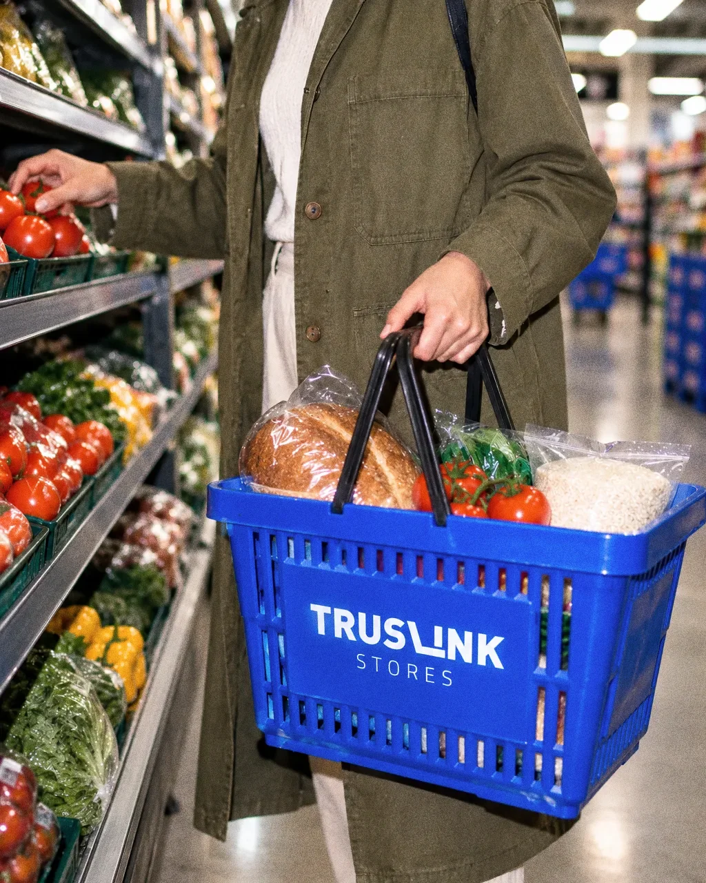
The deck pairs the client’s original presentation boards with new application scenes that show the identity in use.
Some of the older boards have been redrawn. Each one sits where the original stood, with the real original design in its corner and a View original button to open it in full.
Chapter 01
Concept and inspiration
The L and the cart
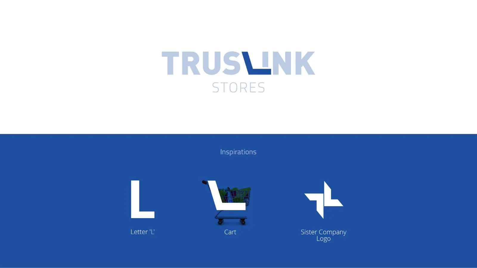
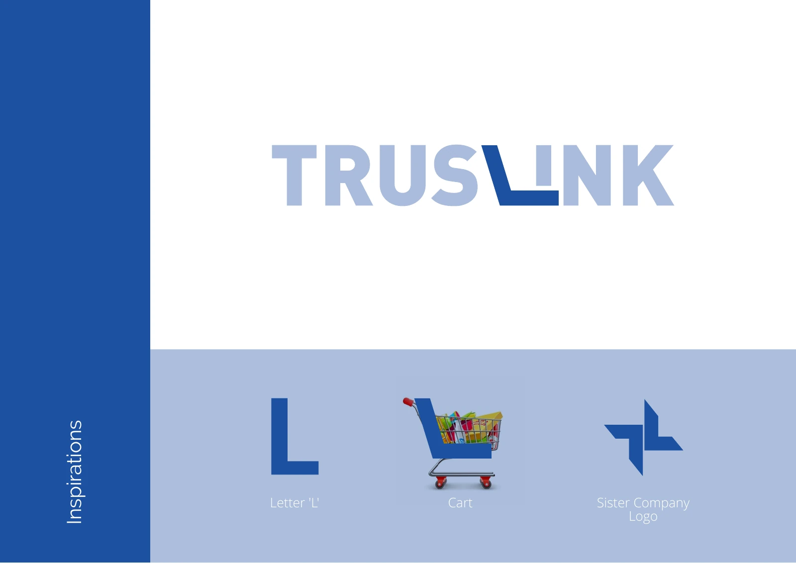
The inspiration board draws on the letter L, a shopping cart and the logo of a sister company. The L in the wordmark becomes a cart, tying the name to the store.

Chapter 02
How the logo was formed
Chapter 03
The logo
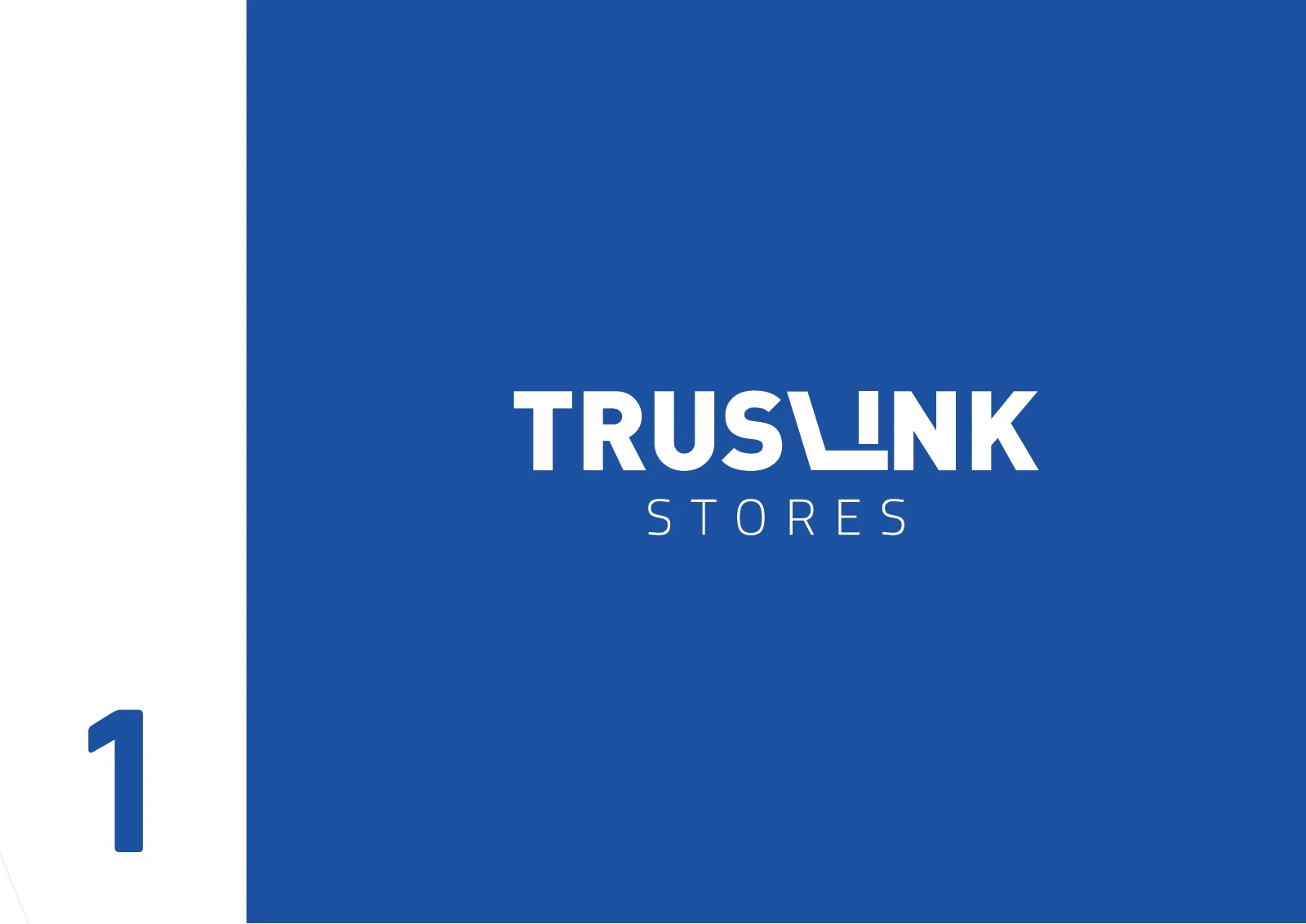
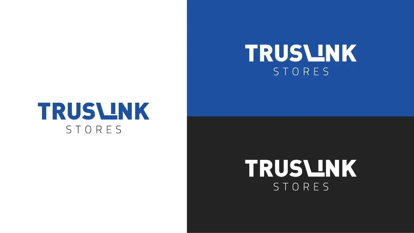
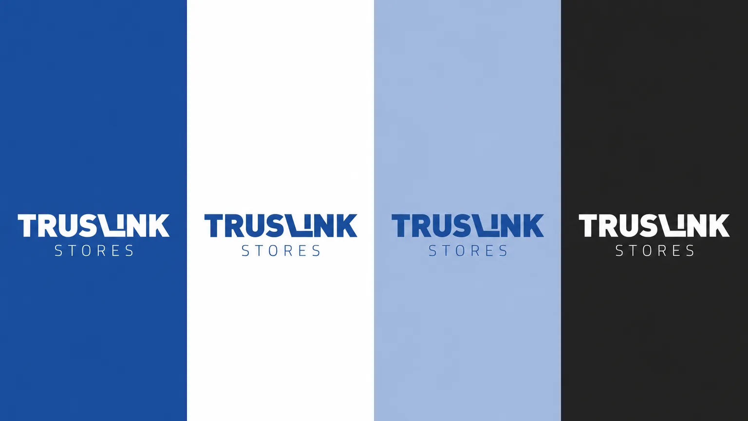
The Truslink Stores wordmark incorporates a shopping cart in the letter L, with the sister-company emblem included on the inspiration board.

Chapter 04
Logo variations

Chapter 05
Colour
- Accent
#18448B - Surface
#0D2859 - Ink
#FFFFFF
Colours sampled from the original identity boards.
Chapter 06
Pattern and graphic elements

Chapter 07
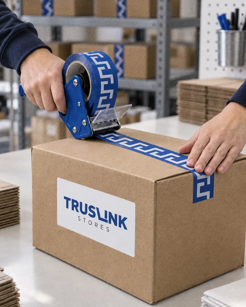
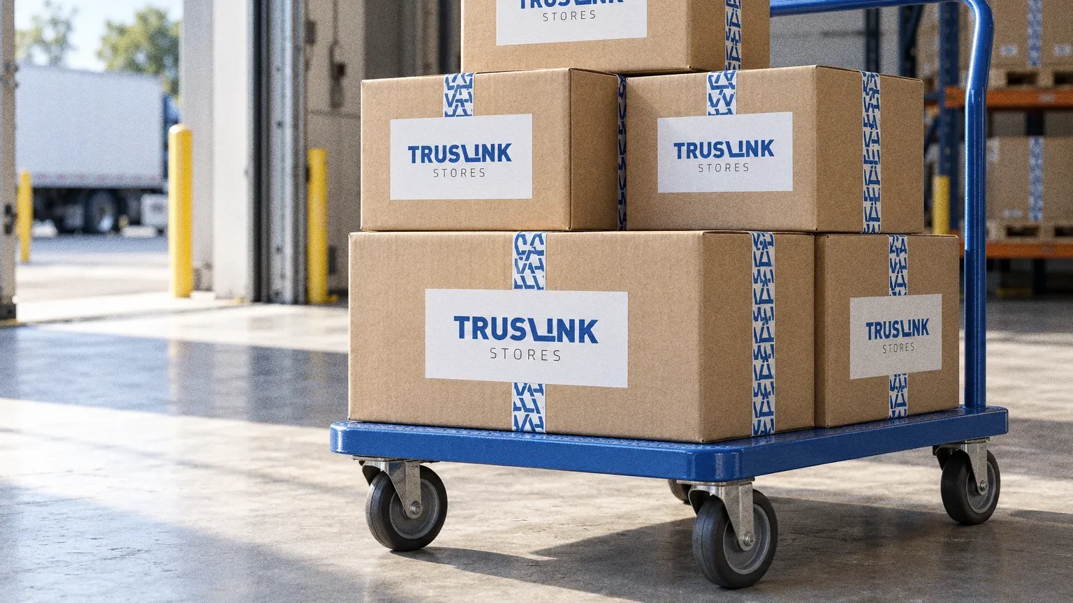
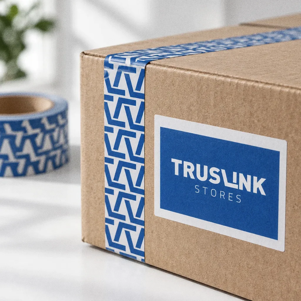
Packaging
Chapter 08
Stationery
Chapter 09
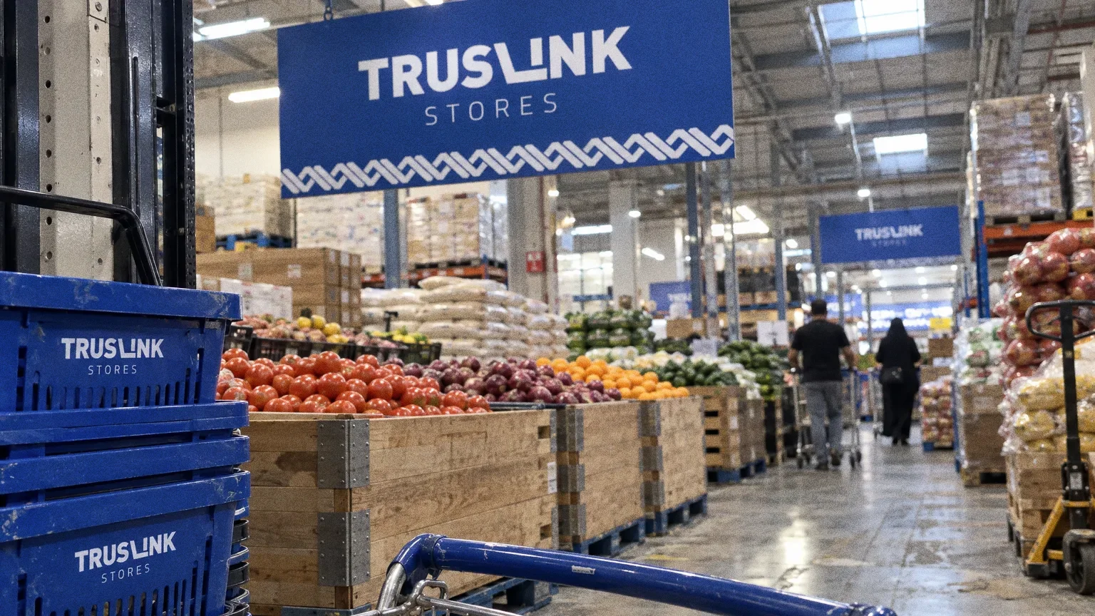
Signage and spaces
One blue, specified exactly
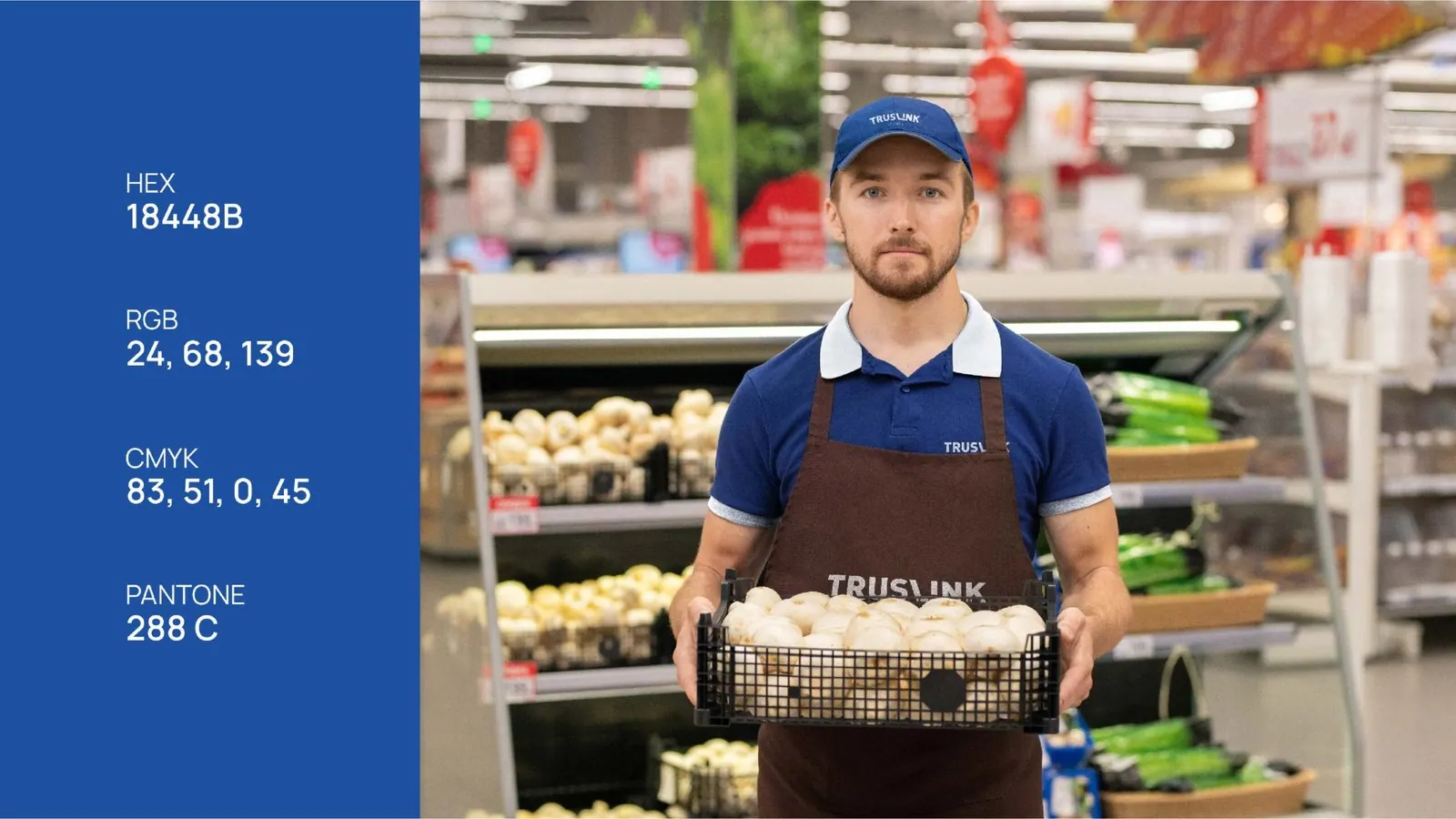
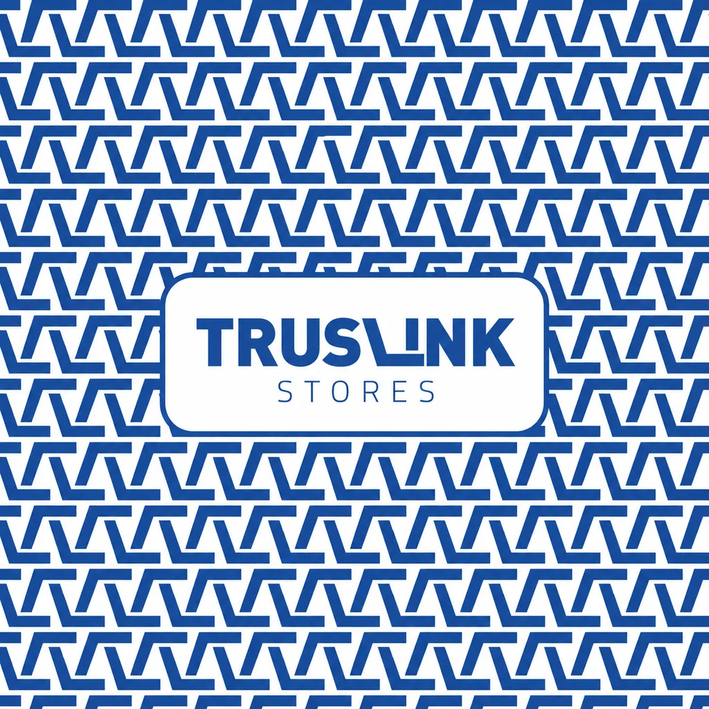
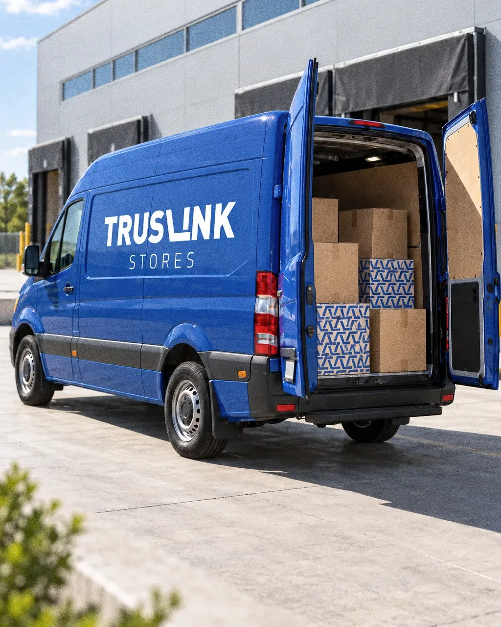
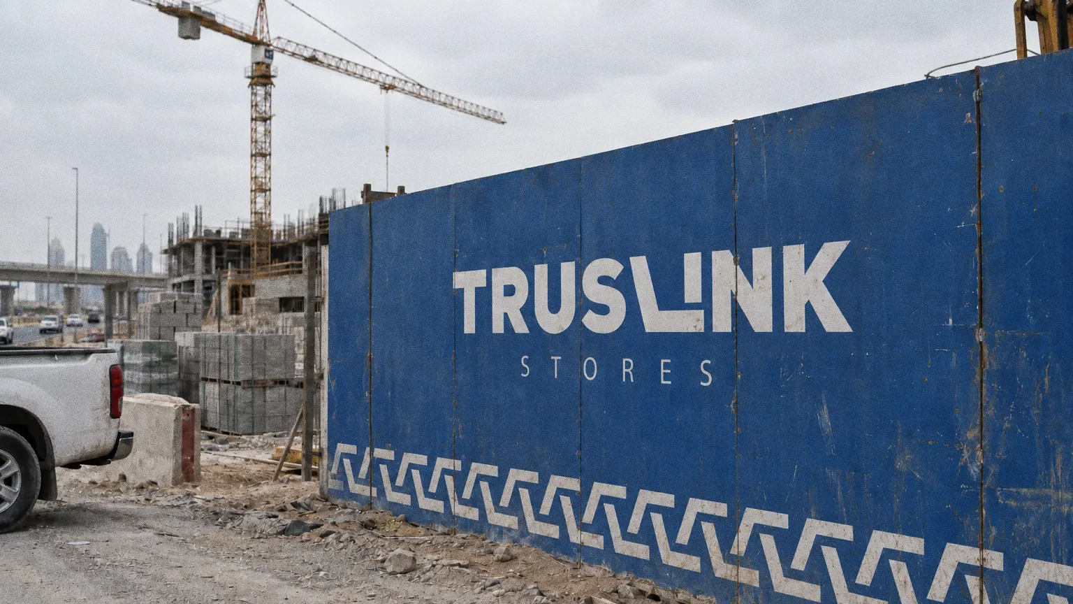
The colour board sets HEX 18448B, RGB 24, 68, 139, CMYK 83, 51, 0, 45 and Pantone 288 C. The building, stationery, uniforms, tote bag, basket and pattern all use it.
Chapter 10
Uniforms and merchandise
Chapter 11
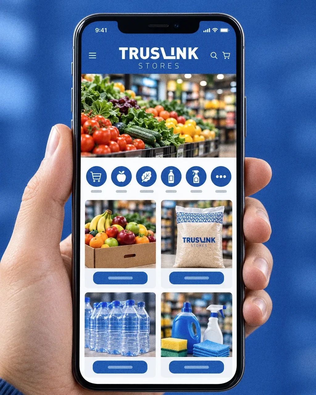
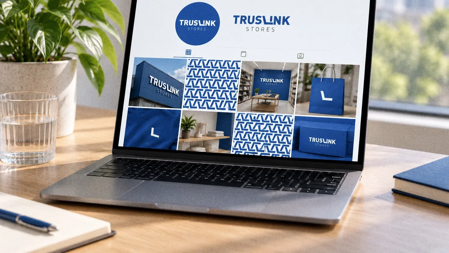
Digital
Chapter 12
The brand in the world
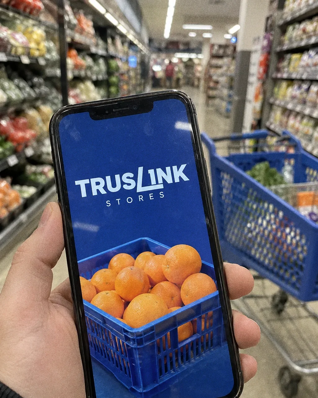
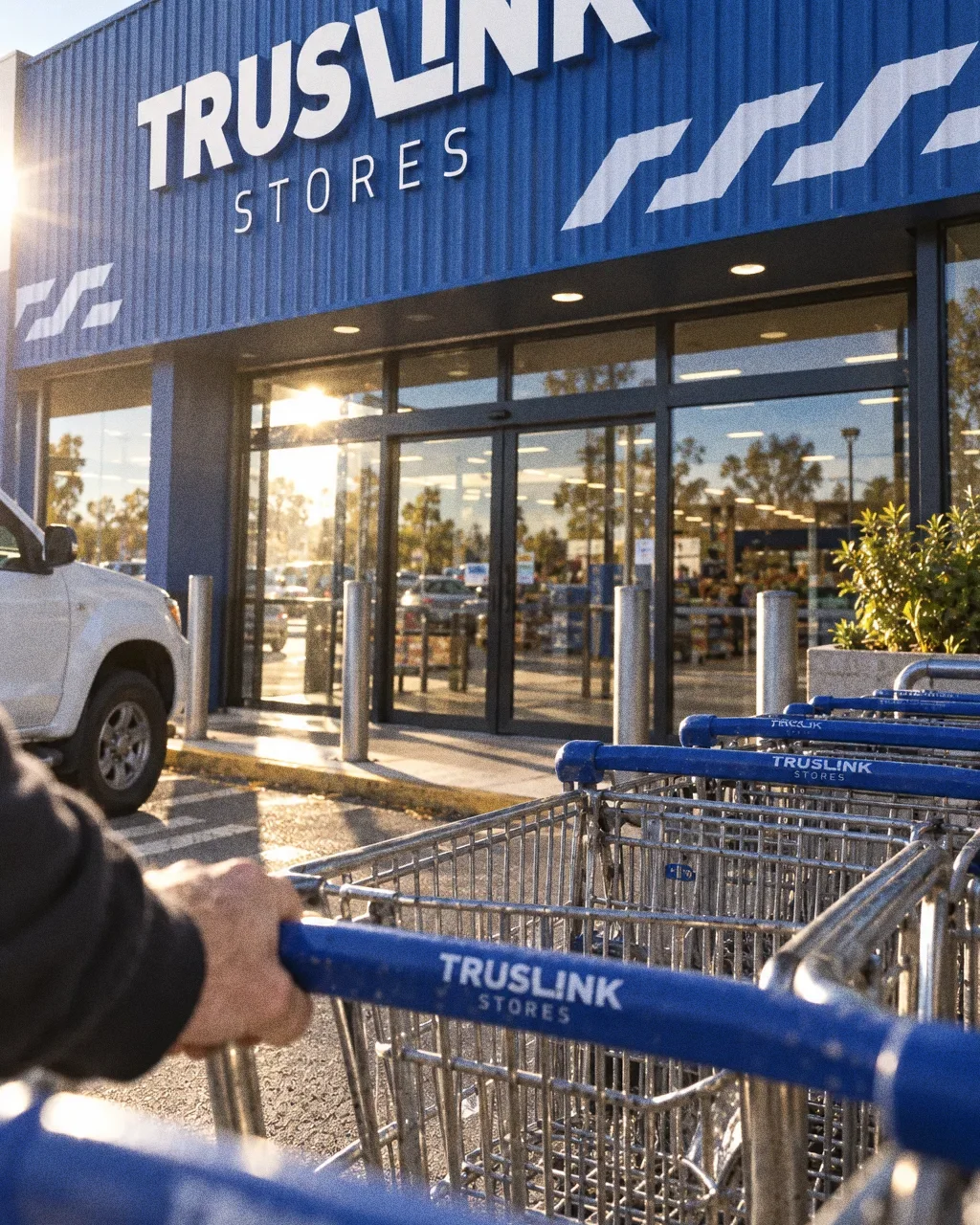
The original applications carry the identity across the building, office stationery, tote bags, staff clothing and shopping baskets.
Chapter 13
In people’s hands
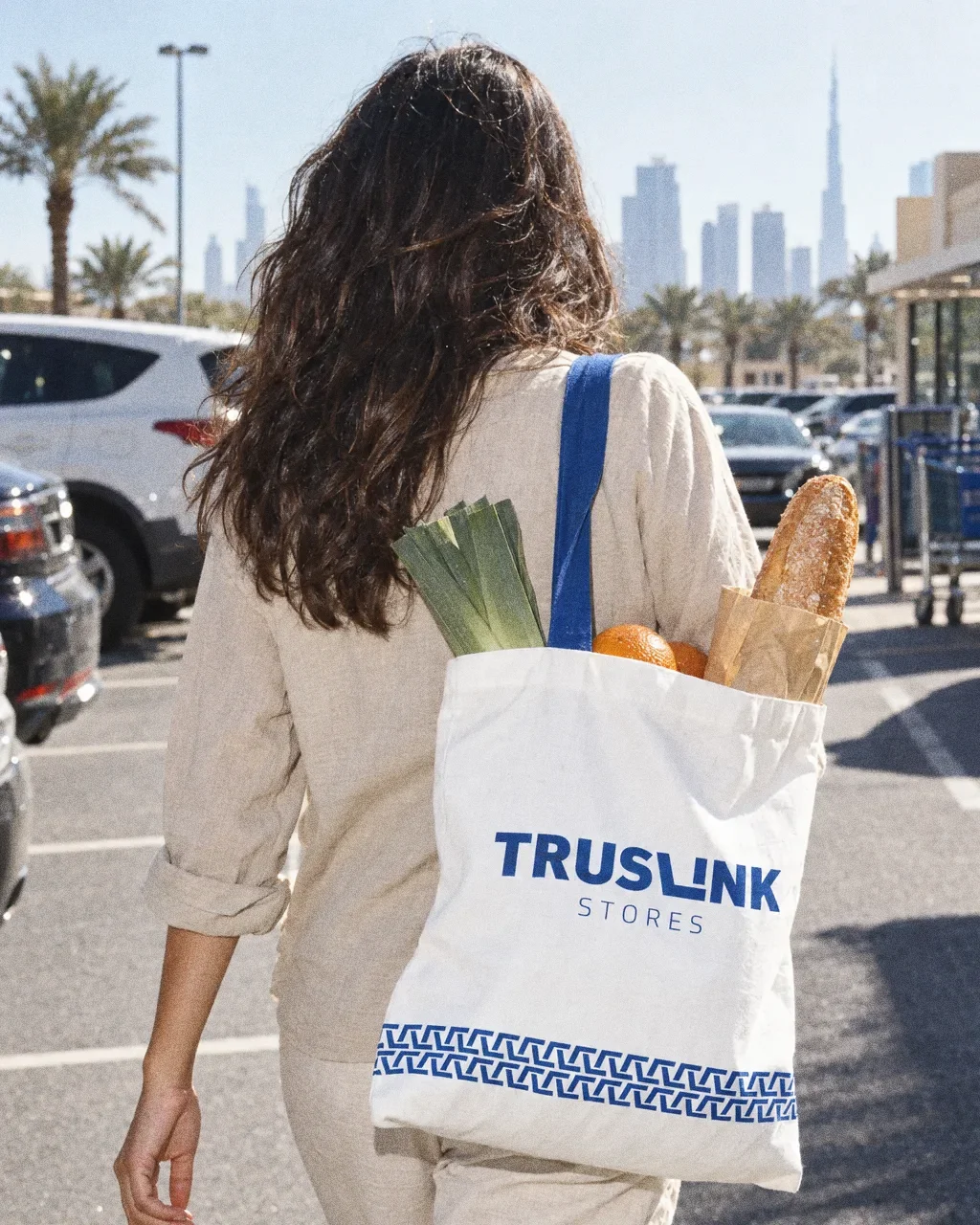
Tote bag across the car parkThe Truslink Stores identity in a lifestyle photograph of a branded tote bag carried through a car park. 
Restocking the shelfThe Truslink Stores identity in a lifestyle photograph of a staff member in uniform restocking shelves. 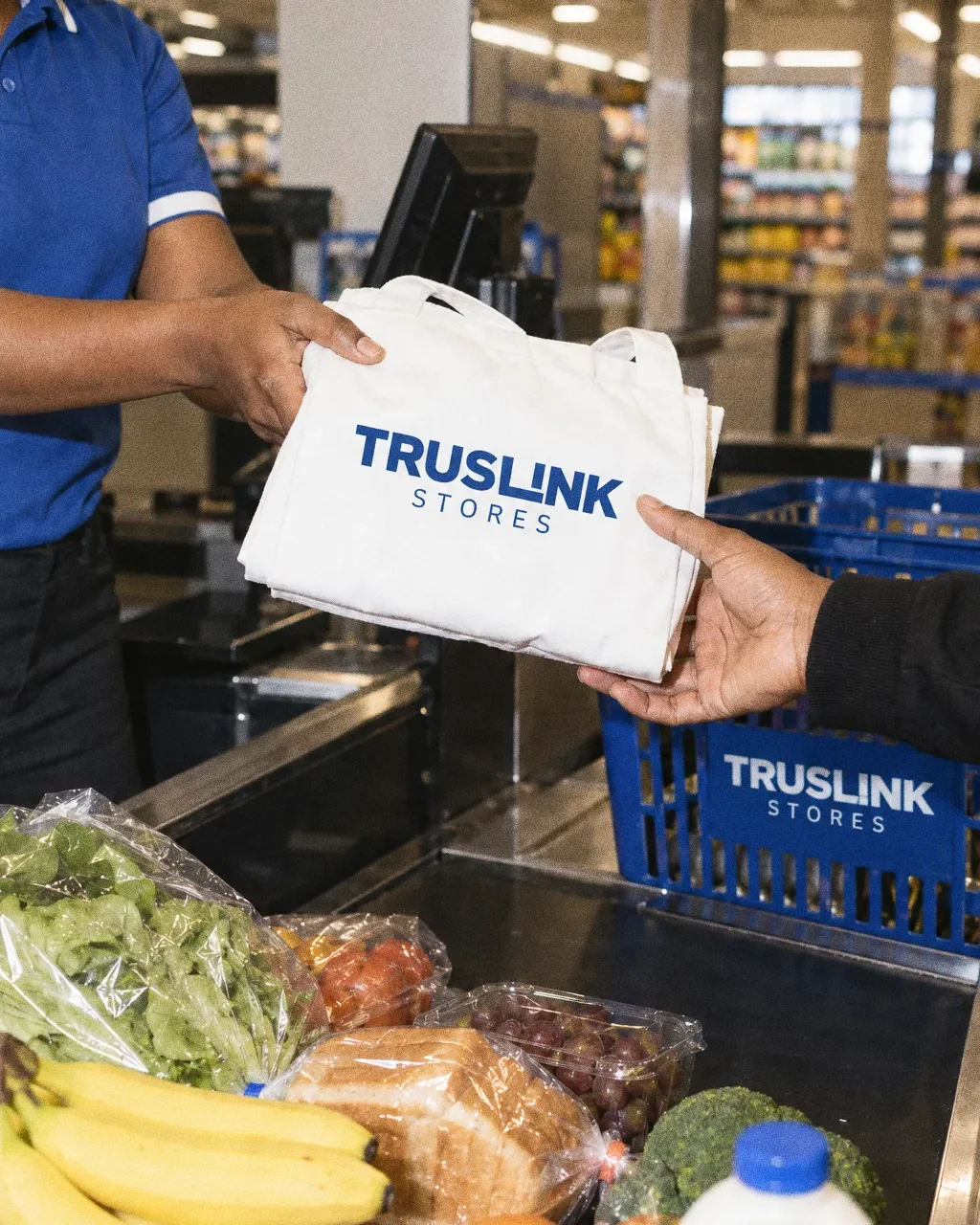
Tote handed over at the tillThe Truslink Stores identity in a lifestyle photograph of a tote bag handed over at a till. 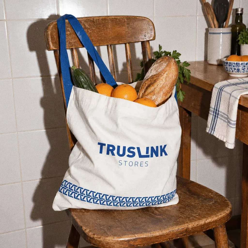
Tote on the kitchen chairThe Truslink Stores identity in a lifestyle photograph of a tote bag of groceries on a kitchen chair. 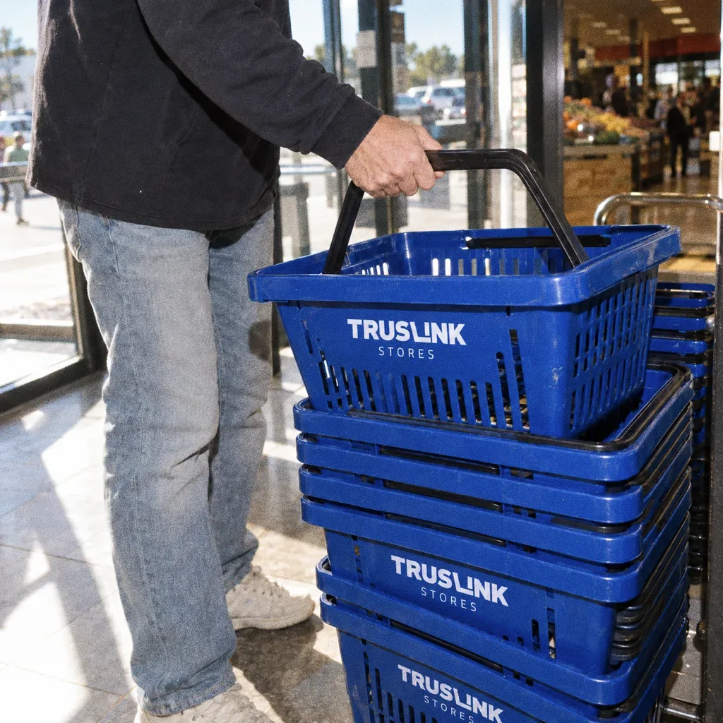
Lifting a basket from the stackThe Truslink Stores identity in a lifestyle photograph of a stack of branded baskets at a store entrance.

Chapter 14
Campaign
About this deck
What we built
A shopping-cart L wordmark, specified blue colour and pattern, with applications for the building, stationery, uniforms, bags and baskets.
About the originals
The original boards are from Abcon’s original project presentation and include application mockups.