
Branding / Distribution
Trusline Distribution
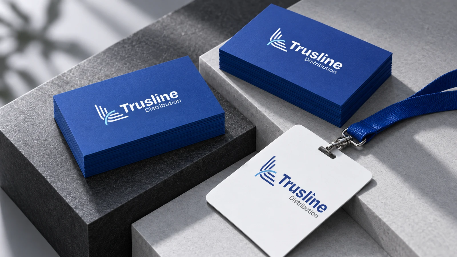
A distribution-company identity with a blue parallel-line emblem and a clear two-line name. The presentation tests the system across colour variants, business cards, a staff card and exterior signage.
Project scope
The original client-supplied presentation documents the identity and its application mockups.
- Emblem and wordmark
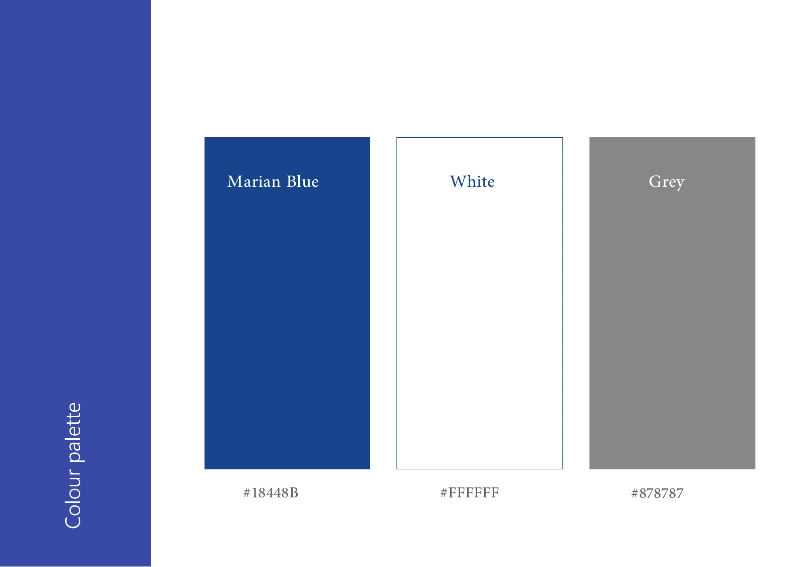
- Colour palette and logo variants
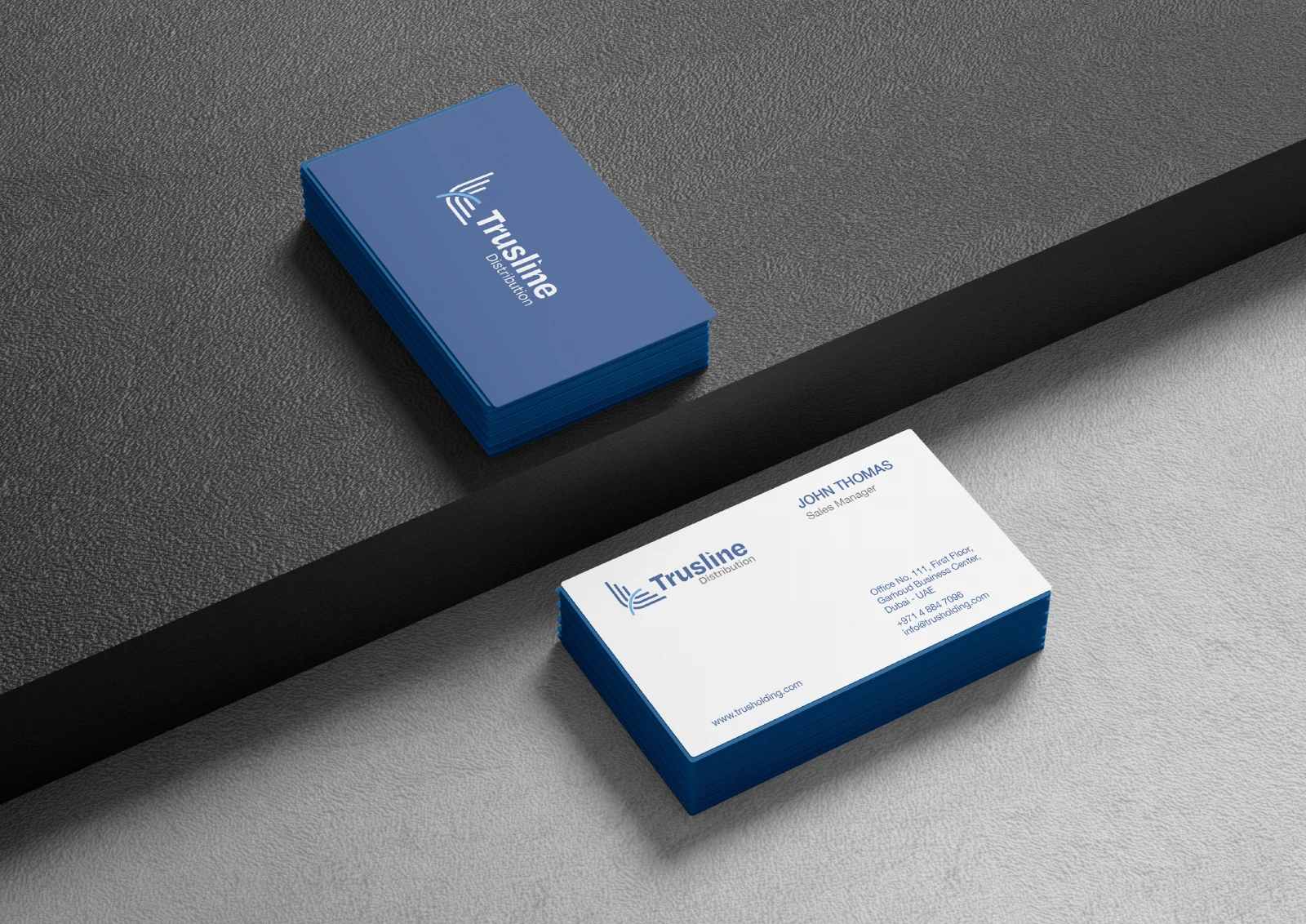
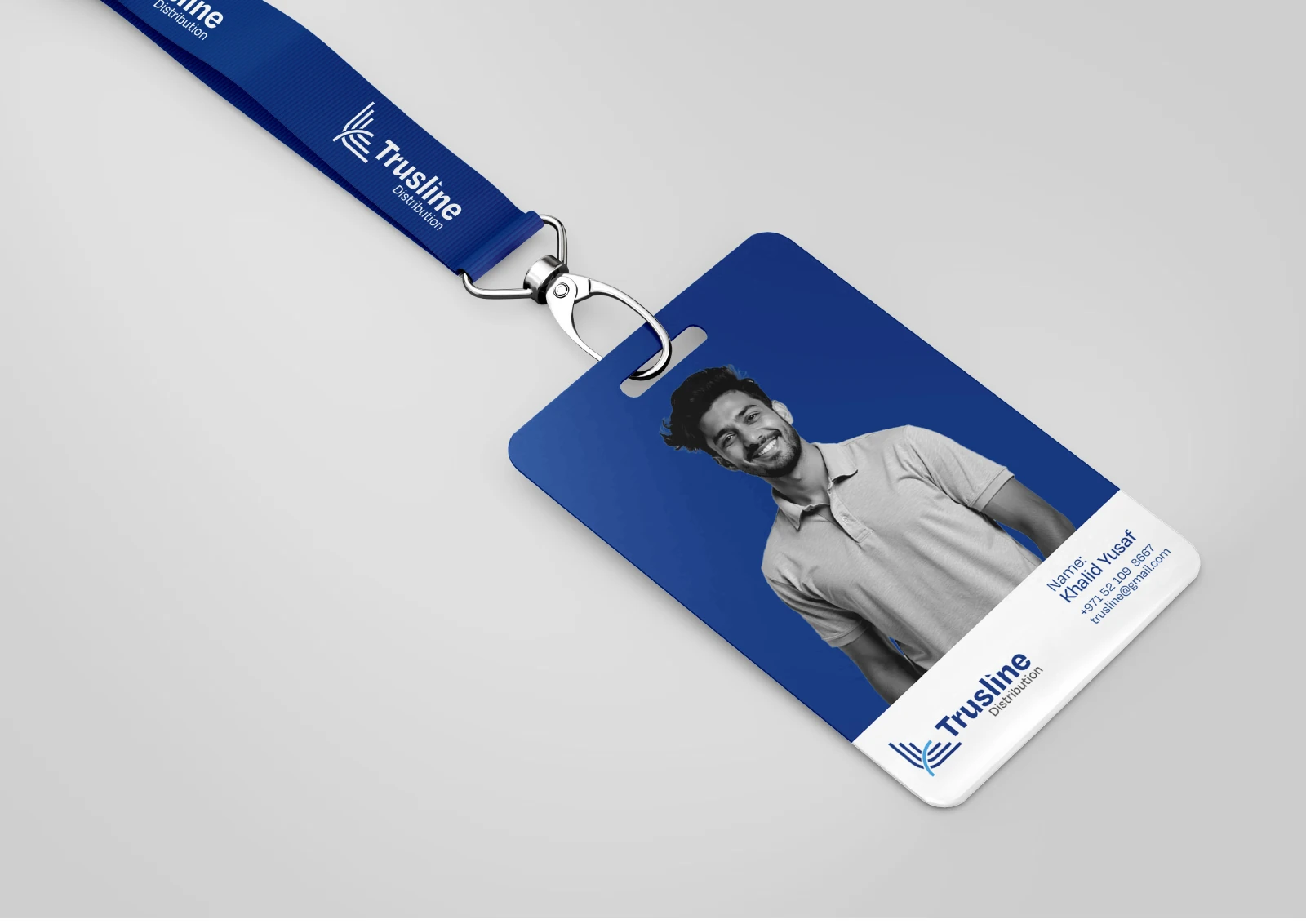
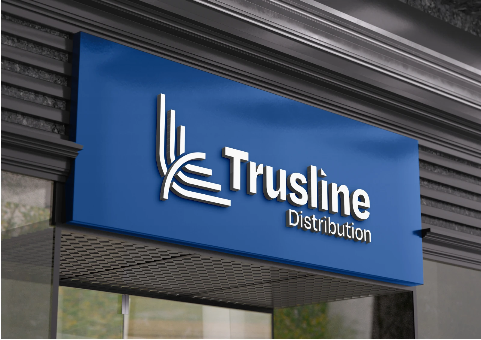
- Business cards, staff identity and signage
How the identity works
The design task
Connect the company name, staff identity and building presence through one consistent visual system, while keeping the symbol distinct from the wider Trus family of brands.
Give parallel strokes a recognisable turn
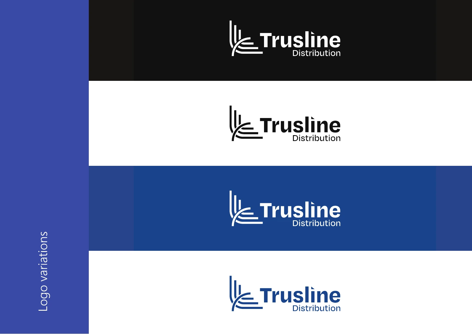
The emblem brings blue parallel strokes around a lighter curved accent. The construction and variant boards keep the form consistent beside the Trusline Distribution wordmark.
See the original boardCarry the identity from the card to the frontage
Blue, white and grey create a restrained corporate palette. The same lockup is used on the business cards, staff identity and building-signage presentation.
See the original boardWhat we built
A corporate identity documented through construction, colour, stationery, staff and signage boards.
The boards below are the original design pages from the supplied PDF presentation, including its application mockups.
Original source: ABCON NEW BRAND PORTFOLIO.pdf


What does your brand need next?
Let’s talk about your project Next projectSara’s Cash & Carry