Branding / Chocolate spread
Choco Moments
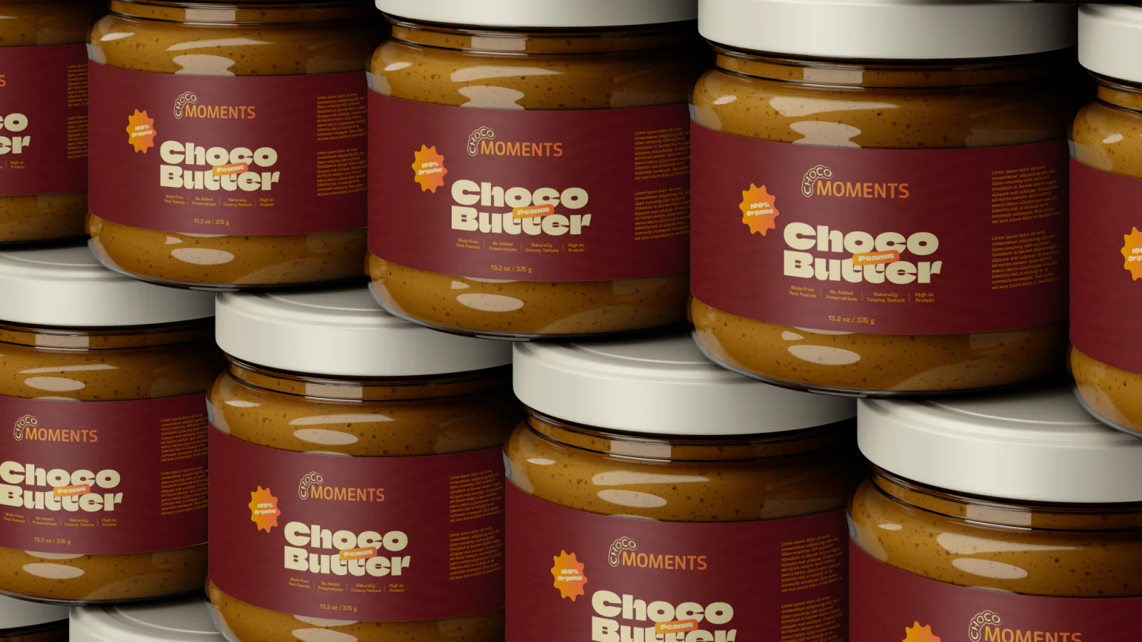
A chocolate-spread identity with playful Choco lettering, a quieter Moments wordmark and a warm palette carried through jars and campaign artwork.
Project scope
- Wordmark
- Colour system
- Jar packaging and campaign artwork
How the identity works
The design task
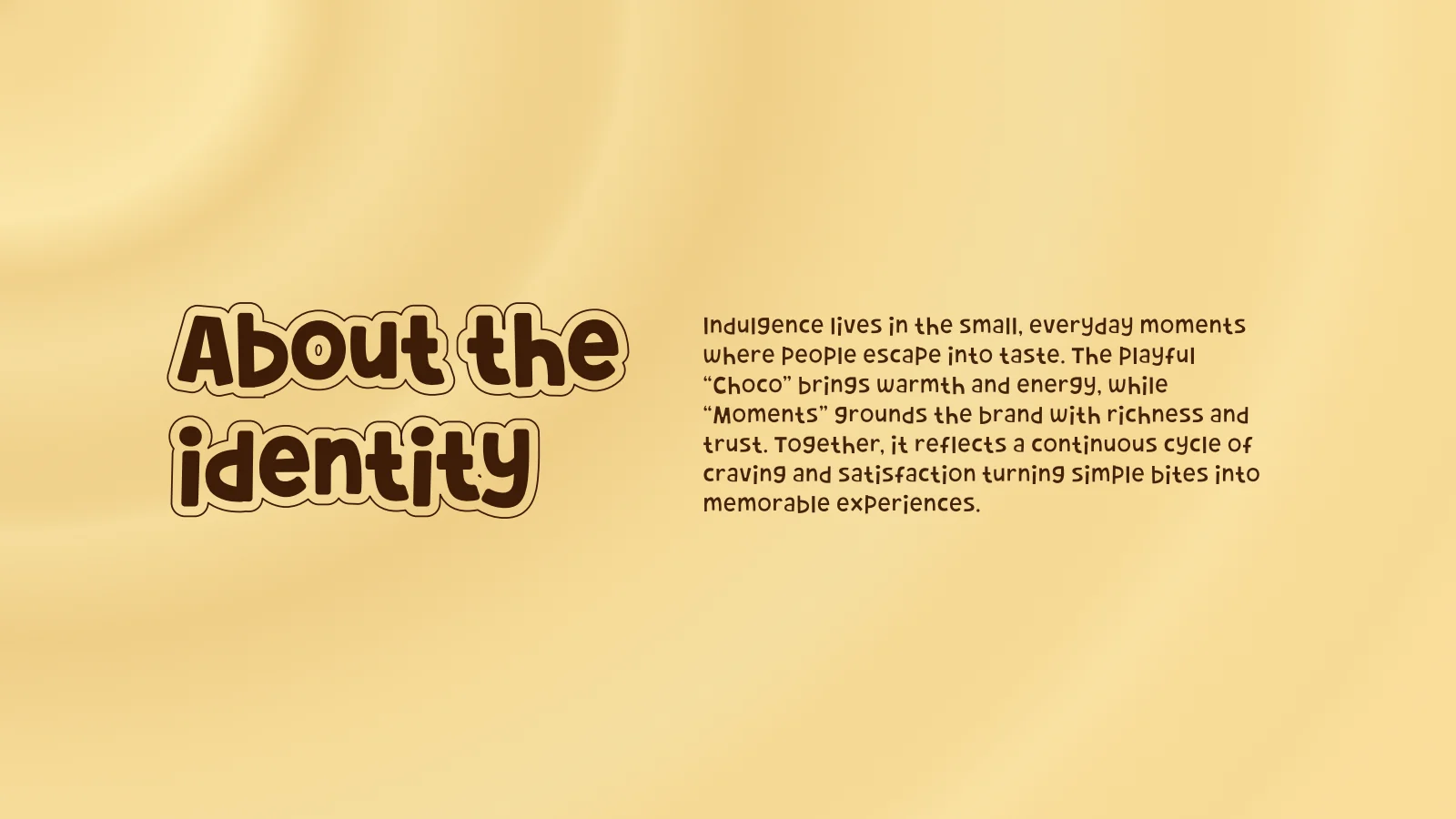
The original identity story centres on small moments of enjoyment. The design task is to give the product an approachable character while keeping the brand and product names distinct.
Balance playfulness with clarity
The outlined Choco lettering curves beside the simpler Moments name. The product labels use a stronger display treatment for Choco Butter while keeping the brand visible above it.
See the original boardCarry one palette through packaging and communication
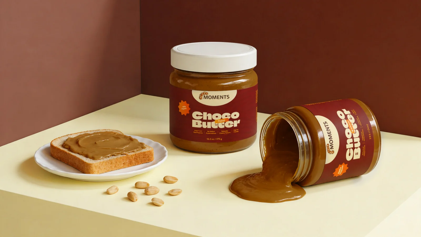
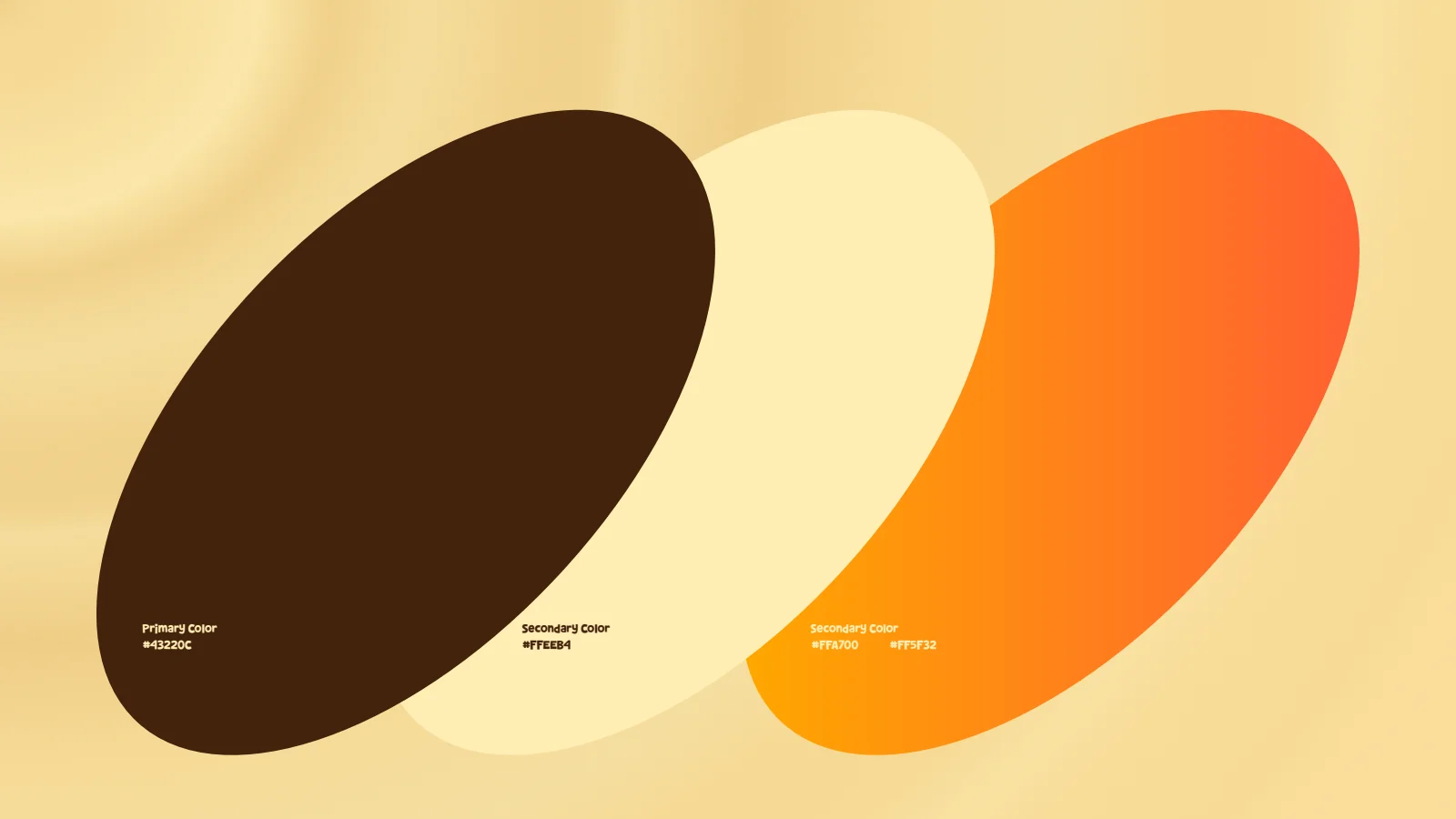
Chocolate brown, cream and warm orange connect the jars with the supplied campaign artwork. The visual continuity comes from the colour and product treatment, not a different logo for each scene.
See the original boardWhat we built
A wordmark system, chocolate-and-cream palette with orange accents, jar-label applications and a family of campaign visuals.
The boards below are the original design pages from the supplied PDF presentation, including its application mockups.
Original source: Choco Moments.pdf




What does your brand need next?
Let’s talk about your project Next projectJumanah Foods