
Branding / Food products
Afdal Foods
A bilingual food identity that connects an Arabic-led mark with a warm gold-and-burgundy palette and a coordinated rice-packaging presentation.
Project scope
- Bilingual identity
- Colour system
- Rice packaging applications
How the identity works
The design task
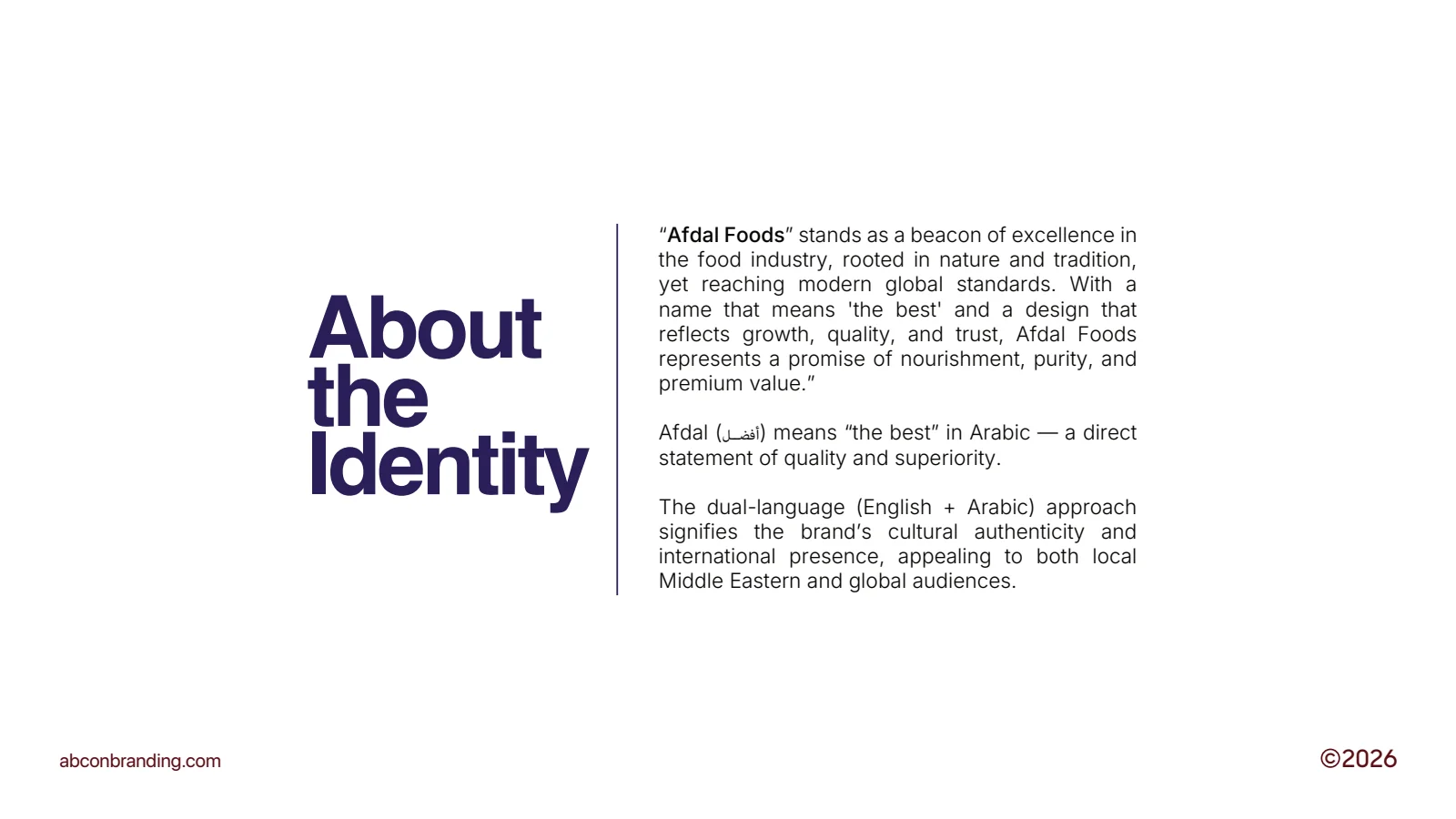
The supplied brief connects Afdal’s Arabic name with quality, nature and tradition. The design task is to bring that idea into a bilingual identity that remains recognisable on the pack.
Let the two languages belong together
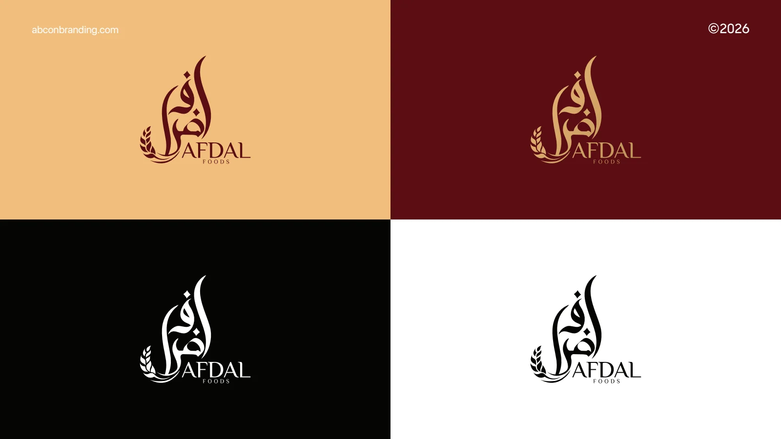
The mark leads with an expressive Arabic form above the English Afdal Foods name. Colour and monochrome versions preserve that structure rather than treating the scripts as separate identities.
See the original boardConnect the identity with the product
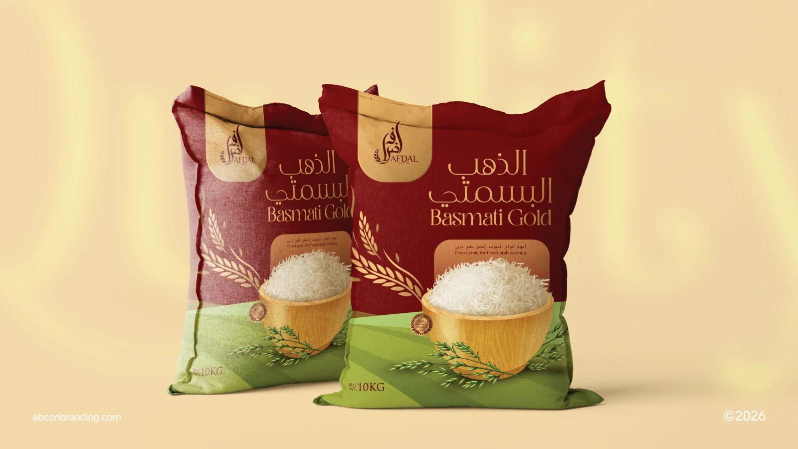
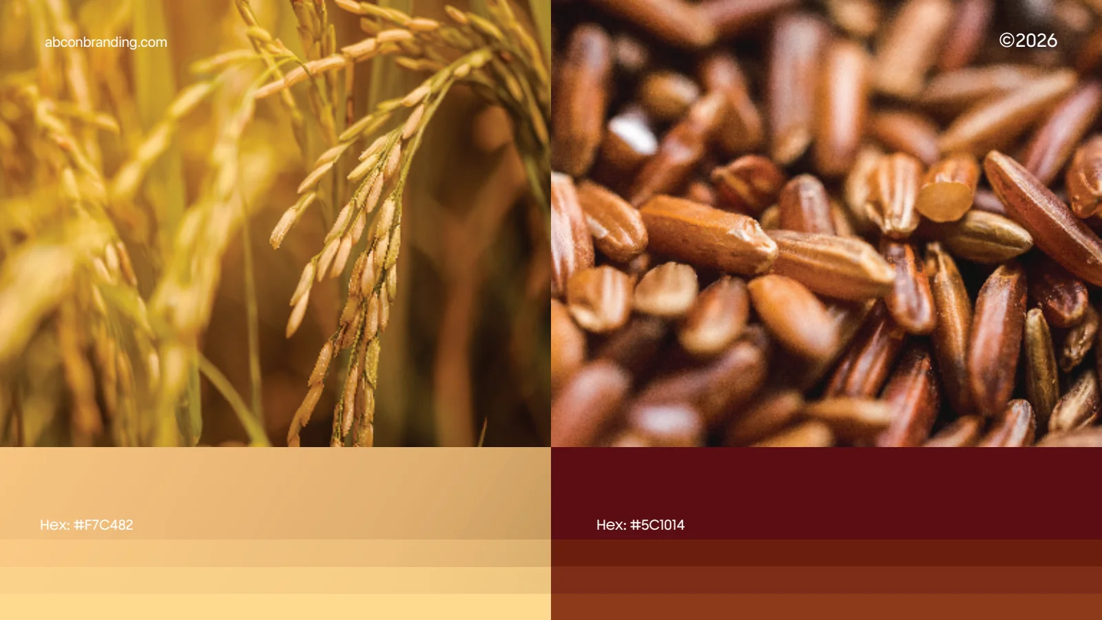
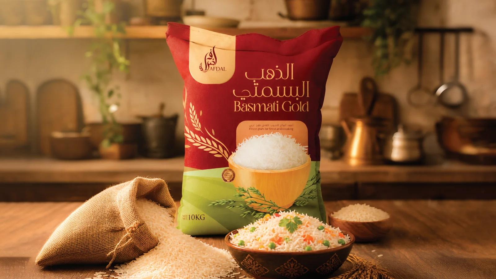
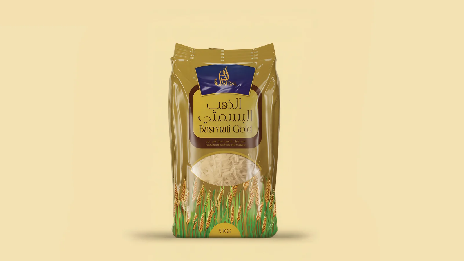
The presentation pairs warm gold and burgundy with grain imagery. The rice-pack designs carry the same identifying mark into different pack formats.
See the original boardWhat we built
A coordinated logo system, gold-and-burgundy colour specification and rice packaging applications, shown in studio and kitchen mockups.
The boards below are the original design pages from the supplied PDF presentation, including its application mockups.
Original source: AFDAL BRANDING.pdf
Illustrative applications
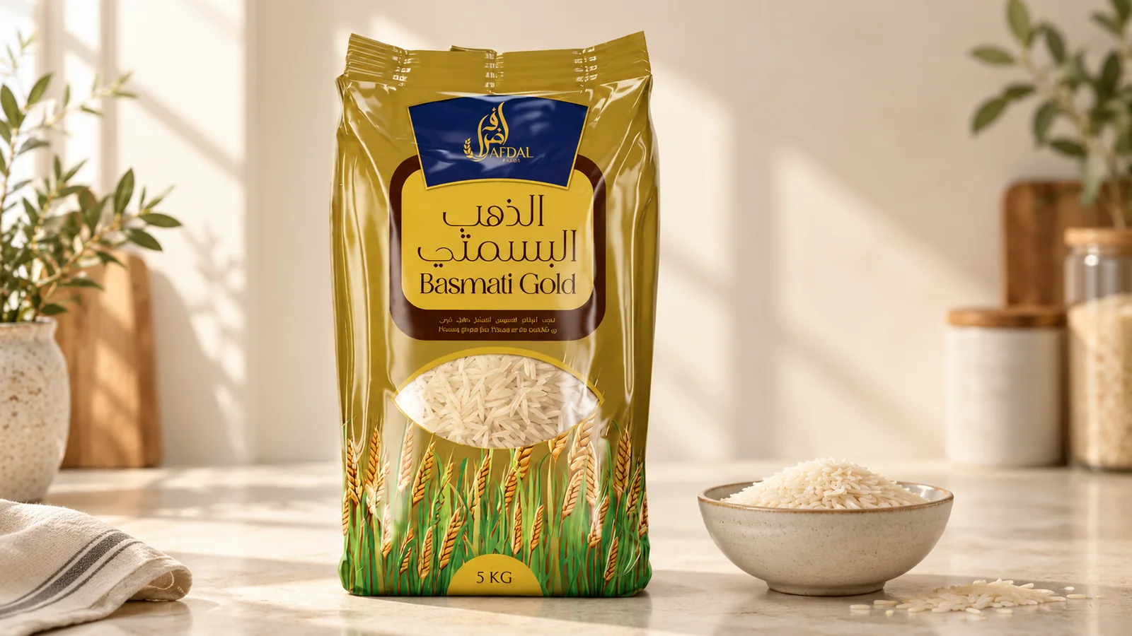
The visual system in context
Additional scenes explore the design using the original project materials.
What does your brand need next?
Let’s talk about your project Next projectChoco Moments