Food products
Ideal
Ideal brand film. Motion film made from the original Ideal identity boards and brand applications.
Overview
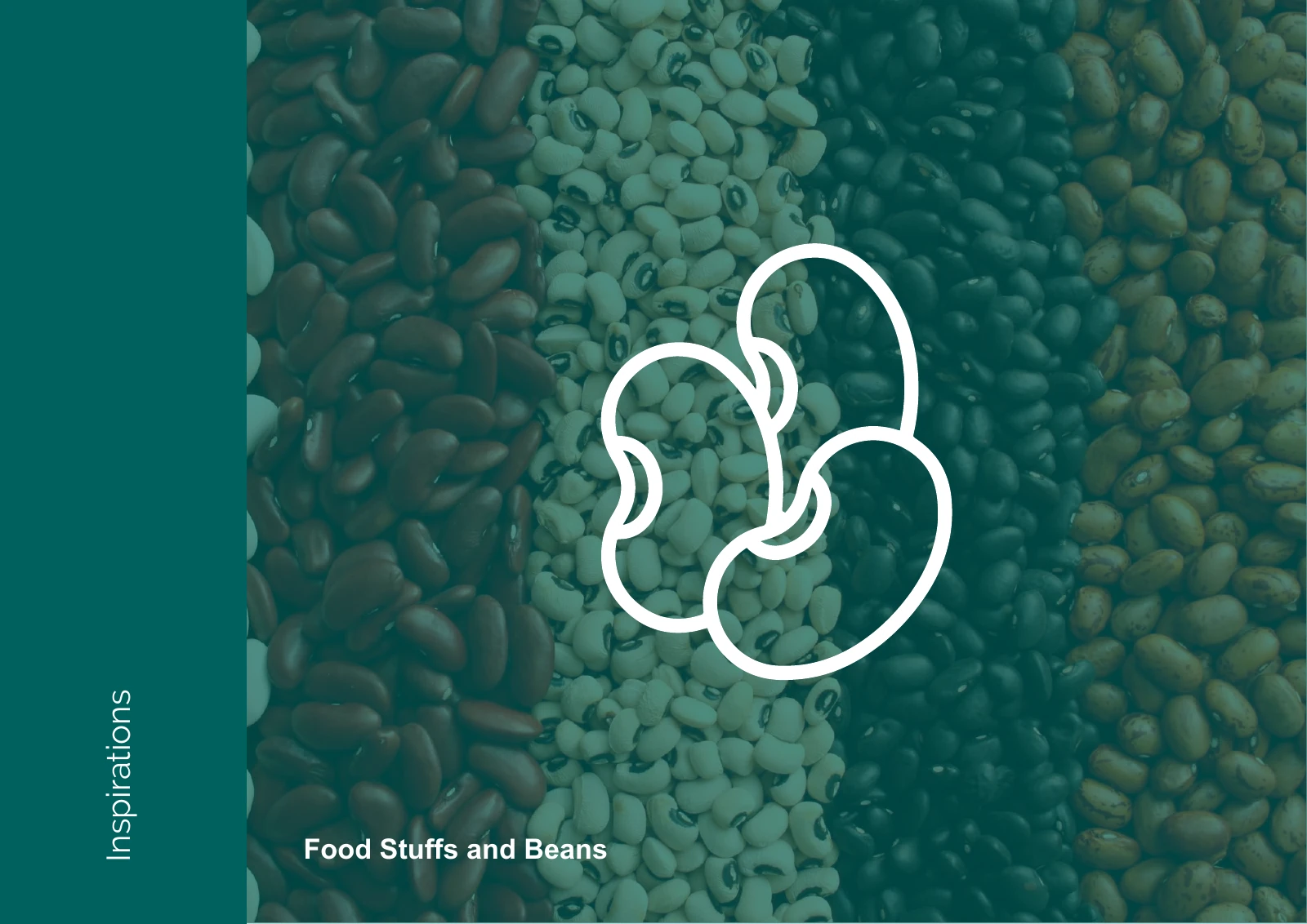
An identity for Ideal Food Choice, a food-stuffs and beans brand.
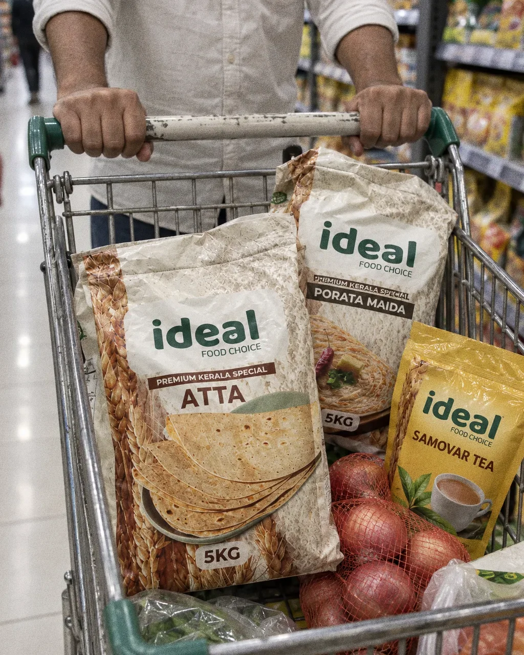
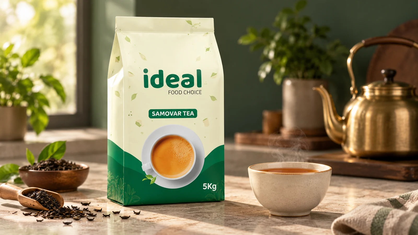
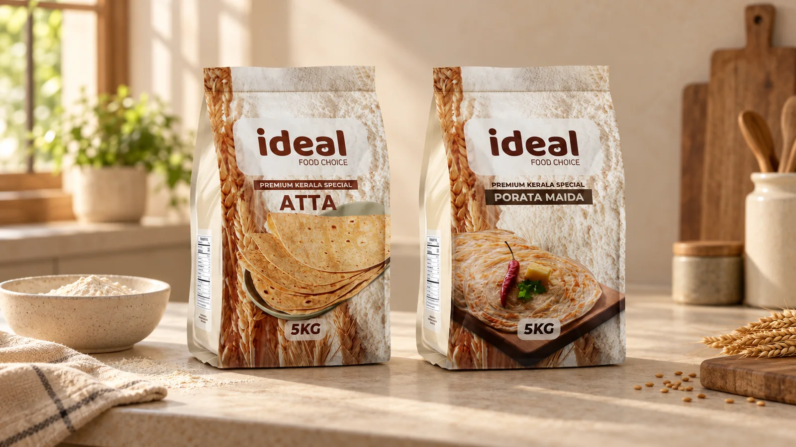
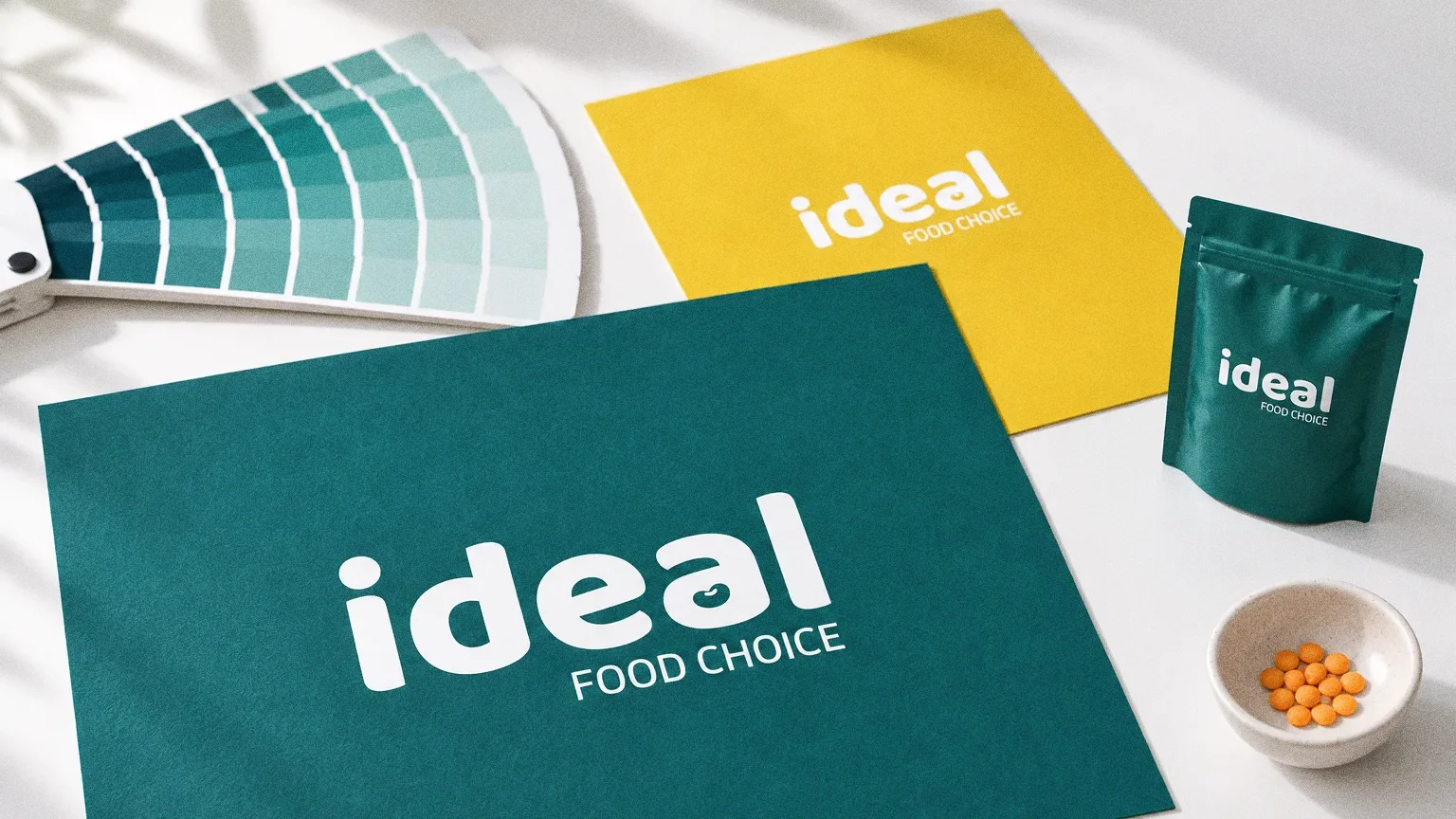
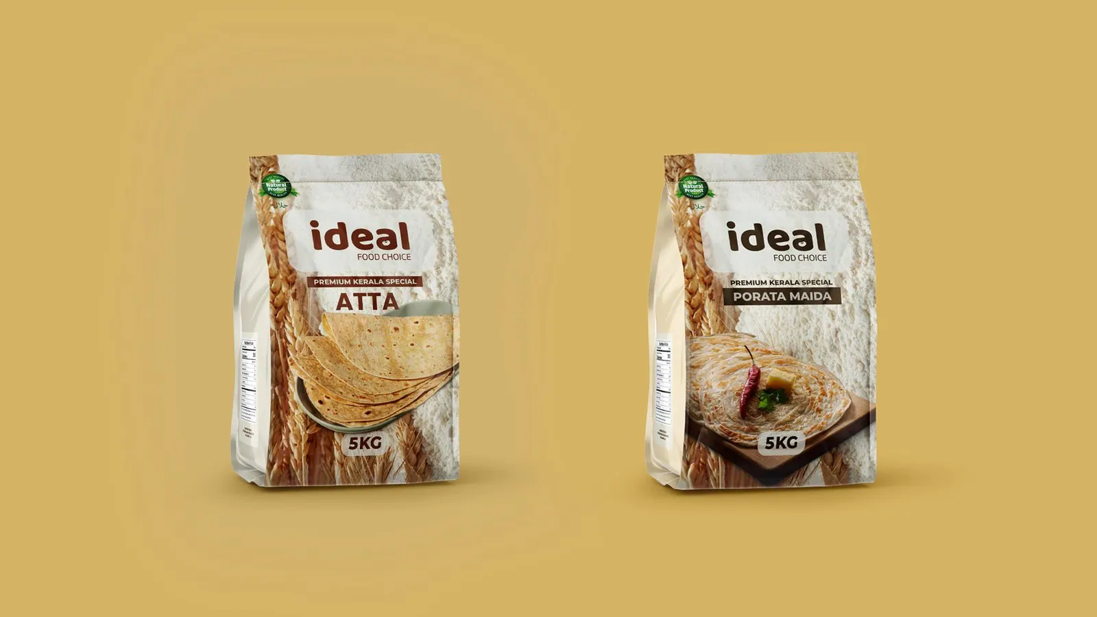
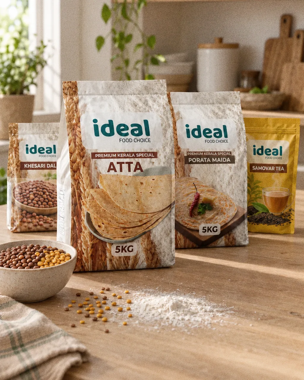
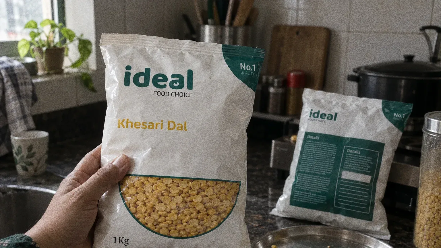
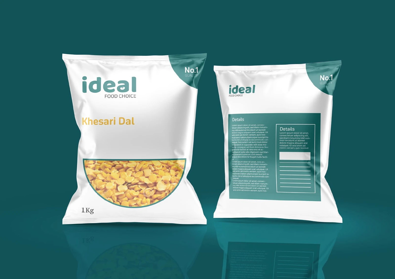
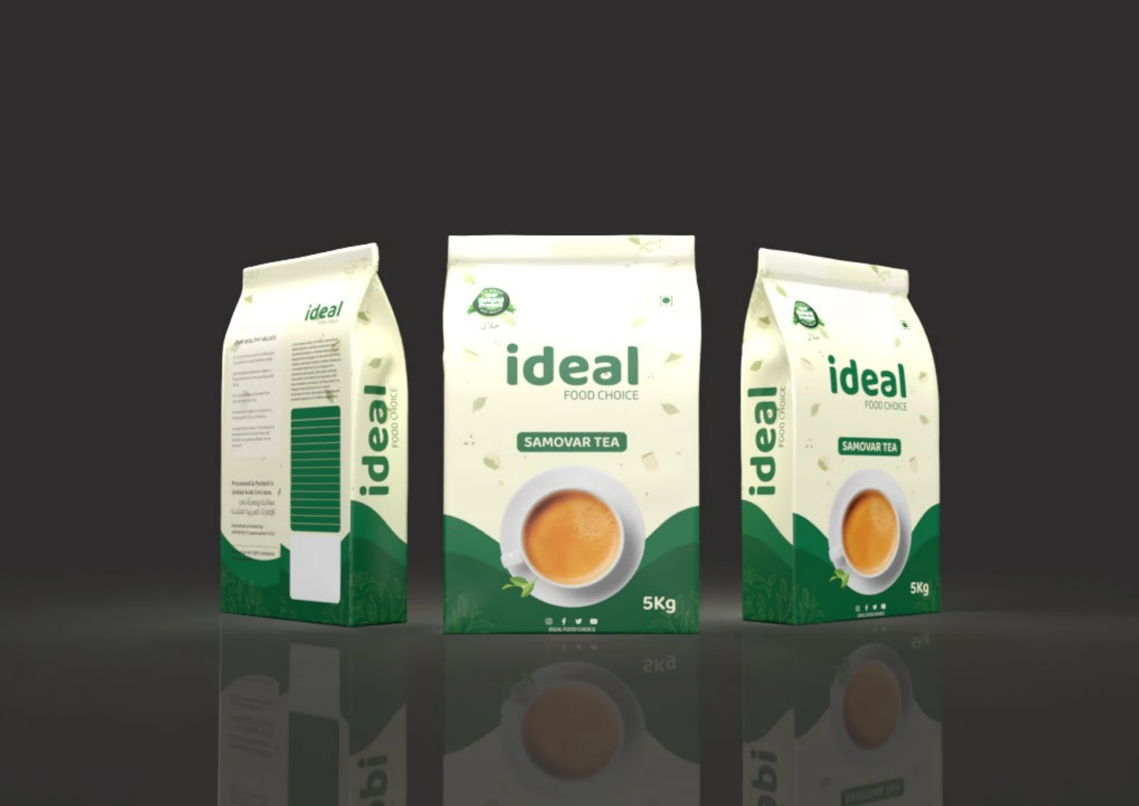
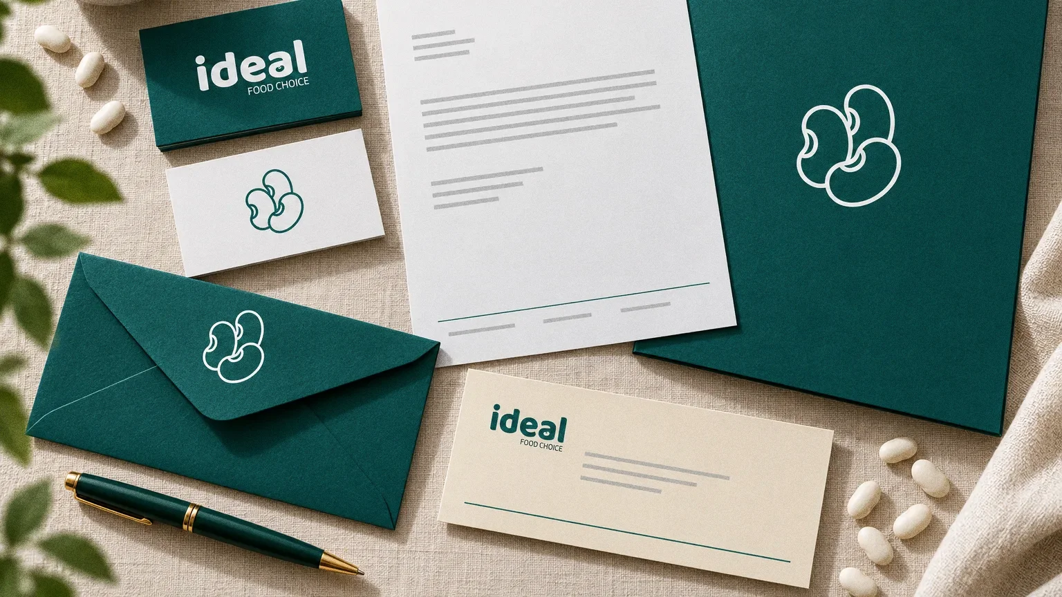
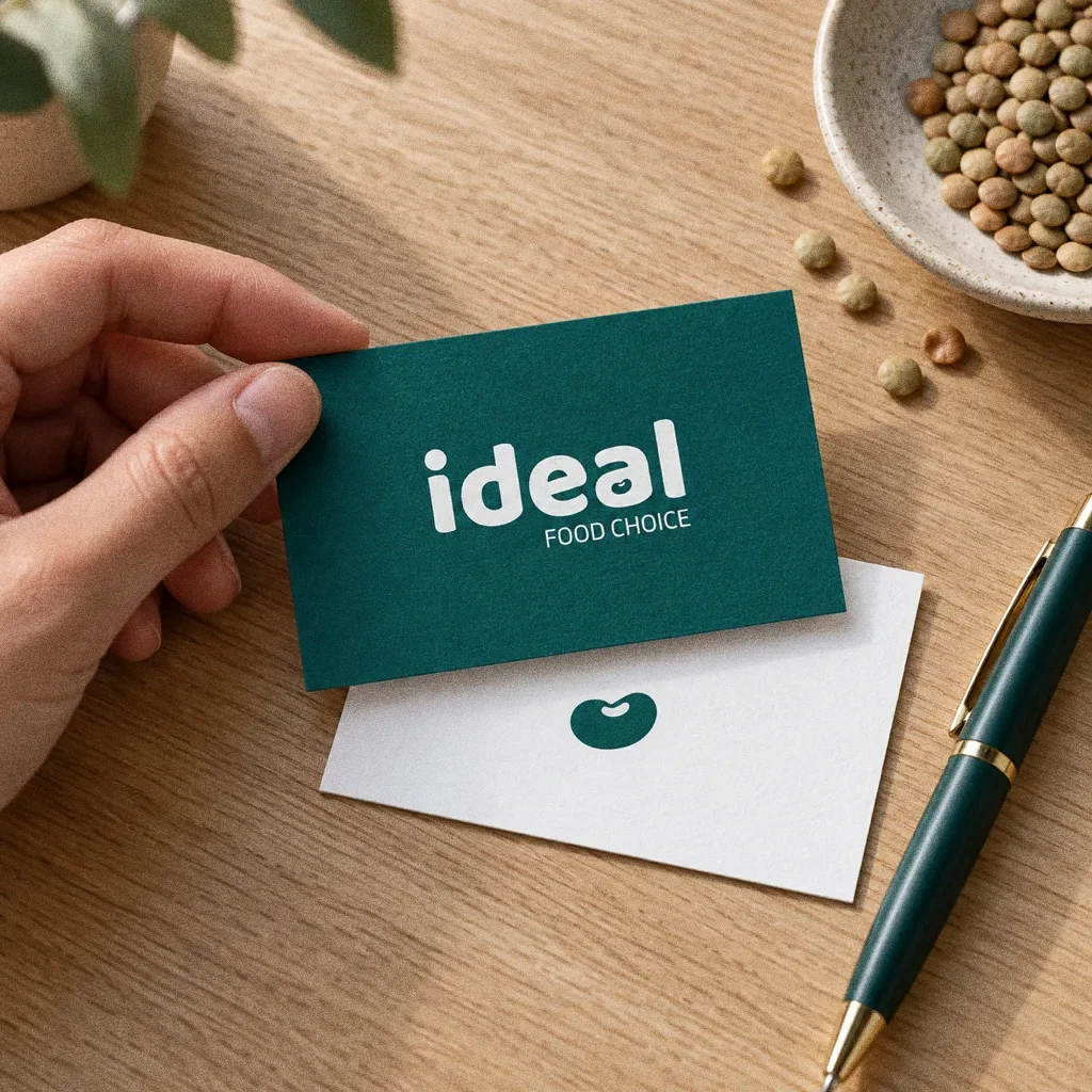
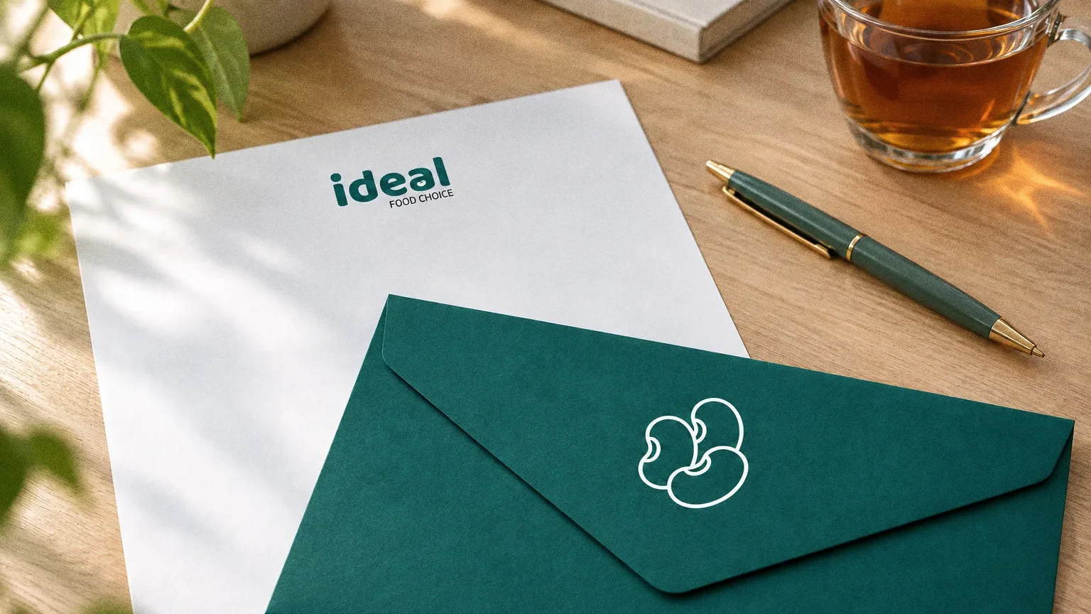
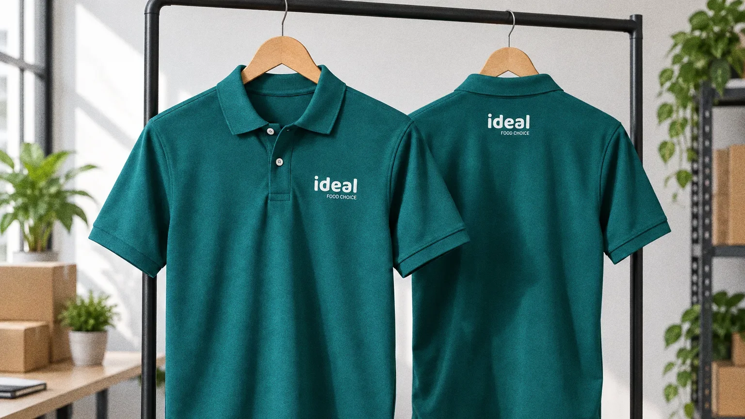
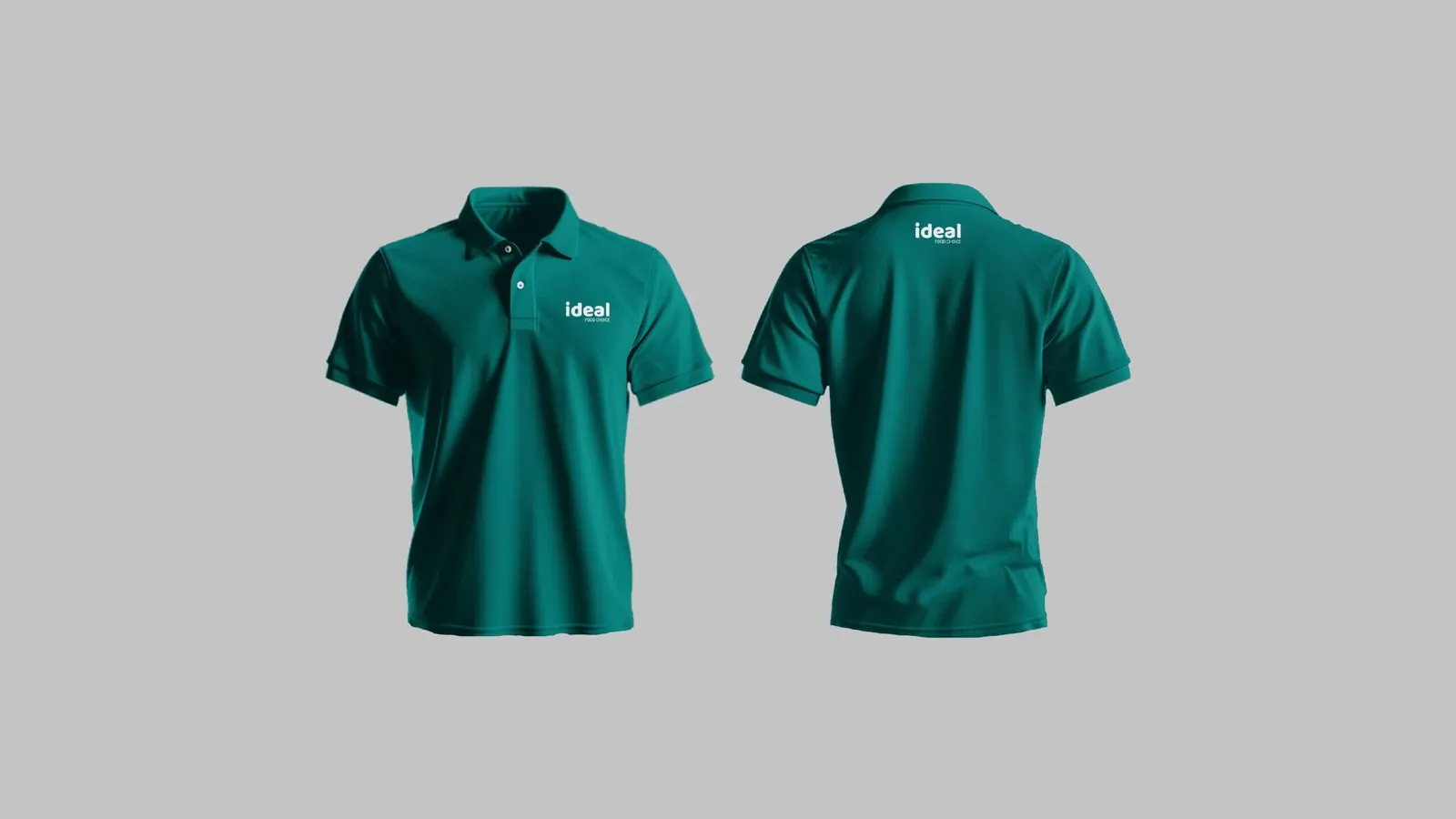
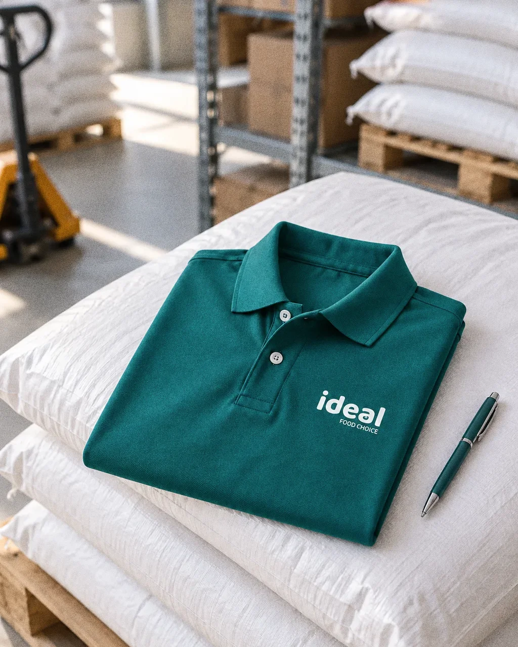
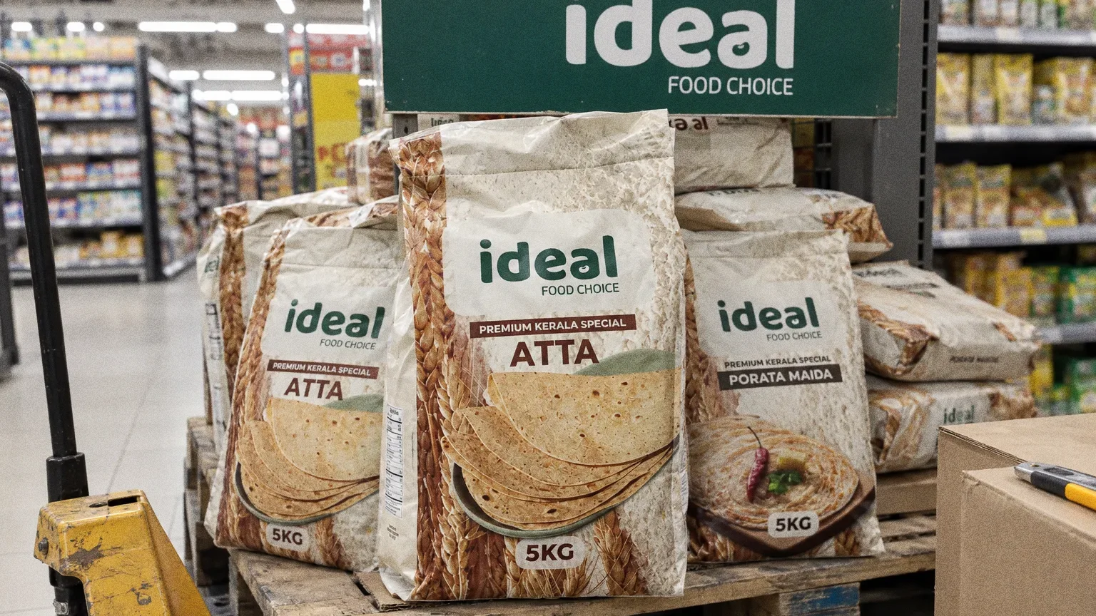
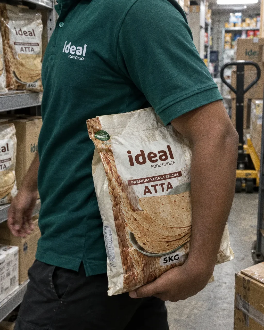
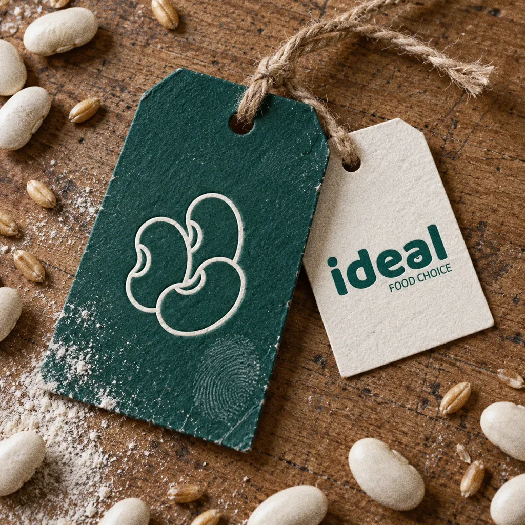
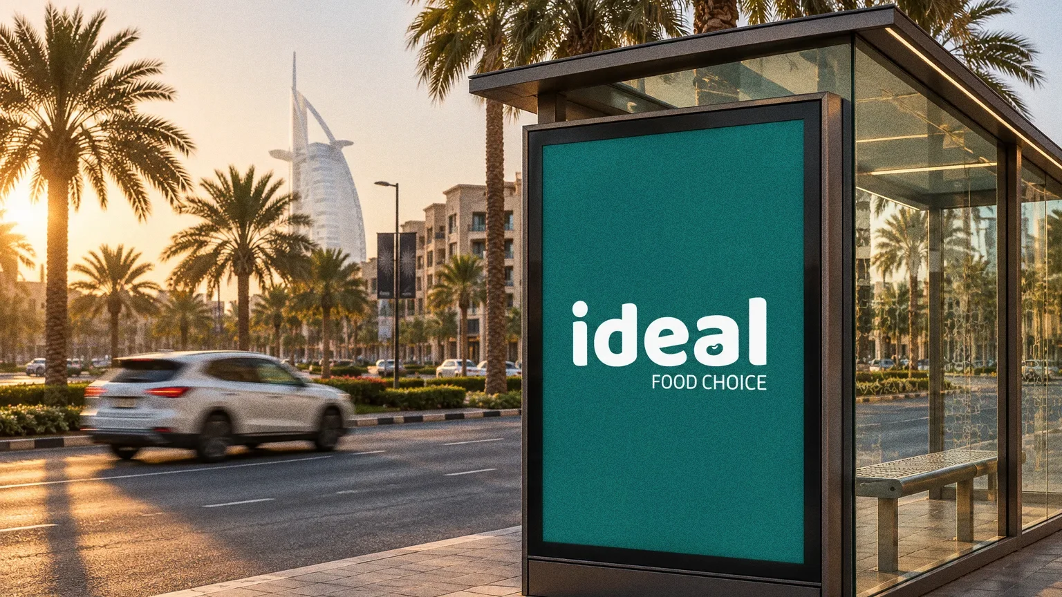
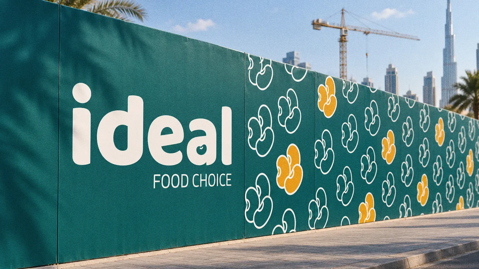
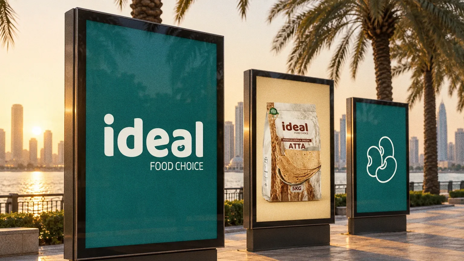
The wordmark sits on a deep green (#01625D), with a bean outline as the inspiration. The presentation sets a two-typeface system, then applies it to retail packs, including 5 kg atta and porata maida bags, and staff polo shirts.
BriefA food range needs to identify the brand while leaving room to tell products apart. The design task is to give the name a consistent presence across packaging with different product images and backgrounds.
Services
Scope
- Wordmark
- Colour and type system
- Retail packaging and uniforms
Sources
How to read this deck
The deck pairs the client’s original presentation boards with new application scenes that show the identity in use.
Some of the older boards have been redrawn. Each one sits where the original stood, with the real original design in its corner and a View original button to open it in full.
Chapter 01
Concept and inspiration
Chapter 02
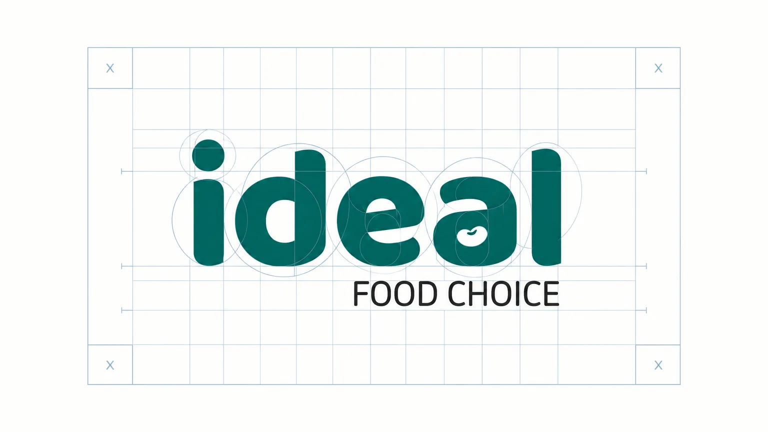
How the logo was formed
Chapter 03
The logo
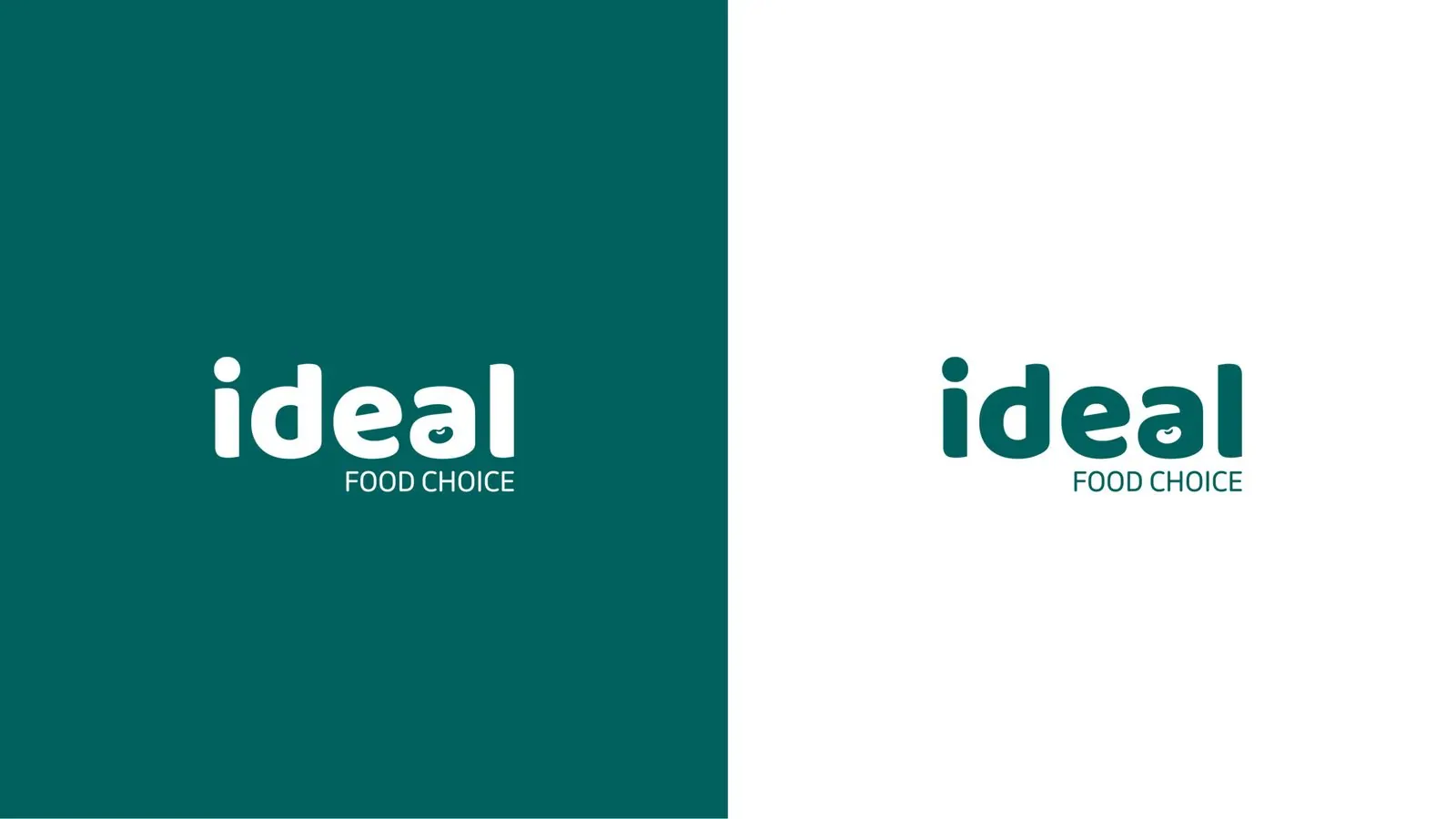
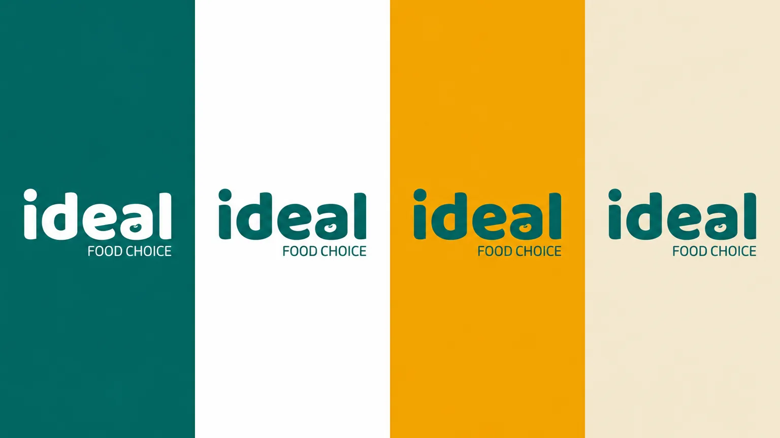
Food and bean imagery informs Ideal's lowercase wordmark and Food Choice descriptor, shown in green and in reversed versions.
From beans to a brand
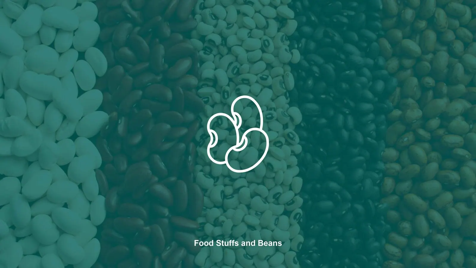
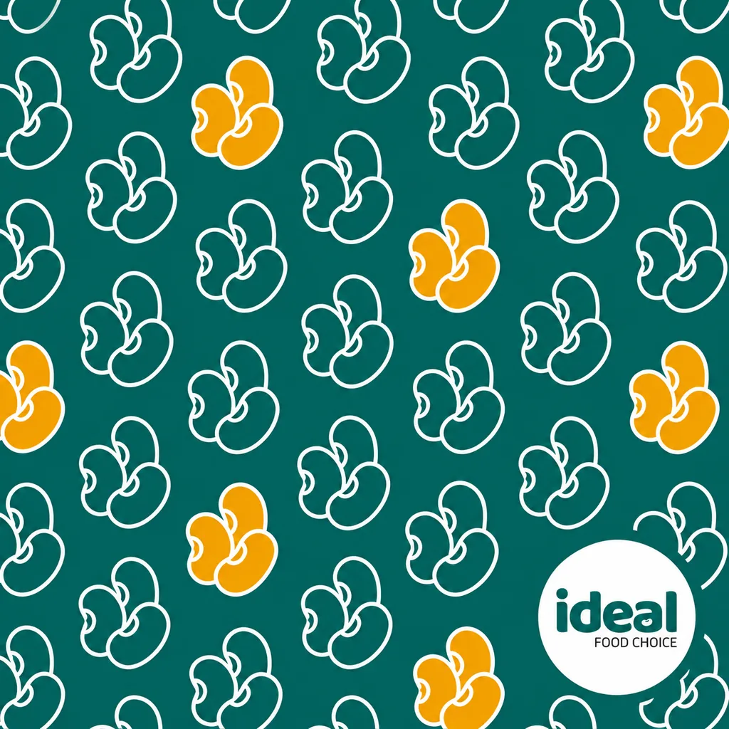
The inspiration board places a bean outline over a field of beans under the line "Food Stuffs and Beans". The wordmark keeps the same rounded character.
Chapter 04
Logo variations

Chapter 05
Colour
- Accent
#01625D - Surface
#01403D - Ink
#FFFFFF
Colours sampled from the original identity boards.

Chapter 06
Typography
Built for the shelf
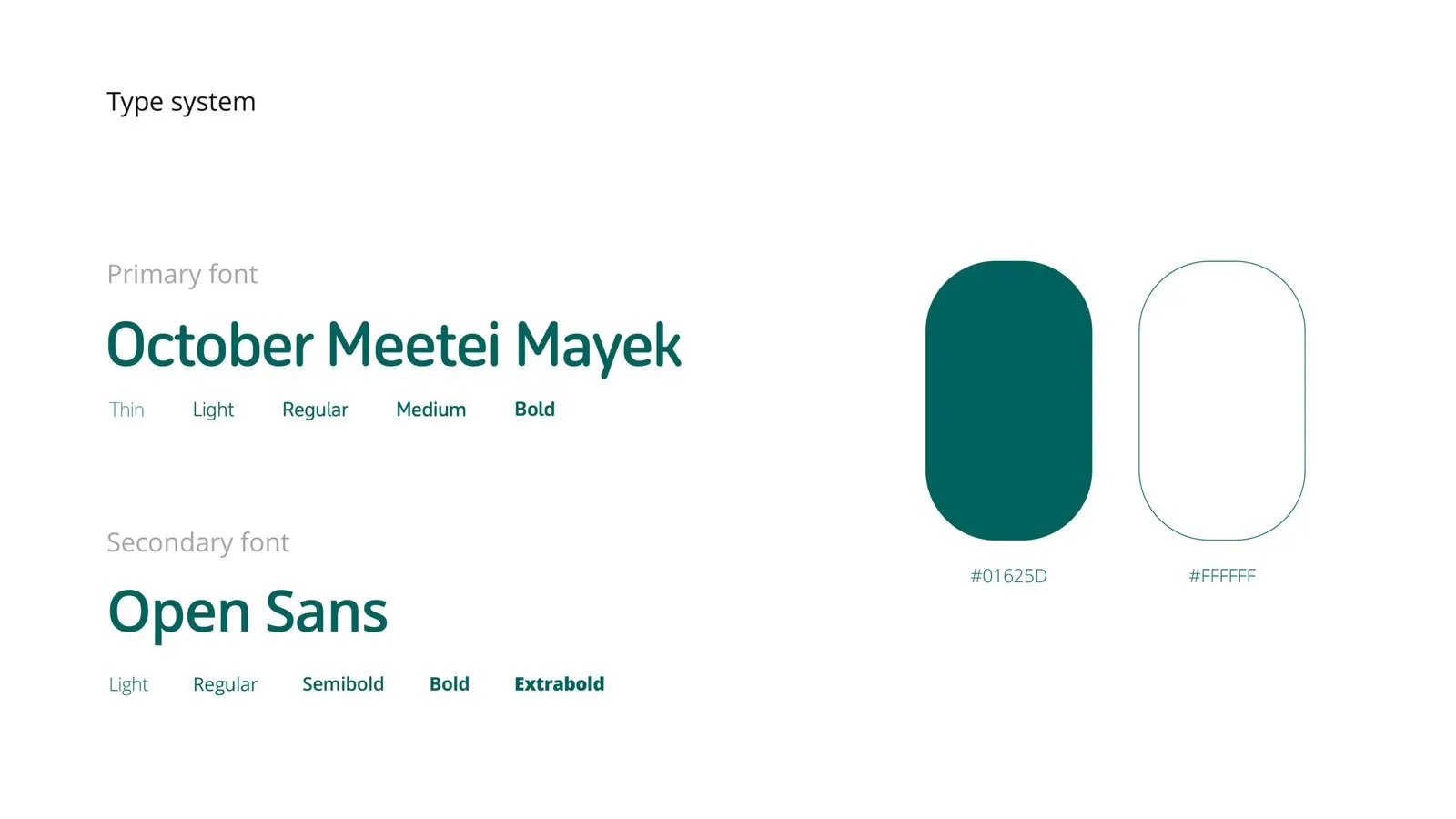
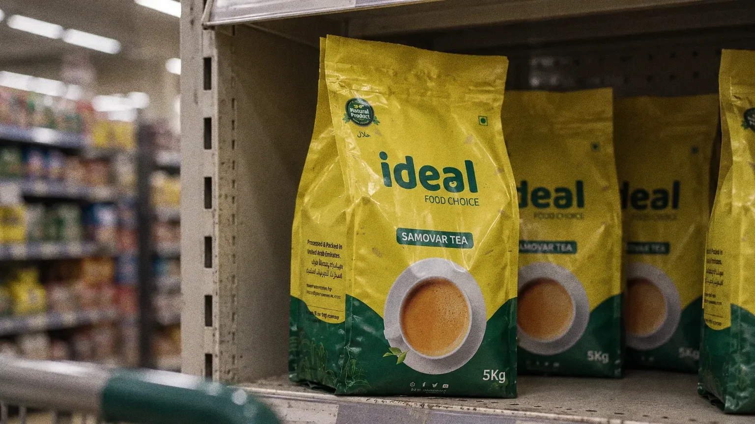
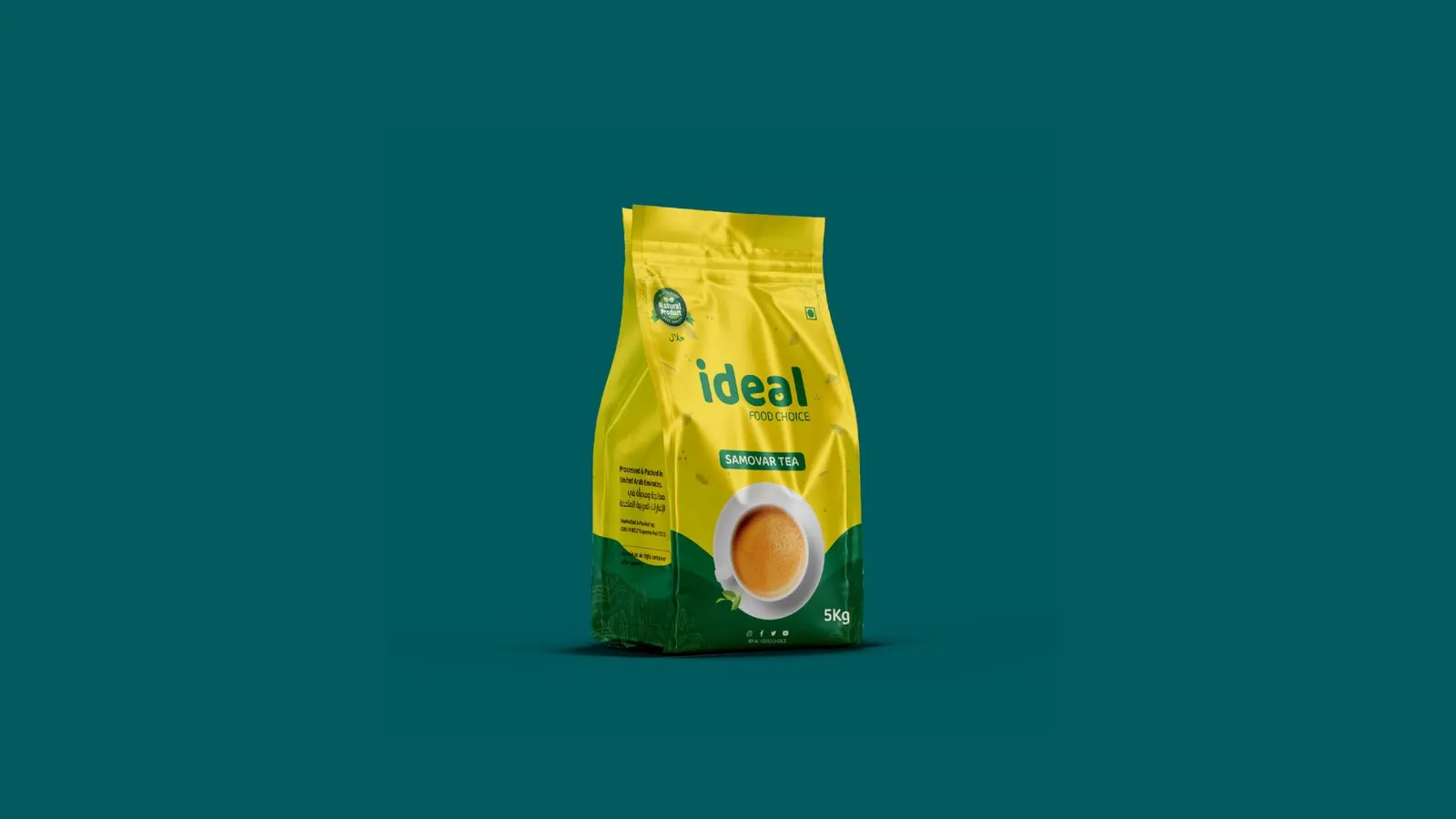
The type system pairs October Meetei Mayek with Open Sans and two colours, #01625D and white. The packs then switch background colour and imagery by product while keeping the green logo panel.
Chapter 07
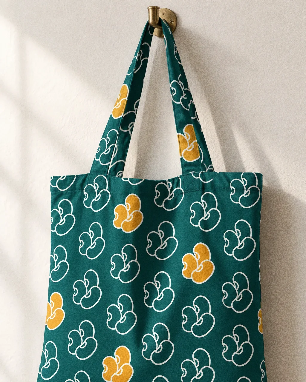
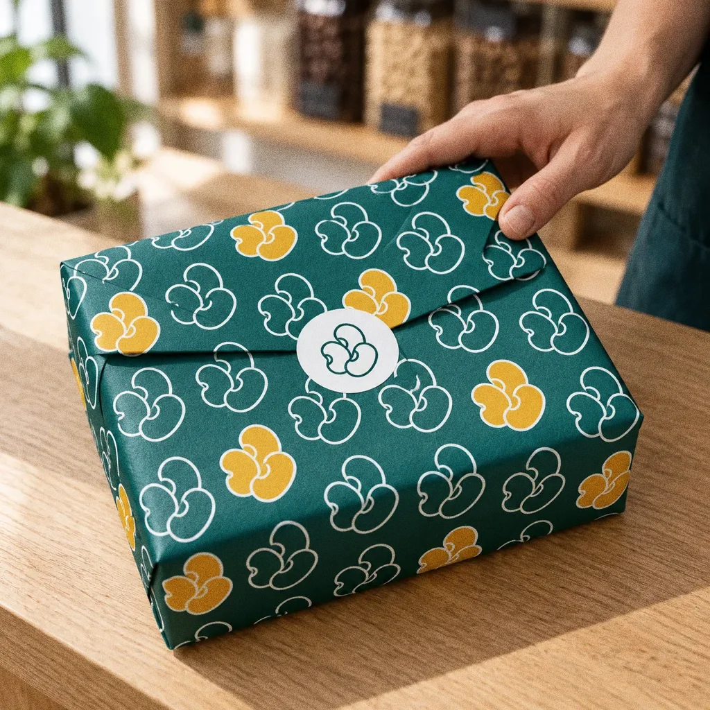
Pattern and graphic elements
Chapter 08
Packaging
Chapter 09
Stationery
Chapter 10
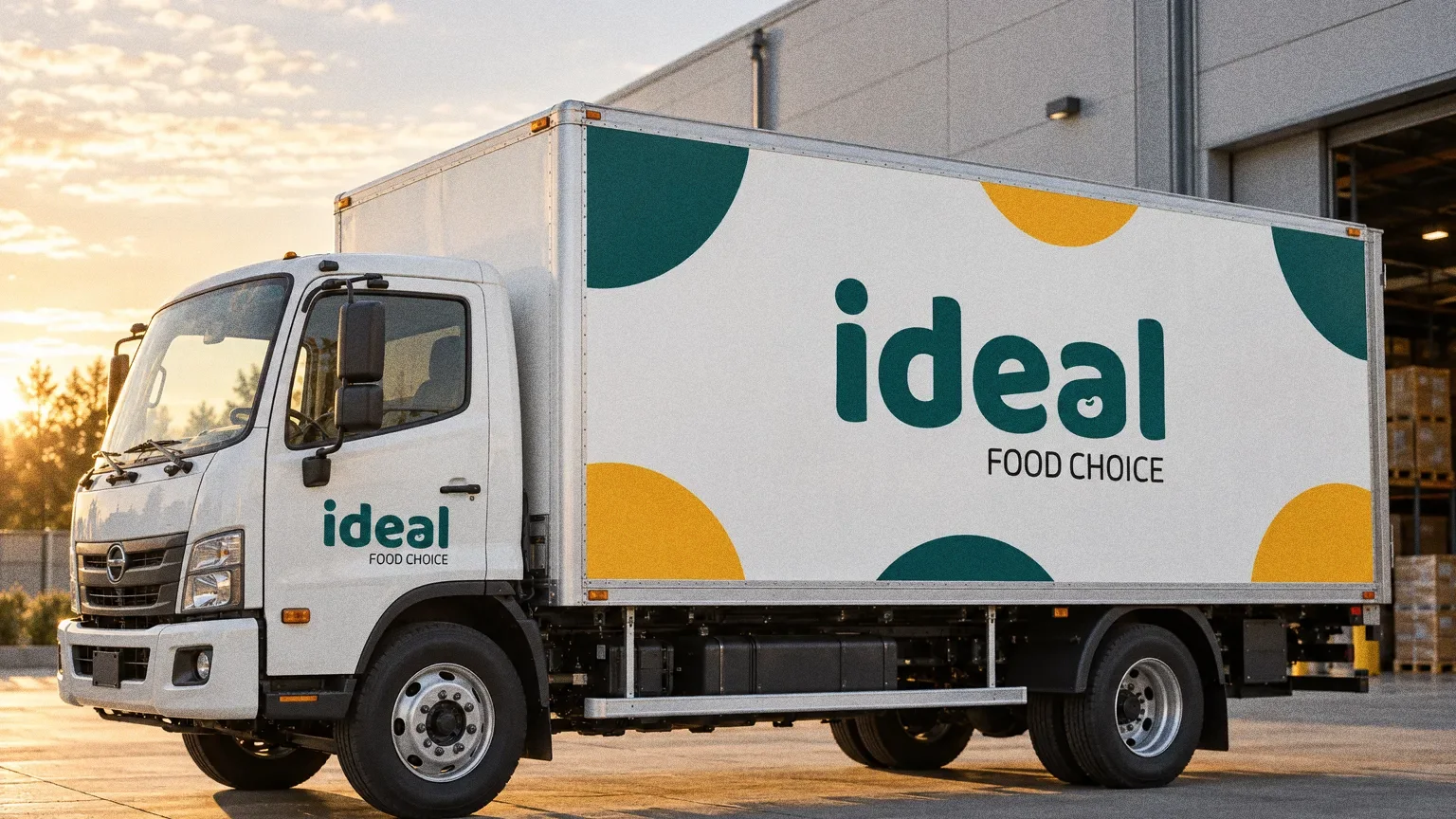
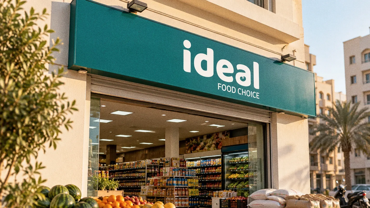
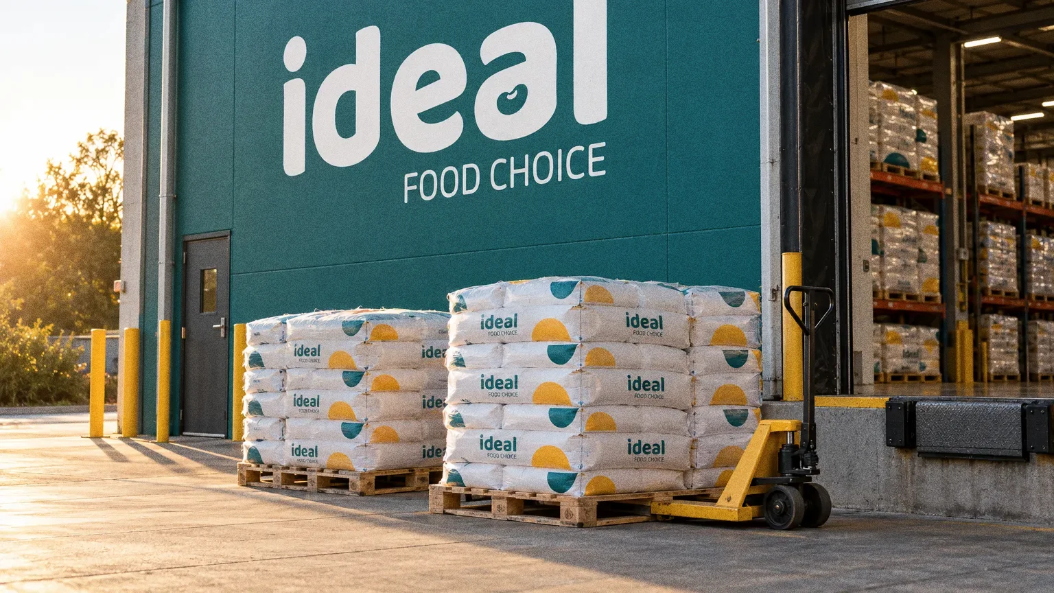
Signage and spaces
Chapter 11
Uniforms and merchandise

Chapter 12
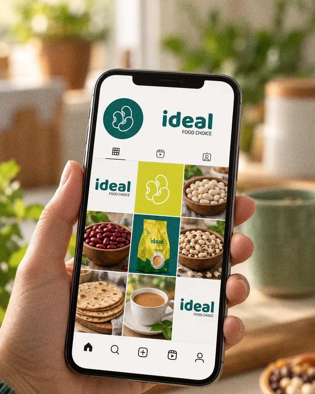
Digital
Chapter 13
The brand in the world
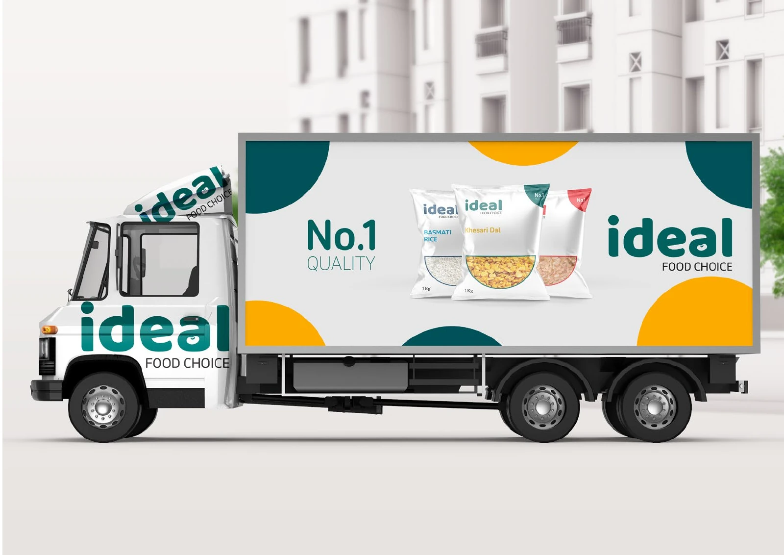
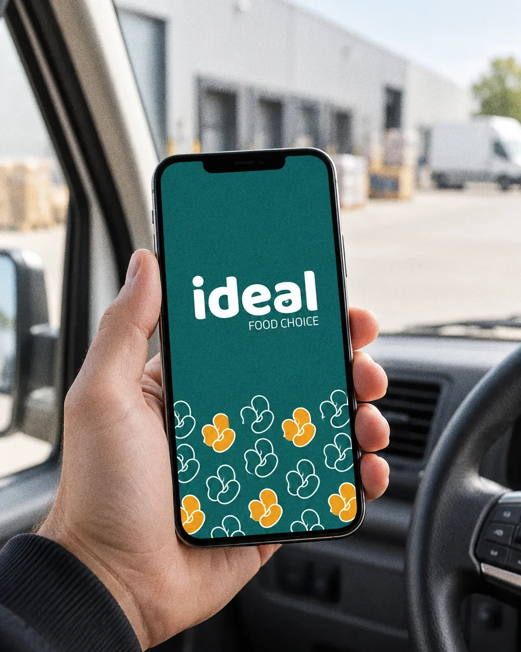
The source includes retail flour and tea packs, staff polo shirts, and delivery-truck graphics that combine the wordmark with product-pack imagery.
Chapter 14
In people’s hands
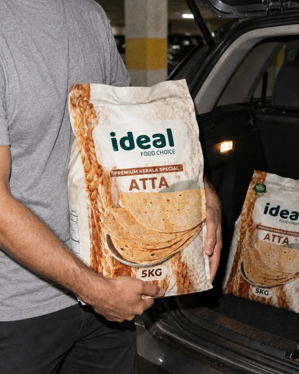
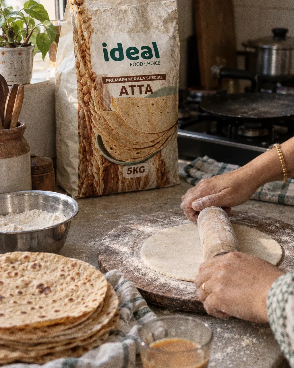
Atta out of the bootThe Ideal Food Choice identity in a lifestyle photograph of a 5KG atta bag lifted out of a car boot. 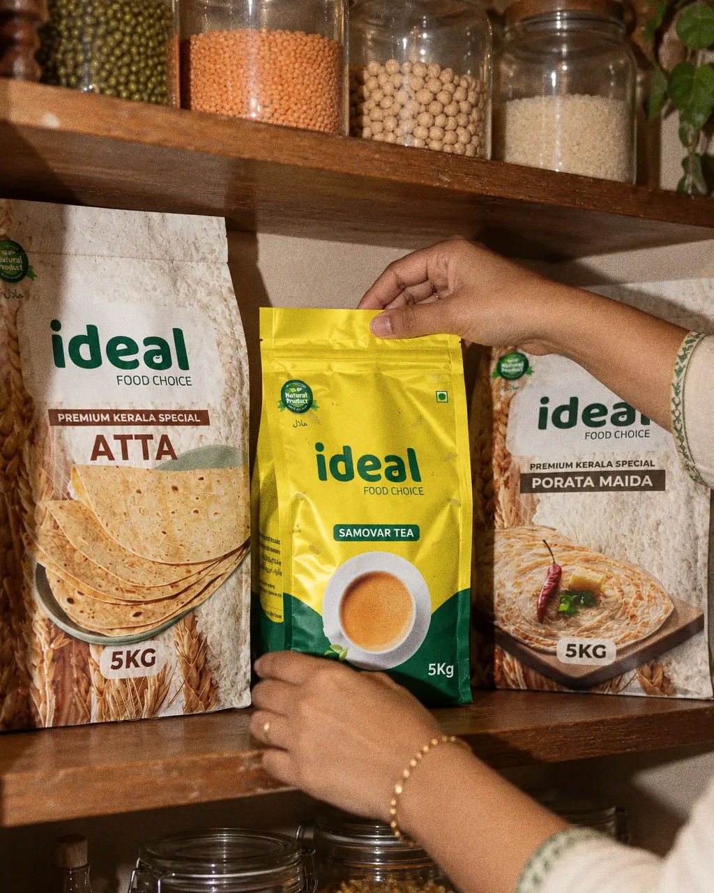
Tea on the pantry shelfThe Ideal Food Choice identity in a lifestyle photograph of an Ideal tea pouch being put on a pantry shelf. 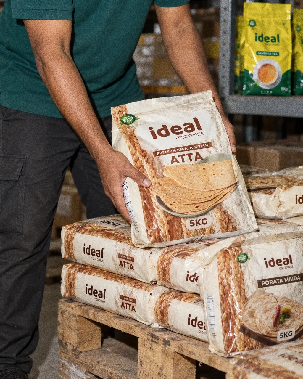
Stacking atta in the stockroomThe Ideal Food Choice identity in a lifestyle photograph of a stockroom worker stacking atta bags on a pallet. 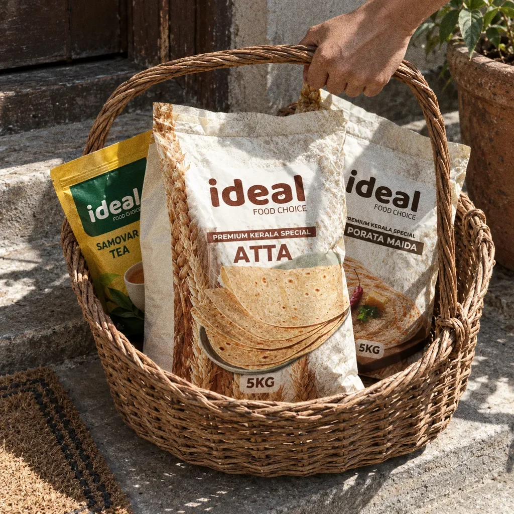
Basket on the doorstepThe Ideal Food Choice identity in a lifestyle photograph of a basket of Ideal packs on a doorstep. 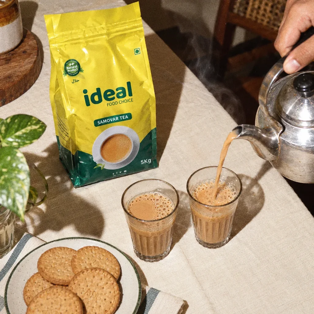
Pouring chai at the tableThe Ideal Food Choice identity in a lifestyle photograph of tea being poured beside an Ideal tea pouch.
Chapter 15
Campaign
About this deck
What we built
A bean-inspired wordmark, deep-green colour system and two-typeface pairing, with retail pouches, flour bags and staff polo-shirt applications.
About the originals
The original boards are from Abcon’s original project presentation and include application mockups.