Healthcare
Mednoora
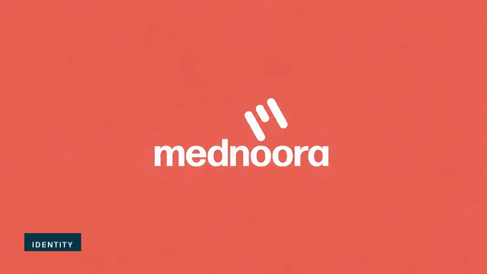
Mednoora brand film. Motion film made from the original Mednoora identity boards and brand applications.
Overview
A healthcare identity for Mednoora.
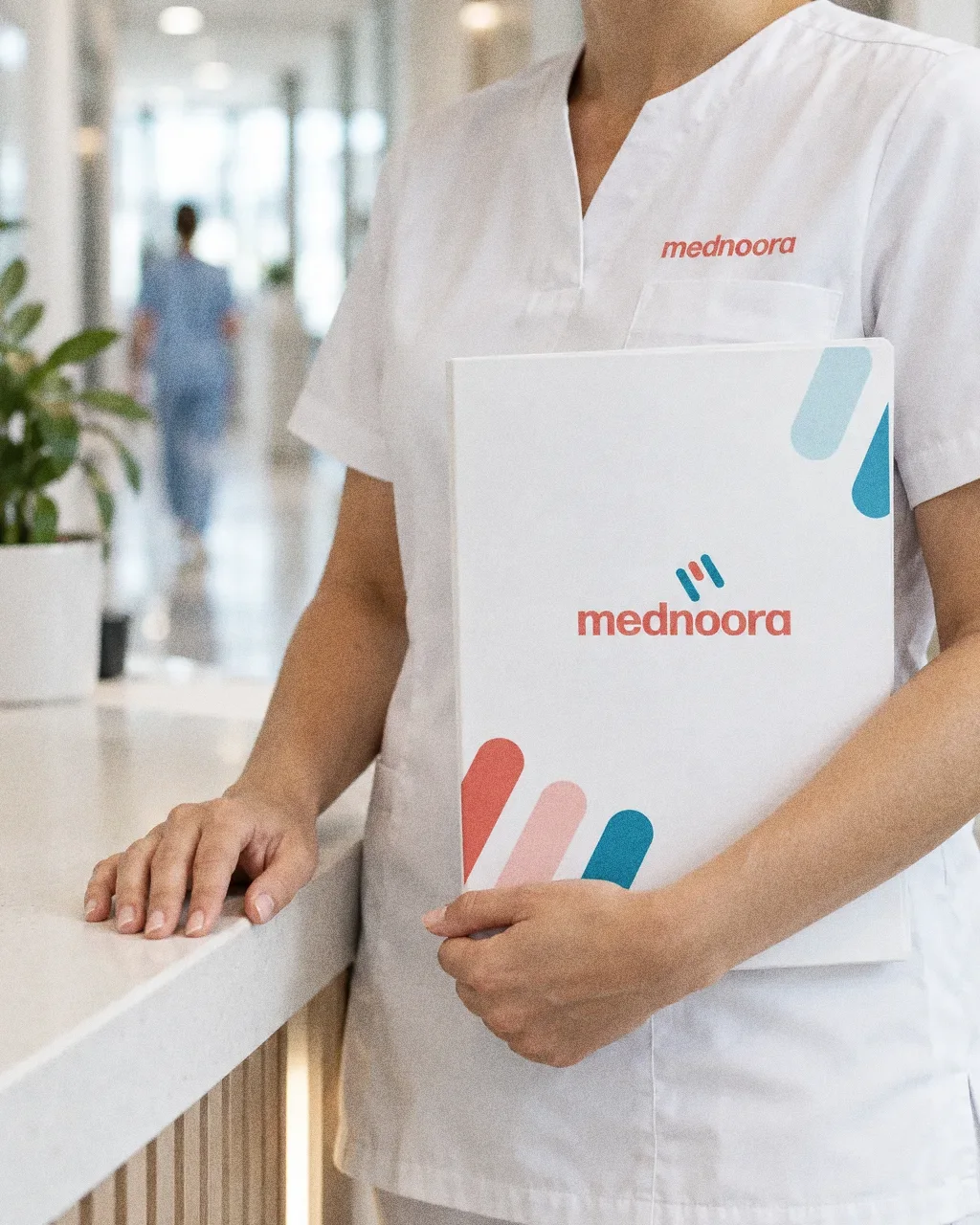
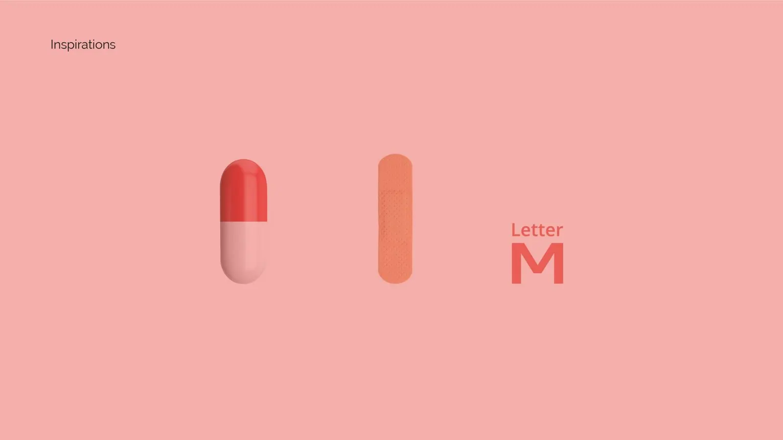
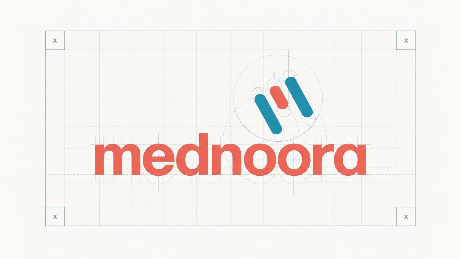
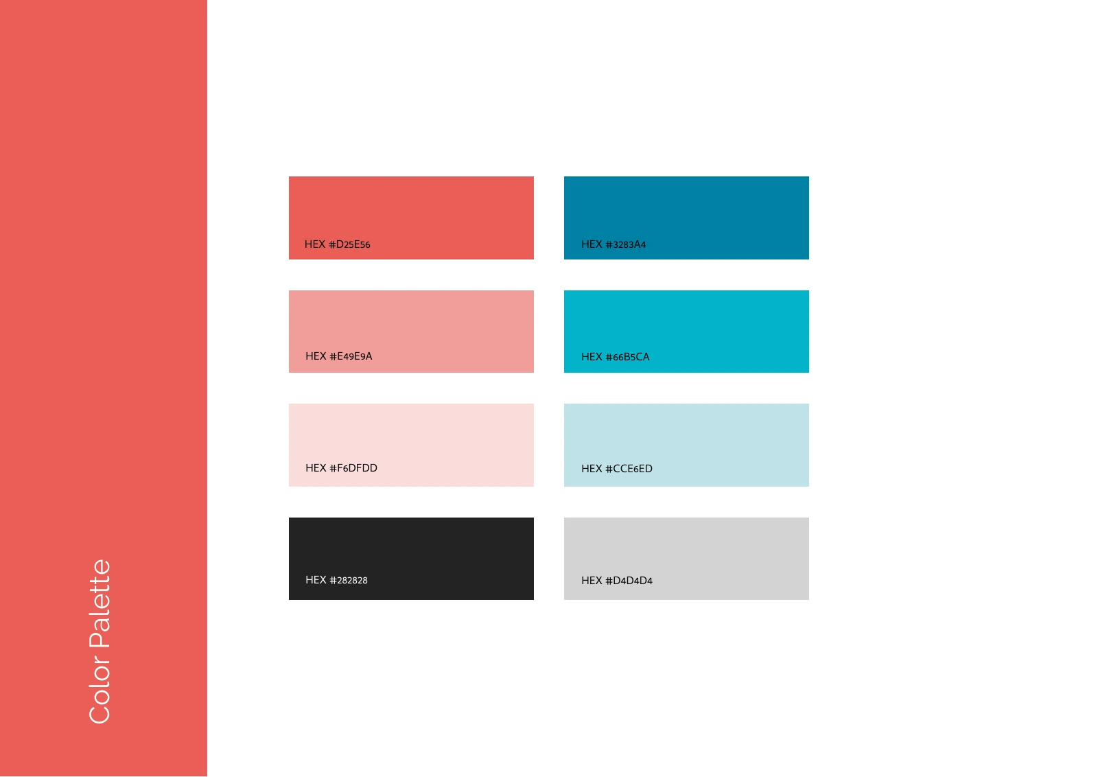
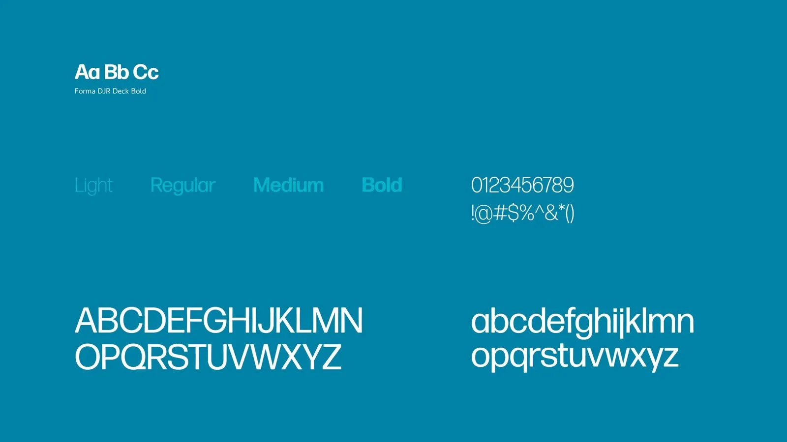
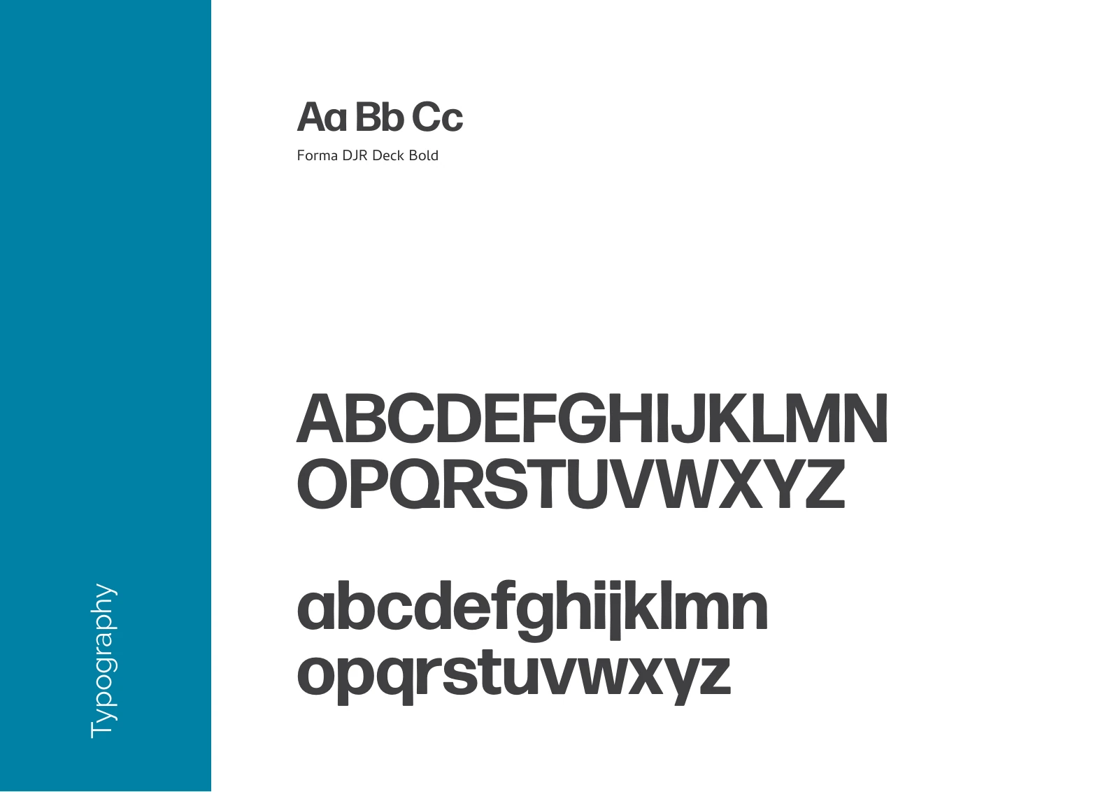
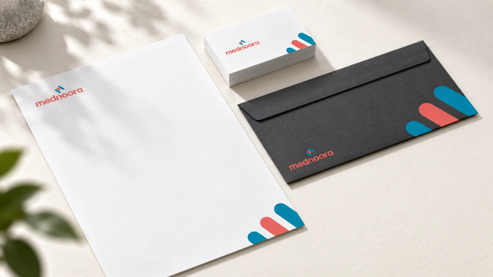
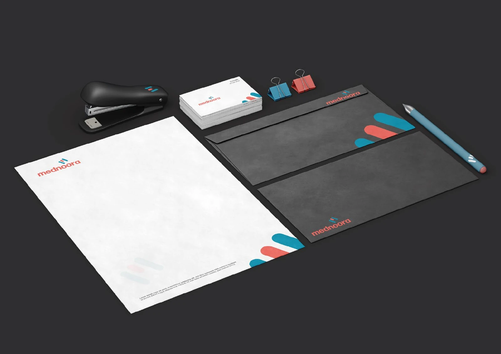
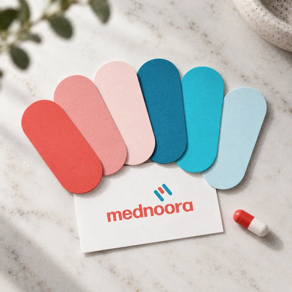
Its mark draws on a capsule, a plaster and the letter M, set above a rounded wordmark. The presentation specifies a six-colour palette from coral to teal, a typeface in four weights and a pattern, then applies the system to signage, stationery, a desk calendar and a van.
BriefA healthcare identity has to move between formal documents and larger physical applications. The design task is to create a recognisable mark and a coordinated visual system for that range of settings.
Services
Scope
- Mark and wordmark
- Colour palette, typography and pattern
- Signage, stationery and vehicle applications
Sources
How to read this deck
The deck pairs the client’s original presentation boards with new application scenes that show the identity in use.
Some of the older boards have been redrawn. Each one sits where the original stood, with the real original design in its corner and a View original button to open it in full.
Chapter 01
Concept and inspiration
Chapter 02
How the logo was formed
Chapter 03
The logo
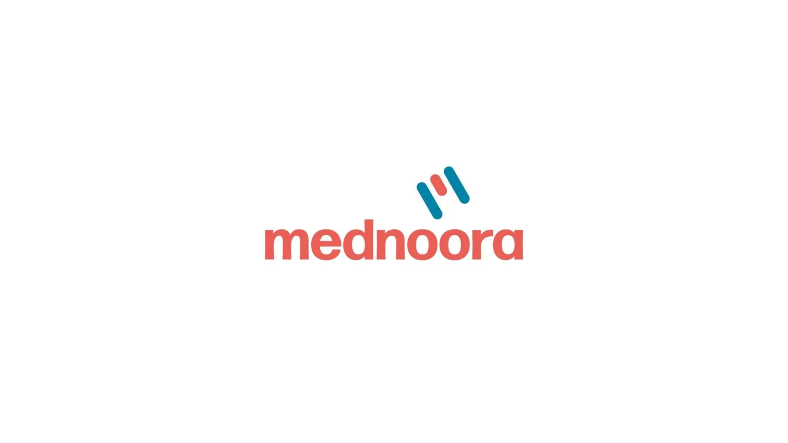
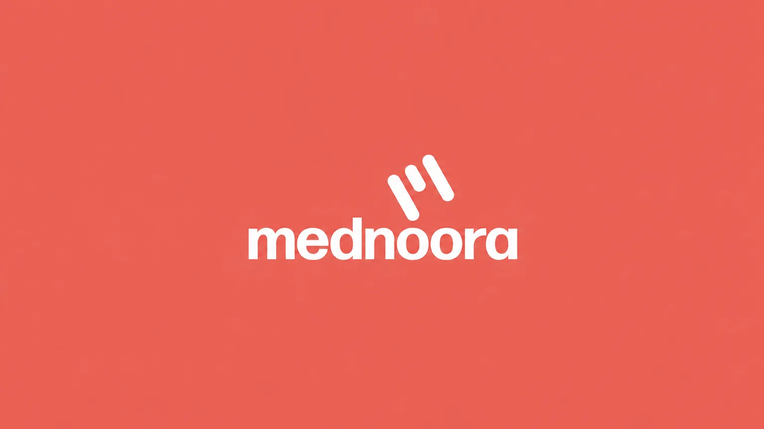
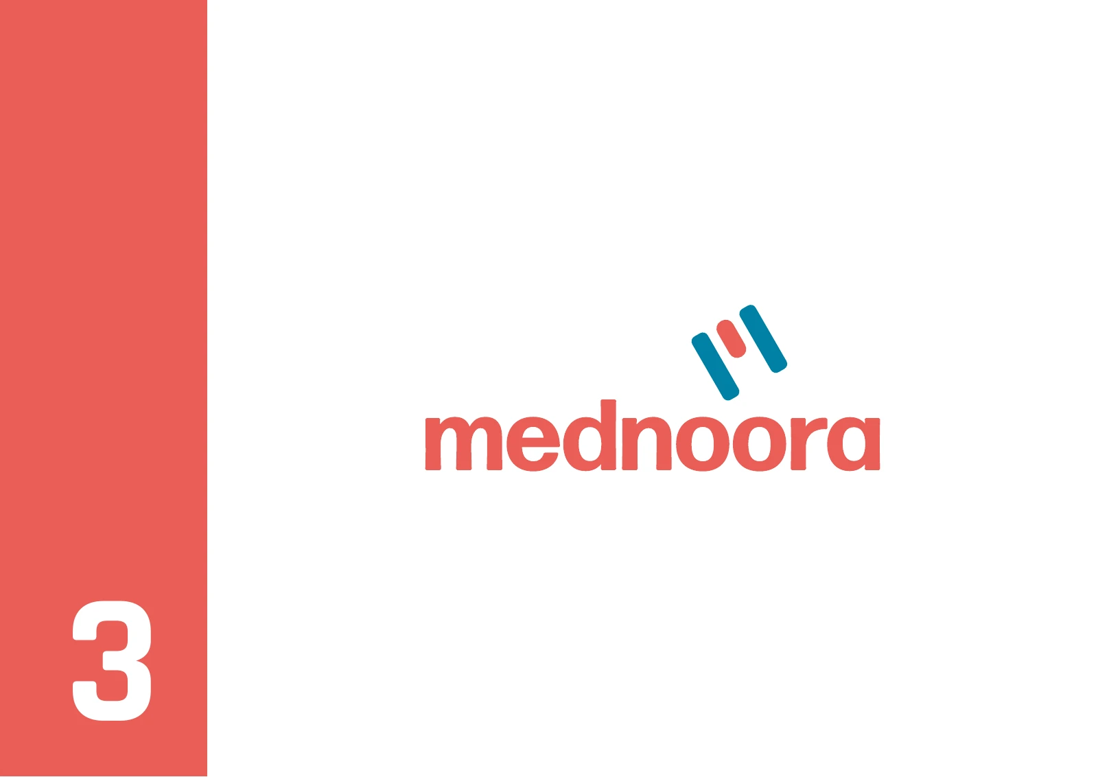
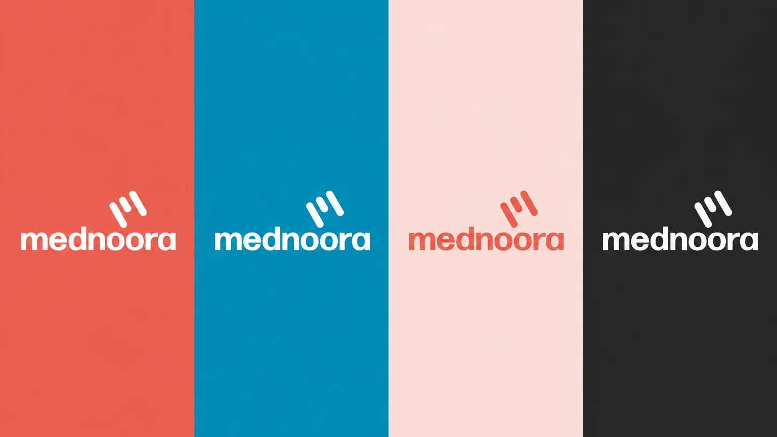
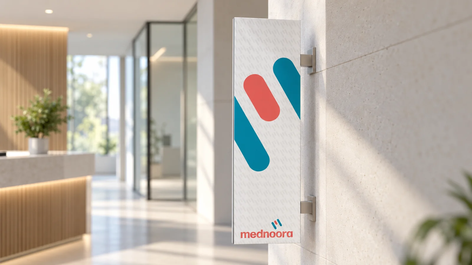
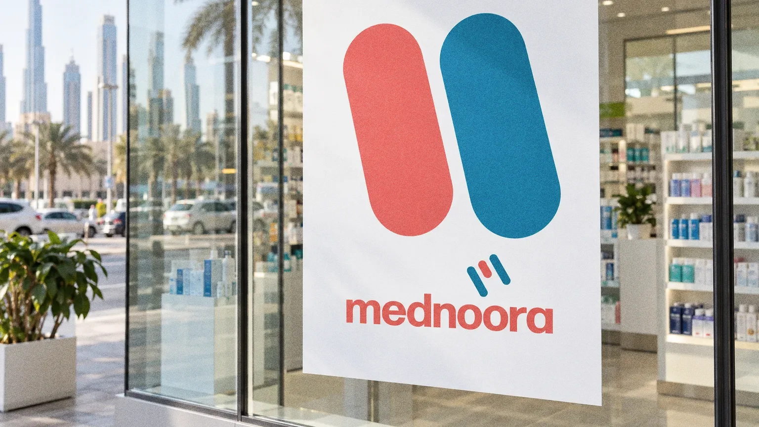
A capsule, a bandage and the letter M inform Mednoora's three-stroke symbol beside the lowercase wordmark.
Chapter 04
Logo variations
Familiar medical shapes
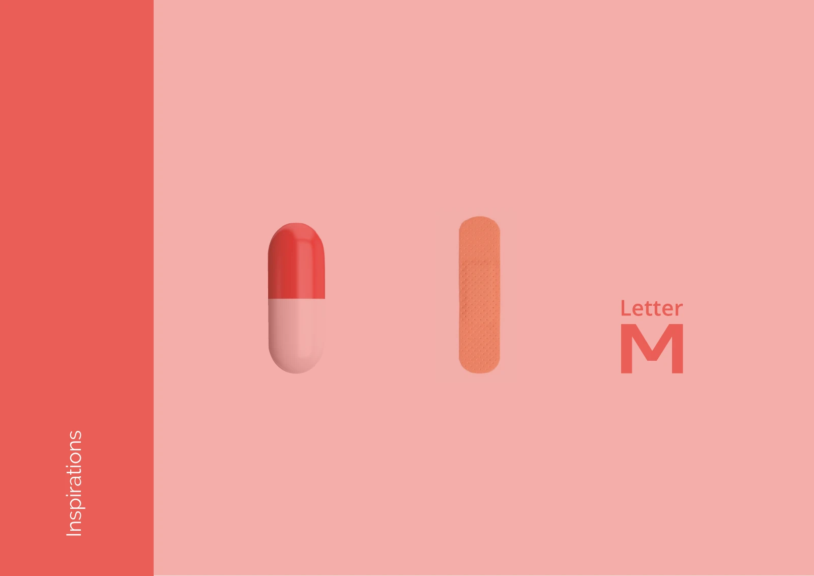
The inspiration board pairs a capsule, a plaster and the letter M. The mark turns them into three rounded strokes in coral and teal above the wordmark.


Chapter 05
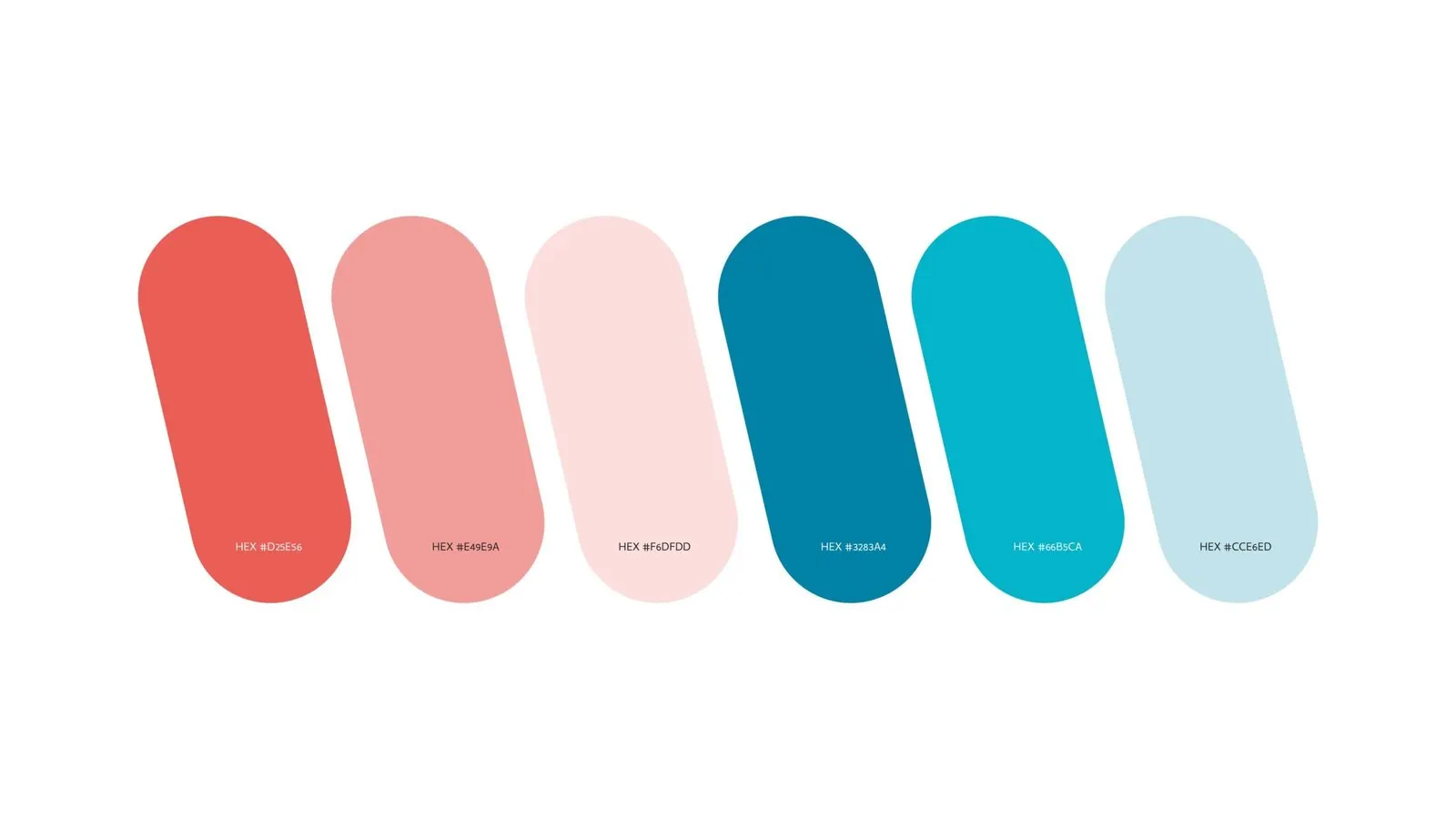
Colour
- Accent
#EA5D52 - Surface
#06384A - Ink
#FFFFFF
Colours sampled from the original identity boards.
Chapter 06
Typography
Chapter 07
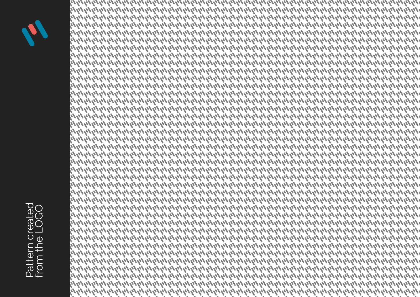
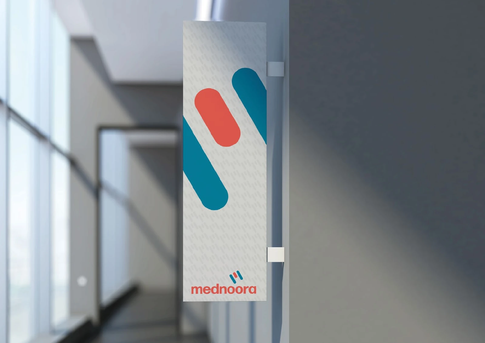
Pattern and graphic elements


Chapter 08
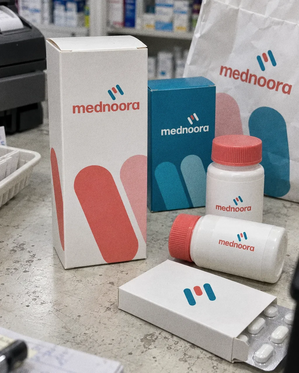
Packaging
Chapter 09
Stationery

Chapter 10
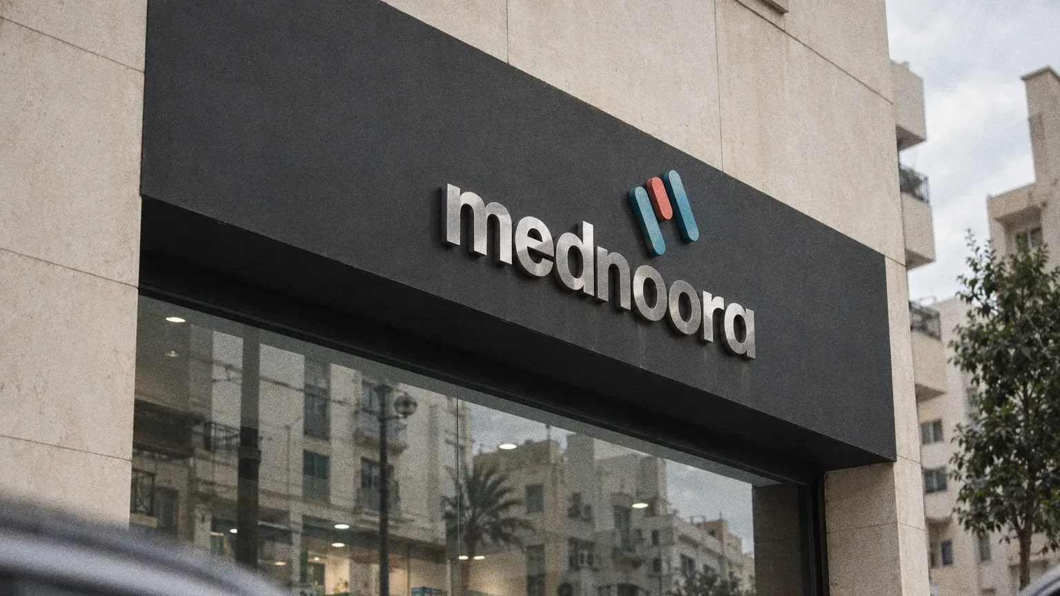
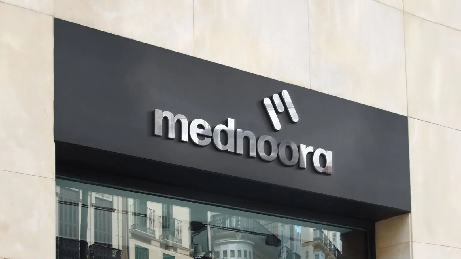
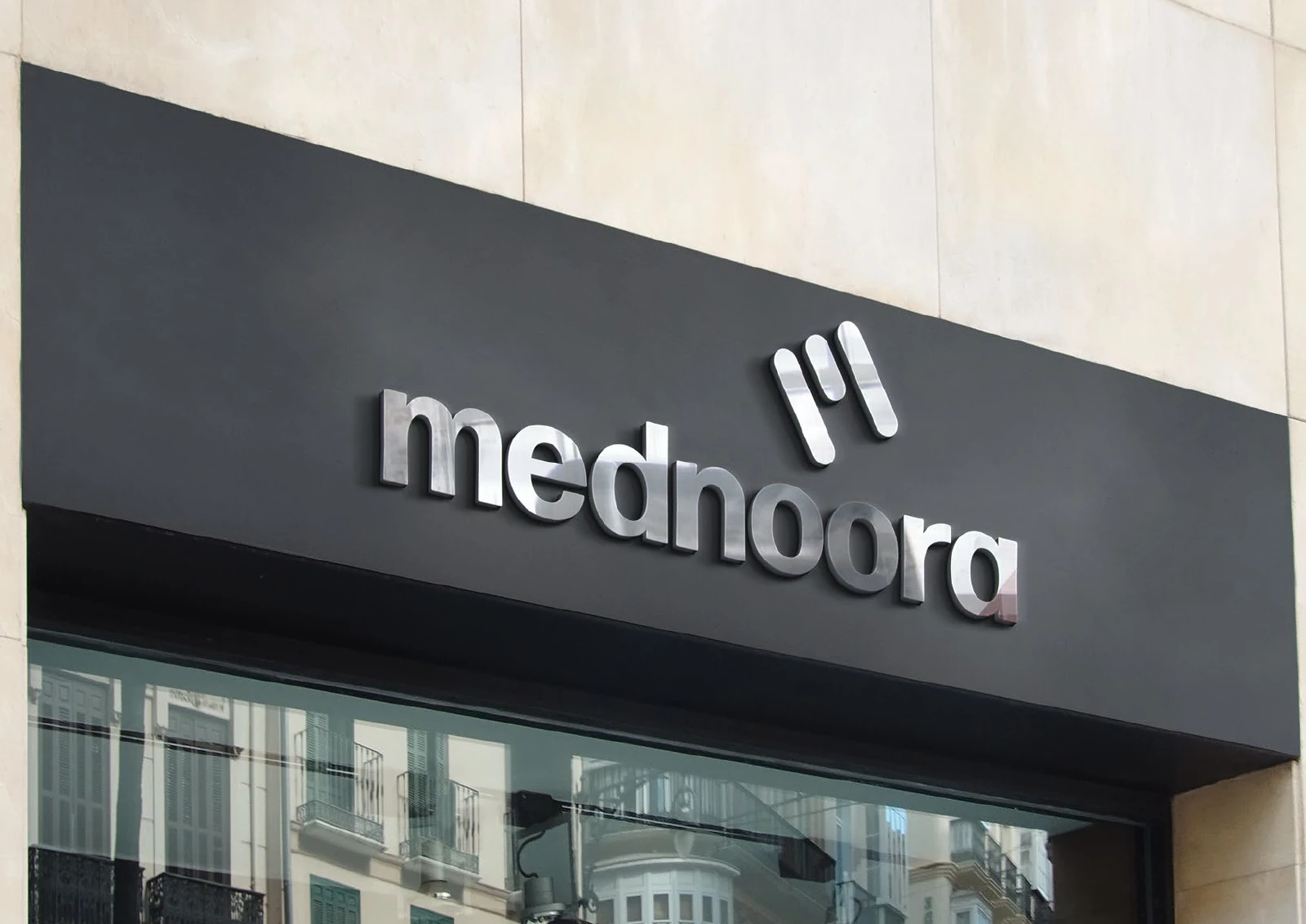
Signage and spaces
A system for every touchpoint
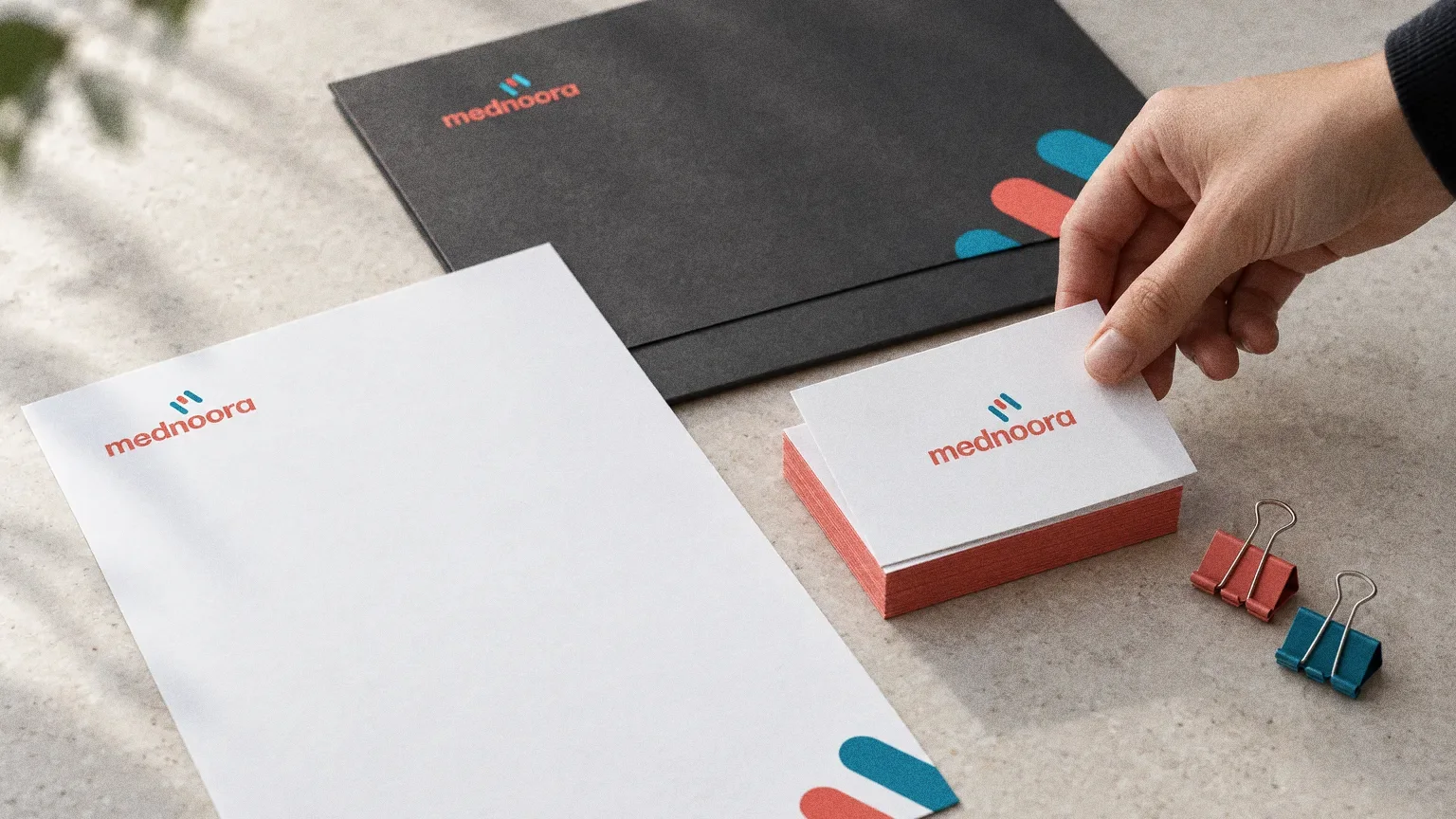
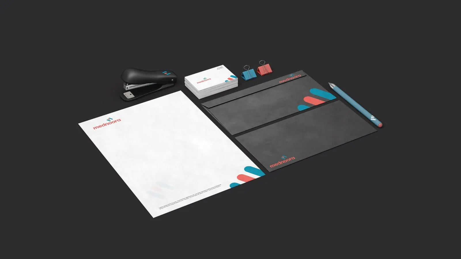
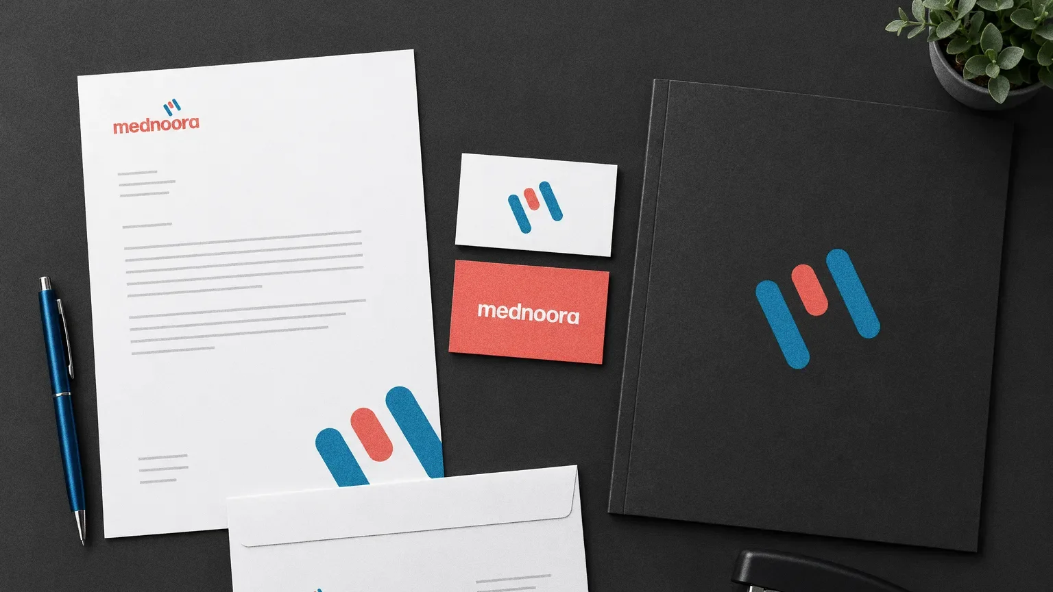
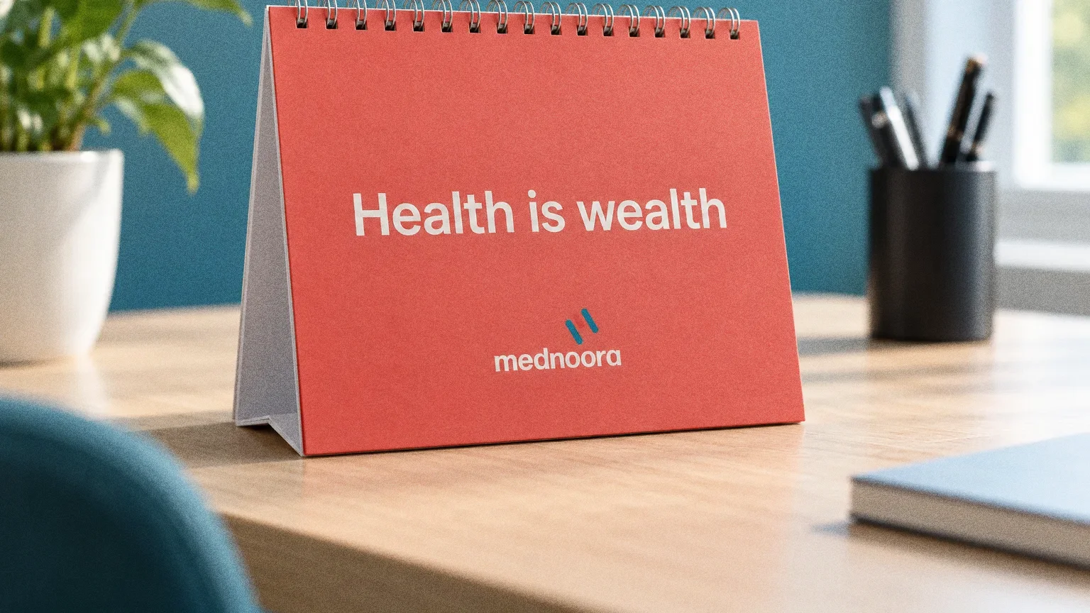
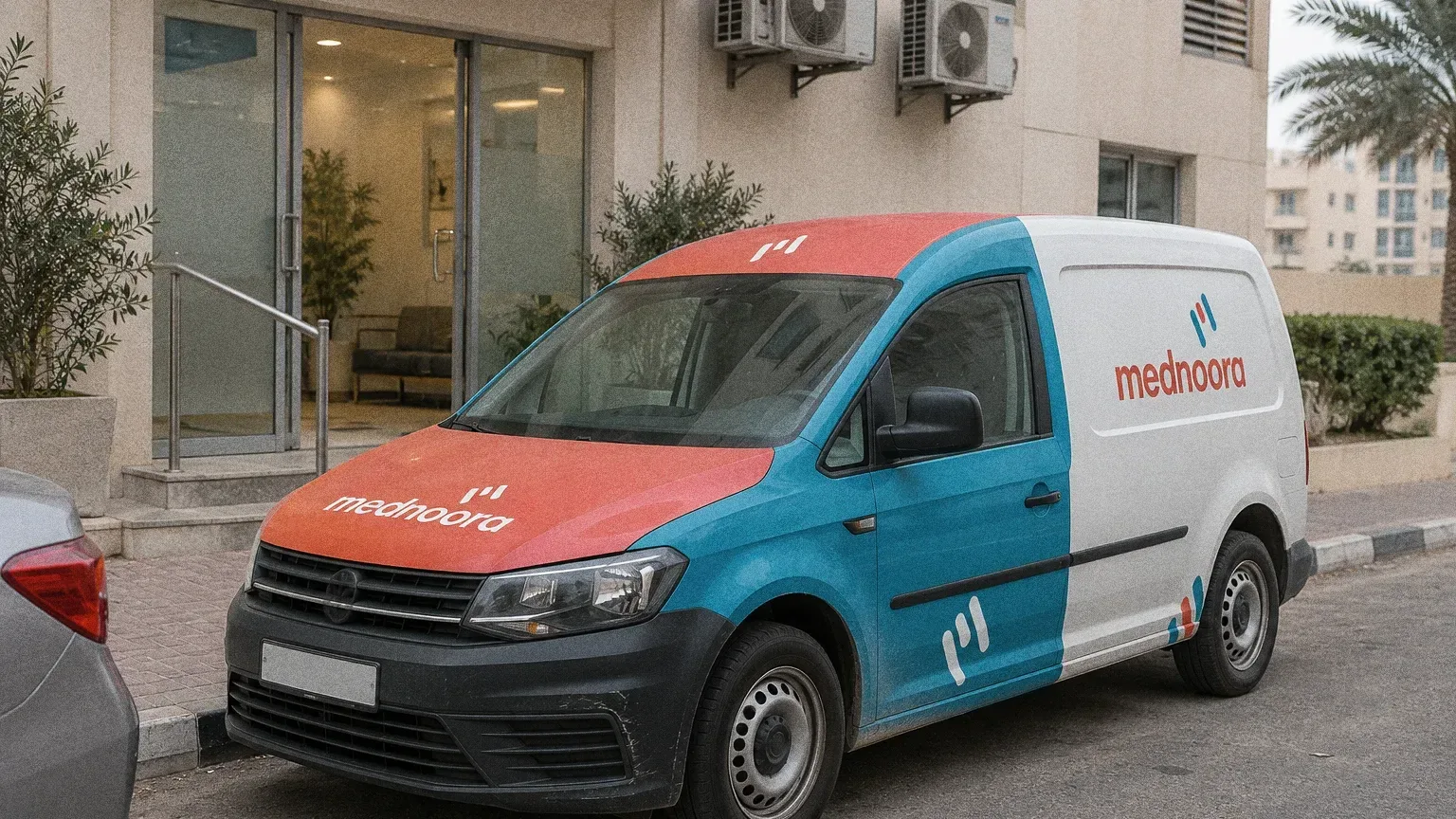
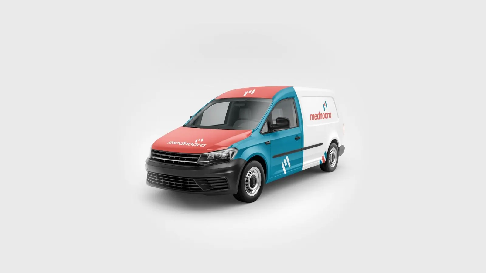
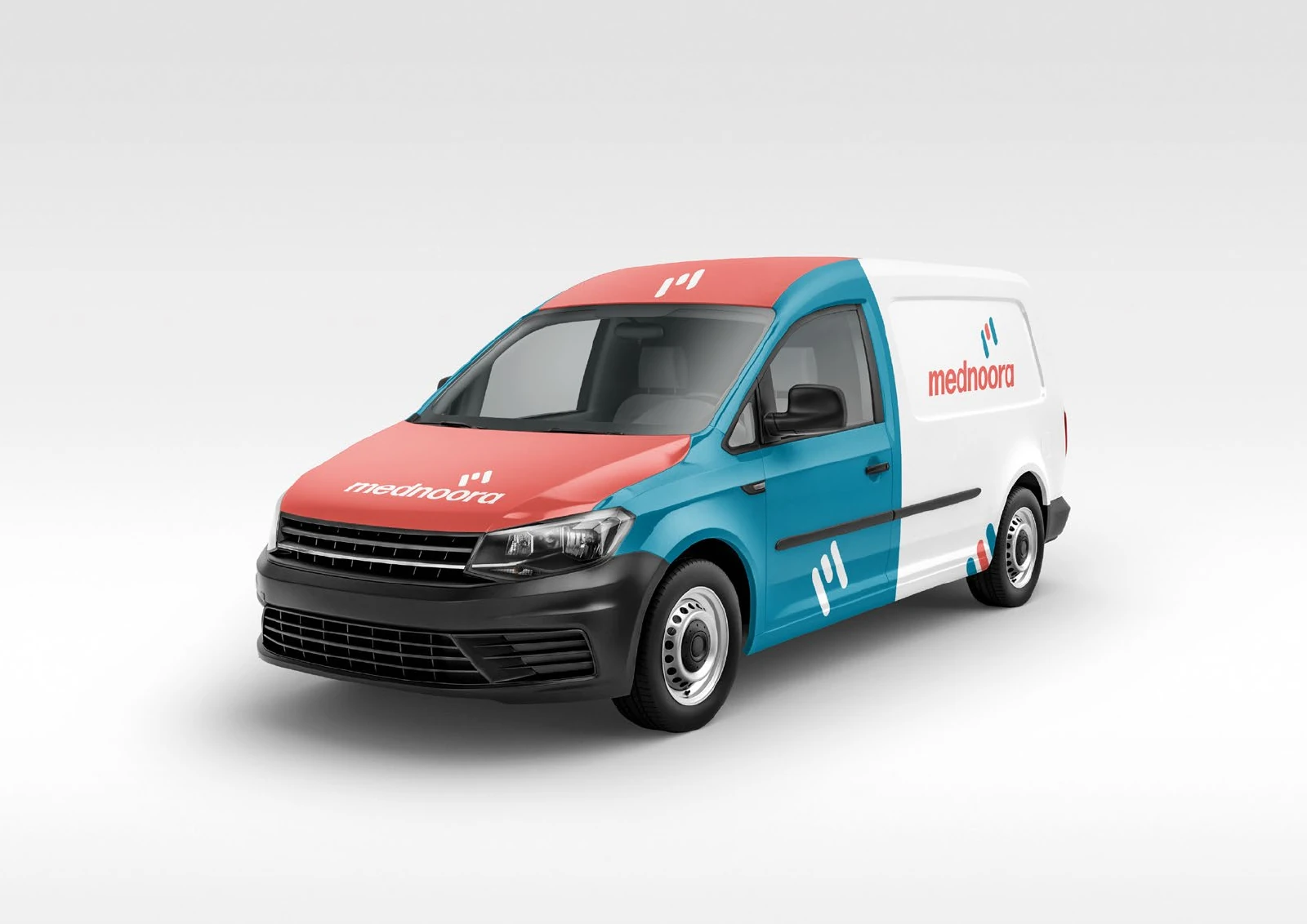
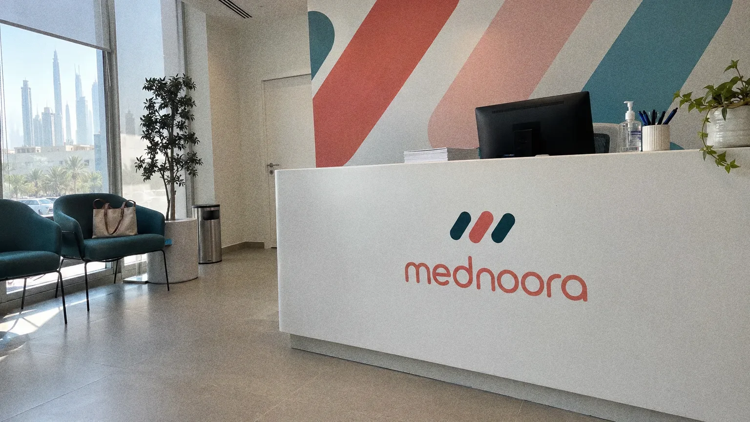
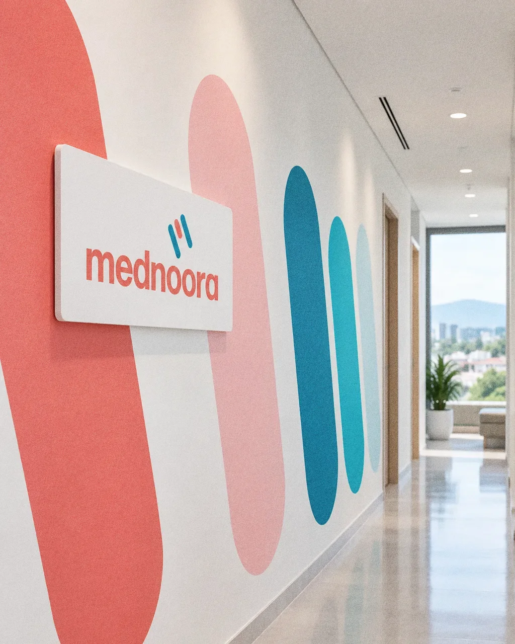
The six-colour palette and four typeface weights carry from the building sign to stationery, a calendar reading "Health is wealth" and a van livery.
Chapter 11
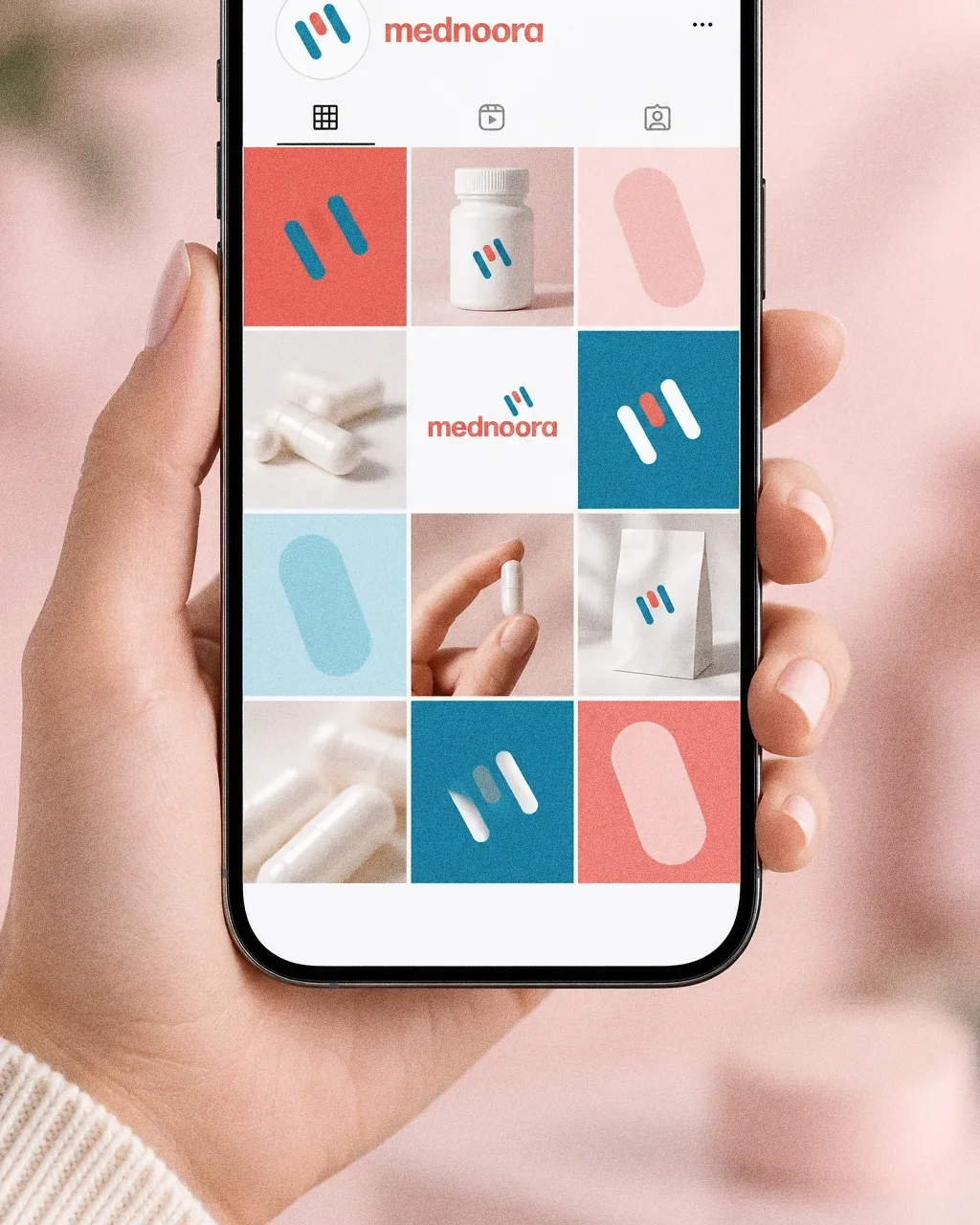
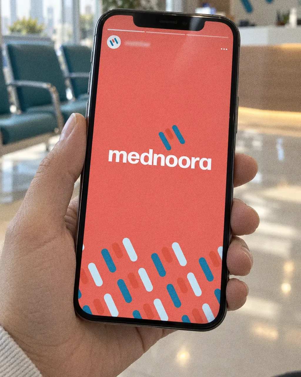
Digital

Chapter 12
The brand in the world
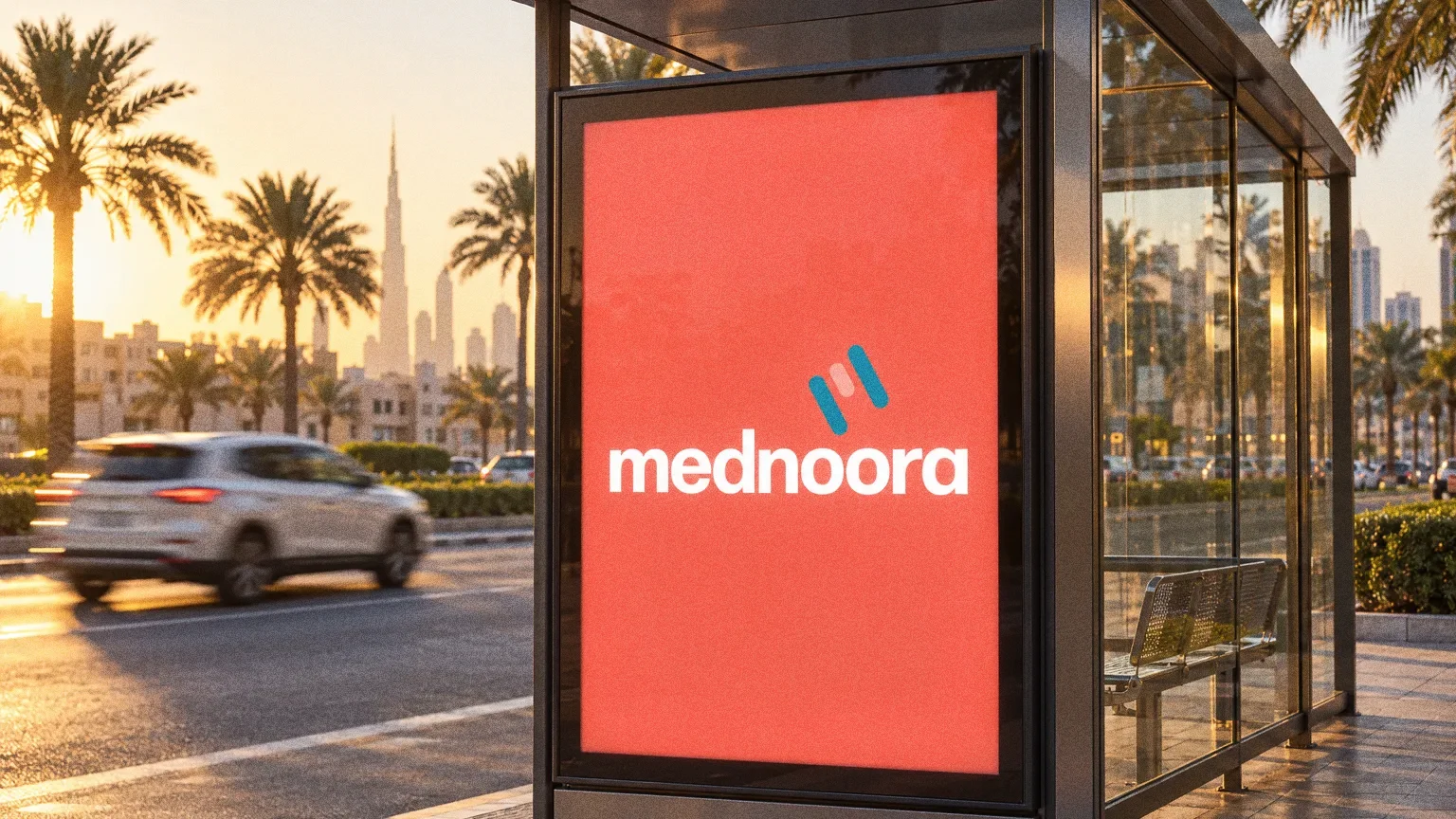
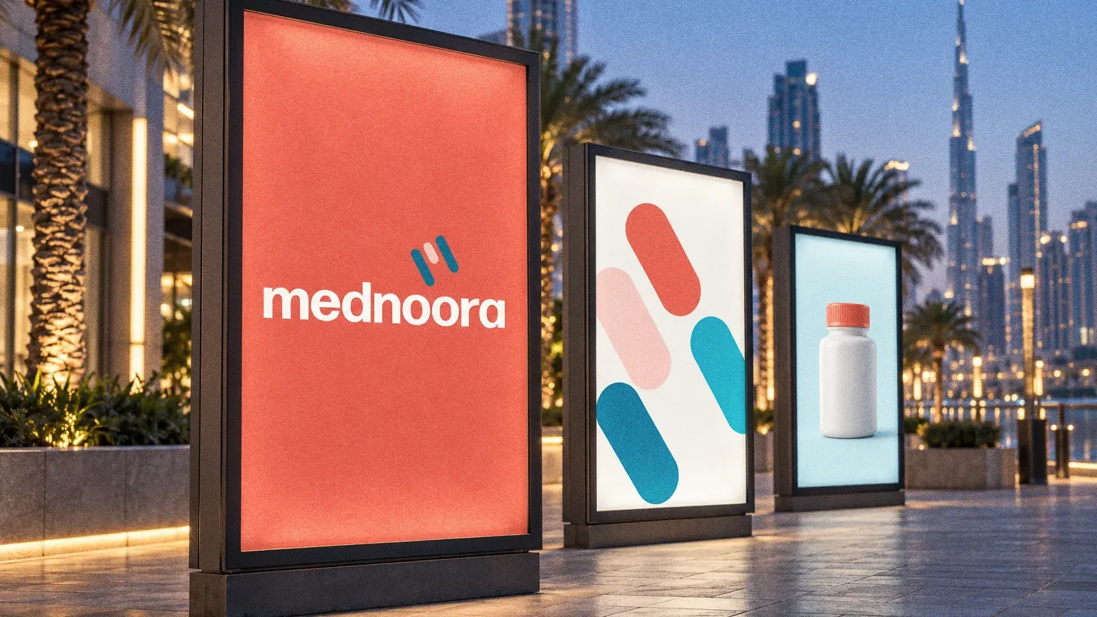
Stationery, a desk calendar, storefront lettering and a branded van demonstrate how the healthcare identity extends across printed and physical applications.
Chapter 13
In people’s hands
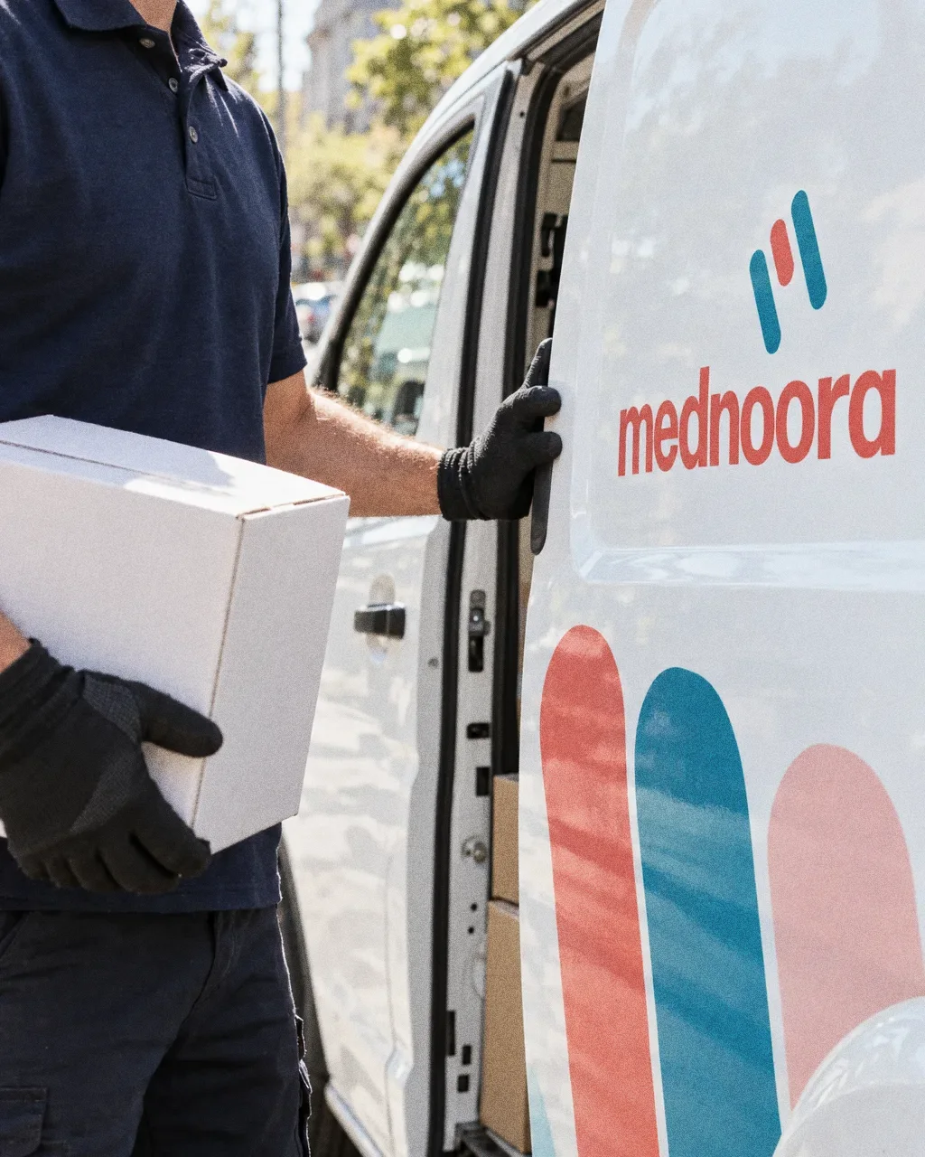
Courier at the van doorThe Mednoora identity in a lifestyle photograph of a courier at the door of a Mednoora van. 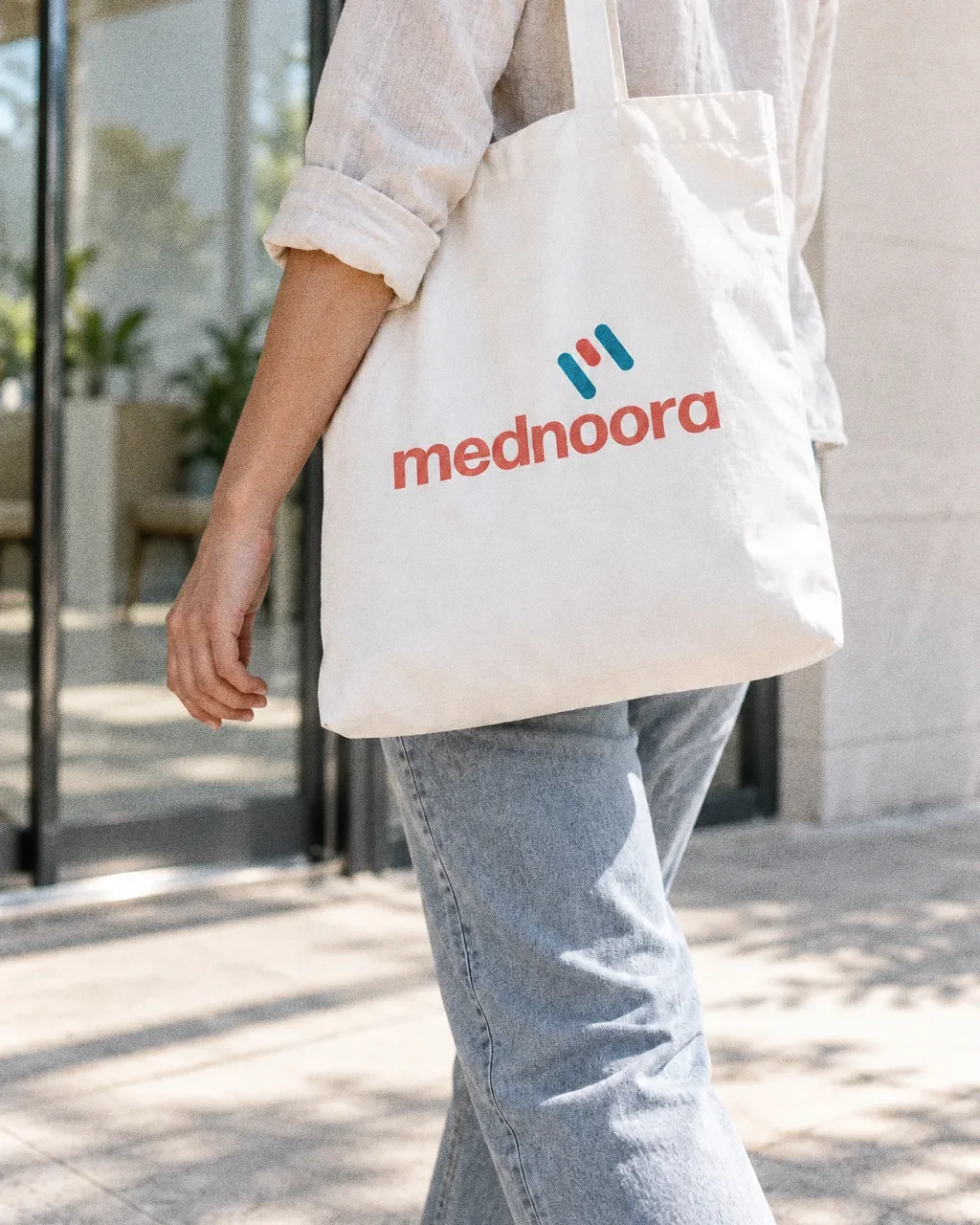
Tote leaving the clinicThe Mednoora identity in a lifestyle photograph of a canvas tote carried past a clinic entrance. 
Notes on mednoora letterheadThe Mednoora identity in a lifestyle photograph of a doctor writing on letterhead at a sunlit desk. 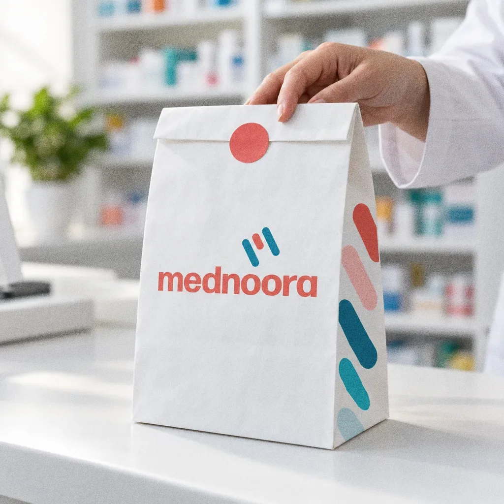
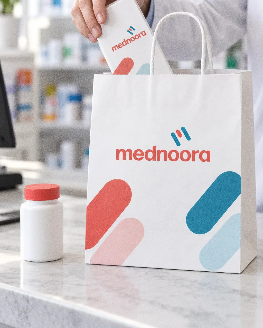
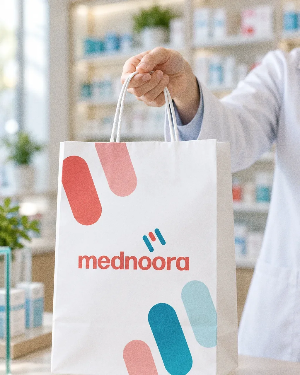
Paper bag on the counterThe Mednoora identity in a lifestyle photograph of a paper bag on a pharmacy counter. 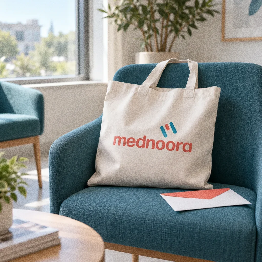
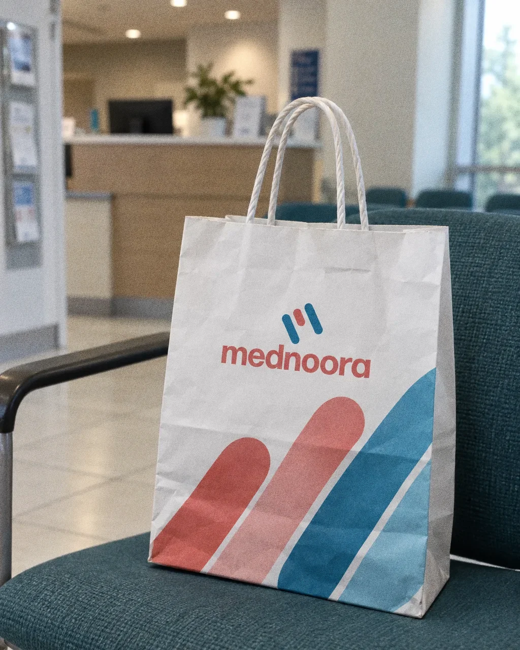
Tote in the waiting roomThe Mednoora identity in a lifestyle photograph of a tote bag on a waiting-room chair.
Chapter 14
Campaign
About this deck
What we built
An M-inspired capsule-and-plaster mark, rounded wordmark, coral-to-teal palette, typography and pattern, shown on signage, stationery, a desk calendar and a van.
About the originals
The original boards are from Abcon’s original project presentation and include application mockups.