
Branding / Cafeteria
Al Mamzar
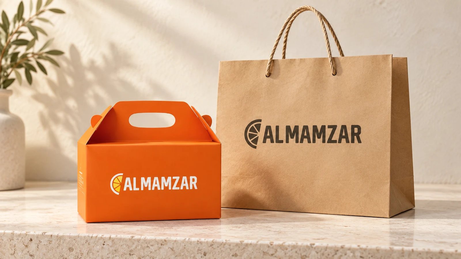
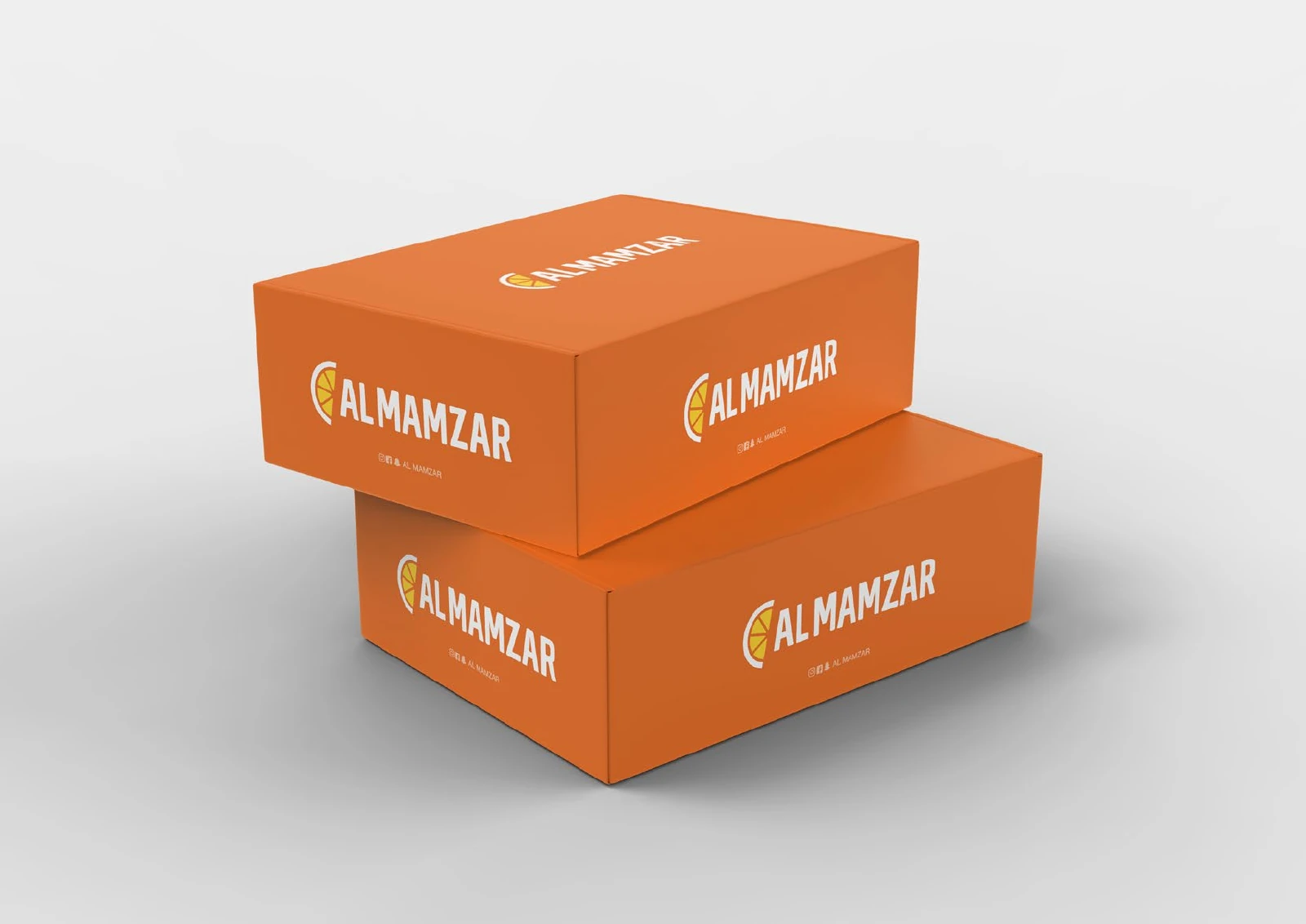
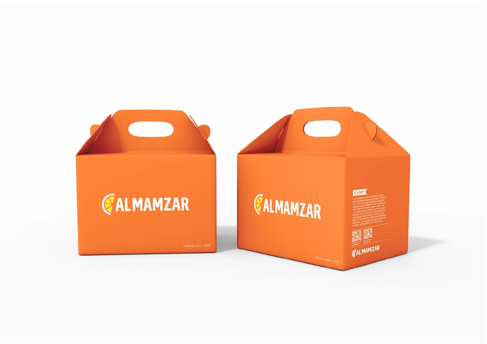
A cafeteria identity built around a segmented citrus symbol, a bold wordmark and a vivid orange palette. The original boards show how the same mark works across boxes, gable packaging and carry bags.
Project scope
The original client-supplied presentation documents the identity and its application mockups.
- Citrus emblem and wordmark
- Colour and graphic pattern
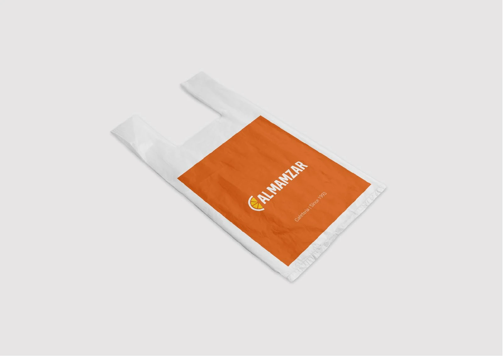
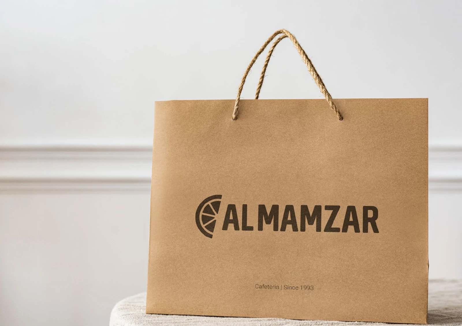
- Takeaway boxes and carry bags
How the identity works
The design task
Build an identity that reads clearly on takeaway packaging and remains recognisable when the print changes from full colour to a single ink on kraft paper.
Give the food identity a compact symbol
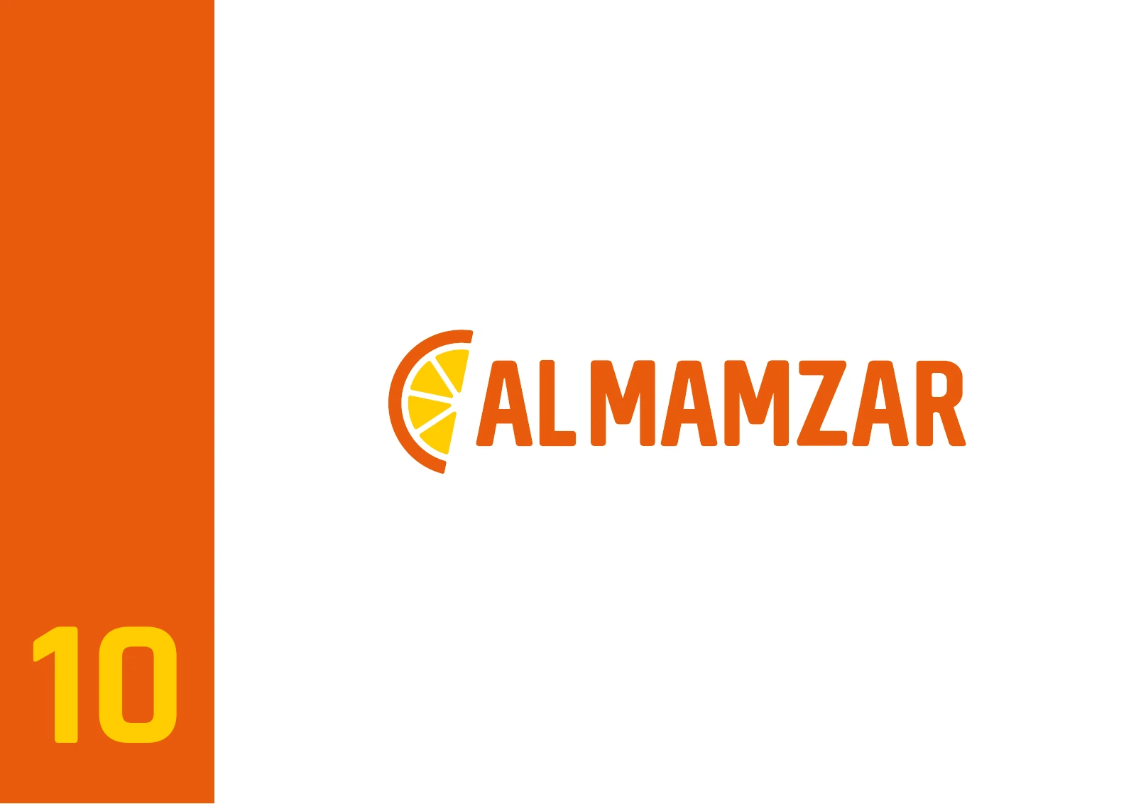
A segmented half-citrus shape sits beside the bold ALMAMZAR name. The source also develops the citrus form into a repeat pattern, giving the identity a second graphic scale.
See the original boardAdapt the mark to the material
The full-colour system appears on orange boxes, while a black version of the logo is used on the kraft bag. The shape and name remain consistent across those changes in surface and printing.
See the original boardWhat we built
A logo and pattern system demonstrated on a coordinated takeaway packaging range in seven original boards.
The boards below are the original design pages from the supplied PDF presentation, including its application mockups.
Original source: ABCON NEW BRAND PORTFOLIO.pdf


What does your brand need next?
Let’s talk about your project Next projectTrusline Distribution