Café
52 Cafe
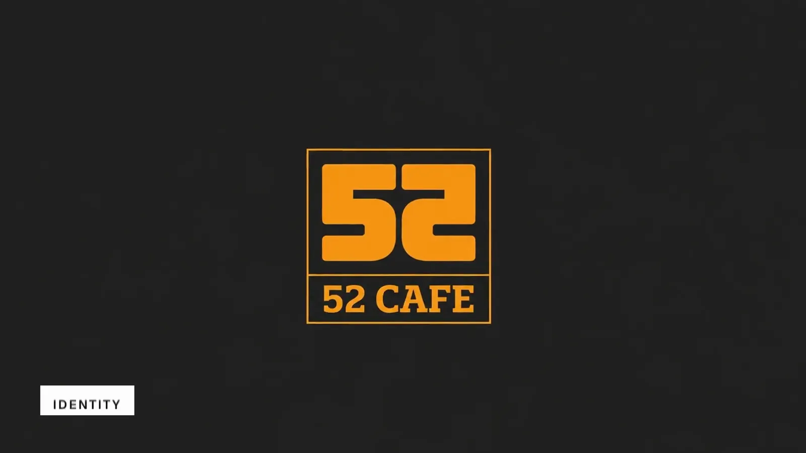
52 Cafe brand film. Motion film made from the original 52 Cafe identity boards and brand applications.
Overview
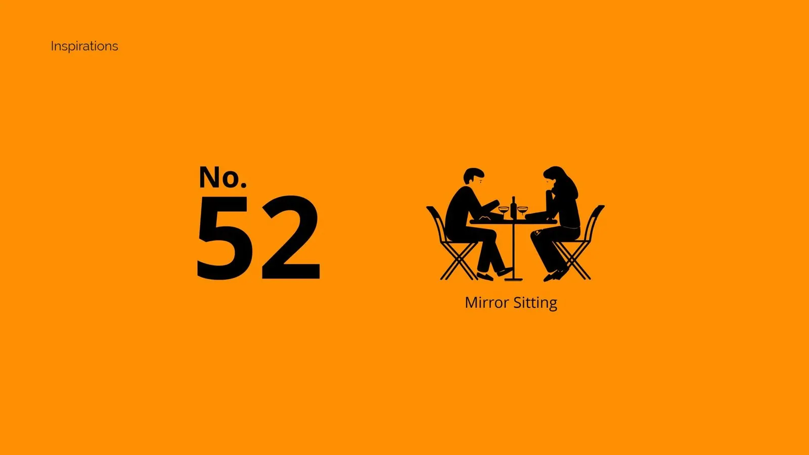
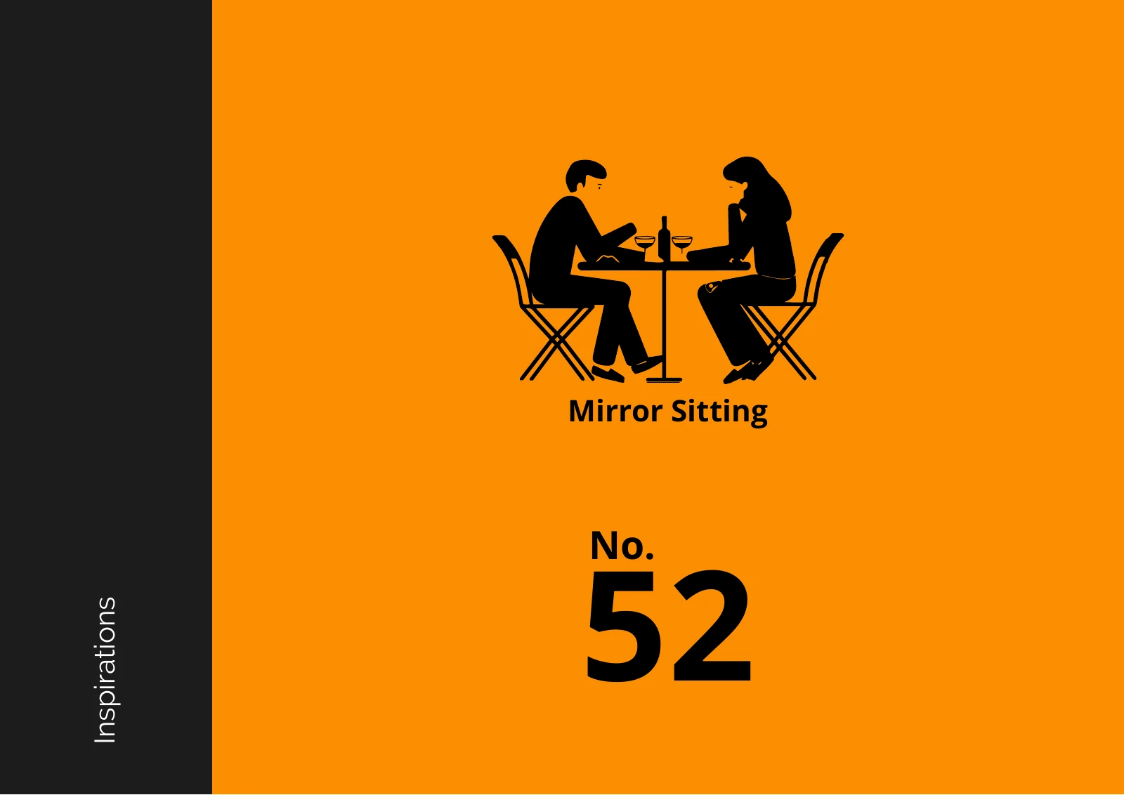
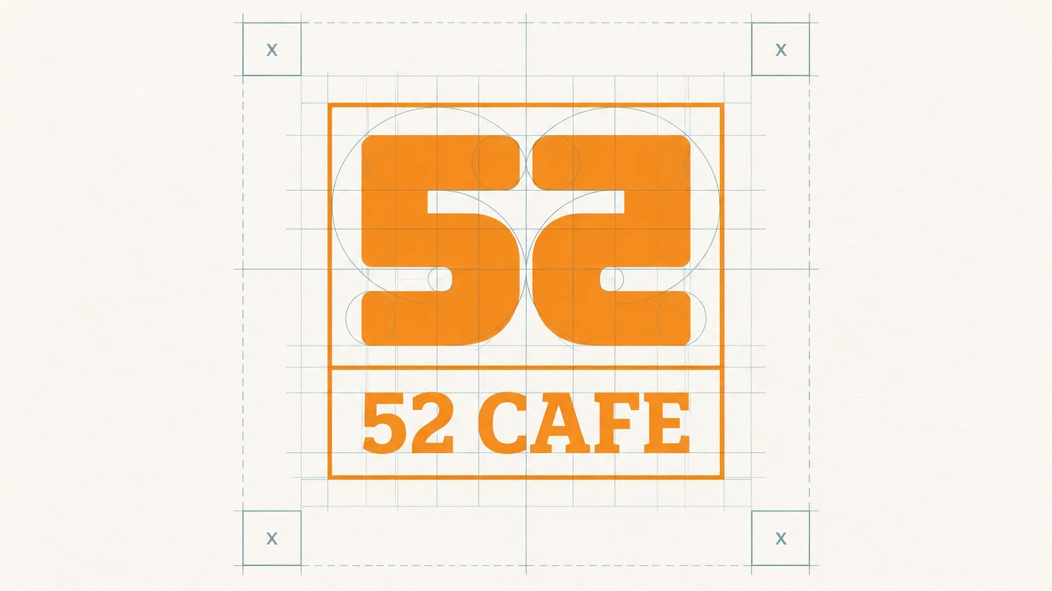
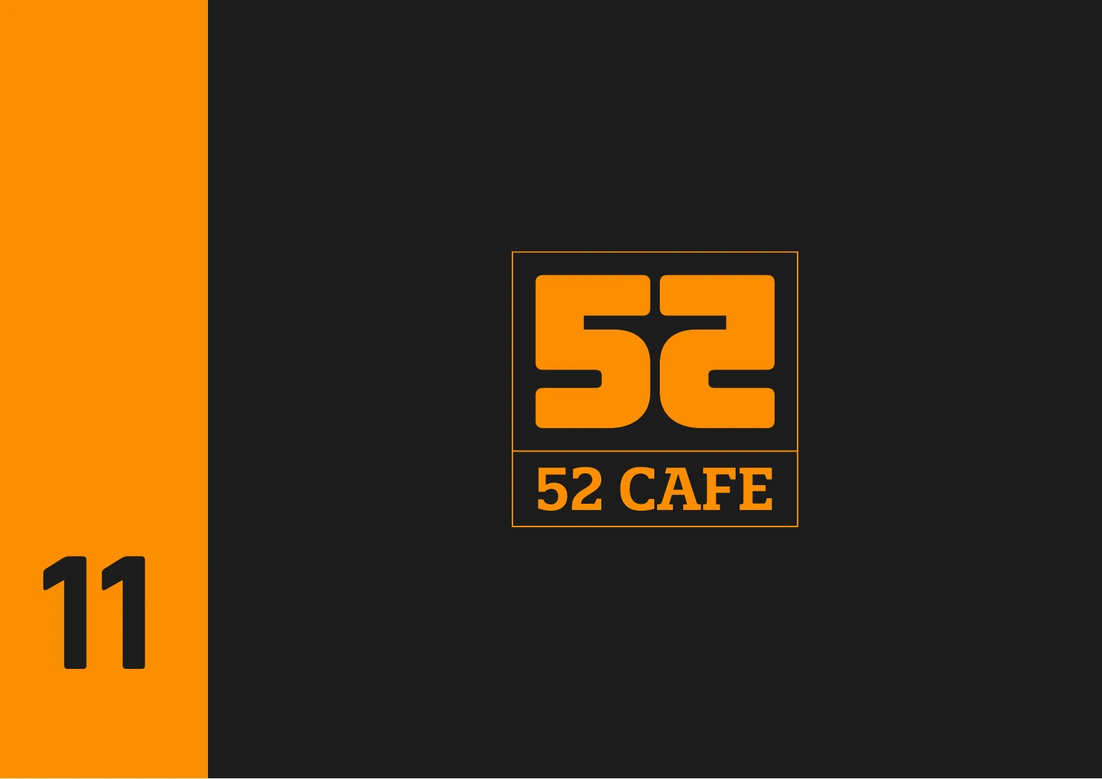
An identity for 52 Cafe built on a monogram where the 5 and 2 mirror each other, inspired by two people sitting face to face.
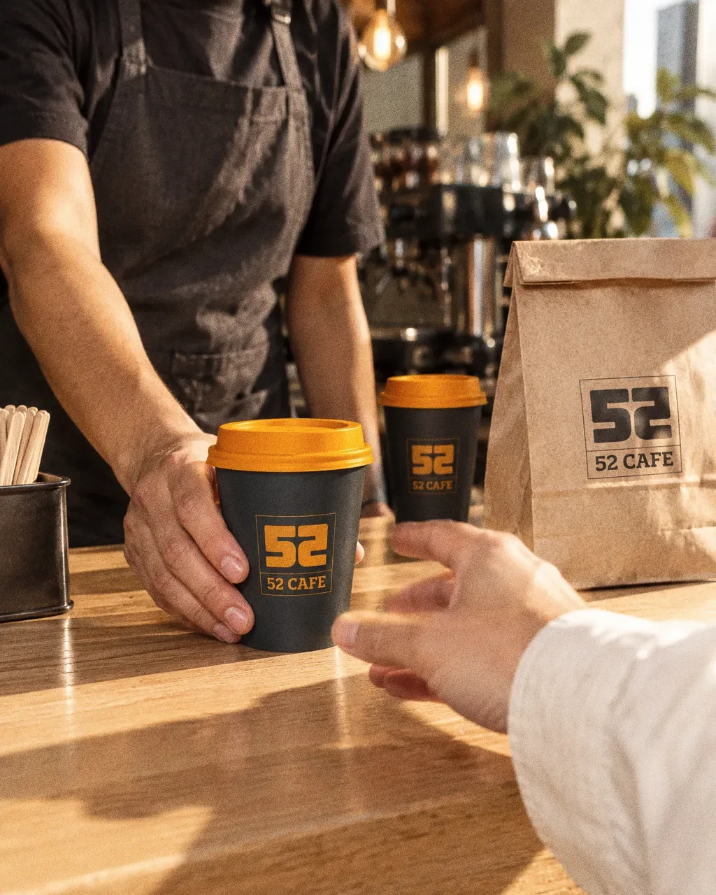
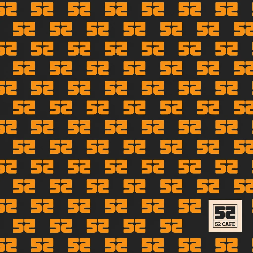
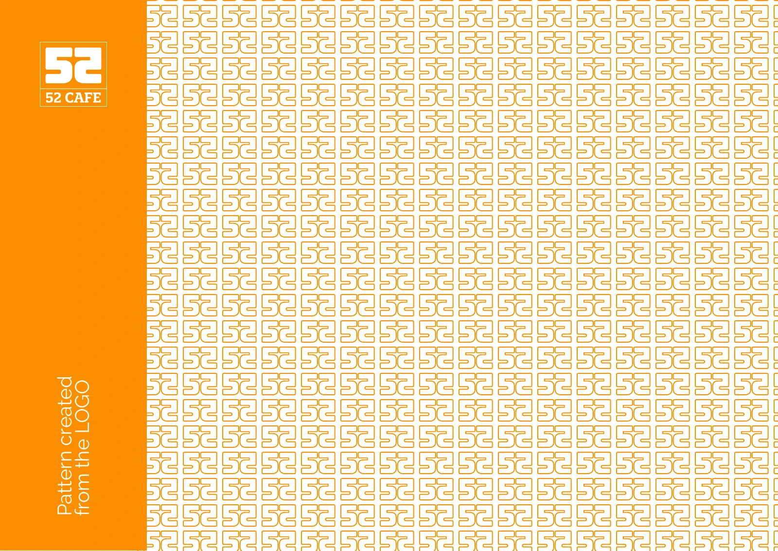
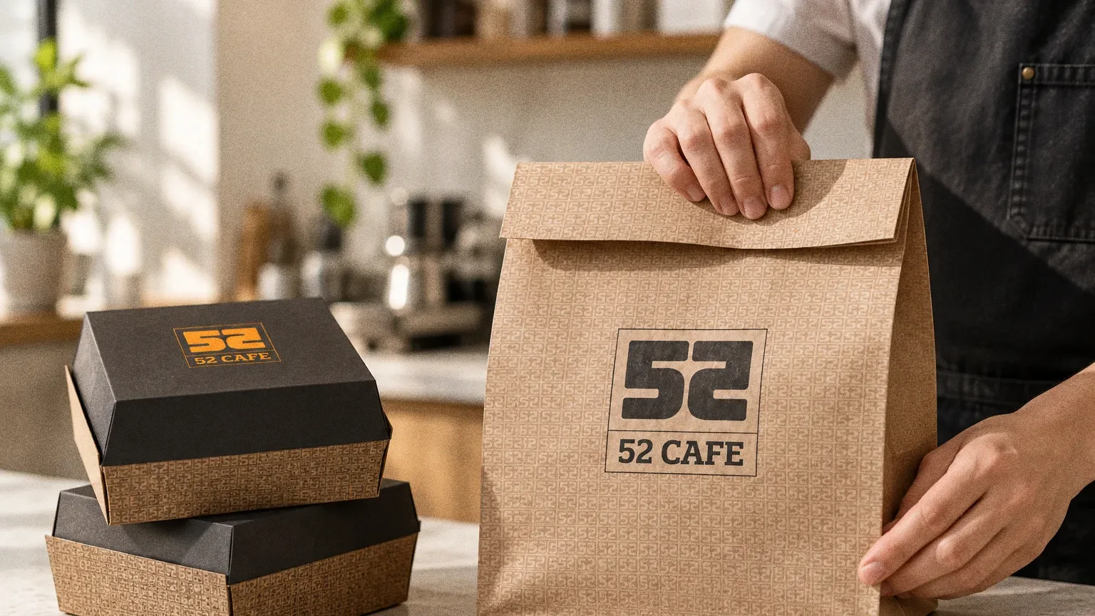
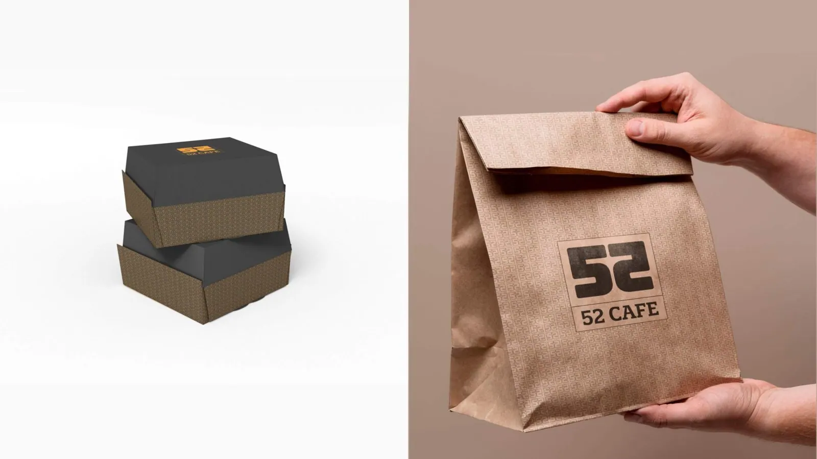
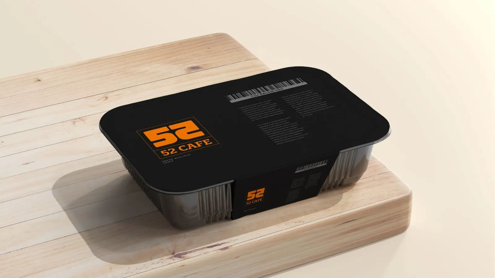
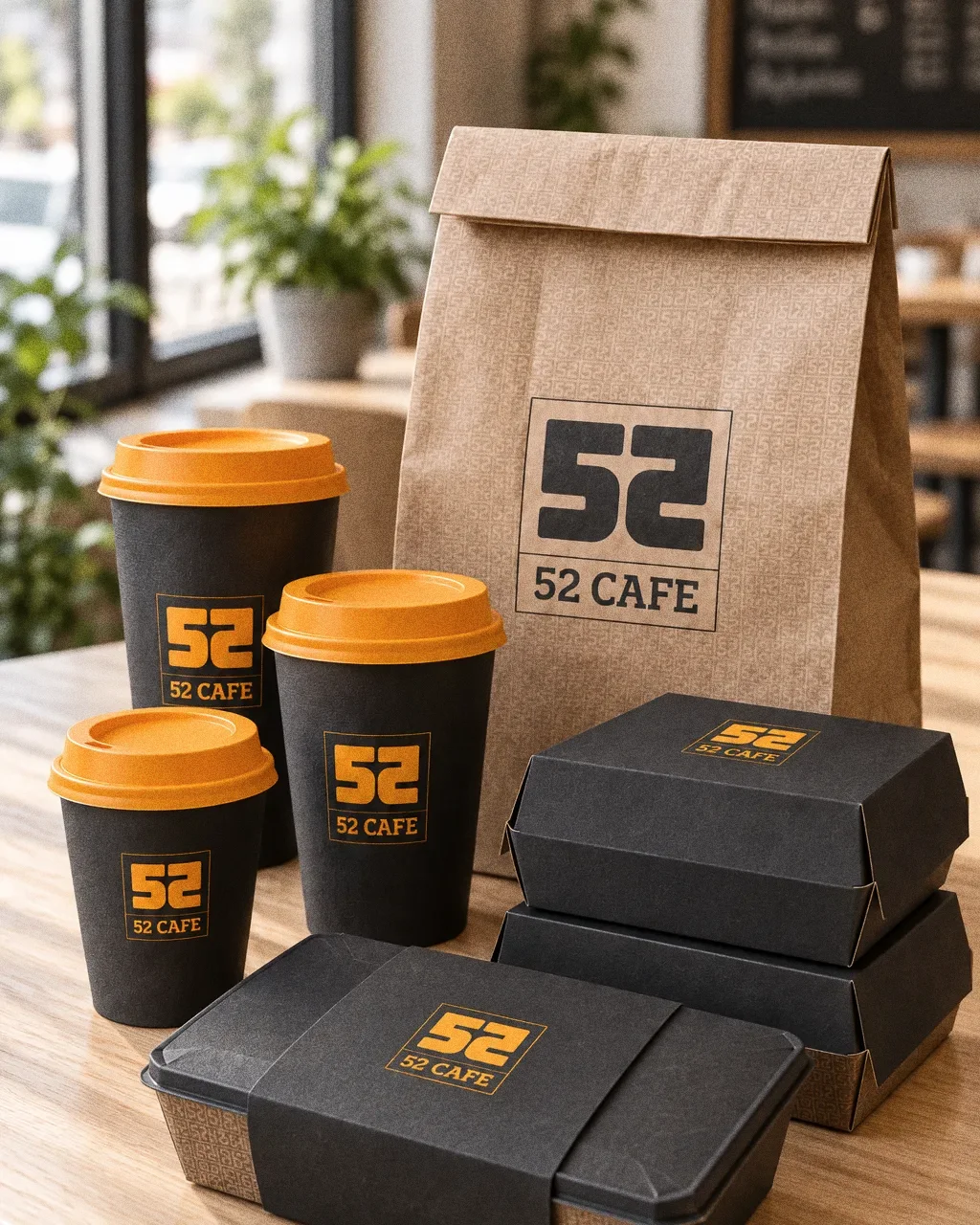
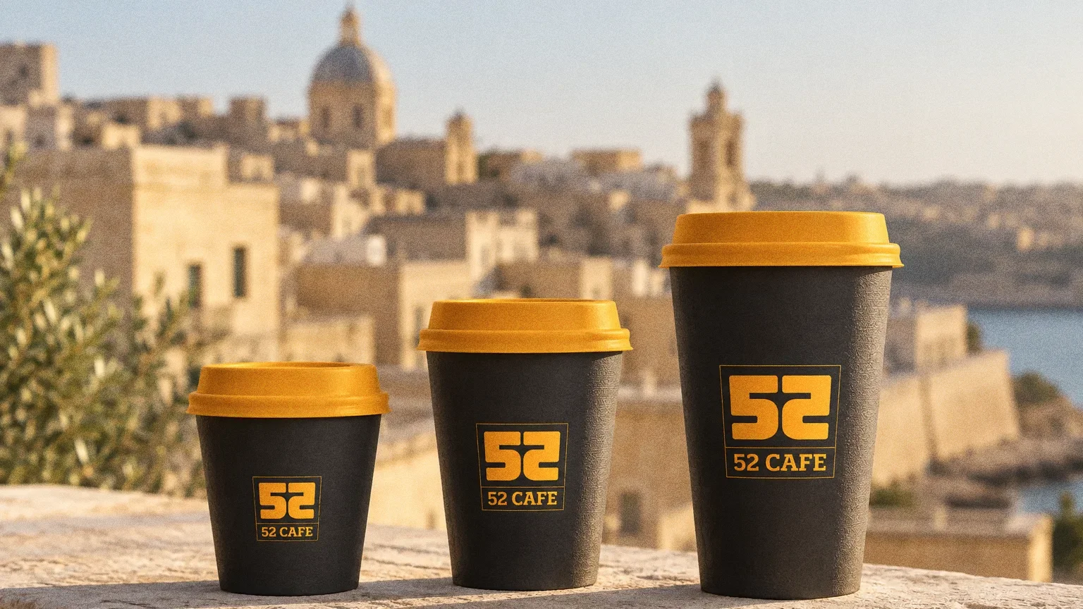
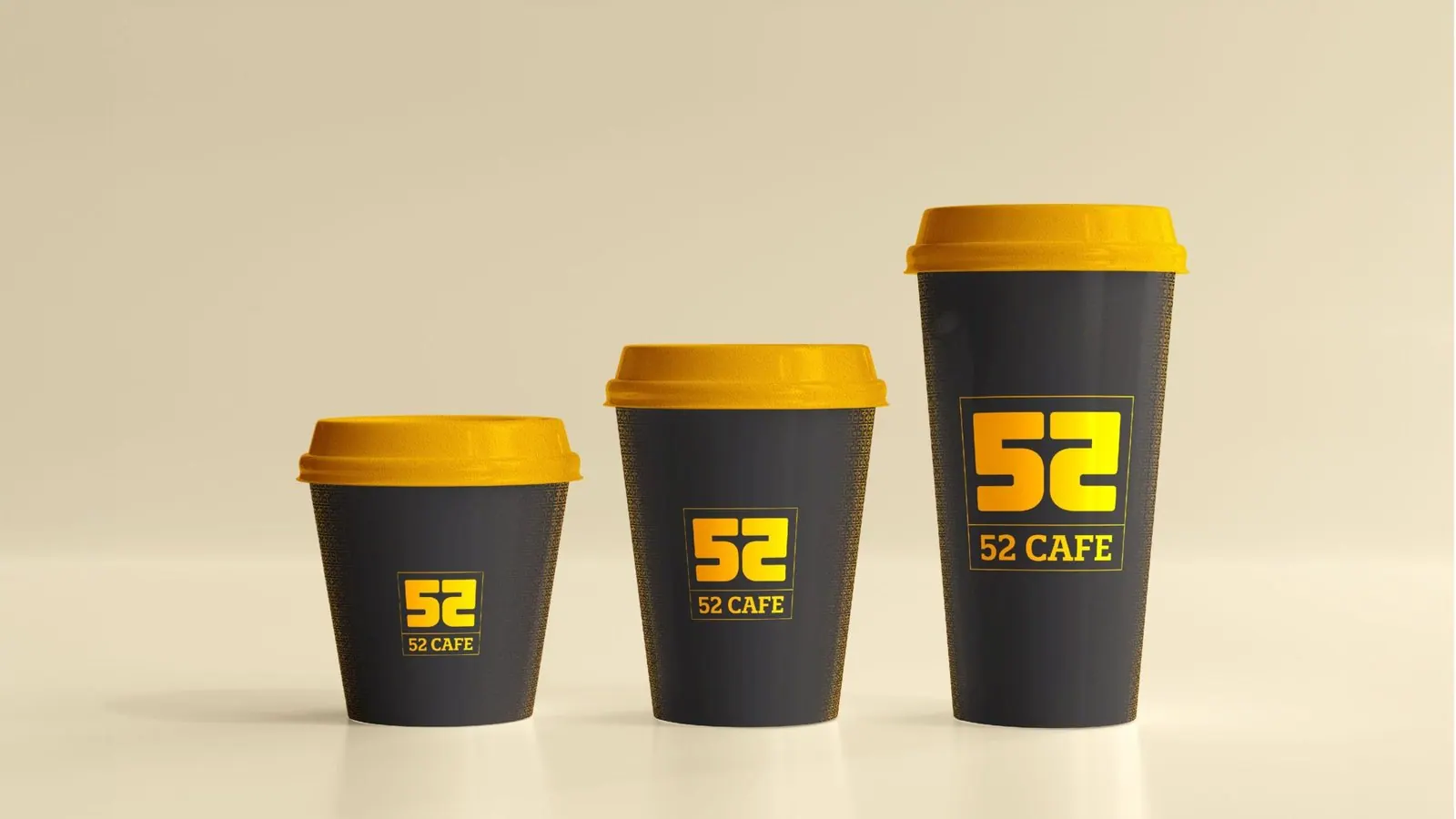
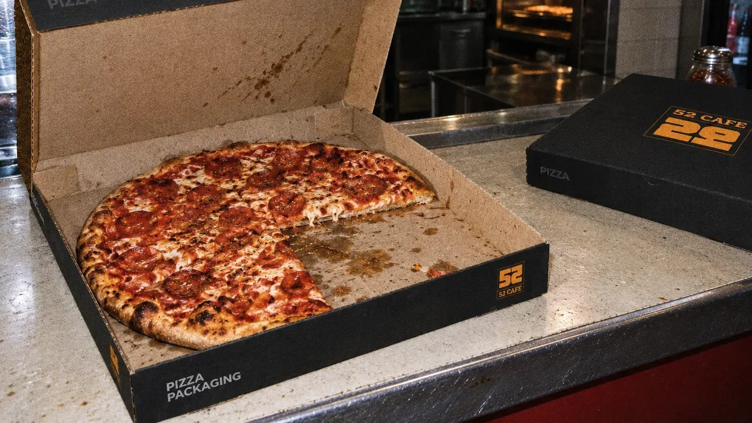
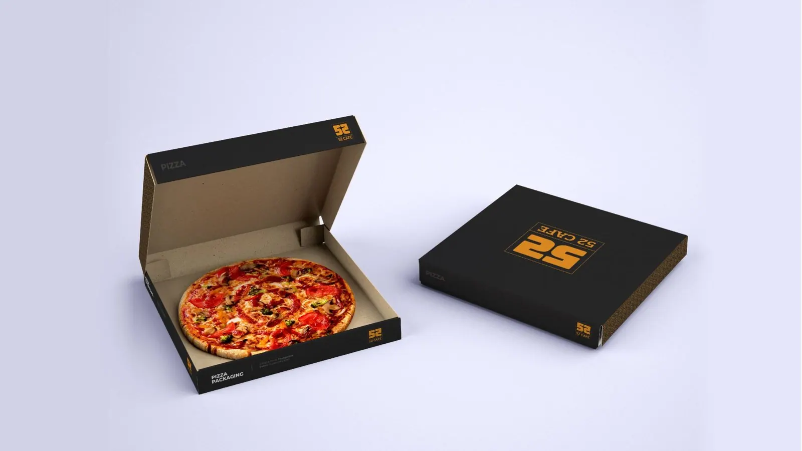
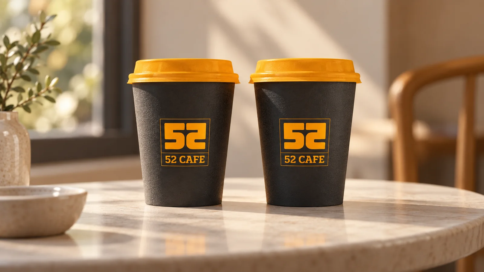
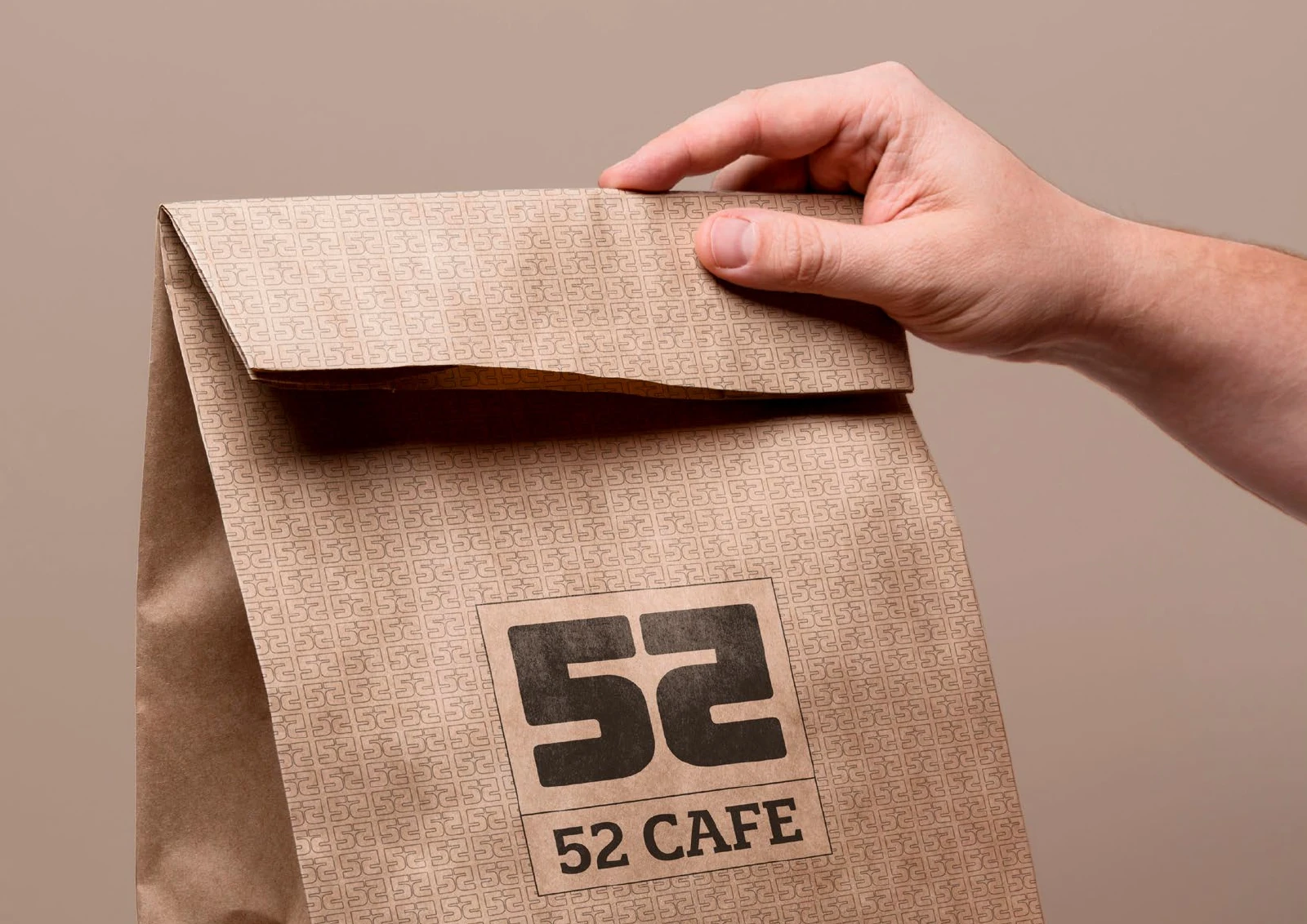
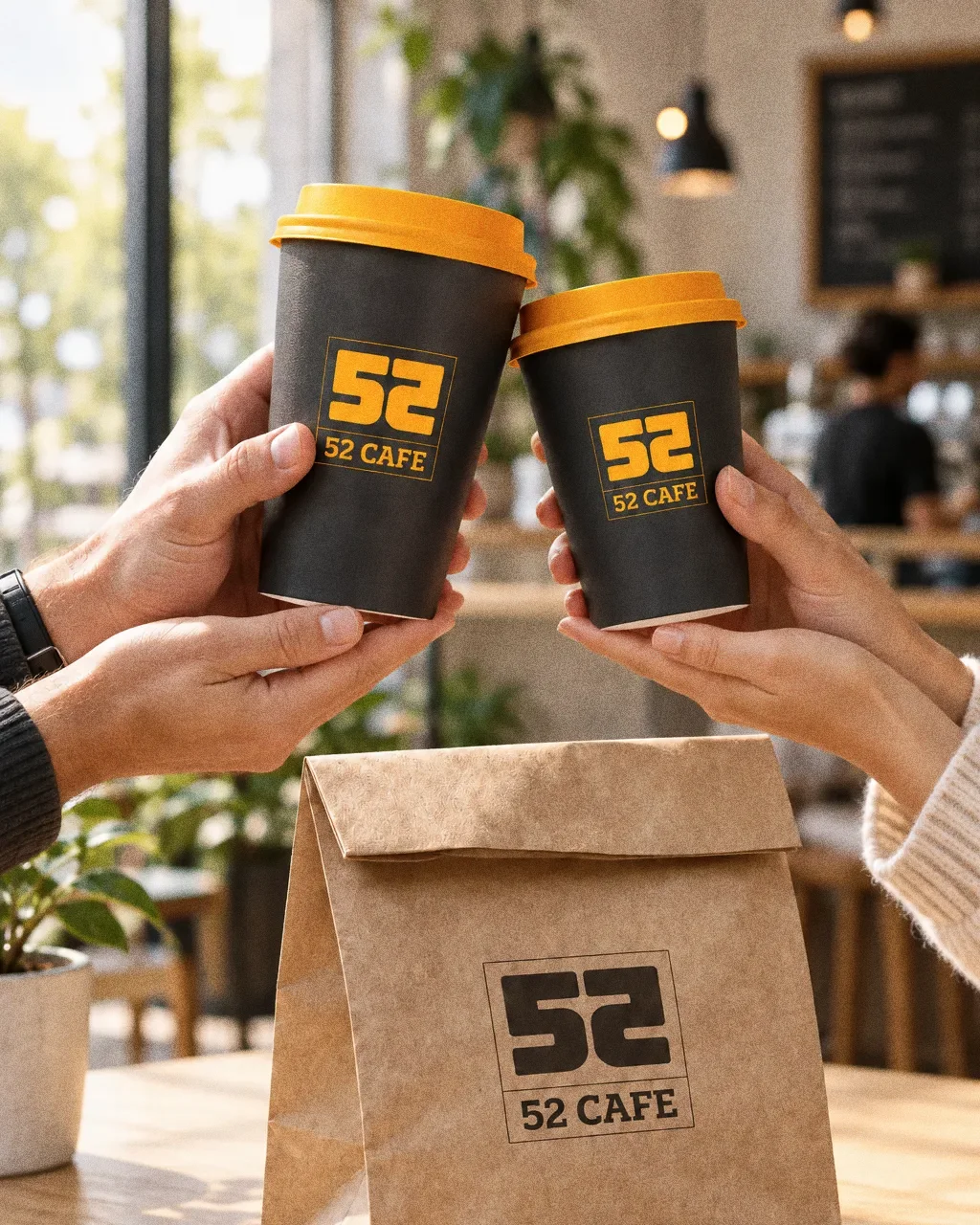
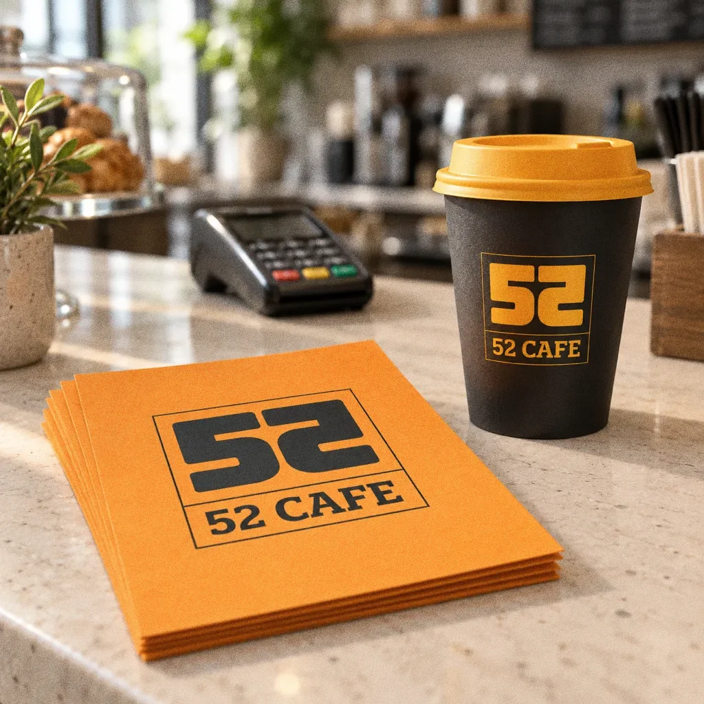
The presentation sets out an orange-and-charcoal palette and a pattern, then applies the monogram to boxes, a paper bag, a food tray, cups and a pizza box.
BriefA numerical café name offers the chance to create a compact identifying mark. The design task is to make those two numbers feel like one place, with a connection to the face-to-face encounter in the original inspiration board.
Services
Scope
- Monogram and wordmark
- Colour palette and pattern
- Packaging range
How to read this deck
The deck pairs the client’s original presentation boards with new application scenes that show the identity in use.
Some of the older boards have been redrawn. Each one sits where the original stood, with the real original design in its corner and a View original button to open it in full.
Chapter 01
Concept and inspiration
Chapter 02
How the logo was formed
Chapter 03
The logo
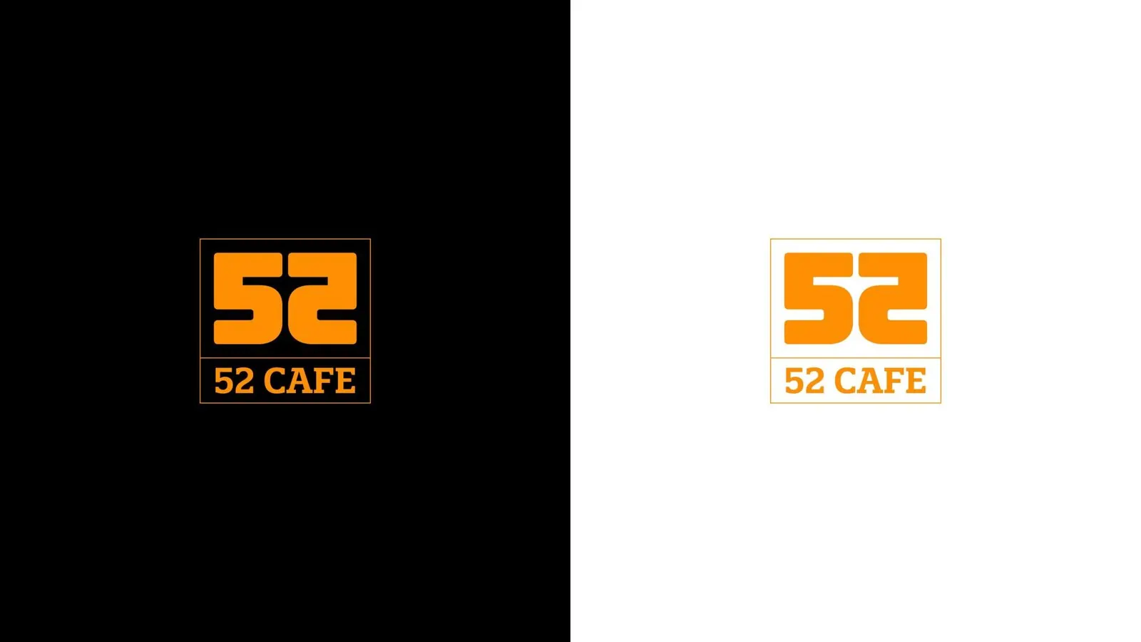
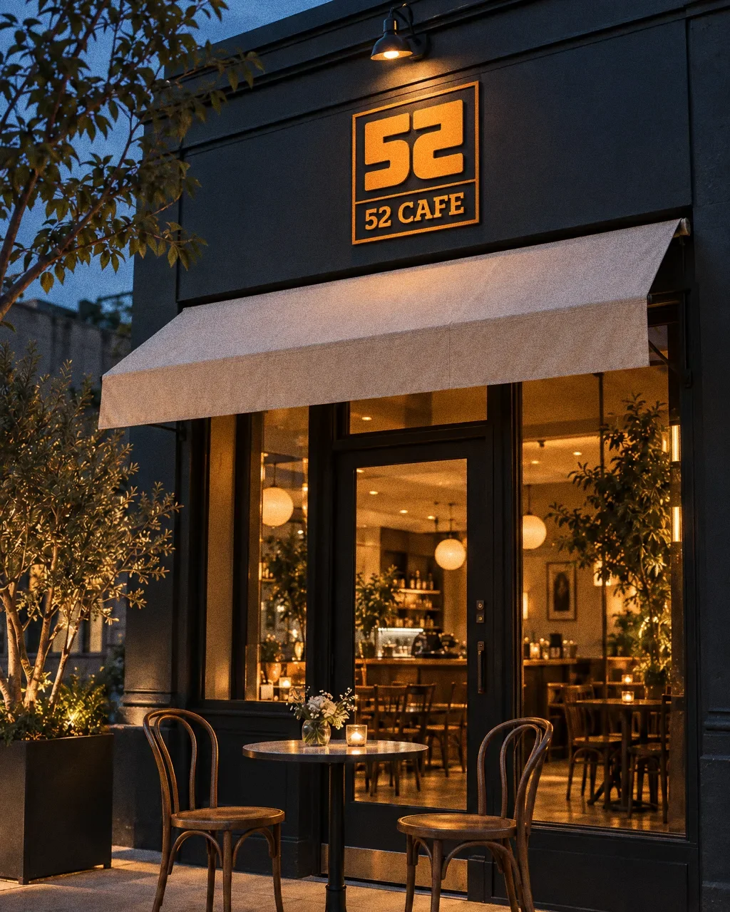
52 Cafe turns mirrored café seating and the number 52 into a distinctive numeric emblem. The framed mark and café name create a compact lockup that can sit clearly on small food packs as well as larger carry bags.
Two people at one table
The inspiration board pairs "No. 52" with a "mirror sitting" illustration of two people facing each other. The monogram mirrors the 5 and the 2 in the same way.
Chapter 04
Logo variations

Chapter 05
Colour
Orange on charcoal, everywhere
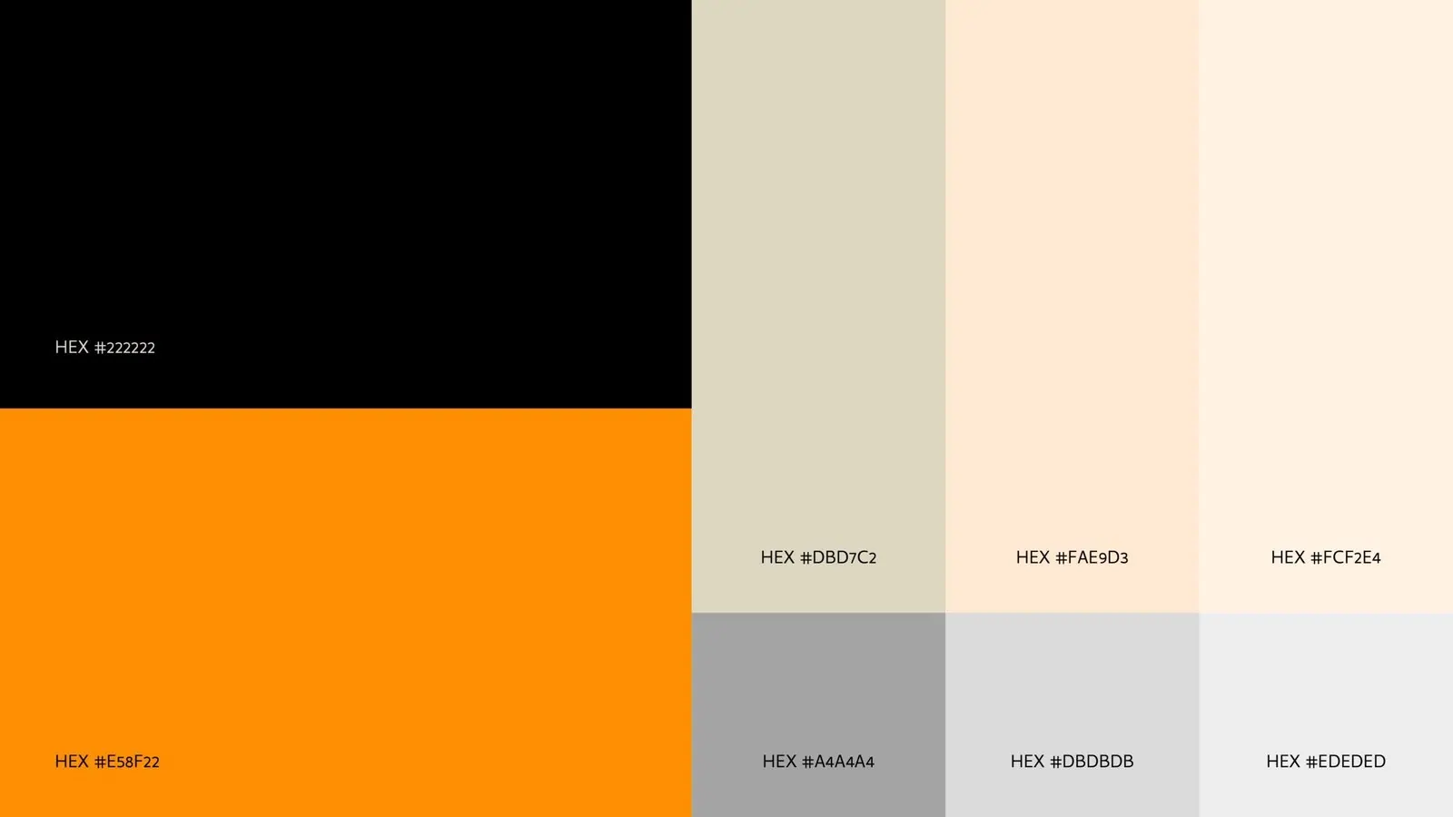
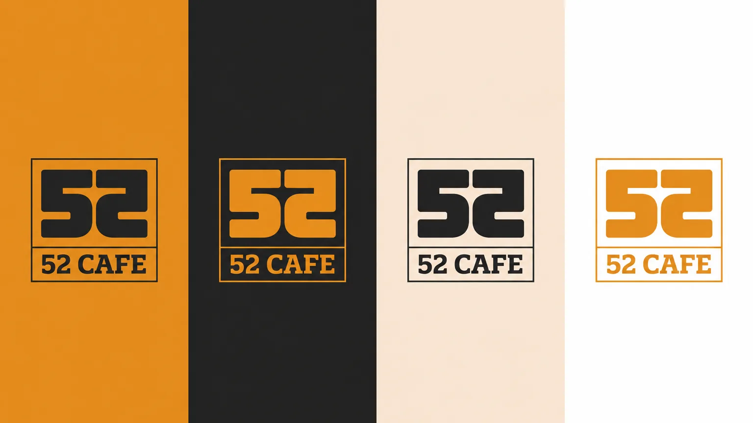
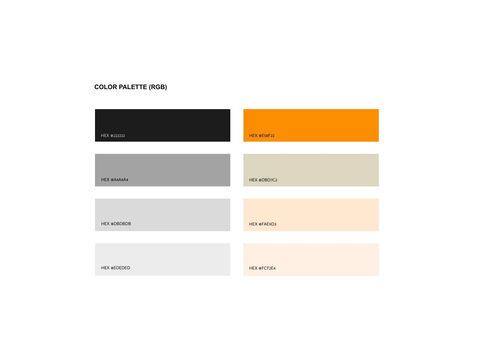
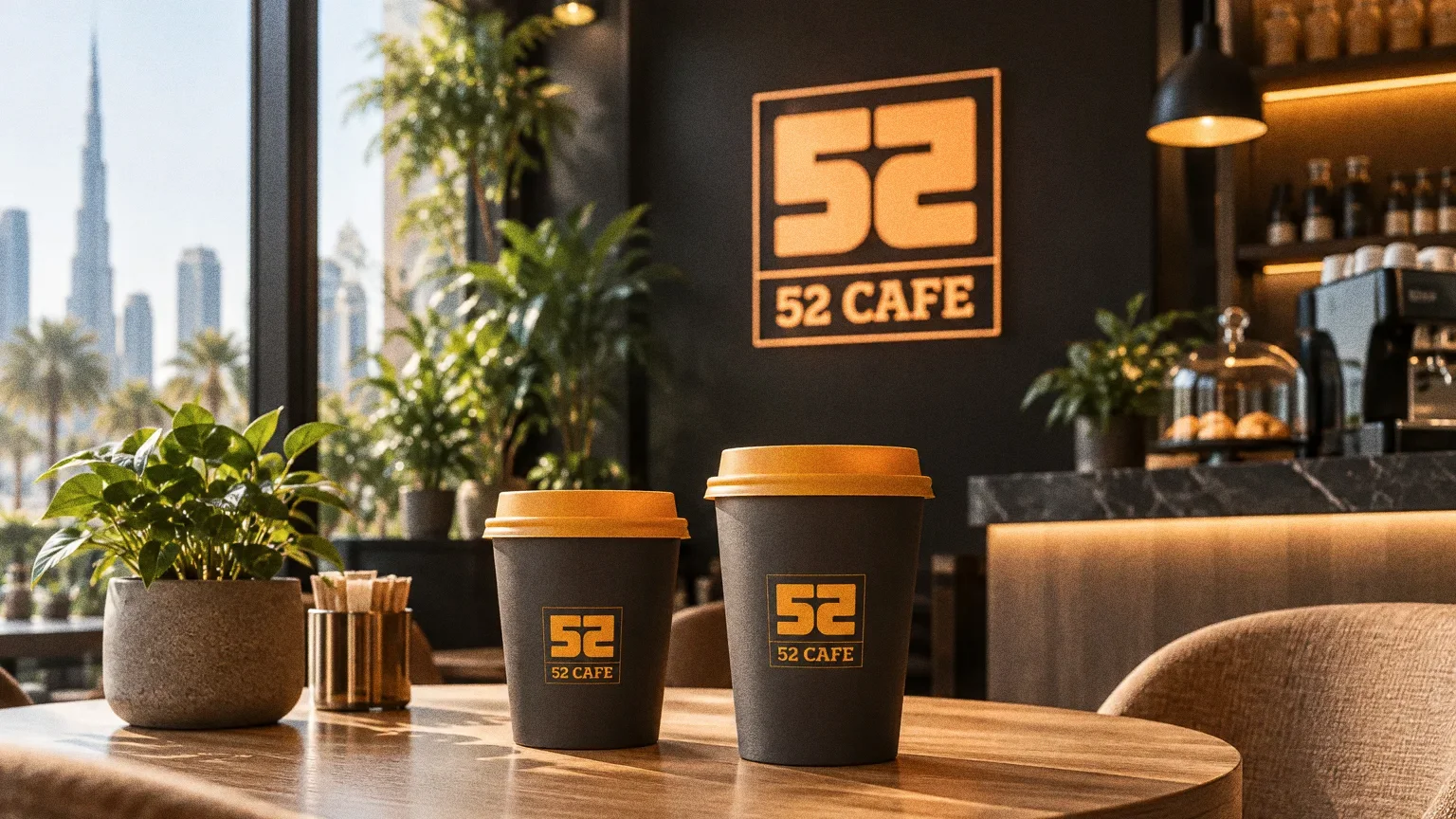
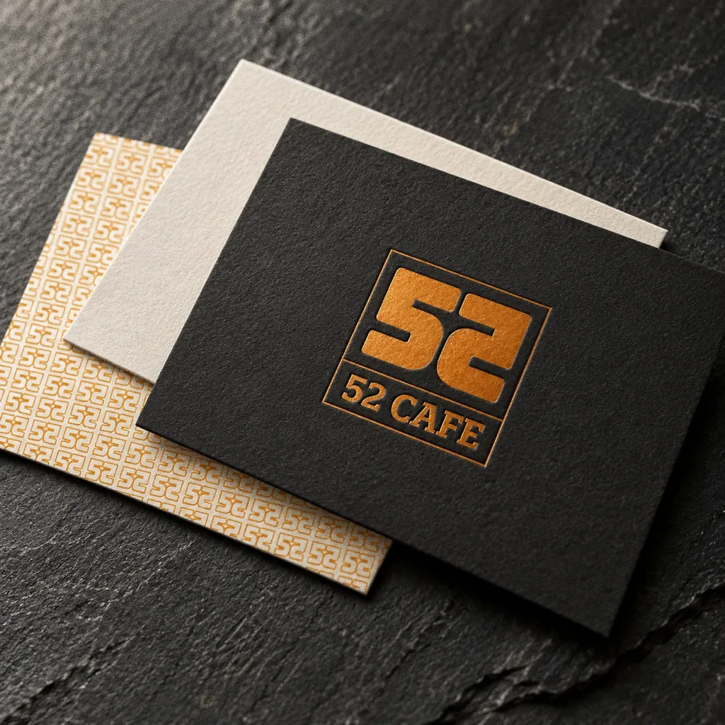
The palette board leads with charcoal and orange, supported by creams and greys. The boxes, bag, tray, cups and pizza box keep the orange monogram on charcoal or kraft.
- Accent
#E58F22 - Surface
#222222 - Ink
#FFFFFF
Colours sampled from the original identity boards.
Chapter 06
Typography
Chapter 07
Pattern and graphic elements

Chapter 08
Packaging
Chapter 09
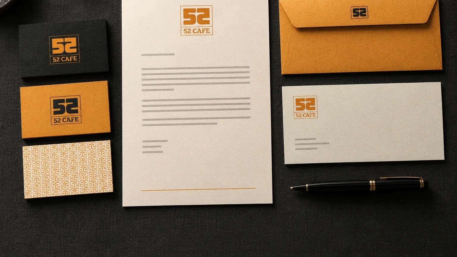
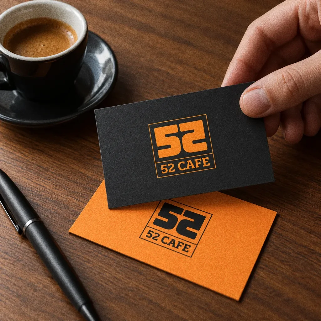
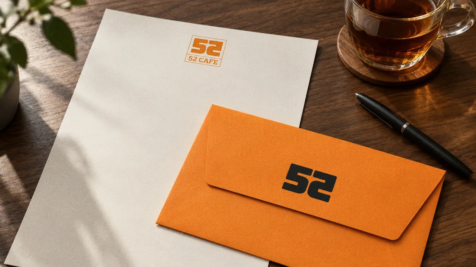
Stationery
Chapter 10
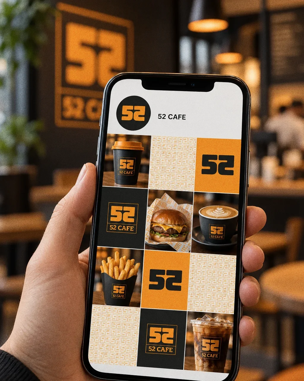
Digital
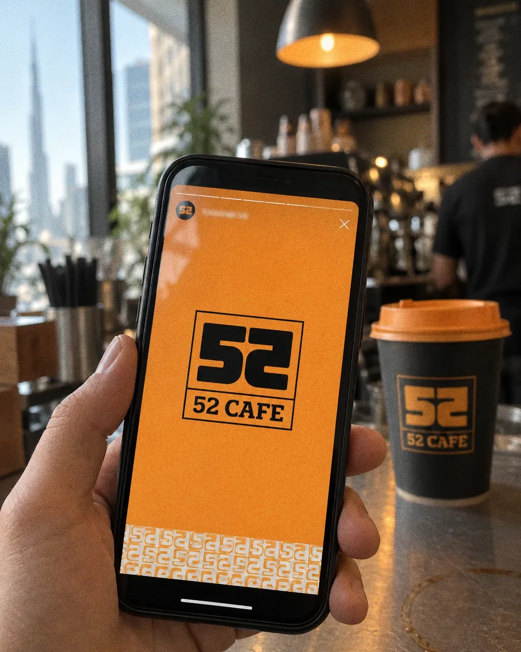
Chapter 11
The brand in the world
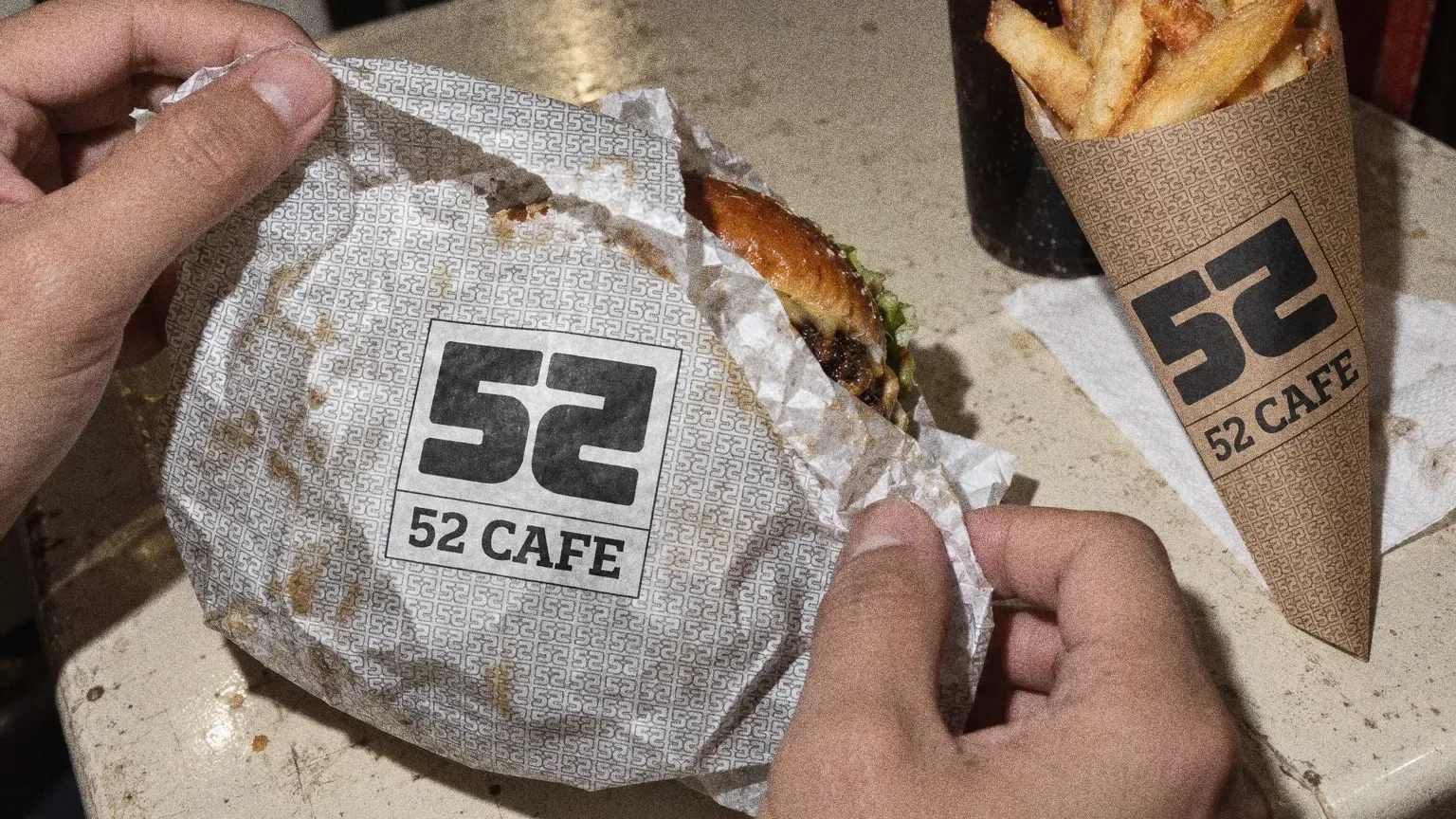
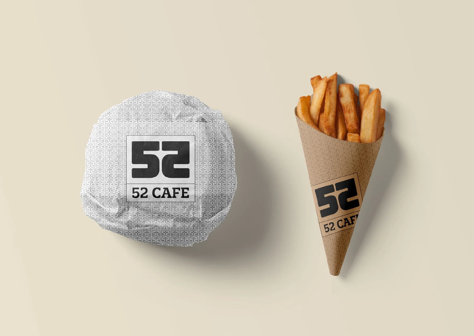
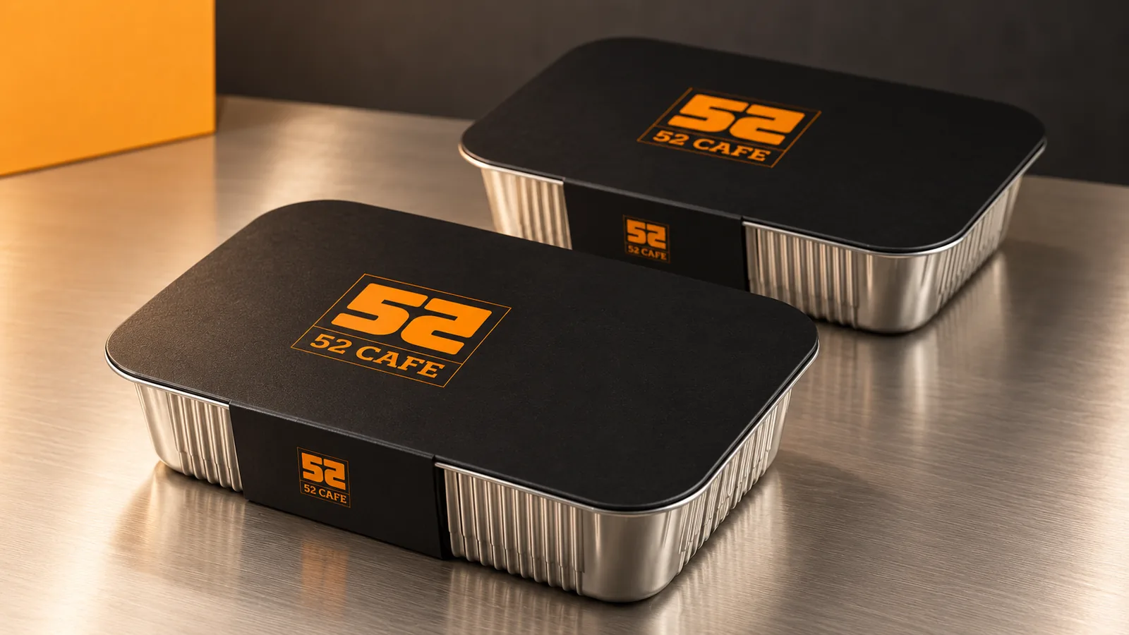
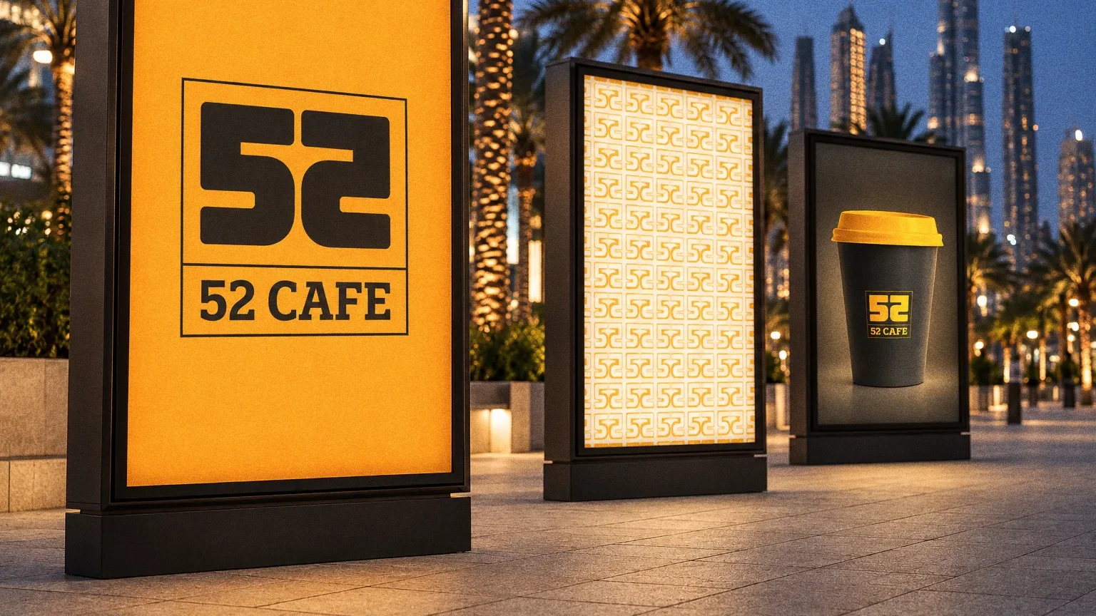
Food trays, burger wrapping, fries sleeves and carry bags show how the same framed lockup works on rigid and folded packaging. The repeat pattern creates continuity across the different surfaces.
Chapter 12
In people’s hands
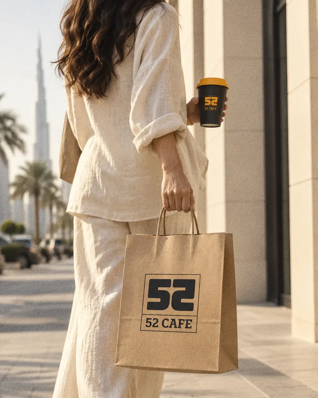
Kraft bag on the pavementThe 52 Cafe identity in a lifestyle photograph of a kraft bag and a cup carried along a sunlit pavement. 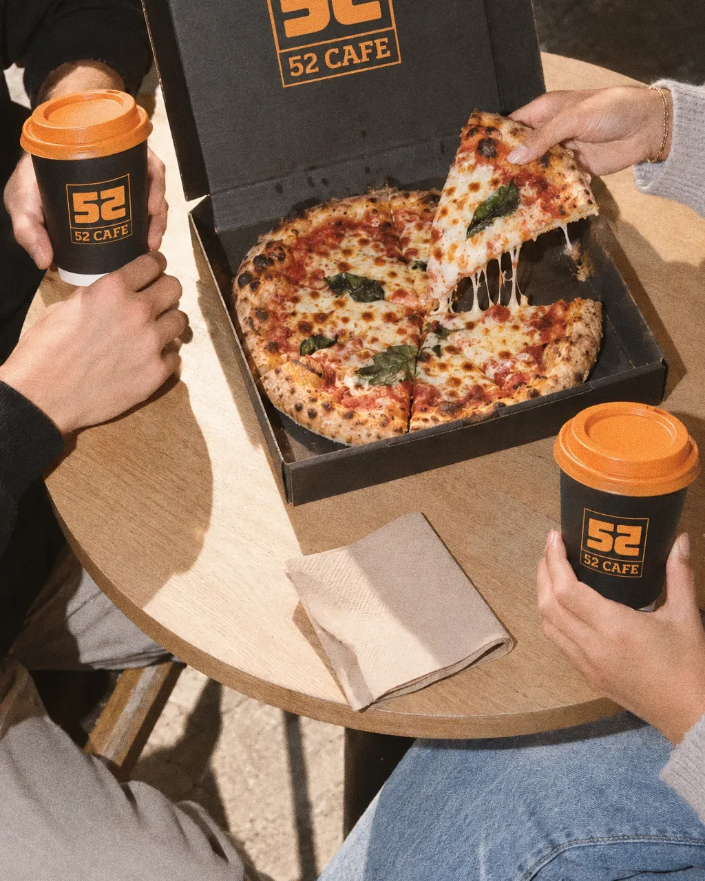
Pizza and cups, face to faceThe 52 Cafe identity in a lifestyle photograph of two people sharing a pizza box and cups at a small table. 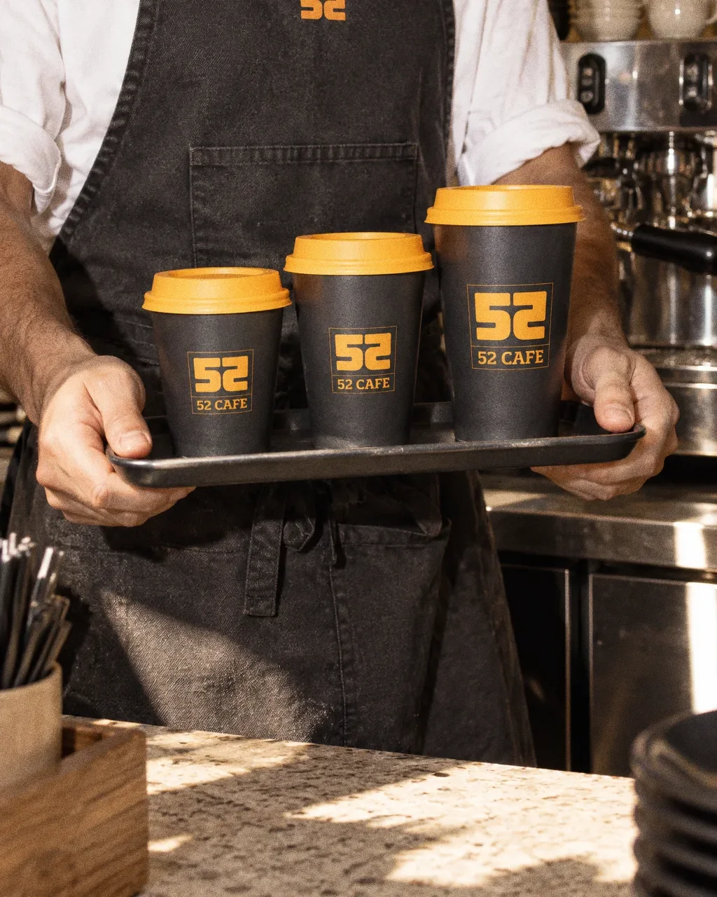
Three sizes on a trayThe 52 Cafe identity in a lifestyle photograph of a barista carrying a tray of three cup sizes. 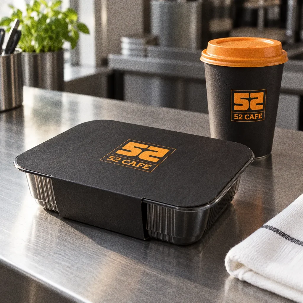
Tray and cup on steelThe 52 Cafe identity in a lifestyle photograph of a food tray and a cup on a steel kitchen counter. 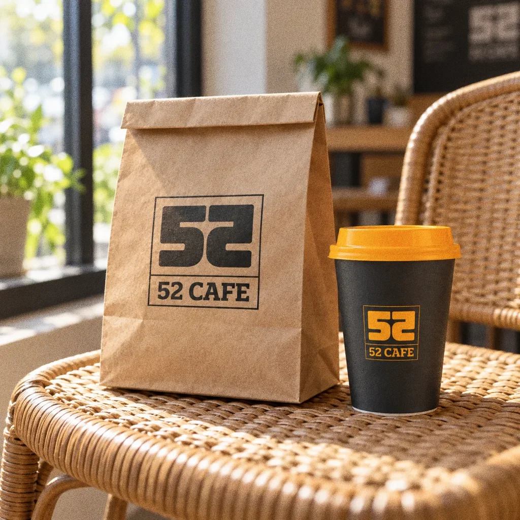
Bag and cup on a rattan chairThe 52 Cafe identity in a lifestyle photograph of a kraft bag and a cup on a rattan chair.
Chapter 13
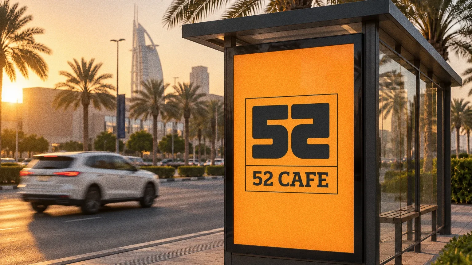
Campaign
About this deck
What we built
A mirrored 5-and-2 monogram, orange-and-charcoal palette and repeat pattern, demonstrated across cups, a tray, boxes, a bag and a pizza box.
About the originals
The original boards are from Abcon’s original project presentation and include application mockups.