
Website / Printing and packaging
German Printing
A printing website that connects its opening brand message with a visible packaging section, using production imagery and a clear red-and-white hierarchy.
Project scope
- Website design
- Homepage composition
- Content and navigation hierarchy
From the business to the screen
The design task
Printing is a broad service category. The design task is to turn the offer into something visitors can see, moving from the company introduction into examples of the materials it produces.
Move from the promise to the product
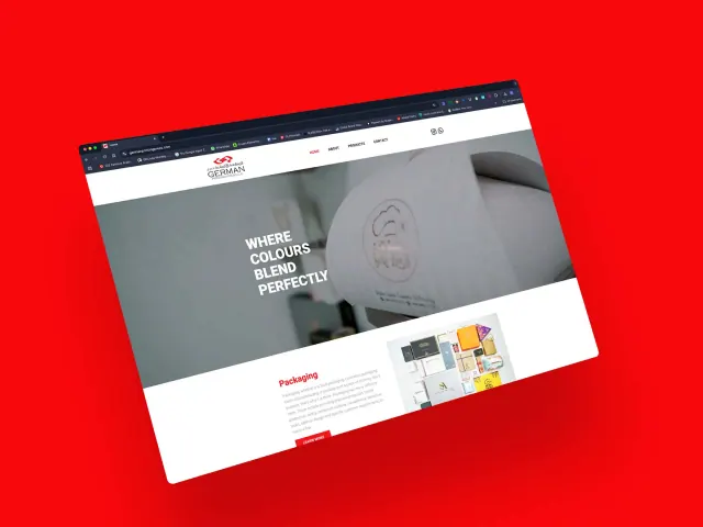
The captured page introduces “Where Colours Blend Perfectly” over a production image, then moves directly into a packaging section with printed examples.
See the original boardKeep the service hierarchy readable
A white header and content area frame the photography. Red section headings and actions carry the brand colour into the service explanation.
See the original boardWhat we built
A homepage with a production-led opening, a packaging introduction, supporting examples and a clear navigation structure.
The image below is the original website capture from Abcon’s portfolio. The client site may have changed since this presentation.
Visit the client website ↗What does your brand need next?
Let’s talk about your project Next projectRaza Gems